效果图是这样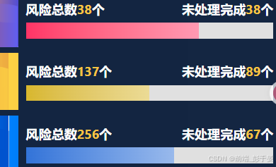
下面直接上组件代码
html
<template>
  <div
    class="gradient-progress"
    :style="{ '--progress': percent + '%', '--main-color': color }"
  ></div>
</template>

<script>
export default {
  props: {
    percent: { type: Number, default: 0, min: 0, max: 100 },
    color: { type: String, default: '#ff4444' }
  }
}
</script>

<style scoped>
.gradient-progress {
  --bg-color: #e0e0e0;
  width: 100%;
  height: 6px;
  background: var(--bg-color);
  /* border-radius: 999px; */
  overflow: hidden;
  position: relative;
}
.gradient-progress::after {
  content: '';
  position: absolute;
  left: 0; top: 0;
  height: 100%;
  width: var(--progress);
  background: linear-gradient(to right,
    var(--main-color),
    color-mix(in srgb, var(--main-color), white 50%)
  );
  /* border-radius: 999px; */
  transition: width 0.3s ease;
}
</style>
使用的时候也非常简单,引入组件后传入颜色以及进度就可以了
<GradientProgress :percent="60" color="#3273d8" class="progress" />