使用HTML打包EXE工具的无边框窗口 功能,结合CSS透明背景和 -webkit-app-region 拖动属性,可以打造出炫酷的透明桌面应用程序。告别千篇一律的标准窗口,让你的应用拥有独特的视觉风格。
下载最新版本
实现原理
透明窗口的实现需要两个关键步骤配合:
- 打包工具端:勾选「无边框窗口」选项,去掉系统默认的标题栏和窗口边框
- HTML/CSS端 :将页面背景设为透明,让窗口呈现透明效果;同时使用
-webkit-app-region: drag让用户可以拖动窗口
打包工具配置
在打包工具主界面切换到高级配置 标签页,勾选无边框窗口选项:
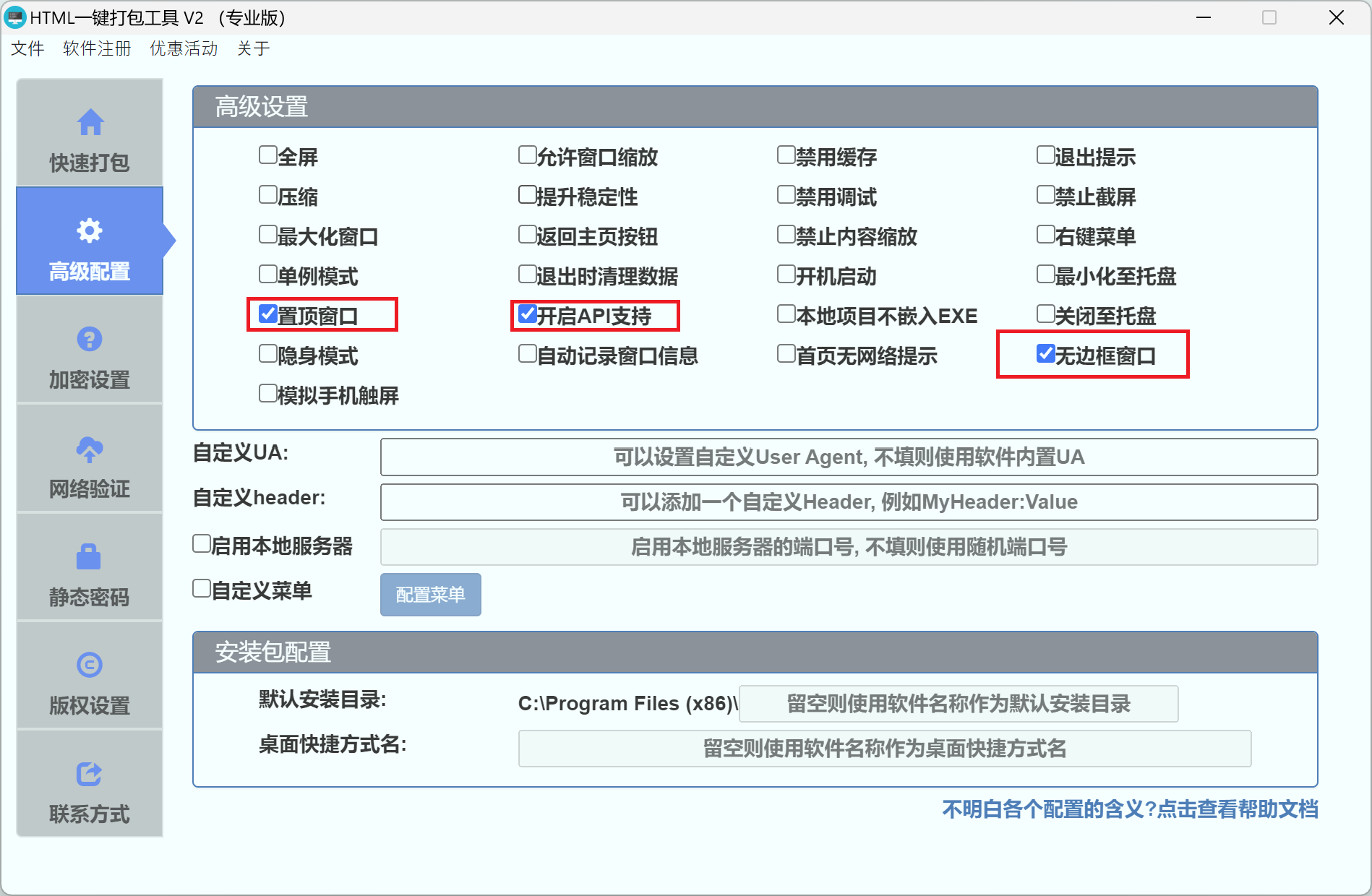
| 配置项 | 说明 |
|---|---|
| 无边框窗口 | 勾选后,打包的EXE文件将没有窗口边框和标题栏 |
提示:勾选无边框窗口后,系统自带的标题栏(包括最小化、最大化、关闭按钮)将被移除,需要在HTML中自行实现这些功能。
设置透明背景
在HTML文件中,将 html 和 body 的背景色设置为透明:
css
html,
body {
    margin: 0;
    padding: 0;
    background: transparent !important;
}
这样窗口中没有内容覆盖的区域将直接透明,可以看到桌面背景。
实现窗口拖动
无边框窗口去掉了系统标题栏,用户无法通过标题栏拖动窗口。此时需要使用 -webkit-app-region 属性来指定可拖动区域:
css
/* 设置整个容器可拖动 */
.drag-area {
    -webkit-app-region: drag;
}

/* 按钮、输入框等交互元素需要排除拖动,否则无法点击 */
button,
input,
a,
.no-drag {
    -webkit-app-region: no-drag;
}
关键规则
| 属性值 | 说明 |
|---|---|
drag |
设置该区域可以拖动窗口,类似系统标题栏的效果 |
no-drag |
排除该区域的拖动行为,使其可以正常点击和交互 |
注意 :被设置为
drag的区域将无法响应鼠标点击事件。因此按钮、链接、输入框等需要交互的元素,必须单独设置no-drag,否则用户将无法点击。
自定义关闭/最小化按钮
去掉系统标题栏后,需要自己实现窗口控制按钮。可以通过开启API支持来调用窗口控制功能:
- 在高级配置中勾选 开启API支持
- 在HTML中使用以下JS API控制窗口:
javascript
// 最小化窗口
window.HTMLPackHelper.minimize();

// 最大化/还原窗口
window.HTMLPackHelper.maximize();

// 恢复窗口大小
window.HTMLPackHelper.restore();

// 关闭窗口
window.HTMLPackHelper.close();
完整示例:赛博朋克桌面时钟
下面是一个赛博朋克风格的透明桌面时钟组件,带有霓虹灯光效、扫描线动画和实时时钟,可以直接用于打包:
html
<!DOCTYPE html>
<html>
    <head>
        <meta charset="UTF-8" />
        <title>Cyber Clock</title>
        <style>
            * {
                margin: 0;
                padding: 0;
                box-sizing: border-box;
            }

            html,
            body {
                background: transparent !important;
                height: 100%;
                font-family: 'Consolas', 'Courier New', monospace;
                overflow: hidden;
                -webkit-user-select: none;
                user-select: none;
            }

            .panel {
                width: 100%;
                height: 100%;
                display: flex;
                flex-direction: column;
                border: 1px solid rgba(0, 255, 200, 0.25);
                background: rgba(0, 10, 15, 0.85);
                position: relative;
            }

            /* 扫描线动画 */
            .panel::after {
                content: '';
                position: absolute;
                top: 0;
                left: 0;
                right: 0;
                height: 2px;
                background: linear-gradient(
                    90deg,
                    transparent,
                    rgba(0, 255, 200, 0.4),
                    transparent
                );
                animation: scanline 3s linear infinite;
                pointer-events: none;
                z-index: 10;
            }
            @keyframes scanline {
                0% {
                    top: 0;
                    opacity: 1;
                }
                50% {
                    opacity: 0.5;
                }
                100% {
                    top: 100%;
                    opacity: 0;
                }
            }

            /* 顶栏 - 可拖动 */
            .top-bar {
                -webkit-app-region: drag;
                display: flex;
                align-items: center;
                justify-content: space-between;
                padding: 8px 14px;
                border-bottom: 1px solid rgba(0, 255, 200, 0.12);
                flex-shrink: 0;
            }
            .top-bar .sys-label {
                font-size: 10px;
                color: rgba(0, 255, 200, 0.5);
                letter-spacing: 3px;
                text-transform: uppercase;
            }
            .top-bar .dot {
                display: inline-block;
                width: 6px;
                height: 6px;
                border-radius: 50%;
                background: #0fa;
                margin-right: 8px;
                box-shadow: 0 0 6px #0fa;
                animation: blink 2s ease infinite;
            }
            @keyframes blink {
                0%,
                100% {
                    opacity: 1;
                }
                50% {
                    opacity: 0.3;
                }
            }

            /* 窗口按钮 */
            .win-btns {
                display: flex;
                gap: 6px;
                -webkit-app-region: no-drag;
            }
            .win-btns button {
                width: 18px;
                height: 18px;
                border: 1px solid rgba(0, 255, 200, 0.25);
                background: transparent;
                color: rgba(0, 255, 200, 0.6);
                font-size: 10px;
                cursor: pointer;
                display: flex;
                align-items: center;
                justify-content: center;
                transition: all 0.15s;
            }
            .win-btns button:hover {
                background: rgba(0, 255, 200, 0.12);
                border-color: rgba(0, 255, 200, 0.6);
                color: #0fa;
            }
            .win-btns .btn-x:hover {
                background: rgba(255, 60, 60, 0.2);
                border-color: rgba(255, 60, 60, 0.6);
                color: #ff5050;
            }

            /* 时钟主体 */
            .clock-body {
                flex: 1;
                display: flex;
                flex-direction: column;
                align-items: center;
                justify-content: center;
                padding: 0 24px;
            }
            .time {
                font-size: 64px;
                font-weight: 700;
                color: #0fa;
                letter-spacing: 4px;
                text-shadow: 0 0 20px rgba(0, 255, 200, 0.35);
                font-variant-numeric: tabular-nums;
                line-height: 1;
            }
            .time .colon {
                animation: blink 1s step-end infinite;
            }
            .date-row {
                margin-top: 8px;
                font-size: 13px;
                color: rgba(0, 255, 200, 0.4);
                letter-spacing: 2px;
            }

            /* 分隔线 */
            .sep {
                margin: 0 24px;
                height: 1px;
                background: linear-gradient(
                    90deg,
                    transparent,
                    rgba(0, 255, 200, 0.2),
                    transparent
                );
                flex-shrink: 0;
            }

            /* 底部信息 */
            .info-grid {
                display: grid;
                grid-template-columns: 1fr 1fr 1fr;
                gap: 0;
                padding: 12px 24px;
                text-align: center;
                flex-shrink: 0;
            }
            .info-item {
                padding: 6px 0;
            }
            .info-item:not(:last-child) {
                border-right: 1px solid rgba(0, 255, 200, 0.08);
            }
            .info-val {
                font-size: 18px;
                color: #0fa;
                font-weight: 700;
                display: block;
            }
            .info-label {
                font-size: 9px;
                color: rgba(0, 255, 200, 0.35);
                letter-spacing: 2px;
                text-transform: uppercase;
                margin-top: 4px;
                display: block;
            }
        </style>
    </head>
    <body>
        <div class="panel">
            <div class="top-bar">
                <span><span class="dot"></span><span class="sys-label">System Monitor</span></span>
                <div class="win-btns">
                    <button onclick="window.HTMLPackHelper.minimize()">─</button>
                    <button class="btn-x" onclick="window.HTMLPackHelper.close()">✕</button>
                </div>
            </div>

            <div class="clock-body">
                <div class="time" id="clock">
                    00<span class="colon">:</span>00<span class="colon">:</span>00
                </div>
                <div class="date-row" id="date-row">----/--/--</div>
            </div>

            <div class="sep"></div>

            <div class="info-grid">
                <div class="info-item">
                    <span class="info-val" id="run-time">00:00</span>
                    <span class="info-label">运行时长</span>
                </div>
                <div class="info-item">
                    <span class="info-val" id="fps">--</span>
                    <span class="info-label">FPS</span>
                </div>
                <div class="info-item">
                    <span class="info-val" id="mem">-- MB</span>
                    <span class="info-label">内存</span>
                </div>
            </div>
        </div>

        <script>
            const weekdays = ['日', '一', '二', '三', '四', '五', '六'];
            const startTime = Date.now();
            let frames = 0,
                lastFpsTime = Date.now(),
                currentFps = 0;

            function pad(n) {
                return n < 10 ? '0' + n : n;
            }

            function tick() {
                const now = new Date();
                document.getElementById('clock').innerHTML =
                    pad(now.getHours()) +
                    '<span class="colon">:</span>' +
                    pad(now.getMinutes()) +
                    '<span class="colon">:</span>' +
                    pad(now.getSeconds());

                document.getElementById('date-row').textContent =
                    now.getFullYear() +
                    '/' +
                    pad(now.getMonth() + 1) +
                    '/' +
                    pad(now.getDate()) +
                    '  星期' +
                    weekdays[now.getDay()];

                // 运行时长
                const elapsed = Math.floor((Date.now() - startTime) / 1000);
                const m = Math.floor(elapsed / 60),
                    s = elapsed % 60;
                document.getElementById('run-time').textContent = pad(m) + ':' + pad(s);

                // FPS
                frames++;
                if (Date.now() - lastFpsTime >= 1000) {
                    currentFps = frames;
                    frames = 0;
                    lastFpsTime = Date.now();
                }
                document.getElementById('fps').textContent = currentFps || '--';

                // 内存
                if (performance.memory) {
                    const mb = (performance.memory.usedJSHeapSize / 1048576).toFixed(1);
                    document.getElementById('mem').textContent = mb + ' MB';
                }

                requestAnimationFrame(tick);
            }
            requestAnimationFrame(tick);
        </script>
    </body>
</html>
打包配置要点
使用上面的HTML打包时,需要在打包工具中做以下配置:
- 快速打包页面:选择该HTML文件作为本地主文件
- 高级配置 页面:
- ✅ 勾选 无边框窗口
- ✅ 勾选 开启API支持(用于窗口控制按钮)
- ✅ 勾选 置顶窗口, 可以让整个html时钟始终显示在最前面
- 窗口大小建议设为 宽度 350 、高度 200
- 内核选择 Chrome内核(透明效果仅Chrome内核支持)
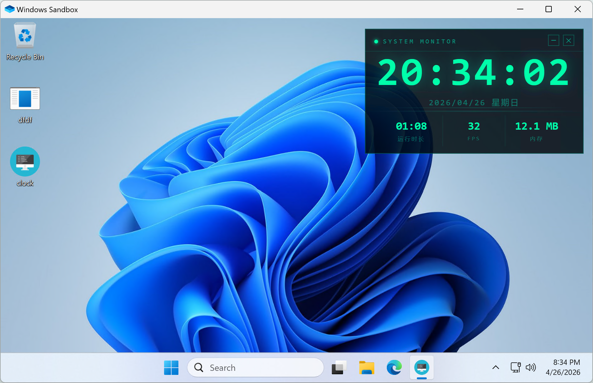
效果预览
打包后运行效果如下,赛博朋克风格的时钟面板悬浮在桌面上,带有扫描线动画和霓虹灯光效果:
进阶技巧
1. 只让部分区域可拖动
如果只想让标题栏可拖动,其余区域正常交互:
css
/* 仅标题栏可拖动 */
.title-bar {
    -webkit-app-region: drag;
}

/* 标题栏内的按钮排除拖动 */
.title-bar button {
    -webkit-app-region: no-drag;
}
2. 半透明磨砂背景
可以在深色背景上使用 rgba 和 backdrop-filter 实现层叠的半透明磨砂效果:
css
.container {
    background: rgba(255, 255, 255, 0.1);
    backdrop-filter: blur(20px);
    -webkit-backdrop-filter: blur(20px);
}
3. 异形窗口效果
利用 border-radius 制作圆角甚至圆形窗口:
css
.card {
    border-radius: 20px; /* 圆角矩形 */
}

.circle-window {
    border-radius: 50%; /* 圆形窗口 */
    width: 300px;
    height: 300px;
}
4. 窗口阴影效果
可以用CSS阴影为内部元素添加浮层感:
css
.card {
    box-shadow: 0 8px 32px rgba(0, 0, 0, 0.15);
}
注意事项
- 透明窗口效果仅Chrome内核支持,IE内核不支持
- 勾选无边框窗口后,系统标题栏将被移除,请务必自行添加关闭按钮
- 透明区域可以穿透点击到桌面或下层窗口
- 使用
-webkit-app-region: drag的区域无法响应鼠标事件,交互元素需设为no-drag - 建议搭配 开启API支持 使用,方便调用窗口最小化、最大化、关闭等功能