MDN 规范参考: CSS Box Model · margin 折叠 · overflow · CSS 继承
一、知识脉络总览
Day07 CSS
盒子模型
内容 content
width / height
max / min 宽高
默认宽高行为
内边距 padding
单方向属性
复合属性口诀
百分比规则
边框 border
style / color / width
三角形技巧
圆角 radius
外边距 margin
auto 居中
负值技巧
塌陷与合并
overflow 溢出
visible / hidden
scroll / auto
BFC 关联
隐藏元素
visibility hidden
display none
opacity 0
样式继承
可继承属性
不可继承属性
强制继承 inherit
用户代理样式
浏览器默认样式
样式优先级
CSS Reset
二、前置回顾
CSS 知识体系
选择器
属性
基本选择器
组合选择器
伪类选择器
选择器权重
字体 font-*
颜色 color
文本 text-*
背景 background-*
列表 list-style
表格样式
三、盒子模型 Box Model
3.1 核心概念与名词解释
盒子模型(Box Model):CSS 渲染引擎把每个 HTML 元素都视为一个矩形的"盒子",这个盒子由四层区域嵌套而成。页面布局本质上就是这些盒子的排列与堆叠。
| 名词 | 英文 | 定义 |
|---|---|---|
| 内容区域 | Content Area | 元素的核心区域,文本、图片、子元素都渲染在这里 |
| 内边距 | Padding | 内容区域与边框之间的透明填充区域 |
| 边框 | Border | 围绕内边距和内容的可见边界线 |
| 外边距 | Margin | 边框以外的透明区域,用于控制元素与周围元素的间距 |
| 盒子总宽度 | Box Total Width | 内容宽 + 左右 padding + 左右 border |
| 盒子总高度 | Box Total Height | 内容高 + 上下 padding + 上下 border |
| content-box | content-box | 默认盒模型,width/height 只指内容区尺寸 |
| border-box | border-box | 替代盒模型,width/height 包含 padding + border |
| 包含块 | Containing Block | 元素计算百分比尺寸时参照的父级盒子区域 |
| 渲染引擎 | Rendering Engine | 浏览器负责解析 HTML/CSS 并绘制页面的核心模块 |
3.2 盒子模型结构图
Margin(外边距)--- 透明,不可见,不计入盒子尺寸
Border(边框)--- 可设颜色/样式/宽度,计入盒子尺寸
Padding(内边距)--- 透明,背景色延伸至此,计入盒子尺寸
Content(内容区)--- 文字/图片/子元素
width × height
3.3 两种盒模型对比:content-box vs border-box
这是前端开发中最重要的特性之一,必须深刻理解。
box-sizing: content-box
(浏览器默认值)
width = 内容宽度
实际占宽 = width + padding + border
box-sizing: border-box
(推荐设置)
width = 内容 + padding + border
实际占宽 = width(固定不变)
🔥 2026 年全球标准实践:
所有现代前端项目都在 CSS 第一行写入以下代码,这被称为"通用 border-box 重置":
css*, *::before, *::after { box-sizing: border-box; }为什么必须这样做?
- 默认
content-box会导致width: 100%+padding= 元素溢出父容器- 响应式布局计算噩梦(百分比宽度无法精确控制)
- Flexbox/Grid 中尺寸不可预测
- Bootstrap、Tailwind CSS、Ant Design 等所有主流框架都默认启用
具体对比:
css/* ❌ content-box 问题场景 */ .container { width: 500px; } .child { width: 50%; /* 期望250px */ padding: 20px; /* 实际渲染:290px,超出! */ border: 5px solid; } /* ✅ border-box 解决方案 */ * { box-sizing: border-box; } .child { width: 50%; /* 实际渲染:250px,符合预期! */ padding: 20px; border: 5px solid; }
对比示例:
html
<!DOCTYPE html>
<html lang="zh-CN">
<head>
<meta charset="UTF-8">
<title>box-sizing 对比演示</title>
<style>
/* 全局重置:清除默认 margin 和 padding */
* {
    margin: 0;
    padding: 0;
}

body {
    background: #f5f5f5;          /* 浅灰背景,突出盒子 */
    padding: 40px;                /* 页面内边距 */
    font-family: sans-serif;      /* 系统字体 */
}

/* 容器:使用 flexbox 横向排列两个盒子 */
.demo-wrapper {
    display: flex;                /* 弹性布局 */
    gap: 30px;                    /* 子元素间距 30px */
    align-items: flex-start;      /* 顶部对齐 */
}

/* ========== content-box 示例(浏览器默认模式) ========== */
.content-box-demo {
    box-sizing: content-box;      /* 默认盒模型:width 只控制内容区 */
    width: 200px;                 /* 内容区宽度 = 200px */
    padding: 20px;                /* 内边距:左右各 20px,上下各 20px */
    border: 5px solid #333;       /* 边框:四周各 5px */

    /* 💡 计算实际宽度:
       实际渲染宽度 = width + padding-left + padding-right + border-left + border-right
                   = 200 + 20 + 20 + 5 + 5
                   = 250px ← 超出了预期的 200px!
       这就是为什么传统布局经常出现"撑破"问题 */

    background: #ffeaa7;          /* 黄色背景 */
    color: #333;                  /* 深灰色文字 */
    text-align: center;           /* 文字居中 */
}

/* ========== border-box 示例(现代推荐模式) ========== */
.border-box-demo {
    box-sizing: border-box;       /* 替代盒模型:width 包含 padding 和 border */
    width: 200px;                 /* 总宽度 = 200px(含 padding 和 border) */
    padding: 20px;                /* 内边距:左右各 20px */
    border: 5px solid #333;       /* 边框:四周各 5px */

    /* 💡 计算实际宽度:
       实际渲染宽度 = width(固定为 200px)
       内容区宽度   = width - padding-left - padding-right - border-left - border-right
                   = 200 - 20 - 20 - 5 - 5
                   = 150px
       优势:无论如何调整 padding 和 border,盒子总宽度始终是 200px */

    background: #55efc4;          /* 绿色背景 */
    color: #333;                  /* 深灰色文字 */
    text-align: center;           /* 文字居中 */
}

/* 提示信息样式 */
.info {
    margin-bottom: 16px;          /* 与下方内容的间距 */
    font-size: 13px;              /* 小号字体 */
    color: #666;                  /* 灰色文字 */
}
</style>
</head>
<body>
    <!-- 说明文字 -->
    <p class="info">
        📐 两个盒子都设置了 width: 200px,但实际宽度不同:<br>
        左侧 content-box 实际宽度 250px,右侧 border-box 实际宽度 200px
    </p>

    <!-- 对比容器 -->
    <div class="demo-wrapper">
        <!-- content-box:宽度会被撑大 -->
        <div class="content-box-demo">
            content-box(默认)<br>实际宽度 250px
        </div>

        <!-- border-box:宽度固定不变 -->
        <div class="border-box-demo">
            border-box(推荐)<br>实际宽度 200px
        </div>
    </div>
</body>
</html>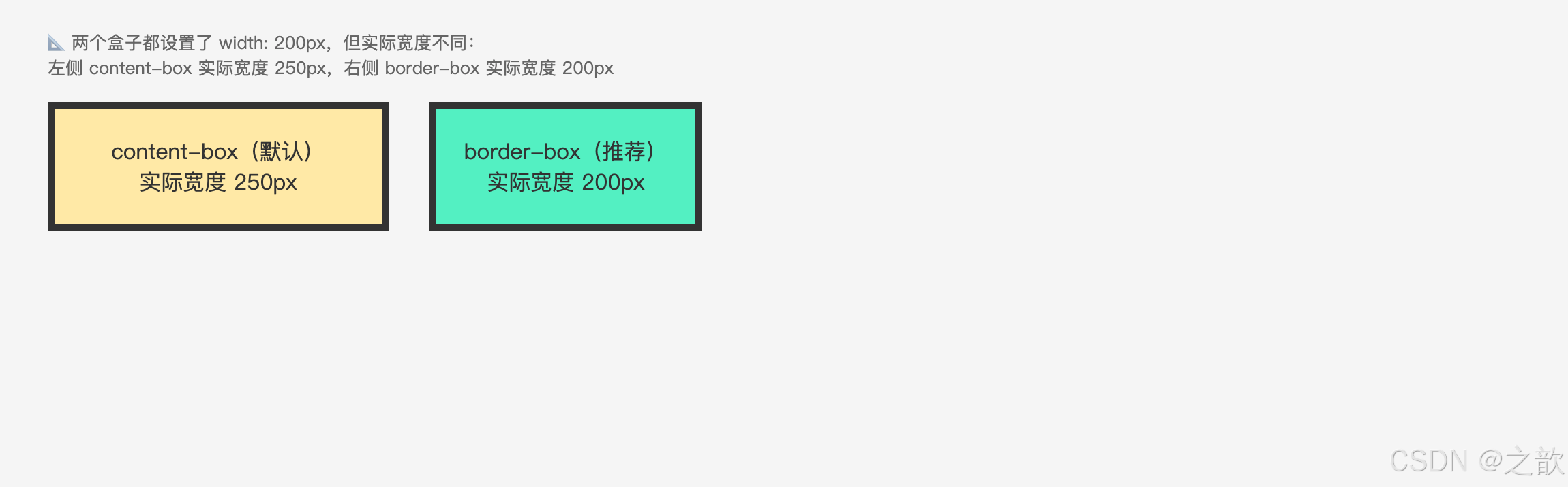
content-box(默认):
  设置 width: 200px,加上 padding:20px 和 border:5px
  → 实际占宽 = 200 + 40 + 10 = 250px  ← 超出设定值

border-box(推荐):
  设置 width: 200px,无论 padding 和 border 如何调整
  → 实际占宽始终 = 200px  ← 不会超出设定值
工程实践: 几乎所有现代项目都在全局 CSS 的第一行加上
* { box-sizing: border-box; },这样设置宽度就不会因为 padding 和 border 而"撑大"盒子,布局更直观可控。Bootstrap、Tailwind CSS 等主流框架也默认使用border-box。
3.4 盒子大小计算公式
content-box 默认模型:
  盒子总宽度 = width + padding-left + padding-right + border-left + border-right
  盒子总高度 = height + padding-top + padding-bottom + border-top + border-bottom

border-box 替代模型:
  盒子总宽度 = width(已包含 padding 和 border)
  内容宽度   = width - padding-left - padding-right - border-left - border-right

注意:margin 不计入盒子本身的尺寸,只影响盒子与外部的间距
计算示例(content-box):
css
.box {
    width: 200px;
    height: 100px;
    padding: 20px;
    border: 5px solid #333;
    margin: 30px;
}实际渲染宽度 = 200 + 20 + 20 + 5 + 5 = 250px
实际渲染高度 = 100 + 20 + 20 + 5 + 5 = 150px
占据空间宽度(含margin) = 250 + 30 + 30 = 310px实际网站案例: 淘宝商品卡片、京东商品列表中每张商品卡都是一个标准盒子,padding 控制内容与卡片边缘的留白,border 形成卡片轮廓,margin 控制卡片之间的间距。
四、内容区域 --- width / height
4.1 相关 CSS 属性
| CSS 属性 | 功能 | 属性值 | 说明 |
|---|---|---|---|
width |
内容宽度 | 长度 / 百分比 / auto | 默认 auto |
max-width |
最大宽度 | 长度 / 百分比 | 限制宽度上限,响应式常用 |
min-width |
最小宽度 | 长度 / 百分比 | 限制宽度下限,防止过窄 |
height |
内容高度 | 长度 / 百分比 / auto | 默认 auto(随内容撑开) |
max-height |
最大高度 | 长度 / 百分比 | 限制高度上限,常配合 overflow |
min-height |
最小高度 | 长度 / 百分比 | 保证最小显示高度 |
注意:
max-width/min-width一般不 与固定的width同时设置,否则其中一个会失效。
4.2 元素默认宽高行为
元素类型
块级元素 block
行内块元素 inline-block
行内元素 inline
宽度:默认撑满父元素(auto)
高度:由内容撑开,无内容则高度为0
宽度:由内容撑开,无内容则无宽度
高度:由内容撑开,无内容则无高度
宽度:由内容撑开,无内容则无宽度
高度:由内容撑开,无内容也有一行文字高度
块级元素默认宽度公式:
默认总宽度      = 父元素内容宽度 - 自身左右 margin
默认内容宽度    = 父元素内容宽度 - 自身左右 margin - 自身左右 padding - 自身左右 border
4.3 特性总结
width / height 的 5 大特性:
width: auto是块级元素的默认值,会自动填满父容器(考虑 margin)height: auto是所有元素的默认值,由内部内容决定高度- 百分比高度依赖父元素的明确高度,若父元素高度也是 auto,百分比高度无效
max-width优先级高于width,min-width优先级高于max-width(三者冲突时)- 行内元素设置
width/height无效,必须将其转为块级或行内块才生效
4.4 代码示例
示例一:max-width / min-width 响应式场景
html
<!DOCTYPE html>
<html lang="zh-CN">
<head>
<meta charset="UTF-8">
<title>max-width / min-width 响应式示例</title>
<style>
/* 外层容器:固定宽度,用于测试内部元素的自适应行为 */
.container {
    width: 800px;                 /* 容器宽度固定为 800px */
    margin: 40px auto;            /* 上下 40px,左右 auto → 水平居中 */
    border: 2px dashed #ccc;      /* 虚线边框,方便观察容器边界 */
    padding: 20px;                /* 内边距 20px */
}

/* 响应式盒子:使用 min-width 和 max-width 限制宽度范围 */
.responsive-box {
    /* ========== 核心属性 ========== */
    min-width: 200px;             /* 最小宽度 200px:防止内容过窄导致文字挤压、布局错乱 */
    max-width: 600px;             /* 最大宽度 600px:防止过宽导致阅读困难(最佳阅读宽度 50-75 字符) */

    /* 💡 工作原理:
       - 当容器宽度 < 200px 时 → 盒子宽度 = 200px(触发横向滚动条)
       - 当容器宽度在 200-600px 之间 → 盒子宽度 = 容器宽度(自适应)
       - 当容器宽度 > 600px 时 → 盒子宽度 = 600px(固定最大值)

       试着调整浏览器窗口宽度,观察盒子宽度的变化! */

    /* ========== 视觉样式 ========== */
    background: #e0f0ff;          /* 浅蓝色背景 */
    padding: 16px;                /* 内边距:让文字与边缘有舒适间距 */
    border: 1px solid #3498db;    /* 蓝色边框:清晰标识盒子边界 */
}
</style>
</head>
<body>
    <div class="container">
        <!-- 响应式内容区域 -->
        <p class="responsive-box">
            响应式内容区域,随窗口缩放自动调整宽度。试着调整浏览器窗口大小,观察这个盒子的宽度变化:最窄200px,最宽600px。
        </p>
    </div>
</body>
</html>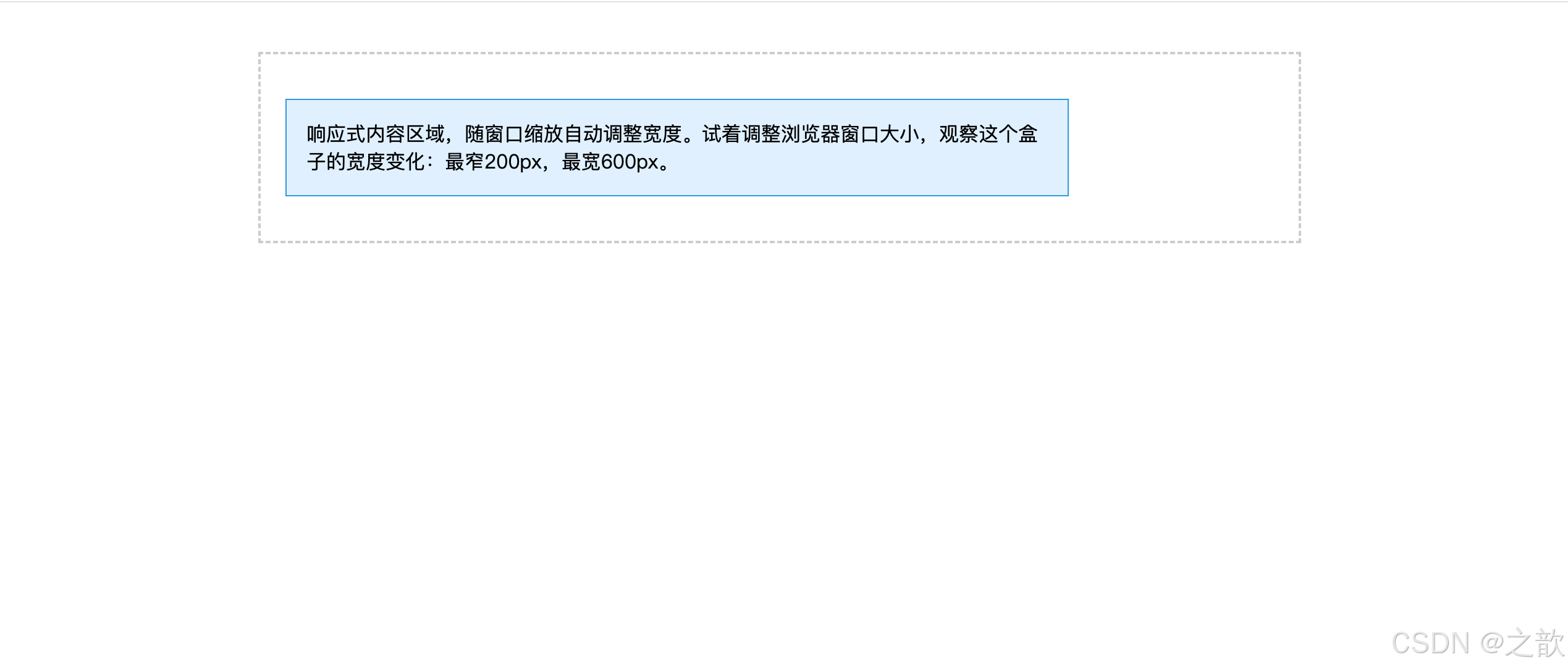
示例二:百分比高度的陷阱
css
/* ========== ❌ 错误示例:父元素高度 auto,子元素百分比高度无效 ========== */
.parent {
    /* 没有设置 height → 默认 height: auto(由内容撑开) */
    width: 500px;
    background: #f0f0f0;
}

.child-wrong {
    height: 50%;   /* ❌ 无效!父元素高度是 auto,百分比无参照基准 */
    background: #ff6b6b;

    /* 💡 为什么无效?
       百分比高度的计算规则:
       - 子元素的百分比高度 = 父元素【明确高度】× 百分比
       - 如果父元素 height: auto(未指定),浏览器无法计算
       - 结果:子元素的 height: 50% 被忽略,回退为 auto

       常见误区:
       "我设置了 height: 100%,为什么元素没高度?"
       → 因为父元素没有明确高度! */
}

/* ========== ✅ 正确示例:父元素有明确高度,子元素百分比生效 ========== */
.parent-fixed {
    height: 400px;   /* 明确设置高度(也可以用 vh、px、em 等单位) */
    width: 500px;
    background: #f0f0f0;
}

.child-correct {
    height: 50%;   /* ✅ 有效!= 400px × 50% = 200px */
    background: #51cf66;

    /* 💡 有效的原因:
       父元素有明确高度 400px → 子元素可以计算 50% = 200px */
}

/* ========== 💡 其他解决方案 ========== */

/* 方案一:使用 vh(viewport height,视口高度单位) */
.child-vh {
    height: 50vh;    /* 50% 的视口高度,无需父元素有明确高度 */
}

/* 方案二:使用 Flexbox */
.parent-flex {
    display: flex;
    height: 400px;   /* 父元素有高度 */
}
.child-flex {
    flex: 1;         /* 子元素自动填充剩余空间 */
    /* 或 */
    height: 100%;    /* 在 flex 容器中,百分比高度可用 */
}

/* 方案三:绝对定位 */
.parent-relative {
    position: relative;
    height: 400px;
}
.child-absolute {
    position: absolute;
    top: 0;
    height: 50%;     /* 相对于已定位的父元素(400px)计算 */
}
示例三:行内元素无法设置宽高
css
/* ❌ 行内元素设置 width/height 无效 */
span {
    width: 100px;    /* 无效 */
    height: 50px;    /* 无效 */
}

/* ✅ 转换为块级或行内块后有效 */
span.block {
    display: block;        /* 转块级 */
    width: 100px;
    height: 50px;
}

span.inline-block {
    display: inline-block; /* 转行内块 */
    width: 100px;
    height: 50px;
}
示例四:min-height 保证最低高度(评论区、空列表)
css
/* 评论列表:没有内容时也要占据一定高度,防止页面塌陷 */
.comment-list {
    min-height: 120px;
    background: #f9f9f9;
    border: 1px dashed #ddd;
    padding: 16px;
}

/* 内容区域:最小撑满视口高度(常见于后台管理页面) */
.main-content {
    min-height: calc(100vh - 60px);  /* 视口高度减去顶部导航 60px */
    padding: 24px;
}
实际网站案例:
- GitHub 代码页:
max-width: 1280px+margin: 0 auto,大屏幕不过宽- Medium 博客:文章正文
max-width: 680px,单行约 70 字,阅读舒适- 掘金 主页:侧边栏
min-width: 240px,防止窗口缩小时侧栏消失
五、内边距 --- padding
5.1 相关 CSS 属性
| CSS 属性名 | 功能 | 属性值 |
|---|---|---|
padding-left |
左内边距 | 长度 / 百分比(不可为负) |
padding-right |
右内边距 | 长度 / 百分比(不可为负) |
padding-top |
上内边距 | 长度 / 百分比(不可为负) |
padding-bottom |
下内边距 | 长度 / 百分比(不可为负) |
padding |
复合属性(上下左右) | 多个长度空格分隔 |
5.2 padding 值的规则
规则一:padding 不能为负值(负值无效,与 margin 不同)
规则二:使用百分比时,上下左右四个方向均参照【父元素内容宽度】计算(注意:不是高度)
规则三:padding 区域会延伸元素的背景色(背景色填充到 padding 区域)
规则四:padding 会影响盒子的实际渲染尺寸(content-box 模式下)
5.3 padding 复合属性口诀
css
/* 1个值:上下左右 */
padding: 20px;

/* 2个值:上下  左右 */
padding: 40px 30px;

/* 3个值:上  左右  下 */
padding: 10px 20px 30px;

/* 4个值:上  右  下  左(顺时针) */
padding: 15px 25px 35px 45px;
记忆口诀: 1值全包,2值上下/左右,3值缺左右,4值顺时针(上→右→下→左)。
5.4 不同显示模式的 padding 表现
padding 设置
元素显示模式
块级元素 block
✅ 上下左右均完美生效
背景色随 padding 延伸
行内块元素 inline-block
✅ 上下左右均完美生效
行内元素 inline
✅ 左右完美生效
⚠️ 上下视觉有效但不影响行高/布局
相邻行会重叠
5.5 padding 的特性总结
padding 的 6 大特性:
- 不可为负:与 margin 最大的区别,负值设置无效
- 背景色延伸:背景色和背景图片都会延伸覆盖 padding 区域
- 百分比参照宽度 :无论上下左右,百分比均参照父元素内容宽度(不是高度)
- 撑大盒子 :在
content-box模式下,padding 会增大盒子的实际渲染尺寸- 行内元素上下 padding 不影响布局:视觉上有效,但相邻行不会因此换位
- padding 可以扩大点击区域:用 padding 代替固定宽高设置按钮,点击面积更大
5.6 代码示例
示例一:按钮中的 padding(最常见用法)
html
<!DOCTYPE html>
<html lang="zh-CN">
<head>
<meta charset="UTF-8">
<title>padding 控制按钮大小示例</title>
<style>
/* ========== 全局重置 ========== */
* {
    margin: 0;
    padding: 0;
    box-sizing: border-box;       /* 统一使用 border-box 模式 */
}

body {
    background: #f5f5f5;          /* 浅灰背景 */
    padding: 40px;                /* 页面内边距 */
    font-family: sans-serif;      /* 系统字体 */
}

/* ========== 按钮容器 ========== */
.btn-wrap {
    display: flex;                /* 弹性布局:按钮横向排列 */
    gap: 12px;                    /* 按钮之间的间距 12px */
    align-items: center;          /* 垂直居中对齐 */
}

/* ========== 按钮通用样式 ========== */
button {
    border: none;                 /* 去掉默认边框 */
    background: #1890ff;          /* 蓝色背景(主题色) */
    color: #fff;                  /* 白色文字 */
    border-radius: 4px;           /* 圆角 4px */
    cursor: pointer;              /* 鼠标手型,提示可点击 */
    transition: background 0.2s;  /* 背景色过渡动画 0.2秒 */
}

/* 按钮悬停效果 */
button:hover {
    background: #40a9ff;          /* 悬停时背景色变亮 */
}

/* ========== 不同尺寸按钮:只用 padding 控制大小 ========== */

/* 小按钮:紧凑型,用于次要操作 */
.btn-sm {
    padding: 4px 12px;            /* 上下 4px,左右 12px */
    font-size: 12px;              /* 字号 12px */
}

/* 中按钮:标准型,最常用尺寸 */
.btn-md {
    padding: 8px 20px;            /* 上下 8px,左右 20px */
    font-size: 14px;              /* 字号 14px */
}

/* 大按钮:醒目型,用于主要操作(如提交、确认) */
.btn-lg {
    padding: 12px 32px;           /* 上下 12px,左右 32px */
    font-size: 16px;              /* 字号 16px */
}

/* 💡 为什么用 padding 而不是 width/height?
   优势 1:文字加长时按钮自动变宽,无需重新计算宽度
   优势 2:字号改变时高度自动调整,保持视觉平衡
   优势 3:多语言场景下(中文/英文/日文)无需手动调整
   优势 4:代码更简洁,维护成本低

   对比:
   - 使用 width: 80px; height: 32px; → 文字超出会被裁剪
   - 使用 padding: 8px 20px; → 文字多少都能完整显示 ✅ */
</style>
</head>
<body>
    <div class="btn-wrap">
        <!-- 三种尺寸按钮:小、中、大 -->
        <button class="btn-sm">小按钮</button>
        <button class="btn-md">中按钮</button>
        <button class="btn-lg">大按钮</button>
    </div>
</body>
</html>
示例二:利用 padding 百分比实现等比例自适应容器(视频占位)
html
<!DOCTYPE html>
<html lang="zh-CN">
<head>
<meta charset="UTF-8">
<title>16:9 自适应视频容器示例</title>
<style>
/* ========== 全局重置 ========== */
* {
    margin: 0;
    padding: 0;
    box-sizing: border-box;
}

body {
    background: #f5f5f5;          /* 浅灰背景 */
    padding: 40px;                /* 页面内边距 */
    font-family: sans-serif;      /* 系统字体 */
}

/* 外层容器:限制最大宽度 + 水平居中 */
.container {
    max-width: 800px;             /* 最大宽度 800px,超出不再变大 */
    margin: 0 auto;               /* 水平居中 */
}

/* ========== 核心技巧:padding 百分比实现等比例容器 ========== */
.video-wrapper {
    position: relative;           /* 定位上下文:让内部绝对定位元素相对于此容器 */
    width: 100%;                  /* 宽度 100%:占满父容器 */

    /* 💡 关键属性:padding-top 百分比参照父元素的【宽度】
       原理:
       - 父容器宽度 = 800px(假设)
       - padding-top: 56.25% = 800px × 56.25% = 450px
       - 56.25% 是如何计算的? 9 ÷ 16 = 0.5625 = 56.25%
       - 因此容器高度自动保持 16:9 比例!

       常见比例:
       - 16:9  → padding-top: 56.25%  (常见视频比例)
       - 4:3   → padding-top: 75%     (传统屏幕比例)
       - 1:1   → padding-top: 100%    (正方形)
       - 21:9  → padding-top: 42.86%  (超宽屏) */
    padding-top: 56.25%;

    background: #000;             /* 黑色背景:模拟视频播放器 */
    overflow: hidden;             /* 隐藏溢出内容 */
    margin-top: 16px;             /* 与上方文字的间距 */
}

/* 视频内容层:绝对定位填满容器 */
.video-iframe {
    position: absolute;           /* 绝对定位:脱离文档流 */
    top: 0;                       /* 定位到容器顶部 */
    left: 0;                      /* 定位到容器左侧 */
    width: 100%;                  /* 宽度 100% */
    height: 100%;                 /* 高度 100%(填满父容器的 padding 区域) */
    border: none;                 /* 去掉 iframe 默认边框 */
}

/* 文字占位层:用于演示效果 */
.video-placeholder {
    position: absolute;           /* 绝对定位 */
    top: 0;
    left: 0;
    width: 100%;
    height: 100%;
    display: flex;                /* 弹性布局 */
    align-items: center;          /* 垂直居中 */
    justify-content: center;      /* 水平居中 */
    color: #fff;                  /* 白色文字 */
    font-size: 18px;              /* 字号 18px */
    text-align: center;           /* 文字居中 */
}

/* 💡 为什么不直接用 height?
   问题:height: 450px; → 固定高度,宽度变化时比例失调
   解决:padding-top: 56.25%; → 高度随宽度自动计算,永远保持 16:9 ✅

   实际应用场景:
   - YouTube/B站 视频嵌入
   - 响应式图片占位(防止加载时页面抖动)
   - 轮播图容器
   - 地图嵌入(Google Maps/高德地图) */
</style>
</head>
<body>
    <div class="container">
        <!-- 说明文字 -->
        <p style="margin-bottom:8px; color:#666;">
            💡 padding-top: 56.25% 实现 16:9 自适应容器,宽度改变时高度自动跟随
        </p>

        <!-- 视频容器 -->
        <div class="video-wrapper">
            <!-- 实际项目中,这里可以替换为 <iframe> 嵌入真实视频 -->
            <div class="video-placeholder">
                16:9 视频占位区域<br>
                (宽度改变时,高度始终保持 16:9 比例)
            </div>

            <!-- 真实使用示例(注释掉):
            <iframe
                class="video-iframe"
                src="https://www.youtube.com/embed/VIDEO_ID"
                allowfullscreen>
            </iframe>
            -->
        </div>
    </div>
</body>
</html>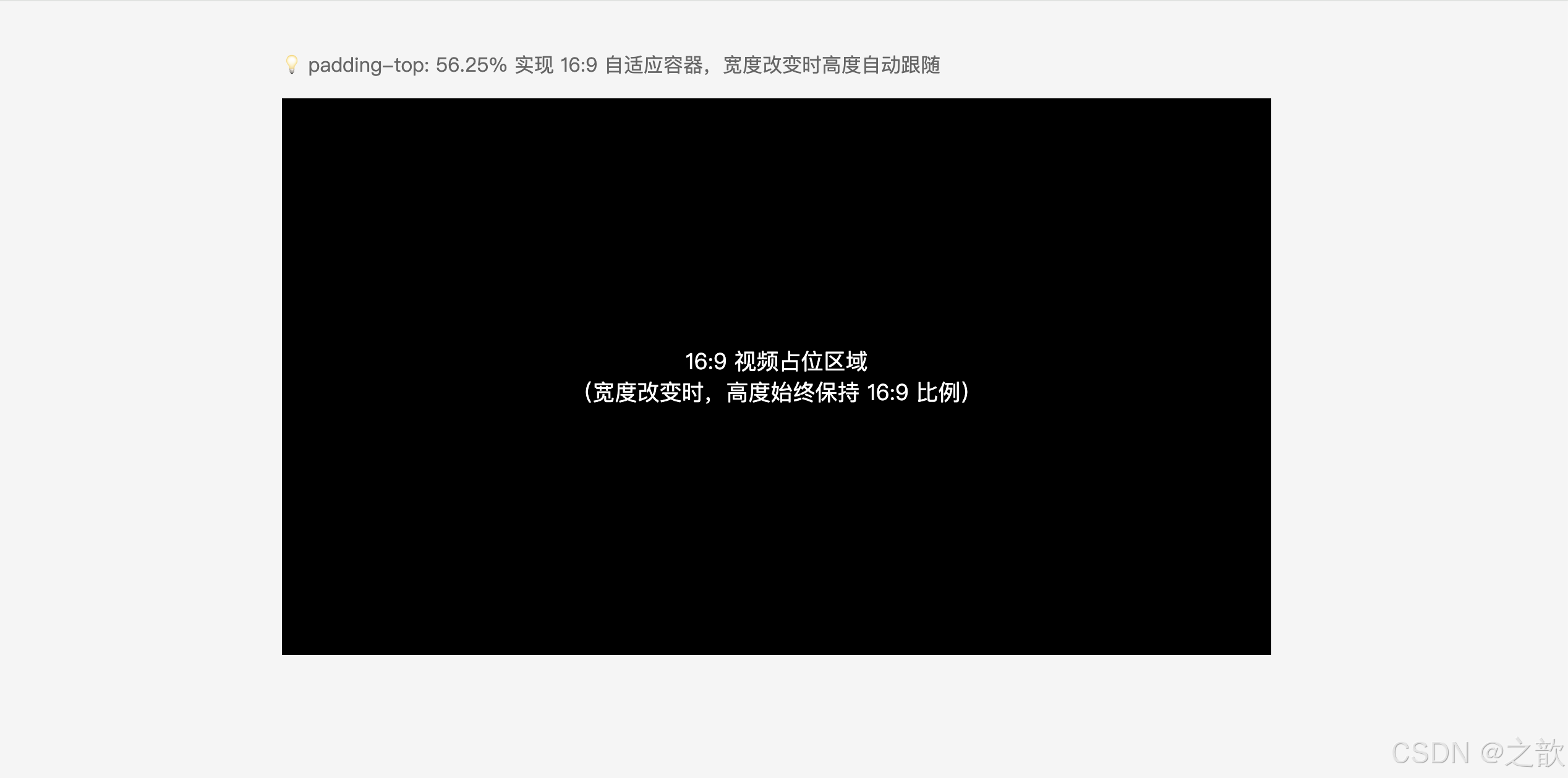
示例三:导航菜单用 padding 控制点击区域
html
<!DOCTYPE html>
<html lang="zh-CN">
<head>
<meta charset="UTF-8">
<title>padding 扩大点击区域示例</title>
<style>
* { margin: 0; padding: 0; box-sizing: border-box; }
body { font-family: sans-serif; }

.nav {
    display: flex;
    background: #2c3e50;
}

.nav-item {
    /* padding 扩大点击区域,而非固定宽高 */
    padding: 16px 24px;
    color: #fff;
    text-decoration: none;
    font-size: 14px;
    transition: background 0.2s;
}

.nav-item:hover {
    background: #34495e;
}
</style>
</head>
<body>
    <nav class="nav">
        <a class="nav-item" href="#">首页</a>
        <a class="nav-item" href="#">产品</a>
        <a class="nav-item" href="#">关于</a>
        <a class="nav-item" href="#">联系我们</a>
    </nav>
</body>
</html>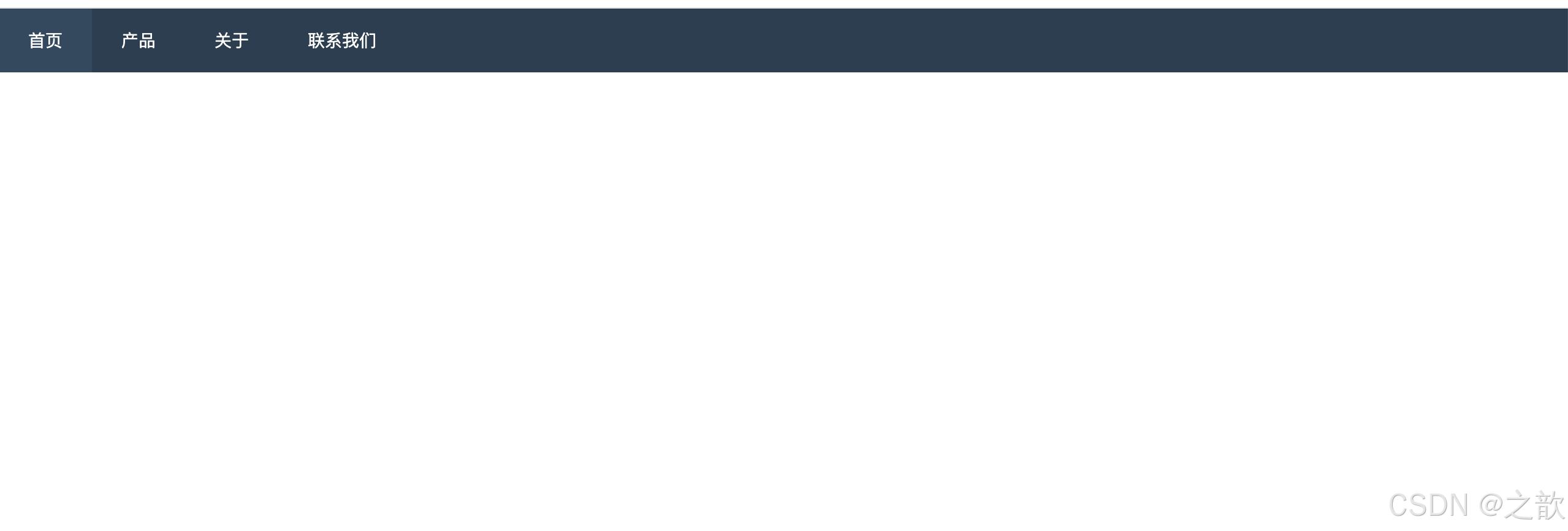
示例四:背景色延伸到 padding 区域的视觉效果
css
.highlight-box {
    background: #fff3cd;    /* 背景色会填充 content + padding 区域 */
    padding: 20px;
    border: 1px solid #ffc107;
    /* 视觉效果:内容四周有 20px 的黄色背景留白,像一个带底色的盒子 */
}

/* 对比:背景色只到 content 区域(使用 background-clip 控制) */
.content-only-bg {
    background: #fff3cd;
    background-clip: content-box;  /* 背景色只在内容区域,不延伸到 padding */
    padding: 20px;
    border: 1px solid #ffc107;
}
实际网站案例:
- 淘宝/京东 商品按钮:
padding: 0 20px而非固定宽度,多文字时自动扩展- B 站 顶部导航:
padding: 0 14px控制每个菜单项的点击宽度- 掘金 文章标签:
padding: 2px 8px控制标签的内部留白
六、边框 --- border
6.1 相关 CSS 属性
| CSS 属性名 | 功能 | 属性值 |
|---|---|---|
border-style |
边框风格 | none / solid / dashed / dotted / double / groove / ridge / inset / outset |
border-color |
边框颜色 | 颜色值(默认继承文字 color) |
border-width |
边框宽度 | 长度(默认 medium ≈ 3px) |
border |
复合属性 | 宽度 风格 颜色(顺序不限,但 style 必须写) |
方向细分属性:
border-left-style    border-left-color    border-left-width    border-left
border-right-style   border-right-color   border-right-width   border-right
border-top-style     border-top-color     border-top-width     border-top
border-bottom-style  border-bottom-color  border-bottom-width  border-bottom
6.2 border 属性层级结构
border
border-style
border-color
border-width
border-top-style
border-right-style
border-bottom-style
border-left-style
border-top-color
border-right-color
border-bottom-color
border-left-color
border-top-width
border-right-width
border-bottom-width
border-left-width
6.3 border-style 各值效果对比
| 值 | 效果描述 | 常见用途 |
|---|---|---|
none |
无边框(默认) | 重置边框、去掉 button 默认边框 |
solid |
实线 | 卡片、输入框、按钮(最常用) |
dashed |
虚线(短横线) | 拖拽区域、上传区域、分割线 |
dotted |
点线(小圆点) | 装饰性边框、辅助线 |
double |
双实线 | 标题装饰 |
groove |
凹槽效果 | 立体感边框(较少用) |
ridge |
凸出效果 | 立体感边框(较少用) |
inset |
内嵌效果 | 表单输入框 |
outset |
外凸效果 | 按钮类元素 |
6.4 border 的特性总结
border 的 7 大特性:
- border-style 必须设置:只写 border-color 或 border-width,边框不会出现(style 默认 none)
- border 颜色默认跟随文字颜色 :不设 color 时,边框颜色 = 元素的
color值- border 计入盒子尺寸 :在
content-box下,border 会增大实际渲染宽高- border 不透明度 :使用
transparent可以设置透明边框(占位但不可见,常用于三角形)- border 四边可独立设置:可以只有左边框(左侧竖线装饰)
- border 可绘制三角形:利用盒子宽高为0、四角斜切特性,纯 CSS 实现三角形
- border 与 outline 的区别 :
outline在边框外绘制,不占据布局空间
6.5 代码示例
示例一:各种 border-style 展示
html
<!DOCTYPE html>
<html lang="zh-CN">
<head>
<meta charset="UTF-8">
<title>border-style 各种样式展示</title>
<style>
* { margin: 0; padding: 0; box-sizing: border-box; }
body { background: #f5f5f5; padding: 40px; font-family: sans-serif; }

.demo-borders {
    display: flex;
    flex-wrap: wrap;
    gap: 16px;
}

.box {
    width: 200px;
    padding: 16px;
    text-align: center;
    background: #fff;
    font-size: 13px;
}

.solid-box  { border: 2px solid #333; }
.dashed-box { border: 2px dashed #e74c3c; }
.dotted-box { border: 2px dotted #3498db; }
.double-box { border: 4px double #27ae60; }

/* 四边设置不同样式 --- 常用于调试布局 */
.mixed-box {
    border-top:    3px solid red;
    border-right:  3px dashed blue;
    border-bottom: 3px dotted green;
    border-left:   3px double orange;
}
</style>
</head>
<body>
    <div class="demo-borders">
        <div class="box solid-box">solid 实线边框</div>
        <div class="box dashed-box">dashed 虚线边框</div>
        <div class="box dotted-box">dotted 点线边框</div>
        <div class="box double-box">double 双实线</div>
        <div class="box mixed-box">四边不同样式</div>
    </div>
</body>
</html>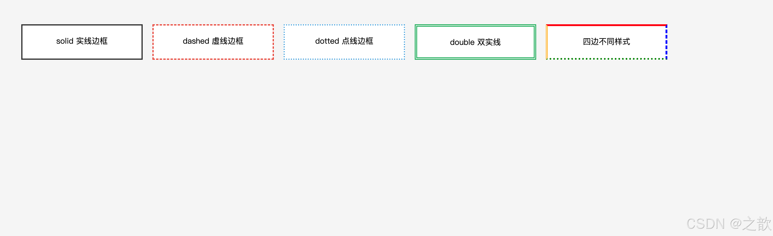
示例二:利用 border 画各方向三角形(经典技巧)
html
<!DOCTYPE html>
<html lang="zh-CN">
<head>
<meta charset="UTF-8">
<title>border 绘制三角形示例</title>
<style>
* { margin: 0; padding: 0; box-sizing: border-box; }
body { background: #f5f5f5; padding: 40px; font-family: sans-serif; }

.demo-container {
    background: #fff;
    padding: 30px;
    border-radius: 8px;
    display: flex;
    gap: 40px;
    align-items: center;
    flex-wrap: wrap;
}

.triangle-item {
    text-align: center;
}

.triangle-item span {
    display: block;               /* 块级显示,独占一行 */
    margin-top: 10px;             /* 与三角形的间距 */
    font-size: 13px;              /* 小号字体 */
    color: #666;                  /* 灰色文字 */
}

/* ========== 核心原理:border 绘制三角形 ========== */
/* 💡 原理解析:
   1. 元素宽高设为 0 → 没有内容区
   2. 设置四条边框 → 四条边框在 0 尺寸元素中心汇聚
   3. 每条边框呈45°斜切状态 → 形成四个三角形
   4. 将不需要的三边设为 transparent(透明)→ 只显示一个三角形

   关键要点:
   - 三角形的方向由【有颜色的边框】的位置决定
   - 三角形的底边长度 = 透明边框宽度 × 2
   - 三角形的高度 = 有颜色边框的宽度 */

/* ========== 向上的三角形(箭头 ↑) ========== */
.triangle-up {
    width: 0;                     /* 宽度为 0 */
    height: 0;                    /* 高度为 0 */
    border-left:   10px solid transparent;   /* 左边框透明,宽度 10px */
    border-right:  10px solid transparent;   /* 右边框透明,宽度 10px */
    border-bottom: 16px solid #ff5000;       /* 下边框橙色,宽度 16px → 三角形向上!*/

    /* 💡 为什么是向上的?
       - border-bottom 有颜色 → 三角形指向相反方向(上)
       - 底边宽度 = 10 + 10 = 20px
       - 高度 = 16px */
}

/* ========== 向下的三角形(箭头 ↓) ========== */
.triangle-down {
    width: 0;
    height: 0;
    border-left:  10px solid transparent;    /* 左边框透明 */
    border-right: 10px solid transparent;    /* 右边框透明 */
    border-top:   16px solid #3498db;        /* 上边框蓝色 → 三角形向下!*/

    /* 💡 应用场景:下拉菜单、折叠面板的展开指示器 */
}

/* ========== 向右的三角形(箭头 →) ========== */
.triangle-right {
    width: 0;
    height: 0;
    border-top:    10px solid transparent;   /* 上边框透明 */
    border-bottom: 10px solid transparent;   /* 下边框透明 */
    border-left:   16px solid #27ae60;       /* 左边框绿色 → 三角形向右!*/

    /* 💡 应用场景:
       - 视频播放按钮 ▶
       - 面包屑导航的分隔符 >
       - 轮播图的下一页按钮 */
}

/* ========== 向左的三角形(箭头 ←) ========== */
.triangle-left {
    width: 0;
    height: 0;
    border-top:    10px solid transparent;   /* 上边框透明 */
    border-bottom: 10px solid transparent;   /* 下边框透明 */
    border-right:  16px solid #9b59b6;       /* 右边框紫色 → 三角形向左!*/

    /* 💡 应用场景:返回按钮、轮播图的上一页 */
}

/* ========== 实用案例:下拉菜单展开箭头 ========== */
.dropdown-arrow {
    width: 0;
    height: 0;
    border-left:  5px solid transparent;     /* 左边框透明,尺寸较小(5px) */
    border-right: 5px solid transparent;     /* 右边框透明 */
    border-top:   6px solid #666;            /* 上边框灰色 → 箭头朝下 */
    display: inline-block;                   /* 行内块:可与文字同行 */
    margin-left: 4px;                        /* 与左侧文字的间距 */
    vertical-align: middle;                  /* 垂直居中对齐 */

    /* 💡 为什么用 border 而不是图片或图标字体?
       优势:
       1. 不需要额外加载资源(0 HTTP 请求)
       2. 可以通过 CSS 动态改变颜色、大小
       3. 完美支持 Retina 屏幕(矢量)
       4. 代码简洁,兼容性好 */
}

.dropdown-demo {
    padding: 8px 16px;
    background: #fff;
    border: 1px solid #ddd;
    border-radius: 4px;
}
</style>
</head>
<body>
    <p style="margin-bottom:16px">🔺 原理:元素宽高为0时,四条边框斜向切割形成三角形</p>
    <div class="demo-container">
        <div class="triangle-item">
            <div class="triangle-up"></div>
            <span>向上三角形</span>
        </div>
        <div class="triangle-item">
            <div class="triangle-down"></div>
            <span>向下三角形</span>
        </div>
        <div class="triangle-item">
            <div class="triangle-right"></div>
            <span>向右三角形</span>
        </div>
        <div class="triangle-item">
            <div class="triangle-left"></div>
            <span>向左三角形</span>
        </div>
        <div class="triangle-item">
            <div class="dropdown-demo">
                下拉菜单
                <span class="dropdown-arrow"></span>
            </div>
            <span>下拉箭头应用</span>
        </div>
    </div>
</body>
</html>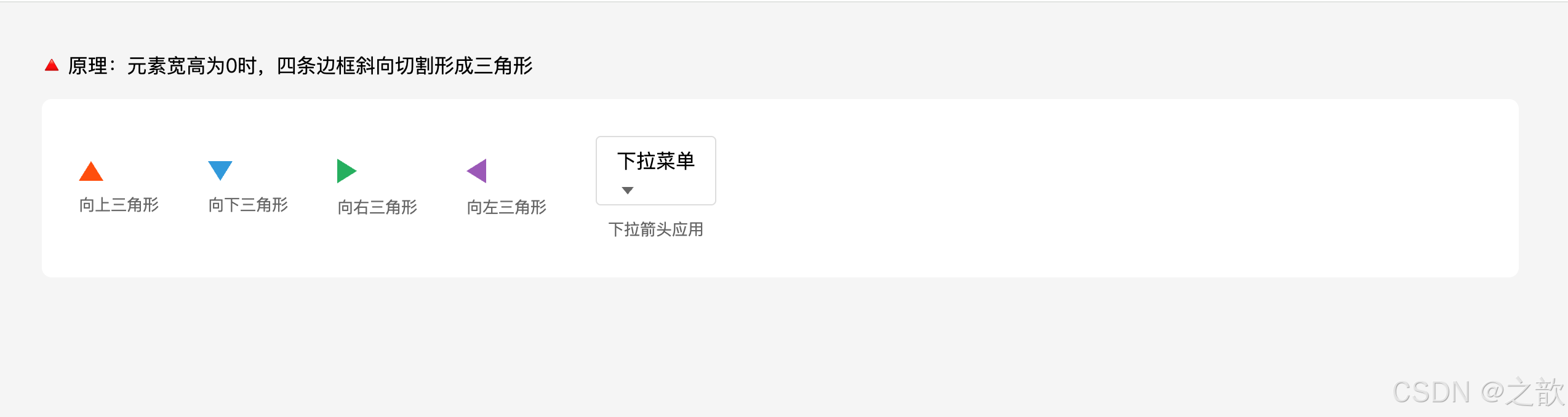
示例三:只设置部分边框(常见装饰技巧)
html
<!DOCTYPE html>
<html lang="zh-CN">
<head>
<meta charset="UTF-8">
<title>部分边框装饰示例</title>
<style>
* { margin: 0; padding: 0; box-sizing: border-box; }
body { background: #f5f5f5; padding: 40px; font-family: sans-serif; }

/* 左侧竖线装饰(新闻标题、引用块) */
.section-title {
    border-left: 4px solid #ff5000;
    padding-left: 12px;
    font-size: 18px;
    font-weight: bold;
    margin-bottom: 20px;
}

/* 底部下划线(tab 选中状态) */
.tabs {
    display: flex;
    gap: 20px;
    margin-bottom: 20px;
    border-bottom: 1px solid #e0e0e0;
}
.tab {
    padding-bottom: 8px;
    cursor: pointer;
    color: #666;
}
.tab-active {
    border-bottom: 2px solid #1890ff;
    padding-bottom: 8px;
    color: #1890ff;
    font-weight: bold;
}

/* 上边框装饰(卡片顶部彩色条) */
.card-featured {
    border-top: 4px solid #e74c3c;
    padding: 16px;
    background: #fff;
    box-shadow: 0 2px 8px rgba(0,0,0,0.1);
}
</style>
</head>
<body>
    <div class="section-title">新闻标题(左侧竖线装饰)</div>

    <div class="tabs">
        <div class="tab">普通标签</div>
        <div class="tab tab-active">选中标签(底部线)</div>
        <div class="tab">普通标签</div>
    </div>

    <div class="card-featured">
        精选卡片(顶部彩色条装饰)
    </div>
</body>
</html>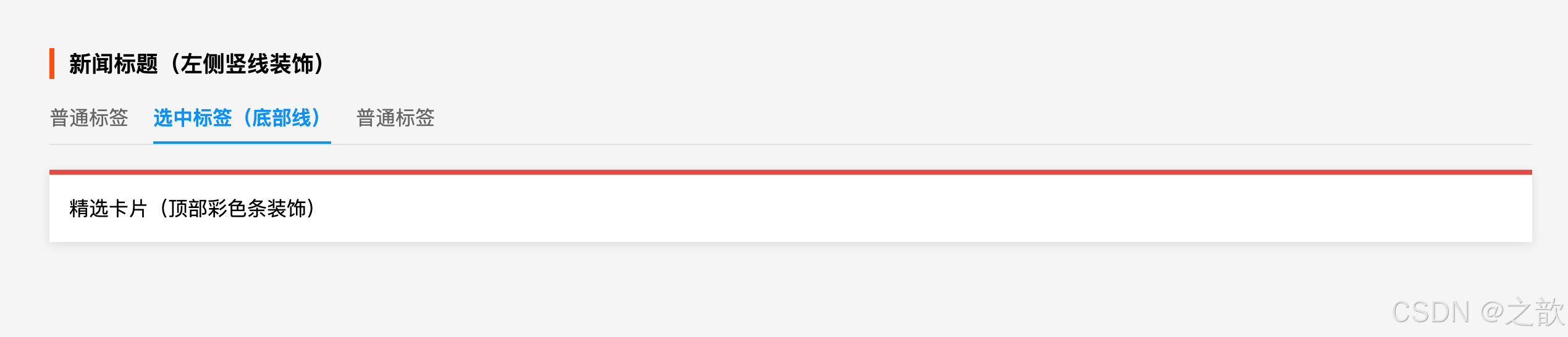
示例四:transparent 边框占位技巧(防止 hover 时布局抖动)
html
<!DOCTYPE html>
<html lang="zh-CN">
<head>
<meta charset="UTF-8">
<title>透明边框防止 hover 抖动</title>
<style>
* { margin: 0; padding: 0; box-sizing: border-box; }
body { background: #f5f5f5; padding: 40px; font-family: sans-serif; }

.demo-section {
    background: #fff;
    padding: 20px;
    border-radius: 8px;
    margin-bottom: 20px;
}

/* 问题:hover 时加边框会让元素变大,页面抖动 */
.btn-wrong {
    padding: 10px 20px;
    background: #fff;
    color: #333;
    cursor: pointer;
    display: inline-block;
}
.btn-wrong:hover {
    border: 2px solid #1890ff;  /* 加了边框,元素变大,布局抖动 */
}

/* 解决:默认设置透明边框,hover 时改颜色,大小不变 */
.btn-correct {
    padding: 10px 20px;
    background: #fff;
    color: #333;
    cursor: pointer;
    display: inline-block;
    border: 2px solid transparent;  /* 透明边框占位 */
}
.btn-correct:hover {
    border-color: #1890ff;  /* 只改颜色,盒子大小不变,无抖动 */
}

h3 {
    margin-bottom: 12px;
    font-size: 14px;
    color: #666;
}
</style>
</head>
<body>
    <div class="demo-section">
        <h3>❌ 错误示例(hover 会抖动)</h3>
        <div class="btn-wrong">移到我上面试试</div>
    </div>

    <div class="demo-section">
        <h3>✅ 正确示例(hover 不抖动)</h3>
        <div class="btn-correct">移到我上面试试</div>
    </div>
</body>
</html>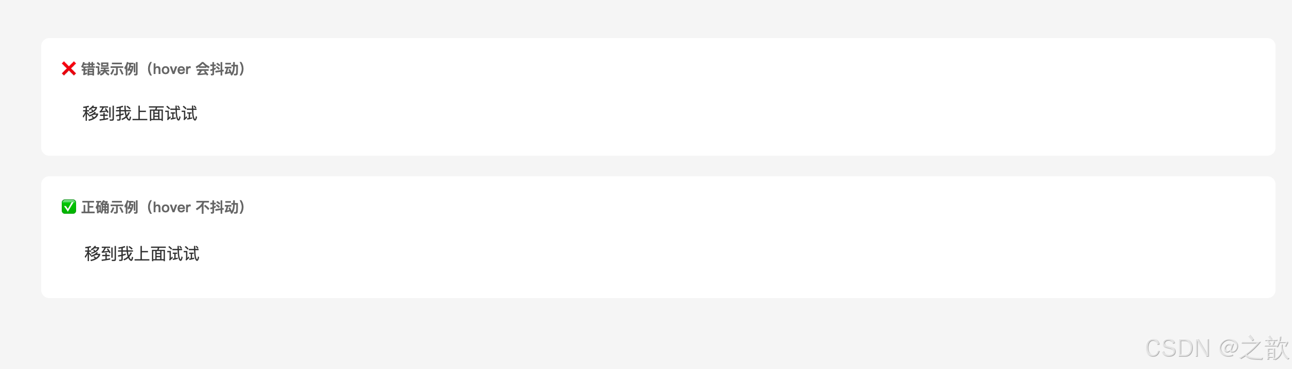
示例五:border 与 outline 的区别
css
/* border:影响布局,计入盒子尺寸 */
.has-border {
    border: 2px solid blue;
    /* 会增大元素尺寸(content-box下),影响周围元素 */
}

/* outline:不影响布局,不占空间,用于焦点高亮 */
.has-outline {
    outline: 2px solid blue;
    /* 不影响尺寸,不影响周围布局 */
}

/* 实际应用:表单元素获得焦点时的蓝色外框 */
input:focus {
    outline: 2px solid #1890ff;
    outline-offset: 0;   /* outline 与元素边缘的距离 */
}
示例六:border 绘制梯形(进阶技巧)
css
/* 原理:在三角形基础上增加 width,使顶边拉长 */
.trapezoid {
    width: 100px;              /* 关键:有宽度后,上下边框被横向拉长 */
    height: 0;
    border-left: 50px solid transparent;
    border-right: 50px solid transparent;
    border-bottom: 80px solid #118C8B;
    /* 结果:下底 200px(100+50+50),上底 100px,高 80px 的梯形 */
}

/* 调整边框宽度可改变梯形形状 */
.trapezoid-narrow {
    width: 60px;
    height: 0;
    border-left: 30px solid transparent;
    border-right: 30px solid transparent;
    border-bottom: 80px solid #e74c3c;
}
示例七:带边框的对话气泡箭头(实战技巧)
html
<div class="bubble">这是一条消息</div>
css
/* 方法一:用两个三角形叠加(传统方案) */
.bubble {
    position: relative;
    padding: 12px 16px;
    background: #fff;
    border: 2px solid #e8e8e8;
    border-radius: 8px;
}
/* 外层三角(边框色) */
.bubble::before {
    content: '';
    position: absolute;
    top: -12px;
    left: 20px;
    border: 10px solid transparent;
    border-bottom-color: #e8e8e8;
}
/* 内层三角(背景色),错位1px遮住外层 */
.bubble::after {
    content: '';
    position: absolute;
    top: -8px;
    left: 20px;
    border: 10px solid transparent;
    border-bottom-color: #fff;
}

/* 方法二:旋转正方形 + inherit(现代方案,更简洁) */
.bubble-modern {
    position: relative;
    padding: 12px 16px;
    background: #fff;
    border: 2px solid #e8e8e8;
    border-radius: 8px;
}
.bubble-modern::before {
    content: '';
    position: absolute;
    top: -8px;
    left: 20px;
    width: 14px;
    height: 14px;
    background: inherit;      /* 继承背景色 */
    border: inherit;          /* 继承边框样式 */
    border-right: 0;
    border-bottom: 0;
    transform: rotate(45deg);
}
实际网站案例:
- GitHub 代码块、输入框:
border: 1px solid #d0d7de(轻量实线)- 掘金 文章标题左侧装饰:
border-left: 4px solid #1e80ff- 各类下拉菜单小箭头 :
border透明技巧绘制三角形(无需图片)- B 站 Tab 选中状态:
border-bottom: 2px solid #00a1d6- 微信、钉钉 聊天气泡:旋转正方形实现带边框的箭头
七、外边距 --- margin
7.1 相关 CSS 属性
| CSS 属性名 | 功能 | 属性值 |
|---|---|---|
margin-left |
左外边距 | 长度 / 百分比 / auto |
margin-right |
右外边距 | 长度 / 百分比 / auto |
margin-top |
上外边距 | 长度 / 百分比(auto 不生效) |
margin-bottom |
下外边距 | 长度 / 百分比(auto 不生效) |
margin |
复合属性 | 多个长度空格分隔 |
7.2 margin 值的规则
规则一:使用百分比时,四个方向均参照【父元素内容宽度】
规则二:margin 可以是负值(元素会向该方向"拉近")
规则三:块级元素左右 margin 均为 auto → 该元素在父元素中水平居中
规则四:margin-top / margin-bottom 设置为 auto 无效(不能垂直居中)
规则五:左外边距和上外边距主要影响自己的位置
        右外边距和下外边距主要影响相邻兄弟元素的位置
7.3 margin 复合属性口诀(同 padding)
css
margin: 20px;                    /* 四边均为 20px */
margin: 40px 30px;               /* 上下40 左右30 */
margin: 10px 20px 30px;          /* 上10 左右20 下30 */
margin: 15px 25px 35px 45px;     /* 上右下左(顺时针) */
7.4 不同显示模式的 margin 表现
margin 设置
元素显示模式
块级元素 block
✅ 四个方向均完美生效
💡 左右设 auto 可水平居中
行内块元素 inline-block
✅ 四个方向均完美生效
行内元素 inline
✅ 左右完美生效
❌ 上下设置无效(不影响布局)
7.5 margin 的特性总结
margin 的 7 大特性:
- 可以为负值:与 padding 最大的区别,负值使元素向指定方向移动
- 不延伸背景色:margin 区域是透明的,背景色不会填充 margin
- 不计入盒子尺寸:margin 不影响盒子自身的宽高,只影响与外部的间距
- auto 水平居中:左右 margin 都设为 auto,块级元素自动水平居中
- 垂直 margin 无法 auto 居中:margin: auto 只在水平方向有效
- 行内元素上下 margin 无效 :
span、a等行内元素的上下 margin 不生效- 存在塌陷和合并现象:垂直方向的特殊行为(见第八章)
7.6 代码示例
示例一:块级元素水平居中
html
<!DOCTYPE html>
<html lang="zh-CN">
<head>
<meta charset="UTF-8">
<title>margin: 0 auto 水平居中</title>
<style>
* { margin: 0; padding: 0; box-sizing: border-box; }
body { background: #f5f5f5; padding: 40px; font-family: sans-serif; }

/* 经典方法:margin: 0 auto + 设置宽度 */
.center-block {
    width: 600px;
    margin: 0 auto;   /* 上下0,左右自动均分 → 水平居中 */
    background: #fff;
    padding: 24px;
    border: 2px solid #3498db;
    text-align: center;
}

/* 也可以只设置左右 */
.center-block-v2 {
    width: 500px;
    margin-left: auto;
    margin-right: auto;
    margin-top: 20px;
    background: #fff;
    padding: 24px;
    border: 2px solid #e74c3c;
    text-align: center;
}
</style>
</head>
<body>
    <p style="margin-bottom:16px; text-align:center">
        💡 块级元素必须设置宽度 + margin: 0 auto 才能水平居中
    </p>
    <div class="center-block">
        方法一:margin: 0 auto(最常用)
    </div>
    <div class="center-block-v2">
        方法二:margin-left: auto; margin-right: auto;
    </div>
</body>
</html>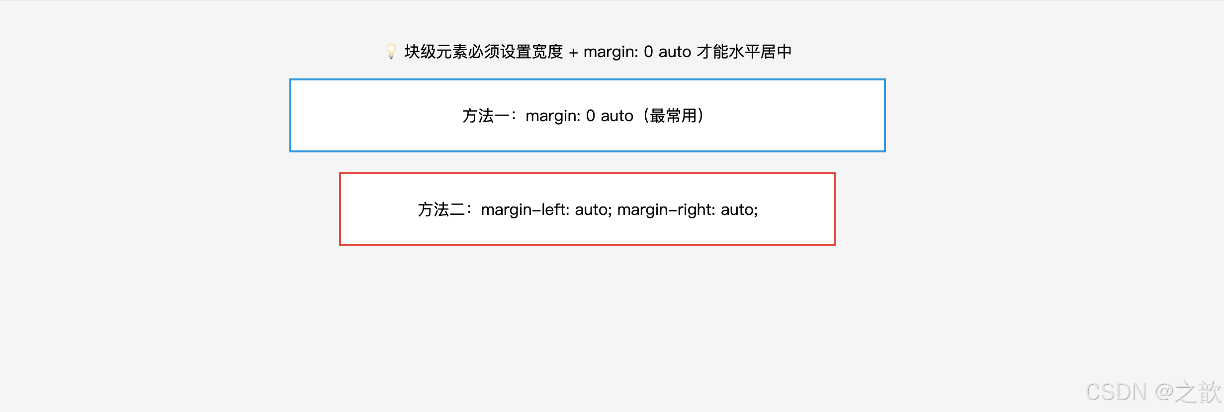
示例二:负 margin 的实战技巧
css
/* 技巧一:负 margin-top 制造卡片浮出效果(覆盖上方元素) */
.card-overlay {
    margin-top: -40px;
    position: relative;
    z-index: 1;
    background: #fff;
    border-radius: 12px;
    padding: 24px;
    box-shadow: 0 4px 16px rgba(0,0,0,0.1);
}

/* 技巧二:负 margin 等宽布局(消除最后一列多余间距) */
.grid-container {
    margin-right: -16px;  /* 抵消最后一个子元素的 margin-right */
}
.grid-item {
    width: calc(33.333% - 16px);
    margin-right: 16px;
    float: left;
}

/* 技巧三:突破父元素限制(全宽图片) */
.article-img-full {
    margin-left: -24px;   /* 父元素有 24px padding,负 margin 突出去 */
    margin-right: -24px;
    width: calc(100% + 48px);
}
示例三:margin 在元素布局中的方向影响
css
.box-a {
    margin-right: 20px;  /* 影响兄弟元素B的位置(B向右移20px) */
    margin-bottom: 20px; /* 影响兄弟元素B的位置(B向下移20px) */
}

.box-b {
    margin-left: 20px;   /* 影响自己的位置(自身向右移20px) */
    margin-top: 20px;    /* 影响自己的位置(自身向下移20px) */
}
实际网站案例:
- 知乎、掘金、B 站 :页面主容器
margin: 0 auto+max-width: 1200px水平居中- 电商页面的 Banner 设计 :Hero 图下方的内容卡片
margin-top: -50px产生图文重叠效果- 文章内图片 :
margin: 24px auto让图片水平居中并与上下文有间距
八、margin 塌陷与合并(重难点)
8.1 名词解释
| 名词 | 定义 |
|---|---|
| margin 塌陷(Margin Collapse) | 父子嵌套关系中,子元素的上/下 margin 会"穿透"父元素,表现在父元素外部 |
| margin 合并(Margin Merging) | 垂直方向上相邻兄弟元素的 margin,不是相加而是取较大值 |
| BFC(Block Formatting Context) | 块级格式化上下文,一种独立的布局区域,内部 margin 不会与外部合并 |
| 格式化上下文 | Formatting Context,CSS 中一种独立的渲染区域,有自己的渲染规则 |
8.2 margin 塌陷详解
页面 子元素 父元素 页面 子元素 父元素 问题场景:子元素有 margin-top,但父元素没有 border/padding 隔离 margin-top 向上"塌陷" 表现为父元素整体下移,而非子元素在父元素内下移
问题代码:
html
<!DOCTYPE html>
<html lang="zh-CN">
<head>
<meta charset="UTF-8">
<title>margin 塌陷问题演示</title>
<style>
* { margin: 0; padding: 0; box-sizing: border-box; }
body { background: #f5f5f5; padding: 40px; font-family: sans-serif; }

.parent {
    width: 400px;
    height: 200px;
    background: lightblue;
    /* 没有 padding-top 和 border-top → 塌陷发生 */
}
.child {
    width: 200px;
    height: 100px;
    background: salmon;
    margin-top: 50px;   /* 本意:子元素在父元素内向下移 50px */
    /* 实际效果:父元素整体向下移动 50px,子元素并未在父元素内移动 */
    color: #fff;
    display: flex;
    align-items: center;
    justify-content: center;
}
</style>
</head>
<body>
    <p style="margin-bottom:16px">👇 观察:父元素(蓝色)整体向下偏移了 50px,子元素(橙色)并未在父元素内部向下移动</p>
    <div class="parent">
        <div class="child">子元素</div>
    </div>
</body>
</html>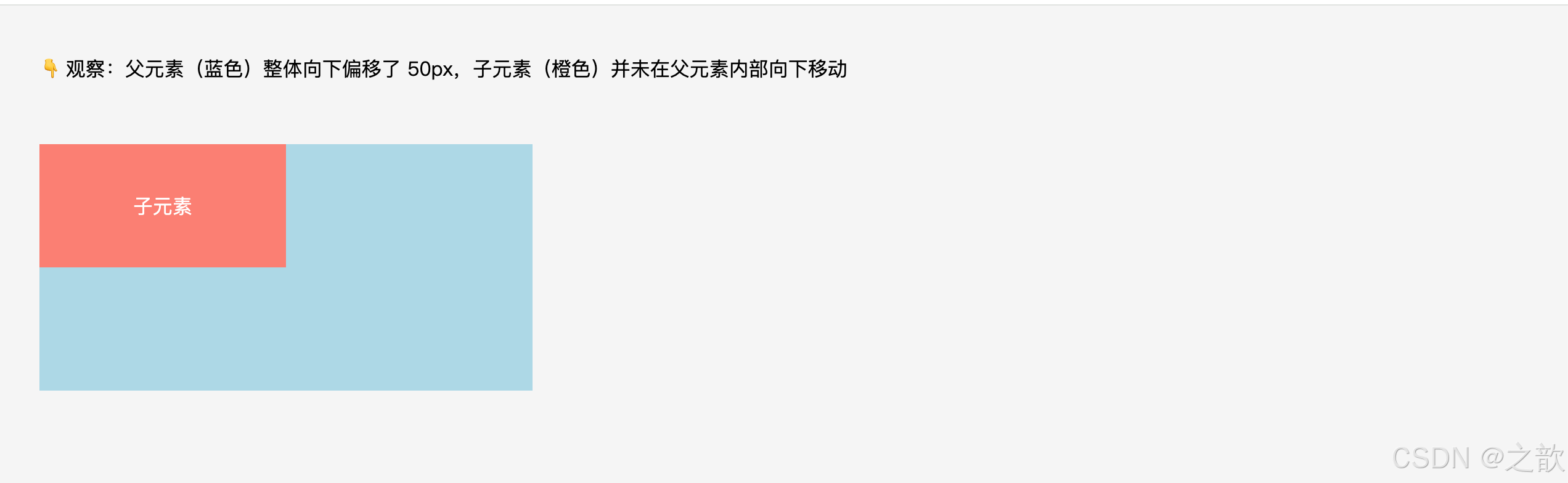
三种解决方案:
css
/* 方案一:父元素添加 border-top(用透明边框不影响外观) */
.parent { border-top: 1px solid transparent; }

/* 方案二:父元素添加 padding-top(注意会撑大父元素) */
.parent { padding-top: 1px; }

/* 方案三:父元素开启 BFC(最常用、最干净) */
.parent { overflow: hidden; }

/* 方案四(补充):父元素设置 display: flow-root(专门用于创建BFC,无副作用) */
.parent { display: flow-root; }
margin 塌陷
解决方案
方案一
border-top 隔离
⚠️ 加了1px边框
可用transparent弥补
方案二
padding-top 隔离
⚠️ 会撑大父元素
方案三
overflow: hidden
✅ 推荐,最常用
触发BFC
方案四
display: flow-root
✅ 最无副作用
专为BFC设计
8.3 margin 合并详解
实际效果
实际间距 = max(30,20)=30px ✅
兄弟元素A
margin-bottom: 30px
兄弟元素B
margin-top: 20px
合并前理解
两者间距 = 30+20=50px ❌(错误理解)
兄弟元素A
margin-bottom: 30px
兄弟元素B
margin-top: 20px
规则总结:
合并规则:取两者中较大的 margin 值作为实际间距
负 margin 合并:max(正值) + min(负值的绝对值最大者)
  示例:margin-bottom: 30px 与 margin-top: -10px → 间距 = 30 + (-10) = 20px
只有块级元素之间才会发生 margin 合并
flex/grid 容器的子元素之间不会合并
处理方式:一般不需要修复,设计时知道这个规律即可
代码示例:
html
<!DOCTYPE html>
<html lang="zh-CN">
<head>
<meta charset="UTF-8">
<title>margin 合并现象演示</title>
<style>
* { margin: 0; padding: 0; box-sizing: border-box; }
body { background: #f5f5f5; padding: 40px; font-family: sans-serif; }

.sibling-a {
    background: #ffeaa7;
    padding: 10px;
    margin-bottom: 40px;  /* 下外边距 40px */
}
.sibling-b {
    background: #dfe6e9;
    padding: 10px;
    margin-top: 20px;     /* 上外边距 20px */
}
/* 实际间距 = max(40, 20) = 40px,而不是60px */
</style>
</head>
<body>
    <p style="margin-bottom:16px">👇 观察:两个 div 之间的实际间距是 40px(取最大值),而不是 40+20=60px</p>
    <div class="sibling-a">兄弟A(margin-bottom: 40px)</div>
    <div class="sibling-b">兄弟B(margin-top: 20px)</div>
</body>
</html>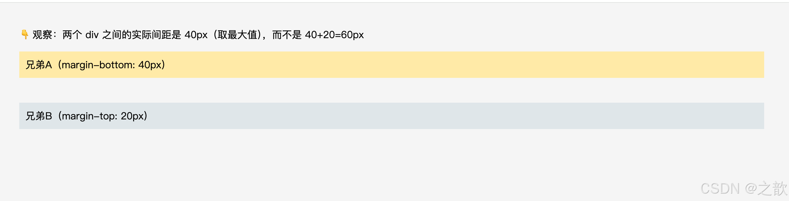
8.4 塌陷 vs 合并 速查对比
margin 特殊行为
塌陷 Collapse
合并 Merging
发生在:父子嵌套
方向:上外边距/下外边距
效果:子的margin作用在父的外部
解决:BFC / border / padding
发生在:兄弟相邻
方向:只有垂直方向
效果:取较大值,非累加
解决:无需解决,了解规律即可
8.5 BFC 深度解析(触发条件与应用场景)
BFC(Block Formatting Context,块级格式化上下文):一个独立的渲染区域,内部元素的布局不受外部影响,外部也不影响内部。
BFC 的核心特性:
① 内部 margin 不会与外部合并 → 解决 margin 塌陷
② 能包裹内部浮动元素 → 清除浮动(父元素高度不塌陷)
③ 不与浮动元素重叠 → 自适应两栏布局
④ 创建独立渲染区域 → 隔离内外布局
触发 BFC 的方式(2026 推荐优先级):
css
/* ⭐ 方法一:display: flow-root(推荐,无副作用,专为 BFC 设计) */
.bfc-container {
    display: flow-root;
}

/* 方法二:overflow: hidden / auto / scroll(最常用,注意可能裁剪内容) */
.bfc-container {
    overflow: hidden;  /* 最常见 */
}

/* 方法三:position: absolute / fixed(会脱离文档流) */
.bfc-container {
    position: absolute;
}

/* 方法四:float: left / right(会脱离文档流) */
.bfc-container {
    float: left;
}

/* 方法五:display: inline-block / table-cell / flex / grid(改变显示模式) */
.bfc-container {
    display: inline-block;
}
BFC 实战应用场景:
场景一:自适应两栏布局(左侧固定,右侧自适应)
html
<div class="container">
    <div class="sidebar">侧边栏(浮动)</div>
    <div class="main">主内容区(BFC)</div>
</div>
css
.sidebar {
    float: left;
    width: 200px;
    background: #f0f0f0;
}
.main {
    overflow: hidden;  /* 触发 BFC,不与 sidebar 重叠 */
    background: #fff;
    padding: 20px;
    /* 主内容区自动填满剩余空间 */
}
场景二:防止图文混排时文字环绕
html
<div class="article">
    <img class="float-img" src="..." alt="...">
    <div class="content">文字内容不被图片遮挡......</div>
</div>
css
.float-img {
    float: left;
    margin-right: 16px;
}
.content {
    overflow: hidden;  /* 触发 BFC,文字不环绕图片 */
}
场景三:卡片组件间距控制(防止 margin 合并)
css
/* 问题:两个卡片的 margin 会合并 */
.card {
    margin-bottom: 20px;
}

/* 解决:每个卡片触发 BFC */
.card {
    margin-bottom: 20px;
    overflow: hidden;  /* 或 display: flow-root */
}
九、内容溢出 --- overflow
9.1 名词解释
| 名词 | 定义 |
|---|---|
| 溢出(Overflow) | 元素内容超出其 content-box 范围的现象 |
| BFC(Block Formatting Context) | 块级格式化上下文,overflow 非 visible/clip 值都会触发 |
| 滚动容器 | 设置了 overflow: auto 或 scroll 的元素,内部内容可滚动 |
| 裁剪(Clip) | 超出容器边界的内容被剪切,不可见也不可访问 |
9.2 相关 CSS 属性
| CSS 属性 | 功能 | 属性值 |
|---|---|---|
overflow |
同时控制 x/y 轴溢出行为 | 见下表 |
overflow-x |
仅控制 x 轴(水平)方向 | 同上 |
overflow-y |
仅控制 y 轴(垂直)方向 | 同上 |
9.3 属性值详解
| 值 | 效果 | 是否触发BFC | 说明 |
|---|---|---|---|
visible |
溢出内容可见(默认值) | ❌ | 不裁剪,内容溢出盒子外显示 |
hidden |
溢出内容隐藏 | ✅ | 裁剪超出部分,不显示滚动条 |
scroll |
始终显示滚动条 | ✅ | 无论是否溢出都有滚动条占位 |
auto |
自动(推荐) | ✅ | 溢出时才显示滚动条 |
clip |
裁剪但完全不可滚动 | ❌ | 较新特性,连代码滚动也禁止 |
overflow 值
visible
溢出可见(默认)
❌不触发BFC
hidden
溢出裁剪
✅触发BFC
常用于BFC场景
scroll
强制显示滚动条
✅触发BFC
auto
按需显示滚动条
✅触发BFC
⭐推荐
clip
硬性裁剪
❌不触发BFC
连js滚动也禁止
auto vs scroll 对比:
scroll:无论内容多少,滚动条永远存在(占据空间,影响布局)
auto:  内容不溢出时无滚动条,溢出后自动出现(推荐使用,不会预占空间)
9.4 overflow 的特性总结
overflow 的 5 大特性:
- 触发 BFC :
hidden、auto、scroll都会创建新的块级格式化上下文,常用于解决 margin 塌陷- 包含浮动子元素:触发 BFC 后,父元素能包裹浮动的子元素(清除浮动的一种方式)
- 生效需要明确高度 :
overflow: auto/scroll需要元素有明确高度 (或max-height)才会出现滚动条- x/y 轴独立控制 :
overflow-x: hidden; overflow-y: auto;可分别控制横/纵向- 文字省略号 配合:
overflow: hidden+text-overflow: ellipsis+white-space: nowrap实现单行文字截断
9.5 代码示例
示例一:四种 overflow 值对比
html
<div class="overflow-demo">
    <div class="box box-visible">
        <p>visible:内容超出后向外溢出显示,不裁剪。这段文字很长很长很长......</p>
    </div>
    <div class="box box-hidden">
        <p>hidden:超出部分被裁剪,只显示盒子内的内容。这段文字很长......</p>
    </div>
    <div class="box box-auto">
        <p>auto:内容溢出时自动出现滚动条,不溢出时无滚动条。推荐使用。这段文字很长......</p>
    </div>
    <div class="box box-scroll">
        <p>scroll:始终显示滚动条,即使内容没有溢出。</p>
    </div>
</div>
css
.box {
    width: 200px;
    height: 80px;
    border: 1px solid #999;
    margin: 10px;
    padding: 8px;
}

.box-visible { overflow: visible; }
.box-hidden  { overflow: hidden; }
.box-auto    { overflow: auto; }
.box-scroll  { overflow: scroll; }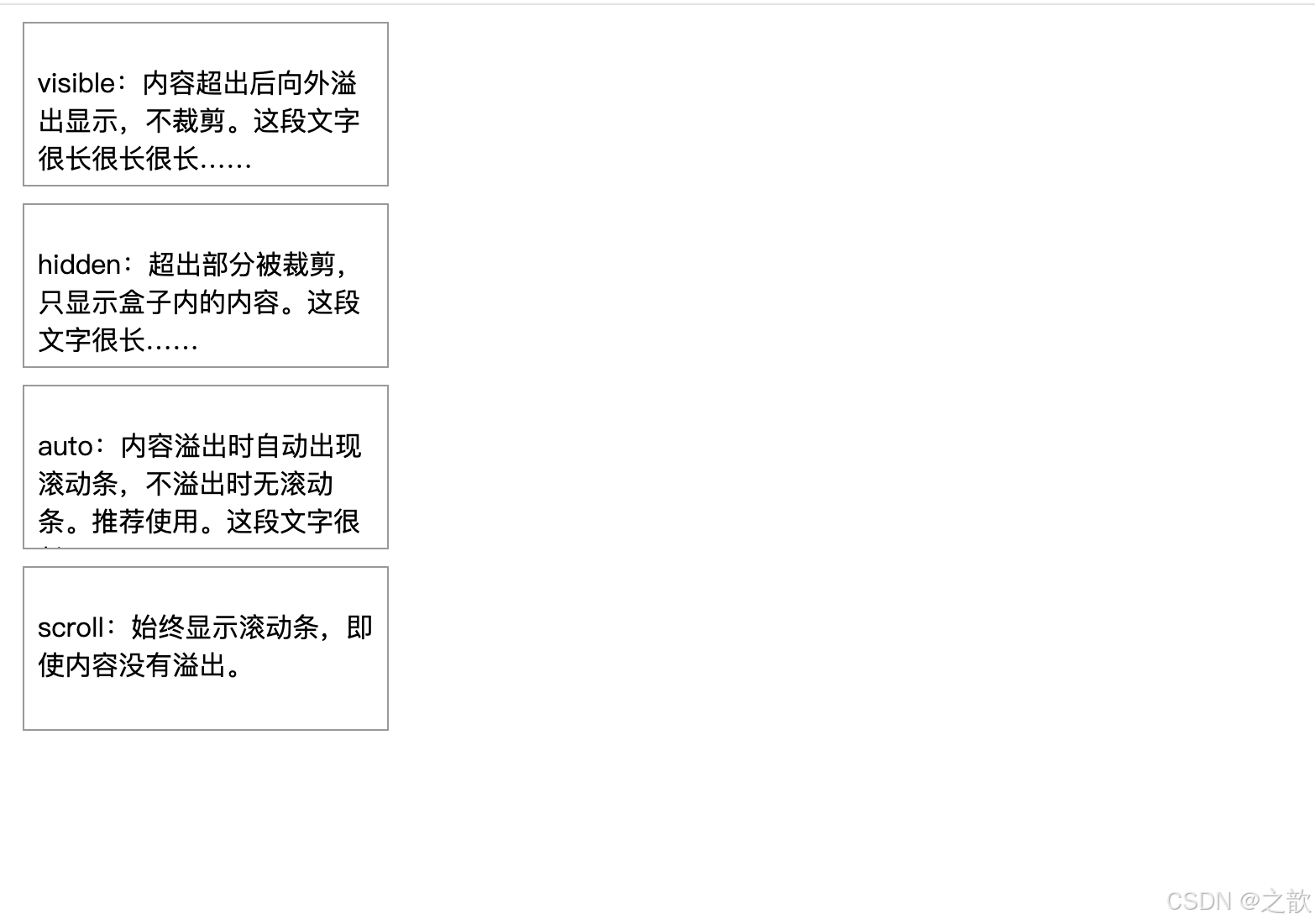
示例二:文字溢出省略号(单行 & 多行)
html
<!DOCTYPE html>
<html lang="zh-CN">
<head>
<meta charset="UTF-8">
<title>文字溢出省略号示例</title>
<style>
/* ========== 全局重置 ========== */
* {
    margin: 0;
    padding: 0;
    box-sizing: border-box;
}

body {
    background: #f5f5f5;          /* 浅灰背景 */
    padding: 40px;                /* 页面内边距 */
    font-family: sans-serif;      /* 系统字体 */
}

/* 演示容器 */
.demo-box {
    background: #fff;             /* 白色背景 */
    padding: 16px;                /* 内边距 */
    margin-bottom: 20px;          /* 与下方内容的间距 */
    border: 1px solid #ddd;       /* 浅灰边框 */
    border-radius: 4px;           /* 圆角 */
}

/* ========== 单行文字溢出省略号(最常用) ========== */
.text-ellipsis-1 {
    width: 200px;                 /* 限定宽度:必须!否则文字会无限延伸 */

    /* 💡 核心三件套(缺一不可): */
    overflow: hidden;             /* ① 隐藏溢出内容(必须) */
    white-space: nowrap;          /* ② 强制不换行,让文字在一行显示(必须) */
    text-overflow: ellipsis;      /* ③ 溢出时显示省略号 "..." (必须) */

    /* 💡 工作原理:
       1. white-space: nowrap; → 文字强制在一行显示
       2. overflow: hidden; → 超出 200px 的文字被裁剪
       3. text-overflow: ellipsis; → 在裁剪位置显示 "..." */

    /* 视觉样式 */
    background: #e3f2fd;          /* 浅蓝色背景 */
    padding: 8px;                 /* 内边距 */
}

/* ========== 多行文字溢出省略号(2行)========== */
.text-ellipsis-2 {
    width: 200px;                 /* 限定宽度 */
    overflow: hidden;             /* 隐藏溢出内容 */

    /* 💡 多行省略号方案(Webkit 内核专用):
       Chrome、Safari、Edge(新版)、移动端浏览器均支持
       兼容性:94%+ 的现代浏览器 */
    display: -webkit-box;         /* 设为弹性伸缩盒子模型(旧语法) */
    -webkit-line-clamp: 2;        /* 限制显示的行数为 2 行 */
    -webkit-box-orient: vertical; /* 设置排列方向为垂直 */

    /* 💡 为什么用 -webkit- 前缀?
       这是 Webkit 私有属性,但已被广泛支持
       Firefox 从 68+ 开始也支持(不需要前缀)
       IE 不支持(但 IE 已停止维护) */

    /* 视觉样式 */
    background: #fff3e0;          /* 浅橙色背景 */
    padding: 8px;
}

/* ========== 多行文字溢出省略号(3行)========== */
.text-ellipsis-3 {
    width: 200px;
    overflow: hidden;
    display: -webkit-box;
    -webkit-line-clamp: 3;        /* 显示 3 行,超出显示 "..." */
    -webkit-box-orient: vertical;

    /* 💡 应用场景:
       - 新闻/文章列表的摘要
       - 商品描述
       - 用户评论
       - 卡片组件的内容预览 */

    background: #f3e5f5;          /* 浅紫色背景 */
    padding: 8px;
}

/* 标题样式 */
h3 {
    margin-top: 0;                /* 顶部无间距 */
    margin-bottom: 8px;           /* 与内容的间距 */
    font-size: 14px;              /* 字号 */
    color: #666;                  /* 灰色文字 */
}

/* 💡 兼容性说明:
   单行省略号:✅ 所有浏览器(包括 IE6+)
   多行省略号:
   - Chrome/Edge/Safari: ✅ 完美支持
   - Firefox 68+: ✅ 支持
   - IE: ❌ 不支持(可用 JavaScript 降级方案)

   降级方案(可选):
   @supports not (-webkit-line-clamp: 2) {
       .text-ellipsis-2 {
           max-height: 3em;
           line-height: 1.5em;
       }
   } */
</style>
</head>
<body>
    <!-- 单行省略号演示 -->
    <div class="demo-box">
        <h3>单行省略号</h3>
        <div class="text-ellipsis-1">
            这是一段很长很长很长很长很长很长的文字,需要在单行中显示,超出部分用省略号表示
        </div>
    </div>

    <!-- 两行省略号演示 -->
    <div class="demo-box">
        <h3>两行省略号</h3>
        <div class="text-ellipsis-2">
            这是一段很长很长很长很长很长很长的文字,需要在两行中显示,超出部分用省略号表示。这是第二行的内容继续显示。
        </div>
    </div>

    <!-- 三行省略号演示 -->
    <div class="demo-box">
        <h3>三行省略号</h3>
        <div class="text-ellipsis-3">
            这是一段很长很长很长很长很长很长的文字,需要在三行中显示,超出部分用省略号表示。这是第二行的内容继续显示。这是第三行的内容,如果还有更多内容就会被省略。
        </div>
    </div>
</body>
</html>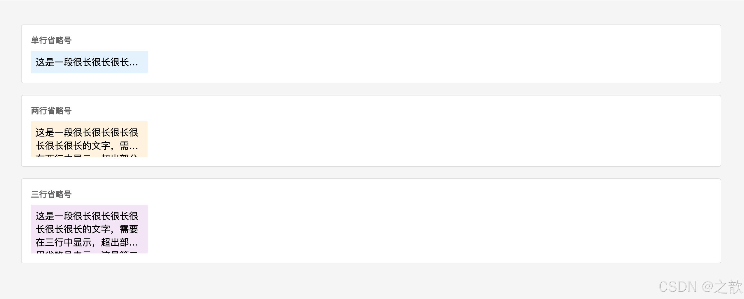
示例三:overflow: hidden 触发 BFC 包裹浮动
html
<!DOCTYPE html>
<html lang="zh-CN">
<head>
<meta charset="UTF-8">
<title>overflow: hidden 清除浮动示例</title>
<style>
* { margin: 0; padding: 0; box-sizing: border-box; }
body { background: #f5f5f5; padding: 40px; font-family: sans-serif; }

.clearfix-parent {
    overflow: hidden;  /* 触发BFC,自动包裹内部浮动元素,父元素高度不塌陷 */
    background: #dfe6e9;
    padding: 8px;
    margin-bottom: 20px;
}
.float-child {
    float: left;
    width: 100px;
    height: 80px;
    background: #74b9ff;
    margin: 8px;
    display: flex;
    align-items: center;
    justify-content: center;
    color: #fff;
    font-size: 12px;
}
</style>
</head>
<body>
    <p style="margin-bottom:16px">✅ 父元素添加 overflow: hidden 后,能正确包裹浮动子元素</p>
    <div class="clearfix-parent">
        <div class="float-child">浮动子元素</div>
        <div class="float-child">浮动子元素</div>
    </div>
</body>
</html>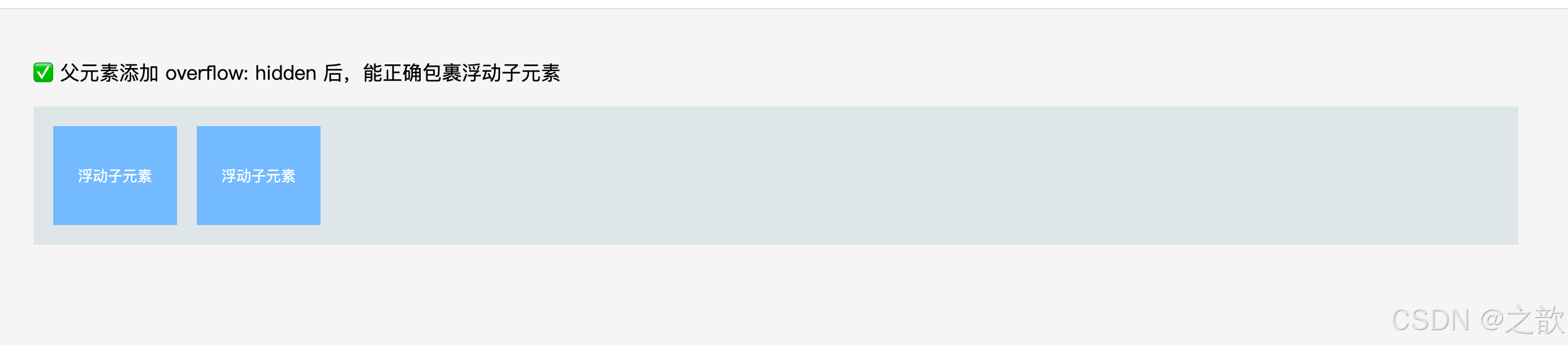
示例四:弹窗遮罩时禁止背景滚动
css
/* 弹出模态框时,禁止 body 滚动 */
body.modal-open {
    overflow: hidden;   /* 禁止页面滚动,常见于弹窗、全屏菜单 */
}

/* 关闭弹窗时恢复滚动 */
body {
    overflow: auto;
}
示例五:水平滚动容器(代码块、表格)
css
/* 代码块水平滚动 */
.code-block {
    width: 100%;
    overflow-x: auto;    /* 水平可滚动 */
    overflow-y: hidden;  /* 垂直不滚动 */
    background: #1e1e1e;
    padding: 16px;
    border-radius: 6px;
}

/* 响应式表格:移动端小屏幕下横向滚动 */
.table-wrapper {
    width: 100%;
    overflow-x: auto;   /* 表格宽度超出时横向滚动 */
}
.table-wrapper table {
    min-width: 600px;   /* 表格最小宽度,防止列挤压 */
}
9.6 滚动体验优化(2026 现代实践)
平滑滚动(Smooth Scrolling)
css
/* 全局平滑滚动(2026 年标准) */
html {
    scroll-behavior: smooth;
}

/* 效果:点击锚点链接时,页面平滑滚动而非瞬间跳转 */
/* <a href="#section2">跳转到第二章</a> */
自定义滚动条样式(WebKit 浏览器)
css
/* 滚动条整体样式 */
.custom-scroll::-webkit-scrollbar {
    width: 8px;          /* 滚动条宽度 */
    height: 8px;         /* 横向滚动条高度 */
}

/* 滚动条轨道 */
.custom-scroll::-webkit-scrollbar-track {
    background: #f1f1f1;
    border-radius: 4px;
}

/* 滚动条滑块 */
.custom-scroll::-webkit-scrollbar-thumb {
    background: #666;
    border-radius: 4px;
}

/* 滚动条滑块 hover 状态 */
.custom-scroll::-webkit-scrollbar-thumb:hover {
    background: #555;
}
Firefox 滚动条样式(标准属性)
css
/* Firefox 滚动条兼容(2026 年已广泛支持) */
@supports (scrollbar-width: thin) {
    .custom-scroll {
        scrollbar-width: thin;              /* 细滚动条 */
        scrollbar-color: #666 #f1f1f1;      /* 滑块色 轨道色 */
    }
}
完整跨浏览器滚动条方案:
css
.scrollable-container {
    max-height: 400px;
    overflow-y: auto;
    scroll-behavior: smooth;

    /* WebKit(Chrome/Safari/Edge) */
    &::-webkit-scrollbar {
        width: 8px;
    }
    &::-webkit-scrollbar-track {
        background: #f1f1f1;
    }
    &::-webkit-scrollbar-thumb {
        background: #888;
        border-radius: 4px;
    }
    &::-webkit-scrollbar-thumb:hover {
        background: #555;
    }

    /* Firefox */
    scrollbar-width: thin;
    scrollbar-color: #888 #f1f1f1;
}
实际网站案例:
- 聊天界面 (微信网页版):消息列表
overflow-y: auto,消息区域固定高度滚动- 轮播图 (淘宝首页 Banner):容器
overflow: hidden裁剪超出的图片- 弹窗打开时 :
document.body.style.overflow = 'hidden'禁止背景滚动- 代码托管平台 :代码块
overflow-x: auto水平滚动查看长代码- 现代网站 :几乎所有项目都设置
html { scroll-behavior: smooth; }提升用户体验
十、隐藏元素
10.1 三种隐藏方式全对比
| 属性 | 是否占位 | 是否响应事件 | 子元素是否继承 | 性能 | 常见场景 |
|---|---|---|---|---|---|
visibility: hidden |
✅ 占据 | ❌ 不响应 | ✅ 可用 visibility: visible 取消继承 |
触发 repaint | 占位隐藏、防抖动 |
display: none |
❌ 不占据 | ❌ 不响应 | ❌ 整个子树都消失 | 触发 reflow + repaint | 完全隐藏、菜单切换 |
opacity: 0 |
✅ 占据 | ✅ 仍然响应 | ✅ 子元素也透明 | 触发 repaint(可GPU加速) | 透明动画、渐变出现 |
是
否
是
否
隐藏元素需求
是否需要保留占位空间?
是否需要响应点击/鼠标事件?
display: none
元素彻底消失,不占位
适合:下拉菜单、模态框、Tab切换
opacity: 0
透明但仍可交互
适合:渐变动画、hover效果
visibility: hidden
不可见不响应事件但占位
适合:加载占位、防抖动
10.2 三种方式的特性总结
display: none 的特性:
元素从渲染树中完全移除,不占任何空间
触发 reflow(回流),影响周围元素的位置,性能消耗较大
设置后所有子元素也一同消失,且无法通过子元素覆盖恢复显示
配合 JS 切换,是实现显示/隐藏效果的最常见方式
visibility: hidden 的特性:元素仍在渲染树中,继续占据原有空间
只触发 repaint(重绘),不触发 reflow,性能更优
子元素可以通过设置
visibility: visible重新显示(打破继承)隐藏后元素不响应任何用户事件(鼠标、键盘)
opacity: 0 的特性:元素完全透明,但仍占空间、仍响应事件(鼠标点击等)
是实现淡入淡出动画的最常用属性(可 GPU 加速)
不影响子元素的单独 opacity 设置
10.3 代码示例
示例一:三种方式对比演示
html
<!DOCTYPE html>
<html lang="zh-CN">
<head>
<meta charset="UTF-8">
<title>三种隐藏元素方式对比</title>
<style>
* { margin: 0; padding: 0; box-sizing: border-box; }
body { background: #f5f5f5; padding: 40px; font-family: sans-serif; }

.container {
    background: #fff;
    padding: 20px;
    border-radius: 8px;
}

.box {
    width: 150px;
    height: 60px;
    background: #3498db;
    color: #fff;
    display: inline-flex;
    align-items: center;
    justify-content: center;
    margin: 8px;
    font-size: 14px;
}

/* B隐藏后,A C之间仍有B的占位空间(看起来有一段空白) */
.visibility-hidden {
    visibility: hidden;
    background: #e74c3c;
}

/* E隐藏后,D F直接相邻,无占位空间(看起来两者紧贴) */
.display-none {
    display: none;
    background: #e67e22;
}

/* H透明但占位,且点击H区域仍有事件响应 */
.opacity-zero {
    opacity: 0;
    background: #9b59b6;
    cursor: pointer;
}

.opacity-zero:hover {
    /* 鼠标移到透明区域时,仍可响应hover事件(关键区别) */
    outline: 2px dashed #f39c12;
}

h3 {
    margin-top: 0;
    margin-bottom: 16px;
    font-size: 16px;
}
</style>
</head>
<body>
    <div class="container">
        <h3>🔍 三种隐藏方式对比演示</h3>
        <p style="margin-bottom:16px; font-size:13px; color:#666;">
            观察:元素B(visibility)和H(opacity)仍占位,元素E(display)不占位
        </p>

        <div class="box box-a">元素A</div>
        <div class="box box-b visibility-hidden">元素B(visibility隐藏)</div>
        <div class="box box-c">元素C</div>
        <br>
        <div class="box box-d">元素D</div>
        <div class="box box-e display-none">元素E(display隐藏)</div>
        <div class="box box-f">元素F</div>
        <br>
        <div class="box box-g">元素G</div>
        <div class="box box-h opacity-zero">元素H(opacity:0)</div>
        <div class="box box-i">元素I</div>
    </div>
</body>
</html>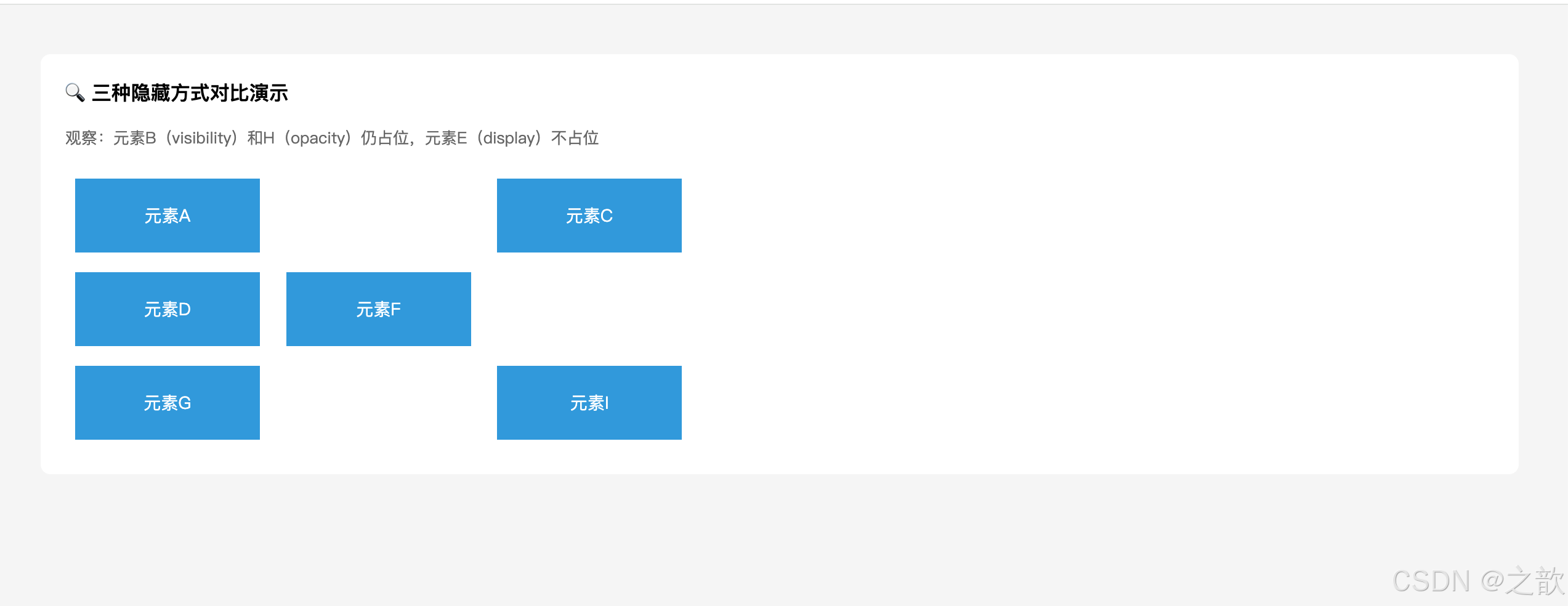
示例二:visibility 子元素特例(打破继承)
html
<!DOCTYPE html>
<html lang="zh-CN">
<head>
<meta charset="UTF-8">
<title>visibility 子元素强制显示</title>
<style>
* { margin: 0; padding: 0; box-sizing: border-box; }
body { background: #f5f5f5; padding: 40px; font-family: sans-serif; }

.parent-hidden {
    visibility: hidden;   /* 父元素隐藏 */
    background: #dfe6e9;
    padding: 20px;
    font-size: 16px;
}
.child-visible {
    visibility: visible;  /* 子元素强制显示 --- display:none 无法做到这点! */
    background: #ff7675;
    padding: 4px 8px;
    color: #fff;
    font-weight: bold;
}
</style>
</head>
<body>
    <p style="margin-bottom:16px">✨ visibility 的独特能力:子元素可以单独设置 visible 打破继承</p>
    <div class="parent-hidden">
        父元素隐藏了(这段文字看不到)
        <span class="child-visible">子元素强制显示</span>
    </div>
</body>
</html>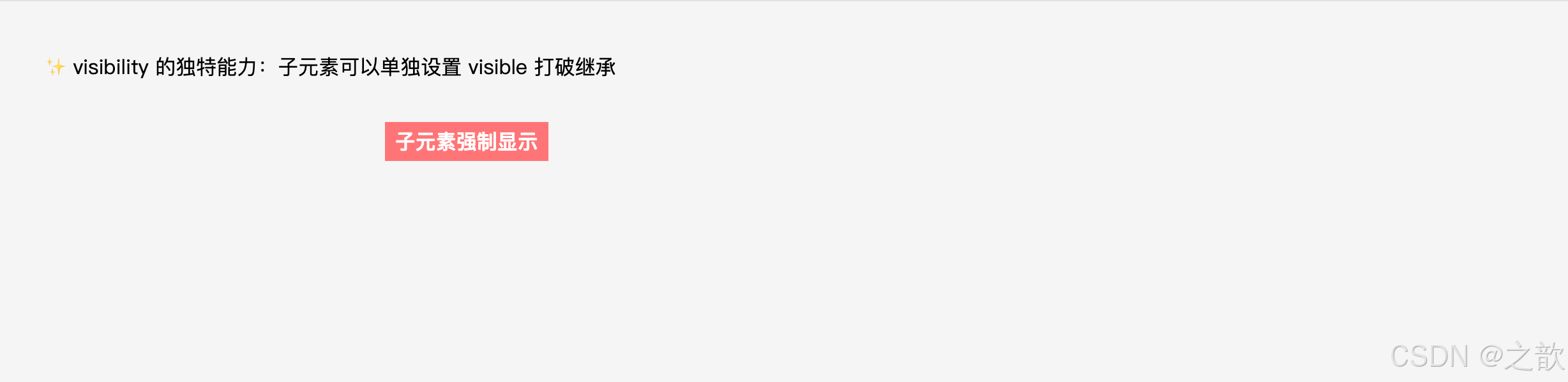
示例三:opacity 实现淡入淡出动画
css
/* 弹窗淡入效果 */
.modal {
    opacity: 0;
    visibility: hidden;
    transition: opacity 0.3s ease, visibility 0.3s ease;
}

.modal.active {
    opacity: 1;
    visibility: visible;
    /* 组合使用 opacity + visibility:
       opacity 做淡入动画,visibility 控制是否响应事件 */
}

/* 图片懒加载:加载完成后淡入显示 */
.lazy-img {
    opacity: 0;
    transition: opacity 0.5s;
}
.lazy-img.loaded {
    opacity: 1;
}
示例四:常见的导航菜单显示/隐藏
css
/* 下拉菜单 --- display: none 方案 */
.dropdown-menu {
    display: none;   /* 默认隐藏,不占空间 */
    position: absolute;
    background: #fff;
    border: 1px solid #e8e8e8;
    box-shadow: 0 4px 12px rgba(0,0,0,0.1);
    min-width: 160px;
}

.dropdown:hover .dropdown-menu {
    display: block;   /* 悬停时显示 */
}

/* 注意:display 切换不支持 transition 动画(无法渐变)
   如需动画效果,改用 opacity + visibility 组合 */

/* 下拉菜单 --- opacity + visibility 方案(支持动画) */
.dropdown-menu-animated {
    opacity: 0;
    visibility: hidden;
    transform: translateY(-8px);
    transition: all 0.2s ease;
    position: absolute;
    background: #fff;
    border: 1px solid #e8e8e8;
}

.dropdown:hover .dropdown-menu-animated {
    opacity: 1;
    visibility: visible;
    transform: translateY(0);
}
实际网站案例:
display: none:B 站、爱奇艺的下拉菜单(hover 显示)、Tab 页内容切换visibility: hidden:骨架屏(Skeleton Screen)加载占位(防止内容区高度抖动)opacity: 0:各类网站的图片懒加载淡入效果、Toast 通知的消失动画
十一、样式继承 Inheritance
11.1 名词解释
| 名词 | 定义 |
|---|---|
| 继承属性 | 子元素未设置该属性时,自动从父元素获取对应属性的计算值 |
| 非继承属性 | 子元素未设置时,取该属性的初始值(initial value),不从父元素获取 |
| 计算值 | CSS 属性经层叠、继承等规则处理后最终用于渲染的值 |
| 初始值 | CSS 规范为每个属性定义的默认出厂值 |
| inherit 关键字 | 强制让属性从父元素继承,即使该属性本身不可继承 |
| initial 关键字 | 强制将属性重置为 CSS 规范定义的初始值 |
| unset 关键字 | 可继承属性用 inherit,不可继承属性用 initial |
11.2 可继承的属性
可继承属性
字体样式
font-size(字号)
font-weight(粗细)
font-style(斜体)
font-family(字体族)
font(复合属性)
文字颜色
color(文字颜色)
文本样式
letter-spacing(字符间距)
word-spacing(单词间距)
text-decoration(文字装饰线)
text-indent(首行缩进)
text-align(水平对齐)
line-height(行高)
text-transform(大小写转换)
列表与其他
list-style(列表样式)
cursor(鼠标光标)
visibility(可见性)
word-break(换行规则)
white-space(空白处理)
重要注意:
vertical-align看似与文本相关,但不可以被继承!background(背景)不可继承(但透明 background 会"看穿"到父元素背景)border不可继承
11.3 不可继承的属性(常见)
尺寸类:   width、height、padding、margin、border
背景类:   background(背景色/图/位置等)
显示类:   display、overflow
定位类:   position、top/right/bottom/left、z-index
浮动类:   float、clear
其他:     box-shadow、border-radius、transform、transition
11.4 继承的特性总结
继承的 5 大特性:
- 只有部分属性可继承:主要是字体、颜色、文本类属性;盒模型属性不继承
inherit强制继承:对任何属性都能强制继承父元素的值,即使该属性本不支持继承initial重置初始值:将属性重置为 CSS 规范定义的出厂值(非浏览器默认值)- 继承的优先级最低:继承的样式会被用户代理样式(浏览器默认样式)覆盖
- 工程价值 :在
body或根容器设置字体、颜色,全站统一,避免重复设置
11.4.1 继承关键字详解(inherit / initial / unset)
css
/* inherit:强制继承父元素的值(即使该属性不可继承) */
.child {
    border: inherit;       /* 子元素也有和父元素一样的边框 */
    padding: inherit;      /* 子元素继承父元素的 padding */
}

/* initial:重置为 CSS 规范定义的初始值 */
.reset {
    color: initial;        /* 重置为黑色(CSS规范初始值) */
    font-weight: initial;  /* 重置为 normal,而非浏览器默认的bold */
}

/* unset:智能重置
   - 可继承属性 → 使用 inherit
   - 不可继承属性 → 使用 initial */
.smart-reset {
    color: unset;          /* 相当于 inherit(color可继承) */
    padding: unset;        /* 相当于 initial(padding不可继承) */
}

/* all: unset(重置元素所有属性) */
.full-reset {
    all: unset;            /* 清除所有自定义样式和浏览器默认样式 */
}
11.5 代码示例
示例一:基础继承演示
html
<!DOCTYPE html>
<html lang="zh-CN">
<head>
<meta charset="UTF-8">
<title>CSS 继承基础演示</title>
<style>
* { margin: 0; padding: 0; box-sizing: border-box; }
body { background: #fafafa; padding: 40px; }

.parent-style {
    font-size: 16px;         /* ✅ 可继承 → 所有子元素文字都是 16px */
    color: #333;             /* ✅ 可继承 → 所有子元素文字都是深灰色 */
    line-height: 1.8;        /* ✅ 可继承 → 所有子元素行高都是 1.8 倍 */
    border: 1px solid #ccc;  /* ❌ 不可继承 → 只有该 div 有边框 */
    background: #f5f5f5;     /* ❌ 不可继承 → 只有该 div 有背景色 */
    padding: 20px;           /* ❌ 不可继承 → 子元素无 padding */
}

ul {
    margin-left: 20px;
    margin-top: 10px;
}
</style>
</head>
<body>
    <p style="margin-bottom:16px; font-size:14px; color:#666;">
        👇 观察:子元素继承了字体、颜色、行高,但没有继承边框、背景和 padding
    </p>
    <div class="parent-style">
        <p>这段文字继承了父元素的字体颜色和字号。</p>
        <span>这里的 <em>斜体文字</em> 也继承了颜色。</span>
        <ul>
            <li>列表项也继承了字号和颜色</li>
        </ul>
    </div>
</body>
</html>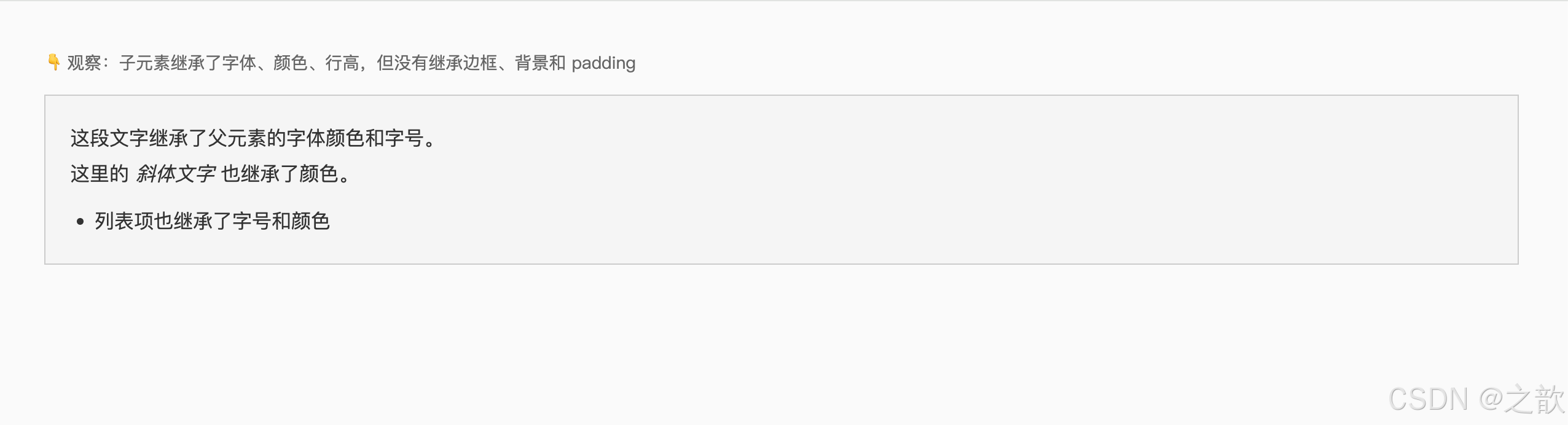
示例二:inherit 关键字强制继承
html
<!DOCTYPE html>
<html lang="zh-CN">
<head>
<meta charset="UTF-8">
<title>inherit 关键字强制继承示例</title>
<style>
* { margin: 0; padding: 0; box-sizing: border-box; }
body { background: #f5f5f5; padding: 40px; font-family: sans-serif; }

.parent-box {
    border: 2px solid #e74c3c;  /* 父元素有红色边框 */
    padding: 16px;
    color: #3498db;
    background: #fff;
}

.child-inherit {
    /* 强制继承父元素的 border(本不可继承) */
    border: inherit;   /* 结果:子元素也有 2px solid #e74c3c 的边框 */

    /* 强制继承父元素 color */
    color: inherit;    /* 结果:子元素文字颜色 = 父元素的 #3498db */

    padding: 8px;
    background: #ecf0f1;
}
</style>
</head>
<body>
    <p style="margin-bottom:16px">✨ inherit 关键字:让不可继承的属性(如 border)也能继承</p>
    <div class="parent-box">
        <p class="child-inherit">子元素强制继承父元素边框和颜色</p>
    </div>
</body>
</html>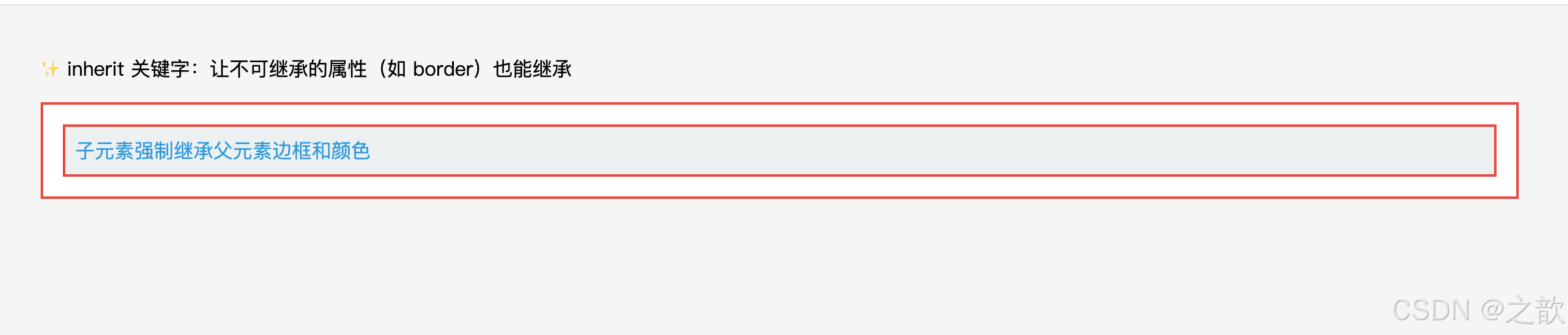
示例三:工程中在 body 统一设置继承样式
css
/* 推荐:在 body 设置全局字体和颜色,利用继承传递给全站 */
body {
    font-family: -apple-system, BlinkMacSystemFont, "Segoe UI", Roboto, sans-serif;
    font-size: 14px;
    color: #333;
    line-height: 1.6;
    /* 以上四个属性都会被所有后代元素继承 */
    /* 从此无需在每个元素上重复设置 font-size 和 color */
}

/* 局部覆盖 */
h1 { font-size: 28px; }   /* 覆盖继承的 14px */
a  { color: #1890ff; }    /* 覆盖继承的 #333(但a有用户代理样式,需要显式设置) */
示例四:initial 重置属性
css
/* 重置 strong 的 font-weight 为初始值(normal,而非 bold) */
.no-bold strong {
    font-weight: initial;   /* CSS 规范初始值 normal,而非浏览器默认的 bold */
}

/* 重置 a 标签的颜色为初始值(黑色,而非浏览器默认的蓝色) */
.reset-link {
    color: initial;
    text-decoration: initial;
}
为什么要有继承机制?
继承避免了重复书写样式,例如整个页面统一字体大小,只需在
body上设置一次,所有后代元素自动继承。这是 CSS 效率的重要来源之一。
十二、用户代理样式 User-Agent Stylesheet
12.1 名词解释
| 名词 | 定义 |
|---|---|
| 用户代理(User Agent) | 浏览器(Chrome / Firefox / Safari / Edge 等),代替用户与服务器交互 |
| 用户代理样式表 | 浏览器内置的默认 CSS 样式,在开发者没有写任何 CSS 时生效 |
| CSS 重置(CSS Reset) | 将所有元素的样式归零,消除浏览器差异(代表:Meyer Reset) |
| CSS 规范化(CSS Normalize) | 保留合理的默认样式,修复跨浏览器差异(代表:normalize.css) |
| 作者样式(Author Style) | 开发者自己编写的 CSS 样式 |
12.2 常见元素的默认样式
| 元素 | 用户代理默认样式 |
|---|---|
h1 |
font-size: 2em、font-weight: bold、margin: 0.67em 0 |
h2 |
font-size: 1.5em、font-weight: bold、margin: 0.83em 0 |
h3 |
font-size: 1.17em、font-weight: bold、margin: 1em 0 |
p |
上下 margin: 1em 0 |
em |
font-style: italic |
strong |
font-weight: bold |
a |
color: -webkit-link(蓝色)、text-decoration: underline、cursor: pointer |
ul / ol |
padding-left: 40px、margin: 1em 0、list-style-type: disc/decimal |
button |
背景色、边框、内边距、默认字体等 |
input |
边框 1px solid、内边距、默认字体(不继承!) |
table |
border-collapse: separate、border-spacing: 2px |
12.3 样式优先级
直接设置的样式
(作者样式)
权重最高
自带样式
(用户代理样式)
居中
继承的样式
权重最低
优先级口诀:
直接 > 自带 > 继承
(作者样式 > 用户代理样式 > 继承来的样式)
12.4 用户代理样式的特性总结
用户代理样式的 5 大特性:
- 跨浏览器不一致:Chrome、Firefox、Safari 的默认样式有差异,不统一
- 会被作者样式覆盖:任何开发者写的 CSS 都会覆盖浏览器默认样式
- input 不继承字体 :
input、textarea、button的字体默认不继承body,需要手动重置- Chrome DevTools 可查看:打开开发者工具 → 选中元素 → 样式面板中标注 "user agent stylesheet" 的就是默认样式
- CSS Reset vs Normalize:Reset 将所有样式清零(更激进);Normalize 保留合理默认值(更温和)
12.5 代码示例
示例一:覆盖用户代理样式
html
<a href="#">默认蓝色下划线链接</a>
<a href="#" class="custom-link">自定义样式链接</a>
css
/* 覆盖用户代理样式 */
.custom-link {
    color: #ff5000;          /* 覆盖默认蓝色 */
    text-decoration: none;   /* 去掉默认下划线 */
    font-weight: bold;
}
示例二:项目标准 CSS Reset(常见的初始化代码)
css
/* 经典 CSS Reset --- 消除浏览器默认样式 */
* {
    margin: 0;
    padding: 0;
    box-sizing: border-box;
}

html {
    font-size: 16px;
}

body {
    font-family: -apple-system, BlinkMacSystemFont, "Segoe UI", sans-serif;
    font-size: 14px;
    color: #333;
    line-height: 1.6;
}

ul, ol {
    list-style: none;   /* 去掉列表默认的圆点/数字 */
}

a {
    color: inherit;           /* 继承父元素颜色,不用默认蓝色 */
    text-decoration: none;    /* 去掉下划线 */
}

img {
    display: block;           /* 消除图片底部空白(inline 的基线对齐问题) */
    max-width: 100%;          /* 图片不超出容器 */
}

/* 表单元素的字体不继承 body,需要手动重置 */
input, textarea, button, select {
    font-family: inherit;     /* 继承 body 的字体 */
    font-size: inherit;       /* 继承 body 的字号 */
    outline: none;            /* 去掉默认 focus 轮廓(记得用其他方式提示焦点状态) */
}

button {
    cursor: pointer;          /* 按钮鼠标手型 */
    border: none;             /* 去掉默认边框 */
    background: transparent;  /* 去掉默认背景 */
}

table {
    border-collapse: collapse;  /* 合并表格边框 */
    border-spacing: 0;
}示例三:input 不继承字体的问题及解决
html
<div class="form-wrap">
    <p>父元素的文字 --- 微软雅黑 16px</p>
    <input type="text" placeholder="没有 inherit:系统默认字体(通常很小)">
    <input type="text" class="inherit-font" placeholder="加了 inherit:与父元素一致">
</div>
css
.form-wrap {
    font-family: "Microsoft YaHei", sans-serif;
    font-size: 16px;
}

/* input 的字体默认不继承 body!用户代理样式强制使用系统字体 */
/* 必须手动重置 */
.inherit-font {
    font-family: inherit;  /* 继承父元素字体 */
    font-size: inherit;    /* 继承父元素字号 */
}
实际网站案例: 所有正规前端项目都会在
index.css的第一行引入样式重置。著名的 normalize.css 被 Bootstrap、Ant Design 等框架依赖,专门解决跨浏览器默认样式差异问题。
十三、核心知识点归纳总结
13.1 盒子模型四层结构总结
content
内容区
① 文本/图片/子元素
② width/height 控制
③ box-sizing 决定计算方式
padding
内边距
① 不能为负
② 背景色延伸到此
③ 百分比参照父宽度
border
边框
① 必须设 style 才可见
② 占据盒子尺寸
③ 可绘制三角形
margin
外边距
① 可为负值
② 不计入盒子宽高
③ 塌陷/合并现象
④ auto 水平居中
13.2 padding vs margin 终极对比
| 对比维度 | padding(内边距) | margin(外边距) |
|---|---|---|
| 能否为负值 | ❌ 不能 | ✅ 可以 |
| 背景色延伸 | ✅ 延伸到 padding 区域 | ❌ 不延伸(margin 透明) |
| 百分比参照 | 父元素内容宽度 | 父元素内容宽度 |
| 是否影响盒子尺寸 | ✅ 影响(content-box下) | ❌ 不影响 |
| 行内元素上下方向 | ⚠️ 视觉有效,布局无效 | ❌ 上下完全无效 |
| auto 值 | ❌ 无效 | ✅ 左右 auto 可水平居中 |
| 特殊现象 | 无 | 塌陷、合并 |
13.3 display: none vs visibility: hidden vs opacity: 0
| 对比维度 | display: none |
visibility: hidden |
opacity: 0 |
|---|---|---|---|
| 是否占据空间 | ❌ 不占 | ✅ 占据 | ✅ 占据 |
| 是否响应事件 | ❌ 不响应 | ❌ 不响应 | ✅ 响应 |
| 子元素是否可覆盖 | ❌ 不可 | ✅ 可设 visible |
❌ 不可 |
| 支持 transition 动画 | ❌ 不支持 | ✅ 支持 | ✅ 支持(最流畅) |
| 触发 reflow | ✅ 触发 | ❌ 不触发 | ❌ 不触发 |
| 性能消耗 | 最大 | 中 | 最小(GPU加速) |
13.4 margin 异常行为速查
| 现象 | 原因 | 解决方案 |
|---|---|---|
子元素 margin-top 作用到了父元素上 |
margin 塌陷 | 父元素加 overflow: hidden 或 border-top: 1px solid transparent |
| 两个相邻 div 间距不是两者之和 | margin 合并 | 无需修复,了解规律即可(设计时取较大值) |
margin: 0 auto 不居中 |
未设置宽度 / 非块级元素 | 必须先设置 width,且元素为 block |
行内元素上下 margin 不生效 |
行内元素特性 | 转为 inline-block 或 block |
13.5 overflow 与 BFC 的关联
overflow: hidden / auto / scroll 均会触发 BFC

BFC 的核心特性:
  ① 内部 margin 不会与外部合并 → 解决 margin 塌陷
  ② 能包裹内部浮动元素 → 清除浮动(父元素高度不塌陷)
  ③ 不与浮动元素重叠 → 自适应两栏布局

→ 这就是 overflow: hidden 能"解决各种问题"的根本原因
13.6 样式优先级与覆盖规则
权重最高,优先应用
在无直接样式时生效
权重最低,最先被覆盖
直接设置的样式(作者样式)
通过 class / id / 选择器设置
最终渲染结果
用户代理样式(浏览器内置CSS)
如 h1 的 font-size, a 的颜色
继承的样式(从父元素获取)
如父元素的 color 传递给子元素
13.7 行内元素的盒模型限制汇总
行内元素(span / a / em / strong 等)的盒模型限制:

  ❌ 无法设置 width / height(需要 display: inline-block 才能设置)
  ✅ padding 左右:完全生效
  ⚠️ padding 上下:视觉上有填充,但不影响行高,相邻行会重叠
  ✅ margin 左右:完全生效
  ❌ margin 上下:设置无效,不影响布局
  ✅ border 左右:完全生效
  ⚠️ border 上下:视觉上显示,但不影响行高

解决方法:将行内元素转为行内块(display: inline-block)
十四、综合实战示例
14.1 实战一:电商商品卡片
html
<!DOCTYPE html>
<html lang="zh-CN">
<head>
    <meta charset="UTF-8">
    <title>商品卡片示例</title>
    <style>
        * { margin: 0; padding: 0; box-sizing: border-box; }

        body {
            font-size: 14px;       /* 可继承 → 后代元素默认 14px */
            color: #333;           /* 可继承 → 后代文字默认深灰色 */
            background: #f5f5f5;
            display: flex;
            gap: 16px;
            flex-wrap: wrap;
            padding: 40px;
        }

        .product-card {
            width: 240px;
            border: 1px solid #e8e8e8;
            border-radius: 8px;
            background: #fff;
            overflow: hidden;          /* 触发BFC,裁剪圆角 */
            box-shadow: 0 2px 8px rgba(0,0,0,0.08);
            transition: box-shadow 0.2s;
        }

        .product-card:hover {
            box-shadow: 0 8px 24px rgba(0,0,0,0.12);
        }

        .product-img {
            width: 100%;
            height: 200px;
            overflow: hidden;
        }

        .product-info {
            padding: 12px 16px 16px;   /* 三值:上12 左右16 下16 */
        }

        .product-title {
            font-size: 14px;
            line-height: 1.5;
            overflow: hidden;
            display: -webkit-box;
            -webkit-line-clamp: 2;
            -webkit-box-orient: vertical;
            margin-bottom: 8px;
        }

        .product-price {
            color: #ff5000;
            font-size: 18px;
            font-weight: bold;
            margin-bottom: 12px;
        }

        .btn-buy {
            display: block;
            width: 100%;
            padding: 8px 0;
            background: #ff5000;
            color: #fff;
            border: 2px solid transparent;   /* 透明边框占位,hover时无抖动 */
            border-radius: 4px;
            text-align: center;
            cursor: pointer;
            font-size: 14px;
            transition: background 0.2s, border-color 0.2s;
        }

        .btn-buy:hover {
            background: #fff;
            border-color: #ff5000;
            color: #ff5000;
        }

        .product-badge {
            display: inline-block;
            padding: 2px 6px;
            border: 1px solid #ff5000;
            color: #ff5000;
            font-size: 11px;
            border-radius: 2px;
            margin-bottom: 6px;
        }
    </style>
</head>
<body>
    <div class="product-card">
        <div class="product-img">
            <div style="width:100%;height:100%;background:linear-gradient(135deg,#667eea,#764ba2);"></div>
        </div>
        <div class="product-info">
            <div class="product-badge">新品</div>
            <h3 class="product-title">无线蓝牙耳机主动降噪超长续航专业音质高保真</h3>
            <div class="product-price">¥299.00</div>
            <button class="btn-buy">加入购物车</button>
        </div>
    </div>
</body>
</html>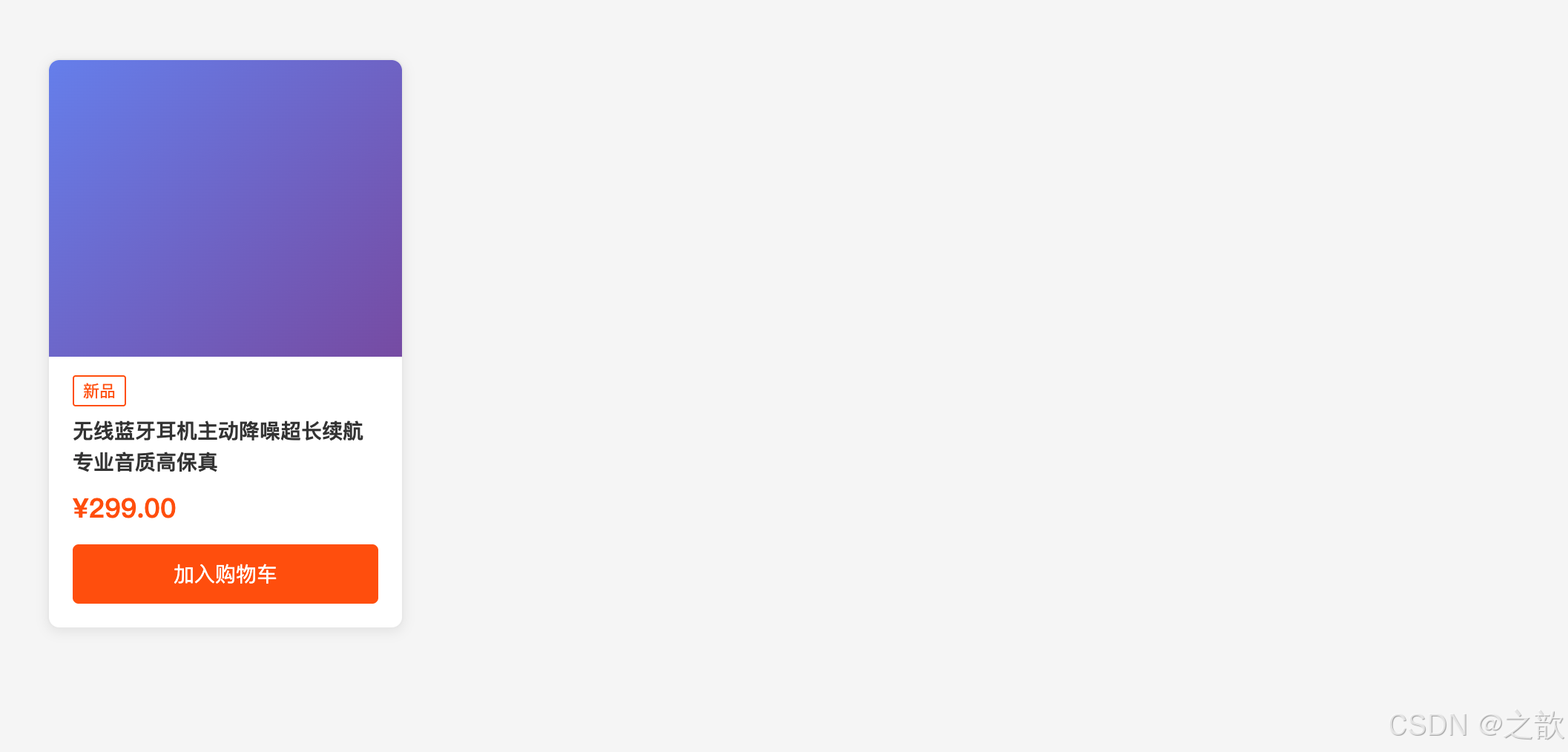
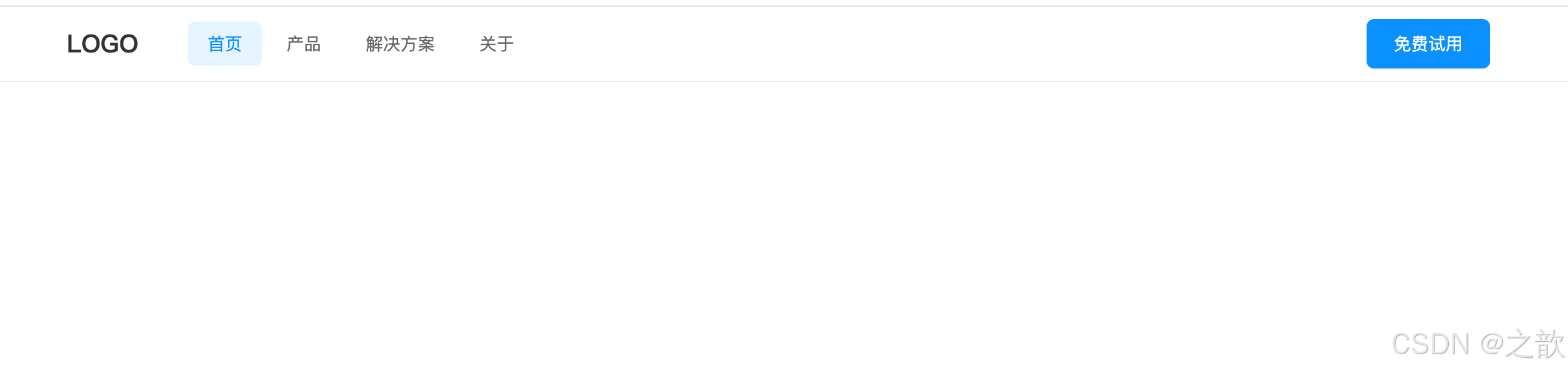
14.2 实战二:导航栏(综合运用)
html
<nav class="navbar">
    <div class="nav-container">
        <a class="nav-logo" href="#">LOGO</a>
        <ul class="nav-list">
            <li class="nav-item active"><a href="#">首页</a></li>
            <li class="nav-item"><a href="#">产品</a></li>
            <li class="nav-item has-dropdown">
                <a href="#">解决方案</a>
                <ul class="dropdown">
                    <li><a href="#">企业版</a></li>
                    <li><a href="#">个人版</a></li>
                </ul>
            </li>
            <li class="nav-item"><a href="#">关于</a></li>
        </ul>
        <a class="btn-nav" href="#">免费试用</a>
    </div>
</nav>
css
* { margin: 0; padding: 0; box-sizing: border-box; }

.navbar {
    background: #fff;
    border-bottom: 1px solid #e8e8e8;   /* 底部分割线 */
    position: sticky;
    top: 0;
    z-index: 100;
}

.nav-container {
    max-width: 1200px;      /* 最大宽度限制 */
    margin: 0 auto;         /* 水平居中 */
    padding: 0 24px;        /* 左右内边距 */
    display: flex;
    align-items: center;
    height: 60px;
}

.nav-logo {
    font-size: 20px;
    font-weight: bold;
    color: #333;            /* 覆盖 a 标签默认蓝色 */
    text-decoration: none;  /* 去掉默认下划线 */
    margin-right: 40px;
}

.nav-list {
    display: flex;
    list-style: none;       /* 去掉 li 默认圆点 */
    gap: 4px;
    flex: 1;
}

.nav-item a {
    display: block;
    padding: 8px 16px;      /* padding 扩大点击区域 */
    color: #666;
    text-decoration: none;
    border-radius: 6px;
    font-size: 14px;
    transition: color 0.2s, background 0.2s;
}

.nav-item.active a {
    color: #1890ff;
    background: #e6f4ff;
}

.nav-item a:hover {
    color: #1890ff;
    background: #f5f5f5;
}

/* 下拉菜单 */
.has-dropdown {
    position: relative;
}

.dropdown {
    display: none;          /* 默认隐藏 */
    position: absolute;
    top: 100%;
    left: 0;
    background: #fff;
    border: 1px solid #e8e8e8;
    border-radius: 6px;
    box-shadow: 0 4px 12px rgba(0,0,0,0.1);
    min-width: 140px;
    list-style: none;
    overflow: hidden;       /* 触发BFC,圆角生效 */
    padding: 4px 0;
}

.has-dropdown:hover .dropdown {
    display: block;         /* 悬停显示下拉 */
}

.dropdown li a {
    display: block;
    padding: 8px 16px;
    color: #666;
    text-decoration: none;
    font-size: 13px;
    border-radius: 0;       /* 覆盖 nav-item a 的 border-radius */
}

.dropdown li a:hover {
    background: #f5f5f5;
    color: #1890ff;
}

/* 右侧按钮 */
.btn-nav {
    padding: 8px 20px;
    background: #1890ff;
    color: #fff;
    text-decoration: none;
    border-radius: 6px;
    font-size: 14px;
    border: 2px solid transparent;  /* 透明边框,hover 时无抖动 */
    transition: all 0.2s;
}

.btn-nav:hover {
    background: #fff;
    color: #1890ff;
    border-color: #1890ff;
}
十五、常见问题 FAQ
Q1:为什么设置了宽度,元素还是撑出了容器?
检查是否使用了默认的
box-sizing: content-box,此时 padding 和 border 会让实际渲染宽度超出width。推荐在项目初始化时全局设置* { box-sizing: border-box; }。
Q2:margin: 0 auto 为什么没居中?
需要同时满足两个条件:① 是块级元素 ;② 设置了宽度 (
width或max-width)。行内元素和行内块元素的 auto margin 无效。
Q3:overflow: hidden 为什么能解决 margin 塌陷?
因为它触发了 BFC(块级格式化上下文),BFC 内部是独立的布局区域,子元素的 margin 不会"逃出"BFC 边界影响外部元素。
Q4:什么时候用 visibility: hidden,什么时候用 display: none?
需要保留占位空间 (防止页面跳动)→
visibility: hidden;需要完全隐藏且释放空间 →display: none;需要透明但保持交互 →opacity: 0;需要淡入淡出动画 →opacity过渡动画。
Q5:padding 百分比为什么参照的是宽度而不是高度?
CSS 规范规定,百分比形式的
padding/margin均参照包含块的宽度 。这是为了方便实现等比例的正方形盒子(如padding-top: 100%→ 正方形,常见于图片占位)。
Q6:为什么行内元素不能设置宽高?
行内元素参与行内格式化上下文(IFC) ,其尺寸由内容流(文字、图片)决定,不允许显式设置宽高。只要将其改为
display: inline-block或display: block,就可以设置宽高了。
Q7:border-style 必须写吗?只写颜色行不行?
必须写。
border-style的默认值是none,如果不设置,边框不会显示。border-color和border-width不写有默认值,但border-style不写等于没有边框。
Q8:继承的样式和用户代理样式,哪个优先级更高?
用户代理样式 > 继承的样式 。这就是为什么
a标签即使继承了父元素的颜色,仍然显示蓝色------因为浏览器默认的蓝色(用户代理样式)优先级更高,会覆盖继承的颜色。要改变a的颜色,必须直接给a设置color。
Q9:为什么 height: 100% 不生效?
父元素必须有明确的 height 值 (非
auto)。解决方案:
css/* 方案一:给所有祖先元素设置 height: 100% */ html, body, .parent { height: 100%; } .child { height: 100%; } /* 方案二:使用 vh 单位(视口高度) */ .child { height: 100vh; } /* 方案三:使用 Flexbox */ .parent { display: flex; flex-direction: column; height: 100vh; } .child { flex: 1; } /* 自动撑满剩余高度 */
Q10:img 标签底部为什么有 3px 空白?
img 默认是
inline元素,按文字基线对齐,底部预留了"字母下沿空间"(如 g、y、p 的下延部分)。解决方案:
css/* 方案一:改为块级元素(推荐) */ img { display: block; } /* 方案二:改变垂直对齐方式 */ img { vertical-align: top; } /* 或 middle / bottom */ /* 方案三:父元素字号为0(不推荐,影响文字) */ .img-wrap { font-size: 0; }
Q11:inline-block 元素之间为什么有间隙?(⭐ 经典"灵异bug")
HTML 中的换行符和空格被浏览器当作空白字符渲染,间隙大小随 font-size 变化(16px 时约 4-8px)。
解决方案优先级排序:
css/* ⭐ 方案一:父元素 font-size: 0(最常用) */ .container { font-size: 0; -webkit-text-size-adjust: none; /* Chrome 兼容 */ } .item { display: inline-block; font-size: 16px; /* 子元素重置字号 */ } /* 方案二:负 margin(精确控制) */ .item { display: inline-block; margin-right: -4px; /* Chrome 用 -8px */ } /* 方案三:移除 HTML 空格(影响代码可读性) */ <!-- 写成一行 --> <span>A</span><span>B</span><span>C</span> <!-- 或用注释分隔 --> <span>A</span><!-- --><span>B</span><!-- --><span>C</span> /* ⭐ 方案四:现代方案 --- 用 Flexbox 替代(推荐) */ .container { display: flex; gap: 0; /* 明确设置间距,无副作用 */ }
参考资料:MDN Web Docs --- CSS Box Model · W3C CSS Box Model Level 3 · MDN --- margin 折叠 · MDN --- overflow · MDN --- CSS 继承
十六、经典使用场景大全
本章把前面所有属性放到真实的开发场景中,帮助建立"看到需求 → 想到属性"的直觉。每个场景均为完整可运行的 HTML 文件,直接复制到浏览器即可查看效果。
场景一:卡片悬浮效果(电商 / 博客列表)
需求: 卡片默认有轻微阴影,鼠标悬停时"浮起来",有平滑过渡。
涉及属性: border + border-radius + overflow: hidden(圆角+BFC)、padding(内容留白)、margin(间距)、overflow + line-clamp(多行省略)
真实案例: 掘金文章列表、知乎回答卡片、GitHub 仓库卡片均采用此模式。
html
<!DOCTYPE html>
<html lang="zh-CN">
<head>
<meta charset="UTF-8">
<title>场景一:卡片悬浮效果</title>
<style>
* { margin: 0; padding: 0; box-sizing: border-box; }
body { background: #f5f5f5; padding: 40px; display: flex; gap: 20px; flex-wrap: wrap; }

.card {
    width: 320px;
    border: 1px solid #e8e8e8;       /* border:轻量边框定义轮廓 */
    border-radius: 12px;
    overflow: hidden;                 /* overflow hidden:圆角裁剪 + 触发BFC */
    background: #fff;
    box-shadow: 0 2px 8px rgba(0,0,0,0.06);
    transition: box-shadow 0.25s ease, transform 0.25s ease;
    cursor: pointer;
}
.card:hover {
    box-shadow: 0 12px 32px rgba(0,0,0,0.14);
    transform: translateY(-4px);     /* 悬浮上移 4px */
}
.card-cover {
    width: 100%;
    height: 180px;
    display: block;
}
.card-body {
    padding: 16px 20px 20px;         /* padding:内容与卡片边缘的留白 */
}
.card-title {
    font-size: 16px;
    font-weight: bold;
    line-height: 1.5;
    margin-bottom: 8px;              /* margin:标题与摘要的间距 */
    overflow: hidden;
    display: -webkit-box;
    -webkit-line-clamp: 2;
    -webkit-box-orient: vertical;
}
.card-desc {
    font-size: 13px;
    color: #666;
    line-height: 1.6;
    margin-bottom: 12px;
    overflow: hidden;
    display: -webkit-box;
    -webkit-line-clamp: 2;
    -webkit-box-orient: vertical;
}
.card-footer {
    display: flex;
    justify-content: space-between;
    align-items: center;
}
.tag {
    display: inline-block;
    padding: 2px 10px;              /* padding:标签内边距 */
    border: 1px solid #1890ff;      /* border:标签轮廓 */
    border-radius: 100px;
    color: #1890ff;
    font-size: 12px;
}
.read-count { font-size: 12px; color: #999; }
</style>
</head>
<body>
    <div class="card">
        <div class="card-cover" style="background:linear-gradient(135deg,#667eea,#764ba2);"></div>
        <div class="card-body">
            <h3 class="card-title">CSS 盒子模型深度解析:从入门到工程实践的完整指南</h3>
            <p class="card-desc">盒子模型是 CSS 布局的核心基础,理解 content-box 与 border-box 的差异对实际开发至关重要......</p>
            <div class="card-footer">
                <span class="tag">CSS</span>
                <span class="read-count">3.2k 阅读</span>
            </div>
        </div>
    </div>
    <div class="card">
        <div class="card-cover" style="background:linear-gradient(135deg,#f093fb,#f5576c);"></div>
        <div class="card-body">
            <h3 class="card-title">overflow: hidden 的三重效果:裁剪、BFC 与圆角</h3>
            <p class="card-desc">一行代码,三个效果。深入理解 overflow: hidden 触发块级格式化上下文的底层原理......</p>
            <div class="card-footer">
                <span class="tag">布局</span>
                <span class="read-count">1.8k 阅读</span>
            </div>
        </div>
    </div>
</body>
</html>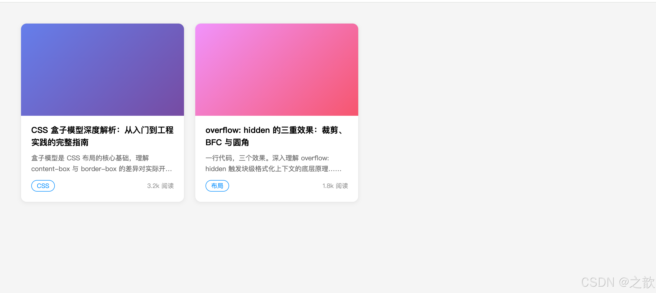
场景二:消息提示 / 警告框(Alert 组件)
需求: 成功、警告、错误三种状态的提示条,左侧有彩色指示线。
涉及属性: padding(不对称留白)、border(轮廓 + 透明占位)、border-radius(圆角)、margin(多条之间间距)
真实案例: Ant Design、Element UI、GitHub 的 Alert 组件均是此结构。
html
<!DOCTYPE html>
<html lang="zh-CN">
<head>
<meta charset="UTF-8">
<title>场景二:Alert 警告框</title>
<style>
* { margin: 0; padding: 0; box-sizing: border-box; }
body { background: #f9fafb; padding: 40px; max-width: 600px; margin: 0 auto; }

.alert {
    padding: 12px 16px 12px 20px;    /* 左侧留更多 padding,为彩色线腾位置 */
    border-radius: 6px;
    border: 1px solid transparent;   /* 透明边框占位,有颜色时不抖动 */
    font-size: 14px;
    line-height: 1.6;
    margin-bottom: 12px;
    position: relative;
}
/* 左侧彩色指示线:用伪元素 + 绝对定位实现 */
.alert::before {
    content: '';
    position: absolute;
    left: 0; top: 0; bottom: 0;
    width: 4px;
    border-radius: 6px 0 0 6px;
}
.alert-success { background: #f0fdf4; border-color: #bbf7d0; color: #166534; }
.alert-success::before { background: #22c55e; }

.alert-warning { background: #fffbeb; border-color: #fde68a; color: #92400e; }
.alert-warning::before { background: #f59e0b; }

.alert-error { background: #fef2f2; border-color: #fecaca; color: #991b1b; }
.alert-error::before { background: #ef4444; }

.alert-info { background: #eff6ff; border-color: #bfdbfe; color: #1e40af; }
.alert-info::before { background: #3b82f6; }

.alert strong { font-weight: 600; }
</style>
</head>
<body>
    <div class="alert alert-success"><strong>操作成功!</strong> 数据已保存,即将跳转到详情页。</div>
    <div class="alert alert-info"><strong>温馨提示:</strong> 该功能需要登录后才可使用。</div>
    <div class="alert alert-warning"><strong>注意:</strong> 此操作不可撤销,请谨慎确认后继续。</div>
    <div class="alert alert-error"><strong>错误:</strong> 网络连接失败,请检查网络后重试。</div>
</body>
</html>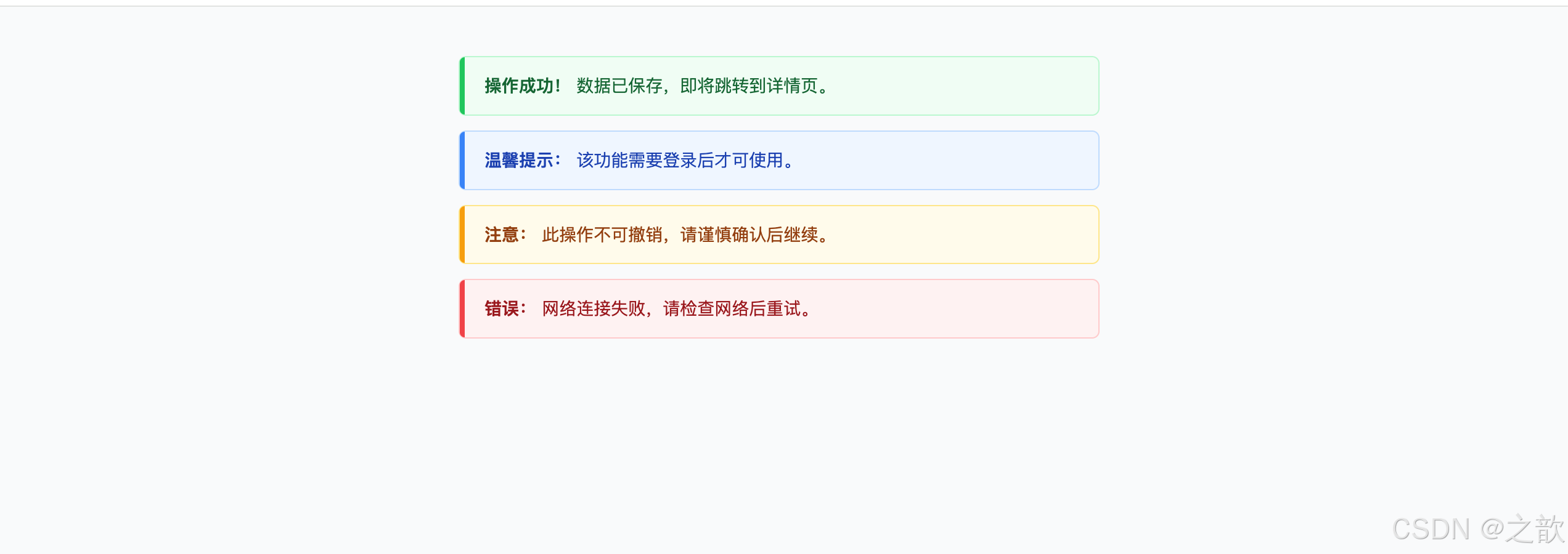
场景三:导航标签页 / Tab 切换
需求: Tab 选中时底部有蓝色下划线,未选中时无;切换时平滑过渡。
涉及属性: border-bottom(下划线指示器)、transparent 边框防抖动、padding(tab 点击区域)、margin-bottom: -1px(覆盖通栏线)
真实案例: B 站首页分类 Tab、掘金首页 Tab、微博热搜 Tab 均用此模式。
html
<!DOCTYPE html>
<html lang="zh-CN">
<head>
<meta charset="UTF-8">
<title>场景三:Tab 标签页</title>
<style>
* { margin: 0; padding: 0; box-sizing: border-box; }
body { background: #fff; padding: 40px; font-family: sans-serif; }

.tab-bar {
    display: flex;
    border-bottom: 1px solid #e8e8e8;  /* 底部通栏分割线 */
    padding: 0 4px;
    margin-bottom: 20px;
}
.tab {
    padding: 12px 20px;               /* padding 控制 tab 点击区域大小 */
    border: none;
    border-bottom: 2px solid transparent;  /* 透明下边框占位,hover/active 时改颜色,无抖动 */
    background: transparent;
    color: #666;
    font-size: 15px;
    cursor: pointer;
    margin-right: 4px;
    margin-bottom: -1px;              /* 关键:让 tab 的下边框覆盖通栏分割线 */
    transition: color 0.2s, border-color 0.2s;
}
.tab:hover { color: #1890ff; }
.tab.active {
    color: #1890ff;
    border-bottom-color: #1890ff;    /* 只改颜色,尺寸不变,不抖动 */
    font-weight: 600;
}
.tab-content { font-size: 14px; color: #555; line-height: 1.8; padding: 0 4px; }
</style>
</head>
<body>
    <div class="tab-bar">
        <button class="tab active" onclick="switchTab(this, 'content1')">推荐</button>
        <button class="tab" onclick="switchTab(this, 'content2')">热门</button>
        <button class="tab" onclick="switchTab(this, 'content3')">最新</button>
        <button class="tab" onclick="switchTab(this, 'content4')">关注</button>
    </div>
    <div class="tab-content" id="content1">推荐内容区域:根据用户喜好智能推荐的文章列表......</div>
    <div class="tab-content" id="content2" style="display:none">热门内容区域:全站近 24 小时阅读量最高的文章......</div>
    <div class="tab-content" id="content3" style="display:none">最新内容区域:按发布时间倒序排列的最新文章......</div>
    <div class="tab-content" id="content4" style="display:none">关注内容区域:你关注的作者发布的最新文章......</div>
    <script>
    function switchTab(btn, id) {
        document.querySelectorAll('.tab').forEach(t => t.classList.remove('active'));
        document.querySelectorAll('.tab-content').forEach(c => c.style.display = 'none');
        btn.classList.add('active');
        document.getElementById(id).style.display = 'block';
    }
    </script>
</body>
</html>
场景四:徽标 / 数字角标(Badge)
需求: 图标右上角显示红色数字消息数,未读数超过 99 时显示"99+"。
涉及属性: min-width(内容自适应扩展)、padding(文字留白)、border(白色分隔边框)、border-radius(圆形/胶囊)
真实案例: 微信未读消息红点、淘宝购物车数量角标、邮件未读数角标。
html
<!DOCTYPE html>
<html lang="zh-CN">
<head>
<meta charset="UTF-8">
<title>场景四:Badge 数字角标</title>
<style>
* { margin: 0; padding: 0; box-sizing: border-box; }
body { background: #f5f5f5; padding: 60px; display: flex; gap: 40px; align-items: flex-start; font-family: sans-serif; }

.badge-wrap {
    position: relative;
    display: inline-block;
}
.icon {
    font-size: 36px;
    display: block;
    line-height: 1;
}
/* 数字角标 */
.badge {
    position: absolute;
    top: -6px;
    right: -10px;
    min-width: 18px;              /* min-width:数字增多时自动扩展宽度 */
    height: 18px;
    padding: 0 5px;               /* padding:左右内边距,文字不贴边 */
    background: #ff4d4f;
    color: #fff;
    font-size: 11px;
    font-weight: bold;
    line-height: 18px;
    border-radius: 100px;         /* 大圆角 → 自动变胶囊/圆形 */
    border: 2px solid #f5f5f5;   /* 白色边框,与背景产生分隔感 */
    text-align: center;
    white-space: nowrap;
}
/* 无数字的红点 */
.badge-dot {
    min-width: 8px;
    width: 8px;
    height: 8px;
    padding: 0;
    top: 0; right: 0;
    border-radius: 50%;
}
/* 大数字自适应 */
.badge-large { right: -18px; }

.label { font-size: 12px; color: #999; margin-top: 12px; text-align: center; }
</style>
</head>
<body>
    <div>
        <div class="badge-wrap">
            <span class="icon">🔔</span>
            <span class="badge">5</span>
        </div>
        <div class="label">数字 5</div>
    </div>
    <div>
        <div class="badge-wrap">
            <span class="icon">💬</span>
            <span class="badge">99+</span>
        </div>
        <div class="label">99+ 超出</div>
    </div>
    <div>
        <div class="badge-wrap">
            <span class="icon">📧</span>
            <span class="badge badge-dot"></span>
        </div>
        <div class="label">红点无数字</div>
    </div>
    <div>
        <div class="badge-wrap">
            <span class="icon">🛒</span>
            <span class="badge badge-large">128</span>
        </div>
        <div class="label">三位数</div>
    </div>
</body>
</html>
场景五:分割线(带文字的 Divider)
需求: 页面中常见"------ 其他登录方式 ------"这类带文字的分隔线,以及纯分隔线与虚线。
涉及属性: border-top(单向边框做线)、border-style: dashed(虚线)、margin(上下间距)
真实案例: 各类登录页的"第三方登录"分隔线,文章段落之间的分隔线。
html
<!DOCTYPE html>
<html lang="zh-CN">
<head>
<meta charset="UTF-8">
<title>场景五:分割线 Divider</title>
<style>
* { margin: 0; padding: 0; box-sizing: border-box; }
body { background: #fff; padding: 40px; max-width: 500px; margin: 0 auto; font-family: sans-serif; }
p { font-size: 14px; color: #333; margin-bottom: 4px; }

/* 方案一:简单实线分割 */
.divider {
    border: none;
    border-top: 1px solid #e8e8e8;  /* 只用上边框,1px 细线 */
    margin: 20px 0;
}

/* 方案二:带文字的分割线 */
.divider-text {
    display: flex;
    align-items: center;
    gap: 12px;
    margin: 20px 0;
    color: #999;
    font-size: 13px;
}
.divider-text::before,
.divider-text::after {
    content: '';
    flex: 1;
    border-top: 1px solid #e8e8e8;
}

/* 方案三:虚线分割 */
.divider-dashed {
    border: none;
    border-top: 1px dashed #d9d9d9;  /* dashed 虚线 */
    margin: 20px 0;
}

/* 方案四:带颜色的粗分割线(章节分隔) */
.divider-bold {
    border: none;
    border-top: 3px solid #1890ff;
    width: 40px;
    margin: 20px 0;
}
</style>
</head>
<body>
    <p>上方内容区域</p>

    <div class="divider"></div>
    <p style="color:#999;font-size:12px;margin-bottom:16px">↑ 方案一:1px 实线分割</p>

    <div class="divider-text">其他登录方式</div>
    <p style="color:#999;font-size:12px;margin-bottom:16px">↑ 方案二:带文字的分割线(登录页常见)</p>

    <div class="divider-dashed"></div>
    <p style="color:#999;font-size:12px;margin-bottom:16px">↑ 方案三:虚线分割</p>

    <div class="divider-bold"></div>
    <p style="color:#999;font-size:12px">↑ 方案四:彩色短线装饰(章节标题下方)</p>
</body>
</html>
场景六:商品网格布局(电商列表)
需求: 4列商品卡片网格,每列等宽,卡片之间有统一间距,不影响左右边缘。
涉及属性: margin: 0 auto(网格居中)、padding(内容留白)、overflow: hidden(触发BFC)、负 margin 技巧、border(卡片轮廓)
真实案例: 淘宝/京东搜索结果页商品网格、Pinterest 图片瀑布流。
html
<!DOCTYPE html>
<html lang="zh-CN">
<head>
<meta charset="UTF-8">
<title>场景六:商品网格布局</title>
<style>
* { margin: 0; padding: 0; box-sizing: border-box; }
body { background: #f5f5f5; font-family: sans-serif; }

.grid-wrap {
    max-width: 1000px;
    margin: 0 auto;         /* 网格整体水平居中 */
    padding: 24px 16px;     /* 左右内边距,防止贴近浏览器边缘 */
}
.grid {
    display: flex;
    flex-wrap: wrap;
    gap: 16px;              /* 等价于每个 item 设置 margin,但不影响边缘 */
}
.grid-item {
    width: calc((100% - 48px) / 4);  /* 四列:(100% - 3个gap) / 4 */
    background: #fff;
    border: 1px solid #f0f0f0;       /* border:轻量卡片边框 */
    border-radius: 8px;
    overflow: hidden;
    transition: box-shadow 0.2s;
    cursor: pointer;
}
.grid-item:hover {
    box-shadow: 0 4px 16px rgba(0,0,0,0.1);
}
.grid-item-img {
    width: 100%;
    height: 150px;
}
.grid-item-info {
    padding: 10px 12px 12px;  /* padding:内容区留白 */
}
.grid-item-name {
    font-size: 13px;
    color: #333;
    line-height: 1.4;
    margin-bottom: 6px;      /* margin:名称与价格的间距 */
    overflow: hidden;
    display: -webkit-box;
    -webkit-line-clamp: 2;
    -webkit-box-orient: vertical;
}
.grid-item-price {
    color: #ff5000;
    font-size: 16px;
    font-weight: bold;
}
.grid-item-price span { font-size: 12px; font-weight: normal; }
</style>
</head>
<body>
    <div class="grid-wrap">
        <div class="grid">
            <div class="grid-item">
                <div class="grid-item-img" style="background:linear-gradient(135deg,#a8edea,#fed6e3);"></div>
                <div class="grid-item-info">
                    <p class="grid-item-name">无线蓝牙耳机 主动降噪 超长续航</p>
                    <div class="grid-item-price"><span>¥</span>299</div>
                </div>
            </div>
            <div class="grid-item">
                <div class="grid-item-img" style="background:linear-gradient(135deg,#fbc2eb,#a6c1ee);"></div>
                <div class="grid-item-info">
                    <p class="grid-item-name">机械键盘 RGB 背光 青轴 游戏办公两用</p>
                    <div class="grid-item-price"><span>¥</span>459</div>
                </div>
            </div>
            <div class="grid-item">
                <div class="grid-item-img" style="background:linear-gradient(135deg,#fddb92,#d1fdff);"></div>
                <div class="grid-item-info">
                    <p class="grid-item-name">人体工学椅 午休可躺 腰托支撑</p>
                    <div class="grid-item-price"><span>¥</span>1299</div>
                </div>
            </div>
            <div class="grid-item">
                <div class="grid-item-img" style="background:linear-gradient(135deg,#96fbc4,#f9f586);"></div>
                <div class="grid-item-info">
                    <p class="grid-item-name">27寸 4K 显示器 广色域 专业设计</p>
                    <div class="grid-item-price"><span>¥</span>2199</div>
                </div>
            </div>
        </div>
    </div>
</body>
</html>
场景七:文章正文排版(博客 / 文档)
需求: 文章正文区域字号、行高、段落间距均舒适,标题有左侧装饰线,代码块深色背景。
涉及属性: max-width + margin: 0 auto(正文居中)、padding(容器留白)、border-left(标题/引用装饰线)、overflow-x: auto(代码块横滚)
真实案例: 掘金、Medium、GitHub README 文章正文排版。
html
<!DOCTYPE html>
<html lang="zh-CN">
<head>
<meta charset="UTF-8">
<title>场景七:文章正文排版</title>
<style>
* { margin: 0; padding: 0; box-sizing: border-box; }
body { background: #f9fafb; font-family: -apple-system, sans-serif; }

.article {
    max-width: 720px;               /* 最大宽度:每行约60字,阅读舒适 */
    margin: 0 auto;                 /* 水平居中 */
    padding: 48px 24px;
    background: #fff;
    min-height: 100vh;
}
.article h1 {
    font-size: 28px;
    font-weight: bold;
    line-height: 1.4;
    margin-bottom: 24px;
    color: #1a1a1a;
}
.article h2 {
    font-size: 22px;
    font-weight: bold;
    line-height: 1.4;
    margin-top: 36px;
    margin-bottom: 16px;
    padding-left: 12px;
    border-left: 4px solid #1890ff;  /* 左边框装饰,常见于技术文章 */
    color: #1a1a1a;
}
.article p {
    font-size: 16px;
    line-height: 1.8;               /* 行高 1.8 是最舒适的阅读行距 */
    color: #374151;
    margin-bottom: 16px;
}
.article code {
    padding: 2px 6px;
    background: #f3f4f6;
    border: 1px solid #e5e7eb;
    border-radius: 4px;
    font-size: 0.875em;
    color: #e11d48;
}
.article pre {
    background: #1e1e1e;
    padding: 20px 24px;
    border-radius: 8px;
    overflow-x: auto;               /* 长代码横向滚动,不破坏布局 */
    margin: 20px 0;
    border-left: 4px solid #3b82f6;
}
.article pre code {
    background: transparent;
    border: none;
    padding: 0;
    color: #d4d4d4;
    font-size: 14px;
    line-height: 1.7;
}
.article blockquote {
    margin: 20px 0;
    padding: 12px 16px 12px 20px;
    border-left: 4px solid #a855f7;
    background: #faf5ff;
    border-radius: 0 8px 8px 0;
    color: #6b21a8;
    font-style: italic;
}
.article ul {
    padding-left: 28px;
    margin-bottom: 16px;
}
.article li { line-height: 1.8; margin-bottom: 6px; }
</style>
</head>
<body>
    <div class="article">
        <h1>CSS 盒子模型:理解页面布局的基础</h1>
        <p>每个 HTML 元素都是一个矩形的盒子,这个盒子由四层区域嵌套而成:<code>content</code>、<code>padding</code>、<code>border</code>、<code>margin</code>。</p>

        <h2>盒子大小的计算公式</h2>
        <p>在默认的 <code>content-box</code> 模式下,盒子的实际渲染尺寸需要手动计算:</p>
        <pre><code>盒子总宽度 = width + padding-left + padding-right + border-left + border-right</code></pre>

        <blockquote>推荐在项目初始化时全局设置 box-sizing: border-box,让 width 直接等于视觉宽度。</blockquote>

        <h2>padding 与 margin 的核心区别</h2>
        <ul>
            <li><strong>padding</strong> 不能为负值,背景色会延伸到 padding 区域</li>
            <li><strong>margin</strong> 可以为负值,不延伸背景色,存在塌陷和合并现象</li>
        </ul>
    </div>
</body>
</html>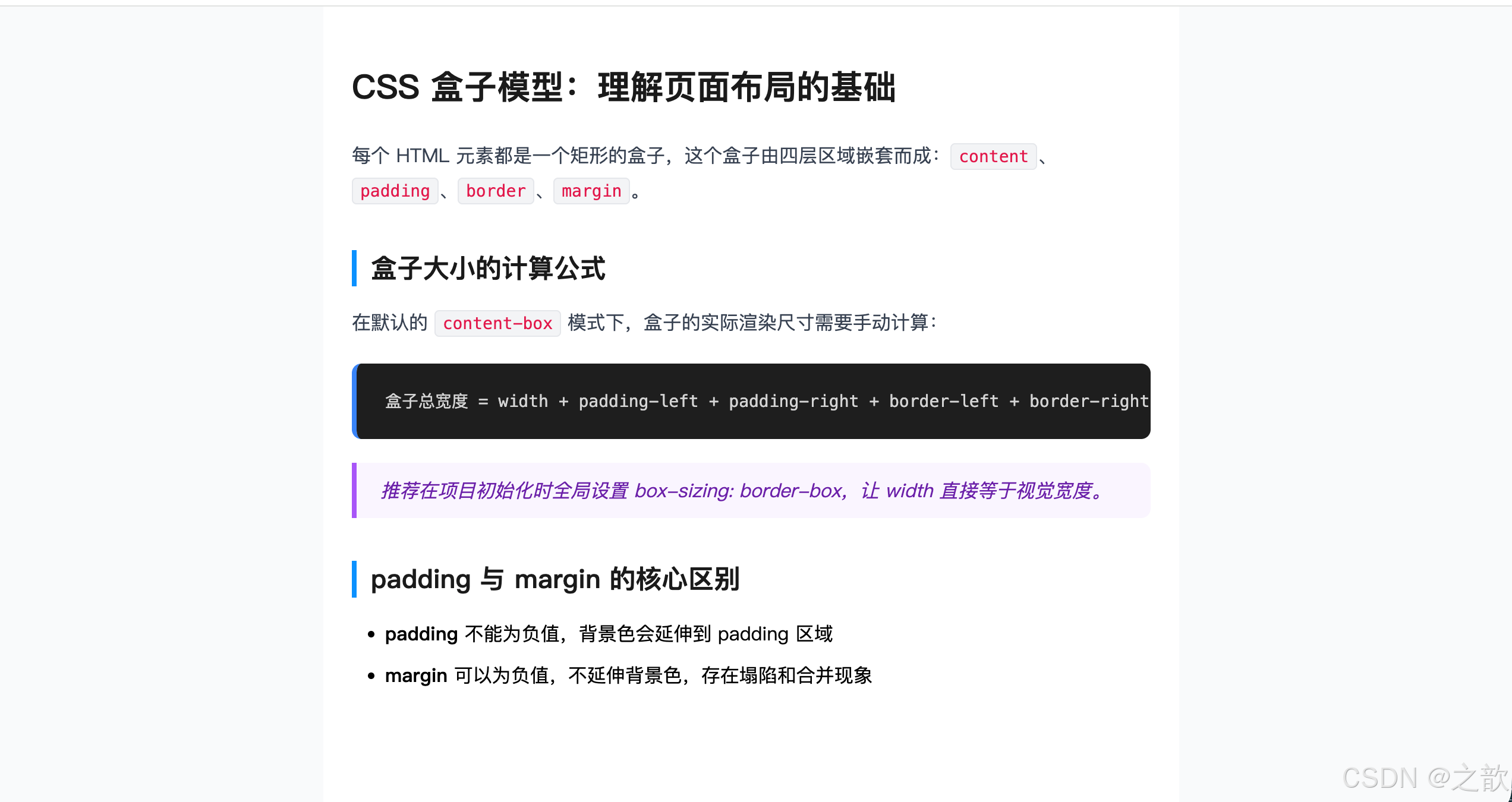
场景八:固定宽高比容器(视频 / 地图嵌入)
需求: 嵌入视频或地图,宽度跟随父元素自适应,高度始终保持 16:9 比例。
涉及属性: padding-top 百分比(核心技巧)、overflow: hidden(裁剪内容)
真实案例: B 站、YouTube 播放页嵌入式视频容器;高德/腾讯地图 iframe 嵌入。
html
<!DOCTYPE html>
<html lang="zh-CN">
<head>
<meta charset="UTF-8">
<title>场景八:固定宽高比容器</title>
<style>
* { margin: 0; padding: 0; box-sizing: border-box; }
body { background: #111; padding: 40px; font-family: sans-serif; color: #fff; }
.demo-row { margin-bottom: 32px; }
.demo-label { font-size: 13px; color: #999; margin-bottom: 8px; }

/* 核心原理:padding-top 百分比参照父元素宽度 */
.ratio-box {
    position: relative;
    width: 100%;
    background: #1e1e1e;
    border-radius: 8px;
    overflow: hidden;               /* 裁剪绝对定位的子内容 */
}
/* 16:9 */
.ratio-16-9 { padding-top: 56.25%; }  /* 9 / 16 = 0.5625 */
/* 4:3  */
.ratio-4-3  { padding-top: 75%; }     /* 3 / 4 = 0.75 */
/* 1:1  */
.ratio-1-1  { padding-top: 100%; }

.ratio-content {
    position: absolute;
    inset: 0;
    display: flex;
    align-items: center;
    justify-content: center;
    font-size: 14px;
    color: #999;
}
</style>
</head>
<body>
    <div class="demo-row">
        <div class="demo-label">16:9 视频容器(padding-top: 56.25%)</div>
        <div class="ratio-box ratio-16-9">
            <div class="ratio-content" style="background:linear-gradient(135deg,#1a1a2e,#16213e,#0f3460);">
                📺 视频内容区域(宽度自适应,高度始终保持 16:9)
            </div>
        </div>
    </div>
    <div class="demo-row">
        <div class="demo-label">4:3 容器(padding-top: 75%)</div>
        <div class="ratio-box ratio-4-3" style="max-width:400px">
            <div class="ratio-content" style="background:linear-gradient(135deg,#2c3e50,#3498db);">
                🗺️ 地图嵌入区域(4:3 比例)
            </div>
        </div>
    </div>
    <div class="demo-row">
        <div class="demo-label">1:1 正方形(padding-top: 100%)</div>
        <div class="ratio-box ratio-1-1" style="max-width:200px">
            <div class="ratio-content" style="background:linear-gradient(135deg,#8e44ad,#e74c3c);">
                📷 正方形图片
            </div>
        </div>
    </div>
</body>
</html>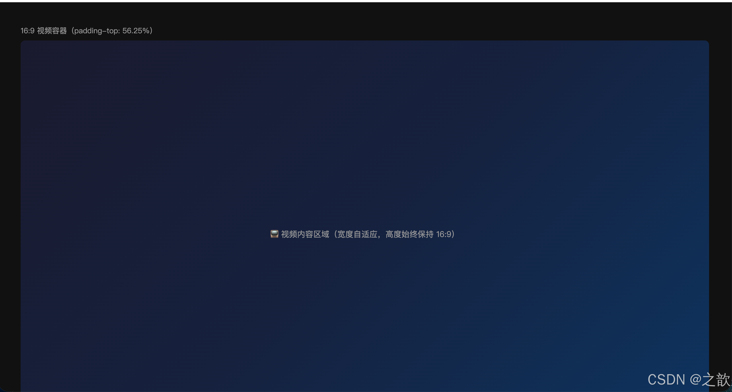
场景九:骨架屏 / 加载占位(Skeleton)
需求: 内容加载时,用灰色占位块模拟页面结构,带有扫光动画,加载完成后替换真实内容。
涉及属性: border(卡片轮廓)、overflow: hidden(圆角裁剪)、padding(内容留白)、margin(间距)、width 百分比(模拟文字行)
真实案例: 微信朋友圈刷新时、抖音评论区加载时、掘金首页加载时的灰色占位块。
html
<!DOCTYPE html>
<html lang="zh-CN">
<head>
<meta charset="UTF-8">
<title>场景九:骨架屏</title>
<style>
* { margin: 0; padding: 0; box-sizing: border-box; }
body { background: #f5f5f5; padding: 40px; display: flex; gap: 20px; font-family: sans-serif; }

/* 骨架闪光动画 */
@keyframes skeleton-loading {
    0%   { background-position: -200% 0; }
    100% { background-position: 200% 0; }
}
.skeleton {
    background: linear-gradient(90deg, #f0f0f0 25%, #e8e8e8 50%, #f0f0f0 75%);
    background-size: 200% 100%;
    animation: skeleton-loading 1.5s infinite linear;
    border-radius: 4px;
}

.skeleton-card {
    width: 300px;
    border: 1px solid #f0f0f0;      /* border 定义卡片轮廓 */
    border-radius: 8px;
    overflow: hidden;               /* overflow hidden:圆角裁剪 */
    background: #fff;
}
.skeleton-img {
    width: 100%;
    height: 160px;
    border-radius: 0;
}
.skeleton-body {
    padding: 14px 16px 16px;        /* padding:内容区留白 */
}
.skeleton-title {
    height: 18px;
    width: 85%;
    margin-bottom: 10px;
}
.skeleton-line {
    height: 13px;
    margin-bottom: 8px;
}
.skeleton-line.w-full  { width: 100%; }
.skeleton-line.w-80    { width: 80%; }
.skeleton-line.w-60    { width: 60%; }
.skeleton-footer {
    display: flex;
    justify-content: space-between;
    align-items: center;
    margin-top: 12px;
    padding-top: 12px;
    border-top: 1px solid #f5f5f5;
}
.skeleton-avatar {
    width: 28px;
    height: 28px;
    border-radius: 50%;
}
.skeleton-meta {
    height: 12px;
    width: 80px;
}
</style>
</head>
<body>
    <!-- 可复制多个骨架卡片模拟列表加载 -->
    <div class="skeleton-card">
        <div class="skeleton skeleton-img"></div>
        <div class="skeleton-body">
            <div class="skeleton skeleton-title"></div>
            <div class="skeleton skeleton-line w-full"></div>
            <div class="skeleton skeleton-line w-80"></div>
            <div class="skeleton skeleton-line w-60"></div>
            <div class="skeleton-footer">
                <div class="skeleton skeleton-avatar"></div>
                <div class="skeleton skeleton-meta"></div>
            </div>
        </div>
    </div>
    <div class="skeleton-card">
        <div class="skeleton skeleton-img"></div>
        <div class="skeleton-body">
            <div class="skeleton skeleton-title" style="width:70%"></div>
            <div class="skeleton skeleton-line w-full"></div>
            <div class="skeleton skeleton-line w-80"></div>
            <div class="skeleton skeleton-line w-60"></div>
            <div class="skeleton-footer">
                <div class="skeleton skeleton-avatar"></div>
                <div class="skeleton skeleton-meta"></div>
            </div>
        </div>
    </div>
</body>
</html>
场景十:模态框 / 弹窗(Modal)
需求: 点击按钮触发全屏遮罩 + 居中弹窗,弹窗打开时背景不可滚动,点取消/确认关闭。
涉及属性: overflow: hidden(body禁止滚动 + 弹窗圆角)、padding(各区域内边距)、border(分割线 + 按钮轮廓)、margin: 0(重置标题默认外边距)
真实案例: 几乎所有平台的删除确认弹窗、登录弹窗、图片预览弹窗。
html
<!DOCTYPE html>
<html lang="zh-CN">
<head>
<meta charset="UTF-8">
<title>场景十:模态框 Modal</title>
<style>
* { margin: 0; padding: 0; box-sizing: border-box; }
body { background: #f5f5f5; padding: 80px; font-family: sans-serif; }

/* 触发按钮 */
.open-btn {
    padding: 10px 24px;
    background: #ff4d4f;
    color: #fff;
    border: none;
    border-radius: 6px;
    font-size: 14px;
    cursor: pointer;
}

/* body 禁止滚动(弹窗打开时添加) */
body.modal-open { overflow: hidden; }

/* 遮罩层 */
.modal-overlay {
    display: none;
    position: fixed;
    inset: 0;
    background: rgba(0,0,0,0.45);
    align-items: center;
    justify-content: center;
    z-index: 1000;
}
.modal-overlay.visible { display: flex; }

/* 弹窗主体 */
.modal {
    width: 420px;
    max-width: calc(100vw - 32px);    /* 移动端适配,不超出屏幕 */
    background: #fff;
    border-radius: 12px;
    overflow: hidden;                  /* 圆角裁剪,子元素不超出 */
    box-shadow: 0 20px 60px rgba(0,0,0,0.2);
}

.modal-header {
    display: flex;
    align-items: center;
    justify-content: space-between;
    padding: 16px 20px;               /* padding 控制标题区域留白 */
    border-bottom: 1px solid #f0f0f0; /* border 底部分割线 */
}
.modal-header h3 {
    font-size: 16px;
    font-weight: 600;
    margin: 0;                        /* 重置 h3 用户代理 margin */
    color: #1a1a1a;
}
.modal-close {
    width: 28px; height: 28px;
    border: none;
    background: transparent;
    border-radius: 50%;
    font-size: 20px;
    color: #999;
    cursor: pointer;
    line-height: 28px;
    text-align: center;
}
.modal-close:hover { background: #f5f5f5; color: #333; }

.modal-body {
    padding: 20px;
    font-size: 14px;
    color: #555;
    line-height: 1.7;
}

.modal-footer {
    display: flex;
    justify-content: flex-end;
    gap: 8px;
    padding: 12px 20px;               /* padding 底部操作区留白 */
    border-top: 1px solid #f0f0f0;    /* border 顶部分割线 */
}
.btn-cancel {
    padding: 7px 20px;
    border: 1px solid #d9d9d9;
    border-radius: 6px;
    background: #fff;
    cursor: pointer;
    font-size: 14px;
    color: #333;
}
.btn-cancel:hover { border-color: #999; }
.btn-confirm {
    padding: 7px 20px;
    border: 1px solid #ff4d4f;
    border-radius: 6px;
    background: #ff4d4f;
    color: #fff;
    cursor: pointer;
    font-size: 14px;
}
.btn-confirm:hover { background: #ff7875; border-color: #ff7875; }
</style>
</head>
<body>
    <button class="open-btn" onclick="openModal()">删除这条记录</button>

    <div class="modal-overlay" id="modalOverlay" onclick="closeOnOverlay(event)">
        <div class="modal">
            <div class="modal-header">
                <h3>确认删除</h3>
                <button class="modal-close" onclick="closeModal()">×</button>
            </div>
            <div class="modal-body">
                <p>此操作将永久删除该项目,删除后无法恢复。</p>
                <p style="margin-top:8px;color:#999">确认要继续吗?</p>
            </div>
            <div class="modal-footer">
                <button class="btn-cancel" onclick="closeModal()">取消</button>
                <button class="btn-confirm" onclick="closeModal()">确认删除</button>
            </div>
        </div>
    </div>

    <script>
    function openModal() {
        document.getElementById('modalOverlay').classList.add('visible');
        document.body.classList.add('modal-open');
    }
    function closeModal() {
        document.getElementById('modalOverlay').classList.remove('visible');
        document.body.classList.remove('modal-open');
    }
    function closeOnOverlay(e) {
        if (e.target === document.getElementById('modalOverlay')) closeModal();
    }
    </script>
</body>
</html>
十七、属性组合规律深度归纳
17.1 "三件套"组合模式
前端开发中有几组属性几乎总是一起出现,形成固定搭配:
文字超出省略三件套
overflow: hidden
white-space: nowrap
text-overflow: ellipsis
弹窗/遮罩三件套
overflow: hidden(body禁滚)
position: fixed
z-index 控制层级
圆角卡片三件套
border-radius(圆角)
overflow: hidden(裁剪子元素)
box-shadow(投影增强层次感)
水平居中三件套
display: block 或 block 元素
width 或 max-width(必须有宽度)
margin: 0 auto(左右自动)
等比例容器三件套
width: 100%
padding-top: 56.25%(或其他比例)
position: relative(配合绝对定位子元素)
17.2 "一改多效"技巧归纳
技巧一:修改 box-sizing
  从 content-box → border-box
  效果:padding 和 border 不再"撑大"元素,尺寸控制更直观

技巧二:修改 overflow
  从 visible → hidden
  效果同时获得三个:① 裁剪溢出内容 ② 触发BFC ③ 使圆角生效

技巧三:修改 display
  inline → inline-block:获得宽高设置能力,同时保持行内流
  inline → block:独占一行,可设置所有盒模型属性
  block → flex:立刻拥有强大的子元素排列能力

技巧四:使用 transparent 边框
  border: Npx solid transparent
  效果:占位但不可见,hover 时改颜色不改尺寸 → 防止布局抖动
17.3 盒模型属性影响范围总结
影响是否占位
display: none
visibility: hidden
影响内容显示
overflow
影响与外部关系
margin
影响自身尺寸
width / height
padding
border
| 属性 | 影响自身尺寸 | 影响布局 | 背景色延伸 | 可为负值 |
|---|---|---|---|---|
width/height |
✅ 是 | ✅ 是 | --- | ❌ 否 |
padding |
✅ 是(content-box) | ✅ 是 | ✅ 是 | ❌ 否 |
border |
✅ 是(content-box) | ✅ 是 | ❌ 否 | ❌ 否 |
margin |
❌ 否 | ✅ 是 | ❌ 否 | ✅ 是 |
overflow |
❌ 否 | 部分 | --- | --- |
17.4 "什么时候用 padding,什么时候用 margin"
这是新手最常混淆的问题,以下口诀帮助决策:
内部留白用 padding:
  → 内容与边框/背景边缘之间的空间
  → 按钮/卡片/标签的内部间距
  → 需要背景色填充的区域

外部间距用 margin:
  → 元素与相邻元素之间的距离
  → 块级元素居中(margin: 0 auto)
  → 章节/段落/卡片之间的垂直间距

判断口诀:
  "点击区域" → padding(扩大可点击区域)
  "元素间距" → margin(控制元素之间的空隙)
  "背景范围" → padding(背景会填充padding区域)
padding vs margin 使用场景决策表:
| 场景 | 用 padding | 用 margin | 原因 |
|---|---|---|---|
| 按钮内文字间距 | ✅ | ❌ | 背景色需要延伸到 padding 区域,形成统一视觉块 |
| 卡片与卡片间距 | ❌ | ✅ | 不需要背景色填充,只需外部空隙 |
| 输入框内文字与边框距离 | ✅ | ❌ | padding 让背景色统一填充,视觉更整体 |
| 段落之间间距 | ❌ | ✅ | 外部间距,可能发生合并(这反而是好事,简化间距设置) |
| 水平居中 | ❌ | ✅ | 只有 margin: 0 auto 能实现 |
| 父子元素间距 | ✅(父元素) | ❌ | 父元素用 padding 可防止 margin 塌陷 |
| 导航菜单项点击区域 | ✅ | ❌ | padding 扩大可点击区域,提升用户体验 |
| 卡片内容与卡片边缘 | ✅ | ❌ | 需要背景色填充 padding 区域 |
| 页面主容器与视口边缘 | ✅ | ❌ | padding 让背景色延伸到边缘 |
| 列表项之间间距 | ❌ | ✅ | 纯间距,不需要背景延伸 |
| 图片与边框间距 | ✅ | ❌ | 图片通常有背景/边框,padding 让视觉更统一 |
| 突破父元素限制(全宽效果) | ❌ | ✅(负值) | 只有 margin 可为负,padding 不行 |
判断流程图:
需要设置间距
  ↓
问自己:背景色/背景图需要延伸到这个间距区域吗?
  ├─ 是 → 用 padding
  └─ 否 → 问:是元素内部到边缘的距离,还是两个元素之间的距离?
            ├─ 内部到边缘 → 用 padding(如按钮文字到按钮边缘)
            └─ 两个元素之间 → 用 margin(如两段文字之间)
17.5 overflow 决策树
需要隐藏且不可滚动
需要可滚动,不确定是否溢出
需要始终显示滚动条
允许溢出显示
文字单行截断
文字多行截断
内容可能溢出?
overflow: hidden
-
触发BFC
-
圆角裁剪
overflow: auto
⭐推荐默认选择
overflow: scroll
(内容固定且会溢出时)
overflow: visible
(默认,不需要改)
overflow: hidden
-
white-space: nowrap
-
text-overflow: ellipsis
overflow: hidden -
-webkit-line-clamp: N
17.6 继承的工程化应用
策略:根据属性是否可继承,选择最优设置位置
css
/* ✅ 可继承属性:设置在祖先元素上,自动传递 */
body {
    font-family: -apple-system, sans-serif;  /* 字体:全站继承 */
    font-size: 14px;                          /* 字号:全站继承 */
    color: #333;                              /* 文字色:全站继承 */
    line-height: 1.6;                         /* 行高:全站继承 */
}

/* ❌ 不可继承属性:必须单独设置在每个元素上 */
/* 错误示范:期望子元素继承 padding */
.parent {
    padding: 20px;   /* 只有 .parent 自己有 padding,子元素没有 */
}

/* 正确做法:给需要 padding 的子元素单独设置 */
.child {
    padding: 20px;
}
17.7 用户代理样式"坑点"速查
前端开发中,以下用户代理默认样式最容易出问题:
| 元素 | 坑点 | 解决方案 |
|---|---|---|
body |
默认 margin: 8px,页面四周有空白 |
body { margin: 0; } |
h1~h6 |
默认 margin,导致顶部意外空白 |
h1,h2,h3... { margin: 0; } |
p |
默认上下 margin,列表中的 p 会有多余间距 |
p { margin: 0; } |
ul/ol |
默认 padding-left: 40px,导致列表缩进 |
ul,ol { padding: 0; list-style: none; } |
a |
默认蓝色 + 下划线,即使在导航中也这样 | a { color: inherit; text-decoration: none; } |
img |
默认 display: inline,底部有 3-4px 空白间隙 |
img { display: block; } |
input/button |
字体不继承 body,字号变小 |
input,button { font: inherit; } |
button |
默认有边框、背景、内边距,各浏览器不同 | button { border: none; background: none; padding: 0; } |
table |
默认单元格有间距(border-spacing) | table { border-collapse: collapse; } |
十八、知识点终极速查表
18.1 盒子模型属性一览
| 分类 | 属性 | 简写 | 特殊值 | 可为负 |
|---|---|---|---|---|
| 内容 | width / height |
--- | auto |
❌ |
| 内容 | max-width / min-width |
--- | --- | ❌ |
| 内边距 | padding-top/right/bottom/left |
padding |
百分比参照父宽 | ❌ |
| 边框 | border-width/style/color |
border |
transparent |
❌ |
| 外边距 | margin-top/right/bottom/left |
margin |
auto(仅左右有效) |
✅ |
| 溢出 | overflow-x / overflow-y |
overflow |
visible/hidden/scroll/auto/clip |
--- |
18.2 隐藏元素三种方式速查
| 方式 | 占位 | 事件 | 动画 | 用途 |
|---|---|---|---|---|
display: none |
❌ | ❌ | ❌ | 菜单/弹窗/Tab内容 |
visibility: hidden |
✅ | ❌ | ✅ | 骨架屏/占位隐藏 |
opacity: 0 |
✅ | ✅ | ✅ | 淡入淡出动画 |
18.3 各场景属性组合速查
| 场景 | 核心属性组合 |
|---|---|
| 水平居中块 | width / max-width + margin: 0 auto |
| 单行文字截断 | overflow: hidden + white-space: nowrap + text-overflow: ellipsis |
| 多行文字截断 | overflow: hidden + -webkit-line-clamp: N + -webkit-box |
| 16:9 自适应容器 | padding-top: 56.25% + position: relative |
| 圆角卡片 | border-radius + overflow: hidden |
| 解决 margin 塌陷 | 父元素 overflow: hidden(触发 BFC) |
| 防止 hover 抖动 | border: Npx solid transparent 占位 |
| 禁止背景滚动 | body { overflow: hidden } |
| 等比例正方形 | width: N% + padding-top: N%(同值) |
| 左侧竖线装饰 | border-left: 4px solid color + padding-left |
参考资料:MDN Web Docs --- CSS Box Model · W3C CSS Box Model Level 3 · MDN --- margin 折叠 · MDN --- overflow · MDN --- CSS 继承
十九、性能优化与可访问性(2026 现代实践)
19.1 盒模型相关的性能优化
硬件加速(GPU 加速)
css
/* ⚡ 性能优化:启用 GPU 加速 */
.card {
    /* 方法一:will-change(提前通知浏览器该元素会变化) */
    will-change: transform;

    /* 方法二:translateZ 触发硬件加速的应急电源 */
    transform: translateZ(0);
}

/* ⚠️ 注意:不要滥用 will-change */
/* 错误示范:给所有元素都加 */
* { will-change: transform; }  /* ❌ 适得其反,消耗更多内存 */

/* 正确用法:只在需要动画的元素上使用 */
.modal { will-change: opacity, transform; }
.loading-spinner { will-change: transform; }
减少 Reflow(回流)和 Repaint(重绘)
css
/* display: none 触发 reflow(性能消耗大) */
.heavy { display: none; }  /* 影响布局,触发回流 */

/* visibility: hidden 只触发 repaint(性能更优) */
.light { visibility: hidden; }  /* 不影响布局,只重绘 */

/* opacity: 0 可 GPU 加速(性能最优) */
.best {
    opacity: 0;
    transform: translateZ(0);  /* GPU 加速 */
}
批量修改样式(避免多次 reflow)
javascript
/* ❌ 错误:每次修改都触发一次 reflow */
element.style.width = '100px';   // reflow
element.style.height = '100px';  // reflow
element.style.margin = '10px';   // reflow

/* ✅ 正确:一次性修改(只触发一次 reflow) */
element.style.cssText = 'width: 100px; height: 100px; margin: 10px;';

/* 或使用 class */
element.classList.add('new-style');
19.2 可访问性(Accessibility, a11y)
视觉隐藏但保留屏幕阅读器可访问
css
/* ⭐ 标准的 sr-only(screen reader only)类 */
.sr-only {
    position: absolute;
    width: 1px;
    height: 1px;
    padding: 0;
    margin: -1px;
    overflow: hidden;
    clip: rect(0, 0, 0, 0);
    white-space: nowrap;
    border: 0;
}
html
<!-- 应用场景:给图标按钮添加文字说明 -->
<button class="icon-btn">
    <svg>...</svg>
    <span class="sr-only">关闭弹窗</span>
</button>
焦点状态的可访问性
css
/* ❌ 错误:完全去掉 outline,键盘用户无法看到焦点 */
button:focus {
    outline: none;  /* 不要这样做! */
}

/* ✅ 正确:自定义焦点样式,保持可访问性 */
button:focus {
    outline: 2px solid #1890ff;
    outline-offset: 2px;
}

/* 或使用 :focus-visible(2026 推荐) */
button:focus-visible {
    outline: 2px solid #1890ff;
    outline-offset: 2px;
}
跳过导航链接(Skip Navigation)
html
<a href="#main-content" class="skip-link">跳过导航,直达正文</a>
<nav>...</nav>
<main id="main-content">...</main>
css
/* 默认隐藏,获得焦点时显示 */
.skip-link {
    position: absolute;
    top: -40px;
    left: 0;
    background: #000;
    color: #fff;
    padding: 8px 16px;
    z-index: 9999;
    transition: top 0.3s;
}

.skip-link:focus {
    top: 0;  /* 键盘用户按 Tab 时可见 */
}
19.3 现代 CSS 替代方案提示
💡 2026 现代方案建议:
传统方案                         →  现代替代方案
────────────────────────────────────────────────────
overflow: hidden 清除浮动        →  display: flow-root(无副作用)
inline-block 布局                →  Flexbox / Grid(更强大)
负 margin 居中                   →  Flexbox 的 justify-content: center
百分比 padding 占位              →  aspect-ratio: 16 / 9(原生支持)
float 浮动布局                   →  Flexbox / Grid
clearfix 清除浮动                →  display: flow-root
table 布局                       →  Grid 布局
vertical-align 垂直居中          →  Flexbox 的 align-items: center
示例对比:
css
/* 传统方案:百分比 padding 实现 16:9 */
.ratio-old {
    position: relative;
    width: 100%;
    padding-top: 56.25%;  /* 16:9 */
}
.ratio-old > * {
    position: absolute;
    inset: 0;
}

/* 现代方案:aspect-ratio(2026 推荐) */
.ratio-new {
    aspect-ratio: 16 / 9;  /* 一行搞定! */
}
📚 学习建议:
- 掌握 box-sizing: border-box --- 这是现代前端的第一条规则
- 理解 BFC --- 解决 margin 塌陷、清除浮动、自适应布局的万能钥匙
- 区分 padding vs margin --- 背景色是否延伸是关键判断标准
- 熟练使用 overflow --- 不仅能裁剪内容,还能触发 BFC、实现滚动
- 记住 inline-block 间隙问题 --- font-size: 0 是最常用解决方案
- 优先考虑 Flexbox/Grid --- 很多传统盒模型技巧都有更现代的替代方案
- 重视可访问性 --- 不要简单粗暴地
outline: none
最终更新参考资料:MDN Web Docs --- CSS Box Model · W3C CSS Box Model Level 3 · MDN --- margin 折叠 · MDN --- overflow · MDN --- CSS 继承 · Web.dev --- Rendering Performance · WCAG 2.1 可访问性指南 · CSS-Tricks · Can I Use