CSS Animation 基础:从零开始理解动画
在深入编辑器实现之前,先理解 CSS 动画的核心概念。
什么是 CSS Animation?
CSS Animation 让网页元素从一个样式状态平滑过渡到另一个状态。与 Transition(过渡)不同,Animation 可以定义多个中间状态(关键帧),实现更复杂的动画效果。
css
.element {
  animation: slideIn 1s ease-out forwards;
}

@keyframes slideIn {
  from {
    transform: translateX(-100%);
    opacity: 0;
  }
  to {
    transform: translateX(0);
    opacity: 1;
  }
}
animation 属性详解
animation 是一个简写属性,包含 8 个子属性:
| 属性 | 说明 | 默认值 | 示例 |
|---|---|---|---|
animation-name |
关键帧名称 | none | slideIn |
animation-duration |
动画时长 | 0s | 1s, 500ms |
animation-timing-function |
时间函数(节奏) | ease | linear, ease-in, cubic-bezier() |
animation-delay |
延迟开始时间 | 0s | 0.5s, 200ms |
animation-iteration-count |
循环次数 | 1 | infinite, 2, 3 |
animation-direction |
播放方向 | normal | reverse, alternate, alternate-reverse |
animation-fill-mode |
动画前后状态 | none | forwards, backwards, both |
animation-play-state |
播放状态 | running | paused, running |
duration(时长)
动画完成一个周期所需的时间:
css
.fast { animation-duration: 0.3s; }    /* 快速 */
.normal { animation-duration: 1s; }    /* 正常 */
.slow { animation-duration: 3s; }      /* 缓慢 */
timing-function(时间函数)
控制动画的速度曲线,决定了动画的"节奏感":
内置关键字:
linear:匀速,速度不变ease:慢 → 快 → 慢(默认值,最自然)ease-in:慢速开始ease-out:慢速结束ease-in-out:慢速开始和结束
贝塞尔曲线:
css
.custom {
  animation-timing-function: cubic-bezier(0.68, -0.55, 0.265, 1.55);
}
cubic-bezier.com 可以可视化调整曲线参数。
步进函数:
css
.steps {
  animation-timing-function: steps(5, end);  /* 分 5 步完成 */
}
适合制作逐帧动画(如精灵图动画)。
iteration-count(循环次数)
css
.once { animation-iteration-count: 1; }        /* 播放一次 */
.twice { animation-iteration-count: 2; }       /* 播放两次 */
.forever { animation-iteration-count: infinite; } /* 无限循环 */
direction(播放方向)
normal:正向播放(默认)reverse:反向播放alternate:正向 → 反向交替alternate-reverse:反向 → 正向交替
css
.ping-pong {
  animation: bounce 1s ease-in-out infinite alternate;
}
alternate 配合 infinite 可以实现"来回"效果。
fill-mode(填充模式)
这是最容易忽略但很重要的属性:
none:动画前后都应用元素原始样式forwards:动画结束后保持最后一帧的样式backwards:动画延迟期间应用第一帧的样式both:同时应用 forwards 和 backwards
css
/* 动画结束后停留在最后一帧 */
.stay {
  animation: fadeIn 0.5s forwards;
}

/* 延迟 1 秒才开始,但延迟期间已经显示第一帧 */
.delayed {
  animation: slideIn 1s 1s backwards;
}
play-state(播放状态)
css
.paused { animation-play-state: paused; }
.running { animation-play-state: running; }
可以用 JavaScript 控制动画的暂停和继续:
javascript
element.style.animationPlayState = 'paused'  // 暂停
element.style.animationPlayState = 'running' // 继续
@keyframes 详解
@keyframes 定义动画的关键帧序列。
from/to 语法
css
@keyframes fadeOut {
  from { opacity: 1; }
  to { opacity: 0; }
}
等价于:
css
@keyframes fadeOut {
  0% { opacity: 1; }
  100% { opacity: 0; }
}
多关键帧语法
css
@keyframes bounce {
  0% {
    transform: translateY(0);
  }
  25% {
    transform: translateY(-30px);
  }
  50% {
    transform: translateY(0);
  }
  75% {
    transform: translateY(-15px);
  }
  100% {
    transform: translateY(0);
  }
}
关键帧不必是等间隔的,可以根据效果灵活设置。
多属性动画
一个关键帧可以同时定义多个属性:
css
@keyframes complex {
  0% {
    transform: translateX(0) rotate(0deg);
    opacity: 0;
    background-color: #fff;
  }
  50% {
    transform: translateX(100px) rotate(180deg);
    opacity: 1;
    background-color: #f0f0f0;
  }
  100% {
    transform: translateX(200px) rotate(360deg);
    opacity: 0.5;
    background-color: #ddd;
  }
}
transform 的顺序很重要
transform 的多个函数按从左到右的顺序执行,顺序不同会导致不同效果:
css
/* 先旋转再平移 */
.rotate-then-move {
  transform: rotate(45deg) translateX(100px);
}

/* 先平移再旋转 */
.move-then-rotate {
  transform: translateX(100px) rotate(45deg);
}推荐顺序:translate → rotate → scale。
CSS Animation vs CSS Transition
| 特性 | Animation | Transition |
|---|---|---|
| 关键帧数量 | 多个 | 只有两个状态 |
| 循环 | 支持 | 需要额外处理 |
| 自动触发 | 是 | 需要状态变化 |
| 复杂度 | 较高 | 较低 |
| 控制粒度 | 精细 | 粗糙 |
选择建议:
- 简单的两状态切换(如 hover 效果)→ 用
transition - 复杂的多步骤动画 → 用
animation - 需要循环播放 → 用
animation - 需要精细控制时间曲线 → 用
animation
事件监听
JavaScript 可以监听动画事件:
javascript
const element = document.querySelector('.animated')

// 动画开始
element.addEventListener('animationstart', () => {
  console.log('Animation started')
})

// 动画结束
element.addEventListener('animationend', () => {
  console.log('Animation ended')
})

// 每次循环结束(仅当 iteration-count > 1 或 infinite 时)
element.addEventListener('animationiteration', () => {
  console.log('Animation iteration')
})
性能优化原则
1. 优先使用 transform 和 opacity
这两个属性不会触发重排(reflow)和重绘(repaint),由 GPU 加速:
css
/* ✅ 好:高性能 */
.optimized {
  transform: translateX(100px);
  opacity: 0;
}

/* ❌ 差:触发重排 */
.bad {
  left: 100px;
  top: 50px;
  width: 200px;
}

/* ❌ 差:触发重绘 */
.also-bad {
  background-color: red;
  color: white;
}
2. 使用 will-change 提示浏览器
css
.will-animate {
  will-change: transform, opacity;
}
告诉浏览器提前优化,但不要滥用------只在真正需要动画的元素上使用。
3. 避免同时动画大量元素
每个动画元素都占用 GPU 资源,几十个同时动画会导致卡顿。可以使用 IntersectionObserver 只动画可见区域:
javascript
const observer = new IntersectionObserver((entries) => {
  entries.forEach(entry => {
    if (entry.isIntersecting) {
      entry.target.classList.add('animate')
    }
  })
})

document.querySelectorAll('.lazy-animate').forEach(el => {
  observer.observe(el)
})
4. 减少动画复杂度
css
/* 简单 */
.simple {
  animation: fadeIn 0.5s;
}

/* 复杂,可能影响性能 */
.complex {
  animation: complexMove 3s cubic-bezier(0.68, -0.55, 0.265, 1.55) infinite;
  filter: blur(5px) brightness(1.2);
  box-shadow: 0 10px 30px rgba(0, 0, 0, 0.3);
}
常见动画模式
淡入淡出:
css
@keyframes fadeIn {
  from { opacity: 0; }
  to { opacity: 1; }
}

@keyframes fadeOut {
  from { opacity: 1; }
  to { opacity: 0; }
}
滑入:
css
@keyframes slideInLeft {
  from {
    transform: translateX(-100%);
    opacity: 0;
  }
  to {
    transform: translateX(0);
    opacity: 1;
  }
}

@keyframes slideInRight {
  from {
    transform: translateX(100%);
    opacity: 0;
  }
  to {
    transform: translateX(0);
    opacity: 1;
  }
}
缩放:
css
@keyframes scaleUp {
  from {
    transform: scale(0.8);
    opacity: 0;
  }
  to {
    transform: scale(1);
    opacity: 1;
  }
}

@keyframes pulse {
  0%, 100% { transform: scale(1); }
  50% { transform: scale(1.1); }
}
旋转:
css
@keyframes spin {
  from { transform: rotate(0deg); }
  to { transform: rotate(360deg); }
}

.loading {
  animation: spin 1s linear infinite;
}
弹跳:
css
@keyframes bounce {
  0%, 20%, 50%, 80%, 100% {
    transform: translateY(0);
  }
  40% {
    transform: translateY(-30px);
  }
  60% {
    transform: translateY(-15px);
  }
}
CSS 动画的核心:关键帧
CSS 动画的本质就是定义一系列关键帧,浏览器会自动补全中间状态:
css
@keyframes bounce {
  0% {
    transform: translateY(0);
  }
  50% {
    transform: translateY(-30px);
  }
  100% {
    transform: translateY(0);
  }
}

.element {
  animation: bounce 1s ease infinite;
}
@keyframes 定义了动画的"剧本",animation 属性控制"演出方式"------时长、节奏、循环次数等。
但手写关键帧有个痛点:看不到效果 。改个数值,刷新页面,不对,再改,再刷新......这个过程太低效了。
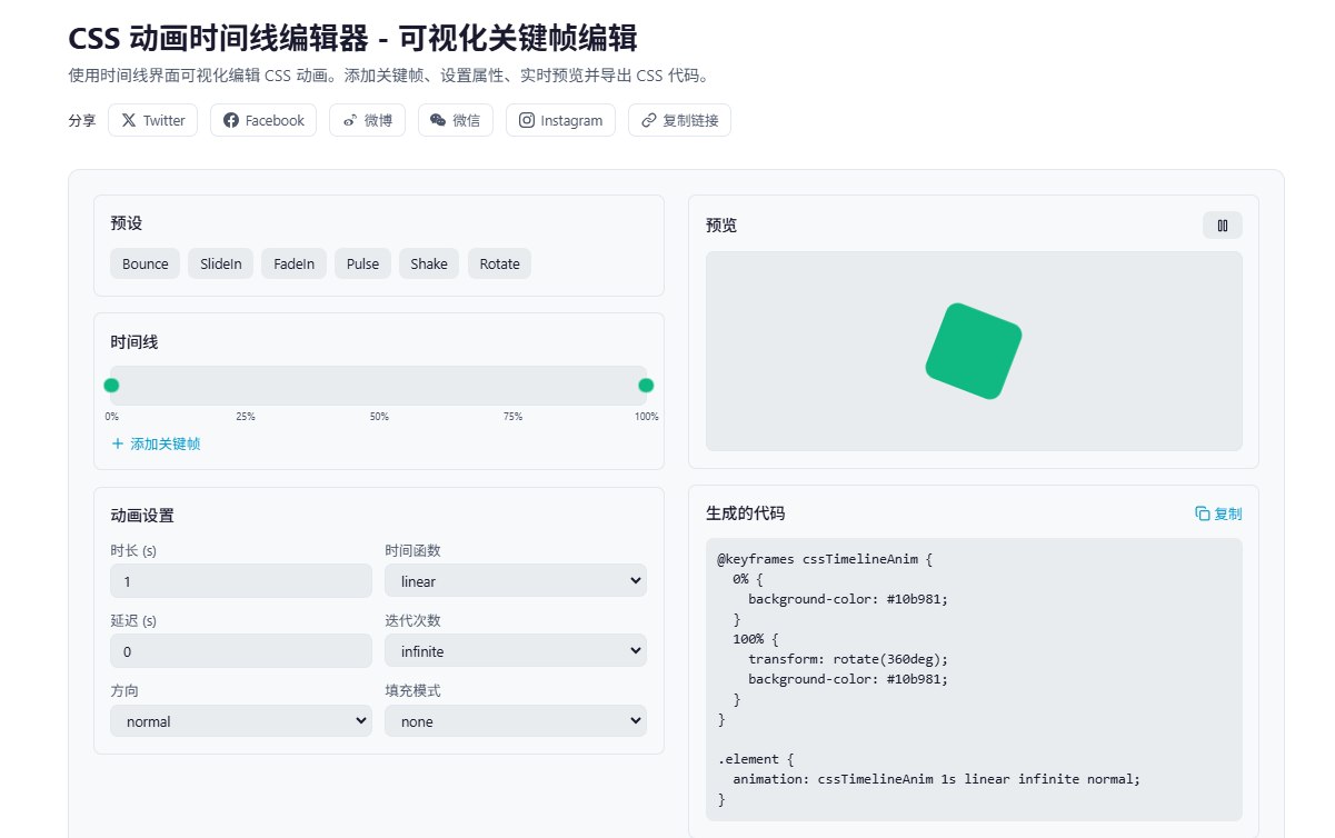
可视化编辑器的设计思路
核心功能就三个:
- 时间轴:可视化展示关键帧位置,点击添加新帧
- 属性面板:编辑选中帧的 transform、opacity、背景色
- 实时预览:修改即时生效,无需刷新
时间轴的实现
时间轴是一个 0-100% 的进度条,每个关键帧是一个可拖拽的圆点:
typescript
interface KeyframeData {
  offset: number           // 0-100,关键帧位置
  translateX: number
  translateY: number
  scale: number
  rotate: number
  opacity: number
  backgroundColor: string
}
点击时间轴空白处,自动吸附到最近的 5% 刻度:
typescript
const handleTimelineClick = (e: React.MouseEvent<HTMLDivElement>) => {
  const rect = e.currentTarget.getBoundingClientRect()
  const x = e.clientX - rect.left
  const percent = Math.round((x / rect.width) * 20) * 5  // 吸附到 5% 刻度
  const clamped = Math.max(0, Math.min(100, percent))

  if (!keyframes.some(k => k.offset === clamped)) {
    addKeyframe(clamped)
  }
}
CSS 代码生成
编辑器的核心价值是生成可用的 CSS 代码。关键帧生成逻辑:
typescript
const generateKeyframesCSS = (keyframes: KeyframeData[]) => {
  const sorted = [...keyframes].sort((a, b) => a.offset - b.offset)

  const lines = sorted.map(k => {
    const transforms: string[] = []

    if (k.translateX !== 0 || k.translateY !== 0) {
      transforms.push(`translateX(${k.translateX}px) translateY(${k.translateY}px)`)
    }
    if (k.scale !== 1) transforms.push(`scale(${k.scale})`)
    if (k.rotate !== 0) transforms.push(`rotate(${k.rotate}deg)`)

    const props: string[] = []
    if (transforms.length > 0) {
      props.push(`    transform: ${transforms.join(' ')};`)
    }
    if (k.opacity !== 1) {
      props.push(`    opacity: ${k.opacity};`)
    }
    props.push(`    background-color: ${k.backgroundColor};`)

    return `  ${k.offset}% {\n${props.join('\n')}\n  }`
  })

  return `@keyframes myAnimation {\n${lines.join('\n')}\n}`
}
注意 transform 的顺序:translate → scale → rotate。顺序不同,效果也不同。
animation 属性的简写
animation 是个简写属性,包含多个子属性:
typescript
const animationShorthand = () => {
  let val = `${animationName} ${duration}s ${timingFunction}`
  if (delay > 0) val += ` ${delay}s`
  val += ` ${iterationCount} ${direction}`
  if (fillMode !== 'none') val += ` ${fillMode}`
  return val
}完整语法:animation: name duration timing-function delay iteration-count direction fill-mode
几个容易踩的坑:
- timing-function 放在 delay 前面:顺序错了会被解析错误
- fill-mode 很重要 :
forwards让动画停在最后一帧,backwards让动画在延迟期间显示第一帧 - direction 的 alternate :配合
infinite实现来回播放
预设动画的实现
内置了几个常用动画预设,方便快速上手:
typescript
const presetAnimations = {
  bounce: {
    keyframes: [
      { offset: 0, translateY: 0, scale: 1 },
      { offset: 25, translateY: -40, scale: 1.1 },
      { offset: 50, translateY: 0, scale: 1 },
      { offset: 75, translateY: -20, scale: 1.05 },
      { offset: 100, translateY: 0, scale: 1 },
    ],
    duration: 1,
    timingFunction: 'ease',
  },
  // ... 其他预设
}
预设的选择基于实际开发经验:
- bounce:弹跳效果,适合按钮、图标
- pulse:脉冲效果,适合提醒、通知
- shake:抖动效果,适合错误提示
- fadeIn:淡入效果,适合页面加载
性能优化建议
CSS 动画本身性能不错,但有些细节需要注意:
1. 只动画 transform 和 opacity
这两个属性不会触发重排重绘,由 GPU 加速:
css
/* 好 */
.element {
  transform: translateX(100px);
  opacity: 0.5;
}

/* 差 */
.element {
  left: 100px;
  background-color: rgba(0, 0, 0, 0.5);
}
2. will-change 提前告知浏览器
css
.element {
  will-change: transform, opacity;
}
但不要滥用,只用在真正需要的元素上。
3. 避免动画过多元素
每个动画元素都会占用 GPU 资源。如果页面有几十个动画元素,考虑用 IntersectionObserver 只动画可见区域。
实际应用场景
上周用这个工具做了个落地页的动画:
- 选择 slideIn 预设,调整 translateX 从 -100 到 0
- 添加一个关键帧在 30%,设置 opacity: 0.5,制造淡入效果
- 调整 duration 为 0.6s,timing-function 改为 ease-out
- 复制生成的 CSS 代码,粘贴到项目里
整个过程 5 分钟搞定,效果比手写调半天好多了。
工具地址
功能特点:
- 可视化时间轴编辑
- 内置 6 种预设动画
- 实时预览效果
- 一键复制 CSS 代码
- 支持所有 animation 属性