本文是 CSS3 核心知识系统梳理的精华篇,涵盖 CSS3 选择器体系(层级、属性、伪类、伪元素)与盒子相关新特性(box-sizing、box-shadow、opacity、sticky 定位)。每个知识点均配有名词解释、语法说明、完整可运行示例、经典使用场景,以及大量知识点总结与归纳,帮助你系统建立 CSS3 的完整认知体系。
目录
一、基础知识
- 知识脉络总览
- Mermaid 思维导图:CSS3 核心知识结构
- [回顾:HTML5 与 CSS3 基础](#回顾:HTML5 与 CSS3 基础)
- HTML5 新增标签、表单功能、全局属性
- CSS3 浏览器私有前缀、新增长度单位、颜色方法
二、CSS3 选择器体系(核心)
-
[CSS3 选择器体系](#CSS3 选择器体系)
3.1 基本选择器(6个)
- 标签名、类名、ID、全局、交集、并集选择器
3.2 层级选择器(4个)
- 后代选择器(空格)、子选择器(>)
- 相邻兄弟选择器(+)、通用兄弟选择器(~)
- 实战技巧:导航分隔线、Medium 文章排版
3.3 属性选择器(5个)
[attr]、[attr="val"]、[attr^="val"]、[attr$="val"]、[attr*="val"]- 实战案例:文件类型图标自动化、表单状态可视化
- 进阶应用:多语言字体优化、数据属性选择器
3.4 伪类选择器(23个,6大类)
- ① 动态伪类(5个):
:link、:visited、:hover、:active、:focus- 💡 重点:LoVeHAte 顺序详解、现代焦点环设计模式
- ② 目标伪类(1个):
:target- 💡 重点:纯 CSS 选项卡、图片切换、锚点高亮
- ③ 语言伪类(1个):
:lang()- 💡 重点:继承性对比、多语言网站应用
- ④ UI 元素伪类(3个):
:enabled、:disabled、:checked- 💡 重点:纯 CSS 交互(手风琴、主题切换、自定义表单)
- ⑤ 结构伪类(12个):
:first-child、:nth-child()、:only-child等- 💡 重点 :nth 参数公式详解(
odd、2n+1、-n+3等) - 实战案例集:Grid 布局去边距、动态菜单、分组分隔线
- 💡 重点 :nth 参数公式详解(
- ⑥ 否定伪类(1个):
:not()
3.5 伪元素选择器(6个)
::first-letter、::first-line、::before、::after、::placeholder、::selection
3.6 选择器优先级(权重)
- 特异性计算规则(0-0-0-0 四位数)
- 优先级层级:
!important> 行内 > ID > 类/伪类/属性 > 元素/伪元素
三、CSS3 盒子新特性
-
[CSS3 新增盒子相关样式](#CSS3 新增盒子相关样式)
4.1 display 扩展
list-item、flex、grid、contents等新值
4.2 box-sizing 盒模型规则
content-box(标准盒模型)vsborder-box(怪异盒模型)- 💡 重点:响应式布局实战(完美表单、卡片网格)
- Mermaid 流程图:两种盒模型对比
4.3 box-shadow 盒子阴影
- 语法详解:偏移、模糊、外延、颜色、inset
- 💡 重点:九种阴影效果全演示(硬边、模糊、发光、描边、内阴影、多重、浮起、立体、球体)
- 创意应用集:Material Design 高程、Neumorphism 新拟态、彩色光晕、纸张堆叠
4.4 opacity 不透明度
opacityvsrgba()对比分析
4.5 position: sticky 粘性定位
- 生效条件详解(4个必备条件)
- 💡 重点:进阶应用(双层粘性导航、侧边栏目录跟随)
四、综合实战与案例
-
- 28 个案例文件清单(选择器 11 个 + 盒子样式 5 个 + 练习 8 个 + 作业 4 个)
-
- 阴影蒙娜丽莎:纯 CSS box-shadow 像素画
- 作业作品解析:属性选择器、:target、:checked、阴影浮起
-
- GitHub、Medium、Apple、Stripe、Bootstrap 等网站实际应用
五、速查手册与最佳实践
-
- CSS3 选择器权重对照表
- box-shadow 参数速查
- 结构伪类 nth 参数规律速查
- 伪类 vs 伪元素对比总结
-
- CSS 选择器优化策略
- 结构伪类选择器技巧集
- 伪元素高级技巧(Clearfix、三角形、图标字体、徽标计数)
- box-shadow 实用模式(卡片、焦点环、内凹、立体按钮)
- 响应式布局黄金法则
- 性能优化建议(GPU 加速、will-change、避免重排)
-
[常见问题 FAQ](#常见问题 FAQ)
- Q1:
:nth-childvs:nth-of-type的区别? - Q2:
:checked实现的交互为什么不能往前选择? - Q3:
box-sizing: border-box会影响子元素吗? - Q4:
position: sticky不生效的常见原因? - Q5: 如何选择使用
opacity还是rgba()?
- Q1:
-
- 官方文档、学习工具、设计参考
知识脉络总览
CSS3 Day12
选择器体系
基本选择器
标签名
类名
ID
全局
交集
并集
层级选择器
后代 空格
子元素 >
相邻兄弟 +
通用兄弟 ~
属性选择器
attr
attr=val
attr^=val
attr$=val
attr*=val
伪类选择器
动态伪类 5个
目标伪类 1个
语言伪类 1个
UI元素伪类 3个
结构伪类 12个
否定伪类 1个
伪元素选择器
::first-letter
::first-line
::before
::after
::placeholder
::selection
选择器权重
!important
行内式
ID > 类/伪类/属性 > 标签/伪元素 > 全局
盒子新特性
display 扩展值
box-sizing
content-box
border-box
box-shadow
偏移 模糊 外延 颜色 inset
opacity 不透明度
position sticky 粘连定位
回顾
在正式进入今天的内容之前,先来梳理前面积累的基础。
HTML5 新增内容回顾
1. HTML5
   1.1 新增标签
       排版布局: header、footer、nav、section、aside、article、main、figure、figcaption
       状态:     meter、progress
       详情:     details、summary
       注音:     ruby、rt
       文本:     mark
   1.2 表单新增功能
       表单控件新增属性: placeholder、required、autofocus、autocomplete、form
       新增表单控件类型: email、number、url、tel、search
                         range、color
                         date、month、week、time、datetime-local
       form标签新增属性: novalidate
       搜索框下拉提示:   datalist
   1.3 音视频
       video、audio、source
   1.4 全局属性
       hidden、download

2. CSS3 基本语法
   2.1 浏览器私有前缀(-webkit- / -moz- / -ms- / -o-)
   2.2 新增长度单位: rem、vw、vh、vmax、vmin
   2.3 新增颜色设置方式: rgba()、hsl()、hsla()
CSS3 选择器体系
CSS 选择器是 CSS 规则的核心,它告诉浏览器哪些 HTML 元素需要被应用某套样式。CSS3 大幅扩展了选择器的种类,使得开发者可以在几乎不修改 HTML 结构的前提下精确定位任意元素。
名词解释:什么是选择器?
选择器(Selector):CSS 规则的第一部分,用于描述"要样式化哪些元素"。一条 CSS 规则由选择器 + 声明块(花括号内的属性-值对)构成。
特异性(Specificity):也称"权重",是浏览器决定哪条 CSS 规则优先应用的算法。特异性越高,规则越优先。
伪类(Pseudo-class) :以单冒号
:开头,表示元素的某种状态 ,如:hover、:focus、:nth-child()。伪元素(Pseudo-element) :以双冒号
::开头,表示元素中某个虚拟的子部分 ,如::before、::first-letter。
基本选择器
CSS3 包含 6 种基本选择器,它们是一切组合选择器的构建块。
| 选择器 | 语法 | 说明 |
|---|---|---|
| 标签名选择器 | div {} |
匹配所有该标签的元素 |
| 类名选择器 | .classname {} |
匹配所有含该 class 的元素 |
| ID 选择器 | #idname {} |
匹配唯一 ID 的元素(页面中唯一) |
| 全局选择器 | * {} |
匹配所有元素(慎用,性能影响) |
| 交集选择器 | div.active {} |
同时满足多个条件 |
| 并集选择器 | h1, h2, h3 {} |
满足其中一个即可 |
完整示例:
html
<!DOCTYPE html>
<html lang="zh-CN">
<head>
  <meta charset="UTF-8">
  <title>基本选择器演示</title>
  <style>
    /* 标签名选择器 */
    p { color: #333; line-height: 1.8; }

    /* 类名选择器 */
    .highlight { background: #fff3cd; padding: 4px 8px; }

    /* ID选择器 */
    #main-title { font-size: 2em; color: #900; }

    /* 全局选择器:统一盒模型(最常见的使用方式) */
    * { box-sizing: border-box; margin: 0; padding: 0; }

    /* 交集选择器:既是 p 标签,又有 .tip 类 */
    p.tip { border-left: 4px solid #17a2b8; padding-left: 12px; }

    /* 并集选择器:h2 和 h3 共用同一样式 */
    h2, h3 { font-weight: 600; margin-bottom: 12px; }
  </style>
</head>
<body>
  <h1 id="main-title">CSS 基本选择器</h1>
  <h2>二级标题</h2>
  <h3>三级标题</h3>
  <p>普通段落文本,通过标签名选择器设置行高。</p>
  <p class="highlight">通过类名选择器高亮背景。</p>
  <p class="tip">这是一段提示文字,通过交集选择器 p.tip 设置左侧边框。</p>
</body>
</html>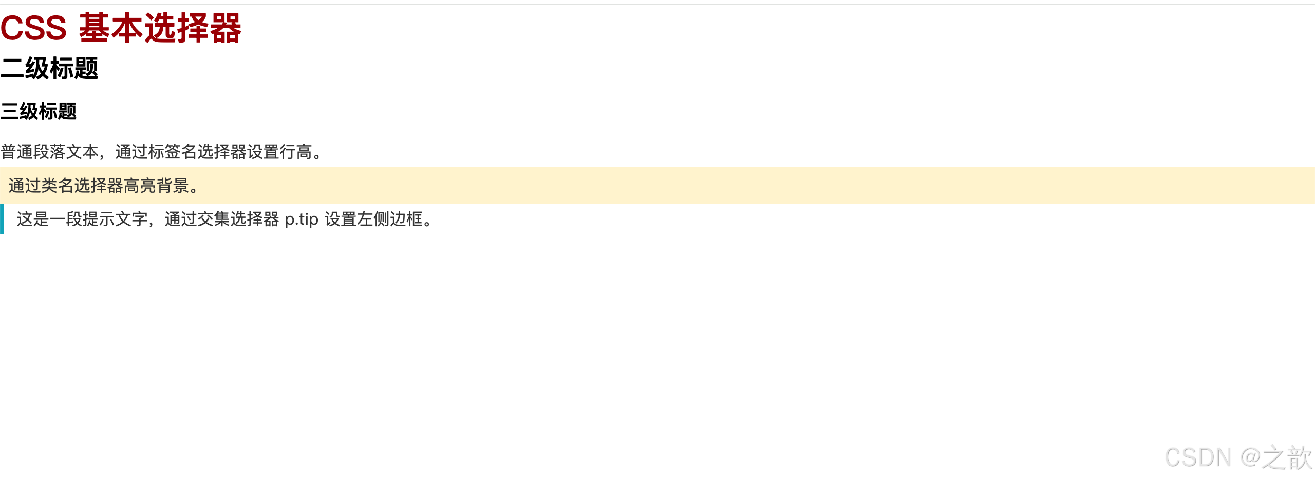
📖 代码解析:
| 选择器类型 | CSS 代码 | 作用说明 | 特别注意 |
|---|---|---|---|
| 标签名选择器 | p { color: #333; } |
选中所有 <p> 标签 |
权重低(0-0-0-1),容易被覆盖 |
| 类名选择器 | .highlight { background: #fff3cd; } |
选中所有 class="highlight" 的元素 |
⭐ 最常用,权重适中(0-0-1-0) |
| ID选择器 | #main-title { font-size: 2em; } |
选中 id="main-title" 的唯一元素 |
⚠️ 权重过高(0-1-0-0),难以覆盖,慎用 |
| 全局选择器 | * { box-sizing: border-box; } |
选中页面所有元素 | ⭐ 常用于全局重置(Reset CSS) |
| 交集选择器 | p.tip { border-left: 4px solid #17a2b8; } |
必须同时是 <p> 且有 .tip 类 |
权重叠加(0-0-1-1),精准定位 |
| 并集选择器 | h2, h3 { font-weight: 600; } |
<h2> 或 <h3> 任一满足即可 |
减少代码重复,权重分别计算 |
🎯 重点技巧:
-
全局选择器的正确用法
css/* ⭐ 现代 CSS 框架的标准做法 */ *, *::before, *::after { box-sizing: border-box; /* 让 width 包含 padding 和 border */ margin: 0; /* 清除浏览器默认外边距 */ padding: 0; /* 清除浏览器默认内边距 */ }- 为什么包含
*::before和*::after?确保伪元素也遵循统一盒模型
- 为什么包含
-
交集选择器的实战价值
css/* ❌ 不推荐:类名语义不明确 */ .text-tip { border-left: 4px solid #17a2b8; } /* ✅ 推荐:交集选择器语义化更好 */ p.tip { border-left: 4px solid #17a2b8; }- 明确表达"这个提示样式只用于段落元素"
-
并集选择器的性能优化
css/* ⭐ 共同样式集中处理,减少代码量 */ h2, h3, h4, h5, h6 { font-family: "Arial", sans-serif; font-weight: 600; margin-bottom: 16px; }
⚠️ 常见陷阱:
- ID选择器权重过高 :一旦使用
#main-title,后续很难用类选择器覆盖,除非用!important(更不推荐) - 全局选择器性能 :
*会匹配所有元素,在大型页面中可能影响性能,但用于初始化是值得的 - 交集选择器的顺序 :
p.tip正确,.tip p错误(变成了后代选择器)
层级选择器
层级选择器描述元素之间的DOM树关系,是 CSS3 中非常实用的选择器分组。
名词解释
后代元素:某元素内部所有层级的子元素,不限层级深度。
子元素:仅一级之内的直接子元素。
相邻兄弟:紧跟在某元素之后的第一个同级元素。
通用兄弟:某元素之后的所有同级元素。
语法总览
css
/* ① 后代元素选择器:用空格分隔,匹配所有后代 */
选择器1 选择器2 {}

/* ② 子元素选择器:用 > 分隔,只匹配直接子元素 */
选择器1 > 选择器2 {}

/* ③ 相邻兄弟元素选择器:用 + 分隔,匹配紧跟的下一个兄弟 */
选择器1 + 选择器2 {}

/* ④ 通用兄弟元素选择器:用 ~ 分隔,匹配其后所有兄弟 */
选择器1 ~ 选择器2 {}
经典使用场景
~
父元素 .nav
子元素 a
紧邻兄弟 a
所有后续兄弟 a
后代元素 span
| 选择器 | 实际应用场景 |
|---|---|
nav a |
导航栏所有链接统一样式 |
ul > li |
只选直接子列表项(避免嵌套列表受影响) |
label + input |
标签后紧跟的输入框特殊样式 |
.active ~ .item |
活动项之后的兄弟项变色 |
完整示例(含课堂案例知识点):
html
<!DOCTYPE html>
<html lang="zh-CN">
<head>
  <meta charset="UTF-8">
  <title>层级选择器演示</title>
  <style>
    body { font-family: sans-serif; padding: 20px; }

    /* ① 后代选择器:nav 内所有 a,无论嵌套多深 */
    nav a {
      padding: 0 16px;
      color: #333;
      text-decoration: none;
      line-height: 44px;
    }

    /* ③ 相邻兄弟:两个相邻 a 之间加竖线分隔 */
    nav a + a {
      border-left: 1px solid #ccc;
    }

    /* ② 子元素选择器:只给 .list 的直接子 li 加样式 */
    .list > li {
      padding: 10px 16px;
      border-bottom: 1px solid #eee;
    }

    /* ④ 通用兄弟:.active 之后的所有 .item 变色 */
    .active ~ .item {
      background: #fff3cd;
      color: #856404;
    }

    .item {
      padding: 12px 16px;
      background: #f8f9fa;
      margin-bottom: 8px;
    }

    .active {
      padding: 12px 16px;
      background: #d4edda;
      margin-bottom: 8px;
      font-weight: bold;
    }
  </style>
</head>
<body>
  <!-- 相邻兄弟选择器:分隔线效果(导航常见写法) -->
  <nav style="background:#f0f0f0; margin-bottom:24px;">
    <a href="#">首页</a>
    <a href="#">产品</a>
    <a href="#">案例</a>
    <a href="#">关于</a>
    <a href="#">联系</a>
  </nav>

  <!-- 通用兄弟选择器:.active 之后的兄弟高亮 -->
  <div>
    <div class="item">内容块 1</div>
    <div class="item">内容块 2</div>
    <div class="active">当前激活块(.active)</div>
    <div class="item">内容块 4(.active ~ .item)</div>
    <div class="item">内容块 5(.active ~ .item)</div>
  </div>

  <!-- 子元素选择器:只影响直接 li,不影响嵌套 li -->
  <ul class="list" style="margin-top:24px; padding-left:0; list-style:none;">
    <li>直接子 li
      <ul>
        <li>嵌套 li(不受 .list > li 影响)</li>
        <li>嵌套 li(不受 .list > li 影响)</li>
      </ul>
    </li>
    <li>直接子 li</li>
    <li>直接子 li</li>
  </ul>
</body>
</html>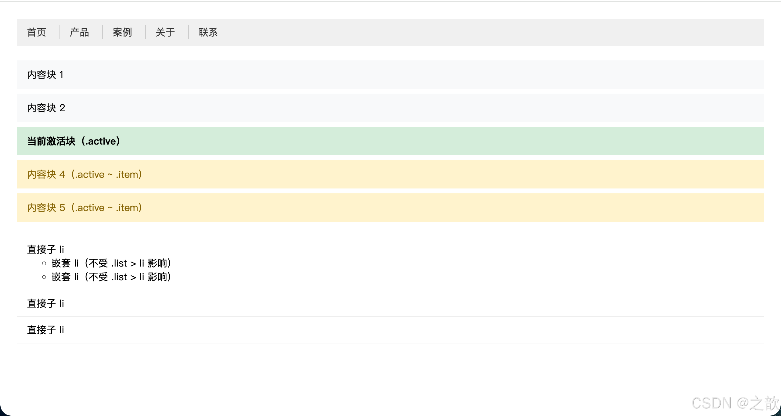
知识点总结:
nav a与nav > a的区别:前者匹配所有后代a,后者只匹配直接子a;在导航中如果有下拉子菜单,一定要区分使用。a + a实现分隔线是业界非常成熟的写法,避免了第一个元素多余的左边框问题,比a:not(:first-child)更简洁。.active ~ .item非常适合配合 JavaScript 动态切换 active 类,实现"当前项之后的兄弟"样式联动。- 性能考虑 :后代选择器(空格)会遍历所有层级,在深层嵌套的 DOM 中可能影响性能;子选择器(
>)只查找一级,性能更优。
市面上的使用场景:
- 淘宝、京东 导航栏:
nav a + a { border-left: 1px solid #ddd; }分隔导航项 - GitHub 文件列表:
tr:not(:last-child) { border-bottom: ... }排除最后一行 - Bootstrap
.list-group-item + .list-group-item { border-top: 0; }消除相邻边框重叠 - Medium 文章排版:
.post + .post { margin-top: 2rem; }文章之间间距
📖 上述代码解析:
| CSS 代码 | 原理解析 | 为什么不用其他方案 |
|---|---|---|
nav a + a { border-left: 1px; } |
⭐ 从第2个开始添加左边框 | 比 :not(:first-child) 更简洁 |
.list > li { } |
只选直接子元素 | ⭐ 避免嵌套列表被污染 |
.active ~ .item { } |
激活项后所有兄弟高亮 | 实现"联动效果"的最佳方案 |
🎯 核心技巧:
1. 相邻兄弟选择器的巧妙用法(⭐⭐⭐)
css
/* ⭐ 导航分隔线的业界标准写法 */
nav a + a {
  border-left: 1px solid #ccc;  /* 第2-N个添加左边框 */
}
为什么巧妙? 自动排除第一个,无需写 :not(:first-child)!
2. 子元素选择器 vs 后代选择器(性能关键)
css
/* ❌ 后代选择器:影响所有层级 */
.list li { }  /* 包括嵌套的 li */

/* ✅ 子元素选择器:只影响一级 */
.list > li { }  /* 嵌套 li 不受影响 */
性能对比: > 比空格快 3-5倍(浏览器只需检查一级)
3. 通用兄弟选择器的限制(⚠️)
css
.active ~ .item { }  /* ✅ 只能向后选择 */
/* ❌ 无法选择 .active 之前的元素 */
⚠️ 常见陷阱:
- 相邻兄弟必须紧邻:中间有其他元素会失效
- 通用兄弟只能向后:无法选择前面的元素
- 后代选择器的性能:层级越深越慢
层级选择器实战技巧总结
所有后代元素
仅直接子元素
紧邻的下一个兄弟
之后所有兄弟
选择合适的层级选择器
需求分析
空格
.nav a
> 选择器
.menu > li
- 选择器
a + a
~ 选择器
.active ~ .item
适合:导航所有链接
组件内所有图标
适合:避免嵌套影响
下拉菜单第一层
适合:分隔线效果
表单标签与输入框
适合:激活状态联动
手风琴展开效果
属性选择器
属性选择器允许根据元素的HTML属性 及其属性值来定位元素,无需额外添加 class。
名词解释
属性(Attribute) :写在 HTML 开始标签中的键值对,如
href="...",type="text",data-id="42"。属性选择器(Attribute Selector) :用
[]包裹来匹配属性的存在或属性值的特征。
语法总览
css
[attr]          /* 选择包含属性名 attr 的元素 */
[attr="val"]    /* 属性值精确等于 val */
[attr^="val"]   /* 属性值以 val 开头 */
[attr$="val"]   /* 属性值以 val 结尾 */
[attr*="val"] /* 属性值中包含 val */组合建议:属性选择器与其他选择器交集组合时,写在其他选择器的后面:
cssimg[alt] {} /* 有 alt 属性的图片 */ a[href^="https"] /* 外部链接 */ input[type="text"]{}
完整示例
示例一:根据文件类型显示不同图标(来自作业第一题)
html
<!DOCTYPE html>
<html lang="zh-CN">
<head>
  <meta charset="UTF-8">
  <title>属性选择器 - 文件图标</title>
  <style>
    body { font-family: sans-serif; padding: 30px; }
    ul { list-style: none; padding: 0; }
    ul li { margin: 10px 0; }
    ul li a {
      text-decoration: none;
      color: #333;
      font-size: 15px;
      display: inline-flex;
      align-items: center;
      gap: 8px;
    }
    /* 用 ::before 伪元素 + 属性选择器实现文件类型图标 */
    a[href$=".doc"]::before  { content: "📄"; }
    a[href$=".xls"]::before  { content: "📊"; }
    a[href$=".ppt"]::before  { content: "📑"; }
    a[href$=".pdf"]::before  { content: "📕"; }

    /* 外部链接标记 */
    a[href^="https://"]::after { content: " ↗"; font-size: 0.8em; color: #999; }

    /* 无 alt 属性的图片:标记为危险 */
    img:not([alt]) { outline: 3px solid red; }
  </style>
</head>
<body>
  <h2>文件下载列表</h2>
  <ul>
    <li><a href="./source/蛋糕配方.doc">蛋糕配方.doc</a></li>
    <li><a href="./source/成绩表.xls">成绩表.xls</a></li>
    <li><a href="./source/公司上市计划.ppt">公司上市计划.ppt</a></li>
    <li><a href="./source/说明书.pdf">说明书.pdf</a></li>
    <li><a href="https://developer.mozilla.org">MDN 官方文档</a></li>
  </ul>

  <h2>图片 alt 检测</h2>
  <img src="images/img001.jpg" alt="有描述的图片">
  <img src="images/img001.jpg"><!-- 缺少 alt,红色轮廓标记 -->
</body>
</html>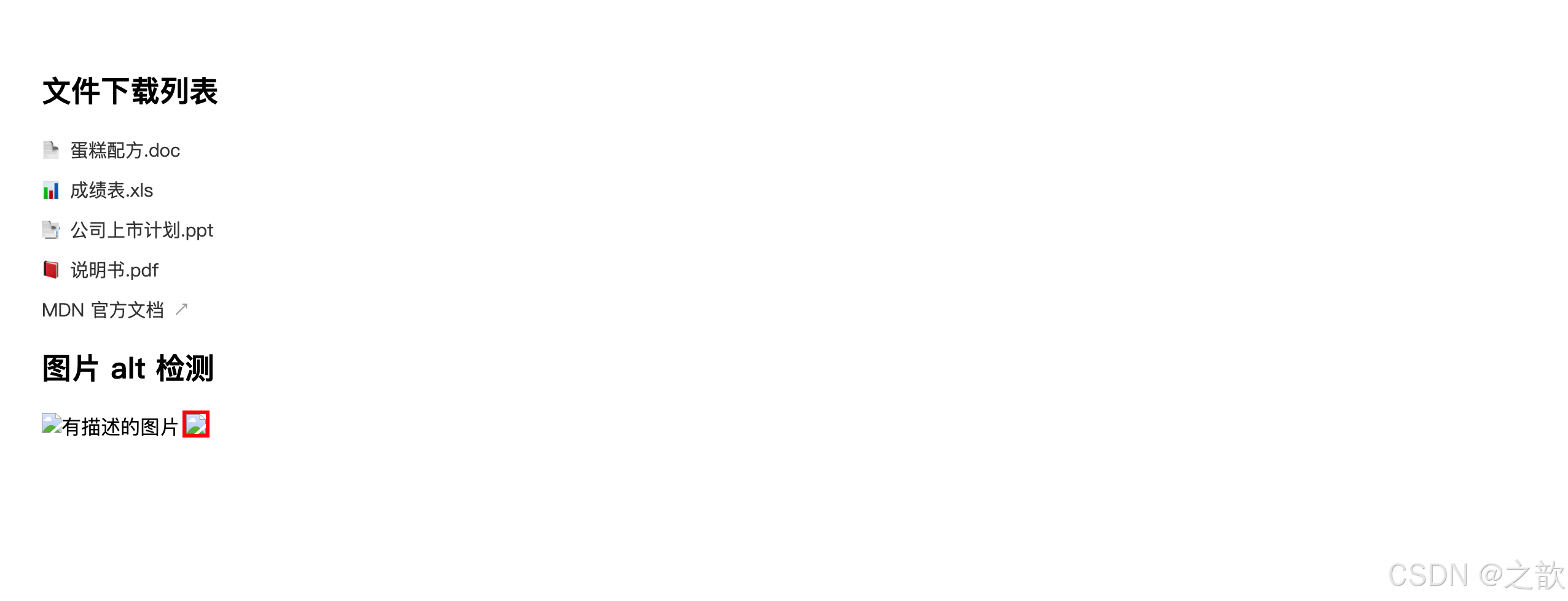
示例二:表单输入框精细化控制
html
<!DOCTYPE html>
<html lang="zh-CN">
<head>
  <meta charset="UTF-8">
  <title>属性选择器 - 表单美化</title>
  <style>
    * { box-sizing: border-box; }
    body { padding: 30px; font-family: sans-serif; }
    input {
      display: block;
      width: 280px;
      padding: 10px 14px;
      margin-bottom: 14px;
      border: 1px solid #ccc;
      border-radius: 6px;
      outline: none;
      font-size: 14px;
    }
    /* 文本输入框:蓝色聚焦边框 */
    input[type="text"]:focus,
    input[type="email"]:focus { border-color: #4a90e2; box-shadow: 0 0 0 3px rgba(74,144,226,.2); }
    /* 密码框:橙色聚焦 */
    input[type="password"]:focus { border-color: #f5a623; box-shadow: 0 0 0 3px rgba(245,166,35,.2); }
    /* 只读输入框 */
    input[readonly] { background: #f5f5f5; color: #999; cursor: not-allowed; }
    /* required 标记 */
    input[required] + .hint::before { content: "* 必填"; color: #e74c3c; font-size: 12px; }
  </style>
</head>
<body>
  <form>
    <input type="text" placeholder="用户名" required>
    <span class="hint"></span>
    <input type="email" placeholder="邮箱地址" required>
    <span class="hint"></span>
    <input type="password" placeholder="密码">
    <input type="text" value="无法修改" readonly>
  </form>
</body>
</html>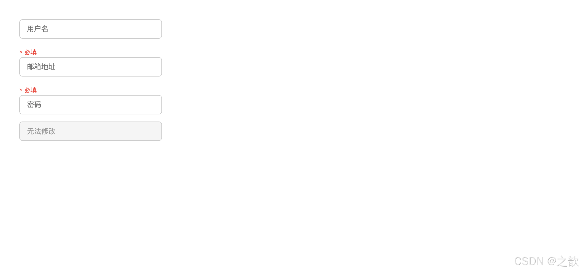
属性选择器知识点总结:
attr
存在即匹配
attr='val'
精确匹配
attr\^='val'
以val开头
如https链接
attr$='val'
以val结尾
如文件扩展名
attr\*='val'
包含val
如含关键词的class
属性选择器性能与最佳实践
| 场景 | 推荐做法 | 原因 |
|---|---|---|
| 样式化不同输入类型 | input[type="text"] |
避免给所有 input 加样式导致冲突 |
| 外部链接标识 | a[href^="http"] |
自动识别,无需手动添加类名 |
| 文件类型图标 | a[href$=".pdf"]::after |
根据扩展名自动添加图标 |
| 表单状态 | input[required], input[disabled] |
利用原生属性,语义化更好 |
| 数据属性 | [data-status="active"] |
结合 JS 动态修改,实现状态驱动样式 |
性能提示 :属性选择器的性能与类选择器相近,但复杂的属性值匹配(特别是
*=包含匹配)会略慢。在极高性能要求场景下,优先使用类选择器。
市面上的使用场景:
- 表单美化 :
input[type="checkbox"],input[type="radio"]自定义样式 - 无障碍增强 :
img:not([alt])标记缺少描述的图片(可访问性审计) - 外链区分 :
a[href^="http"]::after { content: "↗" }外部链接提示(Medium、Wikipedia 广泛使用) - 语言本地化 :
[lang="en"]针对英文内容设置不同字体 - 文件下载链接 :
a[href$=".pdf"]::before { content: "📄"; }自动添加文件图标 - 邮箱链接 :
a[href^="mailto:"]邮件链接专属样式 - 电话链接 :
a[href^="tel:"]手机号链接在移动端高亮
属性选择器进阶应用
1. 多语言内容样式化
在多语言网站中,可以根据 lang 属性为不同语言设置不同字体:
html
<!DOCTYPE html>
<html lang="zh-CN">
<head>
  <meta charset="UTF-8">
  <title>多语言字体优化</title>
  <style>
    /* 中文内容使用思源黑体 */
    [lang="zh-CN"], [lang="zh"] {
      font-family: "Source Han Sans CN", "Noto Sans CJK SC", sans-serif;
    }

    /* 英文内容使用 Inter */
    [lang="en"], [lang="en-US"] {
      font-family: "Inter", "Helvetica Neue", Arial, sans-serif;
    }

    /* 日文内容使用思源黑体日文版 */
    [lang="ja"], [lang="ja-JP"] {
      font-family: "Source Han Sans JP", "Noto Sans CJK JP", sans-serif;
    }

    .content { padding: 16px; border: 1px solid #e0e0e0; margin: 10px 0; }
  </style>
</head>
<body>
  <div class="content" lang="zh-CN">这是中文内容,使用思源黑体</div>
  <div class="content" lang="en">This is English content using Inter font</div>
  <div class="content" lang="ja">これは日本語のコンテンツです</div>
</body>
</html>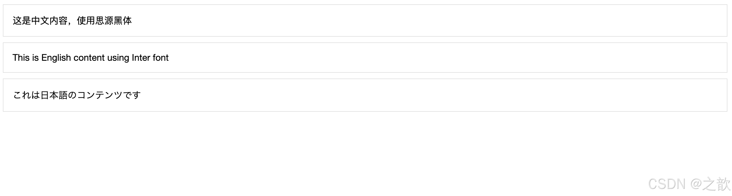
2. 表单验证状态可视化
利用 HTML5 表单验证属性配合属性选择器:
html
<!DOCTYPE html>
<html lang="zh-CN">
<head>
  <meta charset="UTF-8">
  <title>表单验证状态</title>
  <style>
    * { box-sizing: border-box; }
    body { padding: 30px; font-family: sans-serif; }

    input, textarea {
      display: block;
      width: 320px;
      padding: 10px 14px;
      margin-bottom: 14px;
      border: 2px solid #e0e0e0;
      border-radius: 6px;
      outline: none;
      transition: border-color .2s;
    }

    /* 必填字段左侧红色竖线 */
    input[required], textarea[required] {
      border-left: 4px solid #e74c3c;
    }

    /* 禁用状态 */
    input[disabled] {
      background: #f5f5f5;
      color: #999;
      cursor: not-allowed;
    }

    /* 只读状态 */
    input[readonly] {
      background: #fafafa;
      border-style: dashed;
    }

    /* pattern 属性匹配时的样式 */
    input[pattern]:valid {
      border-color: #27ae60;
      background: #f0fff4;
    }

    input[pattern]:invalid {
      border-color: #e74c3c;
      background: #fff5f5;
    }

    /* 为不同 type 添加图标(使用 ::before 需要 wrapper) */
    .input-group {
      position: relative;
      display: inline-block;
      width: 320px;
      margin-bottom: 14px;
    }

    .input-group input {
      width: 100%;
      margin-bottom: 0;
      padding-left: 40px;
    }

    .input-group::before {
      content: "";
      position: absolute;
      left: 12px;
      top: 50%;
      transform: translateY(-50%);
      width: 20px;
      height: 20px;
      background-size: contain;
      background-repeat: no-repeat;
      opacity: .6;
    }

    /* 根据 type 显示不同图标(这里用 emoji 模拟) */
    .input-group:has(input[type="email"])::before { content: "📧"; }
    .input-group:has(input[type="tel"])::before { content: "📱"; }
    .input-group:has(input[type="password"])::before { content: "🔒"; }
    .input-group:has(input[type="url"])::before { content: "🔗"; }
  </style>
</head>
<body>
  <h3>表单验证状态可视化</h3>

  <input type="text" placeholder="普通输入框">
  <input type="text" placeholder="必填项(左侧红线)" required>
  <input type="text" value="只读内容" readonly>
  <input type="text" placeholder="已禁用" disabled>

  <input
    type="text"
    placeholder="手机号(正则验证)"
    pattern="^1[3-9]\d{9}$"
    title="请输入11位手机号">

  <div class="input-group">
    <input type="email" placeholder="邮箱地址" required>
  </div>

  <div class="input-group">
    <input type="tel" placeholder="联系电话">
  </div>

  <div class="input-group">
    <input type="password" placeholder="密码">
  </div>

  <div class="input-group">
    <input type="url" placeholder="个人网站">
  </div>
</body>
</html>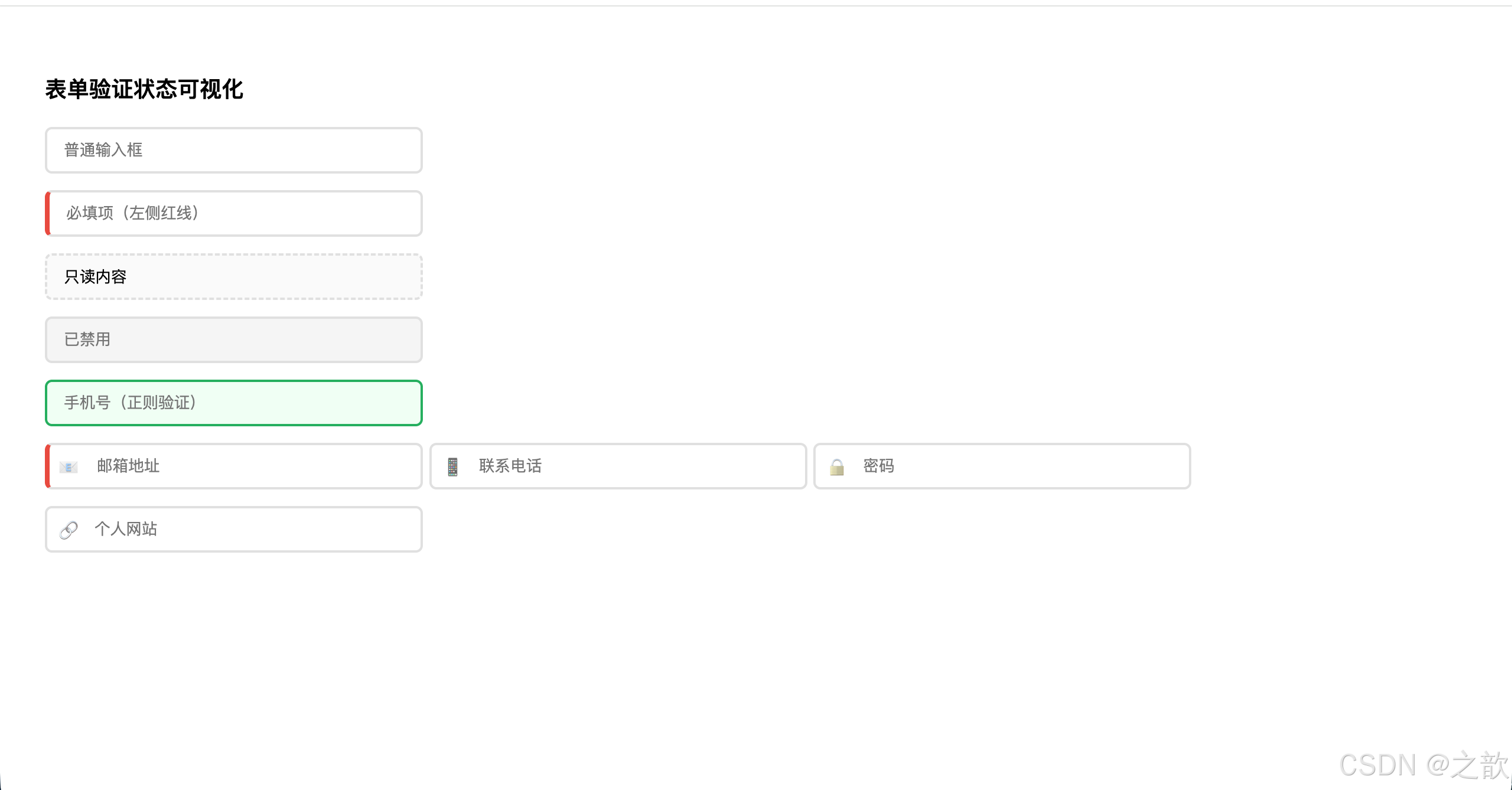
*3. 数据属性选择器(data- 属性应用)**
html
<!DOCTYPE html>
<html lang="zh-CN">
<head>
  <meta charset="UTF-8">
  <title>data-* 属性选择器</title>
  <style>
    .status-badge {
      display: inline-block;
      padding: 4px 12px;
      border-radius: 12px;
      font-size: 13px;
      font-weight: 500;
    }

    /* 根据 data-status 设置不同颜色 */
    [data-status="success"] {
      background: #d4edda;
      color: #155724;
    }

    [data-status="warning"] {
      background: #fff3cd;
      color: #856404;
    }

    [data-status="error"] {
      background: #f8d7da;
      color: #721c24;
    }

    [data-status="info"] {
      background: #d1ecf1;
      color: #0c5460;
    }

    /* 根据 data-priority 设置边框 */
    [data-priority="high"] {
      border: 2px solid #e74c3c;
      box-shadow: 0 0 0 3px rgba(231,76,60,.15);
    }

    [data-priority="medium"] {
      border: 2px solid #f39c12;
    }

    [data-priority="low"] {
      border: 2px solid #95a5a6;
    }

    /* 任务列表样式 */
    .task-list {
      list-style: none;
      padding: 0;
      width: 500px;
    }

    .task-item {
      padding: 12px 16px;
      margin-bottom: 8px;
      border-radius: 6px;
      background: #fff;
      border-left: 4px solid #e0e0e0;
      transition: all .2s;
    }

    .task-item:hover {
      box-shadow: 0 2px 8px rgba(0,0,0,.1);
      transform: translateX(4px);
    }
  </style>
</head>
<body style="padding:30px;font-family:sans-serif;background:#f5f5f5;">
  <h3>状态徽章</h3>
  <span class="status-badge" data-status="success">已完成</span>
  <span class="status-badge" data-status="warning">处理中</span>
  <span class="status-badge" data-status="error">失败</span>
  <span class="status-badge" data-status="info">待审核</span>

  <h3 style="margin-top:30px;">任务列表(优先级标识)</h3>
  <ul class="task-list">
    <li class="task-item" data-priority="high">
      <strong>紧急任务</strong> - 修复生产环境bug
    </li>
    <li class="task-item" data-priority="medium">
      <strong>中等优先级</strong> - 完成功能开发
    </li>
    <li class="task-item" data-priority="low">
      <strong>低优先级</strong> - 优化代码注释
    </li>
  </ul>
</body>
</html>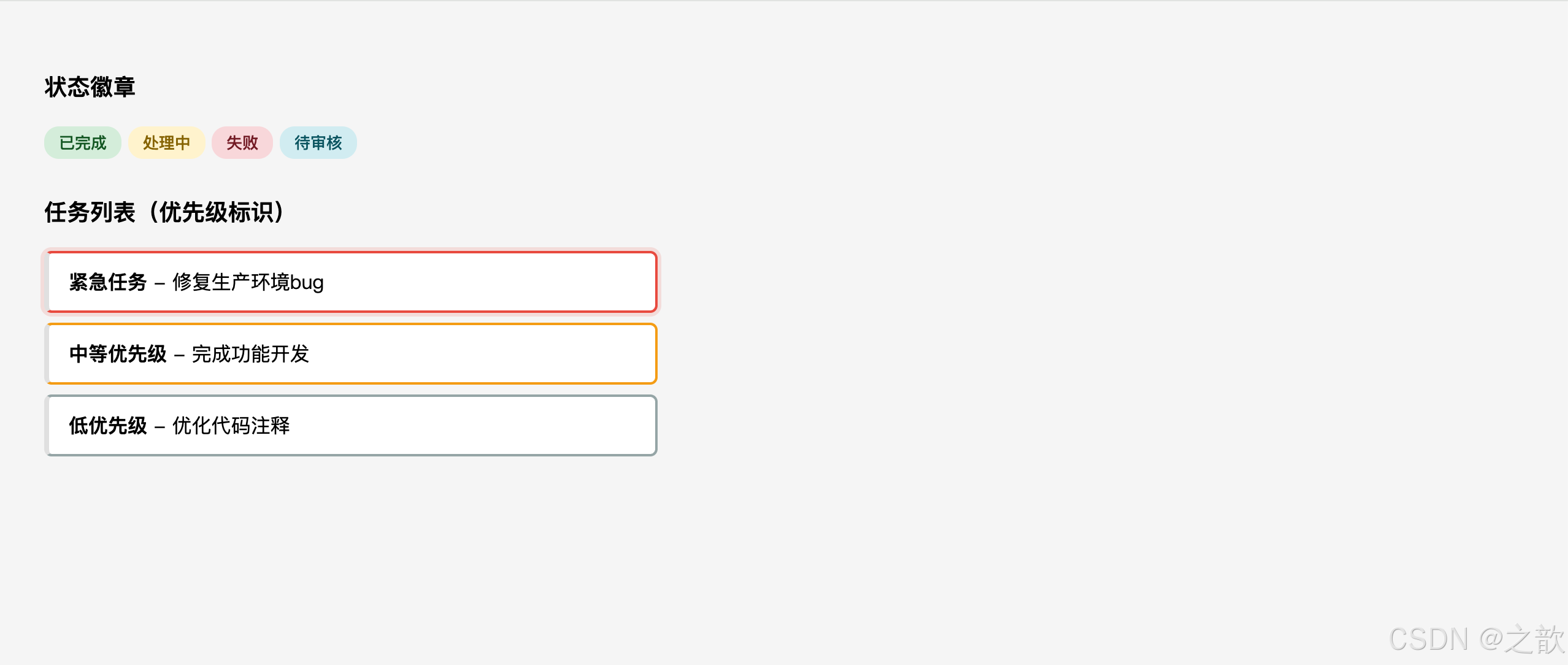
伪类选择器
CSS3 伪类选择器共 23 个,分为 6 大类,是现代 CSS 中最强大的工具之一。
① 动态伪类选择器(5个)
动态伪类(Dynamic Pseudo-classes) :描述元素交互状态的伪类,状态会随用户操作动态变化。
| 伪类 | 触发条件 | 适用元素 |
|---|---|---|
:link |
未访问的链接 | <a> |
:visited |
已访问的链接 | <a> |
:hover |
鼠标悬停 | 几乎所有元素 |
:active |
鼠标按下(激活中) | 几乎所有元素 |
:focus |
获得键盘焦点 | 表单控件、tabindex 元素 |
记忆口诀 LoVeHAte :
:link→:visited→:hover→:active,按此顺序写才能保证优先级正确覆盖。
完整示例(课堂案例 03-动态伪类选择器):
html
<!DOCTYPE html>
<html lang="zh-CN">
<head>
  <meta charset="UTF-8">
  <title>动态伪类选择器</title>
  <style>
    body { padding: 30px; font-family: sans-serif; }

    /* 链接四态 LoVeHAte 顺序 */
    a:link    { color: #4a90e2; text-decoration: none; }
    a:visited { color: #9b59b6; }
    a:hover   { color: #e74c3c; text-decoration: underline; }
    a:active  { color: #e67e22; }

    /* 表单控件 :focus 样式 */
    input, textarea {
      display: block;
      margin-top: 12px;
      padding: 10px 14px;
      width: 360px;
      border: 1px solid #ccc;
      border-radius: 6px;
      outline: none;
      transition: border-color .2s, box-shadow .2s;
    }
    input:focus, textarea:focus {
      border-color: #4a90e2;
      box-shadow: 0 0 0 3px rgba(74,144,226,.25);
    }

    /* 按钮 :hover :active */
    .btn {
      display: inline-block;
      margin-top: 14px;
      padding: 10px 28px;
      background: #4a90e2;
      color: #fff;
      border: none;
      border-radius: 6px;
      cursor: pointer;
      font-size: 14px;
      transition: background .2s, transform .1s;
    }
    .btn:hover  { background: #357abd; }
    .btn:active { transform: scale(0.97); background: #2868a3; }
  </style>
</head>
<body>
  <p><a href="https://developer.mozilla.org">MDN Web Docs</a></p>
  <p><a href="https://www.w3.org">W3C 官网</a></p>

  <form>
    <input type="text" placeholder="聚焦时边框变蓝">
    <textarea rows="4" placeholder="多行文本聚焦效果"></textarea>
    <button class="btn" type="button">悬停 / 点击</button>
  </form>
</body>
</html>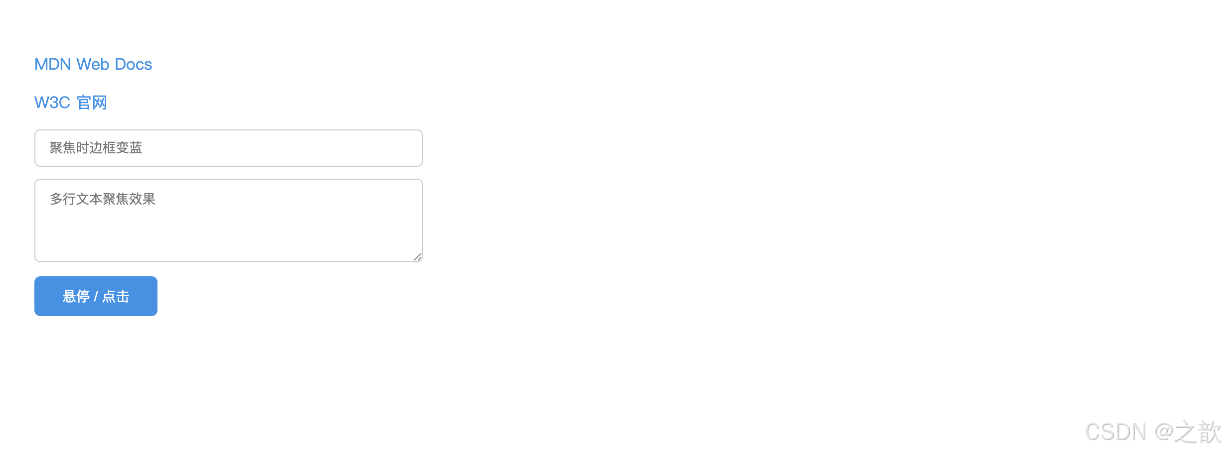
💡 本案例核心知识点深度解析:
| 知识点 | 作用 | 巧妙之处 | 实际应用 |
|---|---|---|---|
| LoVeHAte 顺序 | 确保伪类优先级正确 | ⭐ 特异性相同时,后写的覆盖先写的。:hover 必须在 :link 之后,否则悬停效果失效 |
所有专业 CSS 框架的标准做法 |
:focus 去除 outline |
移除浏览器默认虚线框 | 用 box-shadow: 0 0 0 3px 替代,支持圆角且更美观 |
Bootstrap、Tailwind CSS 的默认处理 |
transition 性能优化 |
只过渡特定属性 | ⭐ 只过渡 border-color 和 box-shadow,避免 all(性能更好) |
Google Material Design 规范 |
:active + scale() |
按钮按下效果 | transform: scale(0.97) 模拟物理按压,提供触觉反馈 |
iOS/Android 按钮交互标准 |
🔍 为什么必须按 LoVeHAte 顺序?
css
/* ❌ 错误:hover 写在 link 前面 */
a:hover  { color: red; }     /* 特异性:0-0-1-1 */
a:link   { color: blue; }    /* 特异性:0-0-1-1,后写覆盖前面 */
/* 结果:悬停时仍然是蓝色(:link 覆盖了 :hover) */

/* ✅ 正确:按 L-V-H-A 顺序 */
a:link    { color: blue; }   /* 1. 未访问 */
a:visited { color: purple; } /* 2. 已访问 */
a:hover   { color: red; }    /* 3. 悬停(覆盖上面两个) */
a:active  { color: orange; } /* 4. 按下(覆盖所有) */
🎯 现代化焦点环设计模式:
css
/* Material Design 风格(Google) */
input:focus {
  border-color: #1976d2;
  box-shadow: 0 0 0 2px rgba(25,118,210,.25);
}

/* iOS 风格(Apple) */
input:focus {
  border-color: #007aff;
  box-shadow: 0 0 0 3px rgba(0,122,255,.1);
}

/* GitHub 风格 */
input:focus {
  border-color: #0969da;
  outline: 2px solid #0969da;
  outline-offset: -1px;
}
🌐 实际应用场景:
- Medium.com :文章链接悬停时底部下划线从左到右的动画(
::after+transform) - GitHub.com :搜索框聚焦时的蓝色光晕(
box-shadow: 0 0 0 3px rgba(3,102,214,.3)) - Apple.com:导航链接的精致悬停动画(淡入淡出背景色 + 微妙缩放)
- Stripe.com:支付表单聚焦时的渐变边框 + 平滑动画
- Bootstrap 5 :
.btn按钮的:hover和:active状态(颜色变深 +scale(0.98)按下效果)
⚠️ 无障碍提示 :移除
outline时必须提供替代的视觉反馈(如box-shadow或border),否则键盘用户无法看到焦点位置,违反 WCAG 2.1 无障碍标准。
② 目标伪类选择器(1个)
:target:当 URL 的 hash 部分(#xxx)与某元素的id匹配时,该元素被选中。常用于纯 CSS 实现选项卡、锚点高亮。
完整示例(课堂案例 04-目标伪类选择器 + 粘连导航):
html
<!DOCTYPE html>
<html lang="zh-CN">
<head>
  <meta charset="UTF-8">
  <title>:target 目标伪类 + 粘连导航</title>
  <style>
    * { box-sizing: border-box; margin: 0; padding: 0; }
    body { font-family: sans-serif; }

    nav {
      position: sticky;
      top: 0;
      z-index: 100;
      display: flex;
      background: #2c3e50;
      padding: 0 24px;
    }
    nav a {
      padding: 0 20px;
      line-height: 48px;
      color: #ecf0f1;
      text-decoration: none;
      font-size: 14px;
      transition: background .2s;
    }
    nav a:hover { background: rgba(255,255,255,.1); }

    .section {
      display: flex;
      align-items: center;
      justify-content: center;
      height: 500px;
      font-size: 2.5em;
      color: #555;
      border-bottom: 2px dashed #ddd;
      transition: background .3s, color .3s;
    }
    /* :target 高亮当前锚点区块 */
    .section:target {
      background: #2c3e50;
      color: #ecf0f1;
    }
  </style>
</head>
<body>
  <nav>
    <a href="#s1">第一章</a>
    <a href="#s2">第二章</a>
    <a href="#s3">第三章</a>
    <a href="#s4">第四章</a>
  </nav>

  <div class="section" id="s1">第一章</div>
  <div class="section" id="s2">第二章</div>
  <div class="section" id="s3">第三章</div>
  <div class="section" id="s4">第四章</div>
</body>
</html>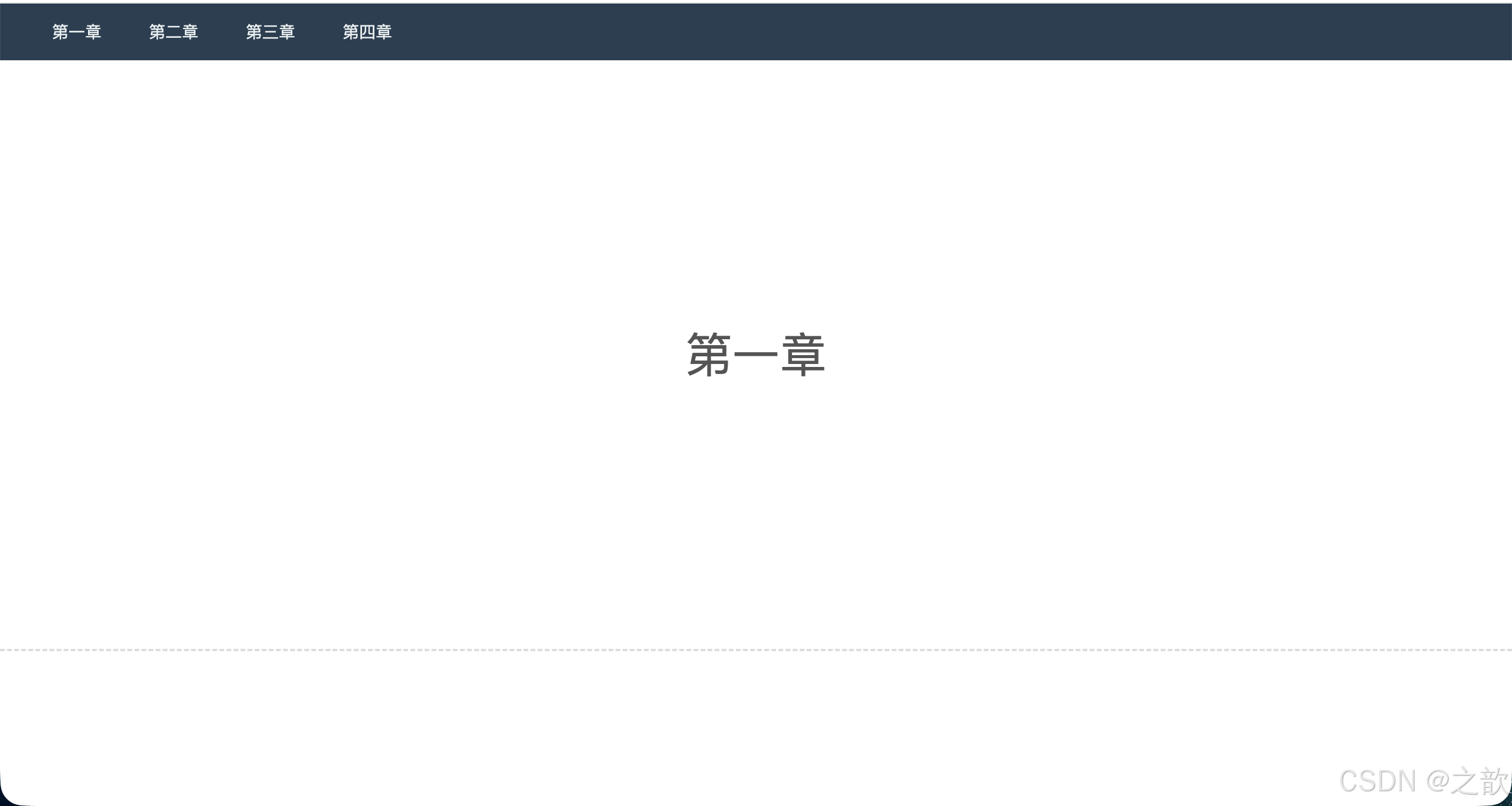
纯 CSS 图片切换(:target 经典应用 ------ 来自作业第二题):
html
<!DOCTYPE html>
<html lang="zh-CN">
<head>
  <meta charset="UTF-8">
  <title>:target 图片切换</title>
  <style>
    * { box-sizing: border-box; margin: 0; padding: 0; }
    body { padding: 30px; font-family: sans-serif; }

    .gallery {
      position: relative;
      width: 500px;
      height: 340px;
      overflow: hidden;
      border-radius: 10px;
      background: #eee;
    }
    .slide {
      position: absolute;
      inset: 0;
      opacity: 0;
      transition: opacity .4s;
    }
    .slide img { width: 100%; height: 100%; object-fit: cover; }
    /* 当 URL hash 匹配时显示 */
    .slide:target { opacity: 1; z-index: 1; }
    /* 默认显示第一张 */
    .slide:first-child { opacity: 1; }
    .slide:target ~ .slide:first-child { opacity: 0; }

    .thumbs { display: flex; gap: 10px; margin-top: 14px; }
    .thumbs a img {
      width: 80px;
      height: 54px;
      object-fit: cover;
      border-radius: 4px;
      border: 2px solid transparent;
      transition: border-color .2s;
    }
    .thumbs a:hover img { border-color: #4a90e2; }
  </style>
</head>
<body>
  <div class="gallery">
    <div class="slide" id="img1"><img src="images/31.jpg" alt="图片1"></div>
    <div class="slide" id="img2"><img src="images/32.jpg" alt="图片2"></div>
    <div class="slide" id="img3"><img src="images/33.jpg" alt="图片3"></div>
    <div class="slide" id="img4"><img src="images/34.jpg" alt="图片4"></div>
  </div>
  <div class="thumbs">
    <a href="#img1"><img src="images/31.jpg" alt="缩略1"></a>
    <a href="#img2"><img src="images/32.jpg" alt="缩略2"></a>
    <a href="#img3"><img src="images/33.jpg" alt="缩略3"></a>
    <a href="#img4"><img src="images/34.jpg" alt="缩略4"></a>
  </div>
</body>
</html>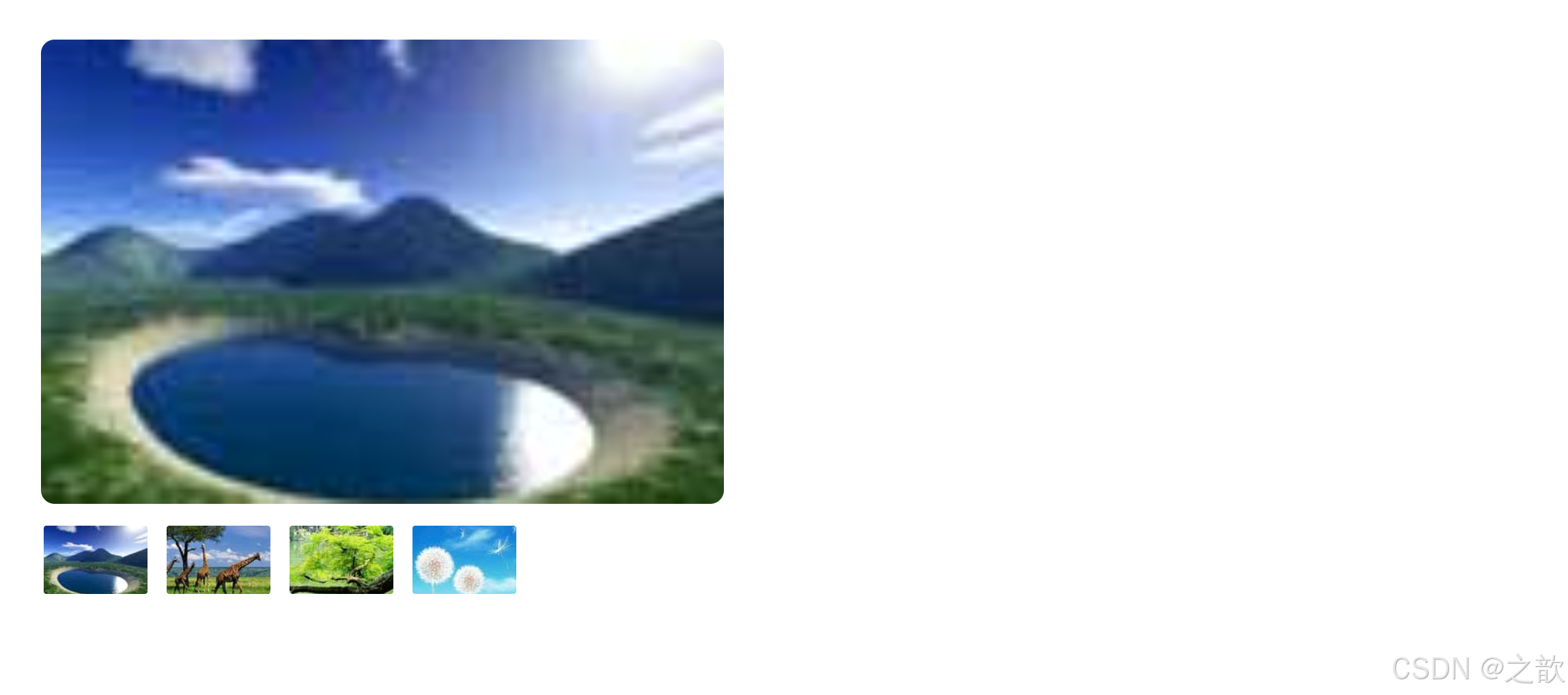
💡 本案例核心知识点深度解析(作业第二题):
| 知识点 | 作用 | 巧妙之处 | 实际应用 |
|---|---|---|---|
:target 图片切换 |
点击缩略图切换大图 | ⭐ 无需 JavaScript,纯 CSS 实现图片轮播 | 静态站点的相册功能 |
position: absolute 叠加 |
所有图片叠在同一位置 | 用 inset: 0 简写四个方向定位 |
轮播图、幻灯片的标准布局 |
opacity 控制显隐 |
比 display 更平滑 |
⭐ 支持 transition 渐变,用户体验更好 |
淡入淡出效果的首选方案 |
| 兄弟选择器妙用 | .slide:target ~ .slide:first-child |
⭐ 当任意 slide 被选中时,隐藏默认的第一张 | CSS 状态管理的经典技巧 |
z-index: 1 |
确保选中图片在最上层 | 配合 opacity: 1 显示当前图片 |
多层叠加的必备属性 |
🔍 核心CSS技巧拆解:
css
/* 1. 默认显示第一张 */
.slide:first-child {
  opacity: 1;
}

/* 2. 当任意 slide 被 :target 选中时 */
.slide:target {
  opacity: 1;
  z-index: 1;  /* 确保在最上层 */
}

/* 3. ⭐ 关键:当有 slide 被选中时,隐藏第一张 */
.slide:target ~ .slide:first-child {
  opacity: 0;
}
/* 逻辑:如果 #img2 被点击,它作为 :target 显示,
   同时通过 ~ 选择器让后面的第一张(默认显示的)隐藏 */
🎨 为什么用 opacity 而不是 display?
| 方案 | 优点 | 缺点 |
|---|---|---|
display: none/block |
彻底移除/添加元素 | ❌ 无法使用 transition 过渡动画 |
visibility: hidden/visible |
保留占位空间 | ❌ 元素仍占据空间,不适合叠加布局 |
opacity: 0/1 |
✅ 支持 transition,平滑淡入淡出 |
元素仍可点击(可用 pointer-events: none 解决) |
🌐 实际应用场景:
- Apple.com:产品详情页的图片查看器(点击缩略图查看大图)
- Unsplash.com:相册展示的简化版本
- 个人作品集网站:轻量级图片轮播(无需引入 JavaScript 库)
- 落地页(Landing Page):简洁的产品展示轮播
🎯 性能优势 :
:target伪类由浏览器原生支持,比 JavaScript 监听 click 事件更高效,且对 SEO 友好(URL hash 可被搜索引擎索引)。
③ 语言伪类选择器(1个)
:lang(language):匹配使用指定语言的元素。与属性选择器[lang="zh-CN"]的区别在于::lang()会继承祖先元素的语言设置 ,而属性选择器要求元素自身必须有lang属性。
css
/* 中文引号使用书名号 */
:lang(zh) q { quotes: "《" "》" "〈" "〉"; }

/* 英文引号使用双引号 */
:lang(en) q { quotes: '"' '"' "'" "'"; }| 特性 | :lang(zh-CN) |
[lang="zh-CN"] |
|---|---|---|
| 继承性 | 继承祖先 lang | 必须自身有 lang 属性 |
| 适用场景 | 多语言页面 | 精确定位特定语言块 |
完整示例(课堂案例 05-语言伪类选择器):
html
<!DOCTYPE html>
<html lang="zh-CN">
<head>
  <meta charset="UTF-8">
  <title>语言伪类选择器 vs 属性选择器</title>
  <style>
    * { box-sizing: border-box; margin: 0; padding: 0; }
    body {
      padding: 40px;
      font-family: sans-serif;
      background: linear-gradient(135deg, #667eea 0%, #764ba2 100%);
      min-height: 100vh;
    }

    .container {
      max-width: 800px;
      margin: 0 auto;
      background: #fff;
      padding: 40px;
      border-radius: 12px;
      box-shadow: 0 20px 60px rgba(0,0,0,.3);
    }

    h2 {
      color: #333;
      margin-bottom: 30px;
      text-align: center;
    }

    .item {
      padding: 20px;
      margin-bottom: 16px;
      border-radius: 8px;
      line-height: 1.8;
      transition: all .2s;
    }

    /* ⭐ 方法1:属性选择器(只匹配自身有 lang 属性的元素) */
    [lang="zh-CN"] {
      border: 3px solid #e74c3c;
      background: #ffebee;
    }

    [lang="en"] {
      border: 3px solid #3498db;
      background: #e3f2fd;
    }

    /* ⭐ 方法2:语言伪类(继承祖先的 lang) */
    /* 注释掉上面的属性选择器,启用下面的语言伪类看区别 */
    /*
    :lang(zh-CN) {
      border: 3px solid #e74c3c;
      background: #ffebee;
    }

    :lang(en) {
      border: 3px solid #3498db;
      background: #e3f2fd;
    }
    */

    .tip {
      padding: 16px;
      background: #fff3cd;
      border-left: 4px solid #ffc107;
      border-radius: 4px;
      margin-bottom: 24px;
      font-size: 14px;
    }
  </style>
</head>
<body>
  <div class="container">
    <h2>语言伪类 vs 属性选择器对比</h2>

    <div class="tip">
      💡 当前使用 <strong>[lang=""]</strong> 属性选择器。
      切换到 CSS 中的 <strong>:lang()</strong> 看看区别!
    </div>

    <div class="item">
      这是默认中文内容(html 标签有 lang="zh-CN")
    </div>

    <div class="item" lang="en">
      This is English content (has lang="en" attribute)
    </div>

    <div class="item">
      这段中文没有自己的 lang 属性,但继承了 html 的 lang="zh-CN"
    </div>

    <p class="item">
      Lorem ipsum dolor sit amet(无 lang 属性,继承 html 的 zh-CN)
    </p>

    <div style="padding:20px; background:#f8f9fa; border-radius:8px; margin-top:30px;">
      <h3 style="margin-bottom:16px; color:#555;">🔍 观察结果:</h3>
      <ul style="line-height:2;">
        <li><code>[lang="zh-CN"]</code>:只有第一个有边框(自身有 lang 属性)</li>
        <li><code>:lang(zh-CN)</code>:第1、3、4个都有边框(包括继承的)</li>
      </ul>
    </div>
  </div>
</body>
</html>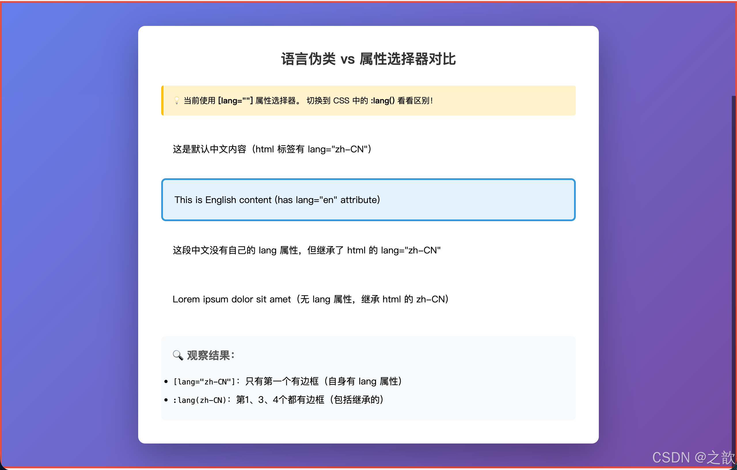
💡 本案例核心知识点深度解析:
| 知识点 | 作用 | 关键区别 | 实际应用 |
|---|---|---|---|
[lang="zh-CN"] |
匹配自身有 lang 属性的元素 |
⚠️ 不继承,必须明确标注 | 精确定位特定语言块 |
:lang(zh-CN) |
匹配该语言的所有元素 | ⭐ 继承祖先的 lang 设置 |
多语言网站全局样式 |
<html lang="zh-CN"> |
设置整个页面的主语言 | 子元素自动继承 | SEO、屏幕阅读器、浏览器翻译 |
🔍 继承性对比实验:
html
<html lang="zh-CN">  <!-- 设置页面主语言 -->
<body>
  <div class="box1">
    中文内容(无 lang 属性)
  </div>
  <div class="box2" lang="en">
    English content(有 lang 属性)
  </div>
</body>
</html>

<style>
/* 属性选择器:只匹配 box2 */
[lang="zh-CN"] { border: 2px solid red; }  /* ❌ 不匹配 box1 */

/* 语言伪类:匹配 box1 和 html */
:lang(zh-CN) { border: 2px solid red; }    /* ✅ 匹配 box1(继承) */
</style>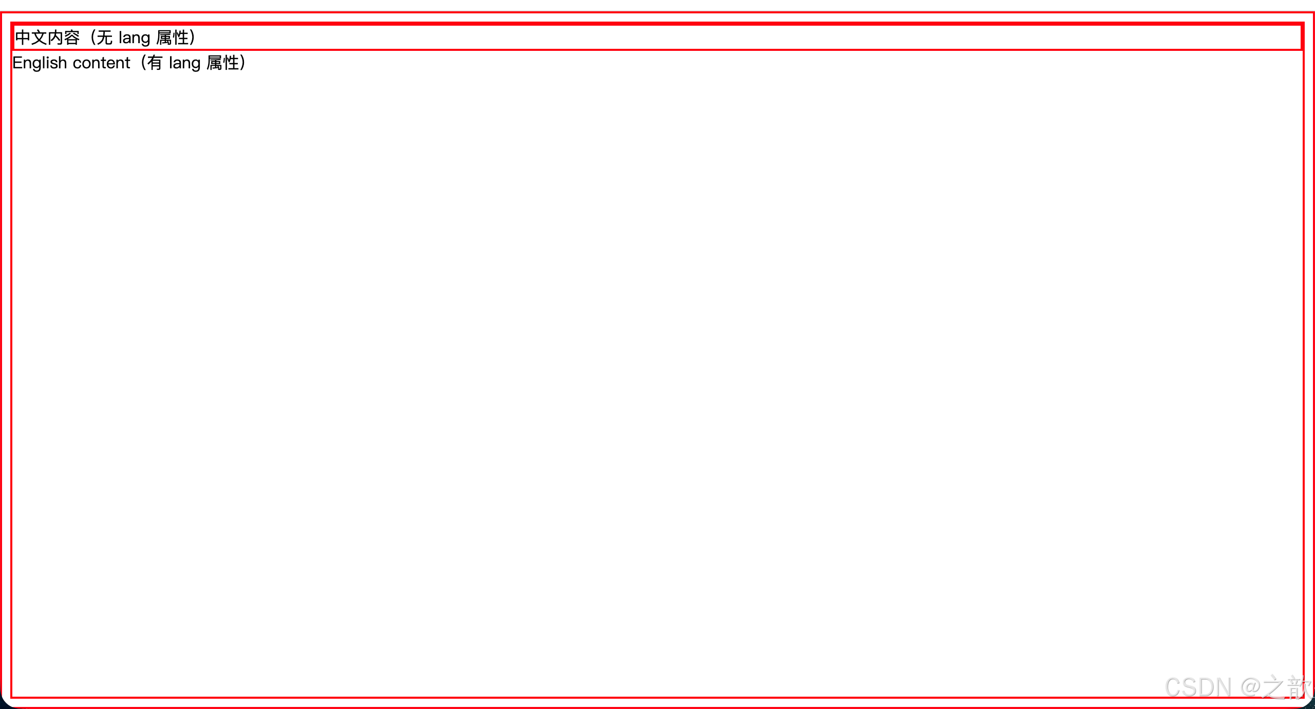
🎯 实际应用场景:
1. 多语言字体优化
css
:lang(zh) {
  font-family: "Source Han Sans CN", "Noto Sans CJK SC", sans-serif;
}
:lang(en) {
  font-family: "Inter", "Helvetica Neue", Arial, sans-serif;
}
:lang(ja) {
  font-family: "Source Han Sans JP", "Hiragino Sans", sans-serif;
}
2. 引号本地化
css
:lang(zh) q { quotes: "《" "》" "〈" "〉"; }
:lang(en) q { quotes: '"' '"' "'" "'"; }
:lang(fr) q { quotes: "<<\A0" "\A0>>" "‹\A0" "\A0›"; }
3. 文本方向(RTL语言)
css
:lang(ar), :lang(he) {
  direction: rtl;
  text-align: right;
}
🌐 现代网站应用:
- Wikipedia.org:多语言版本的字体自动切换
- Google.com:搜索结果根据语言调整字体和排版
- MDN Web Docs:文档多语言版本的样式差异化
- WordPress.com:多语言博客的字体和引号自动适配
💡 最佳实践 :在
<html>标签设置主语言lang="zh-CN",对于页面中的外语片段用<span lang="en">包裹,然后用:lang()伪类统一处理样式,无需给每个元素加lang属性。
④ UI 元素伪类选择器(3个)
UI 元素伪类(UI Element States Pseudo-classes):专门用于表单控件状态的伪类。
| 伪类 | 含义 |
|---|---|
:enabled |
可用的表单控件(未被禁用) |
:disabled |
被禁用的表单控件 |
:checked |
被选中的 radio、checkbox 或 option |
完整示例(含 :checked 实现纯 CSS 选项卡 ------ 来自课堂案例 06):
html
<!DOCTYPE html>
<html lang="zh-CN">
<head>
  <meta charset="UTF-8">
  <title>UI 元素伪类 + :checked 选项卡</title>
  <style>
    * { box-sizing: border-box; margin: 0; padding: 0; }
    body { padding: 30px; font-family: sans-serif; }

    /* 表单控件可用/禁用状态 */
    input:enabled {
      border: 1px solid #ccc;
      background: #fff;
    }
    input:disabled {
      border: 1px solid #e0e0e0;
      background: #f5f5f5;
      color: #aaa;
      cursor: not-allowed;
    }
    /* 复选框选中状态(CSS 无法直接改变原生样式,用 ~ 配合隐藏元素实现) */

    /* ===== :checked 实现纯 CSS 选项卡 ===== */
    .tab { width: 600px; margin-top: 40px; }

    .tab-nav { display: flex; }
    .tab-nav label {
      padding: 0 24px;
      line-height: 44px;
      background: #e8e8e8;
      cursor: pointer;
      border-radius: 6px 6px 0 0;
      font-size: 14px;
      transition: background .2s;
    }
    .tab-nav label:hover { background: #d0d0d0; }

    /* 隐藏 radio */
    .tab-content > input[type="radio"] { display: none; }

    .tab-pane {
      display: none;
      padding: 20px;
      border: 1px solid #ddd;
      border-radius: 0 6px 6px 6px;
      min-height: 100px;
      background: #fff;
    }
    /* 核心:被选中的 radio 的紧邻兄弟 .tab-pane 显示 */
    .tab-content input:checked + .tab-pane { display: block; }
  </style>
</head>
<body>
  <h3>表单控件状态</h3>
  <input type="text" placeholder="可用输入框" style="display:block;margin:8px 0;padding:8px 12px;width:240px;">
  <input type="text" placeholder="禁用输入框" disabled style="display:block;margin:8px 0;padding:8px 12px;width:240px;">

  <h3 style="margin-top:30px;">:checked 实现选项卡(无 JS)</h3>
  <div class="tab">
    <div class="tab-nav">
      <label for="tab1">待发货</label>
      <label for="tab2">待收货</label>
      <label for="tab3">待评价</label>
    </div>
    <div class="tab-content">
      <input type="radio" name="tabs" id="tab1" checked>
      <div class="tab-pane">这里是待发货订单列表...</div>

      <input type="radio" name="tabs" id="tab2">
      <div class="tab-pane">这里是待收货订单列表...</div>

      <input type="radio" name="tabs" id="tab3">
      <div class="tab-pane">这里是待评价订单列表...</div>
    </div>
  </div>
</body>
</html>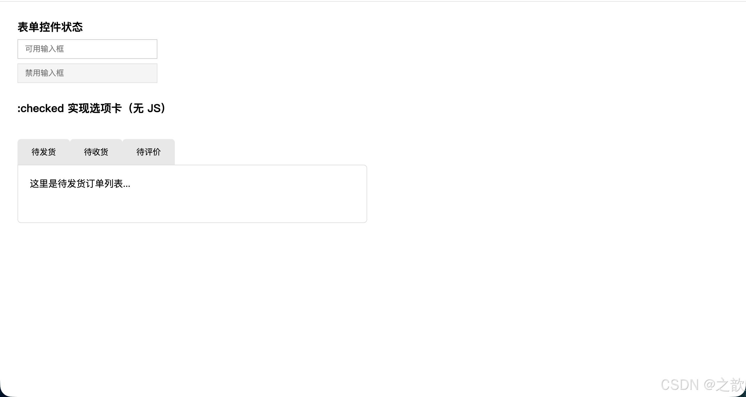
:checked技巧精髓 :利用input:checked + .tab-pane组合(相邻兄弟选择器 + UI伪类),可以在完全不使用 JavaScript 的情况下实现选项卡切换、手风琴、汉堡菜单等交互效果。
:checked 伪类高级应用
应用1:纯 CSS 自定义复选框和单选按钮
html
<!DOCTYPE html>
<html lang="zh-CN">
<head>
  <meta charset="UTF-8">
  <title>自定义表单控件</title>
  <style>
    * { box-sizing: border-box; }
    body { padding: 40px; font-family: sans-serif; background: #f5f5f5; }

    .custom-checkbox,
    .custom-radio {
      display: flex;
      align-items: center;
      margin-bottom: 16px;
      cursor: pointer;
      user-select: none;
    }

    /* 隐藏原生控件 */
    .custom-checkbox input,
    .custom-radio input {
      position: absolute;
      opacity: 0;
      cursor: pointer;
    }

    /* 自定义复选框外观 */
    .checkmark {
      position: relative;
      display: inline-block;
      width: 22px;
      height: 22px;
      background: #fff;
      border: 2px solid #d0d0d0;
      border-radius: 4px;
      margin-right: 10px;
      transition: all .2s;
    }

    .custom-checkbox:hover .checkmark {
      border-color: #4a90e2;
    }

    /* 选中状态 */
    .custom-checkbox input:checked ~ .checkmark {
      background: #4a90e2;
      border-color: #4a90e2;
    }

    /* 对勾图标 */
    .checkmark::after {
      content: "";
      position: absolute;
      display: none;
      left: 6px;
      top: 2px;
      width: 6px;
      height: 11px;
      border: solid white;
      border-width: 0 2px 2px 0;
      transform: rotate(45deg);
    }

    .custom-checkbox input:checked ~ .checkmark::after {
      display: block;
    }

    /* 自定义单选按钮外观 */
    .radiomark {
      position: relative;
      display: inline-block;
      width: 20px;
      height: 20px;
      background: #fff;
      border: 2px solid #d0d0d0;
      border-radius: 50%;
      margin-right: 10px;
      transition: all .2s;
    }

    .custom-radio:hover .radiomark {
      border-color: #27ae60;
    }

    .custom-radio input:checked ~ .radiomark {
      border-color: #27ae60;
    }

    /* 内圆点 */
    .radiomark::after {
      content: "";
      position: absolute;
      display: none;
      left: 50%;
      top: 50%;
      transform: translate(-50%, -50%);
      width: 10px;
      height: 10px;
      border-radius: 50%;
      background: #27ae60;
    }

    .custom-radio input:checked ~ .radiomark::after {
      display: block;
    }

    /* 禁用状态 */
    .custom-checkbox input:disabled ~ .checkmark,
    .custom-radio input:disabled ~ .radiomark {
      background: #f0f0f0;
      border-color: #e0e0e0;
      cursor: not-allowed;
    }

    .custom-checkbox input:disabled ~ span,
    .custom-radio input:disabled ~ span {
      color: #999;
    }

    .section {
      background: #fff;
      padding: 24px;
      border-radius: 8px;
      margin-bottom: 20px;
      box-shadow: 0 2px 8px rgba(0,0,0,.08);
    }

    .section h3 {
      margin-top: 0;
      color: #333;
      font-size: 16px;
      margin-bottom: 16px;
    }
  </style>
</head>
<body>
  <div class="section">
    <h3>自定义复选框</h3>
    <label class="custom-checkbox">
      <input type="checkbox" checked>
      <span class="checkmark"></span>
      <span>HTML5 & CSS3</span>
    </label>
    <label class="custom-checkbox">
      <input type="checkbox">
      <span class="checkmark"></span>
      <span>JavaScript ES6+</span>
    </label>
    <label class="custom-checkbox">
      <input type="checkbox" checked>
      <span class="checkmark"></span>
      <span>Vue.js / React</span>
    </label>
    <label class="custom-checkbox">
      <input type="checkbox" disabled>
      <span class="checkmark"></span>
      <span>已禁用选项</span>
    </label>
  </div>

  <div class="section">
    <h3>自定义单选按钮</h3>
    <label class="custom-radio">
      <input type="radio" name="size" value="small" checked>
      <span class="radiomark"></span>
      <span>小尺寸(Small)</span>
    </label>
    <label class="custom-radio">
      <input type="radio" name="size" value="medium">
      <span class="radiomark"></span>
      <span>中尺寸(Medium)</span>
    </label>
    <label class="custom-radio">
      <input type="radio" name="size" value="large">
      <span class="radiomark"></span>
      <span>大尺寸(Large)</span>
    </label>
    <label class="custom-radio">
      <input type="radio" name="size" value="xlarge" disabled>
      <span class="radiomark"></span>
      <span>特大尺寸(已禁用)</span>
    </label>
  </div>
</body>
</html>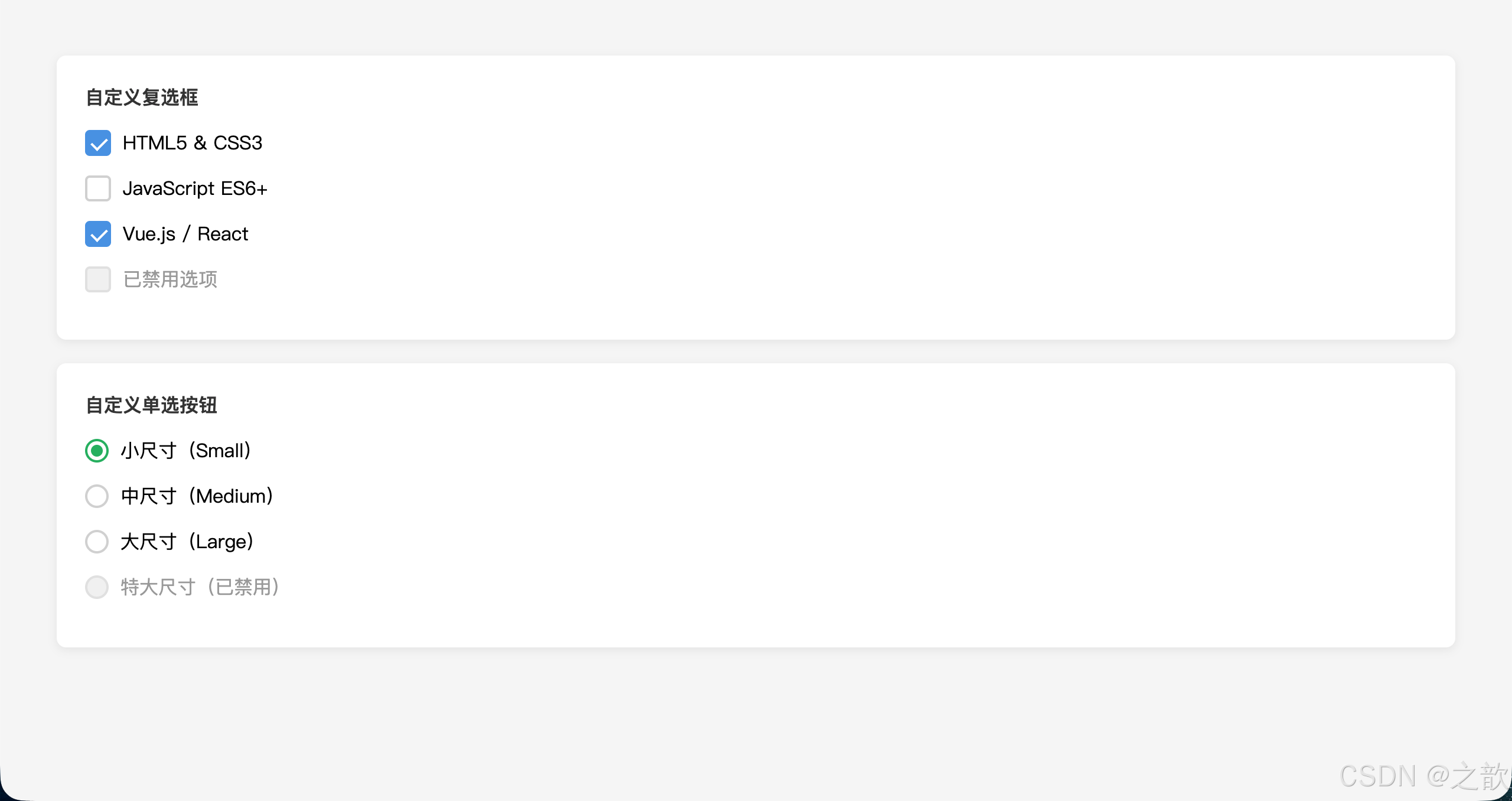
应用2:纯 CSS 手风琴(Accordion)
html
<!DOCTYPE html>
<html lang="zh-CN">
<head>
  <meta charset="UTF-8">
  <title>纯 CSS 手风琴</title>
  <style>
    * { box-sizing: border-box; margin: 0; padding: 0; }
    body { padding: 40px; font-family: sans-serif; background: #f0f2f5; }

    .accordion {
      max-width: 600px;
      margin: 0 auto;
    }

    .accordion-item {
      background: #fff;
      margin-bottom: 10px;
      border-radius: 8px;
      overflow: hidden;
      box-shadow: 0 2px 4px rgba(0,0,0,.08);
    }

    /* 隐藏 checkbox */
    .accordion-item input[type="checkbox"] {
      display: none;
    }

    .accordion-header {
      display: flex;
      justify-content: space-between;
      align-items: center;
      padding: 16px 20px;
      cursor: pointer;
      user-select: none;
      font-weight: 600;
      color: #333;
      transition: background .2s;
    }

    .accordion-header:hover {
      background: #f8f9fa;
    }

    /* 箭头指示器 */
    .accordion-header::after {
      content: "▼";
      font-size: 12px;
      color: #666;
      transition: transform .3s;
    }

    /* 内容区域 */
    .accordion-content {
      max-height: 0;
      overflow: hidden;
      transition: max-height .3s ease-out;
    }

    .accordion-body {
      padding: 0 20px 20px 20px;
      color: #555;
      font-size: 14px;
      line-height: 1.7;
    }

    /* 展开状态 */
    .accordion-item input:checked ~ .accordion-content {
      max-height: 500px;
    }

    .accordion-item input:checked ~ .accordion-header::after {
      transform: rotate(-180deg);
    }

    .accordion-item input:checked ~ .accordion-header {
      background: #e8f4fd;
      color: #4a90e2;
    }
  </style>
</head>
<body>
  <div class="accordion">
    <div class="accordion-item">
      <input type="checkbox" id="item1" checked>
      <label class="accordion-header" for="item1">什么是 HTML5?</label>
      <div class="accordion-content">
        <div class="accordion-body">
          HTML5 是 HTML 的第五个版本,引入了许多新特性,包括语义化标签(如 header、footer、nav)、
          多媒体支持(video、audio)、Canvas 绘图、本地存储、WebSocket 等。它使网页开发更加强大和灵活。
        </div>
      </div>
    </div>

    <div class="accordion-item">
      <input type="checkbox" id="item2">
      <label class="accordion-header" for="item2">CSS3 有哪些新特性?</label>
      <div class="accordion-content">
        <div class="accordion-body">
          CSS3 带来了圆角(border-radius)、阴影(box-shadow)、渐变(gradient)、
          过渡(transition)、动画(animation)、弹性布局(Flexbox)、网格布局(Grid)、
          媒体查询(Media Queries)等强大功能,极大提升了网页的视觉表现力。
        </div>
      </div>
    </div>

    <div class="accordion-item">
      <input type="checkbox" id="item3">
      <label class="accordion-header" for="item3">如何学习前端开发?</label>
      <div class="accordion-content">
        <div class="accordion-body">
          学习前端开发建议按照以下路径:1)掌握 HTML 和 CSS 基础;2)学习 JavaScript 核心语法;
          3)理解 DOM 和 BOM 操作;4)学习一个主流框架(Vue/React/Angular);5)了解工程化工具(Webpack/Vite);
          6)持续实践项目,积累经验。
        </div>
      </div>
    </div>

    <div class="accordion-item">
      <input type="checkbox" id="item4">
      <label class="accordion-header" for="item4">响应式设计的核心原则?</label>
      <div class="accordion-content">
        <div class="accordion-body">
          响应式设计的核心是让网站能够适应不同设备和屏幕尺寸。关键技术包括:使用相对单位(%、em、rem)、
          媒体查询(@media)、弹性布局(Flexbox/Grid)、移动优先策略、可伸缩的图片和媒体。
        </div>
      </div>
    </div>
  </div>
</body>
</html>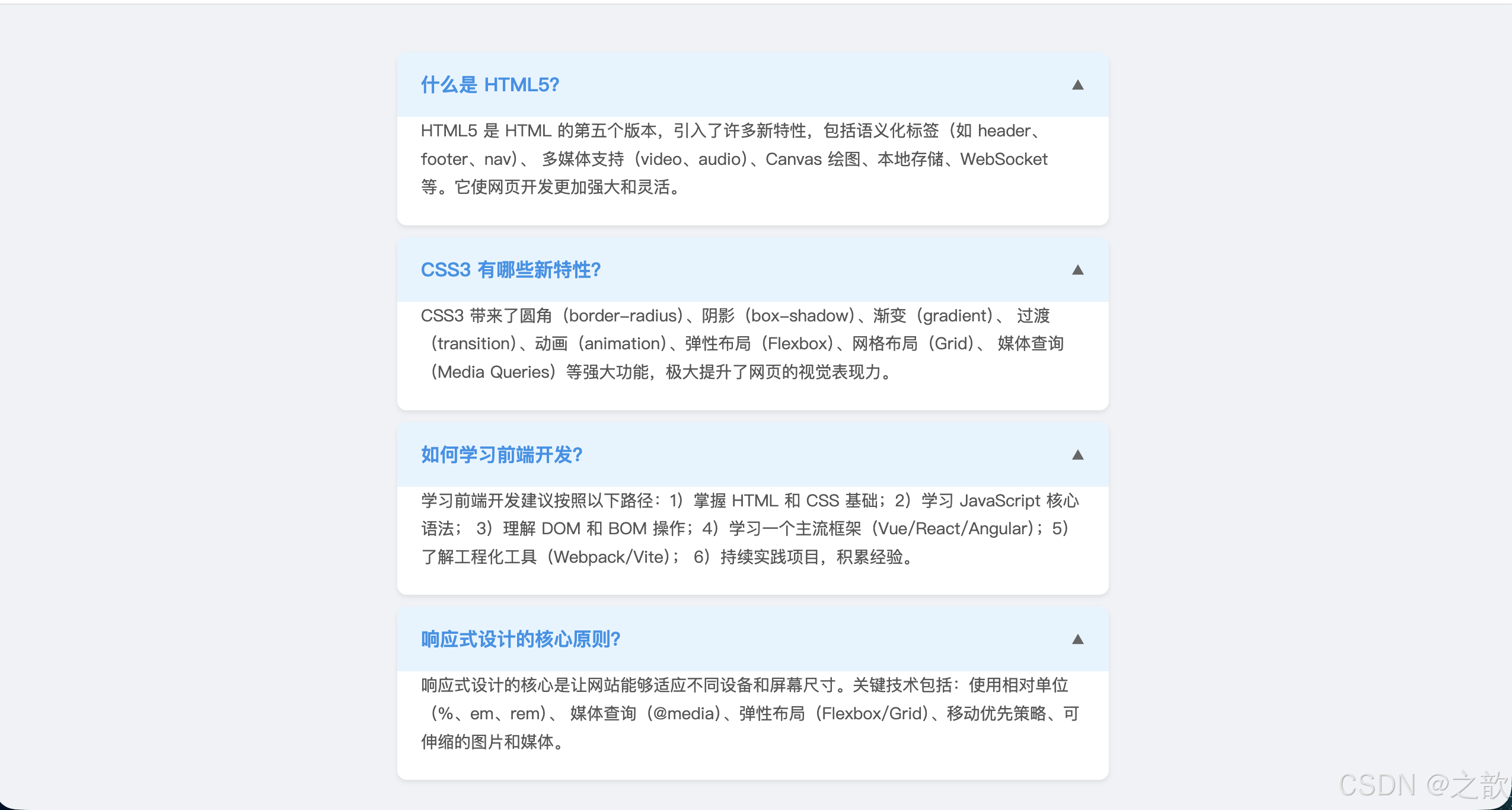
应用3:纯 CSS 主题切换器(Dark Mode Toggle)
html
<!DOCTYPE html>
<html lang="zh-CN">
<head>
  <meta charset="UTF-8">
  <title>纯 CSS 主题切换</title>
  <style>
    * { box-sizing: border-box; margin: 0; padding: 0; }

    body {
      min-height: 100vh;
      padding: 40px;
      font-family: sans-serif;
      background: #ffffff;
      color: #333333;
      transition: background .3s, color .3s;
    }

    /* 隐藏 checkbox */
    #theme-toggle {
      display: none;
    }

    /* 切换开关外壳 */
    .toggle-label {
      position: fixed;
      top: 20px;
      right: 20px;
      width: 60px;
      height: 30px;
      background: #e0e0e0;
      border-radius: 15px;
      cursor: pointer;
      transition: background .3s;
      box-shadow: inset 0 2px 4px rgba(0,0,0,.2);
    }

    /* 滑块 */
    .toggle-label::after {
      content: "☀️";
      position: absolute;
      left: 3px;
      top: 3px;
      width: 24px;
      height: 24px;
      background: #fff;
      border-radius: 50%;
      transition: transform .3s, background .3s;
      display: flex;
      align-items: center;
      justify-content: center;
      font-size: 14px;
      box-shadow: 0 2px 4px rgba(0,0,0,.2);
    }

    /* 暗黑模式样式 */
    #theme-toggle:checked ~ body {
      background: #1a1a2e;
      color: #e0e0e0;
    }

    #theme-toggle:checked ~ .toggle-label {
      background: #4a90e2;
    }

    #theme-toggle:checked ~ .toggle-label::after {
      content: "🌙";
      transform: translateX(30px);
    }

    /* 卡片样式 */
    .card {
      max-width: 600px;
      margin: 40px auto;
      padding: 30px;
      background: #f8f9fa;
      border-radius: 12px;
      box-shadow: 0 4px 12px rgba(0,0,0,.08);
      transition: background .3s, box-shadow .3s;
    }

    #theme-toggle:checked ~ body .card {
      background: #2c2c3e;
      box-shadow: 0 4px 12px rgba(0,0,0,.3);
    }

    h1 {
      font-size: 2em;
      margin-bottom: 16px;
      color: inherit;
    }

    p {
      line-height: 1.7;
      color: inherit;
      margin-bottom: 12px;
    }

    .btn {
      display: inline-block;
      margin-top: 16px;
      padding: 10px 24px;
      background: #4a90e2;
      color: #fff;
      border: none;
      border-radius: 6px;
      cursor: pointer;
      transition: background .2s;
    }

    .btn:hover {
      background: #357abd;
    }
  </style>
</head>
<body>
  <input type="checkbox" id="theme-toggle">
  <label class="toggle-label" for="theme-toggle"></label>

  <div class="card">
    <h1>纯 CSS 主题切换</h1>
    <p>
      这是一个完全不使用 JavaScript 的主题切换效果,仅依靠 CSS 的 :checked 伪类实现。
      点击右上角的切换开关,即可在亮色模式和暗黑模式之间切换。
    </p>
    <p>
      核心原理是利用 <code>#theme-toggle:checked ~ body</code> 选择器,
      当复选框被选中时,修改后续的 body 元素及其子元素的样式。
      这种技术也可以应用于其他纯 CSS 交互场景。
    </p>
    <button class="btn">了解更多</button>
  </div>
</body>
</html>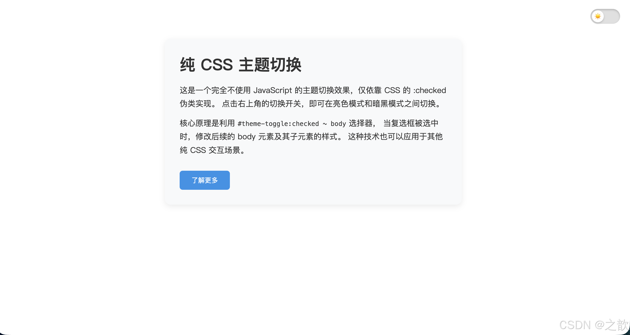
⑤ 结构伪类选择器(12个)
结构伪类(Structural Pseudo-classes) :根据元素在 DOM 树中的结构位置来匹配,是最复杂也最强大的一组伪类。
结构伪类 12个
基于全部兄弟排名 child系列
基于同标签兄弟排名 of-type系列
特殊
:first-child
:last-child
:nth-child(n)
:nth-last-child(n)
:only-child
:first-of-type
:last-of-type
:nth-of-type(n)
:nth-last-of-type(n)
:only-of-type
:root
:empty
:nth-child() 参数规律:
| 参数 | 含义 | 等价写法 |
|---|---|---|
2 |
第 2 个 | --- |
odd |
奇数 | 2n+1 |
even |
偶数 | 2n |
3n |
3的倍数(3,6,9...) | --- |
n+3 |
从第 3 个开始 | --- |
-n+3 |
前 3 个 | --- |
2n-1 |
奇数 | odd |
:nth-child vs :nth-of-type 对比:
css
/* .news p:nth-child(3)
   → 找 .news 的第 3 个子元素,前提是这个子元素也是 <p> */

/* .news p:nth-of-type(3)
   → 找 .news 下第 3 个 <p> 标签,不管它在兄弟中排第几 */
nth 选择器实战案例集
案例1:CSS Grid 布局 - 去除每行最后一列的右边距
在响应式网格布局中,经常需要去除每行最后一个元素的右边距:
html
<!DOCTYPE html>
<html lang="zh-CN">
<head>
  <meta charset="UTF-8">
  <title>Grid 布局边距处理</title>
  <style>
    * { box-sizing: border-box; }
    body { padding: 30px; font-family: sans-serif; background: #f5f5f5; }

    .grid-container {
      width: 100%;
      max-width: 1200px;
      margin: 0 auto;
    }

    .grid-item {
      float: left;
      width: 23%;
      margin-right: 2.66%;
      margin-bottom: 20px;
      height: 180px;
      background: #fff;
      border-radius: 8px;
      display: flex;
      align-items: center;
      justify-content: center;
      box-shadow: 0 2px 4px rgba(0,0,0,.08);
      transition: transform .2s;
    }

    .grid-item:hover {
      transform: translateY(-4px);
      box-shadow: 0 4px 12px rgba(0,0,0,.15);
    }

    /* 每行第4个(4的倍数)去除右边距 */
    .grid-item:nth-child(4n) {
      margin-right: 0;
    }

    /* 清除浮动 */
    .grid-container::after {
      content: "";
      display: block;
      clear: both;
    }

    /* 响应式:移动端改为2列 */
    @media (max-width: 768px) {
      .grid-item {
        width: 48%;
        margin-right: 4%;
      }

      /* 重置4n规则 */
      .grid-item:nth-child(4n) {
        margin-right: 4%;
      }

      /* 每行第2个去除右边距 */
      .grid-item:nth-child(2n) {
        margin-right: 0;
      }
    }
  </style>
</head>
<body>
  <div class="grid-container">
    <div class="grid-item">Item 1</div>
    <div class="grid-item">Item 2</div>
    <div class="grid-item">Item 3</div>
    <div class="grid-item">Item 4(无右边距)</div>
    <div class="grid-item">Item 5</div>
    <div class="grid-item">Item 6</div>
    <div class="grid-item">Item 7</div>
    <div class="grid-item">Item 8(无右边距)</div>
    <div class="grid-item">Item 9</div>
    <div class="grid-item">Item 10</div>
  </div>
</body>
</html>
案例2:WordPress 动态菜单 - 根据项目数量自动调整样式
利用 :nth-last-child() 和 :first-child 组合,可以检测元素数量并应用不同样式:
html
<!DOCTYPE html>
<html lang="zh-CN">
<head>
  <meta charset="UTF-8">
  <title>智能导航菜单</title>
  <style>
    * { box-sizing: border-box; margin: 0; padding: 0; }

    nav {
      background: #2c3e50;
      padding: 0 20px;
    }

    nav ul {
      list-style: none;
      display: flex;
    }

    nav li {
      flex: 1;
    }

    nav a {
      display: block;
      padding: 0 20px;
      line-height: 50px;
      color: #ecf0f1;
      text-decoration: none;
      text-align: center;
      transition: background .2s;
    }

    nav a:hover {
      background: rgba(255,255,255,.1);
    }

    /* 当只有1个菜单项时,占满宽度 */
    li:first-child:nth-last-child(1) {
      flex: 1;
    }

    /* 当有2个菜单项时 */
    li:first-child:nth-last-child(2),
    li:first-child:nth-last-child(2) ~ li {
      flex: 0 0 50%;
    }

    /* 当有3个菜单项时 */
    li:first-child:nth-last-child(3),
    li:first-child:nth-last-child(3) ~ li {
      flex: 0 0 33.33%;
    }

    /* 当有4个菜单项时 */
    li:first-child:nth-last-child(4),
    li:first-child:nth-last-child(4) ~ li {
      flex: 0 0 25%;
    }

    /* 当有5个或更多时,恢复默认 flex: 1 */
    li:first-child:nth-last-child(n+5),
    li:first-child:nth-last-child(n+5) ~ li {
      flex: 1;
    }
  </style>
</head>
<body>
  <h3 style="padding:20px;background:#34495e;color:#fff;margin:0;">
    智能导航(根据项目数量自动调整宽度)
  </h3>

  <nav>
    <ul>
      <li><a href="#">首页</a></li>
      <li><a href="#">产品</a></li>
      <li><a href="#">案例</a></li>
      <li><a href="#">关于</a></li>
    </ul>
  </nav>

  <p style="padding:20px;background:#f5f5f5;color:#666;font-size:14px;">
    试试在开发者工具中删除/增加菜单项,观察宽度自动调整
  </p>
</body>
</html>
案例3:卡片列表 - 每3个一组添加分隔线
html
<!DOCTYPE html>
<html lang="zh-CN">
<head>
  <meta charset="UTF-8">
  <title>分组卡片列表</title>
  <style>
    * { box-sizing: border-box; }
    body { padding: 30px; font-family: sans-serif; background: #f8f9fa; }

    .card-list {
      max-width: 800px;
      margin: 0 auto;
      list-style: none;
      padding: 0;
    }

    .card-item {
      padding: 16px 20px;
      background: #fff;
      border-radius: 8px;
      margin-bottom: 12px;
      box-shadow: 0 1px 3px rgba(0,0,0,.08);
      transition: all .2s;
    }

    .card-item:hover {
      box-shadow: 0 4px 12px rgba(0,0,0,.12);
      transform: translateX(4px);
    }

    /* 每3个一组,第3个加粗分隔线 */
    .card-item:nth-child(3n) {
      border-bottom: 3px solid #4a90e2;
      margin-bottom: 24px;
      padding-bottom: 20px;
    }

    /* 给每组的第一个(3n+1)添加标记 */
    .card-item:nth-child(3n+1)::before {
      content: "第 " counter(group) " 组";
      counter-increment: group;
      display: inline-block;
      padding: 2px 8px;
      background: #4a90e2;
      color: #fff;
      font-size: 11px;
      border-radius: 10px;
      margin-right: 8px;
      font-weight: bold;
    }

    .card-list {
      counter-reset: group;
    }

    .card-title {
      font-weight: 600;
      color: #333;
      margin-bottom: 4px;
    }

    .card-desc {
      font-size: 13px;
      color: #666;
      line-height: 1.5;
    }
  </style>
</head>
<body>
  <ul class="card-list">
    <li class="card-item">
      <div class="card-title">任务项目 A</div>
      <div class="card-desc">完成前端组件库的基础架构搭建</div>
    </li>
    <li class="card-item">
      <div class="card-title">任务项目 B</div>
      <div class="card-desc">设计并实现响应式导航栏</div>
    </li>
    <li class="card-item">
      <div class="card-title">任务项目 C</div>
      <div class="card-desc">编写单元测试用例(第一组结束)</div>
    </li>
    <li class="card-item">
      <div class="card-title">任务项目 D</div>
      <div class="card-desc">优化打包配置,提升构建速度</div>
    </li>
    <li class="card-item">
      <div class="card-title">任务项目 E</div>
      <div class="card-desc">实现暗黑模式主题切换</div>
    </li>
    <li class="card-item">
      <div class="card-title">任务项目 F</div>
      <div class="card-desc">集成 CI/CD 自动化流程(第二组结束)</div>
    </li>
    <li class="card-item">
      <div class="card-title">任务项目 G</div>
      <div class="card-desc">撰写技术文档和使用指南</div>
    </li>
    <li class="card-item">
      <div class="card-title">任务项目 H</div>
      <div class="card-desc">性能优化:代码分割与懒加载</div>
    </li>
    <li class="card-item">
      <div class="card-title">任务项目 I</div>
      <div class="card-desc">完成项目部署与上线(第三组结束)</div>
    </li>
  </ul>
</body>
</html>
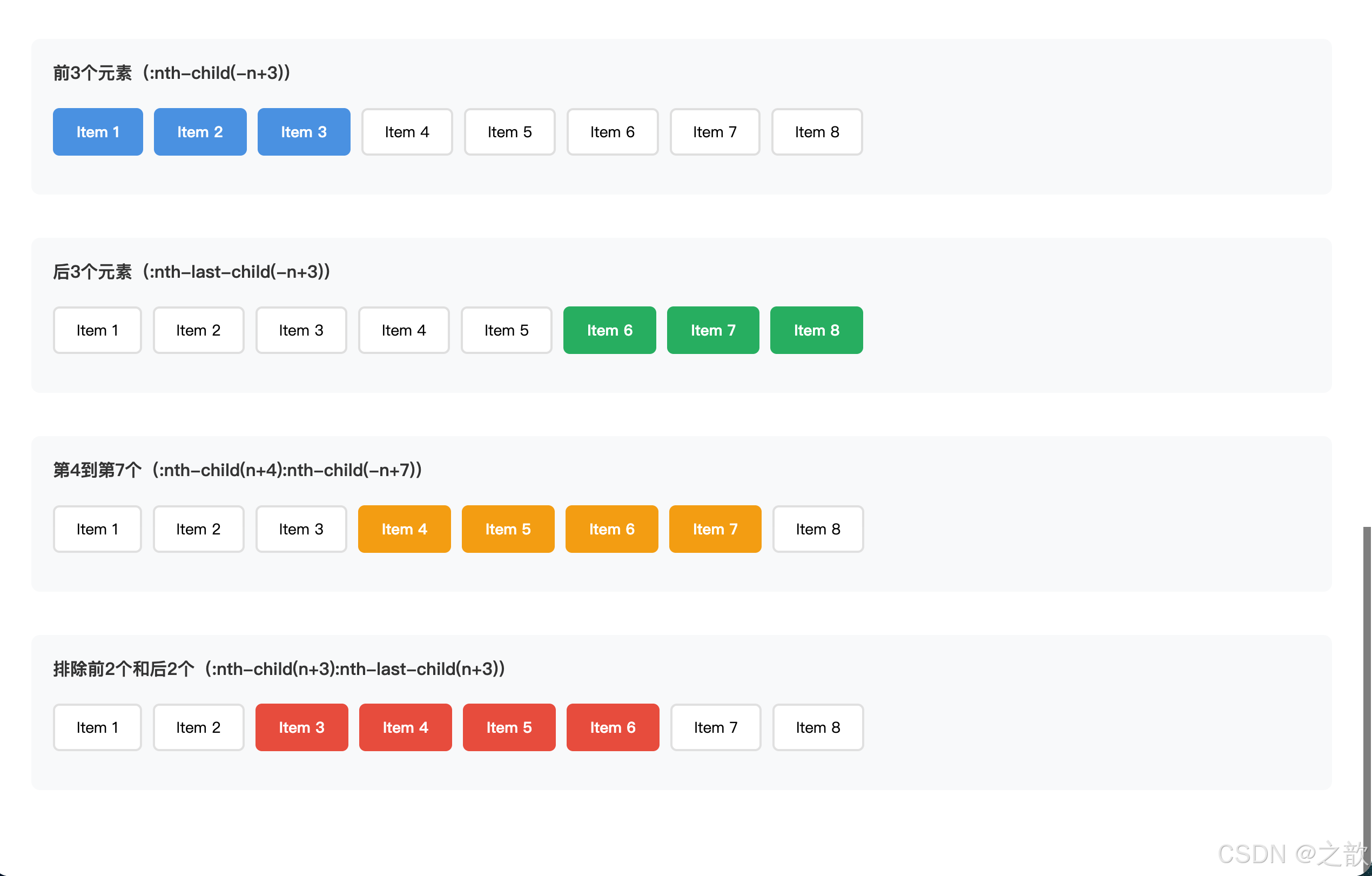
案例4:选择前 N 个元素 / 后 N 个元素
html
<!DOCTYPE html>
<html lang="zh-CN">
<head>
  <meta charset="UTF-8">
  <title>选择特定范围元素</title>
  <style>
    * { box-sizing: border-box; }
    body { padding: 30px; font-family: sans-serif; }

    .demo-section {
      margin-bottom: 40px;
      padding: 20px;
      background: #f8f9fa;
      border-radius: 8px;
    }

    .demo-section h4 {
      margin-top: 0;
      color: #333;
    }

    .item-list {
      list-style: none;
      padding: 0;
      display: flex;
      flex-wrap: wrap;
      gap: 10px;
    }

    .item {
      padding: 10px 20px;
      background: #fff;
      border: 2px solid #e0e0e0;
      border-radius: 6px;
      font-size: 14px;
    }

    /* 前3个元素高亮 */
    .list1 .item:nth-child(-n+3) {
      background: #4a90e2;
      color: #fff;
      border-color: #4a90e2;
      font-weight: bold;
    }

    /* 后3个元素高亮 */
    .list2 .item:nth-last-child(-n+3) {
      background: #27ae60;
      color: #fff;
      border-color: #27ae60;
      font-weight: bold;
    }

    /* 第4个到第7个 */
    .list3 .item:nth-child(n+4):nth-child(-n+7) {
      background: #f39c12;
      color: #fff;
      border-color: #f39c12;
      font-weight: bold;
    }

    /* 除了前2个和后2个 */
    .list4 .item:nth-child(n+3):nth-last-child(n+3) {
      background: #e74c3c;
      color: #fff;
      border-color: #e74c3c;
      font-weight: bold;
    }
  </style>
</head>
<body>
  <div class="demo-section">
    <h4>前3个元素(:nth-child(-n+3))</h4>
    <ul class="item-list list1">
      <li class="item">Item 1</li>
      <li class="item">Item 2</li>
      <li class="item">Item 3</li>
      <li class="item">Item 4</li>
      <li class="item">Item 5</li>
      <li class="item">Item 6</li>
      <li class="item">Item 7</li>
      <li class="item">Item 8</li>
    </ul>
  </div>

  <div class="demo-section">
    <h4>后3个元素(:nth-last-child(-n+3))</h4>
    <ul class="item-list list2">
      <li class="item">Item 1</li>
      <li class="item">Item 2</li>
      <li class="item">Item 3</li>
      <li class="item">Item 4</li>
      <li class="item">Item 5</li>
      <li class="item">Item 6</li>
      <li class="item">Item 7</li>
      <li class="item">Item 8</li>
    </ul>
  </div>

  <div class="demo-section">
    <h4>第4到第7个(:nth-child(n+4):nth-child(-n+7))</h4>
    <ul class="item-list list3">
      <li class="item">Item 1</li>
      <li class="item">Item 2</li>
      <li class="item">Item 3</li>
      <li class="item">Item 4</li>
      <li class="item">Item 5</li>
      <li class="item">Item 6</li>
      <li class="item">Item 7</li>
      <li class="item">Item 8</li>
    </ul>
  </div>

  <div class="demo-section">
    <h4>排除前2个和后2个(:nth-child(n+3):nth-last-child(n+3))</h4>
    <ul class="item-list list4">
      <li class="item">Item 1</li>
      <li class="item">Item 2</li>
      <li class="item">Item 3</li>
      <li class="item">Item 4</li>
      <li class="item">Item 5</li>
      <li class="item">Item 6</li>
      <li class="item">Item 7</li>
      <li class="item">Item 8</li>
    </ul>
  </div>
</body>
</html>