这里写目录标题

评价
我们还可以评估 IPW 模型的性能。
简单评价
在提供的数据集上评估拟合的模型
python
results = evaluate(ipw, data.X, data.a, data.y)结果包含模型、图表和分数,但由于我们没有请求图表,也没有重新拟合模型,我们主要关注的是分数。我们既有预测性能分数,也有标准化均值差异表,其中包括平衡前后的结果。
python
results.evaluated_metrics.prediction_scores
python
results.evaluated_metrics.covariate_balance.head()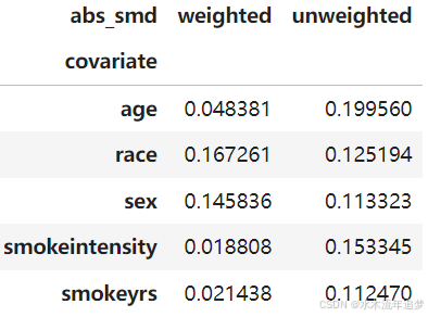
详尽评价
可以检查模型的一般规范,因为它使用交叉验证并在每一折上重新拟合模型进行评估
python
from sklearn import metrics
metrics = {"roc_auc": metrics.roc_auc_score,
           "avg_precision": metrics.average_precision_score,}
ipw = IPW(LogisticRegression(solver="liblinear"))
results = evaluate(ipw, data.X, data.a, data.y, cv="auto", metrics_to_evaluate=metrics)
results.plot_all()
{'train': {'calibration': <AxesSubplot:title={'center':'Calibration'}, xlabel='Predicted probability', ylabel='Observed probability'>,
  'covariate_balance_slope': <AxesSubplot:ylabel='Absolute Standard Mean Difference'>,
  'pr_curve': <AxesSubplot:title={'center':'PR Curve'}, xlabel='Recall', ylabel='Precision'>,
  'covariate_balance_love': <AxesSubplot:xlabel='Absolute Standard Mean Difference', ylabel='Covariates'>,
  'weight_distribution': <AxesSubplot:title={'center':'Propensity Distribution'}, xlabel='Propensity', ylabel='Probability density'>,
  'roc_curve': <AxesSubplot:title={'center':'ROC Curve'}, xlabel='False Positive Rate', ylabel='True Positive Rate'>},
 'valid': {'calibration': <AxesSubplot:title={'center':'Calibration'}, xlabel='Predicted probability', ylabel='Observed probability'>,
  'covariate_balance_slope': <AxesSubplot:ylabel='Absolute Standard Mean Difference'>,
  'pr_curve': <AxesSubplot:title={'center':'PR Curve'}, xlabel='Recall', ylabel='Precision'>,
  'covariate_balance_love': <AxesSubplot:xlabel='Absolute Standard Mean Difference', ylabel='Covariates'>,
  'weight_distribution': <AxesSubplot:title={'center':'Propensity Distribution'}, xlabel='Propensity', ylabel='Probability density'>,
  'roc_curve': <AxesSubplot:title={'center':'ROC Curve'}, xlabel='False Positive Rate', ylabel='True Positive Rate'>}}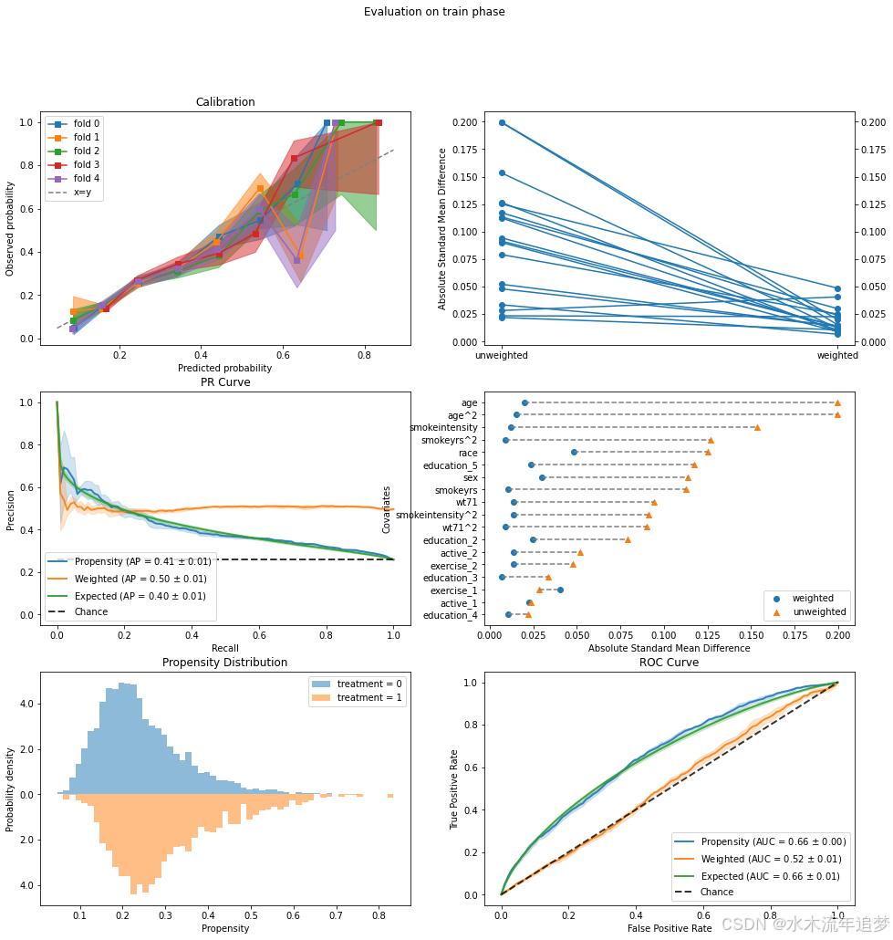
协变量平衡
让我们聚焦于一个常见的图表------Love 图。Love 图计算各协变量组间标准化均值差异。它还计算了逆概率加权平均值,因此我们可以检查加权是否使得两组更加相似(均值差异更小)。然后我们为每个协变量绘制两个值(加权和未加权的均值差异),并希望加权差异小于某个任意阈值(通常是 0.1)。
python
fig, ax = plt.subplots(1, 1, figsize=(6, 6))
results.plot_covariate_balance(kind="love", ax=ax, thresh=0.1);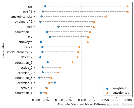
高阶平衡
上面的图表检查每个协变量的标准化差异。它非常直观且易于理解。然而,根据定义,标准化均值差异是一个边际估计,独立测试每个协变量。不幸的是,边际平衡并不能保证在高维协变量空间中的联合平衡(参见这篇手稿中的图 1)。
为了克服这一点,我们可以在检查平衡时加入特征交互作用。需要注意的是,我们不一定需要在包含交互作用的数据上拟合模型,只需要在这样的数据上进行测试即可。
下面展示一个简单的例子,加入一些交互作用并绘制图表。可以看到新的交互协变量出现在图表中,仍然保持着良好的平衡。这是进一步的证据,表明我们的模型表现良好,能够平衡协变量的联合分布。
python
from patsy import dmatrix

# Define some basic feature interactions using Patsy's formula:
X_interactions = dmatrix(
    "0 + age:sex + age:race + smokeyrs:sex + wt71:sex",
    data.X,
    return_type="dataframe"
)
# Set the entire data to be evaluated, but can also just use the interactions without the original data
results.X = data.X.join(X_interactions)

fig, ax = plt.subplots(1, 1, figsize=(6,6))
results.plot_covariate_balance(kind="love", phase="train", ax=ax, thresh=0.1);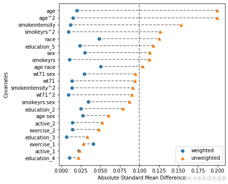
这些图表非常易于解释,但请注意我们必须明确选择交互作用来模拟联合协变量空间。这可能是耗时的,并且数量会迅速增加(我们 18 列的数据集有 172 种可能的交互作用,而且这只是二阶交互作用)。下面我们将展示如何使用 ROC 曲线来评估高维联合平衡。虽然没有必要,但为了有序起见,让我们将 EvaluationResults 对象中的数据恢复为原始数据:
python
results.X = data.X倾向得分的 ROC 曲线
根据上面的讨论,让我们聚焦于橙色的"加权"线。这是一个逆概率加权 ROC 曲线。作为提醒,IP 权重模拟了一个伪人口,在这个人群中处理是可以忽略的,这意味着(加权)协变量分布应该在处理组之间相似。这意味着不应该有任何信息可以帮助我们区分处理单元和对照单元。理论上,为了在高维设置中测试这一点,我们可以使用分类器并看它是否可以区分处理分配。理想情况下,它不应该能够区分。使用 IP 加权 ROC 曲线是对此分类器基础测试的有效替代。
python
results.plot_roc_curve();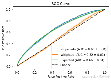
有关如何直观地解释高维倾向得分的 ROC 曲线的更多信息,请参阅这篇博客文章。
数字预测分数
python
results.evaluated_metrics.prediction_scores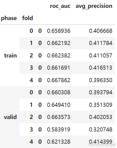
python
print(len(results.models))
results.models[2]
5
IPW(clip_max=None, clip_min=None, use_stabilized=False, verbose=False,
    learner=LogisticRegression(solver='liblinear'))