踩坑记录27:自定义弹窗组件的实现与层级管理
阅读时长 :10分钟 | 难度等级 :高级 | 适用版本 :HarmonyOS NEXT (API 12+)
关键词 :CustomDialogController、弹窗层级、zIndex、overlay
声明:本文基于真实项目开发经历编写,所有代码片段均来自实际踩坑场景。
欢迎加入开源鸿蒙PC社区 :https://harmonypc.csdn.net/
项目 Git 仓库 :https://atomgit.com/Dgr111-space/HarmonyOS
📖 前言导读
作为「HarmonyOS 开发踩坑记录」系列的一部分,本文总结了踩坑记录27:自定义弹窗组件的实现与层级管理方面的实战经验。这些经验来自真实的开发过程,每一项都曾让我们花费大量时间排查和修复。现在把它们整理出来,希望对你有所帮助。
踩坑记录27:自定义弹窗组件的实现与层级管理
严重程度 :⭐⭐⭐ | 发生频率 :高
涉及模块:CustomDialogController、overlay、zIndex、弹窗管理
一、问题现象
- 弹窗显示后被页面内容遮挡
- 多个弹窗同时弹出时顺序混乱
- 弹窗关闭后背景页面无法交互(事件穿透被错误拦截)
- 弹窗内容过长溢出屏幕
二、问题代码分析
typescript
// ❌ 问题一:zIndex 不够高被遮挡
@Builder renderDialog() {
  Column({ space: 20 }) {
    // 弹窗内容...
  }.width(420).position({ x: 300, y: 200 }).zIndex(10)
  // 页面中的某些 Stack zIndex=50 → 把弹窗盖住了
}

// ❌ 问题二:遮罩层和弹窗分离导致点击问题
Column().width('100%').height('100%').onClick(() => { /* 关闭 */ })  // 遮罩
Column({ space: 20 }) { /* 弹窗内容 */ }  // 弹窗体
// 点击弹窗内部的事件冒泡到遮罩层 → 误关闭!

// ❌ 问题三:硬编码 position
.position({ x: 340, y: 160 })
// 不同屏幕尺寸下位置完全不对
三、完整的弹窗解决方案
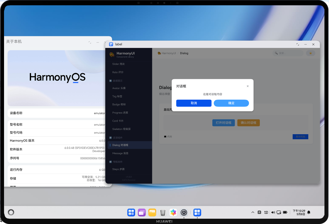
方案一:使用 CustomDialogController(推荐)
typescript
// ===== 定义弹窗内容 =====
@CustomDialog
struct ConfirmDialog {
controller: CustomDialogController
title: string = '提示'
message: string = ''
confirmText: string = '确定'
cancelText: string = '取消'
dangerMode: boolean = false
onConfirm?: () => void
onCancel?: () => void
build() {
Column({ space: 20 }) {
// 标题行
Row() {
Text(this.title)
.fontSize(17)
.fontWeight(FontWeight.Medium)
.fontColor('#303133')
Blank()
Text('\u00D7')
.fontSize(22)
.fontColor('#909399')
.onClick(() => {
this.controller.close()
this.onCancel?.()
})
}
.width('100%')
// 消息内容
Text(this.message)
.fontSize(14)
.fontColor('#606266')
.lineHeight(22)
.textAlign(TextAlign.Start)
.width('100%')
// 操作按钮
Row({ space: 12 }) {
Button(this.cancelText)
.type(ButtonType.Normal)
.height(36)
.layoutWeight(1)
.borderRadius(6)
.fontColor('#606266')
.onClick(() => {
this.controller.close()
this.onCancel?.()
})
Button(this.confirmText)
.type(ButtonType.Capsule)
.height(36)
.layoutWeight(1)
.borderRadius(6)
.backgroundColor(this.dangerMode ? '#F56C6C' : '#409EFF')
.fontColor('#FFF')
.onClick(() => {
this.controller.close()
this.onConfirm?.()
})
}
.width('100%')
}
.width(340)
.padding(24)
.borderRadius(12)
.backgroundColor('#FFFFFF')
.shadow({ radius: 16, color: 'rgba(0,0,0,0.15)', offsetY: 8 })
}
}
// ===== 在页面中使用 =====
@Entry
@Component
struct HomePage {
private confirmController: CustomDialogController = new CustomDialogController({
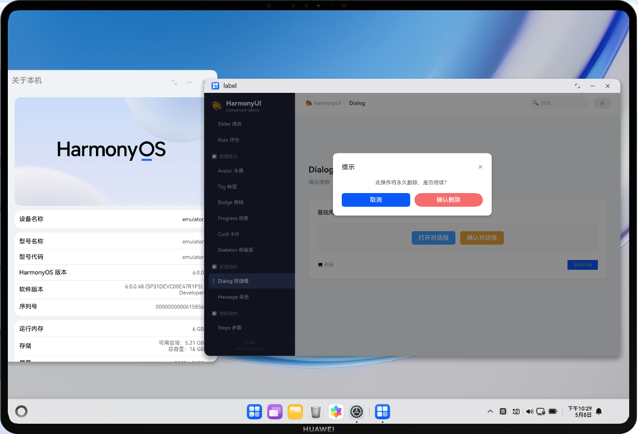
builder: ConfirmDialog({
title: '确认删除',
message: '此操作将永久删除该数据,是否继续?',
confirmText: '确认删除',
cancelText: '再想想',
dangerMode: true,
onConfirm: () => { this.handleDelete() },
onCancel: () => { console.log('cancelled') }
}),
autoCancel: true,
alignment: DialogAlignment.Center,
customStyle: true, // 自定义样式
maskColor: 'rgba(0,0,0,0.45)' // 遮罩颜色
})
showDeleteConfirm() {
this.confirmController.open()
}
handleDelete() {
// 执行删除逻辑
}
build() {
// ...
}
}方案二:手动实现的 overlay 弹窗
当需要更灵活的控制时(如非居中定位、跟随锚点等):
typescript
@Component
struct PopoverMenu {
  @State visible: boolean = false
  @Prop anchorPosition: { x: number; y: number } = { x: 0, y: 0 }

  private menuItems: MenuItem[] = [
    { id: 'edit', label: '编辑', icon: '\u270F' },
    { id: 'delete', label: '删除', icon: '\U0001F5D1', danger: true },
  ]

  build() {
    Stack({ alignContent: Alignment.TopStart }) {
      // 触发器(由外部传入或自行定义)
      if (this.visible) {
        // ===== 遮罩层 =====
        Column()
          .width('100%')
          .height('100%')
          .backgroundColor('transparent')
          .onClick(() => { this.visible = false })  // 点击空白关闭

        // ===== 菜单面板 =====
        Column({ space: 0 }) {
          ForEach(this.menuItems, (item) => {
            Row({ space: 8 }) {
              Text(item.icon).fontSize(14)
              Text(item.label)
                .fontSize(14)
                .fontColor(item.danger ? '#F56C6C' : '#303133')
              Blank()
            }
            .width('100%')
            .height(40)
            .padding({ left: 12, right: 12 })
            .backgroundColor(item.danger ? '#FEF0F0' : 'transparent')
            .borderRadius(4)
            .onClick(() => {
              this.onSelect(item.id)
              this.visible = false
            })
          })
        }
        .width(160)
        .padding(6)
        .borderRadius(8)
        .backgroundColor('#FFFFFF')
        .shadow({ radius: 12, color: 'rgba(0,0,0,0.12)', offsetY: 4 })
        .border({ width: 1, color: '#EBEEF5' })
        .position({ x: this.anchorPosition.x, y: this.anchorPosition.y + 8 })
        .zIndex(1000)
      }
    }
    .width('100%')
    .height('100%')
  }

  onSelect(id: string) {
    // 处理选择
  }
}
四、zIndex 层级规范
zIndex 层级体系
0: 默认页面内容
10: 固定的 Header/Footer
50: 浮动按钮 FAB
100: Tooltip / Popover
500: Dialog 遮罩层
501: Dialog 内容
999: Toast / Loading
1000: 全局 Modal
| 元素 | zIndex 范围 | 说明 |
|---|---|---|
| 普通内容 | 0(默认) | 页面主体 |
| 吸顶 Header | 10-49 | 固定定位 |
| 浮动按钮 | 50-99 | FAB、快捷操作 |
| 下拉菜单/Tooltip | 100-499 | 临时浮层 |
| Dialog 遮罩 | 500 | 半透明黑色背景 |
| Dialog 内容 | 501+ | 必须高于遮罩 |
| Toast 提示 | 900-999 | 全局通知 |
| 全局 Modal | 1000+ | 最高优先级 |
五、弹窗设计 Checklist
- 遮罩层覆盖全屏且可点击关闭
- 弹窗内容的 z-index 高于遮罩
- 支持键盘 Escape 关闭(如有物理键盘)
- 弹窗内的点击事件不会冒泡到遮罩层
- 内容超出时支持内部滚动
- 弹窗打开时禁止背景页面滚动
- 关闭动画与打开动画对称
参考资源与延伸阅读
官方文档
> 系列导航:本文是「HarmonyOS 开发踩坑记录」系列的第 27 篇。该系列共 30 篇,涵盖 ArkTS 语法、组件开发、状态管理、网络请求、数据库、多端适配等全方位实战经验。
工具与资源### 工具与资源
- DevEco Studio 官方下载 --- HarmonyOS 官方IDE
- HarmonyOS 开发者社区 --- 技术问答与经验分享
👇 如果这篇对你有帮助,欢迎点赞、收藏、评论!
你的支持是我持续输出高质量技术内容的动力 💪