在 WPF 中使用 OxyPlot 实现不同图表,核心在于创建和配置PlotModel对象,并将其绑定到PlotView控件上进行显示。通过向PlotModel中添加不同类型的Series(数据系列),即可轻松实现折线图、柱状图、饼图、散点图等多种图表。
基础使用
在 XAML 文件的 Window 或 UserControl 元素中添加 OxyPlot 的命名空间引用:
xml
xmlns:oxy="http://oxyplot.org/wpf"添加图表控件
xml
<oxy:PlotView Model="{Binding PlotModel}" />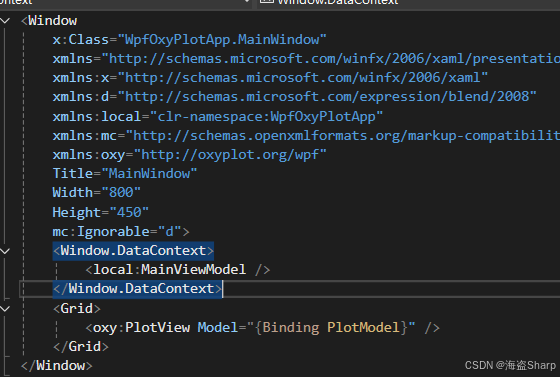
ViewModel:
定义好PlotModel ,然后初始化不同的图表
csharp
public class MainViewModel
{
    public PlotModel PlotModel { get; }

    public MainViewModel()
    {
        // 创建 PlotModel,设置标题
        var plotModel = new PlotModel { Title = "简单折线图" };

        // 创建折线数据系列并添加数据点
        var lineSeries = new LineSeries
        {
            Title = "数据曲线",
            Color = OxyColors.Red,
            MarkerSize = 4,
        };
        lineSeries.Points.Add(new DataPoint(0, 1));
        lineSeries.Points.Add(new DataPoint(1, 5));
        lineSeries.Points.Add(new DataPoint(2, 3));


        plotModel.Series.Add(lineSeries);
        this.PlotModel = plotModel;
    }
}
以下是几种常见图表的实现方法:
📈 折线图 (Line Chart)
折线图通过LineSeries来实现。你只需创建LineSeries对象,向其中添加DataPoint数据点,然后将其加入PlotModel的Series 集合中。
csharp
        public MainViewModel()
        {
            // 创建 PlotModel,设置标题
            var plotModel = new PlotModel { Title = "简单折线图" };

            // 创建折线数据系列并添加数据点
            var lineSeries = new LineSeries
            {
                Title = "数据曲线",
                Color = OxyColors.Red,
                MarkerSize = 4,
            };
            lineSeries.Points.Add(new DataPoint(0, 1));
            lineSeries.Points.Add(new DataPoint(1, 5));
            lineSeries.Points.Add(new DataPoint(2, 3));
            lineSeries.Points.Add(new DataPoint(3, 7));
            lineSeries.Points.Add(new DataPoint(4, 8));

            plotModel.Series.Add(lineSeries);
            this.PlotModel = plotModel;
        }
效果:
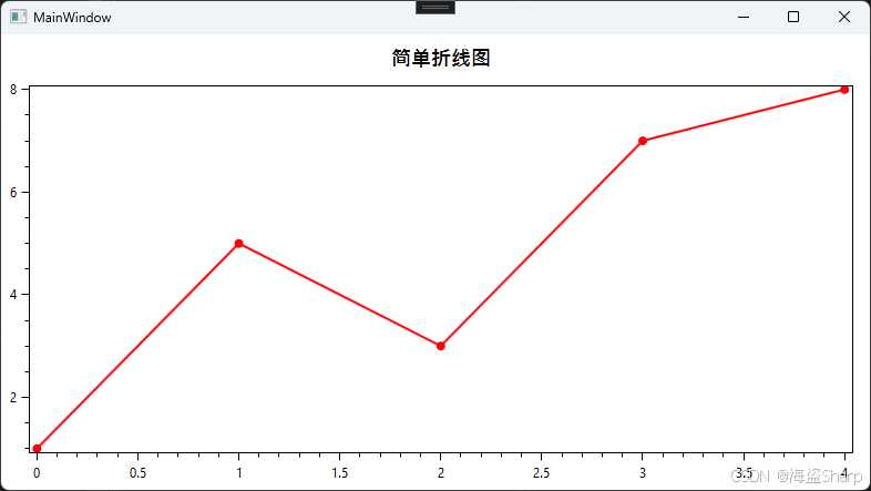
曲线图
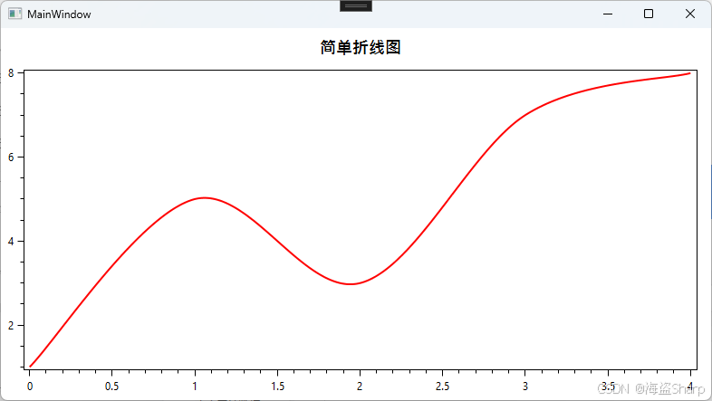
在折线图上LineSeries增加InterpolationAlgorithm = InterpolationAlgorithms.CanonicalSpline就可以变成曲线图
csharp
            // 创建 PlotModel,设置标题
            var plotModel = new PlotModel { Title = "简单折线图" };

            // 创建折线数据系列并添加数据点
            var lineSeries = new LineSeries
            {
                Title = "数据曲线",
                Color = OxyColors.Red,
                InterpolationAlgorithm = InterpolationAlgorithms.CanonicalSpline,
                MarkerSize = 4,
            };
            lineSeries.Points.Add(new DataPoint(0, 1));
            lineSeries.Points.Add(new DataPoint(1, 5));
            lineSeries.Points.Add(new DataPoint(2, 3));
            lineSeries.Points.Add(new DataPoint(3, 7));
            lineSeries.Points.Add(new DataPoint(4, 8));

            plotModel.Series.Add(lineSeries);
效果:
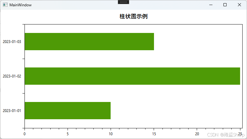
📊 水平柱状图 (Bar Chart)
柱状图通过ColumnSeries来实现。与折线图类似,你创建ColumnSeries 并填充数据即可。
注:后面代码只写public MainViewModel()里面部分的,其他的都一样
csharp
  var plotModel = new PlotModel { Title = "柱状图示例" };
  var barSeries = new BarSeries { Title = "生产数量" };
  barSeries.Items.Add(new BarItem { Value = 10 });
  barSeries.Items.Add(new BarItem { Value = 25 });
  barSeries.Items.Add(new BarItem { Value = 15 });

  plotModel.Series.Add(barSeries);
  plotModel.Axes.Add(
      new CategoryAxis
      {
          Position = AxisPosition.Left,
          Key = "X",
          ItemsSource = new[] { "2023-01-01", "2023-01-02", "2023-01-03" },
      }
  );
  this.PlotModel = plotModel;
效果:
自定义颜色
csharp
barSeries.Items.Add(new BarItem { Value = 10, Color = OxyColor.FromRgb(255, 0, 0) });
barSeries.Items.Add(new BarItem { Value = 25, Color = OxyColor.FromRgb(0, 255, 0) });
barSeries.Items.Add(new BarItem { Value = 15, Color = OxyColor.FromRgb(0, 0, 255) });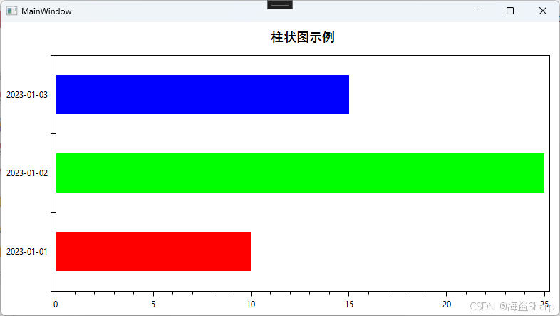
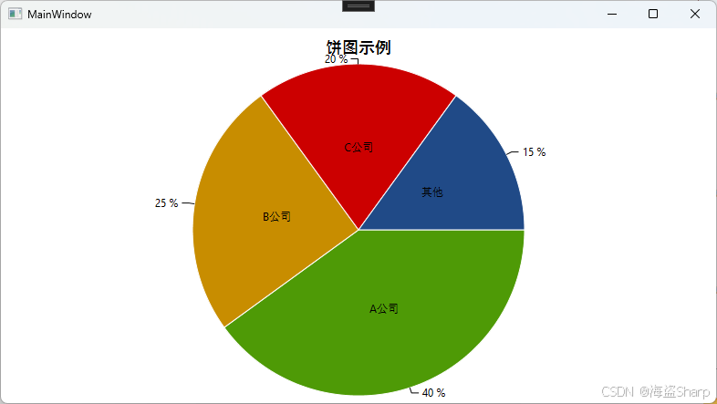
🥧 饼图 (Pie Chart)
饼图通过PieSeries 来实现,非常适合展示各部分占整体的比例。
csharp
var plotModel = new PlotModel { Title = "饼图示例" };
var pieSeries = new PieSeries
{
    Title = "市场份额",
    AngleSpan = 360,
    StartAngle = 0
};
pieSeries.Slices.Add(new PieSlice("A公司", 40) { IsExploded = true }); // IsExploded 可使扇区分离
pieSeries.Slices.Add(new PieSlice("B公司", 25));
pieSeries.Slices.Add(new PieSlice("C公司", 20));
pieSeries.Slices.Add(new PieSlice("其他", 15));
plotModel.Series.Add(pieSeries);
效果: