
在数据可视化场景中,饼图和环形图是展示比例关系和市场份额的理想选择。通过 Python 自动化生成这些图表,可以高效地将数据转换为直观的视觉呈现,适用于销售报告、市场分析和管理演示等场景。
本文介绍如何使用 Spire.Presentation for Python 在 PowerPoint 演示文稿中创建和自定义饼图与环形图,包括数据绑定、颜色定制和标签设置等核心功能。
环境准备
首先安装 Spire.Presentation 库:
bash
pip install Spire.Presentation该库提供了完整的 PowerPoint 操作 API,支持创建各种类型的图表并进行精细化定制。
创建饼图
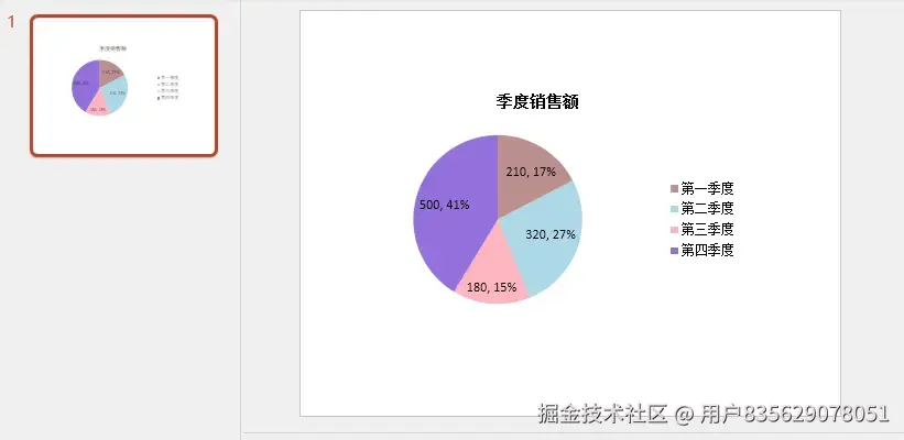
饼图适合展示各部分占整体的比例关系。以下示例演示如何创建一个展示季度销售额的饼图。
基本实现步骤
创建饼图的核心流程包括:初始化演示文档、添加图表对象、绑定数据源、配置图表属性,最后保存文件。
python
from spire.presentation.common import *
from spire.presentation import *

# 创建演示文档
presentation = Presentation()

# 在第一张幻灯片中添加饼图,设置位置和大小
rect = RectangleF.FromLTRB(40, 100, 590, 420)
chart = presentation.Slides[0].Shapes.AppendChartInit(ChartType.Pie, rect, False)

# 设置图表标题
chart.ChartTitle.TextProperties.Text = "季度销售额"
chart.ChartTitle.TextProperties.IsCentered = True
chart.ChartTitle.Height = 30
chart.HasTitle = True

# 定义数据
quarters = ["第一季度", "第二季度", "第三季度", "第四季度"]
sales = [210, 320, 180, 500]

# 将数据写入图表数据表
chart.ChartData[0, 0].Text = "季度"
chart.ChartData[0, 1].Text = "销售额"

for i in range(len(quarters)):
    chart.ChartData[i + 1, 0].Text = quarters[i]
    chart.ChartData[i + 1, 1].NumberValue = sales[i]

# 绑定数据系列
chart.Series.SeriesLabel = chart.ChartData["B1", "B1"]
chart.Categories.CategoryLabels = chart.ChartData["A2", "A5"]
chart.Series[0].Values = chart.ChartData["B2", "B5"]

# 为每个数据点设置不同颜色
for i in range(len(chart.Series[0].Values)):
    cdp = ChartDataPoint(chart.Series[0])
    cdp.Index = i
    chart.Series[0].DataPoints.Add(cdp)

chart.Series[0].DataPoints[0].Fill.FillType = FillFormatType.Solid
chart.Series[0].DataPoints[0].Fill.SolidColor.Color = Color.get_RosyBrown()
chart.Series[0].DataPoints[1].Fill.FillType = FillFormatType.Solid
chart.Series[0].DataPoints[1].Fill.SolidColor.Color = Color.get_LightBlue()
chart.Series[0].DataPoints[2].Fill.FillType = FillFormatType.Solid
chart.Series[0].DataPoints[2].Fill.SolidColor.Color = Color.get_LightPink()
chart.Series[0].DataPoints[3].Fill.FillType = FillFormatType.Solid
chart.Series[0].DataPoints[3].Fill.SolidColor.Color = Color.get_MediumPurple()

# 显示数值和百分比标签
chart.Series[0].DataLabels.LabelValueVisible = True
chart.Series[0].DataLabels.PercentValueVisible = True

# 保存文件
presentation.SaveToFile("饼图示例.pptx", FileFormat.Pptx2013)
presentation.Dispose()
结果预览:
代码解析
AppendChartInit 方法用于在指定位置添加图表,第一个参数指定图表类型,第二个参数定义矩形区域。
数据通过 ChartData 二维数组进行绑定,其中 [行,列] 索引对应单元格位置。SeriesLabel 指定系列名称来源,CategoryLabels 设置分类标签范围,Values 绑定实际数值数据。
每个数据点通过 ChartDataPoint 对象单独配置,可以精确控制颜色和样式。DataLabels 属性控制标签显示内容,同时显示数值和百分比能提供更完整的信息。
创建环形图
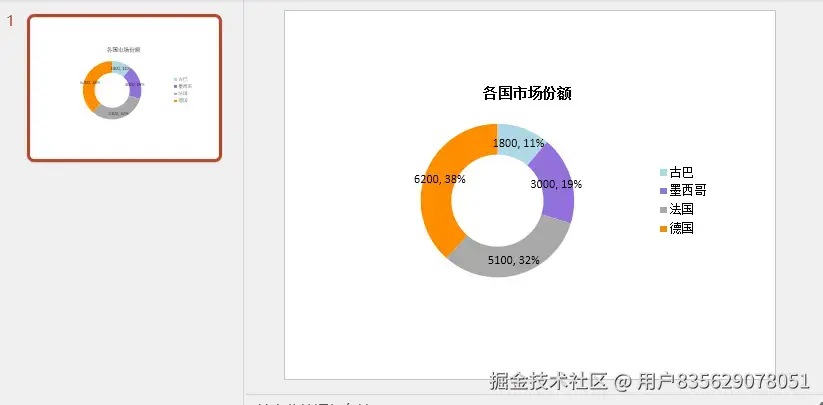
环形图是饼图的变体,中心留空形成环状结构,视觉上更加现代,适合展示市场占有率等对比数据。
实现方法
环形图的创建流程与饼图类似,主要区别在于图表类型和额外的环形尺寸设置。
python
from spire.presentation.common import *
from spire.presentation import *

# 创建演示文档
presentation = Presentation()
rect = RectangleF.FromLTRB(80, 100, 630, 420)

# 添加环形图
chart = presentation.Slides[0].Shapes.AppendChartInit(ChartType.Doughnut, rect, False)

# 设置标题
chart.ChartTitle.TextProperties.Text = "各国市场份额"
chart.ChartTitle.TextProperties.IsCentered = True
chart.ChartTitle.Height = 30

# 定义数据
countries = ["古巴", "墨西哥", "法国", "德国"]
sales = [1800, 3000, 5100, 6200]

# 写入数据
chart.ChartData[0, 0].Text = "国家"
chart.ChartData[0, 1].Text = "销售额"

for i in range(len(countries)):
    chart.ChartData[i + 1, 0].Text = countries[i]
    chart.ChartData[i + 1, 1].NumberValue = sales[i]

# 绑定数据系列
chart.Series.SeriesLabel = chart.ChartData["B1", "B1"]
chart.Categories.CategoryLabels = chart.ChartData["A2", "A5"]
chart.Series[0].Values = chart.ChartData["B2", "B5"]

# 添加数据点并设置颜色
for i in range(len(chart.Series[0].Values)):
    cdp = ChartDataPoint(chart.Series[0])
    cdp.Index = i
    chart.Series[0].DataPoints.Add(cdp)

chart.Series[0].DataPoints[0].Fill.FillType = FillFormatType.Solid
chart.Series[0].DataPoints[0].Fill.SolidColor.Color = Color.get_LightBlue()
chart.Series[0].DataPoints[1].Fill.FillType = FillFormatType.Solid
chart.Series[0].DataPoints[1].Fill.SolidColor.Color = Color.get_MediumPurple()
chart.Series[0].DataPoints[2].Fill.FillType = FillFormatType.Solid
chart.Series[0].DataPoints[2].Fill.SolidColor.Color = Color.get_DarkGray()
chart.Series[0].DataPoints[3].Fill.FillType = FillFormatType.Solid
chart.Series[0].DataPoints[3].Fill.SolidColor.Color = Color.get_DarkOrange()

# 显示标签
chart.Series[0].DataLabels.LabelValueVisible = True
chart.Series[0].DataLabels.PercentValueVisible = True

# 设置环形孔洞大小(0-90之间)
chart.Series[0].DoughnutHoleSize = 60

# 保存文件
presentation.SaveToFile("环形图示例.pptx", FileFormat.Pptx2013)
presentation.Dispose()
结果预览:
关键特性
DoughnutHoleSize 属性控制环形图中心空白区域的大小,取值范围为 0 到 90。数值越大,中心空洞越大,环形越细。默认值通常为 50-60,能在美观性和可读性之间取得平衡。
环形图的数据绑定方式与饼图完全相同,可以复用相同的数据处理逻辑。
高级定制技巧
动态颜色分配
在实际应用中,可能需要根据数据量动态分配颜色。可以使用预定义的颜色列表循环应用:
python
# 预定义颜色列表
colors = [
    Color.get_LightBlue(),
    Color.get_MediumPurple(),
    Color.get_LightPink(),
    Color.get_RosyBrown(),
    Color.get_DarkOrange(),
    Color.get_DarkGray()
]

# 循环应用颜色
for i in range(len(chart.Series[0].Values)):
    cdp = ChartDataPoint(chart.Series[0])
    cdp.Index = i
    chart.Series[0].DataPoints.Add(cdp)
    chart.Series[0].DataPoints[i].Fill.FillType = FillFormatType.Solid
    chart.Series[0].DataPoints[i].Fill.SolidColor.Color = colors[i % len(colors)]
这种方法适用于数据点数量不确定的场景,确保每个数据点都有合适的颜色。
标签位置调整
数据标签的位置可以通过 DataLabels 属性进一步定制:
python
# 设置标签显示位置
chart.Series[0].DataLabels.Position = LabelPositionType.OutsideEnd

# 仅显示百分比
chart.Series[0].DataLabels.LabelValueVisible = False
chart.Series[0].DataLabels.PercentValueVisible = True

# 自定义标签格式
chart.Series[0].DataLabels.NumberFormat = "0.0%"
LabelPositionType 枚举提供了多种位置选项,如 OutsideEnd(外部末端)、InsideEnd(内部末端)、Center(居中)等,可根据图表布局选择最合适的位置。
图表背景设置
为提升视觉效果,可以为幻灯片添加背景:
python
# 设置背景图片
image_file = "background.png"
bg_rect = RectangleF.FromLTRB(0, 0, presentation.SlideSize.Size.Width,
                               presentation.SlideSize.Size.Height)
presentation.Slides[0].Shapes.AppendEmbedImageByPath(
    ShapeType.Rectangle, image_file, bg_rect)
presentation.Slides[0].Shapes[0].Line.FillFormat.SolidFillColor.Color = Color.get_FloralWhite()
背景图片应与图表颜色协调,避免干扰数据阅读。
实用建议
选择合适的图表类型:饼图适合展示 5-7 个类别的比例关系,类别过多会降低可读性。环形图在视觉上更现代,且中心区域可用于放置总计数字或说明文字。
颜色搭配原则:使用对比明显的颜色区分不同数据点,避免使用过于相近的色调。考虑色盲用户的可访问性,可借助在线工具验证配色方案。
标签清晰度:同时显示数值和百分比能提供完整信息,但如果空间有限,可只显示百分比并在图例中注明总数。
数据排序:将数据按降序排列,从最大份额开始顺时针展示,符合阅读习惯,便于快速识别主要贡献者。
总结
通过 Spire.Presentation for Python,可以在 PowerPoint 中灵活创建和定制饼图与环形图。核心 API 包括 AppendChartInit 用于添加图表、ChartData 用于数据绑定、DataPoints 用于颜色定制,以及 DataLabels 用于标签控制。
这些技术可应用于销售分析、市场调研、预算分配等多种业务场景,帮助将复杂数据转化为直观的视觉呈现。结合动态数据源,还能实现自动化报告生成,大幅提升工作效率。