# Matplotlib可视化教程:从入门到精通
Matplotlib介绍与环境搭建
Matplotlib简介
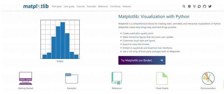
Matplotlib 是一个用于绘制图表和可视化数据的 Python 库。它提供了一种类似于 MATLAB 的绘图接口,使用户能够轻松地生成各种类型的图形,包括折线图、散点图、直方图、饼图等。Matplotlib被广泛应用于数据分析、科学计算、工程和其他领域
为什么学习Matplotlib
- 可让数据可视化,更直观的真实给用户。使数据更加客观、更具有说服力。
- Matplotlib是Python的库,又是开发中常用的库
图表的组成
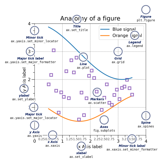
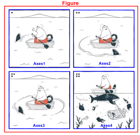
图表(Figure)
在 Matplotlib 中, Figure 是一个顶层容器,用于包含图表中的所有元素。比如坐标轴、图例、标题、等
轴(Axes)
一个 Matplotlib 图表可以包含一个或多个 Axes 对象,每个 Axes 对象都是一个独立的坐标系,可以理解成一个子图
轴(Axis)
在 Matplotlib 中, Axis 这个词可以指代 坐标轴,即图表中的X轴和Y轴。这是用于定位和测量数据点位置的参考线
画家(Artist)
在 Matplotlib 中, Artist 是一个基础的图形元素对象,它代表了图表中的各种图形元素,如图形、文本、线条等。所有的图形元素,无论是图表本身、坐标轴、标签还是其他可见的部分,都是 Artist 对象
Matplotlib的安装
python
conda install matplotlib==3.8.0Matplotlib初步体验
Matplotlib的基本使用
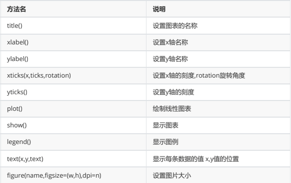
在使用Matplotlib绘制图形时,其中有两个最为常用的场景。一个是画点,一个是画线。pyplot基本方法的使用如下表
案例
python
import matplotlib.pyplot as plt

x=[1,2,3,4,5]
squares=[1,4,9,16,25]
plt.plot(x,squares)
plt.show()
设置标签文字和线条粗细
python
import matplotlib.pyplot as plt

datas=[1,2,3,4,5]
squares=[1,4,9,16,25]
plt.plot(datas,squares,linewidth=5) #设置线条宽度
#设置图标标题,并在坐标轴上添加标签
plt.title('Numbers',fontsize=24)
plt.xlabel('datas',fontsize=14)
plt.ylabel('squares',fontsize=14)
plt.show()
Matplotlib中文问题
查看系统内字体
python
from matplotlib.font_manager import

fontManager as fm
for f in fm.ttflist:
    if f.fname.find('simhei.ttf') != -1:
        print(f.name,'===',f.fname)
临时增加字体
python
from matplotlib.font_manager import

fontManager as fm
fm.addfont('./ali.ttf')
for f in fm.ttflist:
    if f.fname.find('ali') != -1:
        print(f.name,'===',f.fname)
设置字体
python
import matplotlib.pyplot as plt

#设置中文乱码问题
plt.rcParams['font.sans-serif'] = 'SimHei'
plt.rcParams['font.family']='SimHei'
单独设置字体
python
import matplotlib.pyplot as plt
from matplotlib.font_manager import FontProperties

datas=[1,2,3,4,5]
squares=[1,4,9,16,25]

plt.plot(datas,squares) #设置线条宽度
#设置图标标题,并在坐标轴上添加标签
plt.title('标题设置',fontsize=24,fontdict=
{'fontproperties':FontProperties(fname='./ali.ttf')})
plt.xlabel('x轴',fontsize=14,fontdict={'family':'SimHei'})
plt.ylabel('y轴',fontsize=14,fontdict={'family':'SimHei'})
Matplotlib风格
官方地址:https://matplotlib.org/stable/api/style_api.html
python
from matplotlib import style

#风格的设置
#查看有哪些风格
print(style.available)
#设置风格
style.use('ggplot')
提示:设置风格时,有可能让部分设置失效,需要重新设置
某周最高温度和最低温度变化
python
from matplotlib import pyplot as plt

#设置中文字体显示
plt.rcParams['font.sans-serif'] = 'SimHei'
#准备数据
max_temperture = [25,26,25,28,28,30,31]
min_temperture = [17,18,19,20,21,22,23]
x = range(7)
#填充数据到图表
plt.plot(x,max_temperture,label='最高温度')
plt.plot(x,min_temperture,label='最低温度')
#设置图表信息
#设置标题
plt.title('一周温度变化')
#设置X轴的文字说明
plt.xlabel('日期')
#设置Y轴的文字说明  ℃(alt + 41446)
plt.ylabel('温度:单位(℃)')
#设置图例
plt.legend()
Matplotlib多图分布
pyplot.subplot
python
from matplotlib import pyplot as plt

#多图分布设置
lt.figure(figsize=(16,8))
#方式一
ax1 = plt.subplot(2,2,1)
ax2 = plt.subplot(2,2,2)
ax3 = plt.subplot(2,2,3)
ax4 = plt.subplot(2,2,4)
ax1.plot([1,2,3,4],[13,15,14,18])
pyplot.subplots
python
from matplotlib import pyplot as plt
#方式二
fig = plt.figure(figsize=(16,8))#不好用
fig,ax = plt.subplots(2,2,figsize=(16,8))

#方式三
fig = plt.figure(figsize=(16,8))
ax = fig.subplots(2,2)
ax[0][0].plot([1,2,3,4],[1,4,9,16])
ax[0][0].set_title('test title')
Matplotlib嵌套图形
fig.add_subplot
python
from matplotlib import pyplot as plt
#图形嵌套
#方法一
fig = plt.figure(figsize=(20,8))

#绘制一个大图
ax1 = fig.add_subplot(1,1,1)
ax1.plot([1,2,3,4,5],[1,4,9,16,25])

#绘制嵌套图
ax2 = fig.add_subplot(2,2,1)
ax2.plot([1,2,3,4,5],[1,4,9,16,25])
ax3 = fig.add_subplot(2,2,4)
ax3.plot([1,2,3,4,5],[1,4,9,16,25])
plt.axes与fig.add_axes
python
from matplotlib import pyplot as plt
#方法二
fig = plt.figure(figsize=(20,8))
#绘制一个大图
plt.plot([1,2,3,4,5],[1,4,9,16,25])
#绘制嵌套图
plt.axes((0.3,0.6,0.2,0.2))     #左边距离,下边距离,宽度,高度,单位是画布比列
fig.add_axes((0.6,0.2,0.2,0.4))
Matplotlib双轴显示
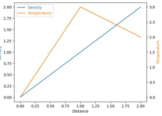
Axes.twinx()
创建共享 x 轴的双轴
python
from matplotlib import pyplot as plt

#设置中文字体
plt.rcParams['font.sans-serif'] = 'SimHei'
#显示正常显示符号
plt.rcParams['axes.unicode_minus'] = False

#   1;准备数据
#  1天24小时的温度
data1 = [-5,1,5,2,6,8,11,13,12,10,9,4,6,4,3,2]
#  1天24小时的湿度
data2 = [-2,4,5,2,7,8,11,13,12,10,9,4,6,4,3,2]
x = range(0,len(data1))
#   2:创建画布
fig,ax1 = plt.subplots()

ax1.set_xlabel('时间')
ax1.set_ylabel('温度')
#   3:绘制图像
ax1.plot(x,data1,label='温度')
#设置共享X轴
ax2 = ax1.twinx()
#   5:绘制图像
ax2.set_ylabel('湿度')
ax1.plot(x,data2,label='湿度',color='r')
#显示图例
fig.legend()