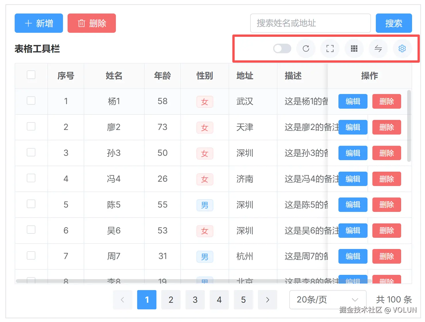
在企业后台系统里,表格几乎是最核心的组件之一。
但随着业务复杂度提升,传统 el-table 往往会遇到几个典型问题:
- 列太多,用户想隐藏/显示列
- 列顺序无法调整
- 需要支持固定列(left / right)
- 表格需要全屏查看
- 需要统一工具栏能力(刷新、密度、斑马纹等)
这篇文章带你实现一个 Vue3 + Element Plus 的 TableSetting 表格增强组件,支持:
✅ 列显示/隐藏
✅ 拖拽排序列
✅ 左右固定列
✅ 表格密度切换
✅ 斑马纹开关
✅ 全屏模式
✅ 刷新事件
✅ slot 驱动表格渲染
📦 一、组件设计思路
这个组件的核心思想是:
TableSetting 不直接渲染表格,而是"控制表格行为 + 提供配置能力"
真正的表格(如 gi-table / el-table)通过 slot 注入:
ruby
<slot :setting-columns="settingColumns" :table-props="tableProps" />也就是说:
- TableSetting = "控制器"
- gi-table = "渲染器"
使用示例
xml
<template>
  <gi-page-layout bordered style="height: 520px">
    <template #tool>
      <el-row justify="space-between" class="g-tool g-w-full">
        <el-space wrap>
          <gi-button type="add"></gi-button>
          <gi-button type="delete"></gi-button>
        </el-space>
        <el-space wrap>
          <el-input v-model="queryParams.keyword" placeholder="搜索姓名或地址" clearable style="width: 200px" />
          <ElButton type="primary" @click="search">搜索</ElButton>
        </el-space>
      </el-row>
    </template>
    <TableSetting title="表格工具栏" :columns="columns" :disabled-column-keys="disabledColumnKeys" @refresh="refresh">
      <template #default="{ settingColumns, tableProps }">
        <gi-table v-loading="loading" v-bind="tableProps" :columns="settingColumns" :data="tableData"
          :pagination="pagination">
          <template #action="scope">
            <el-space>
              <ElButton type="primary" size="small" @click="onEdit(scope.row)">编辑</ElButton>
              <ElButton type="danger" size="small">删除</ElButton>
            </el-space>
          </template>
        </gi-table>
      </template>
    </TableSetting>
  </gi-page-layout>
</template>

<script lang="ts" setup>
import type { UserItem } from '@docs/_apis/mockTable'
import type { TableColumnItem } from 'gi-component'
import { getUserList } from '@docs/_apis/mockTable'
import { useTable } from '@docs/_hooks'
import { ElButton, ElMessage, ElTag } from 'element-plus'
import { h, reactive } from 'vue'
import TableSetting from './components/TableSetting.vue'

const columns: TableColumnItem[] = [
  { type: 'selection', width: 55, align: 'center', fixed: 'left' },
  { type: 'index', label: '序号', width: 60, align: 'center' },
  {
    prop: 'name',
    label: '姓名',
    width: 100,
    align: 'center',
    showOverflowTooltip: true
  },
  { prop: 'age', label: '年龄', width: 60, align: 'center' },
  {
    prop: 'sex',
    label: '性别',
    width: 80,
    align: 'center',
    render: ({ row }) => {
      return h(
        ElTag,
        { type: row.sex === '男' ? 'primary' : 'danger', size: 'small' },
        { default: () => row.sex }
      )
    }
  },
  {
    prop: 'address',
    label: '地址'
  },
  { prop: 'remark', label: '描述', width: 150, showOverflowTooltip: true },
  {
    prop: 'action',
    label: '操作',
    width: 140,
    align: 'center',
    slotName: 'action',
    fixed: 'right'
  }
]

/** 与 TableSetting 内 getColumnKey 规则一致:无 prop 的列用 __type_{type}_{index}__(多选列不在列设置中) */
const disabledColumnKeys = ['__type_index_1__', 'name']

const queryParams = reactive({
  keyword: ''
})

const { tableData, pagination, search, refresh, loading } = useTable(
  (p) => getUserList({ ...p, ...queryParams }),
  {
    onSuccess: () => { }
  }
)

function onEdit(row: UserItem) {
  ElMessage.success(`编辑 ${row.name}`)
}
</script>

<style lang="scss" scoped>
.demo-table-setting__title {
  font-size: 14px;
  font-weight: 500;
  line-height: 32px;
  color: var(--el-text-color-primary);
}
</style>
组件源码
xml
<template>
  <div class="table-setting" :class="{ 'table-setting--fullscreen': isFullscreen }">
    <div class="table-setting__toolbar">
      <div class="table-setting__toolbar-left">
        <slot name="toolbar-left">
          <span class="table-setting__title">{{ title }}</span>
        </slot>
      </div>
      <el-space wrap :size="8">
        <el-tooltip content="斑马纹" placement="top">
          <el-switch v-model="stripe" size="small" />
        </el-tooltip>
        <el-tooltip content="刷新" placement="top">
          <el-button class="table-setting__icon-btn" bg text circle @click="emit('refresh')">
            <el-icon :size="14">
              <RefreshRight />
            </el-icon>
          </el-button>
        </el-tooltip>
        <el-tooltip :content="isFullscreen ? '退出全屏' : '全屏'" placement="top">
          <el-button class="table-setting__icon-btn" bg text circle @click="toggleFullscreen">
            <el-icon :size="14">
              <ScaleToOriginal v-if="isFullscreen" />
              <FullScreen v-else />
            </el-icon>
          </el-button>
        </el-tooltip>
        <el-tooltip content="显示边框" placement="top">
          <el-button class="table-setting__icon-btn" bg text circle @click="toggleBorder">
            <el-icon :size="14">
              <Grid />
            </el-icon>
          </el-button>
        </el-tooltip>
        <el-dropdown trigger="click" @command="handleSizeCommand">
          <span class="el-dropdown-link">
            <el-tooltip content="表格尺寸" placement="top">
              <el-button class="table-setting__icon-btn" bg text circle>
                <el-icon :size="14">
                  <Switch />
                </el-icon>
              </el-button>
            </el-tooltip>
          </span>
          <template #dropdown>
            <el-dropdown-menu>
              <el-dropdown-item v-for="item in TABLE_SIZE_OPTIONS" :key="item.label" :command="item.value"
                :class="{ 'is-active': item.value === size }">
                {{ item.label }}
              </el-dropdown-item>
            </el-dropdown-menu>
          </template>
        </el-dropdown>
        <el-popover v-if="showColumnSetting" placement="bottom-end" :width="180" trigger="click"
          transition="el-zoom-in-top">
          <template #reference>
            <el-button type="primary" bg text circle>
              <el-icon :size="14">
                <Setting />
              </el-icon>
            </el-button>
          </template>
          <div class="table-setting__popover">
            <el-scrollbar class="table-setting__draggable" height="200px" :wrap-style="{ overflowX: 'hidden' }">
              <VueDraggable v-model="settingColumnList" :animation="150" handle=".table-setting__drag-handle">
                <div v-for="item in settingColumnList" :key="item.key" class="table-setting__draggable-item">
                  <span class="table-setting__drag-handle">
                    <el-icon :size="14">
                      <Rank />
                    </el-icon>
                  </span>
                  <el-checkbox v-model="item.show" :disabled="item.disabled" class="table-setting__checkbox">
                    {{ item.title }}
                  </el-checkbox>
                  <div class="table-setting__pins">
                    <span class="table-setting__pin-btn" :class="{ 'is-active': item.fixedLeft }"
                      @click.stop="toggleFixedLeft(item.key)">
                      <el-icon :size="14">
                        <LocationFilled />
                      </el-icon>
                    </span>
                    <span class="table-setting__pin-btn table-setting__pin-btn--right"
                      :class="{ 'is-active': item.fixedRight }" @click.stop="toggleFixedRight(item.key)">
                      <el-icon :size="14">
                        <LocationFilled />
                      </el-icon>
                    </span>
                  </div>
                </div>
              </VueDraggable>
            </el-scrollbar>
            <el-divider style="margin: 8px 0" />
            <el-button type="primary" size="small" style="width: 100%" @click="resetSettingColumns">
              <el-icon class="el-icon--left">
                <RefreshRight />
              </el-icon>
              重置
            </el-button>
          </div>
        </el-popover>
      </el-space>
    </div>
    <div class="table-setting__body">
      <slot :setting-columns="settingColumns" :is-fullscreen="isFullscreen" :table-props="tableProps" />
    </div>
  </div>
</template>

<script lang="ts" setup>
import type { TableColumnItem } from 'gi-component'
import {
  FullScreen,
  Grid,
  LocationFilled,
  Rank,
  RefreshRight,
  ScaleToOriginal,
  Setting,
  Switch
} from '@element-plus/icons-vue'
import { computed, ref, watch } from 'vue'
import { VueDraggable } from 'vue-draggable-plus'

export interface TableSettingColumnItem {
  key: string
  title: string
  show: boolean
  disabled: boolean
  fixedLeft: boolean
  fixedRight: boolean
}

/** Element Plus 表格 size */
export type TableSettingSize = 'small' | 'default' | 'large'

interface TableSettingProps {
  title?: string
  columns?: TableColumnItem[]
  /** 不允许在列设置中切换显示/隐藏的列 key(仍可拖拽、固定) */
  disabledColumnKeys?: string[]
}

const props = withDefaults(defineProps<TableSettingProps>(), {
  title: '',
  columns: () => [],
  disabledColumnKeys: () => []
})

const emit = defineEmits<{
  refresh: []
}>()

const TABLE_SIZE_OPTIONS: { label: string, value: TableSettingSize }[] = [
  { label: '迷你', value: 'small' },
  { label: '中等', value: 'default' },
  { label: '大型', value: 'large' }
]

const stripe = ref(false)
const size = ref<TableSettingSize>('default')
const border = ref(true)
const isFullscreen = ref(false)

const tableProps = computed(() => ({
  stripe: stripe.value,
  border: border.value,
  size: size.value
}))

function toggleFullscreen() {
  isFullscreen.value = !isFullscreen.value
}

function toggleBorder() {
  border.value = !border.value
}

function handleSizeCommand(value: string | number | object) {
  size.value = value as TableSettingSize
}

/** 参与列设置(可拖拽 / 显隐 / 固定)的列;多选列不参与 */
function isColumnInSettingList(column: TableColumnItem): boolean {
  return column.type !== 'selection'
}

const showColumnSetting = computed(() => {
  const cols = props.columns ?? []
  return cols.some((c) => isColumnInSettingList(c))
})

function getColumnKey(column: TableColumnItem, index: number): string {
  if (column.prop != null && column.prop !== '')
    return String(column.prop)
  if (column.type)
    return `__type_${String(column.type)}_${index}__`
  if (typeof column.label === 'string' && column.label)
    return column.label
  return `__column_${index}__`
}

function columnTitle(column: TableColumnItem): string {
  const lab = column.label
  return typeof lab === 'string' ? lab : ''
}

const initialSettingColumns = computed<TableSettingColumnItem[]>(() => {
  const list = props.columns ?? []
  const out: TableSettingColumnItem[] = []
  list.forEach((column, index) => {
    if (!isColumnInSettingList(column))
      return
    const key = getColumnKey(column, index)
    const fixed = column.fixed
    out.push({
      key,
      title: columnTitle(column),
      show: true,
      disabled: props.disabledColumnKeys.includes(key),
      fixedLeft: fixed === 'left',
      fixedRight: fixed === 'right'
    })
  })
  return out
})

const settingColumnList = ref<TableSettingColumnItem[]>([])

function isColumnStructureMatch(
  user: TableSettingColumnItem[],
  initial: TableSettingColumnItem[]
): boolean {
  if (user.length === 0 || user.length !== initial.length)
    return false
  const initialKeys = new Set(initial.map((i) => i.key))
  const userKeys = new Set(user.map((i) => i.key))
  return initialKeys.size === userKeys.size && [...initialKeys].every((k) => userKeys.has(k))
}

const columnMap = computed(() => {
  const list = props.columns ?? []
  return new Map(list.map((col, index) => [getColumnKey(col, index), col]))
})

function resetSettingColumns() {
  settingColumnList.value = initialSettingColumns.value.map((i) => ({ ...i }))
}

function ensureSettingColumnList() {
  if (settingColumnList.value.length === 0 && initialSettingColumns.value.length > 0)
    settingColumnList.value = initialSettingColumns.value.map((i) => ({ ...i }))
}

function toggleFixedLeft(key: string) {
  ensureSettingColumnList()
  settingColumnList.value = settingColumnList.value.map((item) =>
    item.key === key ? { ...item, fixedLeft: !item.fixedLeft, fixedRight: false } : item
  )
}

function toggleFixedRight(key: string) {
  ensureSettingColumnList()
  settingColumnList.value = settingColumnList.value.map((item) =>
    item.key === key ? { ...item, fixedRight: !item.fixedRight, fixedLeft: false } : item
  )
}

watch(
  initialSettingColumns,
  (next) => {
    if (next.length === 0) {
      settingColumnList.value = []
      return
    }
    if (!isColumnStructureMatch(settingColumnList.value, next))
      settingColumnList.value = next.map((i) => ({ ...i }))
  },
  { immediate: true }
)

/** 多选列始终保留在表格中,且不参与列设置列表;按原始 columns 顺序排在最前 */
const selectionColumnsPrefix = computed(() => {
  const cols = props.columns ?? []
  return cols.filter((c) => c.type === 'selection') as TableColumnItem[]
})

const settingColumns = computed<TableColumnItem[]>(() => {
  const cols = props.columns ?? []
  if (!cols.length)
    return []

  const prefix = selectionColumnsPrefix.value

  if (!settingColumnList.value.length)
    return prefix.length ? [...prefix] : []

  const shown = settingColumnList.value.filter((item) => item.show)
  const leftFixed: typeof shown = []
  const noFixed: typeof shown = []
  const rightFixed: typeof shown = []
  for (const item of shown) {
    if (item.fixedLeft)
      leftFixed.push(item)
    else if (item.fixedRight)
      rightFixed.push(item)
    else
      noFixed.push(item)
  }
  const ordered = [...leftFixed, ...noFixed, ...rightFixed]

  const body = ordered
    .map((item) => {
      const col = columnMap.value.get(item.key)
      if (!col)
        return null
      const fixed = item.fixedRight ? 'right' : item.fixedLeft ? 'left' : undefined
      return { ...col, fixed } as TableColumnItem
    })
    .filter(Boolean) as TableColumnItem[]

  return [...prefix, ...body]
})
</script>

<style lang="scss" scoped>
.table-setting {
  flex: 1;
  min-height: 0;
  display: flex;
  flex-direction: column;
  height: 100%;
  overflow: hidden;
  background: var(--el-bg-color);

  &__title {
    font-size: 15px;
    font-weight: 600;
    line-height: 32px;
    color: var(--el-text-color-primary);
  }

  &--fullscreen {
    position: fixed;
    inset: 0;
    z-index: 2000;
    padding: 12px;
    box-sizing: border-box;
  }

  &__toolbar {
    display: flex;
    flex-shrink: 0;
    flex-wrap: wrap;
    gap: 8px;
    align-items: center;
    justify-content: space-between;
    margin-bottom: 8px;
  }

  &__toolbar-left {
    flex: 1;
    min-width: 0;
  }

  &__body {
    flex: 1;
    min-height: 0;
    overflow: hidden;
  }

  &__draggable {
    box-sizing: border-box;
    padding: 2px 0;
    box-sizing: border-box;

    :deep(.el-scrollbar__wrap) {
      overflow-x: hidden !important;
    }

    :deep(.el-scrollbar__view) {
      box-sizing: border-box;
      min-width: 0;
      overflow-x: hidden;
    }
  }

  &__draggable-item {
    display: flex;
    align-items: center;
    padding: 2px 4px;
    cursor: pointer;
    border-radius: var(--el-border-radius-small);
    box-sizing: border-box;

    &:hover {
      background-color: var(--el-fill-color-light);
    }
  }

  &__drag-handle {
    display: inline-flex;
    flex-shrink: 0;
    align-items: center;
    justify-content: center;
    padding: 0 4px;
    box-sizing: border-box;
    color: var(--el-text-color-secondary);
    cursor: move;
  }

  &__checkbox {
    flex: 1;
    min-width: 0;
    margin-right: 4px;
    font-size: 12px;

    :deep(.el-checkbox__label) {
      font-size: 12px;
      color: var(--el-text-color-regular);
      overflow: hidden;
      text-overflow: ellipsis;
      white-space: nowrap;
    }
  }

  :deep(.el-checkbox.is-disabled .el-checkbox__label) {
    color: var(--el-text-color-placeholder);
  }

  &__pins {
    display: flex;
    flex-shrink: 0;
    gap: 2px;
    align-items: center;
    margin-left: auto;
    padding-right: 10px;
  }

  &__pin-btn {
    display: inline-flex;
    align-items: center;
    justify-content: center;
    padding: 2px;
    color: var(--el-text-color-placeholder);
    cursor: pointer;
    transition: color 0.2s;

    &:hover {
      color: var(--el-text-color-secondary);
    }

    &.is-active {
      color: var(--el-color-primary);
    }

    &--right {
      transform: scaleX(-1);
    }
  }
}

:deep(.el-dropdown-menu__item.is-active) {
  font-weight: 600;
  color: var(--el-color-primary);
}
</style>
🧱 二、核心能力拆解
1️⃣ 列结构标准化
先定义统一的列配置结构:
typescript
export interface TableSettingColumnItem { key: string title: string show: boolean disabled: boolean fixedLeft: boolean fixedRight: boolean}它是 TableSetting 内部"中间态"。
2️⃣ Column Key 生成策略(非常关键)
为了支持各种 column(index / selection / prop),设计统一 key:
javascript
function getColumnKey(column, index) { if (column.prop) return String(column.prop) if (column.type) return `__type_${column.type}_${index}__` if (column.label) return column.label return `__column_${index}__`}👉 这样可以保证:
- selection / index 不冲突
- render column 可识别
- 外部 disabledColumnKeys 可控制
3️⃣ 表格配置状态(核心)
内部状态:
csharp
const stripe = ref(false)const size = ref<'small' | 'default' | 'large'>('default')const border = ref(true)const isFullscreen = ref(false)统一导出:
arduino
const tableProps = computed(() => ({ stripe: stripe.value, border: border.value, size: size.value}))👉 外部只需要:
ini
v-bind="tableProps"🎛 三、工具栏功能实现
1️⃣ 全屏切换
csharp
function toggleFullscreen() { isFullscreen.value = !isFullscreen.value}配合样式:
css
.table-setting--fullscreen { position: fixed; inset: 0; z-index: 2000;}2️⃣ 表格密度切换
ini
const TABLE_SIZE_OPTIONS = [ { label: '迷你', value: 'small' }, { label: '中等', value: 'default' }, { label: '大型', value: 'large' }]3️⃣ 刷新事件(外部控制)
ini
const emit = defineEmits<{  refresh: []}>()

@refresh="refresh"
🧩 四、列设置系统(核心亮点)
这是整个组件最复杂的部分。
1️⃣ 初始化列数据
less
const initialSettingColumns = computed(() => { return props.columns.map((column, index) => ({ key: getColumnKey(column, index), title: column.label, show: true, disabled: props.disabledColumnKeys.includes(key), fixedLeft: column.fixed === 'left', fixedRight: column.fixed === 'right' }))})2️⃣ 响应式列状态
csharp
const settingColumnList = ref<TableSettingColumnItem[]>([])watch 自动同步:
javascript
watch(initialSettingColumns, (next) => { settingColumnList.value = next.map(i => ({ ...i }))})3️⃣ 拖拽排序(VueDraggable)
ini
<VueDraggable v-model="settingColumnList" :animation="150">实现:
- 拖拽调整顺序
- 实时更新列渲染顺序
4️⃣ 固定列逻辑
php
function toggleFixedLeft(key) { settingColumnList.value = settingColumnList.value.map(item => item.key === key ? { ...item, fixedLeft: !item.fixedLeft, fixedRight: false } : item )}👉 左右互斥设计,避免冲突
🧮 五、最终输出列(核心 computed)
这是 TableSetting 的"最终结果"。
scss
const settingColumns = computed(() => { const shown = settingColumnList.value.filter(i => i.show) const left = [] const center = [] const right = [] for (const item of shown) { if (item.fixedLeft) left.push(item) else if (item.fixedRight) right.push(item) else center.push(item) } const ordered = [...left, ...center, ...right] return ordered.map(item => { const col = columnMap.value.get(item.key) return { ...col, fixed: item.fixedLeft ? 'left' : item.fixedRight ? 'right' : undefined } })})🧪 六、使用方式(非常清晰)
1️⃣ 定义 columns
css
const columns: TableColumnItem[] = [ { type: 'selection', width: 55 }, { type: 'index', label: '序号', width: 60 }, { prop: 'name', label: '姓名' }, { prop: 'age', label: '年龄' }, { prop: 'address', label: '地址' },]2️⃣ 使用 TableSetting
ini
<TableSetting title="表格工具栏" :columns="columns" @refresh="refresh">3️⃣ 接收 settingColumns
xml
<template #default="{ settingColumns, tableProps }"> <gi-table v-bind="tableProps" :columns="settingColumns" :data="tableData" /></template>💡 七、这个组件的设计亮点
1️⃣ "控制器 vs 渲染器"解耦
TableSetting 不关心表格实现,只负责控制。
2️⃣ 列系统完全可扩展
支持:
- selection
- index
- render column
- slot column
3️⃣ 状态完全可组合
所有能力都是 ref + computed:
- stripe
- border
- size
- columns
4️⃣ 插槽驱动设计
完全支持:
ruby
<slot :setting-columns :table-props />👉 非常适合组件库设计
🚀 八、可以继续优化的方向
如果要继续增强,可以考虑:
1️⃣ 持久化列配置(localStorage)
2️⃣ 列宽拖拽调整
3️⃣ 列权限控制(RBAC)
4️⃣ 列配置导入导出
5️⃣ 服务端列配置同步
🧾 总结
这个 TableSetting 本质上做了三件事:
让一个普通 Table 变成"可配置数据面板"
它的价值在于:
- 提升后台系统体验
- 降低重复开发成本
- 统一表格交互规范
- 提升组件库能力边界