标签: Vue3 · CSS · 前端设计 · 渐变背景
阅读时间: 约 10 分钟
适合人群: Vue 初中级前端开发者
一、什么是径向渐变(radial-gradient)?
径向渐变是一种从某个中心点向四周扩散的颜色过渡效果。与线性渐变从一端到另一端不同,径向渐变以 圆形 或 椭圆形 的方式向外扩散,形成更加柔和、有层次感的视觉效果。
CSS 属性 radial-gradient() 是实现这一效果的核心函数,在 Vue 中可以通过多种方式与之结合使用。
💡 核心语法:
radial-gradient( [形状 尺寸] [at 位置], 颜色1, 颜色2, ... )
二、参数完整解析
2.1 形状(shape)
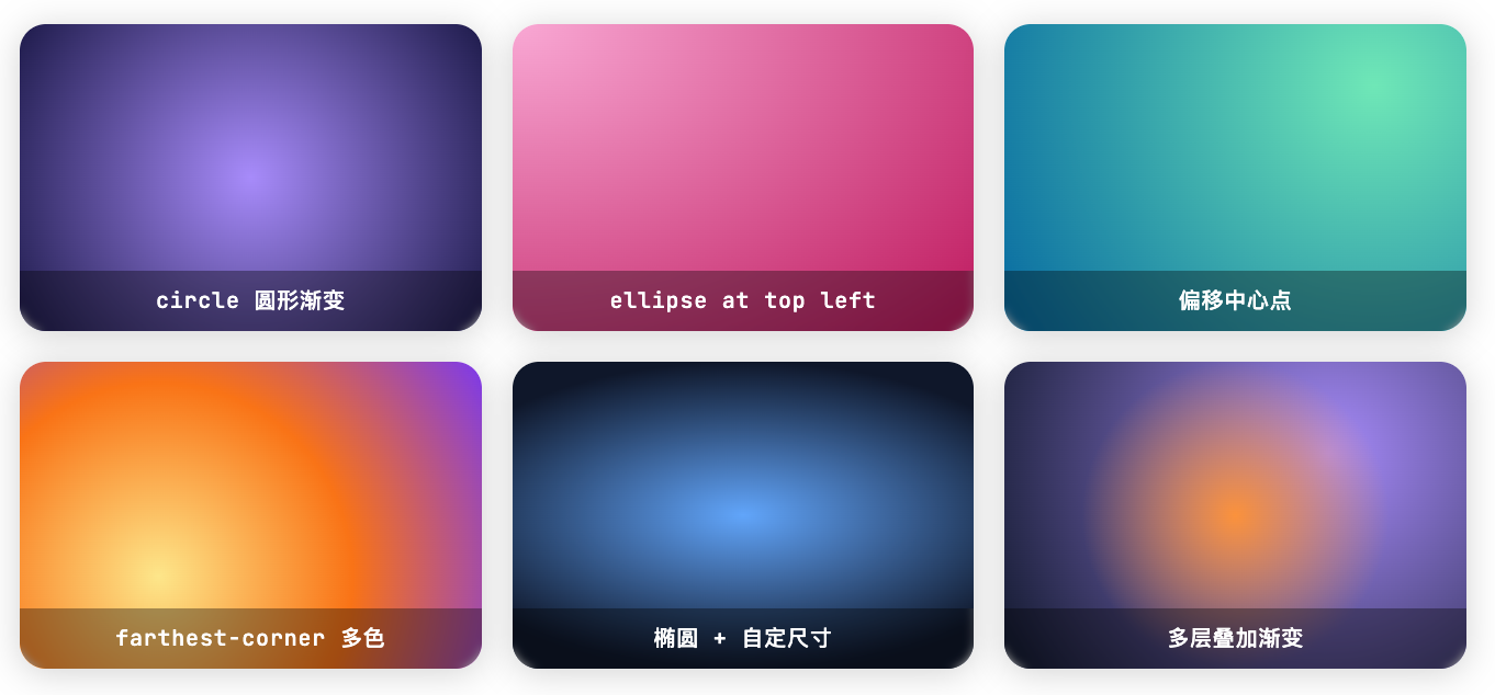
径向渐变默认为椭圆,可以显式声明圆形或椭圆:
css
/* 圆形 - 始终保持正圆 */
background: radial-gradient(circle, #a78bfa, #1e1b4b);

/* 椭圆(默认) - 根据容器形状自适应 */
background: radial-gradient(ellipse, #f9a8d4, #be185d);
2.2 尺寸关键字(size)
| 关键字 | 含义 | 常用场景 |
|---|---|---|
closest-side |
渐变边缘到最近的容器边 | 聚焦光晕效果 |
closest-corner |
渐变边缘到最近的角 | 角落高亮 |
farthest-side |
渐变边缘到最远的容器边 | 背景填充 |
farthest-corner |
渐变边缘到最远的角(默认值) | 全屏背景 |
css
/* 示例:使用不同尺寸关键字 */
background: radial-gradient(circle closest-side at center, #a78bfa, #1e1b4b);
background: radial-gradient(circle farthest-corner at center, #60a5fa, #0f172a);
2.3 中心位置(at position)
css
/* 使用关键字 */
background: radial-gradient(circle at top left, #60a5fa, #0f172a);
background: radial-gradient(circle at bottom right, #fde68a, #7c3aed);

/* 使用百分比坐标(最常用) */
background: radial-gradient(circle at 80% 20%, #6ee7b7, #0369a1);

/* 使用像素坐标 */
background: radial-gradient(circle at 100px 60px, #fde68a, #7c3aed);
2.4 颜色色标(color stops)
css
/* 基础两色 */
background: radial-gradient(circle, #a78bfa, #1e1b4b);

/* 多色 + 指定位置 */
background: radial-gradient(
  circle farthest-corner at 30% 70%,
  #fde68a 0%,
  #f97316 50%,
  #7c3aed 100%
);

/* 使用 rgba 实现透明过渡 */
background: radial-gradient(circle, rgba(167,139,250,0.8) 0%, rgba(30,27,75,0) 70%);
三、在 Vue 中的四种使用方式
方式一:静态 <style> 写法
最基础的用法,适合固定不变的装饰背景:
vue
<template>
  <div class="hero-section">
    <h1>欢迎来到我的主页</h1>
  </div>
</template>

<style scoped>
.hero-section {
  width: 100%;
  height: 400px;
  /* 圆形径向渐变,从中心紫色到深蓝 */
  background: radial-gradient(
    circle at center,
    #a78bfa 0%,
    #6d28d9 40%,
    #1e1b4b 100%
  );
  display: flex;
  align-items: center;
  justify-content: center;
  color: white;
  border-radius: 16px;
}
</style>方式二::style 动态绑定(响应式)
根据用户交互或数据动态改变渐变颜色,使用 computed 属性生成样式对象:
vue
<template>
  <div>
    <!-- 颜色选择器 -->
    <label>中心色:<input type="color" v-model="centerColor" /></label>
    <label>边缘色:<input type="color" v-model="edgeColor" /></label>

    <!-- 动态背景 -->
    <div :style="bgStyle" class="preview-box"></div>
  </div>
</template>

<script setup>
import { ref, computed } from 'vue'

const centerColor = ref('#a78bfa')
const edgeColor   = ref('#1e1b4b')

const bgStyle = computed(() => ({
  background: `radial-gradient(circle, ${centerColor.value}, ${edgeColor.value})`
}))
</script>

<style scoped>
.preview-box {
  width: 100%;
  height: 200px;
  border-radius: 12px;
  transition: background 0.4s ease; /* 平滑过渡 */
}
</style>
✅ 优点: 响应式、写法直观;
transition可实现颜色切换动画。
方式三:CSS 变量 + v-bind()(Vue 3 特有,推荐 ⭐)
Vue 3.2 起支持在 <style> 中直接用 v-bind() 引用 JS 响应式变量,是最优雅的写法:
vue
<template>
  <div
    class="gradient-bg"
    @mousemove="onMove"
  >
    <p>移动鼠标,渐变随你而动 ✨</p>
  </div>
</template>

<script setup>
import { ref } from 'vue'

const posX   = ref(50)       // 百分比,范围 0~100
const posY   = ref(50)
const color1 = ref('#60a5fa') // 中心色
const color2 = ref('#0f172a') // 边缘色

// 监听鼠标移动,实时更新渐变中心位置
function onMove(e) {
  const rect = e.currentTarget.getBoundingClientRect()
  posX.value = Math.round(((e.clientX - rect.left) / rect.width) * 100)
  posY.value = Math.round(((e.clientY - rect.top) / rect.height) * 100)
}
</script>

<style scoped>
.gradient-bg {
  width: 100%;
  height: 300px;
  border-radius: 16px;
  cursor: crosshair;

  /* 直接在 CSS 中引用 JS 响应式变量 */
  background: radial-gradient(
    circle at v-bind("posX + '%'") v-bind("posY + '%'"),
    v-bind(color1) 0%,
    v-bind(color2) 100%
  );

  transition: background 0.1s ease;
  display: flex;
  align-items: center;
  justify-content: center;
  color: white;
  font-size: 1.2rem;
}
</style>
💡 v-bind() 原理: Vue 3 编译器会将
v-bind()转换为 CSS 自定义属性(Custom Properties),通过element.style.setProperty()注入到元素的内联样式中,实现 JS 与 CSS 的无缝联动,无需手动操作 DOM。
方式四:Composable 封装复用(多组件共享)
当多个组件需要共享渐变逻辑时,抽象为 Composable 是最佳实践:
composables/useRadialGradient.js
javascript
import { ref, computed } from 'vue'

/**
 * 径向渐变 Composable
 * @param {Object} options - 配置项
 * @param {string} options.shape    - 形状:'circle' | 'ellipse'
 * @param {number} options.initX    - 初始 X 位置(百分比)
 * @param {number} options.initY    - 初始 Y 位置(百分比)
 * @param {Array}  options.colors   - 初始颜色数组
 */
export function useRadialGradient(options = {}) {
  const {
    shape  = 'circle',
    initX  = 50,
    initY  = 50,
    colors = ['#a78bfa', '#1e1b4b']
  } = options

  const x       = ref(initX)
  const y       = ref(initY)
  const palette = ref([...colors])

  // 生成 style 对象,直接绑定到 :style
  const gradientStyle = computed(() => {
    const stops = palette.value.join(', ')
    return {
      background: `radial-gradient(
        ${shape} at ${x.value}% ${y.value}%,
        ${stops}
      )`
    }
  })

  // 更新中心位置,自动约束在 0~100 范围内
  function setCenter(newX, newY) {
    x.value = Math.max(0, Math.min(100, newX))
    y.value = Math.max(0, Math.min(100, newY))
  }

  // 更新指定索引的颜色
  function updateColor(index, color) {
    const arr = [...palette.value]
    arr[index] = color
    palette.value = arr
  }

  return { x, y, palette, gradientStyle, setCenter, updateColor }
}
在组件中使用:
vue
<template>
  <div :style="gradientStyle" class="card" @mousemove="handleMove">
    <slot />
  </div>
</template>

<script setup>
import { useRadialGradient } from '@/composables/useRadialGradient'

const { gradientStyle, setCenter } = useRadialGradient({
  colors: ['#f9a8d4', '#be185d', '#1e1b4b']
})

function handleMove(e) {
  const rect = e.currentTarget.getBoundingClientRect()
  setCenter(
    ((e.clientX - rect.left) / rect.width) * 100,
    ((e.clientY - rect.top)  / rect.height) * 100
  )
}
</script>

<style scoped>
.card {
  border-radius: 16px;
  padding: 2rem;
  min-height: 200px;
  transition: background 0.15s ease;
}
</style>
四、进阶技巧
4.1 多层径向渐变叠加
用逗号分隔叠加多个渐变,后面的渐变作为底层,可实现复杂氛围效果:
css
.bg-layered {
  background:
    /* 第一层:右上角暖色亮点 */
    radial-gradient(circle closest-side at 80% 15%, rgba(253,230,138,0.5), transparent),
    /* 第二层:左下角冷色调 */
    radial-gradient(circle at 10% 85%, rgba(96,165,250,0.3), transparent),
    /* 底层:深色基底 */
    radial-gradient(ellipse at center, #1e293b, #0f172a);
}
效果:右上角有淡黄色光晕,左下角有蓝色散射,中心为深色过渡,层次丰富。
4.2 Spotlight 追踪鼠标光标
这是现代 Hero 区域常见的交互效果,结合 Vue 的 v-bind() 可以非常简洁地实现:
vue
<template>
  <section
    class="spotlight-bg"
    @mousemove="onMove"
    @mouseleave="onLeave"
  >
    <slot />
  </section>
</template>

<script setup>
import { ref } from 'vue'

const mx     = ref(50)
const my     = ref(50)
const active = ref(false)

function onMove(e) {
  const r  = e.currentTarget.getBoundingClientRect()
  mx.value = Math.round(((e.clientX - r.left) / r.width)  * 100)
  my.value = Math.round(((e.clientY - r.top)  / r.height) * 100)
  active.value = true
}

function onLeave() {
  active.value = false
}
</script>

<style scoped>
.spotlight-bg {
  min-height: 400px;
  background:
    /* 鼠标光晕层:半透明,随鼠标移动 */
    radial-gradient(
      600px circle at v-bind("mx + '%'") v-bind("my + '%'"),
      rgba(167, 139, 250, 0.15) 0%,
      transparent 60%
    ),
    /* 底层固定背景 */
    radial-gradient(ellipse at center, #1e1b4b, #0a0915);
}
</style>
4.3 配合 @keyframes 实现动画背景
css
.animated-bg {
  background: radial-gradient(circle at 0% 50%, #a78bfa, #1e1b4b);
  background-size: 300% 300%;
  animation: radialPulse 6s ease infinite alternate;
}

@keyframes radialPulse {
  0%   { background-position: 0%   50%; }
  50%  { background-position: 100% 50%; }
  100% { background-position: 0%   50%; }
}
⚠️ 注意:
background-size放大后配合background-position位移才能产生流动效果;直接对background属性做 transition 在部分浏览器有性能问题,推荐用animation替代。
4.4 使用 CSS 自定义属性(Custom Properties)统一管理主题色
适合需要支持暗色/亮色模式切换的项目:
css
/* 在 :root 中统一定义 */
:root {
  --gradient-center: #a78bfa;
  --gradient-edge:   #1e1b4b;
  --gradient-pos-x:  50%;
  --gradient-pos-y:  50%;
}

[data-theme="dark"] {
  --gradient-center: #60a5fa;
  --gradient-edge:   #0f172a;
}

.bg {
  background: radial-gradient(
    circle at var(--gradient-pos-x) var(--gradient-pos-y),
    var(--gradient-center),
    var(--gradient-edge)
  );
  transition: background 0.4s ease;
}
在 Vue 中配合 provide/inject 或 Pinia 全局管理主题状态,动态切换 data-theme 属性即可。
五、四种方案对比总结
| 方案 | 响应式 | 代码简洁度 | 适用场景 |
|---|---|---|---|
静态 <style> |
❌ 不响应 | ⭐⭐⭐⭐⭐ 最简洁 | 固定装饰背景 |
:style 绑定 |
✅ 全响应 | ⭐⭐⭐ 中等 | 用户交互、实时更新 |
v-bind() + style |
✅ 全响应 | ⭐⭐⭐⭐ 优雅 | Vue 3 推荐首选 |
| Composable 封装 | ✅ 全响应 | ⭐⭐⭐⭐⭐ 可复用 | 多组件共享逻辑 |
📌 推荐策略:
- 简单固定效果 → 静态 CSS
- 单组件动态交互 →
v-bind()- 跨组件共享 → Composable
六、常见问题 FAQ
Q:为什么我的渐变在 Safari 上显示有差异?
A:Safari 对某些 radial-gradient 语法支持略有差异,建议避免使用 ellipse 70% 50% 这类自定义尺寸写法,改用 farthest-corner 等关键字,兼容性更好。
Q:v-bind() 在 CSS 中性能如何?
A:Vue 3 内部通过 element.style.setProperty() 实现,每次响应式数据变化时只更新对应的 CSS 变量,性能开销极小,不会触发重新渲染。
Q:可以在 radial-gradient 中使用 currentColor 吗?
A:可以,但不常见。更实用的做法是结合 CSS 变量,通过父元素的 --color 变量传递颜色值。
Q:如何让渐变背景在移动端也有良好表现?
A:推荐使用百分比坐标而非像素值,确保中心位置随容器自适应。同时注意减少多层渐变叠加的数量(建议不超过 3 层),避免移动端 GPU 压力过大。
七、完整示例:可复用的渐变卡片组件
vue
<!-- GradientCard.vue -->
<template>
  <div
    class="gradient-card"
    @mousemove="onMove"
    @mouseleave="resetCenter"
  >
    <div class="gradient-card__content">
      <slot />
    </div>
  </div>
</template>

<script setup>
import { ref } from 'vue'

const props = defineProps({
  colorFrom: { type: String, default: '#a78bfa' },
  colorTo:   { type: String, default: '#1e1b4b' },
  shape:     { type: String, default: 'circle' },
})

const px = ref(50)
const py = ref(50)

function onMove(e) {
  const r = e.currentTarget.getBoundingClientRect()
  px.value = Math.round(((e.clientX - r.left) / r.width)  * 100)
  py.value = Math.round(((e.clientY - r.top)  / r.height) * 100)
}

function resetCenter() {
  px.value = 50
  py.value = 50
}
</script>

<style scoped>
.gradient-card {
  border-radius: 16px;
  padding: 2rem;
  background: radial-gradient(
    v-bind(shape) at v-bind("px + '%'") v-bind("py + '%'"),
    v-bind(colorFrom) 0%,
    v-bind(colorTo)   100%
  );
  transition: background 0.2s ease;
  color: white;
}

.gradient-card__content {
  position: relative;
  z-index: 1;
}
</style>
使用:
vue
<GradientCard color-from="#f9a8d4" color-to="#be185d">
  <h2>这是一个渐变卡片</h2>
  <p>移动鼠标可以改变渐变中心位置。</p>
</GradientCard>
总结
径向渐变是现代 UI 设计中非常实用的视觉工具。在 Vue 中,通过合理选择使用方式:
- 静态场景 用
<style scoped>直接写,简单高效 - 动态交互 优先选
v-bind(),Vue 3 原生支持,代码最优雅 - 复杂逻辑 封装为 Composable,便于复用和测试
掌握这些技巧之后,从 Spotlight Hero 到动态主题卡片,各种炫酷的视觉效果都能信手拈来。
如果本文对你有帮助,欢迎点赞收藏 🌟
有问题欢迎在评论区留言交流!