欢迎加入开源鸿蒙PC社区:
atomgit仓库地址: https://atomgit.com/gcw_7DJ1SfsY/chuangkoucuoluan
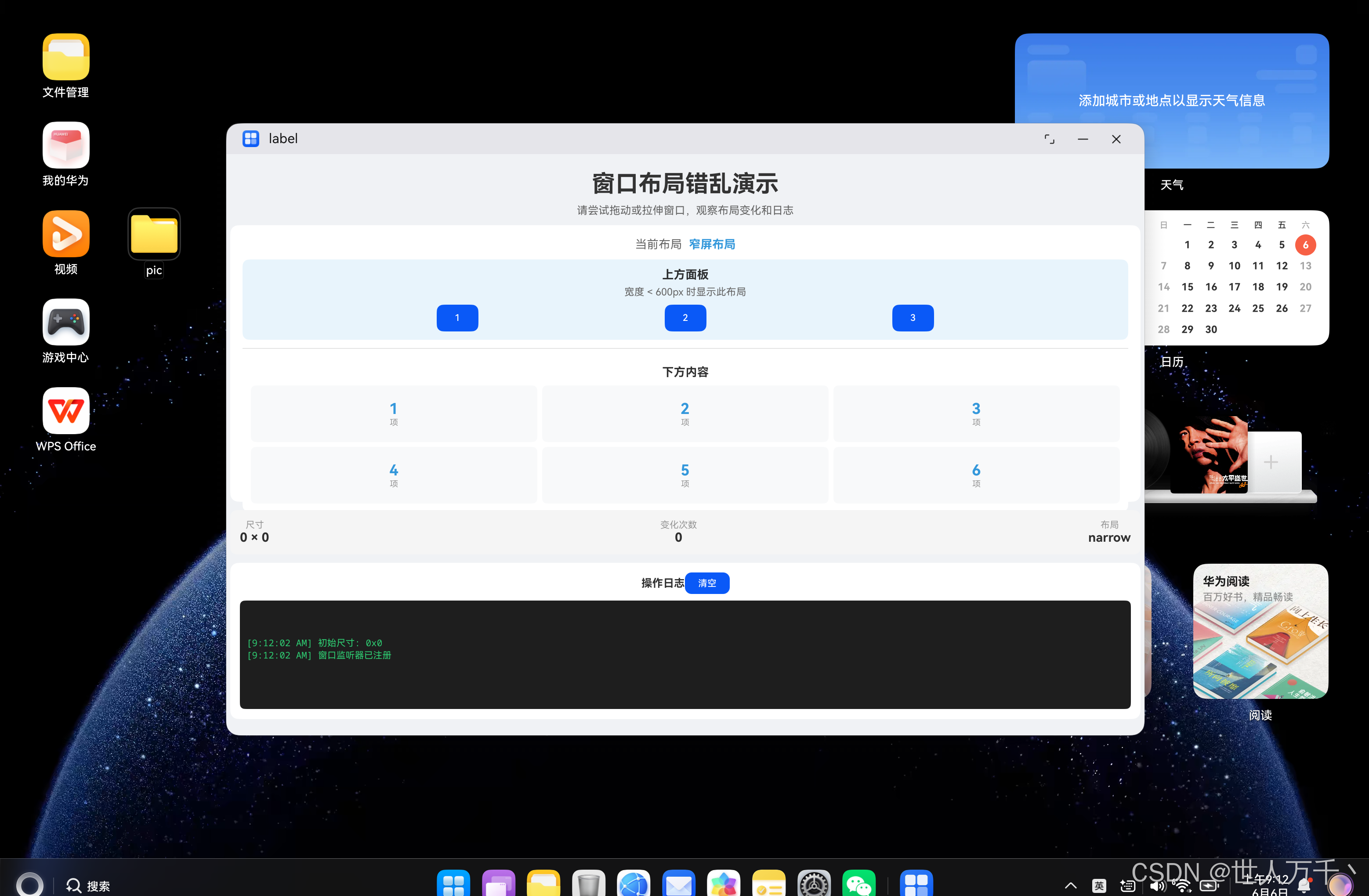
小窗口效果:
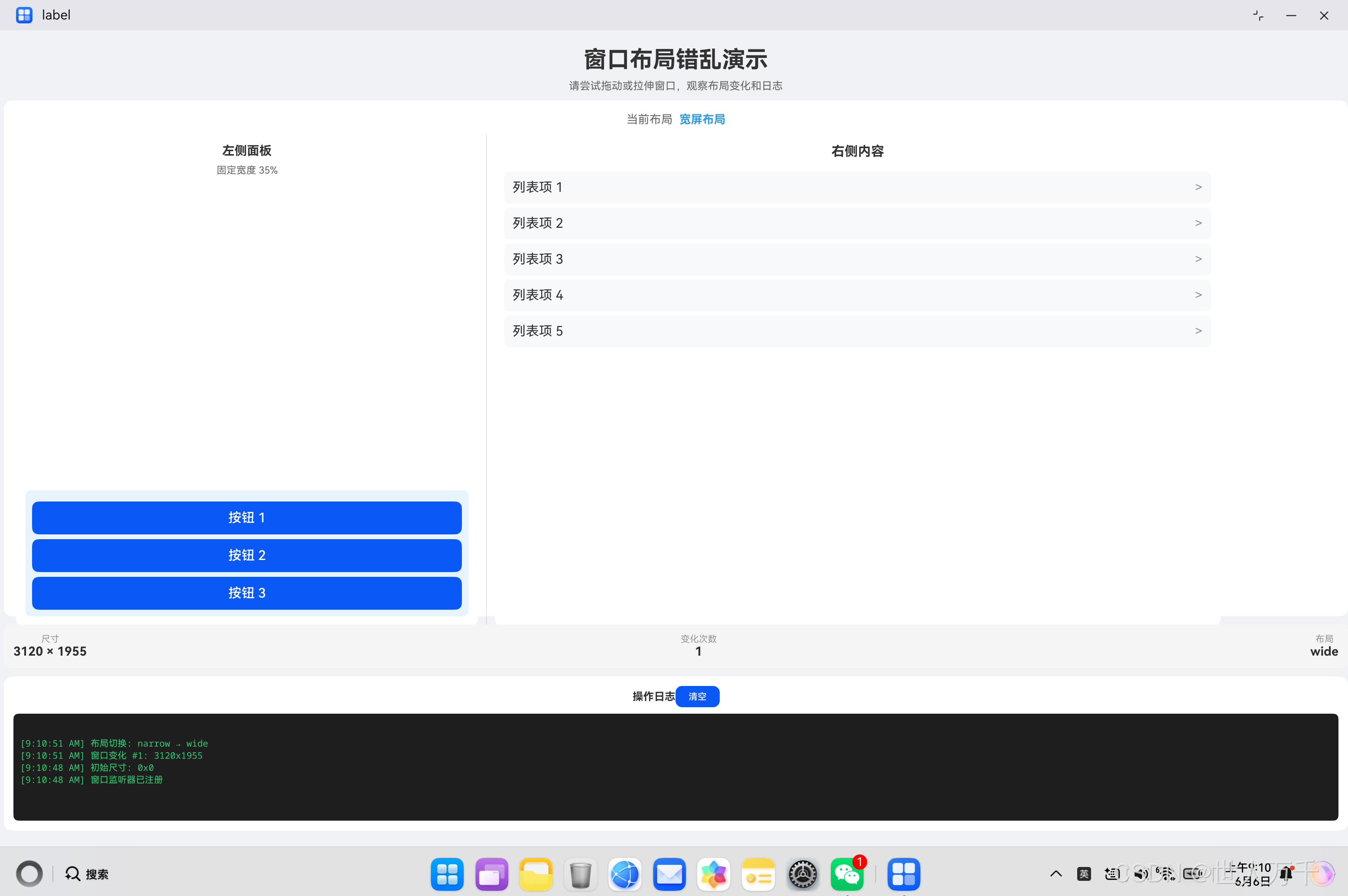
全屏效果:
修正后的小窗口:
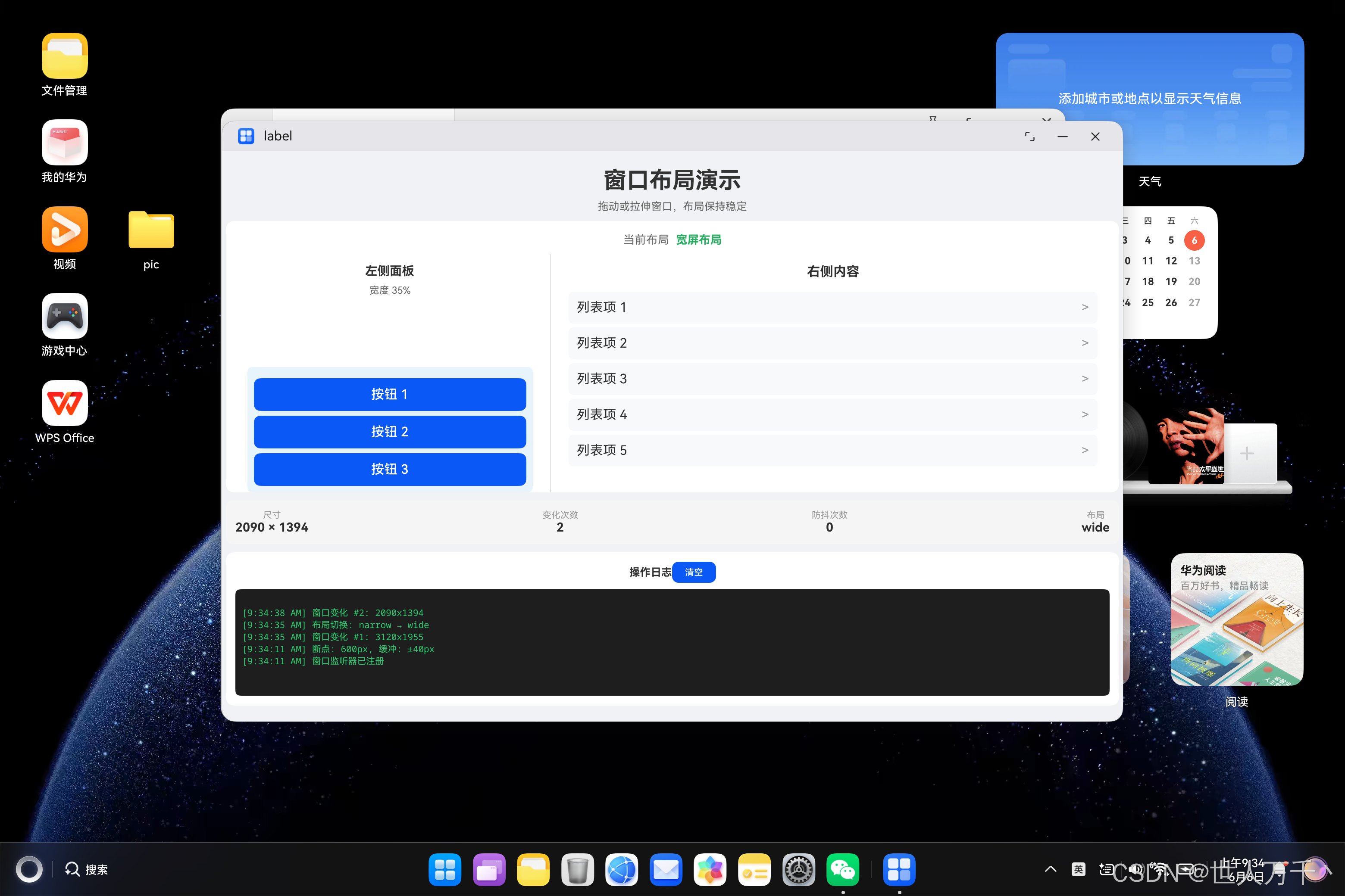
修正后的大窗口:

前言
在PC端开发鸿蒙应用时,一个常见的问题是:当用户拖动窗口或调整窗口大小时,页面布局会出现短暂的错乱,然后"回弹"到正确的状态。这种视觉上的不稳定感会严重影响用户体验。
本文将深入分析这个问题的成因,并提供多种实用的解决方案,帮助开发者构建流畅、稳定的响应式布局。
一、问题现象
1.1 典型的布局错乱表现
用户在拖动或拉伸窗口时,会观察到以下现象:
┌─────────────────────────────────────┐
│  正常状态                           │
│  ┌─────────┬─────────┐              │
│  │  左侧   │  右侧   │              │
│  │  面板   │  内容   │              │
│  │         │         │              │
│  └─────────┴─────────┘              │
└─────────────────────────────────────┘

┌─────────────────────────────────────┐
│  拖动中(瞬间错乱)                 │
│  ┌───────┬─────────────┐            │
│  │ 左侧 │    右侧内容   │            │
│  │ 面板 │   布局错乱   │            │
│  │      │   被压缩     │            │
│  └───────┴─────────────┘            │
│         ↑ 组件被挤压,间距消失        │
└─────────────────────────────────────┘

┌─────────────────────────────────────┐
│  停止后(回弹恢复)                 │
│  ┌─────────┬─────────┐              │
│  │  左侧   │  右侧   │              │
│  │  面板   │  内容   │              │
│  │         │         │              │
│  └─────────┴─────────┘              │
└─────────────────────────────────────┘
1.2 具体表现
| 现象 | 描述 |
|---|---|
| 组件被挤压 | 原本固定宽度的组件被压缩到异常小的尺寸 |
| 间距消失 | 组件之间的间距在拖动过程中暂时变为0 |
| 文字溢出 | 文本超出容器边界 |
| 滚动条抖动 | 滚动条位置和大小异常跳动 |
| 动画卡顿 | 布局切换时出现明显的卡顿或延迟 |
| 布局闪烁 | 布局在两种状态之间快速切换 |
1.3 触发条件
这些问题通常在以下场景中出现:
- 快速拖动窗口边缘调整大小
- 从窗口最大化切换到普通大小
- 双击标题栏最大化/还原窗口
- 切换窗口模式(从全屏切换到浮动窗口)
- 使用分屏功能时窗口大小变化
- 切换多任务视图时窗口自动调整
二、问题原因深度分析
2.1 渲染机制导致的时序问题
鸿蒙的布局渲染流程是一个复杂的状态转换过程,当窗口尺寸快速变化时,会导致状态不一致:
┌──────────────────────────────────────────────────────────────┐
│                    渲染流程                                  │
├──────────────────────────────────────────────────────────────┤
│  窗口尺寸变化                                                │
│       ↓                                                     │
│  触发窗口尺寸更新                                            │
│       ↓                                                     │
│  状态变量更新(@State)                                     │
│       ↓                                                     │
│  组件树重新计算                                              │
│       ↓                                                     │
│  布局测量(Measure)                                         │
│       ↓                                                     │
│  布局排列(Layout)                                          │
│       ↓                                                     │
│  绘制(Draw)                                               │
└──────────────────────────────────────────────────────────────┘
在快速拖动窗口时,这个流程可能在短时间内多次执行,导致:
| 问题 | 说明 | 后果 |
|---|---|---|
| 状态不一致 | 某些组件已经更新,某些还没有 | 布局错乱 |
| 测量错误 | 组件在测量时获取到不一致的父容器尺寸 | 尺寸计算错误 |
| 布局冲突 | 多个组件同时请求布局,造成冲突 | 组件重叠或留白 |
| 渲染中断 | 渲染过程中被新的尺寸变化打断 | 画面闪烁 |
2.2 响应式断点的问题
常见的响应式布局使用固定的断点值,这种设计在临界点附近会出问题:
typescript
// 问题代码
if (this.windowWidth > 600) {
  // 左右布局
} else {
  // 上下布局
}当窗口宽度在600附近时,会产生临界抖动:
窗口宽度变化序列:
601px → 600px → 599px → 600px → 601px → ...

触发布局切换序列:
左右布局 → 上下布局 → 左右布局 → 上下布局 → 左右布局 → ...
     ↑          ↑          ↑          ↑
每次变化都触发布局重新渲染!临界抖动的后果:
- 布局在两种状态之间疯狂切换
- 每次切换都触发完整的组件树重新计算
- 用户看到明显的"闪烁"和"抖动"效果
2.3 固定尺寸与相对尺寸的冲突
很多开发者在设计布局时混用了固定尺寸和相对尺寸,这种混用会导致尺寸计算冲突:
typescript
// 问题代码
Row() {
  Column() {
    // 侧边栏
  }
  .width(200)  // 固定宽度:200px

  Column() {
    // 主内容区
  }
  .width('65%')  // 相对宽度:65%
}问题分析:
当容器总宽度为500px时:
- 侧边栏:固定200px
- 主内容区:500px × 65% = 325px
- 总计:200 + 325 = 525px ❌ 超出容器
当容器总宽度缩小到300px时:
- 侧边栏:固定200px
- 主内容区:300px × 65% = 195px
- 总计:200 + 195 = 395px ❌ 仍然超出
根本原因:相对尺寸是在父容器尺寸确定后计算的,但固定尺寸先于相对尺寸参与计算,导致总尺寸可能超出容器。
2.4 缺少尺寸限制
没有在 module.json5 中设置最小和最大窗口尺寸限制:
typescript
// module.json5 - 问题配置
{
  "abilities": [{
    "name": "EntryAbility",
    // 缺少窗口尺寸限制
    // 没有设置 minWindowWidth
    // 没有设置 minWindowHeight
    // 没有设置 maxWindowWidth
    // 没有设置 maxWindowHeight
  }]
}没有限制时的后果:
| 用户操作 | 可能出现的问题 |
|---|---|
| 将窗口拖到极小 | 内容被压缩到无法辨认 |
| 将窗口拖到屏幕外 | 部分内容不可见 |
| 窗口宽高比极端化 | 布局完全崩溃 |
| 最大化后拖动 | 布局与预期差异大 |
2.5 布局约束不足
组件之间的约束关系不明确,导致布局系统在计算时产生歧义:
typescript
// 问题代码
Row() {
  LeftPanel()
  RightPanel()
}问题:
- 没有指定 LeftPanel 和 RightPanel 的宽度比例
- 依赖默认的
layoutWeight(1)均分 - 但如果某个面板内部有固定宽度元素,就会产生冲突
typescript
// 冲突示例
Row() {
  Column() {
    Image()
      .width(300)  // 内部固定宽度
  }  // 外层没有设置宽度约束

  Column() {
    // 占据剩余空间
  }
}
三、核心代码详解
代码一:响应式布局基础实现
这是最常见的响应式布局实现方式,根据窗口宽度切换布局模式:
typescript
@Entry
@Component
struct ResponsiveLayout {
  @State windowWidth: number = 0;
  @State windowHeight: number = 0;
  @State layoutMode: string = 'unknown';

  private windowObj: window.Window | null = null;

  aboutToAppear(): void {
    this.initWindowListener();
  }

  aboutToDisappear(): void {
    if (this.windowObj) {
      this.windowObj.off('windowSizeChange');
    }
  }

  initWindowListener(): void {
    try {
      const context = getContext(this) as common.UIAbilityContext;
      window.getLastWindow(context).then((win: window.Window) => {
        this.windowObj = win;

        // 获取初始窗口尺寸
        win.getProperties((err: BusinessError, props: window.WindowProperties) => {
          if (!err) {
            this.windowWidth = props.windowRect.width;
            this.windowHeight = props.windowRect.height;
            this.updateLayoutMode();
          }
        });

        // 监听窗口尺寸变化
        win.on('windowSizeChange', (data: WindowSizeData) => {
          this.windowWidth = data.width;
          this.windowHeight = data.height;
          this.updateLayoutMode();
        });
      }).catch((err: BusinessError) => {
        hilog.error(DOMAIN, 'testTag', '获取窗口失败: %{public}s', JSON.stringify(err));
      });
    } catch (e) {
      hilog.error(DOMAIN, 'testTag', '初始化失败: %{public}s', JSON.stringify(e));
    }
  }

  updateLayoutMode(): void {
    const newMode = this.windowWidth > 600 ? 'wide' : 'narrow';
    if (newMode !== this.layoutMode) {
      hilog.info(DOMAIN, 'testTag', '布局切换: %{public}s → %{public}s',
        this.layoutMode, newMode);
      this.layoutMode = newMode;
    }
  }

  build() {
    Column() {
      if (this.layoutMode === 'wide') {
        this.buildWideLayout();
      } else {
        this.buildNarrowLayout();
      }
    }
    .width('100%')
    .height('100%')
  }

  @Builder
  buildWideLayout() {
    Row() {
      Column() {
        // 左侧面板
        Text('左侧面板 - 宽度35%')
          .fontSize(20)
      }
      .width('35%')
      .height('100%')
      .backgroundColor('#e8f4fc')

      Divider()
        .vertical(true)

      Column() {
        // 右侧内容
        Text('右侧内容 - 自适应')
          .fontSize(20)
      }
      .layoutWeight(1)
      .height('100%')
      .backgroundColor('#f8f9fa')
    }
    .width('100%')
    .height('100%')
  }

  @Builder
  buildNarrowLayout() {
    Column() {
      // 上方面板
      Text('上方面板 - 高度40%')
        .fontSize(20)
    }
    .width('100%')
    .height('40%')
    .backgroundColor('#e8f4fc')

      Divider()

      Column() {
        // 下方内容
        Text('下方内容 - 自适应')
          .fontSize(20)
      }
      .width('100%')
      .layoutWeight(1)
      .backgroundColor('#f8f9fa')
    }
    .width('100%')
    .height('100%')
  }
}代码解析:
| 关键点 | 说明 |
|---|---|
window.getLastWindow() |
获取当前窗口对象,用于监听尺寸变化 |
win.getProperties() |
获取窗口属性,包括初始尺寸 |
win.on('windowSizeChange') |
注册窗口尺寸变化监听器 |
props.windowRect |
窗口矩形区域,包含 width, height, x, y |
updateLayoutMode() |
根据窗口宽度更新布局模式 |
.layoutWeight(1) |
让组件占据剩余空间 |
问题所在:
- 在窗口宽度刚好在600左右时,会频繁触发布局切换
- 窗口在临界点附近拖动时,会导致布局不断在两种模式之间切换
- 每次布局切换都会触发重新渲染,造成视觉上的"抖动"
代码二:带防抖的窗口尺寸监听
为了避免窗口尺寸频繁变化导致的布局抖动,可以使用防抖技术延迟更新:
typescript
@Entry
@Component
struct DebouncedResponsiveLayout {
  @State windowWidth: number = 0;
  @State windowHeight: number = 0;
  @State layoutMode: string = 'unknown';

  // 防抖定时器
  private resizeTimer: number = -1;
  // 防抖延迟时间(毫秒)
  private readonly DEBOUNCE_DELAY: number = 100;

  aboutToAppear(): void {
    this.initWindowListener();
  }

  aboutToDisappear(): void {
    // 页面隐藏时清除定时器,防止内存泄漏
    if (this.resizeTimer !== -1) {
      clearTimeout(this.resizeTimer);
    }
  }

  initWindowListener(): void {
    try {
      const context = getContext(this) as common.UIAbilityContext;
      window.getLastWindow(context).then((win: window.Window) => {
        // 获取初始尺寸
        win.getProperties((err: BusinessError, props: window.WindowProperties) => {
          if (!err) {
            this.windowWidth = props.windowRect.width;
            this.windowHeight = props.windowRect.height;
            this.updateLayoutMode();
          }
        });

        // 注册窗口尺寸变化监听
        win.on('windowSizeChange', (data: WindowSizeData) => {
          // 防抖处理:清除之前的定时器
          if (this.resizeTimer !== -1) {
            clearTimeout(this.resizeTimer);
          }

          // 设置新的定时器,延迟更新
          this.resizeTimer = setTimeout(() => {
            this.windowWidth = data.width;
            this.windowHeight = data.height;
            this.updateLayoutMode();
            this.resizeTimer = -1;
          }, this.DEBOUNCE_DELAY);
        });
      }).catch((err: BusinessError) => {
        hilog.error(DOMAIN, 'testTag', '获取窗口失败: %{public}s', JSON.stringify(err));
      });
    } catch (e) {
      hilog.error(DOMAIN, 'testTag', '初始化失败: %{public}s', JSON.stringify(e));
    }
  }

  updateLayoutMode(): void {
    const newMode = this.windowWidth > 600 ? 'wide' : 'narrow';

    // 只在模式真正改变时更新,避免不必要的重渲染
    if (newMode !== this.layoutMode) {
      hilog.info(DOMAIN, 'testTag', '布局模式切换: %{public}s → %{public}s',
        this.layoutMode, newMode);
      this.layoutMode = newMode;
    }
  }

  build() {
    Column() {
      // 根据 layoutMode 而非 windowWidth 来决定布局
      if (this.layoutMode === 'wide') {
        WideContent()
      } else {
        NarrowContent()
      }
    }
    .width('100%')
    .height('100%')
  }
}

@Component
struct WideContent {
  build() {
    Row() {
      Column() {
        Text('宽屏布局 - 左侧')
          .fontSize(20)
      }
      .width('35%')
      .height('100%')

      Column() {
        Text('宽屏布局 - 右侧')
          .fontSize(20)
      }
      .layoutWeight(1)
      .height('100%')
    }
    .width('100%')
    .height('100%')
  }
}

@Component
struct NarrowContent {
  build() {
    Column() {
      Text('窄屏布局 - 上方')
        .fontSize(20)
    }
    .width('100%')
    .height('40%')

    Column() {
      Text('窄屏布局 - 下方')
        .fontSize(20)
    }
    .width('100%')
    .layoutWeight(1)
  }
}代码解析:
| 关键点 | 说明 |
|---|---|
resizeTimer |
定时器ID,用于取消待执行的更新 |
DEBOUNCE_DELAY |
防抖延迟时间,100ms 可以有效减少抖动又不影响响应 |
clearTimeout() |
清除之前的定时器,确保只有最后一次触发有效 |
setTimeout(..., 100) |
延迟100ms后执行更新 |
条件判断 newMode !== this.layoutMode |
只在模式真正改变时触发更新 |
改进效果:
- 快速拖动窗口时,100ms内的多次变化只会触发一次布局更新
- 减少了重渲染次数,提升性能
- 避免了临界点附近的频繁切换
代码三:带缓冲区的断点设计
为了彻底解决临界点附近的频繁切换问题,需要添加缓冲区设计:
typescript
@Entry
@Component
struct BufferedResponsiveLayout {
  @State windowWidth: number = 0;
  @State windowHeight: number = 0;
  @State layoutMode: string = 'narrow';

  // 断点配置
  private readonly BREAK_POINT: number = 600;
  // 缓冲区间大小
  private readonly BUFFER_SIZE: number = 40;

  aboutToAppear(): void {
    this.initWindowListener();
  }

  initWindowListener(): void {
    try {
      const context = getContext(this) as common.UIAbilityContext;
      window.getLastWindow(context).then((win: window.Window) => {
        win.getProperties((err: BusinessError, props: window.WindowProperties) => {
          if (!err) {
            this.windowWidth = props.windowRect.width;
            this.windowHeight = props.windowRect.height;
            // 初始化布局模式
            this.layoutMode = this.calculateLayoutMode();
          }
        });

        win.on('windowSizeChange', (data: WindowSizeData) => {
          this.windowWidth = data.width;
          this.windowHeight = data.height;
          const newMode = this.calculateLayoutMode();

          if (newMode !== this.layoutMode) {
            hilog.info(DOMAIN, 'testTag', '布局切换: %{public}s → %{public}s (宽度: %{public}d)',
              this.layoutMode, newMode, data.width);
            this.layoutMode = newMode;
          }
        });
      }).catch((err: BusinessError) => {
        hilog.error(DOMAIN, 'testTag', '获取窗口失败: %{public}s', JSON.stringify(err));
      });
    } catch (e) {
      hilog.error(DOMAIN, 'testTag', '初始化失败: %{public}s', JSON.stringify(e));
    }
  }

  // 计算布局模式,使用缓冲区间避免临界抖动
  calculateLayoutMode(): string {
    if (this.windowWidth <= 0) {
      return 'narrow';
    }

    // 计算缓冲区的上下界
    const upperBound = this.BREAK_POINT + this.BUFFER_SIZE;  // 640
    const lowerBound = this.BREAK_POINT - this.BUFFER_SIZE;   // 560

    if (this.windowWidth > upperBound) {
      // 宽度 > 640px,切换到宽屏
      return 'wide';
    } else if (this.windowWidth < lowerBound) {
      // 宽度 < 560px,切换到窄屏
      return 'narrow';
    }

    // 在 560-640px 之间,保持当前状态不变
    return this.layoutMode;
  }

  build() {
    Column() {
      // 显示当前状态信息
      Row() {
        Text('断点: 600px | 缓冲: ±40px')
          .fontSize(12)
          .fontColor('#666')
      }
      .margin({ bottom: 10 })

      if (this.layoutMode === 'wide') {
        this.WideLayout();
      } else {
        this.NarrowLayout();
      }
    }
    .width('100%')
    .height('100%')
    .padding(10)
  }

  @Builder
  WideLayout() {
    Row() {
      Column() {
        Text('宽屏布局')
          .fontSize(24)
          .fontWeight(FontWeight.Bold)
        Text('窗口宽度 > 640px')
          .fontSize(14)
          .fontColor('#666')
      }
      .width('35%')
      .height('100%')
      .backgroundColor('#e8f4fc')
      .borderRadius(8)
      .padding(15)

      Column() {
        Text('右侧内容区域')
          .fontSize(20)
      }
      .layoutWeight(1)
      .height('100%')
      .backgroundColor('#f8f9fa')
      .borderRadius(8)
      .padding(15)
    }
    .width('100%')
    .height('100%')
  }

  @Builder
  NarrowLayout() {
    Column() {
      Column() {
        Text('窄屏布局')
          .fontSize(24)
          .fontWeight(FontWeight.Bold)
        Text('窗口宽度 < 560px')
          .fontSize(14)
          .fontColor('#666')
      }
      .width('100%')
      .height('40%')
      .backgroundColor('#e8f4fc')
      .borderRadius(8)
      .padding(15)

      Column() {
        Text('下方内容区域')
          .fontSize(20)
      }
      .width('100%')
      .layoutWeight(1)
      .backgroundColor('#f8f9fa')
      .borderRadius(8)
      .padding(15)
    }
    .width('100%')
    .height('100%')
  }
}代码解析:
| 关键点 | 说明 |
|---|---|
BREAK_POINT = 600 |
基准断点,600px |
BUFFER_SIZE = 40 |
缓冲大小,±40px |
upperBound = 640 |
上界:600 + 40 |
lowerBound = 560 |
下界:600 - 40 |
calculateLayoutMode() |
计算当前应该使用的布局模式 |
缓冲区工作原理:
|<----窄屏---->|<--缓冲-->|<--缓冲-->|<----宽屏---->|
     0         560       600       640         ∞
                ↑                   ↑
              下界               上界

当窗口宽度变化时:
- 640px 以上:稳定宽屏布局
- 560px 以下:稳定窄屏布局
- 560-640px 之间:保持当前布局不变(不切换)优势:
- 彻底消除临界抖动
- 用户在拖动时不会看到频繁的布局切换
- 提供更平滑的用户体验
代码四:带动画过渡的布局切换
为了让布局切换更加平滑,可以使用属性动画实现渐变过渡:
typescript
@Entry
@Component
struct AnimatedResponsiveLayout {
  @State windowWidth: number = 0;
  @State windowHeight: number = 0;
  @State layoutMode: string = 'narrow';

  // 动画配置
  private readonly ANIMATION_DURATION: number = 150;

  aboutToAppear(): void {
    this.initWindowListener();
  }

  initWindowListener(): void {
    try {
      const context = getContext(this) as common.UIAbilityContext;
      window.getLastWindow(context).then((win: window.Window) => {
        win.getProperties((err: BusinessError, props: window.WindowProperties) => {
          if (!err) {
            this.windowWidth = props.windowRect.width;
            this.windowHeight = props.windowRect.height;
          }
        });

        win.on('windowSizeChange', (data: WindowSizeData) => {
          // 记录旧模式
          const oldMode = this.layoutMode;

          // 更新尺寸
          this.windowWidth = data.width;
          this.windowHeight = data.height;

          // 计算新模式
          const newMode = this.windowWidth > 640 ? 'wide' : 'narrow';

          // 如果模式改变,触发动画
          if (newMode !== oldMode) {
            hilog.info(DOMAIN, 'testTag', '布局切换: %{public}s → %{public}s',
              oldMode, newMode);
            this.layoutMode = newMode;
          }
        });
      }).catch((err: BusinessError) => {
        hilog.error(DOMAIN, 'testTag', '获取窗口失败: %{public}s', JSON.stringify(err));
      });
    } catch (e) {
      hilog.error(DOMAIN, 'testTag', '初始化失败: %{public}s', JSON.stringify(e));
    }
  }

  build() {
    Column() {
      // 状态栏
      Row() {
        Text('当前布局: ')
          .fontSize(14)
          .fontColor('#666')
        Text(this.layoutMode === 'wide' ? '宽屏' : '窄屏')
          .fontSize(14)
          .fontWeight(FontWeight.Bold)
          .fontColor('#3498db')
      }
      .width('100%')
      .padding(10)
      .backgroundColor('#f5f5f5')
      .borderRadius(8)

      // 主内容区,使用动画过渡
      Column() {
        if (this.layoutMode === 'wide') {
          this.buildWideContent();
        } else {
          this.buildNarrowContent();
        }
      }
      .width('100%')
      .layoutWeight(1)
      .clip(true)  // 裁剪超出部分,防止布局错乱时出现溢出
      .padding(10)
    }
    .width('100%')
    .height('100%')
    .backgroundColor('#fff')
  }

  @Builder
  buildWideContent() {
    Row() {
      Column() {
        Text('宽屏布局')
          .fontSize(28)
          .fontWeight(FontWeight.Bold)

        Text('左右分栏布局')
          .fontSize(16)
          .fontColor('#666')
          .margin({ top: 8 })

        Row() {
          ForEach([1, 2, 3], (i: number) => {
            Button(`按钮 ${i}`)
              .width(80)
              .height(36)
              .margin({ right: 10 })
          })
        }
        .margin({ top: 20 })
      }
      .width('35%')
      .height('100%')
      .backgroundColor('#e8f4fc')
      .borderRadius(12)
      .padding(20)
      // 添加动画效果
      .transition({ type: TransitionType.Insert, opacity: 0 })
      .transition({ type: TransitionType.Delete, opacity: 0 })

      Column() {
        Text('主内容区')
          .fontSize(20)
          .fontWeight(FontWeight.Bold)

        List() {
          ForEach([1, 2, 3, 4, 5], (i: number) => {
            ListItem() {
              Row() {
                Text(`列表项 ${i}`)
                  .fontSize(16)
                Blank()
                Text('>')
                  .fontColor('#999')
              }
              .width('100%')
              .padding(15)
              .backgroundColor('#f8f9fa')
              .borderRadius(8)
              .margin({ top: 8 })
            }
          })
        }
        .width('100%')
        .layoutWeight(1)
      }
      .layoutWeight(1)
      .height('100%')
      .backgroundColor('#fff')
      .borderRadius(12)
      .padding(20)
      .transition({ type: TransitionType.Insert, opacity: 0 })
      .transition({ type: TransitionType.Delete, opacity: 0 })
    }
    .width('100%')
    .height('100%')
  }

  @Builder
  buildNarrowContent() {
    Column() {
      Column() {
        Text('窄屏布局')
          .fontSize(28)
          .fontWeight(FontWeight.Bold)

        Text('上下分栏布局')
          .fontSize(16)
          .fontColor('#666')
          .margin({ top: 8 })

        Row() {
          ForEach([1, 2, 3], (i: number) => {
            Button(`${i}`)
              .width(60)
              .height(36)
              .margin({ right: 8 })
          })
        }
        .margin({ top: 20 })
      }
      .width('100%')
      .backgroundColor('#e8f4fc')
      .borderRadius(12)
      .padding(20)
      .transition({ type: TransitionType.Insert, opacity: 0 })
      .transition({ type: TransitionType.Delete, opacity: 0 })

      Column() {
        Text('下方内容区')
          .fontSize(20)
          .fontWeight(FontWeight.Bold)

        Grid() {
          ForEach([1, 2, 3, 4, 5, 6], (i: number) => {
            GridItem() {
              Column() {
                Text(`${i}`)
                  .fontSize(24)
                  .fontWeight(FontWeight.Bold)
                  .fontColor('#3498db')
                Text('项')
                  .fontSize(12)
                  .fontColor('#999')
              }
            }
            .padding(15)
            .backgroundColor('#f8f9fa')
            .borderRadius(8)
          })
        }
        .columnsTemplate('1fr 1fr 1fr')
        .rowsTemplate('1fr 1fr')
        .columnsGap(10)
        .rowsGap(10)
        .width('100%')
        .layoutWeight(1)
        .margin({ top: 15 })
      }
      .width('100%')
      .layoutWeight(1)
      .backgroundColor('#fff')
      .borderRadius(12)
      .padding(20)
      .transition({ type: TransitionType.Insert, opacity: 0 })
      .transition({ type: TransitionType.Delete, opacity: 0 })
    }
    .width('100%')
    .height('100%')
  }
}代码解析:
| 关键点 | 说明 |
|---|---|
ANIMATION_DURATION = 150 |
动画时长150毫秒 |
.clip(true) |
裁剪超出部分,防止布局错乱时出现溢出 |
TransitionType.Insert |
组件插入时的过渡效果 |
TransitionType.Delete |
组件删除时的过渡效果 |
animateTo() |
可以配合 animateTo 使用显式动画 |
动画过渡优势:
- 布局切换时有平滑的渐变效果
- 减少视觉上的突兀感
- 用户体验更加流畅
四、解决方案
方案一:使用 layoutWeight 正确分配空间
layoutWeight 是鸿蒙 Flex 布局中的重要属性,用于分配剩余空间:
typescript
@Entry
@Component
struct WeightedLayout {
  build() {
    Row() {
      // 左侧面板:固定百分比宽度,设置最小最大限制
      Column() {
        Text('左侧面板')
          .fontSize(20)
          .fontWeight(FontWeight.Bold)
          .margin({ bottom: 10 })

        Text('固定宽度 35%')
          .fontSize(12)
          .fontColor('#666')
      }
      .width('35%')
      .minWidth(200)           // 最小宽度
      .constraintSize({       // 尺寸约束
        maxWidth: 400         // 最大宽度
      })
      .height('100%')
      .backgroundColor('#e8f4fc')
      .borderRadius(8)
      .padding(15)

      Divider()
        .vertical(true)
        .margin({ left: 10, right: 10 })

      // 右侧内容:占据所有剩余空间
      Column() {
        Text('右侧内容')
          .fontSize(20)
          .fontWeight(FontWeight.Bold)
          .margin({ bottom: 10 })

        Text('自适应宽度')
          .fontSize(12)
          .fontColor('#666')
      }
      .layoutWeight(1)        // 关键:占据所有剩余空间
      .height('100%')
      .backgroundColor('#f8f9fa')
      .borderRadius(8)
      .padding(15)
    }
    .width('100%')
    .height('100%')
  }
}关键属性说明:
| 属性 | 说明 | 示例值 |
|---|---|---|
width('35%') |
百分比宽度 | '35%', '50%', '100%' |
minWidth(200) |
最小宽度(像素) | 200, 300 |
maxWidth(400) |
最大宽度(像素) | 400, 500 |
constraintSize({}) |
综合尺寸约束 | { minWidth, maxWidth, minHeight, maxHeight } |
layoutWeight(1) |
剩余空间分配权重 | 1, 2 |
方案二:添加布局缓冲区间
避免在断点附近频繁切换,添加缓冲区间:
typescript
@Entry
@Component
struct BufferedLayout {
  @State windowWidth: number = 0;
  @State layoutMode: string = 'narrow';

  // 断点配置
  private readonly BREAK_POINT = 600;
  private readonly BUFFER = 40;

  aboutToAppear(): void {
    this.initWindowListener();
  }

  initWindowListener(): void {
    try {
      const context = getContext(this) as common.UIAbilityContext;
      window.getLastWindow(context).then((win: window.Window) => {
        win.getProperties((err: BusinessError, props: window.WindowProperties) => {
          if (!err) {
            this.windowWidth = props.windowRect.width;
          }
        });

        win.on('windowSizeChange', (data: WindowSizeData) => {
          this.windowWidth = data.width;
          this.updateLayoutMode();
        });
      }).catch((err: BusinessError) => {
        hilog.error(DOMAIN, 'testTag', '获取窗口失败: %{public}s', JSON.stringify(err));
      });
    } catch (e) {
      hilog.error(DOMAIN, 'testTag', '初始化失败: %{public}s', JSON.stringify(e));
    }
  }

  updateLayoutMode(): void {
    const newMode = this.calculateLayoutMode();
    if (newMode !== this.layoutMode) {
      hilog.info(DOMAIN, 'testTag', '布局切换: %{public}s → %{public}s',
        this.layoutMode, newMode);
      this.layoutMode = newMode;
    }
  }

  calculateLayoutMode(): string {
    if (this.windowWidth <= 0) {
      return 'narrow';
    }

    // 缓冲区逻辑
    const upperBound = this.BREAK_POINT + this.BUFFER;  // 640
    const lowerBound = this.BREAK_POINT - this.BUFFER;  // 560

    if (this.windowWidth > upperBound) {
      return 'wide';
    } else if (this.windowWidth < lowerBound) {
      return 'narrow';
    }

    // 在缓冲区内,保持当前状态
    return this.layoutMode;
  }

  build() {
    Column() {
      // 显示当前状态
      Text(`窗口宽度: ${this.windowWidth}px`)
        .fontSize(14)
      Text(`断点: ${this.BREAK_POINT}px, 缓冲: ±${this.BUFFER}px`)
        .fontSize(12)
        .fontColor('#666')
      Text(`当前布局: ${this.layoutMode}`)
        .fontSize(14)
        .fontWeight(FontWeight.Bold)

      // 根据布局模式显示不同内容
      if (this.layoutMode === 'wide') {
        WideLayout()
      } else {
        NarrowLayout()
      }
    }
    .width('100%')
    .height('100%')
  }
}缓冲区原理:
|<----窄屏---->|<----缓冲---->|<----缓冲---->|<----宽屏---->|
     0         560           600           640         ∞
                ↑             ↑             ↑
              下界          断点          上界

宽度 < 560px:窄屏
宽度 > 640px:宽屏
560-640px:保持当前状态
方案三:使用 Flex 布局的 shrink 和 grow 属性
Flex 布局提供了灵活的空间分配机制:
typescript
@Entry
@Component
struct FlexLayout {
  build() {
    Row() {
      // 左侧面板:可以缩小但有下限
      Column() {
        Text('左侧面板')
          .fontSize(18)
          .fontWeight(FontWeight.Bold)

        Text('flexShrink: 1')
          .fontSize(12)
          .fontColor('#666')
          .margin({ top: 5 })
      }
      .flexShrink(1)      // 缩小权重
      .flexGrow(0)       // 不扩展
      .minWidth(200)     // 最小宽度
      .maxWidth(400)     // 最大宽度
      .height('100%')
      .backgroundColor('#e8f4fc')
      .padding(15)

      // 分隔线
      Divider()
        .vertical(true)
        .width(1)
        .margin({ left: 5, right: 5 })

      // 右侧内容:可以缩小也可以扩展
      Column() {
        Text('右侧内容')
          .fontSize(18)
          .fontWeight(FontWeight.Bold)

        Text('flexShrink: 2, flexGrow: 1')
          .fontSize(12)
          .fontColor('#666')
          .margin({ top: 5 })
      }
      .flexShrink(2)      // 更容易被压缩
      .flexGrow(1)        // 占据剩余空间
      .minWidth(300)
      .height('100%')
      .backgroundColor('#f8f9fa')
      .padding(15)
    }
    .width('100%')
    .height('100%')
  }
}
Flex 属性说明:
| 属性 | 说明 | 值范围 | 示例 |
|---|---|---|---|
flexShrink |
缩小权重,值越大越容易被压缩 | 0=不压缩,正数=压缩权重 | 0, 1, 2 |
flexGrow |
扩展权重,值越大占据越多剩余空间 | 0=不扩展,正数=扩展权重 | 0, 1 |
minWidth |
最小宽度限制 | 像素值 | 200 |
maxWidth |
最大宽度限制 | 像素值 | 400 |
工作原理:
- 当容器空间不足时,
flexShrink大的组件优先被压缩 - 当容器空间有余时,
flexGrow大的组件优先扩展 minWidth和maxWidth设置硬性限制
方案四:配置文件中的窗口限制
在 module.json5 中设置合理的窗口尺寸限制:
json5
{
  "module": {
    "abilities": [{
      "name": "EntryAbility",

      // 窗口尺寸限制(关键配置)
      "minWindowWidth": 400,      // 最小宽度:400px
      "minWindowHeight": 300,    // 最小高度:300px
      "maxWindowWidth": 1920,    // 最大宽度:1920px
      "maxWindowHeight": 1080,   // 最大高度:1080px

      // 窗口宽高比限制
      "maxWindowRatio": 2.0,     // 最大宽高比(宽/高)
      "minWindowRatio": 0.5,     // 最小宽高比

      // 支持的窗口模式
      "supportWindowMode": ["fullscreen", "floating"]
    }]
  }
}配置说明:
| 配置项 | 说明 | 推荐值 |
|---|---|---|
minWindowWidth |
允许的最小窗口宽度 | 400-600px |
minWindowHeight |
允许的最小窗口高度 | 300-600px |
maxWindowWidth |
允许的最大窗口宽度 | 1920-3840px |
maxWindowHeight |
允许的最大窗口高度 | 1080-2160px |
maxWindowRatio |
最大宽高比 | 2.0-3.0 |
minWindowRatio |
最小宽高比 | 0.3-0.5 |
supportWindowMode |
支持的窗口模式 | fullscreen, floating |
方案五:完整的窗口监听管理
规范的窗口监听管理,避免内存泄漏和状态不一致:
typescript
@Entry
@Component
struct WindowListenerLayout {
  @State windowWidth: number = 0;
  @State windowHeight: number = 0;
  @State layoutMode: string = 'narrow';
  @State logText: string = '';

  private windowObj: window.Window | null = null;
  private resizeTimer: number = -1;

  aboutToAppear(): void {
    this.initWindowListener();
  }

  aboutToDisappear(): void {
    this.cleanup();
  }

  // 清理资源
  private cleanup(): void {
    // 取消窗口监听
    if (this.windowObj) {
      this.windowObj.off('windowSizeChange');
      this.windowObj = null;
    }

    // 清除定时器
    if (this.resizeTimer !== -1) {
      clearTimeout(this.resizeTimer);
      this.resizeTimer = -1;
    }

    this.addLog('资源已清理');
  }

  // 初始化窗口监听
  private initWindowListener(): void {
    try {
      const context = getContext(this) as common.UIAbilityContext;
      window.getLastWindow(context)
        .then((win: window.Window) => {
          this.windowObj = win;

          // 获取初始尺寸
          win.getProperties((err: BusinessError, props: window.WindowProperties) => {
            if (!err) {
              this.windowWidth = props.windowRect.width;
              this.windowHeight = props.windowRect.height;
              this.addLog(`初始尺寸: ${this.windowWidth}x${this.windowHeight}`);
              this.updateLayoutMode();
            }
          });

          // 注册窗口尺寸变化监听
          win.on('windowSizeChange', (data: WindowSizeData) => {
            this.addLog(`窗口变化: ${data.width}x${data.height}`);

            // 防抖处理
            if (this.resizeTimer !== -1) {
              clearTimeout(this.resizeTimer);
            }

            this.resizeTimer = setTimeout(() => {
              this.windowWidth = data.width;
              this.windowHeight = data.height;
              this.updateLayoutMode();
              this.resizeTimer = -1;
            }, 100);
          });

          this.addLog('窗口监听器已注册');
        })
        .catch((err: BusinessError) => {
          this.addLog(`获取窗口失败: ${JSON.stringify(err)}`);
        });
    } catch (e) {
      this.addLog(`初始化失败: ${JSON.stringify(e)}`);
    }
  }

  // 更新布局模式
  private updateLayoutMode(): void {
    const newMode = this.windowWidth > 640 ? 'wide' : 'narrow';
    if (newMode !== this.layoutMode) {
      this.addLog(`布局切换: ${this.layoutMode} → ${newMode}`);
      this.layoutMode = newMode;
    }
  }

  // 添加日志
  private addLog(message: string): void {
    const time = new Date().toLocaleTimeString();
    this.logText = `[${time}] ${message}\n` + this.logText;
    hilog.info(DOMAIN, 'testTag', '%{public}s', message);
  }

  build() {
    Column() {
      // 标题
      Text('窗口布局响应式演示')
        .fontSize(24)
        .fontWeight(FontWeight.Bold)
        .margin({ top: 15, bottom: 10 })

      // 窗口信息栏
      Row() {
        Column() {
          Text('尺寸')
            .fontSize(11)
            .fontColor('#999')
          Text(`${this.windowWidth} × ${this.windowHeight}`)
            .fontSize(16)
            .fontWeight(FontWeight.Bold)
        }
        .layoutWeight(1)

        Column() {
          Text('布局')
            .fontSize(11)
            .fontColor('#999')
          Text(this.layoutMode === 'wide' ? '宽屏' : '窄屏')
            .fontSize(16)
            .fontWeight(FontWeight.Bold)
            .fontColor('#3498db')
        }
        .layoutWeight(1)
      }
      .width('100%')
      .padding(12)
      .backgroundColor('#f5f5f5')
      .borderRadius(8)
      .margin({ left: 15, right: 15 })

      // 主内容区
      Column() {
        if (this.layoutMode === 'wide') {
          this.WideContent();
        } else {
          this.NarrowContent();
        }
      }
      .width('100%')
      .layoutWeight(1)
      .padding(15)

      // 日志区域
      Column() {
        Row() {
          Text('操作日志')
            .fontSize(14)
            .fontWeight(FontWeight.Bold)
          Blank()
          Button('清空')
            .fontSize(12)
            .height(28)
            .onClick(() => {
              this.logText = '';
            })
        }

        Scroll() {
          Text(this.logText)
            .fontSize(11)
            .fontFamily('monospace')
            .fontColor('#2ecc71')
            .width('100%')
        }
        .width('100%')
        .height(120)
        .backgroundColor('#1e1e1e')
        .borderRadius(6)
        .padding(8)
        .margin({ top: 8 })
      }
      .width('100%')
      .padding(12)
      .backgroundColor('#fff')
      .margin({ left: 15, right: 15, bottom: 15 })
    }
    .width('100%')
    .height('100%')
    .backgroundColor('#f0f2f5')
  }

  @Builder
  WideContent() {
    Row() {
      Column() {
        Text('宽屏布局')
          .fontSize(20)
          .fontWeight(FontWeight.Bold)
      }
      .width('35%')
      .height('100%')
      .backgroundColor('#e8f4fc')
      .borderRadius(8)
      .padding(15)

      Column() {
        Text('右侧内容')
          .fontSize(20)
      }
      .layoutWeight(1)
      .height('100%')
      .backgroundColor('#f8f9fa')
      .borderRadius(8)
      .padding(15)
    }
    .width('100%')
    .height('100%')
  }

  @Builder
  NarrowContent() {
    Column() {
      Column() {
        Text('窄屏布局')
          .fontSize(20)
          .fontWeight(FontWeight.Bold)
      }
      .width('100%')
      .height('40%')
      .backgroundColor('#e8f4fc')
      .borderRadius(8)
      .padding(15)

      Column() {
        Text('下方内容')
          .fontSize(20)
      }
      .width('100%')
      .layoutWeight(1)
      .backgroundColor('#f8f9fa')
      .borderRadius(8)
      .padding(15)
    }
    .width('100%')
    .height('100%')
  }
}代码规范要点:
| 要点 | 说明 |
|---|---|
aboutToAppear() |
页面显示时初始化监听器 |
aboutToDisappear() |
页面消失时清理资源 |
win.on('windowSizeChange') |
注册监听器 |
win.off('windowSizeChange') |
取消监听器 |
clearTimeout() |
清理定时器 |
.catch() |
处理 Promise 异常 |
五、最佳实践总结
5.1 布局设计原则
在进行响应式布局设计时,应该遵循以下原则:
┌────────────────────────────────────────────────────────────┐
│              响应式布局设计检查清单                          │
├────────────────────────────────────────────────────────────┤
│                                                            │
│  □ 优先使用百分比和相对尺寸                                  │
│  □ 避免固定像素值(除非绝对必要)                            │
│  □ 为所有可缩放组件设置最小和最大尺寸限制                     │
│  □ 使用 layoutWeight 分配剩余空间                           │
│  □ 添加布局缓冲区间,避免临界点频繁切换                      │
│  □ 考虑断点附近的过渡处理                                   │
│  □ 确保组件内部也有适当的约束                               │
│  □ 在 module.json5 中配置窗口尺寸限制                       │
│  □ 监听窗口变化时使用防抖技术                               │
│  □ 页面销毁时清理所有监听器和定时器                         │
│                                                            │
└────────────────────────────────────────────────────────────┘
5.2 响应式断点策略
根据不同的屏幕尺寸范围,设计不同的布局:
| 断点范围 | 设备类型 | 布局模式 | 说明 |
|---|---|---|---|
| < 480px | 手机竖屏 | 单列布局 | 垂直滚动,组件堆叠 |
| 480-768px | 手机横屏/小平板 | 双列布局 | 部分组件并排 |
| 768-1024px | 平板/小PC | 左右分栏 | 侧边栏 + 主内容 |
| > 1024px | 大屏PC | 多栏布局 | 仪表盘风格 |
5.3 组件设计建议
推荐做法:
typescript
// ✅ 推荐:使用相对尺寸和约束
Column() {
  Text('标题')
    .fontSize('4%')  // 相对于容器宽度
}
.width('80%')
.height('60%')

// ✅ 推荐:设置约束和宽高比
Image()
  .width('100%')
  .aspectRatio(16 / 9)  // 保持宽高比
.objectFit(ImageFit.Contain)

// ✅ 推荐:使用 flexShrink 和 flexGrow
Column() {
  // 内容
}
.flexShrink(1)
.flexGrow(1)
.minWidth(200)
.maxWidth(600)不推荐做法:
typescript
// ❌ 不推荐:固定像素尺寸
Column() {
  Text('标题')
    .fontSize(24)  // 固定像素
}
.width(300)  // 固定像素
.height(200)

// ❌ 不推荐:没有任何约束
Column() {
  // 内容
}
// 完全依赖默认行为,可能导致问题
5.4 性能优化建议
| 优化点 | 方法 | 效果 |
|---|---|---|
| 防抖处理 | 使用 setTimeout 延迟更新 | 减少重渲染次数 |
| 条件渲染 | 使用 if/else 而非 visibility | 减少组件数量 |
| 裁剪 | 使用 .clip(true) | 防止溢出绘制 |
| 缓存 | 避免在 build() 中重复计算 | 减少 CPU 消耗 |
| 动画 | 使用系统动画而非自绘 | 利用 GPU 加速 |
六、总结
窗口拖动和拉伸时的布局错乱问题,是鸿蒙PC应用开发中的常见问题。通过本文的分析,我们了解到问题的根本原因包括:
- 渲染时序问题:窗口尺寸变化触发频繁的重渲染
- 断点设计不当:临界点附近频繁触发布局切换
- 尺寸混用:固定尺寸与相对尺寸产生冲突
- 缺少约束:未设置最小/最大尺寸限制
- 监听器管理不当:未正确清理资源导致内存泄漏
针对这些问题,本文提供了多种解决方案:
- 使用 layoutWeight:正确分配组件空间
- 添加缓冲区间:避免临界抖动
- 使用 Flex 属性:灵活控制缩放行为
- 配置窗口限制:在 module.json5 中设置限制
- 规范监听器管理:正确注册和清理监听器
在实际开发中,建议综合运用多种方案,并根据具体场景选择最合适的方法。同时,遵循最佳实践,注重性能优化,才能构建出流畅、稳定的响应式布局。