
在数据分析和统计报告中,箱形图(Box and Whisker Chart)是一种重要的可视化工具。它能够清晰地展示数据的分布特征、中位数、四分位数以及异常值,帮助观众快速理解数据集的整体情况。在制作演示文稿时,将箱形图直接嵌入到 PowerPoint 幻灯片中,可以使数据分析结果更加直观和专业。
本文将介绍如何使用 Python 和 Spire.Presentation for Python 库在 PowerPoint 演示文稿中创建和自定义箱形图。通过这种方法,开发者可以自动化生成包含统计分析图表的演示文稿,提高工作效率并确保数据展示的一致性。
为什么选择箱形图
箱形图在以下场景中特别有用:
- 比较多个数据集:可以同时展示多组数据的分布情况,便于横向对比
- 识别异常值:自动标记超出正常范围的数据点
- 展示数据分散程度:通过箱体和须线直观显示数据的变异程度
- 统计分析汇报:在业务报告、学术演示中提供专业级的数据可视化
环境准备
在开始之前,需要安装 Spire.Presentation for Python 库。可以使用 pip 进行安装:
bash
pip install Spire.Presentation安装完成后,就可以在 Python 脚本中导入并使用该库来操作 PowerPoint 文档了。
创建基本箱形图
创建箱形图的核心步骤包括:初始化演示文稿、添加图表、设置数据源、配置图表属性,最后保存文件。下面是一个完整的示例:
python
from spire.presentation.common import *
from spire.presentation import *

# 创建 PowerPoint 文档
ppt = Presentation()

# 在第一张幻灯片中添加箱形图
# 参数分别为:图表类型、位置矩形、是否从模板创建
chart = ppt.Slides[0].Shapes.AppendChartInit(
    ChartType.BoxAndWhisker,
    RectangleF.FromLTRB(50, 50, 550, 450),
    False
)

# 设置系列标签
seriesLabel = ["Series 1", "Series 2", "Series 3"]
for i in range(len(seriesLabel)):
    chart.ChartData[0, i + 1].Text = seriesLabel[i]

# 设置分类标签
categories = [
    "Category 1", "Category 1", "Category 1", "Category 1",
    "Category 1", "Category 1", "Category 1",
    "Category 2", "Category 2", "Category 2", "Category 2",
    "Category 2", "Category 2",
    "Category 3", "Category 3", "Category 3", "Category 3",
    "Category 3"
]
for i in range(len(categories)):
    chart.ChartData[i + 1, 0].Text = categories[i]

# 设置数值数据
values = [
    [-7, -3, -24], [-10, 1, 11], [-28, -6, 34],
    [47, 2, -21], [35, 17, 22], [-22, 15, 19],
    [17, -11, 25], [-30, 18, 25], [49, 22, 56],
    [37, 22, 15], [-55, 25, 31], [14, 18, 22],
    [18, -22, 36], [-45, 25, -17], [-33, 18, 22],
    [18, 2, -23], [-33, -22, 10], [10, 19, 22]
]

# 填充数据到图表
for i in range(len(seriesLabel)):
    for j in range(len(categories)):
        chart.ChartData[j + 1, i + 1].NumberValue = values[j][i]

# 绑定数据源到图表系列
chart.Series.SeriesLabel = chart.ChartData[0, 1, 0, len(seriesLabel)]
chart.Categories.CategoryLabels = chart.ChartData[1, 0, len(categories), 0]

# 为每个系列分配数据值
for i in range(len(seriesLabel)):
    chart.Series[i].Values = chart.ChartData[1, i + 1, len(categories), i + 1]

# 设置图表标题
chart.ChartTitle.TextProperties.Text = "箱形图示例"

# 显示图例并设置位置
chart.HasLegend = True
chart.ChartLegend.Position = ChartLegendPositionType.Top

# 保存文档
ppt.SaveToFile("BoxAndWhiskerChart.pptx", FileFormat.Pptx2013)
ppt.Dispose()
结果文档:
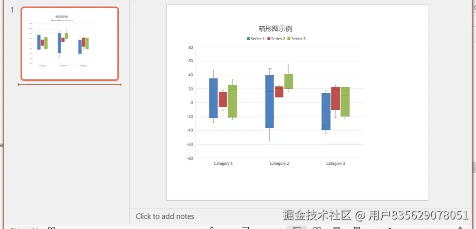
这段代码创建了一个包含三个数据系列的箱形图。AppendChartInit 方法用于在幻灯片的指定位置插入图表,RectangleF.FromLTRB 定义了图表的位置和大小(左、上、右、下边界)。
自定义箱形图样式
箱形图提供了多种自定义选项,可以调整数据显示方式和视觉效果。以下是几个常用的配置项:
显示异常值和均值标记
可以通过设置系列属性来控制是否显示内部点、异常值、均值标记和均值线:
python
# 配置第一个系列
chart.Series[0].ShowInnerPoints = False      # 不显示内部数据点
chart.Series[0].ShowOutlierPoints = True     # 显示异常值
chart.Series[0].ShowMeanMarkers = True       # 显示均值标记
chart.Series[0].ShowMeanLine = True          # 显示均值线

# 设置四分位数计算方法
chart.Series[0].QuartileCalculationType = QuartileCalculation.ExclusiveMedian
这些属性的含义如下:
ShowInnerPoints:控制是否显示箱体内的数据点ShowOutlierPoints:控制是否显示异常值(超出须线范围的点)ShowMeanMarkers:控制是否显示均值标记点ShowMeanLine:控制是否显示均值线QuartileCalculationType:设置四分位数的计算方法,可选ExclusiveMedian(排除中位数)或InclusiveMedian(包含中位数)
为不同系列应用不同配置
可以为每个数据系列设置不同的显示选项,以满足不同的分析需求:
python
# 第一个系列:使用排除中位数法
chart.Series[0].ShowInnerPoints = False
chart.Series[0].ShowOutlierPoints = True
chart.Series[0].ShowMeanMarkers = True
chart.Series[0].ShowMeanLine = True
chart.Series[0].QuartileCalculationType = QuartileCalculation.ExclusiveMedian

# 第二个系列:使用包含中位数法
chart.Series[1].ShowInnerPoints = False
chart.Series[1].ShowOutlierPoints = True
chart.Series[1].ShowMeanMarkers = True
chart.Series[1].ShowMeanLine = True
chart.Series[1].QuartileCalculationType = QuartileCalculation.InclusiveMedian

# 第三个系列:使用排除中位数法
chart.Series[2].ShowInnerPoints = False
chart.Series[2].ShowOutlierPoints = True
chart.Series[2].ShowMeanMarkers = True
chart.Series[2].ShowMeanLine = True
chart.Series[2].QuartileCalculationType = QuartileCalculation.ExclusiveMedian
这种灵活性使得可以在同一张图表中对比不同统计方法的结果。
完整示例
结合上述所有功能,下面是一个完整的箱形图创建示例:
python
from spire.presentation.common import *
from spire.presentation import *

outputFile = "CreateBoxAndWhiskerChart.pptx"

# 创建 PowerPoint 文档
ppt = Presentation()

# 在第一张幻灯片中添加箱形图
chart = ppt.Slides[0].Shapes.AppendChartInit(
    ChartType.BoxAndWhisker,
    RectangleF.FromLTRB(50, 50, 550, 450),
    False
)

# 设置系列标签
seriesLabel = ["Series 1", "Series 2", "Series 3"]
for i in range(len(seriesLabel)):
    chart.ChartData[0, i + 1].Text = seriesLabel[i]

# 设置分类标签
categories = [
    "Category 1", "Category 1", "Category 1", "Category 1",
    "Category 1", "Category 1", "Category 1",
    "Category 2", "Category 2", "Category 2", "Category 2",
    "Category 2", "Category 2",
    "Category 3", "Category 3", "Category 3", "Category 3",
    "Category 3"
]
for i in range(len(categories)):
    chart.ChartData[i + 1, 0].Text = categories[i]

# 设置数值数据
values = [
    [-7, -3, -24], [-10, 1, 11], [-28, -6, 34],
    [47, 2, -21], [35, 17, 22], [-22, 15, 19],
    [17, -11, 25], [-30, 18, 25], [49, 22, 56],
    [37, 22, 15], [-55, 25, 31], [14, 18, 22],
    [18, -22, 36], [-45, 25, -17], [-33, 18, 22],
    [18, 2, -23], [-33, -22, 10], [10, 19, 22]
]

# 填充数据到图表
for i in range(len(seriesLabel)):
    for j in range(len(categories)):
        chart.ChartData[j + 1, i + 1].NumberValue = values[j][i]

# 绑定数据源
chart.Series.SeriesLabel = chart.ChartData[0, 1, 0, len(seriesLabel)]
chart.Categories.CategoryLabels = chart.ChartData[1, 0, len(categories), 0]

# 为每个系列分配数据值并设置显示选项
for i in range(len(seriesLabel)):
    chart.Series[i].Values = chart.ChartData[1, i + 1, len(categories), i + 1]
    chart.Series[i].ShowInnerPoints = False
    chart.Series[i].ShowOutlierPoints = True
    chart.Series[i].ShowMeanMarkers = True
    chart.Series[i].ShowMeanLine = True

    # 根据系列索引设置不同的四分位数计算方法
    if i == 1:
        chart.Series[i].QuartileCalculationType = QuartileCalculation.InclusiveMedian
    else:
        chart.Series[i].QuartileCalculationType = QuartileCalculation.ExclusiveMedian

# 显示图例
chart.HasLegend = True
chart.ChartLegend.Position = ChartLegendPositionType.Top

# 设置图表标题
chart.ChartTitle.TextProperties.Text = "BoxAndWhisker"

# 保存文档
ppt.SaveToFile(outputFile, FileFormat.Pptx2013)
ppt.Dispose()
结果文档:
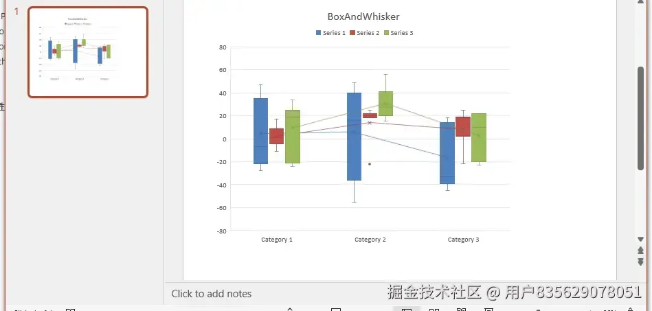
运行此代码后,将生成一个名为 CreateBoxAndWhiskerChart.pptx 的 PowerPoint 文件,其中包含一个格式化的箱形图。
实际应用建议
在实际工作中,可以将箱形图应用于以下场景:
- 质量控制报告:展示产品尺寸、重量等指标的分布情况,识别不合格品
- 财务分析:比较不同季度或部门的收入、支出分布
- 学术研究:呈现实验数据的统计特征和异常值
- 性能监控:可视化系统响应时间、吞吐量等指标的波动范围
通过自动化生成这些图表,可以减少手动操作,确保数据更新的及时性,并保持演示文稿的专业外观。
总结
本文介绍了如何使用 Python 和 Spire.Presentation 库在 PowerPoint 中创建箱形图。我们学习了如何设置图表数据、配置显示选项、自定义四分位数计算方法,以及如何将这些功能组合成完整的解决方案。
箱形图是统计分析中的有力工具,能够直观地展示数据分布特征。通过编程方式生成这些图表,不仅可以提高工作效率,还能确保数据展示的一致性和准确性。开发者可以根据具体需求,进一步探索其他图表类型和自定义选项,创建更加丰富的数据可视化演示文稿。