在鸿蒙 ArkUI 开发中,弹窗是处理用户交互反馈(如警告、确认、自定义提示)的核心组件。根据官方文档与最佳实践,ArkUI 提供了固定样式的 AlertDialog 和高度可定制的 CustomDialog。
以下系统梳理这两种弹窗的创建、关闭及进阶封装方案。
一、 AlertDialog:轻量级警告弹窗
AlertDialog 适用于简单的信息提示或需要用户进行"确认/取消"操作的场景。它由标题区、内容区和操作按钮区组成,无需开发者手动构建 UI 布局。
1. 基础用法(双按钮)
通过 primaryButton 和 secondaryButton 配置两个操作按钮,并通过 action 回调处理点击逻辑。
TypeScript
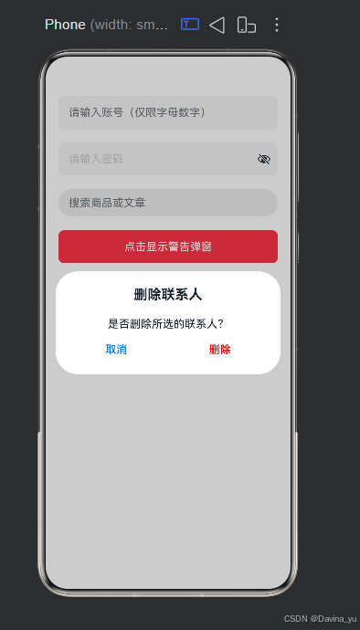
Button('点击显示警告弹窗')
  .onClick(() => {
    AlertDialog.show({
      title: '删除联系人',
      message: '是否删除所选的联系人?',
      autoCancel: true, // 点击遮罩层时是否自动关闭
      primaryButton: {
        value: '取消',
        action: () => { console.info('点击了取消'); }
      },
      secondaryButton: {
        value: '删除',
        fontColor: Color.Red, // 危险操作通常标红
        action: () => { console.info('成功删除'); }
      }
    });
  })
TypeScript
import { promptAction } from '@kit.ArkUI';

@Entry
@Component
struct AdvancedInputExample {
  @State username: string = '';
  @State password: string = '';
  @State searchKey: string = '';

  build() {
    Column({ space: 20 }) {
      // 1. 账号输入框
      TextInput({ placeholder: '请输入账号(仅限字母数字)', text: this.username })
        .type(InputType.Normal)
        .maxLength(20)
        .inputFilter('[a-zA-Z0-9]')
        .onChange((value: string) => { this.username = value; })
        .width('100%')
        .height(48)
        .backgroundColor('#F5F5F5')
        .borderRadius(8)
        .padding({ left: 15, right: 15 } as EdgeWidths)

      // 2. 密码输入框
      TextInput({ placeholder: '请输入密码', text: this.password })
        .type(InputType.Password)
        .maxLength(16)
        .caretColor('#007DFF')
        .placeholderColor('#CCCCCC')
        .onChange((value: string) => { this.password = value; })
        .width('100%')
        .height(48)
        .backgroundColor('#F5F5F5')
        .borderRadius(8)
        .padding({ left: 15, right: 15 } as EdgeWidths)

      // 3. 搜索框
      TextInput({ placeholder: '搜索商品或文章', text: this.searchKey })
        .enterKeyType(EnterKeyType.Search)
        .onSubmit(() => {
          promptAction.showToast({ message: `开始搜索: ${this.searchKey}` });
        })
        .onBlur(() => { console.log('Search input lost focus'); })
        .width('100%')
        .height(40)
        .backgroundColor('#EEEEEE')
        .borderRadius(20)
        .padding({ left: 15, right: 15 } as EdgeWidths)
        .fontSize(14)

      // 👇 【新增】警告弹窗按钮放在这里
      Button('点击显示警告弹窗')
        .onClick(() => {
          AlertDialog.show({
            title: '删除联系人',
            message: '是否删除所选的联系人?',
            autoCancel: true, // 点击遮罩层时是否自动关闭
            primaryButton: {
              value: '取消',
              action: () => { console.info('点击了取消'); }
            },
            secondaryButton: {
              value: '删除',
              fontColor: Color.Red, // 危险操作通常标红
              action: () => { console.info('成功删除'); }
            }
          });
        })
        .width('100%')
        .height(48)
        .backgroundColor('#FF4D4F')
        .fontColor(Color.White)
        .borderRadius(8)
    }
    .padding(20)
    .width('100%')
  }
}
2. 单按钮确认弹窗
如果仅需提示用户且只有一个确认动作,可以使用 confirm 属性替代双按钮配置。
TypeScript
AlertDialog.show({
  title: '提示',
  message: '您的网络已断开!',
  confirm: {
    value: '知道了',
    action: () => { console.info('用户确认'); }
  }
});
二、 CustomDialogController:基础自定义弹窗
当系统的固定样式无法满足需求(例如需要包含输入框、复杂图文排版)时,需使用 CustomDialog。其核心是通过 CustomDialogController 来控制弹窗的生命周期。
1. 定义弹窗组件
使用 @CustomDialog 装饰器标记组件,并通过 controller 接收控制器实例以支持内部关闭。
TypeScript
@CustomDialog
export struct CommonDialog {
  controller: CustomDialogController;
  @State inputValue: string = '';

  build() {
    Column() {
      Text('请输入昵称').fontSize(18).fontWeight(FontWeight.Bold).margin({ top: 20, bottom: 10 })
      TextInput({ placeholder: '请输入...', text: this.inputValue })
        .height(40).borderRadius(8).backgroundColor('#F5F5F5')
        .onChange((value) => { this.inputValue = value; })

      Row() {
        Button('取消').flex(1).backgroundColor('#F5F5F5').fontColor('#333333')
          .onClick(() => { this.controller.close(); })
        Button('确认').flex(1).margin({ left: 12 }).backgroundColor('#007DFF')
          .onClick(() => {
            console.log('提交内容:', this.inputValue);
            this.controller.close();
          })
      }.width('100%').margin({ top: 20, bottom: 20 })
    }
    .padding(20).backgroundColor(Color.White).borderRadius(12)
  }
}
2. 页面调用与关闭
在宿主页面中初始化 CustomDialogController,将自定义组件传入 builder 参数,并通过 .open() 和 .close() 方法控制显隐。
TypeScript
dialogController: CustomDialogController = new CustomDialogController({
  builder: CommonDialog(),
  alignment: DialogAlignment.Center,
  cancelable: true // 允许点击外部蒙层关闭
});

// 打开弹窗
this.dialogController.open();
三、 进阶推荐:全局解耦的 openCustomDialog
1. CustomDialog 的双向数据通信(@Link)
在实际业务中,弹窗往往需要展示父页面的数据,并将用户在弹窗内的操作结果回传给父页面。官方推荐使用 @Link 装饰器实现父子状态同步。
TypeScript
// 自定义弹窗组件:接收外部传入的数据并回传
@CustomDialog
export struct EditNameDialog {
  controller: CustomDialogController;
  @Link currentName: string; // 使用 @Link 实现双向绑定

  build() {
    Column({ space: 20 }) {
      Text('修改昵称').fontSize(18).fontWeight(FontWeight.Bold)

      TextInput({ text: this.currentName })
        .onChange((value: string) => { this.currentName = value; })

      Button('保存')
        .onClick(() => {
          // 点击保存时,父页面的 @State 变量会自动更新为最新值
          this.controller.close();
        })
    }
    .padding(20).backgroundColor(Color.White).borderRadius(12)
  }
}

// 父页面调用示例
@Entry
@Component
struct ProfilePage {
  @State userName: string = 'HarmonyOS_Dev';

  dialogController: CustomDialogController = new CustomDialogController({
    builder: EditNameDialog({ currentName: $userName }), // 使用 $ 传递引用
    alignment: DialogAlignment.Center,
    customStyle: true
  });

  build() {
    Column() {
      Text(`当前昵称: ${this.userName}`)
      Button('编辑昵称').onClick(() => { this.dialogController.open(); })
    }
  }
}
2. 高阶封装:开箱即用的通用业务弹窗 (CommonDialog)
为了避免每次遇到"标题+内容+双按钮"的需求都重写一遍 CustomDialog,可以封装一个完全受控的通用组件,通过参数配置即可生成不同样式的弹窗。
TypeScript
// 定义统一的弹窗配置接口
export interface CommonDialogOptions {
  title?: string;
  content?: string;
  cancelText?: string;
  confirmText?: string;
  onCancel?: () => void;
  onConfirm?: () => void;
}

// 通用弹窗 UI 组件
@CustomDialog
export struct CommonDialog {
  controller: CustomDialogController;
  options: CommonDialogOptions;

  build() {
    Column() {
      if (this.options.title) {
        Text(this.options.title).fontSize(18).fontWeight(FontWeight.Bold).margin({ top: 20, bottom: 10 })
      }
      if (this.options.content) {
        Text(this.options.content).fontSize(14).fontColor('#666666').margin({ bottom: 20 }).textAlign(TextAlign.Center)
      }

      Row({ space: 12 }) {
        Button(this.options.cancelText || '取消')
          .flex(1).height(44).backgroundColor('#F5F5F5').fontColor('#333333')
          .onClick(() => { this.controller.close(); this.options.onCancel?.(); })

        Button(this.options.confirmText || '确认')
          .flex(1).height(44).backgroundColor('#007DFF').fontColor(Color.White)
          .onClick(() => { this.controller.close(); this.options.onConfirm?.(); })
      }.width('100%').margin({ bottom: 20 })
    }
    .width('100%').padding({ left: 20, right: 20 }).backgroundColor(Color.White).borderRadius(12)
  }
}
3. 蒙层控制与高级交互
在某些复杂场景下,我们需要对弹窗的背景蒙层进行精细控制,例如允许点击蒙层穿透到下层页面,或者自定义蒙层的颜色。
- 非模态弹窗(背景可交互) :将
isModal设置为false,此时弹窗不会阻断底层页面的滑动或点击事件。 - 自定义蒙层颜色 :通过
maskColor属性调整遮罩透明度,常用于引导页或夜间模式。
TypeScript
Button('显示非模态提示')
  .onClick(() => {
    AlertDialog.show({
      title: '系统升级中',
      message: '请在后台等待,您可以继续浏览其他页面。',
      isModal: false, // 【关键】设为 false,允许用户与弹窗背后的页面交互
      maskColor: '0x00000000', // 隐藏蒙层
      confirm: { value: '知道了' }
    });
  })
4. 生命周期回调与埋点监控
在大型项目中,我们通常需要知道弹窗何时真正渲染完成以触发埋点上报,或者在关闭后执行清理逻辑。ArkUI 提供了完整的时序回调支持:
TypeScript
AlertDialog.show({
  title: '广告位',
  message: '限时优惠...',
  confirm: { value: '立即查看' },
  onWillAppear: () => console.info('弹窗即将出现(动效前)'),
  onDidAppear: () => {
    console.info('弹窗已完全展示');
    // 【业务场景】在这里触发曝光埋点上报
  },
  onWillDisappear: () => console.info('弹窗即将消失(动效前)'),
  onDidDisappear: () => {
    console.info('弹窗已彻底销毁');
    // 【业务场景】在这里释放相关的定时器或监听器
  }
});
虽然 CustomDialogController 易于上手,但它在实际工程中存在诸多限制(不支持动态创建、刷新受限)。官方强烈推荐 使用从 UIContext 获取的 PromptAction 对象提供的 openCustomDialog API 来实现完全解耦的全局弹窗。
核心优势
- 与 UI 解耦 :通过
ComponentContent封装内容,无需在每个页面都绑定 Controller。 - 支持动态更新 :弹窗打开后,可通过
updateCustomDialog动态修改对齐方式、偏移量或蒙层颜色等属性。 - 完善的生命周期 :提供
onWillAppear、onDidAppear、onWillDisappear、onDidDisappear四个时序回调,方便做埋点或动画过渡。
最佳实践:封装静态工具类
为了避免在业务代码中重复编写冗长的 ComponentContent 创建与销毁逻辑,建议封装一个统一的 DialogController 工具类:
TypeScript
import { promptAction } from '@kit.ArkUI';

export class GlobalDialogUtil {
  private static dialogNode: ComponentContent<Object> | null = null;

  // 打开全局自定义弹窗
  static show(builder: WrappedBuilder<[Object]>, params?: Object) {
    this.dismiss(); // 防止重复弹出
    const ctx = getContext(this);
    this.dialogNode = new ComponentContent(ctx, builder, params);

    promptAction.openCustomDialog(this.dialogNode, {
      isModal: true,
      autoCancel: true,
      alignment: DialogAlignment.Center,
      maskColor: '0x33000000'
    }).then(() => {
      console.info('Global Dialog opened.');
    });
  }

  // 关闭并释放资源
  static dismiss() {
    if (this.dialogNode) {
      promptAction.closeCustomDialog(this.dialogNode).then(() => {
        this.dialogNode?.dispose(); // 【关键】必须手动释放内存
        this.dialogNode = null;
      });
    }
  }
}
💡 选型总结建议
- 简单提示/确认 :直接使用
AlertDialog.show(),零成本接入。 - 常规业务自定义弹窗 :使用
CustomDialogController。 - 全局通用弹窗/复杂交互/需要动态更新样式 :务必采用
PromptAction.openCustomDialog+ComponentContent模式,这是目前鸿蒙应用框架下最优雅、扩展性最强的弹窗解决方案。