HarmonyOS 新闻资讯应用 · 视频模块 features/video 实现指南
开发环境 :DevEco Studio 6.1.0 Release
SDK版本 :HarmonyOS SDK 6.1.0(23) / API 23
开发语言 :ArkTS
状态管理 :V2(@ComponentV2系列装饰器)
前置阅读 :common模块指南 · 整体架构指南
本篇详细讲解视频模块 features/video 的实现。作为应用第二大 Tab 页,视频模块以 Grid 双列网格 布局展示视频封面,通过 Tabs 组件 实现 5 个分类切换,点击封面进入 Video 组件播放页。整个模块仅有 2 个组件、3 个源文件、212 行源码,是结构清晰、易于理解的 HAR 特性模块。
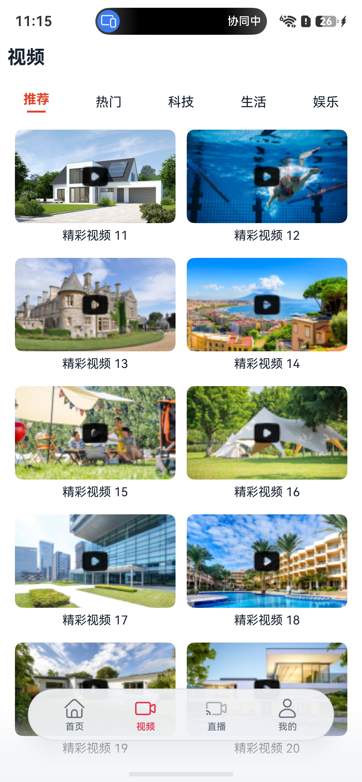
效果
一、模块定位与架构角色
视频模块在三层架构中处于基础特性层(features),编译为 HAR 包,依赖 common 公共能力层:
产品定制层 product/phone (HAP)
    ↓ 依赖
基础特性层 features/news | features/video ← 本模块 | features/live | features/personal | features/service (HAR)
    ↓ 依赖
公共能力层 common (HAR)模块职责:提供视频浏览和播放功能,包含 2 个组件:
| 组件 | 文件 | 行数 | 类型 | 功能 |
|---|---|---|---|---|
VideoHome |
components/VideoHome.ets |
112 | @ComponentV2 | 视频主页,Grid 双列封面列表 + Tabs 5分类 |
VideoPlayer |
pages/VideoPlayer.ets |
97 | @ComponentV2 | 视频播放页,NavDestination + Video 组件 |
被依赖关系 :product/phone 的 MainPage 将 VideoHome 嵌入第二个 HdsTab,用户在主页切换到"视频"Tab 时展示。VideoPlayer 作为 NavDestination 页面,由 MainPage 的 pageMap 路由注册。
二、模块配置详解
2.1 oh-package.json5
json5
{
  "name": "video",
  "version": "1.0.0",
  "description": "Please describe the basic information.",
  "main": "Index.ets",
  "author": "",
  "license": "Apache-2.0",
  "dependencies": {
    "common": "file:../../common"
  }
}逐字段讲解:
| 字段 | 值 | 说明 |
|---|---|---|
name |
"video" |
包标识符,import ... from 'video' 时使用 |
main |
"Index.ets" |
入口文件,外部导入时自动解析到此文件 |
dependencies.common |
"file:../../common" |
本地路径依赖,从 features/video 向上两级到 common |
与 news 模块配置完全一致,仅 name 不同。所有 features 模块都依赖 common,路径格式统一为 "file:../../common"。
2.2 Index.ets 入口文件
typescript
export { VideoHome } from './src/main/ets/components/VideoHome';
export { VideoPlayer } from './src/main/ets/pages/VideoPlayer';
仅 3 行代码,导出 2 个组件。外部通过 import { VideoHome, VideoPlayer } from 'video' 即可使用。注意 VideoPlayer 也在此导出,虽然它是由 MainPage 的 pageMap 内部使用,不需要外部直接实例化。
三、完整文件结构树
features/video/
├── oh-package.json5                    (12行) 模块配置
├── Index.ets                            (3行)  统一导出
├── src/main/
│   ├── ets/
│   │   ├── components/
│   │   │   └── VideoHome.ets            (112行) 视频主页,Grid+Tabs
│   │   └── pages/
│   │       └── VideoPlayer.ets          (97行)  视频播放页,Video组件
│ └── resources/ (图片、视频等静态资源)目录职责:
components/--- 可复用的页面组件,VideoHome是嵌入 HdsTab 的主组件pages/--- 通过 NavDestination 展示的二级页面,VideoPlayer由路由跳转进入
四、VideoHome 视频主页
VideoHome 是视频模块的核心组件,展示 5 个分类 Tab 和双列视频封面网格。
4.1 完整源码
typescript
import { VideoItem, CommonDataSource, CommonConstants, StyleConstants } from 'common';

/**
 * 视频主页组件
 * 使用 @ComponentV2 + @Local 管理状态
 * 展示视频分类Tab和视频Grid列表
 */
@ComponentV2
export struct VideoHome {
  @Local videoList: CommonDataSource<VideoItem> = new CommonDataSource<VideoItem>();
  @Local currentIndex: number = 0;
  @Consumer('pageStack') pageStack!: NavPathStack;
  private categories: string[] = ['推荐', '热门', '科技', '生活', '娱乐'];

  aboutToAppear() {
    let items: VideoItem[] = [];
    let covers = CommonConstants.VIDEO_COVER_LIST;
    for (let i = 0; i < covers.length; i++) {
      items.push(new VideoItem(
        `video_${i}`,
        `精彩视频 ${i + 1}`,
        covers[i],
        'videoTest.mp4',
        this.categories[i % this.categories.length]
      ));
    }
    this.videoList.setData(items);
  }

  @Builder
  TabLabel(label: string, index: number) {
    Column() {
      Text(label)
        .fontSize(14)
        .fontColor(this.currentIndex === index ? '#E84026' : StyleConstants.TEXT_PRIMARY)
        .fontWeight(this.currentIndex === index ? FontWeight.Bold : FontWeight.Normal)
      if (this.currentIndex === index) {
        Divider()
          .width(20)
          .strokeWidth(2)
          .color('#E84026')
          .margin({ top: 4 })
      }
    }
    .width(60)
    .height(40)
    .justifyContent(FlexAlign.Center)
  }

  build() {
    Column() {
      // 顶部标题
      Text('视频')
        .fontSize(20)
        .fontWeight(FontWeight.Bold)
        .fontColor(StyleConstants.TEXT_PRIMARY)
        .margin({ left: 16, top: 12, bottom: 8 })
        .width('100%')

      // 分类Tab
      Tabs({ barPosition: BarPosition.Start, index: this.currentIndex }) {
        ForEach(this.categories, (item: string, index?: number) => {
          TabContent() {
            Grid() {
              LazyForEach(this.videoList, (video: VideoItem) => {
                GridItem() {
                  Column() {
                    Stack() {
                      Image(video.coverImage)
                        .width('100%')
                        .height(100)
                        .borderRadius(8)
                        .objectFit(ImageFit.Cover)

                      // 播放图标
                      Image($r('app.media.play_round_rectangle_fill'))
                        .width(32)
                        .height(32)
                    }

                    Text(video.title)
                      .fontSize(13)
                      .fontColor(StyleConstants.TEXT_PRIMARY)
                      .maxLines(1)
                      .textOverflow({ overflow: TextOverflow.Ellipsis })
                      .margin({ top: 6 })
                  }
                  .onClick(() => {
                    this.pageStack.pushPathByName('VideoPlayer', video);
                  })
                }
              }, (item: VideoItem) => item.videoId)
            }
            .columnsTemplate('1fr 1fr')
            .rowsGap(16)
            .columnsGap(12)
            .padding({ left: 16, right: 16 })
          }
          .tabBar(this.TabLabel(item, index ?? 0))
        }, (item: string) => item)
      }
      .onChange((index: number) => {
        this.currentIndex = index;
      })
      .layoutWeight(1)
    }
    .width('100%')
    .height('100%')
    .backgroundColor(Color.White)
  }
}
4.2 分段深度讲解
段落1 --- 导入与状态变量(第1-13行)
导入语句 :从 common 导入 4 个内容:
| 导入项 | 类型 | 用途 |
|---|---|---|
VideoItem |
数据模型 | 视频数据项,@ObservedV2 类 |
CommonDataSource |
泛型数据源 | IDataSource 实现,配合 LazyForEach |
CommonConstants |
常量类 | 提供 VIDEO_COVER_LIST(20 张封面 Resource) |
StyleConstants |
样式常量 | 颜色、圆角等统一样式 |
状态变量声明:
| 装饰器 | 变量 | 类型 | 说明 |
|---|---|---|---|
@Local |
videoList |
CommonDataSource<VideoItem> |
视频数据源,泛型为 VideoItem |
@Local |
currentIndex |
number |
当前选中的 Tab 索引,初始为 0 |
@Consumer('pageStack') |
pageStack |
NavPathStack |
从 MainPage 的 @Provider 注入,用于路由跳转 |
| 无(private) | categories |
string[] |
5 个分类标签:推荐/热门/科技/生活/娱乐 |
@Consumer('pageStack') 原理回顾 :MainPage 通过 @Provider('pageStack') 将 NavPathStack 注入组件树,所有子组件通过 @Consumer('pageStack') 按 key 匹配获取同一实例。! 是非空断言,表示运行时一定由父组件注入。
段落2 --- aboutToAppear 数据初始化(第15-28行)
typescript
aboutToAppear() {
  let items: VideoItem[] = [];
  let covers = CommonConstants.VIDEO_COVER_LIST;  // 20张封面Resource数组
  for (let i = 0; i < covers.length; i++) {
    items.push(new VideoItem(
      `video_${i}`,                              // videoId:唯一标识
      `精彩视频 ${i + 1}`,                        // title:标题
      covers[i],                                  // coverImage:封面Resource
      'videoTest.mp4',                            // videoSrc:视频路径
      this.categories[i % this.categories.length] // category:按余数循环分配
    ));
  }
  this.videoList.setData(items);                  // 触发 notifyDataReloaded
}数据生成逻辑:
- 从
CommonConstants.VIDEO_COVER_LIST获取 20 张封面图片资源($r('app.media.video_01')到$r('app.media.video_20')) - 循环 20 次,每次创建一个
VideoItem category使用取余算法i % 5,确保 5 个分类均匀分布:0→推荐、1→热门、2→科技、3→生活、4→娱乐、5→推荐...- 所有视频共用同一个测试文件
videoTest.mp4(实际项目中会存储不同视频路径) setData(items)调用后触发notifyDataReloaded(),LazyForEach 重新加载数据
与 news 模块数据加载对比:
| 对比项 | news(NewsHome) | video(VideoHome) |
|---|---|---|
| 数据来源 | rawfile JSON(异步加载) | VIDEO_COVER_LIST 常量(同步构建) |
| 加载方式 | MockDataUtil.getNewsList() | 循环构造器直接创建 |
| 异步处理 | async/await + context | 同步,无需异步 |
| 数据量 | 由 JSON 文件决定 | 固定 20 条 |
段落3 --- @Builder TabLabel 自定义标签(第30-48行)
typescript
@Builder
TabLabel(label: string, index: number) {
  Column() {
    Text(label)
      .fontSize(14)
      .fontColor(this.currentIndex === index ? '#E84026' : StyleConstants.TEXT_PRIMARY)
      .fontWeight(this.currentIndex === index ? FontWeight.Bold : FontWeight.Normal)
    if (this.currentIndex === index) {
      Divider()
        .width(20)
        .strokeWidth(2)
        .color('#E84026')
        .margin({ top: 4 })
    }
  }
  .width(60)
  .height(40)
  .justifyContent(FlexAlign.Center)
}
@Builder 是什么 :@Builder 是 ArkUI 提供的 UI 构建模板装饰器,可以在 build() 中通过 this.TabLabel(...) 调用,编译时内联到调用处。与独立组件不同,@Builder 不需要单独声明 @ComponentV2,适合复用简单的 UI 片段。
TabLabel 选中态逻辑:
| 状态 | 文字颜色 | 字重 | 下划线 |
|---|---|---|---|
选中(currentIndex === index) |
#E84026(红色) |
Bold |
红色 Divider(宽20、粗2) |
| 未选中 | TEXT_PRIMARY(主色) |
Normal |
无(if 条件不满足) |
条件渲染 if :在 ArkUI 中,if 语句可以直接控制组件的创建和销毁。当条件从 false 变为 true 时创建 Divider 组件,反之销毁。这比设置 .opacity(0) 更高效,因为未选中的 Tab 不会创建多余的组件。
调用方式 :在第 99 行通过 .tabBar(this.TabLabel(item, index ?? 0)) 调用,index ?? 0 使用空值合并运算符确保 index 为 number 类型(ForEach 的 index 参数类型为 number | undefined)。
段落4 --- build() 主布局(第50-110行)
布局层级结构:
Column (根容器)
├── Text('视频')                        ← 顶部标题,20号加粗
└── Tabs (barPosition:Start)            ← 分类Tab,标签栏在顶部
    └── ForEach(categories) → TabContent
        └── Grid ('1fr 1fr')            ← 双列网格
            └── LazyForEach → GridItem
                └── Column
                    ├── Stack
                    │   ├── Image(coverImage)    ← 封面图,100高
                    │   └── Image(播放图标)       ← 32×32叠加
                    └── Text(title)              ← 标题,单行截断
Grid 双列布局详解:
typescript
Grid() {
  LazyForEach(this.videoList, (video: VideoItem) => {
    GridItem() { ... }
  }, (item: VideoItem) => item.videoId)
}
.columnsTemplate('1fr 1fr')   // 两列等宽,1fr = 1 fraction(等分剩余空间)
.rowsGap(16)                   // 行间距 16vp
.columnsGap(12)                // 列间距 12vp
.padding({ left: 16, right: 16 })| Grid 属性 | 值 | 说明 |
|---|---|---|
columnsTemplate |
'1fr 1fr' |
两列等宽。1fr 表示一份可用空间,两列各占 50% |
rowsGap |
16 |
行间距 16vp,视觉分隔 |
columnsGap |
12 |
列间距 12vp,略小于行间距 |
padding |
left/right: 16 |
左右内边距,与页面标题对齐 |
Stack 封面叠加设计:
typescript
Stack() {
  Image(video.coverImage)
    .width('100%')
    .height(100)
    .borderRadius(8)
    .objectFit(ImageFit.Cover)        // 等比裁切填满

  Image($r('app.media.play_round_rectangle_fill'))
    .width(32)
    .height(32)                        // 播放图标居中叠加
}
Stack 默认居中对齐子组件,所以播放图标自动叠加在封面图中央。ImageFit.Cover 确保封面图等比缩放裁切填满容器,避免拉伸变形。
路由跳转:
typescript
.onClick(() => {
  this.pageStack.pushPathByName('VideoPlayer', video);
})
点击视频卡片后,将 VideoItem 作为路由参数推入 NavPathStack。MainPage 的 pageMap 匹配 'VideoPlayer' 路由名,渲染 VideoPlayer 组件并传递参数。
Tabs 配置:
typescript
Tabs({ barPosition: BarPosition.Start, index: this.currentIndex })
  .onChange((index: number) => {
    this.currentIndex = index;  // 更新选中索引,触发 TabLabel 重新渲染
  })
  .layoutWeight(1)              // 占满剩余高度(减去顶部标题)
BarPosition.Start 表示标签栏在顶部(默认行为),index 双向绑定当前选中 Tab。.onChange 在用户滑动或点击切换时触发,更新 currentIndex 使 TabLabel 的选中态正确切换。
ForEach 与 .tabBar 的配合:
typescript
ForEach(this.categories, (item: string, index?: number) => {
  TabContent() {
    // 每个Tab的内容:Grid列表
  }
  .tabBar(this.TabLabel(item, index ?? 0))  // 自定义标签
}, (item: string) => item)  // key生成器:用分类名作唯一key
ForEach 遍历 5 个分类,每个创建一个 TabContent。.tabBar() 接收 @Builder 返回值,替换默认的 Tab 标签样式。注意每个 TabContent 都包含完整的 Grid 列表------这意味着切换 Tab 时,同一个 videoList 数据源在所有 Tab 中展示相同内容(实际项目中可根据分类过滤)。
五、VideoPlayer 视频播放页
VideoPlayer 是从 VideoHome 点击跳转后的二级页面,通过 NavDestination 嵌入 Navigation 容器,使用 Video 组件播放视频。
5.1 完整源码
typescript
import { VideoItem, StyleConstants } from 'common';

/**
 * 视频播放页
 * 使用 @ComponentV2 + NavDestination 实现
 * 支持视频播放、进度控制
 */
@ComponentV2
export struct VideoPlayer {
  @Param pageStack: NavPathStack = new NavPathStack();  // @Param 替代 @Consumer
  @Local videoItem: VideoItem = new VideoItem('', '视频播放', $r('app.media.preview'));
  controller: VideoController = new VideoController();

  aboutToAppear() {
    let param: Record<string, Object> | undefined =
      AppStorage.get<Record<string, Object>>('routeParam_VideoPlayer');  // AppStorage 纯对象
    if (param) {
      this.videoItem = new VideoItem(
        (param['videoId'] as string) ?? '',
        (param['title'] as string) ?? '',
        (param['coverImage'] as Resource) ?? $r('app.media.preview'),
        (param['videoSrc'] as string) ?? '',
        (param['category'] as string) ?? '推荐'
      );
    }
  }

  build() {
    NavDestination() {
      Column() {
        // 顶部返回栏
        Row() {
          Image($r('app.media.back'))
            .width(24)
            .height(24)
            .margin({ left: 16 })
            .onClick(() => {
              this.pageStack.pop();
            })

          Text(this.videoItem.title)
            .fontSize(18)
            .fontWeight(FontWeight.Bold)
            .layoutWeight(1)
            .textAlign(TextAlign.Center)
            .maxLines(1)
            .textOverflow({ overflow: TextOverflow.Ellipsis })
            .margin({ right: 40 })
        }
        .width('100%')
        .height(56)
        .padding({ top: 8 })

        // 视频播放器
        Video({
          src: $rawfile('videoTest.mp4'),
          controller: this.controller,
          previewUri: this.videoItem.coverImage
        })
          .width('100%')
          .aspectRatio(16 / 9)
          .autoPlay(false)
          .controls(true)
          .objectFit(ImageFit.Contain)

        // 视频信息
        Column() {
          Text(this.videoItem.title)
            .fontSize(16)
            .fontWeight(FontWeight.Medium)
            .fontColor(StyleConstants.TEXT_PRIMARY)
            .width('100%')
            .margin({ top: 12 })

          Row({ space: 16 }) {
            Text(`分类:${this.videoItem.category}`)
              .fontSize(13)
              .fontColor(StyleConstants.TEXT_SECONDARY)
            Text('华为日报')
              .fontSize(13)
              .fontColor(StyleConstants.TEXT_SECONDARY)
          }
          .margin({ top: 8 })
          .width('100%')

          Text('精彩视频内容,带你领略不一样的世界。本视频展示了最新的技术发展和应用场景。')
            .fontSize(14)
            .lineHeight(24)
            .fontColor(StyleConstants.TEXT_SECONDARY)
            .width('100%')
            .margin({ top: 12 })
        }
        .padding({ left: 16, right: 16 })

        Blank()
      }
      .width('100%')
      .height('100%')
      .backgroundColor(Color.White)
    }
    .hideTitleBar(true)
  }
}
5.2 分段深度讲解
段落1 --- 状态变量与控制器(第9-12行)
typescript
@Consumer('pageStack') pageStack!: NavPathStack;
@Local videoItem: VideoItem = new VideoItem('', '视频播放', $r('app.media.preview'));
controller: VideoController = new VideoController();| 变量 | 装饰器 | 类型 | 说明 |
|---|---|---|---|
pageStack |
@Consumer('pageStack') |
NavPathStack |
路由栈,用于 getParamByName 和 pop |
videoItem |
@Local |
VideoItem |
当前播放的视频数据,默认值用 preview 封面 |
controller |
无(普通属性) | VideoController |
视频控制器,可控制播放/暂停/跳转 |
VideoController 用途 :VideoController 是 ArkUI 提供的视频控制器类,支持以下方法:
start()--- 开始播放pause()--- 暂停播放stop()--- 停止播放seekTo(timeInSeconds)--- 跳转到指定时间requestFullscreen()/exitFullscreen()--- 全屏控制
本例中 controller 仅声明并传递给 Video 组件,未主动调用方法。保留 controller 是为了后续扩展(如自定义控制按钮)。
段落2 --- aboutToAppear 路由参数获取(第14-19行)
typescript
aboutToAppear() {
  let param = this.pageStack.getParamByName('VideoPlayer');
  if (param) {
    this.videoItem = param as VideoItem;
  }
}参数传递链路:
VideoHome.onClick()
  → pushPathByName('VideoPlayer', video)     // 推入路由栈,video 作为参数
  → Navigation 匹配 'VideoPlayer' 路由
  → VideoPlayer 组件创建
  → aboutToAppear()
  → getParamByName('VideoPlayer')            // 按路由名取出参数
  → param as VideoItem                       // 类型断言
getParamByName 从 NavPathStack 中获取当前路由名对应的参数。as VideoItem 是 TypeScript 类型断言,告诉编译器参数一定是 VideoItem 类型。
段落3 --- Video 组件详解(第48-57行)
typescript
Video({
  src: $rawfile('videoTest.mp4'),    // 视频源:rawfile 中的视频文件
  controller: this.controller,       // 控制器:控制播放/暂停/跳转
  previewUri: this.videoItem.coverImage  // 封面预览:播放前显示的图片
})
  .width('100%')
  .aspectRatio(16 / 9)               // 16:9 宽高比
  .autoPlay(false)                    // 不自动播放,用户需点击开始
  .controls(true)                     // 显示系统控制栏(播放/暂停/进度条/全屏)
  .objectFit(ImageFit.Contain)        // 等比缩放,完整显示不裁切
Video 组件属性详解:
| 属性 | 类型 | 值 | 说明 |
|---|---|---|---|
src |
Resource |
$rawfile('videoTest.mp4') |
视频文件路径,从 rawfile 资源目录加载 |
controller |
VideoController |
this.controller |
播放控制器实例 |
previewUri |
Resource |
coverImage |
视频未播放时的封面图 |
autoPlay |
boolean |
false |
加载后不自动播放 |
controls |
boolean |
true |
显示播放控制栏 |
objectFit |
ImageFit |
Contain |
等比缩放完整显示(对比 Cover 会裁切) |
aspectRatio |
number |
16/9 ≈ 1.78 |
宽高比,自动根据宽度计算高度 |
ImageFit.Contain vs ImageFit.Cover:
| 模式 | 效果 | 适用场景 |
|---|---|---|
Contain |
等比缩放,完整显示,可能留黑边 | 视频播放(不裁切内容) |
Cover |
等比缩放,填满容器,可能裁切边缘 | 封面图(填满卡片) |
段落4 --- 顶部返回栏(第25-42行)
typescript
Row() {
  Image($r('app.media.back'))          // 返回图标
    .width(24).height(24)
    .margin({ left: 16 })
    .onClick(() => { this.pageStack.pop(); })  // 返回上一页

  Text(this.videoItem.title)           // 标题
    .fontSize(18)
    .fontWeight(FontWeight.Bold)
    .layoutWeight(1)                   // 占满剩余宽度
    .textAlign(TextAlign.Center)       // 居中
    .maxLines(1)                       // 单行
    .textOverflow({ overflow: TextOverflow.Ellipsis })  // 超长截断...
    .margin({ right: 40 })             // 右侧留白与返回按钮对称
}
.width('100%').height(56).padding({ top: 8 })
布局技巧 :返回图标在左(固定24宽),标题居中(layoutWeight:1 占满中间),margin({ right: 40 }) 为标题右侧留白,使标题在视觉上居中(因为左侧有24+16=40宽的返回按钮区域)。
段落5 --- 视频信息区(第60-86行)
typescript
Column() {
  Text(this.videoItem.title)               // 视频标题
    .fontSize(16).fontWeight(FontWeight.Medium)

  Row({ space: 16 }) {                     // 分类 + 来源
    Text(`分类:${this.videoItem.category}`)  // 模板字符串
    Text('华为日报')
  }

  Text('精彩视频内容...')                    // 描述文字
    .fontSize(14).lineHeight(24)            // 行高24,增强可读性
}
.padding({ left: 16, right: 16 })
模板字符串 :分类:${this.videoItem.category} 使用 ArkTS 模板字符串语法,将变量值嵌入字符串中。如果 category 是"推荐",则显示"分类:推荐"。
Blank() 占位 :在信息区后面放置 Blank() 组件,自动填充剩余垂直空间,将内容推到顶部,避免底部空白区域显示异常。
段落6 --- NavDestination 配置(第22行、第94行)
typescript
NavDestination() {
  // ... 页面内容
}
.hideTitleBar(true)  // 隐藏系统默认标题栏,使用自定义顶部栏
与 news 模块的 NewsDetail 一致,.hideTitleBar(true) 隐藏系统默认导航栏,使用自定义的顶部返回栏。NavDestination 是 Navigation 容器的子页面组件,必须通过 NavPathStack 路由跳转进入。
六、Grid 布局 vs List 布局对比
本项目中,news 和 live 模块使用 List 布局,video 模块使用 Grid 布局。以下是两者的详细对比:
| 特性 | Grid 网格布局 | List 列表布局 |
|---|---|---|
| 列数控制 | columnsTemplate('1fr 1fr') 灵活定义 |
固定单列 |
| 子项组件 | GridItem |
ListItem |
| 行间距 | rowsGap |
space |
| 列间距 | columnsGap |
不适用 |
| 适用场景 | 图片/视频网格、相册、商品列表 | 新闻列表、聊天记录、直播列表 |
| 性能优化 | 配合 LazyForEach |
配合 LazyForEach |
| 本项目使用 | VideoHome(双列视频封面) |
NewsHome、LiveHome |
何时选择 Grid:当内容以图片/卡片为主、需要多列展示时,Grid 是最佳选择。视频封面、商品图片、相册浏览等场景天然适合网格布局。
何时选择 List:当内容以文字为主、单列纵向排列时,List 更合适。新闻标题列表、聊天记录、设置项等场景使用 List 更自然。
七、V2 装饰器使用汇总
| 装饰器 | 变量/位置 | 作用 |
|---|---|---|
@ComponentV2 |
VideoHome、VideoPlayer |
V2 组件声明,替代 @Component |
@Local |
videoList、currentIndex、videoItem |
组件内状态,替代 @State |
@Consumer('pageStack') |
VideoHome.pageStack |
从 @Provider 消费 NavPathStack |
@Param |
VideoPlayer.pageStack |
MainPage 显式传参 |
@Builder |
TabLabel |
可复用 UI 构建模板 |
与 news 模块装饰器对比:
| 装饰器 | news 模块 | video 模块 |
|---|---|---|
@ComponentV2 |
✅ 4个组件 | ✅ 2个组件 |
@Local |
✅ | ✅ |
@Param |
✅ NewsListItem | ❌ 无子组件传参 |
@Consumer |
✅ | ✅ |
@Builder |
✅ 5个 | ✅ 1个 |
八、关键设计模式总结
8.1 Grid + LazyForEach 性能优化
Grid 配合 LazyForEach 实现按需加载,只有进入可视区域的 GridItem 才会被创建。当列表很长时(20条以上),相比 ForEach 一次性创建所有子组件,性能优势显著。
8.2 Tabs + ForEach 动态生成
通过 ForEach 遍历 categories 数组动态生成 TabContent,配合 .tabBar(this.TabLabel(...)) 自定义标签样式。这种模式让 Tab 数量和内容完全由数据驱动,增删分类只需修改数组。
8.3 Stack 叠加图标
使用 Stack 将播放图标叠加在封面图上,比使用 backgroundImage 更灵活------可以自由控制图标大小、位置、动画效果。
8.4 路由参数传递
pushPathByName('VideoPlayer', video) → AppStorage.get('routeParam_VideoPlayer')重要变更 :原方案使用
getParamByName获取路由参数,但 @Param NavPathStack 可能创建浅拷贝导致参数读取失败。现方案改为 AppStorage 纯对象中转 :VideoHome 在 onClick 中提取纯Record<string, Object>存入 AppStorage,VideoPlayer 在 aboutToAppear 中读取并重建。注意:AppStorage 禁止存储 @ObservedV2 代理对象(错误码 140115)。
九、常见问题 Q&A
Q1: 为什么所有 Tab 展示相同的视频列表?
A: 当前实现中所有 5 个 TabContent 共用同一个 videoList 数据源,所以展示相同内容。实际项目中,可以在 onChange 中根据 currentIndex 切换不同数据源,或对 videoList 进行 filter 过滤。
Q2: Grid 的 columnsTemplate('1fr 1fr') 如何改为三列?
A: 改为 '1fr 1fr 1fr' 即可。也可以用固定宽度如 '120vp 120vp 120vp',或混合使用 '1fr 2fr'(第二列是第一列两倍宽)。
Q3: 为什么 videoItem 使用 @Local 而非 @Param?
A: @Param 用于父组件向子组件传递数据,而 VideoPlayer 的数据来自 NavPathStack 路由参数(在 aboutToAppear 中获取),不通过父组件直接传递,所以使用 @Local。
Q4: 如何支持全屏播放?
A: 通过 controller.requestFullscreen() 进入全屏。可以添加一个全屏按钮,onClick 时调用此方法。Video 组件的 controls(true) 已包含全屏按钮。
Q5: previewUri 何时显示?
A: 在视频开始播放前(autoPlay(false) 时)显示封面图。用户点击播放后,封面图自动被视频画面替换。
十、小结
视频模块以 212 行源码实现了完整的视频浏览和播放功能,核心知识点包括:
- Grid 双列布局 :
columnsTemplate('1fr 1fr')+rowsGap/columnsGap构建网格 - Stack 叠加设计:封面图上叠加播放图标
- Video 组件 :
src+controller+previewUri+controls+aspectRatio实现视频播放 - Tabs + ForEach:数据驱动的动态 Tab 生成
- AppStorage + NavPathStack 路由传参:纯对象存入 AppStorage,避免 @ObservedV2 代理对象存储问题