简答题
1. 为什么 z-index: 9999 可能被 z-index: 1 压住?
z-index 的比较只有在同一个层叠上下文中才有效。
如果 z-index: 9999 元素的父级创建了一个新的层叠上下文,并且该父级的层叠等级低于 z-index: 1 元素所在的层叠上下文,那么无论子元素的 z-index 有多大,都会随父级一起被压在下面。
2.
2.1 什么时候会出现父元素塌陷,给出解决方法
出现场景: 当父元素未设置高度,且其内部的所有子元素都设置了浮动(float)时,子元素脱离普通文档流,无法撑开父元素,导致父元素高度变为 0,即发生高度塌陷。
解决方法:
- BFC 触发法: 给父元素设置
overflow: hidden;或display: flow-root;触发 BFC 自动包裹浮动元素。 - 伪元素清除浮动: 给父元素添加
::after伪元素,设置content: ""; display: block; clear: both;。 - 显式高度: 直接给父元素设置固定的
height。
什么是 BFC:
BFC是 Web 页面的可视化 CSS 渲染的一部分,它是块级盒子的布局过程发生的区域,也是浮动元素与其他元素交互的区域。 简单来说,BFC 就是页面上的一个独立的渲染区域,容器里面的子元素不会在布局上影响到外面的元素,反之亦然。它就像一道屏障,把内部和外部隔绝开来。
触发 BFC 的方法:
- overflow 的值不为
visible(如hidden,auto,scroll)。- display 的值为
inline-block,flex,inline-flex,grid,table-cell,flow-root。- position 的值为
absolute或fixed。- float 的值不为
none(如left,right)。- HTML 根元素 (
<html>)天生就是一个 BFC。
2.2 什么时候会出现 margin 上下重叠的问题,给出解决方法
出现场景: 块级元素的垂直外边距在特定情况下会合并为单个外边距,称为 margin 塌陷/合并。主要发生在:
- 相邻兄弟元素: 上面元素的
margin-bottom与下面元素的margin-top重叠,结果取两者绝对值最大者。 - 父子元素: 当父元素没有边框(border)、内边距(padding)和行内内容时,子元素的
margin-top会传递给父元素,导致父子一起下移。
解决方法:
- 对于父子重叠:给父元素加
border或padding;或者给父元素设置overflow: hidden;触发 BFC。 - 对于兄弟重叠:可以将其中一个元素放入独立的 BFC 容器中,或者结合实际需求统一使用单向 margin。
2.3 如何书写自适应两栏、三栏布局
使用 flex 布局。
自适应两栏布局:
css
.container { display: flex; }
.left { width: 200px; flex-shrink: 0; }
.right { flex-grow: 1; }
自适应三栏布局:
css
.container { display: flex; }
.left { width: 200px; flex-shrink: 0; }
.right { width: 200px; flex-shrink: 0; }
.main { flex-grow: 1; }
3. 你了解到几种定位方式?(至少三种)并且分别写出他们各自的特点
relative(相对定位): 相对于元素在正常文档流中的原位置进行偏移。元素虽然发生了位移,但它原本占用的空间依然保留在原处,不会影响周围其他元素的排版。absolute(绝对定位): 相对于最近的非static祖先元素进行定位。如果没有,则相对于初始包含块(通常是 body/html)。绝对定位元素会完全脱离文档流,不占用原本的空间。fixed(固定定位): 相对于浏览器视口进行定位。无论页面如何滚动,元素的位置都固定不变(除非祖先元素有transform等特殊属性打破规则),同样脱离文档流。sticky(粘性定位): 结合了relative和fixed的特性。在跨越特定阈值(如top: 0)前表现为相对定位,之后表现为固定定位,常用于吸顶导航。
4. 在学习 flex 的时候你是否了解他们的底层,讲讲 flex-grow、flex-shrink、flex-basis 分别代表什么吧,并解释 flex: 1
这三个属性都是控制主轴上 Flex 项目(Items)空间的分配规则:
flex-basis: 定义了在分配多余空间之前,项目占据的初始主轴空间大小。默认值为auto(即依赖项目自身内容或宽高度)。flex-grow: 定义项目的放大比例。当主轴有剩余空间时,各项目按照该权重比例分摊并吃掉剩余空间。默认0(即使有剩余空间也不放大)。flex-shrink: 定义项目的缩小比例。当主轴空间不足导致溢出时,各项目按照该权重与基准大小的乘积比例等比缩小。默认1(空间不足时等比缩小)。
flex: 1 的简写含义:
flex: 1 是一个简写,等价于 flex-grow: 1; flex-shrink: 1; flex-basis: 0%;。这意味着项目将无视自身原内容大小,完全平分并占满整条主轴的剩余空间,常用于自适应网格或通栏填充。
5. 浮动元素的特性,为什么要清除浮动?怎么清除浮动?
浮动元素的特性:
- 脱离普通文档流,向左或向右移动,直到外边缘碰到包含框或另一个浮动框。
- 块级元素在一行显示,行内元素可以设置宽高(表现类似
inline-block)。 - 产生"文字环绕"效应(原本是为了实现图文混排设计的)。
为什么要清除浮动:
因为浮动元素脱离了文档流,不再占用父元素的空间,导致父元素高度塌陷,周围的非浮动元素布局产生错乱、重叠。为了让包含块恢复正常高度和正常流排版,必须清除浮动。
怎么清除浮动:
使用 **BFC(如 overflow: hidden)**或 ::after 伪元素法。
6. 对于下列样式的盒子,请解释为什么某些情况下会导致元素宽度超出父容器?如何解决?
css
.box {
    width: 100%;
    padding: 20px;
}
核心原因: 标准的盒子模型(box-sizing: content-box)下,元素的实际渲染宽度等于:width + padding + border。
当设置 width: 100% 时,内容的宽度已经等于父容器的 100%,此时再加上左右各 20px 的 padding,盒子的最终总物理宽度就会变成 100% + 40px,自然超出了父容器。
解决方法:
改变盒模型为怪异盒模型。在样式中添加 box-sizing: border-box;。这样设置后,width: 100% 就包含了 padding 和 border,浏览器会自动压缩内容区,适配父容器。
7. 怎么实现移动端适配不同设备?
移动端适配的核心是确保页面在不同屏幕尺寸的手机上都能展现出等比例、协调的视觉效果。目前主流解决方案有:
-
Viewport 视口配置: 必须在 HTML 的
<head>中配置标准视口标签,禁止用户缩放并使视口宽度等于设备宽度:html<meta name="viewport" content="width=device-width, initial-scale=1.0"> -
使用 rem 单位: 通过 JavaScript 动态计算屏幕宽度,设置根元素
html的font-size随屏幕等比变化。页面中的所有尺寸均采用rem作为单位,实现整页等比缩放。 -
vw / vh 单位: 直接利用视口单位。
-
媒体查询: 使用
@media screen and (max-width: ...)针对不同屏幕范围编写特定的断点样式。
手敲题
1.
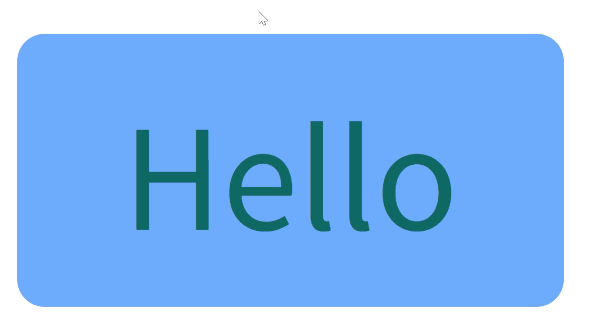
这道题我使用的是两个伪元素来实现的效果,将正方形的伪元素块放在box 和 cover 层中间,box 和 cover 层留出一个 4px 的边框,这样给伪元素设置过渡即可。
但 transition 只能从一个状态转移到另一个状态,像这种折线运动的就要分两个属性先后过渡,第二个属性加延迟,延迟时间就是第一个过渡的所用时间。
元素消失的时候要加延迟,等元素回去到原位置了再隐藏,但是元素出现时延迟要设置为 0。
html
<!DOCTYPE html>
<html lang="en">
<head>
  <meta charset="UTF-8">
  <meta name="viewport" content="width=device-width, initial-scale=1.0">
  <title>1</title>
  <link rel="stylesheet" href="./1.css">
</head>
<body>
  <div class="box">
    <div class="cover">
      <p>Hello</p>
    </div>
  </div>
</body>
</html>
css
* {
margin: 0;
padding: 0;
box-sizing: border-box;
}
.box {
position: relative;
margin: 100px auto;
width: 500px;
height: 200px;
border-radius: 20px;
background-color: skyblue;
padding: 4px;
}
.box::before,
.box::after {
visibility: hidden;
content: '';
width: 50px;
height: 50px;
position: absolute;
top: 0;
left: 0;
background-color: red;
z-index: 0;
border-radius: 15px;
}
.box::before {
transition:
left 0.5s ease-in-out,
top 0.5s ease-in-out 0.5s,
visibility 0s linear 1s;
}
.box:hover::before {
visibility: visible;
left: 450px;
top: 150px;
transition:
left 0.5s ease-in-out,
top 0.5s ease-in-out 0.5s,
visibility 0s linear 0s;
}
.box::after {
transition:
top 0.5s ease-in-out,
left 0.5s ease-in-out 0.5s,
visibility 0s linear 1s;
}
.box:hover::after {
visibility: visible;
top: 150px;
left: 450px;
transition:
top 0.5s ease-in-out,
left 0.5s ease-in-out 0.5s,
visibility 0s linear 0s;
}
.cover {
position: relative;
z-index: 1;
display: flex;
justify-content: center;
align-items: center;
width: 100%;
height: 100%;
border-radius: 15px;
background-color: skyblue;
}
.cover p {
font-size: 40px;
color: green;
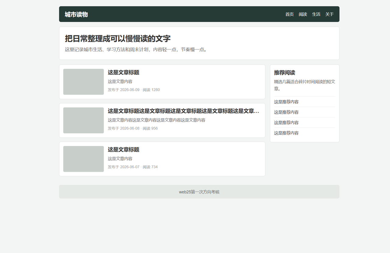
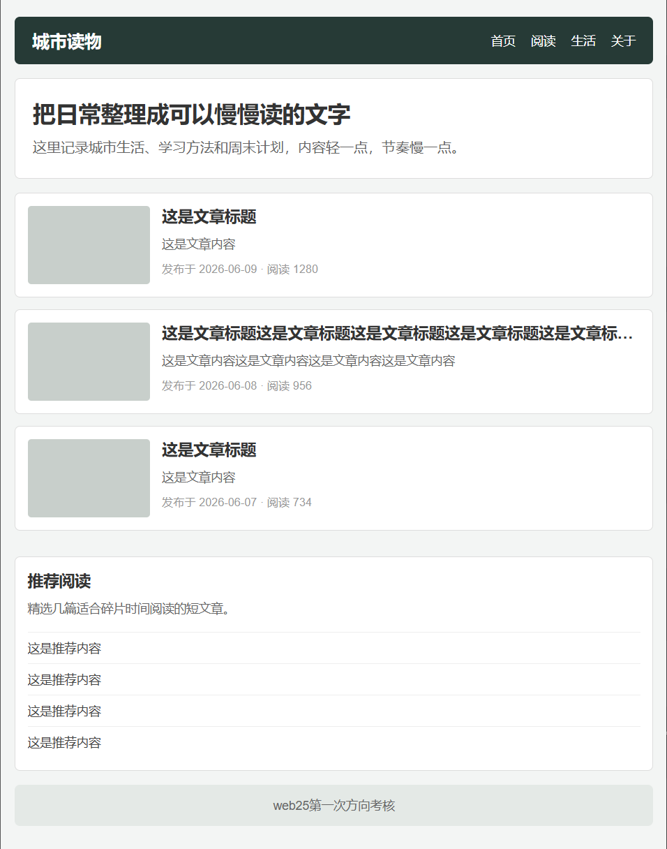
}2. 实现下述页面(响应式布局:响应式锚点为768px):
html
<!DOCTYPE html>
<html lang="en">
<head>
  <meta charset="UTF-8">
  <meta name="viewport" content="width=device-width, initial-scale=1.0">
  <title>2</title>
  <link rel="stylesheet" href="./2.css">
</head>
<body>
  <div class="w">
    <nav class="nav">
      <div class="city">城市读物</div>
      <div class="more">
        <span>首页</span>
        <span>阅读</span>
        <span>生活</span>
        <span>关于</span>
      </div>
    </nav>
    <main>
      <div class="big">
        <div class="up">把日常整理成可以慢慢读的文字</div>
        <div class="down">这里记录城市生活、学习方法和周末计划,内容轻一点,节奏慢一点。
        </div>
      </div>
      <div class="small">
        <div class="img"></div>
        <div class="content">
          <h1>这是文章标题</h1>
          <p>这是文章内容</p>
          <p>发布于 2026-06-09 · 阅读 1280</p>
        </div>
      </div>
      <div class="small over">
        <div class="img"></div>
        <div class="content">
          <h1>这是文章标题这是文章标题这是文章标题这是文章标题这是文章标题</h1>
          <p>这是文章内容这是文章内容这是文章内容这是文章内容</p>
          <p>发布于 2026-06-08 · 阅读 956</p>
        </div>
      </div>
      <div class="small">
        <div class="img"></div>
        <div class="content">
          <h1>这是文章标题</h1>
          <p>这是文章内容</p>
          <p>发布于 2026-06-07 · 阅读 734</p>
        </div>
      </div>
      <div class="small-r">
        <h1>推荐阅读</h1>
        <p>精选几篇适合碎片时间阅读的短文章。</p>
        <hr>
        <p>这是推荐内容</p>
        <hr>
        <p>这是推荐内容</p>
        <hr>
        <p>这是推荐内容</p>
        <hr>
        <p>这是推荐内容</p>
      </div>
    </main>
    <footer>
      <p>web25第一次方向考核</p>
    </footer>
  </div>
</body>
</html>
css
* {
  margin: 0;
  padding: 0;
  box-sizing: border-box;
}

body {
  background-color: #ccc;
}

.w {
  margin: 0 auto;
  width: 1200px;
}

.w .nav {
  display: flex;
  align-items: center;
  justify-content: space-between;
  border-radius: 10px;
  height: 50px;
  background-color: #222;
  margin-bottom: 20px;
}

.w .nav .city {
  margin-left: 10px;
  color: #fff;
  font-weight: 700;
  font-size: 25px;
}

.w .nav .more {
  display: flex;
  align-items: center;
  margin-right: 10px;
  gap: 10px;
  color: #fff;
}

.w main {
  position: relative;
}

.w main .big {
  height: 150px;
  width: 100%;
  border-radius: 10px;
  padding-top: 20px;
  padding-left: 20px;
  margin-bottom: 30px;
  background-color: #fff;
}

.w main .big .up {
  height: 45px;
  font-weight: 700;
  font-size: 30px;
  margin-bottom: 20px;
  color: #222;
}

.w main .big .down {
  height: 75px;
  font-weight: 400;
  font-size: 16px;
  color: #ccc;
}

.w main .small {
  display: flex;
  width: 800px;
  height: 150px;
  background-color: #fff;
  border-radius: 10px;
  padding: 10px;
  margin-top: 20px;
}

.w main .small .img {
  width: 250px;
  height: 100%;
  border-radius: 10px;
  background-color: #ccc;
  margin-right: 15px;
  flex-shrink: 0;
}

.w main .small .content {
  flex: 1;
  min-width: 0;
}

.w main .small .content p {
  font-size: 13px;
  line-height: 30px;
  color: #ccc;
}

.w main .over .content h1 {
  overflow: hidden;
  text-overflow: ellipsis;
  display: -webkit-box;
  -webkit-box-orient: vertical;
  -webkit-line-clamp: 1;
}

.w main .small-r {
  position: absolute;
  top: 180px;
  left: 900px;
  width: 300px;
  height: 350px;
  border-radius: 10px;
  padding: 10px;
  background-color: #fff;
}

.w main .small-r h1 {
  margin-bottom: 10px;
}

.w main .small-r p {
  margin-bottom: 15px;
}

.w main .small-r hr {
  margin-bottom: 15px;
}

.w footer {
  display: flex;
  align-items: center;
  justify-content: center;
  width: 100%;
  height: 50px;
  margin-top: 40px;
  border-radius: 10px;
  background-color: aliceblue;
}

@media (max-width: 768px) {
  .w {
    width: 100%;
    padding: 0 10px;
  }

  .w .nav {
    height: auto;
    padding: 10px;
  }

  .w .nav .more {
    flex-wrap: wrap;
    gap: 5px 10px;
  }

  .w main .big {
    height: auto;
    padding: 20px;
  }

  .w main .big .up {
    font-size: 26px;
    margin-bottom: 10px;
  }

  .w main .big .down {
    height: auto;
    font-size: 14px;
  }

  .w main .small {
    width: 100%;
    height: auto;
  }

  .w main .small .img {
    width: 120px;
    height: 100px;
    margin-right: 10px;
    margin-bottom: 0;
  }

  .w main .small .content h1 {
    font-size: 18px;
  }

  .w main .small-r {
    position: static;
    width: 100%;
    height: auto;
    margin-top: 20px;
  }
}
3.制作数字日历
放一个盒子,显示的区域刚好和数字一样大,再让那一列数字从下到上移动,最后加过渡即可。
html
<!DOCTYPE html>
<html lang="en">
<head>
  <meta charset="UTF-8">
  <meta name="viewport" content="width=device-width, initial-scale=1.0">
  <title>3</title>
  <link rel="stylesheet" href="./3.css">
</head>
<body>
  <div class="box">
    <div class="move">
      <div class="l">0</div>
      <div class="l">1</div>
      <div class="l">2</div>
      <div class="l">3</div>
      <div class="l">4</div>
      <div class="l">5</div>
      <div class="l">6</div>
      <div class="l">7</div>
      <div class="l">8</div>
      <div class="l">9</div>
    </div>
  </div>
</body>
</html>
css
* {
  margin: 0;
  padding: 0;
  box-sizing: border-box;
}

.box {
  width: 40px;
  height: 40px;
  background-color: green;
  overflow: hidden;
  border-radius: 10px;
}

.box .move {
  width: 40px;
  transition: all 3s ease-in-out;
  padding-top: 5px;
}

.box .move .l {
  width: 40px;
  height: 40px;
  font-size: 20px;
  color: black;
  margin-left: 15px;
}

.box:hover .move {
  transform: translateY(-360px);
}
4. 利用css动画实现一个呼吸灯加载的效果
方法一:给外面的大正方形盒子设置圆角50%,然后将上边框颜色设置的更深一些,再添加旋转效果,一直播放动画,里面的小盒子设置圆角50% 和蓝色即可。
html
<!DOCTYPE html>
<html lang="en">

<head>
  <meta charset="UTF-8">
  <meta name="viewport" content="width=device-width, initial-scale=1.0">
  <title>4.1</title>
  <style>
    * {
      margin: 0;
      padding: 0;
      box-sizing: border-box;
    }

    body {
      display: flex;
      flex-direction: column;
      align-items: center;
      justify-content: center;
      min-height: 100vh;
      background-color: #f8f9fa;
    }

    .loader {
      position: relative;
      width: 100px;
      height: 100px;
    }

    .ring {
      position: absolute;
      inset: 0;
      border-radius: 50%;
      border: 3px solid rgba(66, 133, 244, 0.15);
      border-top-color: #4285f4;
      animation: spin 1s linear infinite;
    }

    .dot {
      position: absolute;
      top: 50%;
      left: 50%;
      width: 24px;
      height: 24px;
      margin-top: -12px;
      margin-left: -12px;
      border-radius: 50%;
      background-color: #4285f4;
    }

    @keyframes spin {
      to {
        transform: rotate(360deg);
      }
    }
  </style>
</head>

<body>
  <div class="loader">
    <div class="ring"></div>
    <div class="dot"></div>
  </div>
</body>

</html>
方法二:在内部画一个扇形(使用conic-gradient锥形渐变),添加旋转动画,然后在上面盖一个遮罩层,只留出边框的大小。
html
<!DOCTYPE html>
<html lang="en">

<head>
  <meta charset="UTF-8">
  <meta name="viewport" content="width=device-width, initial-scale=1.0">
  <title>4.2</title>
  <style>
    * {
      margin: 0;
      padding: 0;
      box-sizing: border-box;
    }

    body {
      display: flex;
      flex-direction: column;
      align-items: center;
      justify-content: center;
      min-height: 100vh;
      background-color: #f8f9fa;
    }

    .loader {
      position: relative;
      width: 100px;
      height: 100px;
    }

    .ring {
      width: 100%;
      height: 100%;
      border-radius: 50%;

      background: conic-gradient(
        #4285f4         0deg,   扇形起点
        #4285f4         90deg,  扇形终点
        rgba(66,133,244,0.12) 90deg,
        rgba(66,133,244,0.12) 360deg
      );

      animation: spin 1s linear infinite;
    }

    .ring::after {
      content: '';
      position: absolute;
      top: 3px;
      left: 3px;
      width: 94px;
      height: 94px;
      border-radius: 50%;
      background-color: #f8f9fa;
    }

    .dot {
      position: absolute;
      top: 50%;
      left: 50%;
      width: 24px;
      height: 24px;
      margin-top: -12px;
      margin-left: -12px;
      border-radius: 50%;
      background-color: #4285f4;
      z-index: 1;
    }

    @keyframes spin {
      to {
        transform: rotate(360deg);
      }
    }

  </style>
</head>

<body>
  <div class="loader">
    <div class="ring"></div>
    <div class="dot"></div>
  </div>
</body>

</html>
5.
使用文字裁剪,让文字显示背景色。
背景色渐变(灰-黑-灰)。
将背景放大(background-size: 500%)让每一段颜色都和字的长度差不多大(还有两个颜色的过渡段所以是500%)。
动画将背景从左到右移动,动画持续播放。
html
<!DOCTYPE html>
<html lang="en">

<head>
  <meta charset="UTF-8">
  <meta name="viewport" content="width=device-width, initial-scale=1.0">
  <title>5</title>
  <style>
    * {
      margin: 0;
      padding: 0;
      box-sizing: border-box;
    }

    body {
      display: flex;
      align-items: center;
      justify-content: center;
      min-height: 100vh;
      background-color: #fff;
    }

    .text {
      font-size: 48px;
      font-weight: bold;
      color: transparent;
      background-clip: text;
      -webkit-background-clip: text;
      background-image: linear-gradient(to right,
        #999 0%, #999 20%, #333 40%, #333 60%, #999 80%, #999 100%
      );
      background-size: 500% 100%;
      background-position: 100% 0;
      animation: loading 1.5s ease-in-out infinite;
    }

    @keyframes loading {
      0% {
        background-position: 100% 0;
      }

      100% {
        background-position: 0% 0;
      }
    }
  </style>
</head>

<body>
  <div class="text">正在加载中</div>
</body>

</html>
6.
使用伪元素定位在按钮中间一个半径很小的圆形,颜色设置为半透明的白色,鼠标悬浮之后播放动画,动画from
opacity: 1; scale(0); to opacity: 0; scale(50);
html
<!DOCTYPE html>
<html lang="en">

<head>
  <meta charset="UTF-8">
  <meta name="viewport" content="width=device-width, initial-scale=1.0">
  <title>6</title>
  <style>
    * {
      margin: 0;
      padding: 0;
      box-sizing: border-box;
    }

    body {
      display: flex;
      align-items: center;
      justify-content: center;
      min-height: 100vh;
    }

    .btn {
      position: relative;
      width: 120px;
      height: 44px;
      font-size: 16px;
      font-weight: 500;
      color: #fff;
      background-color: #4285f4;
      border: none;
      border-radius: 22px;
      cursor: pointer;
      overflow: hidden;
      transition: background-color 0.3s;
    }

    .btn::after {
      content: '';
      position: absolute;
      top: 50%;
      left: 50%;
      width: 4px;
      height: 4px;
      background: rgba(255, 255, 255, .3);
      border-radius: 50%;
      transform: translate(-50%, -50%) scale(0);
      opacity: 0;
    }

    .btn:hover::after {
      animation: move 0.5s ease-out;
    }

    @keyframes move {
      0% {
        transform: translate(-50%, -50%) scale(0);
        opacity: 1;
      }

      100% {
        transform: translate(-50%, -50%) scale(50);
        opacity: 0;
      }
    }

    .btn span {
      position: relative;
      z-index: 1;
    }
  </style>
</head>

<body>
  <button class="btn">
    <span>立即加入</span>
  </button>
</body>

</html>
7.
每层都用 flex 布局 排列 label 和 input,左右排列,中间设置 gap。
html
<!DOCTYPE html>
<html lang="en">
<head>
  <meta charset="UTF-8">
  <meta name="viewport" content="width=device-width, initial-scale=1.0">
  <title>7</title>
  <link rel="stylesheet" href="./7.css">
</head>
<body>
  <div class="card">
    <h2 class="card-title">学生信息登记</h2>

    <form class="form">
      <div class="form-row">
        <label class="form-label" for="name">
          <span class="required">*</span> 姓名
        </label>
        <input class="form-input" id="name" type="text" placeholder="请输入姓名" autocomplete="off">
      </div>

      <div class="form-row">
        <label class="form-label" for="age">
          <span class="required">*</span> 年龄
        </label>
        <input class="form-input" id="age" type="text" placeholder="请输入年龄" autocomplete="off">
      </div>

      <div class="form-row">
        <label class="form-label" for="gender">
          <span class="required">*</span> 性别
        </label>
        <select class="form-select" id="gender">
          <option value="female" selected>女</option>
          <option value="male">男</option>
        </select>
      </div>

      <div class="form-row form-row--stacked">
        <label class="form-label" for="profile">个人简介</label>
        <textarea class="form-textarea" id="profile" rows="5" placeholder="请输入个人简介">1212</textarea>
      </div>

      <button class="btn-submit" type="submit">提交</button>
    </form>
  </div>
</body>
</html>
css
* {
  padding: 0;
  margin: 0;
  box-sizing: border-box;
}

body {
  display: flex;
  justify-content: center;
  align-items: center;
  min-height: 100vh;
  background-color: #f5f5f5;
}

.card {
  width: 420px;
  padding: 32px 40px;
  border-radius: 12px;
  background-color: #e0e0e0;
  box-shadow: 0 4px 16px rgba(0, 0, 0, 0.1);
}

.card-title {
  text-align: center;
  font-size: 22px;
  font-weight: 700;
  color: #222;
  margin-bottom: 24px;
}

.form {
  display: flex;
  flex-direction: column;
  gap: 16px;
}

.form-row {
  display: flex;
  align-items: center;
  gap: 12px;
}

.form-row--stacked {
  flex-direction: column;
  align-items: stretch;
  gap: 6px;
}

.form-label {
  font-size: 15px;
  color: #333;
  white-space: nowrap;
}

.required {
  color: #e53935;
}

.form-input,
.form-select,
.form-textarea {
  flex: 1;
  min-width: 0;
  padding: 6px 10px;
  font-size: 14px;
  color: #333;
  background-color: #fff;
  border: 1px solid #999;
  border-radius: 3px;
  outline: none;
  font-family: inherit;
}

.form-input:focus,
.form-select:focus,
.form-textarea:focus {
  border-color: #409eff;
}

.form-textarea {
  width: 100%;
  resize: vertical;
  line-height: 1.5;
}

.form-input::placeholder,
.form-textarea::placeholder {
  color: #999;
}

.btn-submit {
  width: 100%;
  margin-top: 8px;
  padding: 8px 0;
  font-size: 15px;
  color: #333;
  background-color: #f5f5f5;
  border: 1px solid #999;
  border-radius: 3px;
  cursor: pointer;
  transition: background-color 0.2s ease;
}

.btn-submit:hover {
  background-color: #e8e8e8;
}

.btn-submit:active {
  background-color: #dcdcdc;
}