15 Button 组件与交互反馈设计:按压动画与呼吸脉冲
前言
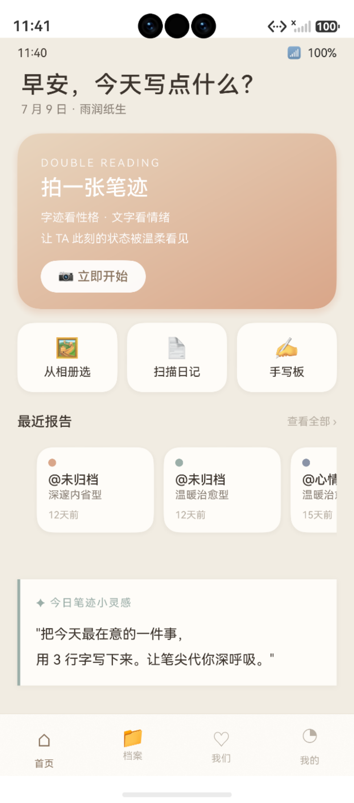
图:15 Button 组件与交互反馈设计:按压动画与呼吸脉冲 运行效果截图(HarmonyOS NEXT)
在移动应用开发中,交互反馈 是提升用户体验的关键细节。一个按钮的按下、弹起、禁用、加载状态,都需要给用户明确的视觉反馈。ArkUI 的 Button 组件提供了丰富的类型和样式,结合 onTouch 事件 和 animateTo 显式动画,可以实现高精度的交互反馈效果。
本文将以"鹿鹿·笔迹心理分析"项目中 CapturePage 拍照页 、HomePage 首页 和 DuetReportPage 合盘页的真实按钮代码为例,深度解析 ArkUI 按钮交互设计的最佳实践。
鸿蒙官方·Button 组件:developer.huawei.com
项目源码仓库:harmony-app GitHub
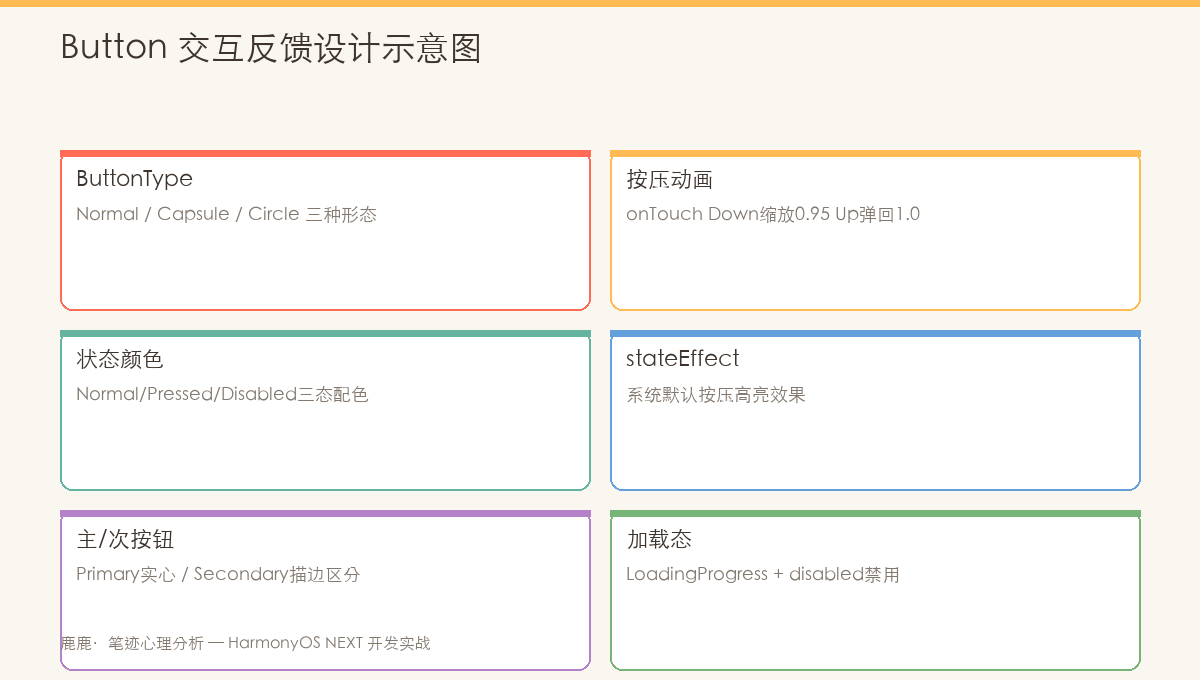
图:按钮三种交互状态------默认(scale 1.0)→ 按下(scale 0.95)→ 弹起(scale 1.0),配合呼吸脉冲动画
按钮 UI @State btnScale onTouch 事件 用户手指 按钮 UI @State btnScale onTouch 事件 用户手指 #mermaid-svg-iMiSkdFObtyOuVRq{font-family:"trebuchet ms",verdana,arial,sans-serif;font-size:16px;fill:#333;}@keyframes edge-animation-frame{from{stroke-dashoffset:0;}}@keyframes dash{to{stroke-dashoffset:0;}}#mermaid-svg-iMiSkdFObtyOuVRq .edge-animation-slow{stroke-dasharray:9,5!important;stroke-dashoffset:900;animation:dash 50s linear infinite;stroke-linecap:round;}#mermaid-svg-iMiSkdFObtyOuVRq .edge-animation-fast{stroke-dasharray:9,5!important;stroke-dashoffset:900;animation:dash 20s linear infinite;stroke-linecap:round;}#mermaid-svg-iMiSkdFObtyOuVRq .error-icon{fill:#552222;}#mermaid-svg-iMiSkdFObtyOuVRq .error-text{fill:#552222;stroke:#552222;}#mermaid-svg-iMiSkdFObtyOuVRq .edge-thickness-normal{stroke-width:1px;}#mermaid-svg-iMiSkdFObtyOuVRq .edge-thickness-thick{stroke-width:3.5px;}#mermaid-svg-iMiSkdFObtyOuVRq .edge-pattern-solid{stroke-dasharray:0;}#mermaid-svg-iMiSkdFObtyOuVRq .edge-thickness-invisible{stroke-width:0;fill:none;}#mermaid-svg-iMiSkdFObtyOuVRq .edge-pattern-dashed{stroke-dasharray:3;}#mermaid-svg-iMiSkdFObtyOuVRq .edge-pattern-dotted{stroke-dasharray:2;}#mermaid-svg-iMiSkdFObtyOuVRq .marker{fill:#333333;stroke:#333333;}#mermaid-svg-iMiSkdFObtyOuVRq .marker.cross{stroke:#333333;}#mermaid-svg-iMiSkdFObtyOuVRq svg{font-family:"trebuchet ms",verdana,arial,sans-serif;font-size:16px;}#mermaid-svg-iMiSkdFObtyOuVRq p{margin:0;}#mermaid-svg-iMiSkdFObtyOuVRq .actor{stroke:hsl(259.6261682243, 59.7765363128%, 87.9019607843%);fill:#ECECFF;}#mermaid-svg-iMiSkdFObtyOuVRq text.actor>tspan{fill:black;stroke:none;}#mermaid-svg-iMiSkdFObtyOuVRq .actor-line{stroke:hsl(259.6261682243, 59.7765363128%, 87.9019607843%);}#mermaid-svg-iMiSkdFObtyOuVRq .innerArc{stroke-width:1.5;stroke-dasharray:none;}#mermaid-svg-iMiSkdFObtyOuVRq .messageLine0{stroke-width:1.5;stroke-dasharray:none;stroke:#333;}#mermaid-svg-iMiSkdFObtyOuVRq .messageLine1{stroke-width:1.5;stroke-dasharray:2,2;stroke:#333;}#mermaid-svg-iMiSkdFObtyOuVRq #arrowhead path{fill:#333;stroke:#333;}#mermaid-svg-iMiSkdFObtyOuVRq .sequenceNumber{fill:white;}#mermaid-svg-iMiSkdFObtyOuVRq #sequencenumber{fill:#333;}#mermaid-svg-iMiSkdFObtyOuVRq #crosshead path{fill:#333;stroke:#333;}#mermaid-svg-iMiSkdFObtyOuVRq .messageText{fill:#333;stroke:none;}#mermaid-svg-iMiSkdFObtyOuVRq .labelBox{stroke:hsl(259.6261682243, 59.7765363128%, 87.9019607843%);fill:#ECECFF;}#mermaid-svg-iMiSkdFObtyOuVRq .labelText,#mermaid-svg-iMiSkdFObtyOuVRq .labelText>tspan{fill:black;stroke:none;}#mermaid-svg-iMiSkdFObtyOuVRq .loopText,#mermaid-svg-iMiSkdFObtyOuVRq .loopText>tspan{fill:black;stroke:none;}#mermaid-svg-iMiSkdFObtyOuVRq .loopLine{stroke-width:2px;stroke-dasharray:2,2;stroke:hsl(259.6261682243, 59.7765363128%, 87.9019607843%);fill:hsl(259.6261682243, 59.7765363128%, 87.9019607843%);}#mermaid-svg-iMiSkdFObtyOuVRq .note{stroke:#aaaa33;fill:#fff5ad;}#mermaid-svg-iMiSkdFObtyOuVRq .noteText,#mermaid-svg-iMiSkdFObtyOuVRq .noteText>tspan{fill:black;stroke:none;}#mermaid-svg-iMiSkdFObtyOuVRq .activation0{fill:#f4f4f4;stroke:#666;}#mermaid-svg-iMiSkdFObtyOuVRq .activation1{fill:#f4f4f4;stroke:#666;}#mermaid-svg-iMiSkdFObtyOuVRq .activation2{fill:#f4f4f4;stroke:#666;}#mermaid-svg-iMiSkdFObtyOuVRq .actorPopupMenu{position:absolute;}#mermaid-svg-iMiSkdFObtyOuVRq .actorPopupMenuPanel{position:absolute;fill:#ECECFF;box-shadow:0px 8px 16px 0px rgba(0,0,0,0.2);filter:drop-shadow(3px 5px 2px rgb(0 0 0 / 0.4));}#mermaid-svg-iMiSkdFObtyOuVRq .actor-man line{stroke:hsl(259.6261682243, 59.7765363128%, 87.9019607843%);fill:#ECECFF;}#mermaid-svg-iMiSkdFObtyOuVRq .actor-man circle,#mermaid-svg-iMiSkdFObtyOuVRq line{stroke:hsl(259.6261682243, 59.7765363128%, 87.9019607843%);fill:#ECECFF;stroke-width:2px;}#mermaid-svg-iMiSkdFObtyOuVRq :root{--mermaid-font-family:"trebuchet ms",verdana,arial,sans-serif;} TouchType.Down(按下) animateTo 80ms → btnScale = 0.95 按钮缩小 5%("压下去"感) TouchType.Up(抬起) animateTo 150ms → btnScale = 1.0 按钮弹回("弹起来"感) 触发 onClick 执行业务逻辑
一、Button 组件基础
1.1 Button 的三种类型
ArkUI 的 Button 组件支持三种类型,通过 ButtonType 枚举指定:
| 类型 | 样式 | 适用场景 |
|---|---|---|
ButtonType.Capsule |
胶囊形(两端半圆) | 页面主按钮、CTA 按钮 |
ButtonType.Normal |
默认矩形(可加 borderRadius) | 卡片操作按钮、次按钮 |
ButtonType.Circle |
正圆形 | 图标按钮、FAB 悬浮按钮 |
typescript
// Capsule 胶囊形 --- 页面主按钮
Button('拍下第一笔')
  .type(ButtonType.Capsule)
  .backgroundColor(AppColors.PRIMARY)
  .fontColor(Color.White)
  .fontSize(16)
  .padding({ left: 28, right: 28, top: 12, bottom: 12 })

// Normal 默认矩形 --- 操作按钮
Button('重拍')
  .type(ButtonType.Normal)
  .backgroundColor(Color.Transparent)
  .border({ width: 1, color: 'rgba(255,255,255,0.25)' })
  .width('45%')

// Circle 圆形 --- 拍照按钮
Button()
  .type(ButtonType.Circle)
  .width(64).height(64)
  .backgroundColor(Color.White)
1.2 Button 的核心属性
typescript
// 一个完整的按钮示例
Button('确认使用')
  .type(ButtonType.Normal)           // 类型
  .backgroundColor(AppColors.WARM)    // 背景色
  .fontColor(Color.White)            // 文字颜色
  .fontSize(16)                      // 字号
  .fontWeight(FontWeight.Medium)     // 字重
  .width('45%')                      // 宽度
  .height(56)                        // 高度
  .borderRadius(12)                  // 圆角
  .enabled(true)                     // 是否启用
1.3 文字按钮与图标按钮
项目中常用的两种按钮形式:
typescript
// 文字按钮(用于导航栏操作)
Text('⋯')
  .fontSize(20)
  .fontColor(AppColors.TEXT_2)
  .onClick(() => this.showMenu())

// 图标按钮
Image($r('app.media.ic_settings'))
  .width(24).height(24)
  .fillColor(AppColors.TEXT_2)
  .onClick(() => this.onAction?.())
提示:ArkUI 的
Text+onClick模式比Button更灵活,适合导航栏和轻量操作入口。
二、onTouch 按压反馈动画
2.1 按压缩放的标准模式
onTouch 事件是 ArkUI 中实现精细交互反馈的核心。在 CapturePage.ets(file:///Users/fiona/Downloads/bijixinli/harmony-app/entry/src/main/ets/pages/CapturePage.ets) 中,"重拍"和"确认使用"按钮采用了完全一致的按压模式:
typescript
// ⭐ 按钮按压反馈的标准模板
@State btnScale: number = 1.0

Button('按钮文字')
  .scale({ x: this.btnScale, y: this.btnScale })
  .animation({ duration: 150, curve: Curve.EaseOut })
  .onTouch((e: TouchEvent) => {
    if (e.type === TouchType.Down) {
      // 按下:缩小到 0.95(视觉"压下去")
      animateTo({ duration: 80 }, () => {
        this.btnScale = 0.95
      })
    } else if (e.type === TouchType.Up || e.type === TouchType.Cancel) {
      // 抬起/取消:弹回 1.0("弹起来")
      animateTo({ duration: 150, curve: Curve.EaseOut }, () => {
        this.btnScale = 1.0
      })
    }
  })
  .onClick(() => {
    // 点击触发的主要业务逻辑
  })
完整时序:
- 手指触碰到按钮 →
TouchType.Down→animateTo 80ms→ 缩放到 0.95 - 手指抬起 →
TouchType.Up→animateTo 150ms→ 弹回到 1.0 - 同时触发
onClick回调执行业务逻辑 - 手指滑出按钮 →
TouchType.Cancel→ 弹回到 1.0(防止卡住)
关键参数:按下动画 80ms(极快,营造"硬"的质感),弹起动画 150ms(稍慢,营造"弹性")。这种"快按慢起"的设计是原生质感的关键。
2.2 多个按钮的状态管理
当页面有多个按钮时,每个按钮需要独立的 @State 变量管理其缩放状态:
typescript
@Entry
@Component
struct CapturePage {
  @State retakeScale: number = 1.0    // "重拍"按钮缩放
  @State confirmScale: number = 1.0   // "确认使用"按钮缩放

  build() {
    Row() {
      // 重拍按钮
      Button('重拍')
        .scale({ x: this.retakeScale, y: this.retakeScale })
        .animation({ duration: 150, curve: Curve.EaseOut })
        .onTouch((e: TouchEvent) => {
          if (e.type === TouchType.Down) {
            animateTo({ duration: 80 }, () => { this.retakeScale = 0.95 })
          } else if (e.type === TouchType.Up || e.type === TouchType.Cancel) {
            animateTo({ duration: 150, curve: Curve.EaseOut }, () => { this.retakeScale = 1.0 })
          }
        })
        .onClick(() => this.retake())

      // 确认使用按钮
      Button('确认使用')
        .scale({ x: this.confirmScale, y: this.confirmScale })
        .animation({ duration: 150, curve: Curve.EaseOut })
        .onTouch((e: TouchEvent) => {
          if (e.type === TouchType.Down) {
            animateTo({ duration: 80 }, () => { this.confirmScale = 0.95 })
          } else if (e.type === TouchType.Up || e.type === TouchType.Cancel) {
            animateTo({ duration: 150, curve: Curve.EaseOut }, () => { this.confirmScale = 1.0 })
          }
        })
        .onClick(() => this.confirmPhoto())
    }
    .width('100%')
  }
}
2.3 HomePage 中的卡片按压
在 HomePage.ets(file:///Users/fiona/Downloads/bijixinli/harmony-app/entry/src/main/ets/pages/HomePage.ets) 中,不仅按钮有按压效果,整张卡片也支持按压反馈:
typescript
@Builder
SubEntryCard(icon: string, label: string, page: string): void {
  Column() {
    Text(icon).fontSize(20)
    Text(label).fontSize(12).fontColor(AppColors.TEXT).margin({ top: 6 })
  }
  .layoutWeight(1)
  .padding({ left: 12, right: 12, top: 14, bottom: 14 })
  .backgroundColor(AppColors.CARD)
  .borderRadius(16)
  .shadow({ radius: AppShadow.CARD_RADIUS, color: AppShadow.CARD_COLOR, offsetY: AppShadow.CARD_OFFSET_Y })
  .onClick(() => {
    // 页面路由跳转
    this.getUIContext().getRouter().pushUrl({ url: page })
  })
}
三、呼吸脉冲动画
3.1 递归 animateTo 实现循环
在 CapturePage.ets(file:///Users/fiona/Downloads/bijixinli/harmony-app/entry/src/main/ets/pages/CapturePage.ets) 中,拍照按钮使用呼吸脉冲动画吸引用户注意:
typescript
@State pulseScale: number = 1.0

// 启动呼吸脉冲动画(递归 animateTo)
private startPulse(): void {
  const pulse = () => {
    animateTo({ duration: 800, curve: Curve.EaseOut }, () => {
      this.pulseScale = this.pulseScale > 1.08 ? 1.0 : 1.08
    })
    // 在 onFinish 中递归调用自身
  }
  // 使用 setInterval 实现循环
  this.pulseTimer = setInterval(() => {
    animateTo({ duration: 800, curve: Curve.EaseOut }, () => {
      this.pulseScale = this.pulseScale > 1.05 ? 1.0 : 1.06
    })
  }, 1600)
}
3.2 EmptyState 按钮脉冲
EmptyState.ets(file:///Users/fiona/Downloads/bijixinli/harmony-app/entry/src/main/ets/common/components/EmptyState.ets) 中的 CTA 按钮也使用了脉冲动画,但幅度更小更温和:
typescript
@Component
export struct EmptyState {
  @State pulseScale: number = 1
  private pulseTimer: number = -1

  aboutToAppear(): void {
    // 入场动画结束后启动脉冲
    this.pulseTimer = setInterval(() => {
      animateTo({ duration: 800, curve: Curve.EaseOut }, () => {
        this.pulseScale = this.pulseScale > 1.05 ? 1 : 1.06
      })
    }, 1600)
  }

  aboutToDisappear(): void {
    // 组件销毁时清除定时器
    if (this.pulseTimer !== -1) clearInterval(this.pulseTimer)
  }

  build() {
    Button(this.ctaText)
      .type(ButtonType.Capsule)
      .backgroundColor(AppColors.PRIMARY)
      .scale({ x: this.pulseScale, y: this.pulseScale })
      .animation({ duration: 800, curve: Curve.EaseOut })
      .onClick(() => this.onCtaClick?.())
  }
}
3.3 脉冲动画参数对比
| 参数 | CapturePage 拍照按钮 | EmptyState CTA 按钮 | HomePage 按钮 |
|---|---|---|---|
| 缩放幅度 | 1.0 ↔ 1.06 | 1.0 ↔ 1.06 | 1.0 ↔ 0.95(按压) |
| 动画时长 | 800ms | 800ms | 80ms / 150ms |
| 间隔 | 1600ms | 1600ms | 触控触发 |
| 曲线 | Curve.EaseOut |
Curve.EaseOut |
Curve.EaseOut |
| 生命周期 | aboutToAppear → aboutToDisappear | aboutToAppear → aboutToDisappear | 触控事件 |
提示:呼吸脉冲动画推荐幅度 3%-8%,频率 1.2s-2s。幅度过大或频率过快会显得廉价和骚扰。
四、按钮视觉设计
4.1 胶囊形 CTA 主按钮
typescript
Button('拍下第一笔')
  .type(ButtonType.Capsule)
  .backgroundColor(AppColors.PRIMARY)
  .fontColor(Color.White)
  .fontSize(AppFonts.BODY)
  .padding({ left: 28, right: 28, top: 12, bottom: 12 })
主按钮设计规则:
- 使用
Capsule胶囊形------视觉亲和力最高 - 背景色使用品牌色(
AppColors.PRIMARY/AppColors.WARM) - 白色文字,16fp 字号
- 左右留白 28vp,上下 12vp(非固定宽高,自适应内容)
- 配合呼吸脉冲动画提升关注度
4.2 线框按钮(Ghost Button)
typescript
Button('重拍')
  .type(ButtonType.Normal)
  .backgroundColor(Color.Transparent)        // 透明背景
  .fontColor('rgba(255,255,255,0.85)')        // 浅色文字
  .border({ width: 1, color: 'rgba(255,255,255,0.25)' })  // 透明边框
  .width('45%')
  .height(46)
线框按钮设计规则:
- 透明背景 + 白色细边框(
0.25透明度,不刺眼) - 白色文字配低透明度(
0.85,比边框亮) - 通常与主按钮成对出现(取消/确认、重拍/使用)
- 视觉层级低于主按钮
4.3 按钮尺寸规范
| 按钮类型 | 高度 | 宽度 | 圆角 | 字号 | 场景 |
|---|---|---|---|---|---|
| 主按钮 Capsule | 44-52vp | 自适应 padding | 胶囊形 | 16fp | 页面 CTA |
| 线框按钮 Normal | 46vp | 45%(等宽对半分) | 8vp | 15fp | 拍照页操作 |
| 图标按钮 | 24-32vp | 24-32vp | 圆 | --- | 导航栏操作 |
| 文字按钮 | 自适应 | 自适应 | 0 | 14-20fp | 轻量操作 |
五、拍照按钮的完整交互设计
5.1 从取景到预览的状态切换
CapturePage.ets(file:///Users/fiona/Downloads/bijixinli/harmony-app/entry/src/main/ets/pages/CapturePage.ets) 中的按钮组是整个页面交互的核心:
typescript
// 根据当前状态渲染不同的按钮组
if (!this.hasPreview) {
  // 取景模式:拍照按钮 + 相册选择
  Column() {
    // 环形呼吸动画拍照按钮
    Stack() {
      Circle().width(70).height(70)
        .fill('rgba(255,255,255,0.15)')
        .scale({ x: this.pulseScale, y: this.pulseScale })
      Circle().width(56).height(56)
        .fill(Color.White)
        .onClick(() => this.takePhoto())
    }
    Text('轻触拍照').fontSize(11).fontColor('rgba(255,255,255,0.65)')
  }
} else {
  // 预览模式:重拍 + 确认使用
  Row() {
    Button('重拍')
      .type(ButtonType.Normal)
      .backgroundColor(Color.Transparent)
      .border({ width: 1, color: 'rgba(255,255,255,0.25)' })
      .width('45%').height(46)
      .scale({ x: this.retakeScale, y: this.retakeScale })
      .onTouch(...)
      .onClick(() => this.retake())

    Button('确认使用')
      .type(ButtonType.Normal)
      .backgroundColor(AppColors.WARM)
      .width('45%').height(46)
      .scale({ x: this.confirmScale, y: this.confirmScale })
      .onTouch(...)
      .onClick(() => this.confirmPhoto())
  }
}
状态转换流程:
取景模式(拍照按钮 + 相册按钮)
   ↓ 用户点击拍照/相册
预览模式(重拍按钮 + 确认使用按钮)
   ↓ 重拍 → 回到取景模式
   ↓ 确认使用 → 跳转 AnalyzingPage
5.2 拍照按钮环形呼吸设计
typescript
// 拍照按钮外围环形呼吸层
Stack() {
  // 外层:半透明环形呼吸
  Circle()
    .width(70).height(70)
    .fill('rgba(255,255,255,0.15)')
    .scale({ x: this.pulseScale, y: this.pulseScale })
  // 内层:白色实心拍照按钮
  Circle()
    .width(56).height(56)
    .fill(Color.White)
    .onClick(() => this.takePhoto())
}
这种"外环呼吸 + 内圆实心"的双层设计,在视觉上形成了靶心式焦点,引导用户点击。
六、DuetReportPage 中的按钮组合
6.1 双按钮行
DuetReportPage.ets(file:///Users/fiona/Downloads/bijixinli/harmony-app/entry/src/main/ets/pages/DuetReportPage.ets) 底部有两个操作按钮,与 CapturePage 模式类似但样式不同:
typescript
@State btnScale: number = 1
@State saveBtnScale: number = 1

Row({ space: 12 }) {
  // 左侧:"生成更多分析"
  Button('生成更多分析')
    .type(ButtonType.Normal)
    .width('45%').height(44)
    .backgroundColor(Color.Transparent)
    .border({ width: 1, color: AppColors.LINE })
    .fontColor(AppColors.TEXT)
    .scale({ x: this.btnScale, y: this.btnScale })
    .animation({ duration: 150, curve: Curve.EaseOut })
    .onTouch((e: TouchEvent) => {
      if (e.type === TouchType.Down) {
        animateTo({ duration: 80 }, () => { this.btnScale = 0.95 })
      } else if (e.type === TouchType.Up || e.type === TouchType.Cancel) {
        animateTo({ duration: 150, curve: Curve.EaseOut }, () => { this.btnScale = 1.0 })
      }
    })

  // 右侧:"保存报告"
  Button('保存报告')
    .type(ButtonType.Normal)
    .width('45%').height(44)
    .backgroundColor(AppColors.PRIMARY)
    .fontColor(Color.White)
    .scale({ x: this.saveBtnScale, y: this.saveBtnScale })
    .animation({ duration: 150, curve: Curve.EaseOut })
    .onTouch((e: TouchEvent) => {
      if (e.type === TouchType.Down) {
        animateTo({ duration: 80 }, () => { this.saveBtnScale = 0.95 })
      } else if (e.type === TouchType.Up || e.type === TouchType.Cancel) {
        animateTo({ duration: 150, curve: Curve.EaseOut }, () => { this.saveBtnScale = 1.0 })
      }
    })
}
6.2 不同页面的按钮风格对比
| 页面 | 主按钮样式 | 次按钮样式 | 间距 | 圆角 |
|---|---|---|---|---|
| CapturePage 取景 | 白色 Circle 56vp | --- | --- | 圆形 |
| CapturePage 预览 | WARM 填充 46vp | 透明边框 46vp | 0 | 默认 |
| DuetReportPage | PRIMARY 填充 44vp | 透明边框 44vp | 12vp | 默认 |
| EmptyState | Capsule PRIMARY | --- | --- | 胶囊 |
| HomePage | Card 阴影 16radius | --- | 8vp | 16vp |
七、按钮交互最佳实践
7.1 无障碍与触控优化
typescript
// 最小触控区域 44×44vp(鸿蒙设计规范)
Button('触摸区域')
  .width(44).height(44)  // 最小触控尺寸
触控优化的核心指标:
- 最小尺寸:任何可点击元素的高度不应小于 44vp
- 安全间距:相邻可点击元素间距不少于 8vp
- 视觉反馈:点击必须有视觉反馈(缩放/颜色变化/涟漪)
- 状态区分:禁用状态必须是可识别的(灰色/不可点击样式)
7.2 按钮状态管理
| 状态 | 视觉表现 | 实现方式 |
|---|---|---|
| 默认 | 正常颜色和大小 | 初始 @State 值 |
| 按下 | 缩小到 0.95 | onTouch Down → animateTo |
| 抬起 | 弹回到 1.0 | onTouch Up → animateTo |
| 禁用 | 灰色 + 不可点击 | .enabled(false) + .alpha(0.5) |
| 加载中 | 禁用 + 显示 loading | @State isLoading → 条件渲染 |
7.3 按钮代码组织结构
推荐按钮代码的组织方式:
typescript
// 1. 按钮 @State 声明
@State btnScale: number = 1.0

// 2. onTouch 回调(可抽取为方法)
private handleTouch(event: TouchEvent, stateProp: Object): void {
  if (event.type === TouchType.Down) {
    animateTo({ duration: 80 }, () => { stateProp.set(0.95) })
  } else if (event.type === TouchType.Up || event.type === TouchType.Cancel) {
    animateTo({ duration: 150, curve: Curve.EaseOut }, () => { stateProp.set(1.0) })
  }
}

// 3. onClick 回调
private onButtonClick(): void { ... }

// 4. build() 中简洁使用
Button('确认')
  .scale({ x: this.btnScale, y: this.btnScale })
  .animation({ duration: 150, curve: Curve.EaseOut })
  .onTouch((e) => this.handleButtonTouch(e))
  .onClick(() => this.onButtonClick())
八、注意事项与常见问题
8.1 开发注意事项
在实际开发过程中,需特别注意以下几点:
- API 兼容性:部分接口仅在特定 HarmonyOS NEXT 版本中可用,需做版本条件判断
- 权限模型:采用静态声明(module.json5)+ 动态申请(requestPermissionsFromUser)的两阶段授权
- 生命周期 :合理使用
aboutToAppear()和aboutToDisappear()管理资源初始化与释放 - 状态同步 :跨页面数据通过 AppStorage 共享,组件内状态使用
@State/@Prop/@Link装饰器
8.2 常见错误与解决方案
常见问题快速排查表:
| 问题类型 | 排查方向 | 参考方法 |
|---|---|---|
| 应用崩溃 | 查看 hilog 错误日志 | hilog.error(TAG, "...", e.message) |
| 状态丢失 | 检查 AppStorage 键名拼写 | 统一使用常量管理键名 |
| 动画不流畅 | 避免在 animateTo 回调中执行 I/O | 动画与数据操作分离 |
总结
本文从 ArkUI Button 组件的基础类型和属性出发,深入解析了项目中三种核心的交互反馈模式:
- 按压反馈(Touch) :
onTouch Down → 80ms 缩放到 0.95+Up → 150ms 弹回 1.0 - 呼吸脉冲(Pulse) :
setInterval 1600ms+animateTo 800ms+scale 1.0↔1.06 - 状态切换(State Switch) :通过
@State控制取景/预览模式下的按钮组切换
三个核心设计原则:
- 快按慢起:按下动画快(80ms),弹起动画慢(150ms),营造物理质感
- 幅度克制:按压缩放到 0.95(不缩太小),脉冲幅度 1.0↔1.06(不夸大)
- 状态分离:每个按钮独立管理 @State,互不干扰
如果这篇文章对你有帮助,欢迎点赞👍、收藏⭐、关注🔔,你的支持是我持续创作的动力!
参考资源:
- Button 组件参考
- onTouch 触摸事件
- animateTo 显式动画
- 无障碍设计规范
- CapturePage 项目源码(file:///Users/fiona/Downloads/bijixinli/harmony-app/entry/src/main/ets/pages/CapturePage.ets)
- EmptyState 组件源码(file:///Users/fiona/Downloads/bijixinli/harmony-app/entry/src/main/ets/common/components/EmptyState.ets)
- DuetReportPage 项目源码(file:///Users/fiona/Downloads/bijixinli/harmony-app/entry/src/main/ets/pages/DuetReportPage.ets)
- ArkUI 交互动画指南
- HarmonyOS 官方示例