鸿蒙实战:导航栏与顶部栏设计规范 HmTitleBar
前言(必读)
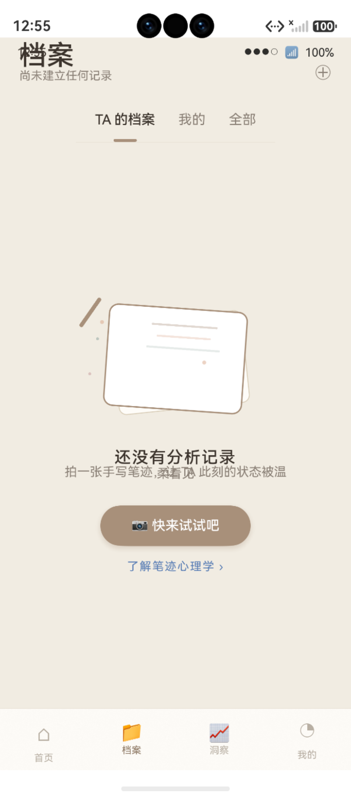
图:鸿蒙实战:导航栏与顶部栏设计规范 HmTitleBar(第 71 篇) 运行效果截图(HarmonyOS NEXT)
导航栏是用户感知页面结构的「路标」。遵循 HarmonyOS Design 大标题栏设计规范,本项目将导航栏封装为可复用的 HmTitleBar 组件,统一管理所有页面的标题、返回按钮和右侧操作按钮。本文从规范到实现逐层解析。
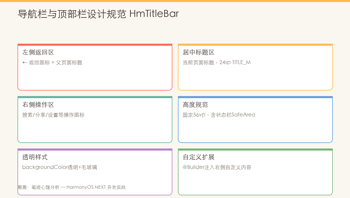
图:HmTitleBar 组件结构------左侧返回按钮 + 居中标题 + 右侧操作区的三区域设计
#mermaid-svg-SLktCF9fJdi6jX4s{font-family:"trebuchet ms",verdana,arial,sans-serif;font-size:16px;fill:#333;}@keyframes edge-animation-frame{from{stroke-dashoffset:0;}}@keyframes dash{to{stroke-dashoffset:0;}}#mermaid-svg-SLktCF9fJdi6jX4s .edge-animation-slow{stroke-dasharray:9,5!important;stroke-dashoffset:900;animation:dash 50s linear infinite;stroke-linecap:round;}#mermaid-svg-SLktCF9fJdi6jX4s .edge-animation-fast{stroke-dasharray:9,5!important;stroke-dashoffset:900;animation:dash 20s linear infinite;stroke-linecap:round;}#mermaid-svg-SLktCF9fJdi6jX4s .error-icon{fill:#552222;}#mermaid-svg-SLktCF9fJdi6jX4s .error-text{fill:#552222;stroke:#552222;}#mermaid-svg-SLktCF9fJdi6jX4s .edge-thickness-normal{stroke-width:1px;}#mermaid-svg-SLktCF9fJdi6jX4s .edge-thickness-thick{stroke-width:3.5px;}#mermaid-svg-SLktCF9fJdi6jX4s .edge-pattern-solid{stroke-dasharray:0;}#mermaid-svg-SLktCF9fJdi6jX4s .edge-thickness-invisible{stroke-width:0;fill:none;}#mermaid-svg-SLktCF9fJdi6jX4s .edge-pattern-dashed{stroke-dasharray:3;}#mermaid-svg-SLktCF9fJdi6jX4s .edge-pattern-dotted{stroke-dasharray:2;}#mermaid-svg-SLktCF9fJdi6jX4s .marker{fill:#333333;stroke:#333333;}#mermaid-svg-SLktCF9fJdi6jX4s .marker.cross{stroke:#333333;}#mermaid-svg-SLktCF9fJdi6jX4s svg{font-family:"trebuchet ms",verdana,arial,sans-serif;font-size:16px;}#mermaid-svg-SLktCF9fJdi6jX4s p{margin:0;}#mermaid-svg-SLktCF9fJdi6jX4s .label{font-family:"trebuchet ms",verdana,arial,sans-serif;color:#333;}#mermaid-svg-SLktCF9fJdi6jX4s .cluster-label text{fill:#333;}#mermaid-svg-SLktCF9fJdi6jX4s .cluster-label span{color:#333;}#mermaid-svg-SLktCF9fJdi6jX4s .cluster-label span p{background-color:transparent;}#mermaid-svg-SLktCF9fJdi6jX4s .label text,#mermaid-svg-SLktCF9fJdi6jX4s span{fill:#333;color:#333;}#mermaid-svg-SLktCF9fJdi6jX4s .node rect,#mermaid-svg-SLktCF9fJdi6jX4s .node circle,#mermaid-svg-SLktCF9fJdi6jX4s .node ellipse,#mermaid-svg-SLktCF9fJdi6jX4s .node polygon,#mermaid-svg-SLktCF9fJdi6jX4s .node path{fill:#ECECFF;stroke:#9370DB;stroke-width:1px;}#mermaid-svg-SLktCF9fJdi6jX4s .rough-node .label text,#mermaid-svg-SLktCF9fJdi6jX4s .node .label text,#mermaid-svg-SLktCF9fJdi6jX4s .image-shape .label,#mermaid-svg-SLktCF9fJdi6jX4s .icon-shape .label{text-anchor:middle;}#mermaid-svg-SLktCF9fJdi6jX4s .node .katex path{fill:#000;stroke:#000;stroke-width:1px;}#mermaid-svg-SLktCF9fJdi6jX4s .rough-node .label,#mermaid-svg-SLktCF9fJdi6jX4s .node .label,#mermaid-svg-SLktCF9fJdi6jX4s .image-shape .label,#mermaid-svg-SLktCF9fJdi6jX4s .icon-shape .label{text-align:center;}#mermaid-svg-SLktCF9fJdi6jX4s .node.clickable{cursor:pointer;}#mermaid-svg-SLktCF9fJdi6jX4s .root .anchor path{fill:#333333!important;stroke-width:0;stroke:#333333;}#mermaid-svg-SLktCF9fJdi6jX4s .arrowheadPath{fill:#333333;}#mermaid-svg-SLktCF9fJdi6jX4s .edgePath .path{stroke:#333333;stroke-width:2.0px;}#mermaid-svg-SLktCF9fJdi6jX4s .flowchart-link{stroke:#333333;fill:none;}#mermaid-svg-SLktCF9fJdi6jX4s .edgeLabel{background-color:rgba(232,232,232, 0.8);text-align:center;}#mermaid-svg-SLktCF9fJdi6jX4s .edgeLabel p{background-color:rgba(232,232,232, 0.8);}#mermaid-svg-SLktCF9fJdi6jX4s .edgeLabel rect{opacity:0.5;background-color:rgba(232,232,232, 0.8);fill:rgba(232,232,232, 0.8);}#mermaid-svg-SLktCF9fJdi6jX4s .labelBkg{background-color:rgba(232, 232, 232, 0.5);}#mermaid-svg-SLktCF9fJdi6jX4s .cluster rect{fill:#ffffde;stroke:#aaaa33;stroke-width:1px;}#mermaid-svg-SLktCF9fJdi6jX4s .cluster text{fill:#333;}#mermaid-svg-SLktCF9fJdi6jX4s .cluster span{color:#333;}#mermaid-svg-SLktCF9fJdi6jX4s div.mermaidTooltip{position:absolute;text-align:center;max-width:200px;padding:2px;font-family:"trebuchet ms",verdana,arial,sans-serif;font-size:12px;background:hsl(80, 100%, 96.2745098039%);border:1px solid #aaaa33;border-radius:2px;pointer-events:none;z-index:100;}#mermaid-svg-SLktCF9fJdi6jX4s .flowchartTitleText{text-anchor:middle;font-size:18px;fill:#333;}#mermaid-svg-SLktCF9fJdi6jX4s rect.text{fill:none;stroke-width:0;}#mermaid-svg-SLktCF9fJdi6jX4s .icon-shape,#mermaid-svg-SLktCF9fJdi6jX4s .image-shape{background-color:rgba(232,232,232, 0.8);text-align:center;}#mermaid-svg-SLktCF9fJdi6jX4s .icon-shape p,#mermaid-svg-SLktCF9fJdi6jX4s .image-shape p{background-color:rgba(232,232,232, 0.8);padding:2px;}#mermaid-svg-SLktCF9fJdi6jX4s .icon-shape .label rect,#mermaid-svg-SLktCF9fJdi6jX4s .image-shape .label rect{opacity:0.5;background-color:rgba(232,232,232, 0.8);fill:rgba(232,232,232, 0.8);}#mermaid-svg-SLktCF9fJdi6jX4s .label-icon{display:inline-block;height:1em;overflow:visible;vertical-align:-0.125em;}#mermaid-svg-SLktCF9fJdi6jX4s .node .label-icon path{fill:currentColor;stroke:revert;stroke-width:revert;}#mermaid-svg-SLktCF9fJdi6jX4s :root{--mermaid-font-family:"trebuchet ms",verdana,arial,sans-serif;} HmTitleBar 组件
左侧区域
居中标题
右侧操作区
返回图标按钮
带文字返回键
主标题 Text
主副标题组合
单个操作图标
多个操作图标
文字操作按钮
一、HarmonyOS 大标题栏设计规范
HarmonyOS Design 对大标题栏(Large Title Bar)的定义如下:
| 规范项 | 值 | 本项目映射 |
|---|---|---|
| 标题字号 | 28fp | AppFonts.TITLE_L = 28 |
| 标题字重 | Medium | AppFonts.W_MEDIUM |
| 标题颜色 | Text Primary | AppColors.TEXT |
| 标题对齐 | 左对齐 | HorizontalAlign.Start |
| 副标题字号 | 12fp | AppFonts.CAPTION = 12 |
| 副标题颜色 | Text Tertiary | AppColors.TEXT_2 |
| 纵向间距 | 4-8vp | AppSpacing.XXS = 4 |
| 左右边距 | 20vp | AppSpacing.L = 20 |
| 右侧操作区域 | 24-44vp | Image(24) / Text(18) |
| 返回按钮 | 可选 | ← Text 元素 |
二、HmTitleBar 组件实现
2.1 完整源码
typescript
// 文件:common/components/HmTitleBar.ets

@Component
export struct HmTitleBar {
  @Prop title: string = ''                  // 标题文字
  @Prop subtitle: string = ''               // 副标题(可选)
  @Prop showBack: boolean = false           // 是否显示返回按钮
  @Prop actionIcon: Resource | null = null  // 右侧图标按钮(可选)
  @Prop actionText: string = ''             // 右侧文字按钮(可选)
  onAction?: () => void                     // 操作按钮回调
  onBack?: () => void                       // 返回按钮回调
  @State subtitleOpacity: number = 0        // 副标题入场动画

  aboutToAppear(): void {
    // 副标题淡入动画
    animateTo({ duration: 500, curve: Curve.FastOutSlowIn }, () => {
      this.subtitleOpacity = 1
    })
  }

  build() {
    Row() {
      // ─── 左区:返回按钮(可选) ───
      if (this.showBack) {
        Text('←')
          .fontSize(20)
          .fontColor(AppColors.TEXT)
          .padding({ left: 0, right: 10 })
          .onClick(() => {
            if (this.onBack) {
              this.onBack()
            } else {
              this.getUIContext().getRouter().back()
            }
          })
      }

      // ─── 中区:标题 + 副标题 ───
      Column() {
        Text(this.title)
          .fontSize(AppFonts.TITLE_L)         // 28fp
          .fontWeight(AppFonts.W_MEDIUM)       // Medium
          .fontColor(AppColors.TEXT)
          .letterSpacing(0.5)

        if (this.subtitle && this.subtitle.length > 0) {
          Text(this.subtitle)
            .fontSize(AppFonts.CAPTION)        // 12fp
            .fontColor(AppColors.TEXT_2)
            .margin({ top: AppSpacing.XXS })   // 4px 间距
            .letterSpacing(1)
            .opacity(this.subtitleOpacity)     // 淡入动画
        }
      }
      .alignItems(HorizontalAlign.Start)
      .layoutWeight(1)

      // ─── 右区:操作按钮(图标 / 文字二选一) ───
      if (this.actionIcon) {
        Image(this.actionIcon)
          .width(24).height(24)
          .fillColor(AppColors.TEXT_2)
          .onClick(() => this.onAction?.())
      }
      if (this.actionText.length > 0) {
        Text(this.actionText)
          .fontSize(18)
          .fontColor(AppColors.TEXT_2)
          .onClick(() => this.onAction?.())
      }
    }
    .width('100%')
    .padding({
      left: AppSpacing.L,         // 20px
      right: AppSpacing.L,        // 20px
      top: AppSpacing.XS,         // 8px
      bottom: AppSpacing.M        // 16px
    })
  }
}
2.2 组件布局示意
┌────────────────────────────────────┐
│ ←  笔迹分析报告               🔍 │   ← 有返回 + 图标操作
│     2026年6月 · 共 3 段书写         │
│                                     │
└────────────────────────────────────┘

┌────────────────────────────────────┐
│     情绪趋势                  设置 │   ← 无返回 + 文字操作
│                                     │
└────────────────────────────────────┘

┌────────────────────────────────────┐
│     合盘报告                        │   ← 无返回 + 无操作
│     鹿鹿 × 茂茂 · 第 87 天          │
│                                     │
└────────────────────────────────────┘
三、组件 Props 详解
3.1 Props 配置表
| Prop | 类型 | 默认值 | 说明 | 必填 |
|---|---|---|---|---|
title |
string | '' |
标题文字 | ✅ 必填 |
subtitle |
string | '' |
副标题(空则不显示) | ❌ 可选 |
showBack |
boolean | false |
是否显示返回按钮 | ❌ 可选 |
actionIcon |
Resource | null | null |
右侧图标按钮 | ❌ 可选 |
actionText |
string | '' |
右侧文字按钮 | ❌ 可选 |
3.2 回调
| Callback | 参数 | 说明 | 默认行为 |
|---|---|---|---|
onAction |
() => void |
右侧操作按钮点击 | 无(需实现) |
onBack |
() => void |
返回按钮点击 | router.back() |
四、各页面使用实例
4.1 DuetReportPage(合盘报告 · 有返回 + 副标题)
typescript
// DuetReportPage.ets
HmTitleBar({
  title: '合盘报告',
  subtitle: `鹿鹿 × ${this.partnerName} · 第 ${this.daysTogether} 天`,
  showBack: true
})
4.2 ReportDetailPage(分析详情 · 有返回)
typescript
// ReportDetailPage.ets
HmTitleBar({
  title: '笔迹分析报告',
  showBack: true
})
4.3 ArchivePage(档案页 · 无返回)
typescript
// ArchivePage.ets
HmTitleBar({
  title: '笔迹档案',
  subtitle: `${this.recordCount} 段书写 · ${this.dayCount} 天`
})
4.4 TrendPage(趋势页 · 带操作按钮)
typescript
// TrendPage.ets
HmTitleBar({
  title: '情绪趋势',
  subtitle: '最近 30 天 · 6 维度',
  actionText: '设置',
  onAction: () => this.openSettings()
})
五、设计规范对照
5.1 HarmonyOS Design 规范适配
HarmonyOS 大标题栏规范:
┌──────────────────────────────────┐
│   28fp Medium   │  操作区 24vp   │
│   文字 Primary  │  可选的图标     │
│                  │               │
│   12fp 副标题    │               │
│   上边距 4vp     │               │
└──────────────────────────────────┘
  ← 20vp 边距 →    ← 20vp 边距 →

本项目 HmTitleBar:
✅ 标题 28fp + Medium → 完全符合
✅ 副标题 12fp + 4vp 间距
✅ 左右边距 20vp
✅ 操作区域 24/24 或 18fp 文字
✅ 左对齐 → 符合阅读习惯
5.2 返回按钮设计
typescript
Text('←')           // 使用文本符号而非图片图标
  .fontSize(20)     // 20fp 与原标题协调
  .fontColor(AppColors.TEXT)
.padding({ left: 0, right: 10 })| 方案 | 优点 | 缺点 |
|---|---|---|
文本 ← |
零资源文件、零网络请求、颜色自适应 | 无 hover 状态 |
| Image SVG | 可自定义 | 需要资源文件 |
| 系统返回 | 统一 | 无法自定义样式 |
本项目选择文本方案,因代码极简且与整体字体风格一致。
六、与 HarmonyOS Navigation 组件的对比
| 对比维度 | HmTitleBar(自定义) |
Navigation(系统组件) |
|---|---|---|
| 灵活性 | ⭐⭐⭐⭐⭐ 完全自定义 | ⭐⭐⭐ 固定布局 |
| 代码量 | 80 行组件 | 0 行(声明即用) |
| 标题动画 | ✅ 副标题淡入 | ❌ |
| 右侧操作区 | ✅ icon / text 二选一 | ✅ 支持 |
| 返回按钮 | ✅ 默认 router.back() | ✅ 自动 |
| 路由集成 | 需外部传递 | 自动感知 NavPathStack |
| 本项目选择 | ✅ 已使用 | ❌ (项目结构更简单) |
Navigation组件在 API 12+ 提供了路由感知的能力,但在本项目早期采用了HmTitleBar+router的架构,已足够满足需求。
七、设计原则
原则 1:每页都有明确的标题
typescript
// ❌ 无标题栏
Column() { ... }

// ✅ 有 HmTitleBar
Column() {
  HmTitleBar({ title: '笔迹分析报告', showBack: true })
  // ... 页面内容
}
原则 2:副标题提供上下文
副标题不是装饰,它告诉用户「你在哪里」「有什么数据」:
笔迹分析报告           ← 标题:页面名称
2026年6月 · 共 3 段    ← 副标题:上下文数据
原则 3:操作按钮不超过 1 个
右侧操作区建议放最重要的操作(设置/筛选/分享),避免拥挤。
八、未来扩展
typescript
// 未来可扩展:搜索模式
@Component
export struct HmTitleBar {
  @Prop showSearch: boolean = false
  @State isSearching: boolean = false

  build() {
    if (this.isSearching) {
      // 替代为搜索输入框
      Search({ placeholder: '搜索笔迹...' })
        .width('100%')
    } else {
      // 标准大标题栏
    }
  }
}
九、注意事项与常见问题
9.1 开发注意事项
在正式开发前,建议按以下步骤完成环境准备与前置检查:
- 版本确认:检查 DevEco Studio 与 SDK 版本,确保满足目标 API Level 要求
- 权限声明 :在
module.json5的requestPermissions字段中提前声明所有需要的系统权限 - 设备能力检查:调用前验证设备是否支持目标能力(相机、NFC、传感器等)
- 异步封装 :所有耗时操作(数据库、文件 I/O、网络请求)统一使用
async/await处理 - 资源释放 :在组件
aboutToDisappear()生命周期钩子中及时释放系统资源,防止内存泄漏
9.2 常见错误与解决方案
常见问题快速排查表:
| 问题类型 | 排查方向 | 参考方法 |
|---|---|---|
| 应用崩溃 | 查看 hilog 错误日志 | hilog.error(TAG, "...", e.message) |
| 状态丢失 | 检查 AppStorage 键名拼写 | 统一使用常量管理键名 |
| 动画不流畅 | 避免在 animateTo 回调中执行 I/O | 动画与数据操作分离 |
总结
- ✅ HmTitleBar 组件:80 行代码,管理全应用所有页面的导航栏
- ✅ HarmonyOS Design 规范:28fp 标题 + 12fp 副标题 + 20vp 边距
- ✅ 三区布局:左返回 + 中标题 + 右操作,灵活配置
- ✅ Props 系统:title / subtitle / showBack / actionIcon / actionText
- ✅ 副标题淡入动画:500ms FastOutSlowIn 提升页面过渡质感
- ✅ 各页面实例:DuetReportPage / ReportDetailPage / ArchivePage / TrendPage
- ✅ 与 Navigation 对比:自定义方案更灵活,适合中小型项目
至此,第十一模块「主题系统与设计令牌(第 67-71 篇)」全部完成! 共覆盖:AppColors 颜色体系、AppFonts 排版规范、线性渐变、阴影系统、HmTitleBar 导航栏。
下一篇将进入 第十二模块「状态管理与全局数据」,讲解 AppStorage 全局状态管理、@State 本地状态、路由参数传递、getUIContext 上下文获取、以及 Toast 提示反馈。
📌 收藏提示:可复用的导航栏组件比每个页面手写导航栏节省 80% 的代码量。
如果这篇文章对你有帮助,欢迎点赞👍、收藏⭐、关注🔔,你的支持是我持续创作的动力!
相关资源:
七、导航栏的进阶场景
7.1 透明渐变导航栏
在图片全屏展示页面,导航栏需使用半透明背景:
typescript
HmTitleBar({
  title: '报告详情',
  transparent: true,  // 自定义参数
  bgColor: 'rgba(250, 248, 244, 0.85)'
})
// 在页面顶部背景图上方叠加,通过 Stack 实现
7.2 滚动时标题栏动态显示
当页面内容向上滚动到一定位置时,顶部标题从透明渐变为不透明:
typescript
@State scrollY: number = 0;

Scroll() {
  Column() { /* 页面内容 */ }
}.onScroll((x, y) => {
  this.scrollY += y;
})

HmTitleBar({
  title: '页面标题',
  bgOpacity: Math.min(this.scrollY / 100, 1)  // 0→1 渐变透明度
})
7.3 安全区域适配
顶部栏需要适配刘海屏和异形屏的安全区域:
typescript
Row() { /* 标题栏内容 */ }
  .width('100%')
  .height(56)
  .padding({ top: px2vp(AppStorage.Get<number>('statusBarHeight') ?? 0) })
如果这篇文章对你有帮助,欢迎点赞👍、收藏⭐、关注🔔,你的支持是我持续创作的动力!