前言
传统前端项目中,CSS 文件容易随着业务增长而不断膨胀:类名越来越多、同一套颜色和间距被重复定义、响应式规则分散在多个媒体查询里。
Tailwind CSS 使用 Utility-First(工具类优先) 的方式,把常见样式拆成可组合类名:
html
<div class="rounded-2xl bg-white p-6 shadow-lg">
  <h2 class="text-xl font-bold text-slate-900">系统运行状态</h2>
  <p class="mt-3 text-slate-600">所有服务运行正常。</p>
</div>
本文基于 Tailwind CSS v4.3,介绍快速体验、Vite 工程化安装、响应式布局、状态变体、自定义主题、暗黑模式和完整后台示例。
一、Tailwind CSS 是什么
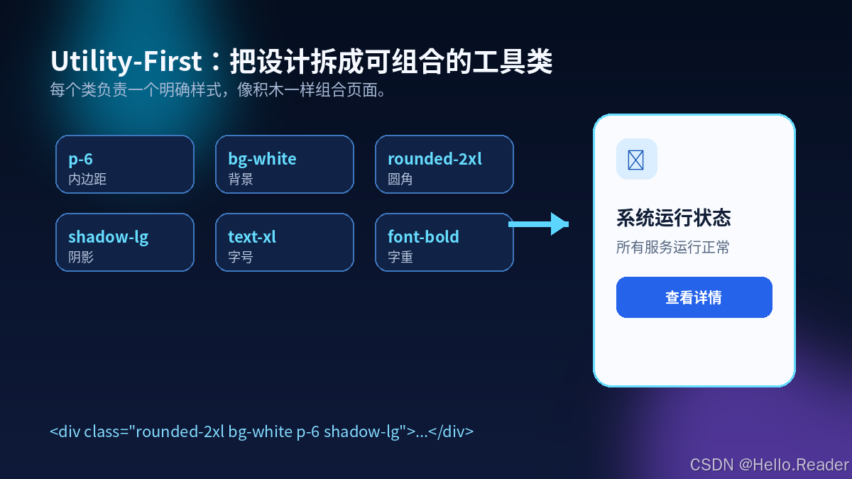
Tailwind CSS 是一个工具类优先的 CSS 框架。每个类通常负责一个明确样式:
| 类名 | 作用 |
|---|---|
p-6 |
内边距 |
bg-white |
白色背景 |
rounded-2xl |
大圆角 |
shadow-lg |
阴影 |
text-xl |
字体大小 |
font-bold |
字体加粗 |
 |
传统 CSS:
html
<button class="submit-button">保存数据</button>
css
.submit-button {
  padding: 10px 20px;
  color: white;
  background: #2563eb;
  border-radius: 8px;
}
Tailwind CSS:
html
<button class="rounded-lg bg-blue-600 px-5 py-2.5 text-white">
  保存数据
</button>
二、使用浏览器版本快速体验
创建 index.html:
html
<!DOCTYPE html>
<html lang="zh-CN">
<head>
  <meta charset="UTF-8">
  <meta name="viewport" content="width=device-width, initial-scale=1.0">
  <title>Tailwind CSS Demo</title>
  <script src="https://cdn.jsdelivr.net/npm/@tailwindcss/browser@4"></script>
</head>
<body class="min-h-screen bg-slate-100 p-6">
  <main class="mx-auto max-w-6xl">
    <h1 class="py-12 text-center text-4xl font-bold text-slate-900">
      Tailwind CSS 示例
    </h1>

    <section class="grid grid-cols-1 gap-6 md:grid-cols-2 lg:grid-cols-3">
      <article class="rounded-2xl bg-white p-6 shadow-lg">
        <h2 class="text-xl font-bold">开发效率</h2>
        <p class="mt-3 text-slate-600">使用工具类快速完成页面样式。</p>
      </article>

      <article class="rounded-2xl bg-white p-6 shadow-lg">
        <h2 class="text-xl font-bold">响应式布局</h2>
        <p class="mt-3 text-slate-600">适配手机、平板和电脑。</p>
      </article>

      <article class="rounded-2xl bg-white p-6 shadow-lg">
        <h2 class="text-xl font-bold">统一设计</h2>
        <p class="mt-3 text-slate-600">统一颜色、间距、圆角和阴影。</p>
      </article>
    </section>
  </main>
</body>
</html>
Play CDN 适合开发体验和演示,生产项目推荐使用构建工具。
三、使用 Vite 工程化安装
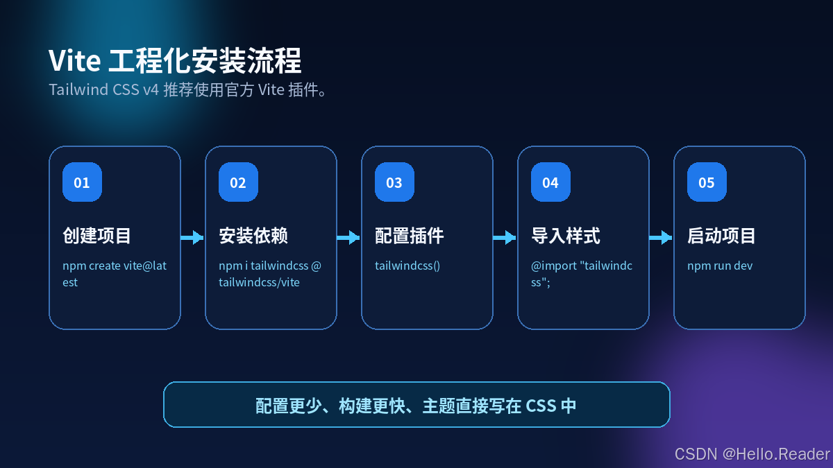
3.1 创建项目
bash
npm create vite@latest tailwind-demo -- --template vanilla
cd tailwind-demo
npm install
3.2 安装 Tailwind CSS
bash
npm install tailwindcss @tailwindcss/vite3.3 配置 vite.config.js
javascript
import { defineConfig } from 'vite'
import tailwindcss from '@tailwindcss/vite'

export default defineConfig({
  plugins: [tailwindcss()]
})
3.4 导入 Tailwind CSS
在 src/style.css 中:
css
@import "tailwindcss";3.5 启动项目
bash
npm run dev四、常用工具类
4.1 间距
html
<div class="mx-auto max-w-7xl px-4 py-12 sm:px-6 lg:px-8">
  页面主体
</div>p-*:四周内边距px-*:左右内边距py-*:上下内边距m-*:四周外边距mx-auto:水平居中mt-*:上外边距
4.2 Flex 布局
html
<div class="flex items-center justify-between gap-4">
  <div>左侧内容</div>
  <div>右侧内容</div>
</div>
4.3 Grid 布局
html
<div class="grid grid-cols-1 gap-6 md:grid-cols-2 lg:grid-cols-4">
  <div class="rounded-xl bg-white p-5">模块一</div>
  <div class="rounded-xl bg-white p-5">模块二</div>
  <div class="rounded-xl bg-white p-5">模块三</div>
  <div class="rounded-xl bg-white p-5">模块四</div>
</div>
五、响应式设计
Tailwind CSS 采用移动端优先策略。
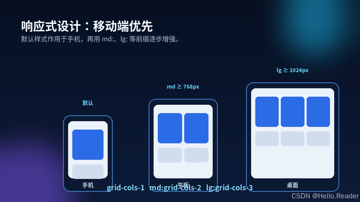
html
<div class="grid grid-cols-1 md:grid-cols-2 lg:grid-cols-3">
  <!-- 手机一列、平板两列、桌面三列 -->
</div>
响应式字体:
html
<h1 class="text-3xl md:text-4xl lg:text-6xl">
  响应式标题
</h1>
响应式间距:
html
<section class="px-4 py-10 md:px-8 lg:px-12 lg:py-20">
  页面内容
</section>
六、状态变体
html
<button
  class="
    rounded-lg bg-blue-600 px-5 py-2.5 font-semibold text-white
    transition hover:bg-blue-700 active:scale-95
    focus:outline-none focus:ring-4 focus:ring-blue-200
    disabled:cursor-not-allowed disabled:opacity-50
  "
>
  保存数据
</button>
常用状态:
hover:focus:active:disabled:checked:group-hover:
七、自定义主题
Tailwind CSS v4 支持 CSS-first 配置:
css
@import "tailwindcss";

@theme {
  --color-brand-50: #eff6ff;
  --color-brand-500: #3b82f6;
  --color-brand-600: #2563eb;
  --color-brand-700: #1d4ed8;
  --radius-panel: 1.25rem;
}
使用自定义主题:
html
<button
  class="rounded-panel bg-brand-600 px-5 py-2.5 text-white hover:bg-brand-700"
>
  品牌按钮
</button>
八、暗黑模式
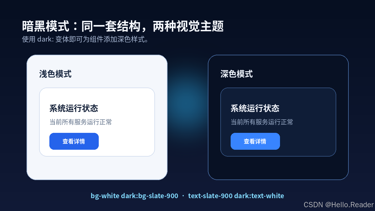
html
<div class="bg-white text-slate-900 dark:bg-slate-900 dark:text-white">
  支持暗黑模式的内容
</div>
使用类名手动控制暗黑模式:
css
@import "tailwindcss";
@custom-variant dark (&:where(.dark, .dark *));
javascript
const root = document.documentElement
const button = document.querySelector('#theme-button')

button.addEventListener('click', () => {
  root.classList.toggle('dark')
})
九、完整实战:后台数据控制台
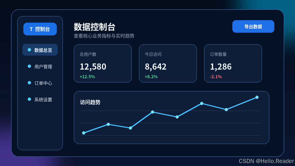
html
<section class="min-h-screen bg-slate-100 px-4 py-12 dark:bg-slate-950">
  <div class="mx-auto max-w-7xl">
    <div class="mb-8 flex flex-col gap-4 md:flex-row md:items-center md:justify-between">
      <div>
        <h1 class="text-3xl font-bold text-slate-900 dark:text-white">
          数据控制台
        </h1>
        <p class="mt-2 text-slate-600 dark:text-slate-400">
          查看当前系统的核心业务指标。
        </p>
      </div>

      <button class="rounded-lg bg-blue-600 px-5 py-2.5 font-semibold text-white hover:bg-blue-700">
        导出数据
      </button>
    </div>

    <div class="grid grid-cols-1 gap-6 sm:grid-cols-2 xl:grid-cols-4">
      <article class="rounded-2xl bg-white p-6 shadow-sm dark:bg-slate-900">
        <p class="text-sm font-medium text-slate-500">总用户数</p>
        <p class="mt-4 text-3xl font-bold text-slate-900 dark:text-white">
          12,580
        </p>
        <p class="mt-3 text-sm text-emerald-600">
          较上月增长 12.5%
        </p>
      </article>
    </div>
  </div>
</section>
十、动态类名问题
不推荐:
javascript
const color = 'blue'
const className = `bg-${color}-500`
推荐使用完整类名映射:
javascript
const colorClasses = {
  blue: 'bg-blue-500',
  red: 'bg-red-500',
  green: 'bg-green-500'
}

const className = colorClasses[color]
十一、React 组件封装示例
jsx
export default function PrimaryButton({ children, disabled = false, onClick }) {
  return (
    <button
      type="button"
      disabled={disabled}
      onClick={onClick}
      className="
        inline-flex items-center justify-center rounded-lg
        bg-blue-600 px-5 py-2.5 text-sm font-semibold text-white
        transition hover:bg-blue-700 focus:outline-none
        focus:ring-4 focus:ring-blue-200
        disabled:cursor-not-allowed disabled:opacity-50
      "
    >
      {children}
    </button>
  )
}
十二、最佳实践
- 使用
@theme统一品牌色、字体、圆角和阴影。 - 避免大量使用任意值,重复值应进入设计系统。
- 不要动态拼接不完整类名。
- 按钮、输入框、标签、卡片和弹窗应封装成组件。
- 优先编写移动端样式,再通过
md:、lg:增强大屏布局。 - 不要忽略焦点状态、标签、颜色对比度和键盘操作。