02. Flutter 鸿蒙实战 02:Web 移植到 Flutter HarmonyOS 的页面结构
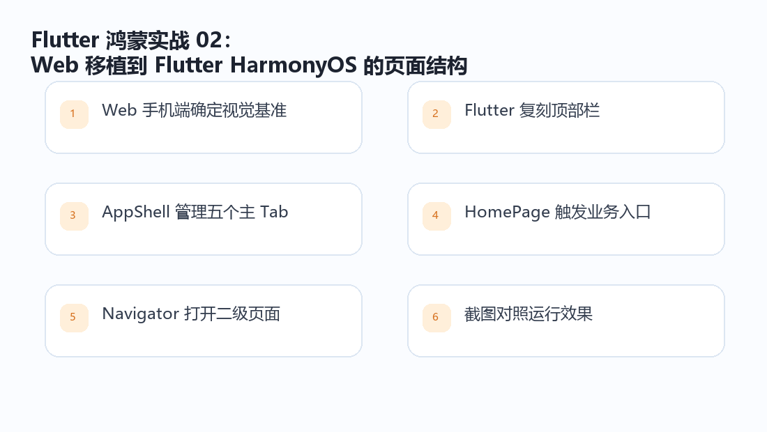
把 Web 手机端的顶部栏、底部导航和业务入口迁移成 Flutter 页面骨架。
迁移思路
这个项目不是从零设计一套新 UI,而是以 Web 手机端为基准迁移到 Flutter HarmonyOS。README.md 里写得很直接:界面与交互以现有 Web 手机端适配效果为基准,不在迁移阶段重新设计。这个约束很重要,意味着 Flutter 端的工作不是"自由发挥",而是把 Web 的信息层级、颜色、圆角、入口位置和导航方式稳定迁过来。
项目中承担主框架职责的是 lib/features/shell/app_shell.dart。它用一个 StatefulWidget 管理底部 Tab,顶部 AppBar 放通知和个人资料入口,中间 body 根据当前 Tab 切换页面。
dart
class AppShell extends StatefulWidget {
  const AppShell({super.key, this.initialRoute});

  final String? initialRoute;

  @override
  State<AppShell> createState() => _AppShellState();
}
五项底部导航
底部导航没有直接使用 Material 默认的胶囊样式,而是手写 _MobileBottomNav。这样做是为了更接近 Web 手机端的视觉:白底、顶部分割线、选中项橙色、图标和文字上下排列。
dart
static const _destinations = [
  _Destination(AppRoutes.home, '首页', Icons.home_outlined),
  _Destination(AppRoutes.stories, '故事', Icons.menu_book_outlined),
  _Destination(AppRoutes.upload, '上传', Icons.upload_rounded),
  _Destination(AppRoutes.map, '地图', Icons.location_on_outlined),
  _Destination(AppRoutes.anniversary, '纪念日', Icons.calendar_month_outlined),
];
页面切换逻辑保持简单:
dart
bottomNavigationBar: _MobileBottomNav(
  destinations: _destinations,
  selectedIndex: _selectedIndex,
  onSelected: (index) => setState(() => _selectedIndex = index),
)
这个写法不依赖路由栈切换主 Tab,状态更直观。首页、故事、上传、地图、纪念日都是主功能,点击底部导航时直接切换 body。
首页入口联动
首页不是孤立页面,它把多个业务入口统一放到首屏:上传照片、智能对话、照片活化、故事集、家族地图、添加家人。AppShell 传入回调,让首页按钮可以切换 Tab 或打开二级页面。
dart
0 => HomePage(
  onUploadPressed: () => setState(() => _selectedIndex = 2),
  onStoriesPressed: () => setState(() => _selectedIndex = 1),
  onMapPressed: () => setState(() => _selectedIndex = 3),
  onChatPressed: () => _openPage(const ChatPage()),
  onFamilyPressed: () => _openPage(const FamilyPage()),
),
这段设计比较适合移动端:上传、故事、地图属于主 Tab,直接切过去;对话和家人列表属于二级功能,用 Navigator.push 打开。
顶部栏和二级页面
顶部栏右侧有通知和个人资料入口:
dart
IconButton(
  tooltip: '通知',
  onPressed: () => _openPage(const NotificationsPage()),
  icon: const Icon(Icons.notifications_none_rounded, size: 28),
),
PopupMenuButton<String>(
  tooltip: '个人资料',
  icon: const Icon(Icons.account_circle_outlined, size: 29),
  onSelected: (value) {
    if (value == 'profile') _openPage(const ProfilePage());
    if (value == 'logout') AuthScope.of(context).logout();
  },
)
通知中心和个人资料不是底部主 Tab,但它们是全局入口,放在 AppBar 里更符合使用习惯。退出登录直接调用 AuthScope.of(context).logout(),会清除本地会话并回到登录页。
页面迁移时最容易忽略的点
Web 到 Flutter 的迁移不能只看颜色。移动端页面还要关注安全区、底部导航遮挡、长列表滚动、返回栈和弹层高度。这个项目的主页面列表普遍使用类似下面的 padding:
dart
ListView(
  padding: const EdgeInsets.fromLTRB(16, 16, 16, 112),
  children: [...]
)
底部预留 112,就是为了避免内容被底部导航挡住。这个细节如果漏掉,页面底部按钮或列表最后一项会被导航栏盖住。

扩展拆解
迁移页面时要避免的几个问题
Web 页面迁移到 Flutter 时,最容易犯的错误是只盯着截图颜色,忽略移动端交互。这个项目的首页、故事页、上传页都使用长列表,底部又有固定导航,所以内容区域必须预留底部空间。否则最后一个按钮或列表项会被导航栏遮住。
主 Tab 用 setState 切换,二级页面用 Navigator.push,这是比较清晰的移动端层级。主 Tab 代表长期存在的功能区,二级页代表临时任务,例如通知、个人资料、家人列表、智能对话。这样的层级让返回行为更自然:从个人资料返回首页,而不是在几个 Tab 之间倒退。
dart
body: switch (_selectedIndex) {
  0 => HomePage(...),
  1 => const StoriesPage(),
  2 => UploadPage(onUploaded: () => setState(() => _selectedIndex = 0)),
  3 => const MapPage(),
  4 => const AnniversaryPage(),
  _ => FeaturePlaceholderPage(...),
}
tedIndex = 0)),
3 => const MapPage(),
4 => const AnniversaryPage(),
_ => FeaturePlaceholderPage(...),
}
这段代码不依赖复杂框架,但足够实用:用 Flutter 原生能力就能组织一个完整移动端应用。