引言
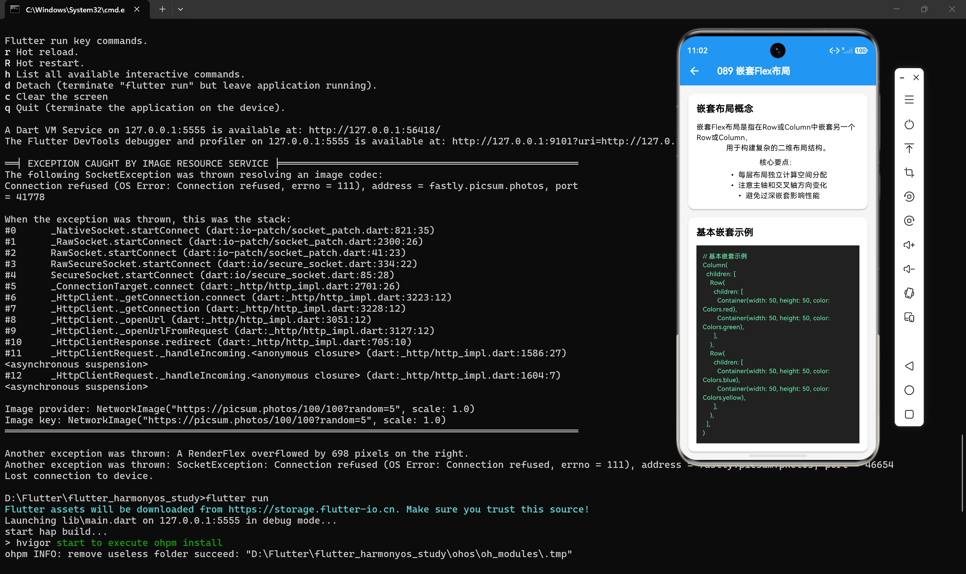
在Flutter开发中,嵌套布局是构建复杂UI界面的常用方法。通过合理嵌套Row和Column组件,可以实现各种复杂的布局效果。然而,嵌套布局也容易导致布局计算复杂、代码难以维护等问题。本文将深入探讨Flex嵌套布局的技巧,帮助开发者构建高效、可维护的嵌套布局。
一、嵌套布局基础
1.1 嵌套布局的概念
嵌套布局是指在一个布局组件中嵌套另一个布局组件,形成多层布局结构。
1.2 嵌套布局的用途
- 复杂界面:实现复杂的UI界面,如表单、卡片、列表等
- 层次结构:构建有层次的布局结构
- 响应式设计:实现响应式布局
1.3 嵌套布局的注意事项
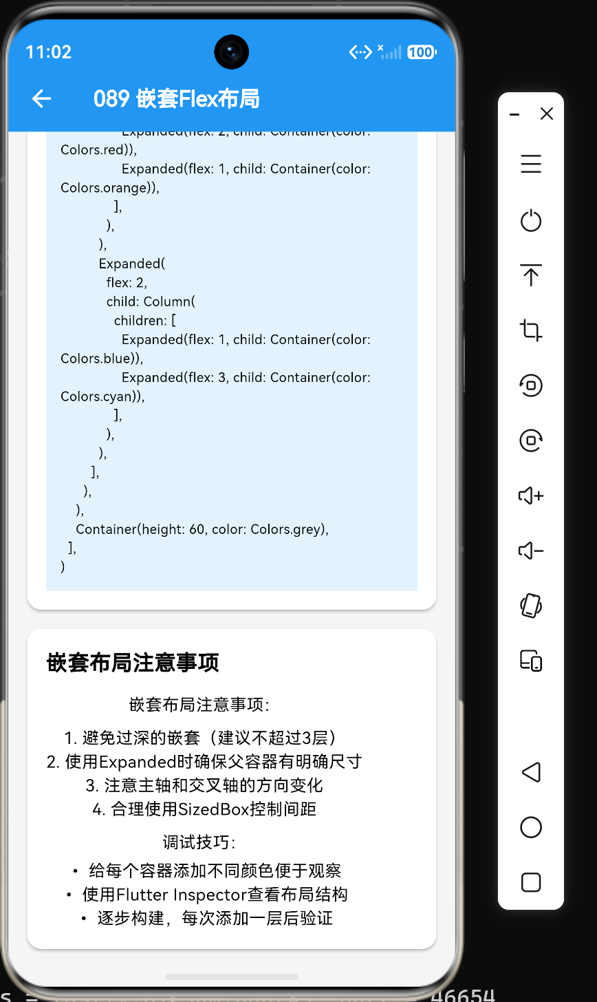
- 避免过度嵌套:过多的嵌套会增加布局计算复杂度
- 明确对齐方式:每个容器都需要明确设置对齐方式
- 合理使用Expanded:在需要弹性空间时使用Expanded
二、基本嵌套布局
2.1 Row嵌套Row
在Row中嵌套Row:
dart
Row(
  children: [
    Container(width: 100, height: 100, color: Colors.orange),
    Expanded(
      child: Row(
        children: [
          Container(width: 50, height: 100, color: Colors.red),
          Container(width: 50, height: 100, color: Colors.blue),
        ],
      ),
    ),
  ],
)
2.2 Column嵌套Column
在Column中嵌套Column:
dart
Column(
  children: [
    Container(width: 100, height: 50, color: Colors.orange),
    Expanded(
      child: Column(
        children: [
          Container(width: 100, height: 50, color: Colors.red),
          Container(width: 100, height: 50, color: Colors.blue),
        ],
      ),
    ),
  ],
)
2.3 Row嵌套Column
在Row中嵌套Column:
dart
Row(
  children: [
    Expanded(
      child: Column(
        children: [
          Container(height: 50, color: Colors.red),
          Container(height: 50, color: Colors.blue),
        ],
      ),
    ),
    Expanded(
      child: Column(
        children: [
          Container(height: 50, color: Colors.green),
          Container(height: 50, color: Colors.yellow),
        ],
      ),
    ),
  ],
)
2.4 Column嵌套Row
在Column中嵌套Row:
dart
Column(
  children: [
    Row(
      children: [
        Container(width: 50, height: 50, color: Colors.red),
        Container(width: 50, height: 50, color: Colors.blue),
      ],
    ),
    Row(
      children: [
        Container(width: 50, height: 50, color: Colors.green),
        Container(width: 50, height: 50, color: Colors.yellow),
      ],
    ),
  ],
)
三、复杂嵌套布局示例
3.1 用户信息卡片
实现一个用户信息卡片布局:
dart
Card(
  elevation: 2,
  margin: const EdgeInsets.all(16),
  child: Padding(
    padding: const EdgeInsets.all(16),
    child: Column(
      children: [
        Row(
          children: [
            Container(
              width: 60,
              height: 60,
              decoration: BoxDecoration(
                shape: BoxShape.circle,
                color: Colors.grey[200],
              ),
              child: const Icon(Icons.person, size: 30),
            ),
            const SizedBox(width: 12),
            Column(
              crossAxisAlignment: CrossAxisAlignment.start,
              children: const [
                Text("用户名", style: TextStyle(fontSize: 18, fontWeight: FontWeight.bold)),
                Text("user@example.com", style: TextStyle(fontSize: 14, color: Colors.grey)),
              ],
            ),
          ],
        ),
        const SizedBox(height: 16),
        Row(
          mainAxisAlignment: MainAxisAlignment.spaceEvenly,
          children: const [
            Column(
              children: [
                Text("128", style: TextStyle(fontSize: 20, fontWeight: FontWeight.bold)),
                Text("关注", style: TextStyle(fontSize: 12, color: Colors.grey)),
              ],
            ),
            Column(
              children: [
                Text("512", style: TextStyle(fontSize: 20, fontWeight: FontWeight.bold)),
                Text("粉丝", style: TextStyle(fontSize: 12, color: Colors.grey)),
              ],
            ),
            Column(
              children: [
                Text("1024", style: TextStyle(fontSize: 20, fontWeight: FontWeight.bold)),
                Text("获赞", style: TextStyle(fontSize: 12, color: Colors.grey)),
              ],
            ),
          ],
        ),
        const SizedBox(height: 16),
        Row(
          children: [
            Expanded(
              child: ElevatedButton(onPressed: () {}, child: const Text("关注")),
            ),
            const SizedBox(width: 8),
            Expanded(
              child: OutlinedButton(onPressed: () {}, child: const Text("发消息")),
            ),
          ],
        ),
      ],
    ),
  ),
)
3.2 新闻卡片布局
实现一个新闻卡片布局:
dart
Card(
  margin: const EdgeInsets.symmetric(horizontal: 16, vertical: 8),
  child: Padding(
    padding: const EdgeInsets.all(16),
    child: Row(
      crossAxisAlignment: CrossAxisAlignment.start,
      children: [
        Expanded(
          flex: 1,
          child: Container(
            height: 120,
            color: Colors.grey[200],
            child: const Center(child: Icon(Icons.image)),
          ),
        ),
        const SizedBox(width: 12),
        Expanded(
          flex: 2,
          child: Column(
            crossAxisAlignment: CrossAxisAlignment.start,
            children: [
              const Text(
                "新闻标题:Flutter嵌套布局技巧详解",
                style: TextStyle(fontSize: 16, fontWeight: FontWeight.bold),
                maxLines: 2,
                overflow: TextOverflow.ellipsis,
              ),
              const SizedBox(height: 8),
              const Text(
                "本文详细介绍了Flutter中嵌套布局的技巧,通过实际示例展示了如何构建复杂的UI界面。",
                style: TextStyle(fontSize: 14, color: Colors.grey),
                maxLines: 2,
                overflow: TextOverflow.ellipsis,
              ),
              const SizedBox(height: 8),
              Row(
                children: const [
                  Text("技术博客", style: TextStyle(fontSize: 12, color: Colors.grey)),
                  SizedBox(width: 12),
                  Text("10分钟前", style: TextStyle(fontSize: 12, color: Colors.grey)),
                ],
              ),
            ],
          ),
        ),
      ],
    ),
  ),
)
3.3 表单布局
实现一个复杂的表单布局:
dart
Column(
  children: [
    Row(
      children: [
        Expanded(flex: 1, child: Container(color: Colors.grey[100], padding: const EdgeInsets.all(16), child: const Text("姓名"))),
        Expanded(flex: 3, child: Container(color: Colors.white, padding: const EdgeInsets.all(16), child: const TextField(decoration: InputDecoration(hintText: "请输入姓名")))),
      ],
    ),
    Row(
      children: [
        Expanded(flex: 1, child: Container(color: Colors.grey[100], padding: const EdgeInsets.all(16), child: const Text("邮箱"))),
        Expanded(flex: 3, child: Container(color: Colors.white, padding: const EdgeInsets.all(16), child: const TextField(decoration: InputDecoration(hintText: "请输入邮箱")))),
      ],
    ),
    Row(
      children: [
        Expanded(flex: 1, child: Container(color: Colors.grey[100], padding: const EdgeInsets.all(16), child: const Text("电话"))),
        Expanded(flex: 3, child: Container(color: Colors.white, padding: const EdgeInsets.all(16), child: const TextField(decoration: InputDecoration(hintText: "请输入电话")))),
      ],
    ),
    Row(
      children: [
        Expanded(flex: 1, child: Container(color: Colors.grey[100], padding: const EdgeInsets.all(16), child: const Text("地址"))),
        Expanded(flex: 3, child: Container(color: Colors.white, padding: const EdgeInsets.all(16), child: const TextField(decoration: InputDecoration(hintText: "请输入地址")))),
      ],
    ),
    Row(
      children: [
        Expanded(
          child: ElevatedButton(onPressed: () {}, child: const Text("提交")),
        ),
      ],
    ),
  ],
)
四、嵌套布局的对齐方式
4.1 设置对齐方式
每个容器都需要明确设置对齐方式:
dart
Column(
  crossAxisAlignment: CrossAxisAlignment.stretch,
  children: [
    Row(
      mainAxisAlignment: MainAxisAlignment.spaceBetween,
      children: [
        Container(width: 80, height: 80, color: Colors.red),
        Container(width: 80, height: 80, color: Colors.blue),
      ],
    ),
    Row(
      mainAxisAlignment: MainAxisAlignment.center,
      children: [
        Container(width: 80, height: 80, color: Colors.green),
        Container(width: 80, height: 80, color: Colors.yellow),
      ],
    ),
  ],
)
4.2 对齐方式的优先级
嵌套布局中,内层容器的对齐方式优先于外层容器:
dart
Column(
  crossAxisAlignment: CrossAxisAlignment.center,
  children: [
    Row(
      mainAxisAlignment: MainAxisAlignment.end,
      children: [
        Container(width: 80, height: 80, color: Colors.red),
      ],
    ),
  ],
)
外层Column居中,内层Row右对齐,最终效果是子组件在右侧。
4.3 对齐方式的冲突
当内层和外层的对齐方式冲突时,以内层为准:
dart
Row(
  mainAxisAlignment: MainAxisAlignment.center,
  children: [
    Column(
      crossAxisAlignment: CrossAxisAlignment.start,
      children: [
        Container(width: 80, height: 80, color: Colors.red),
        Container(width: 80, height: 80, color: Colors.blue),
      ],
    ),
  ],
)
外层Row居中,内层Column左对齐,最终效果是Column在Row中居中,但Column内的子组件左对齐。
五、嵌套布局的性能考量
5.1 减少嵌套层级
过多的嵌套会增加布局计算复杂度:
dart
// 不良示例:三层嵌套
Column(
  children: [
    Row(
      children: [
        Column(children: [...]),
      ],
    ),
  ],
)

// 优化后:使用自定义组件
Column(
  children: [
    UserInfoCard(),
    ContentSection(),
  ],
)
5.2 使用const构造函数
对于不变的子组件,使用const构造函数:
dart
Row(
  children: const [
    Icon(Icons.home),
    Text("首页"),
  ],
)
5.3 避免不必要的Expanded
只在需要弹性空间时使用Expanded:
dart
// 不良示例
Row(
  children: [
    Expanded(child: Text("短文本")),
  ],
)

// 优化后
Row(
  children: [
    Text("短文本"),
  ],
)
5.4 使用RepaintBoundary
对于复杂的子组件,使用RepaintBoundary隔离重绘:
dart
Row(
  children: [
    RepaintBoundary(child: ComplexWidget1()),
    RepaintBoundary(child: ComplexWidget2()),
  ],
)
六、嵌套布局的最佳实践
6.1 提取自定义组件
将重复的布局模式提取为自定义组件:
dart
class FormRow extends StatelessWidget {
  final String label;
  final Widget child;

  const FormRow({super.key, required this.label, required this.child});

  @override
  Widget build(BuildContext context) {
    return Row(
      children: [
        Expanded(flex: 1, child: Container(color: Colors.grey[100], padding: const EdgeInsets.all(16), child: Text(label))),
        Expanded(flex: 3, child: Container(color: Colors.white, padding: const EdgeInsets.all(16), child: child)),
      ],
    );
  }
}

Column(
  children: [
    FormRow(label: "姓名", child: const TextField()),
    FormRow(label: "邮箱", child: const TextField()),
    FormRow(label: "电话", child: const TextField()),
  ],
)
6.2 使用布局常量
将常用的布局配置提取为常量:
dart
class LayoutConstants {
  static const MainAxisAlignment centerAlign = MainAxisAlignment.center;
  static const CrossAxisAlignment stretchAlign = CrossAxisAlignment.stretch;
  static const EdgeInsets cardPadding = EdgeInsets.all(16);
}

Column(
  crossAxisAlignment: LayoutConstants.stretchAlign,
  children: [
    Container(padding: LayoutConstants.cardPadding, child: const Text("内容")),
  ],
)
6.3 保持代码可读性
保持代码的可读性,便于维护:
dart
// 良好示例:有清晰的注释和缩进
Column(
  children: [
    // 用户信息区域
    Row(
      children: [
        Container(width: 60, height: 60, color: Colors.grey[200]),
        const SizedBox(width: 12),
        Column(
          crossAxisAlignment: CrossAxisAlignment.start,
          children: const [
            Text("用户名"),
            Text("user@example.com"),
          ],
        ),
      ],
    ),
  ],
)

// 不良示例:代码混乱,难以理解
Column(children: [Row(children: [Container(width:60,height:60,color:Colors.grey[200]),SizedBox(width:12),Column(crossAxisAlignment:CrossAxisAlignment.start,children:[Text("用户名"),Text("user@example.com")])])])
6.4 测试嵌套布局
在开发过程中测试嵌套布局:
- 使用Flutter Inspector查看布局结构
- 使用不同屏幕尺寸测试布局效果
- 使用设备预览功能测试响应式布局
七、总结
通过本文的学习,我们掌握了Flex嵌套布局的核心技巧:
- 基本嵌套:掌握了Row嵌套Row、Column嵌套Column、Row嵌套Column、Column嵌套Row的基本用法
- 复杂布局:实现了用户信息卡片、新闻卡片、表单等复杂布局示例
- 对齐方式:学会了设置对齐方式、处理对齐方式的优先级和冲突
- 性能考量:了解了减少嵌套层级、使用const构造函数、避免不必要的Expanded等技巧
- 最佳实践:学会了提取自定义组件、使用布局常量、保持代码可读性等方法
嵌套布局是Flutter开发中构建复杂UI界面的常用方法,掌握它的技巧对于构建高质量的应用至关重要。在实际开发中,合理使用嵌套布局可以实现各种复杂的布局效果,提升用户体验。