先看这张不会翻的卡
作者想得很美:卡片写 rotateY(180deg),悬停转过去。结果------卡片转了,但转出来的是镜像的正面,背面那个"答案"从头到尾没出现过。
Plaintext
<!-- 《30天精通CSS》Day 20 · 平头哥 · 技术改变世界,勤奋改变人生 -->
<!DOCTYPE html>
<html lang="zh-CN">
<head>
  <meta charset="UTF-8">
  <title>翻一半穿帮</title>
  <style>
    * { box-sizing: border-box; }
    body { max-width: 700px; margin: 30px auto; padding: 0 16px;
      font-family: "Microsoft YaHei", sans-serif; background: #f6f4ee; color: #24292f; }
    .bar { background: #fff3e0; border: 1px solid #e3e0d8; border-radius: 6px;
      padding: 8px 14px; font-size: 14px; color: #8a3a28; margin-bottom: 24px; }
    .card { position: relative; width: 240px; height: 150px; margin: 0 auto;
      cursor: pointer; transition: transform .6s; }
    .card:hover { transform: rotateY(180deg); }
    .face { position: absolute; inset: 0; border-radius: 12px;
      display: flex; align-items: center; justify-content: center; font-size: 15px; }
    .front { background: #2563eb; color: #fff; }
    .back { background: #2f8f4e; color: #fff; transform: rotateY(180deg); }
    .note { font-size: 13px; color: #8a3a28; margin-top: 16px; }
  </style>
</head>
<body>
  <div class="bar">悬停看效果:卡片翻了,但看到的还是正面 ------ 镜像的</div>
  <div class="card">
    <div class="face front">正面:什么是盒模型?</div>
    <div class="face back">背面:内容+padding+border+margin 的总称</div>
  </div>
  <p class="note">缺三样东西:外层没有 perspective(没有"纵深"),
    正反两面都露着脸(没藏背面),翻到一半正反面同时可见(穿帮)。</p>
</body>
</html>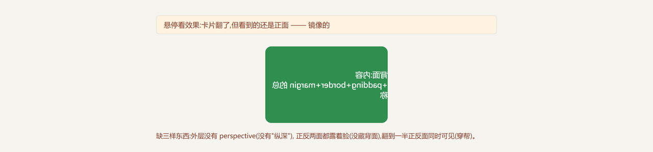
三个嫌疑,逐个排除
嫌疑一:rotateY 角度不对。 180 度没毛病,转半圈就该看到背面。排除。
嫌疑二:背面颜色写错。 绿色没问题,.back 里那行 rotateY(180deg) 也正确------背面就该先翻过去等着。排除。
嫌疑三:缺少 3D 的三件套。 成立,而且是三处同时缺:
一,没有透视 。没有 perspective,rotateY 只是水平压缩,像拉窗帘,没有"绕轴翻转"的纵深感。
二,背面没藏 。.back 翻了过去,但它的背面 正对着你------浏览器默认把元素背面渲染成镜像正面,所以你看到的是镜像文字。
三,两层没有叠准。正反两面都 absolute 了,但没有共同的"翻转舞台"。
元凶:perspective 写错了人
perspective(透视)决定 3D 的"眼睛离屏幕多远"。值越小,透视越夸张;越大越平。
它的写法有两个位置,效果天差地别:
写法 A:写在父容器上 ------ 父 { perspective: 800px }。父的所有 3D 子元素共享同一个视点 ,整体翻转,像一叠卡一起转。
写法 B:写在 transform 里 ------ transform: perspective(800px) rotateY(180deg)。每个元素各看各的,适合单个元素独立转。
翻卡要用 A:翻的是整个卡片容器,正反两面跟着一起翻。
修好它:三层结构缺一不可
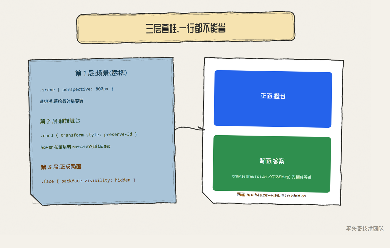
标准翻卡是三层套娃:外层管透视,中层管翻转,内层是正反两面。
Plaintext
<!-- 《30天精通CSS》Day 20 · 平头哥 · 技术改变世界,勤奋改变人生 -->
<!DOCTYPE html>
<html lang="zh-CN">
<head>
  <meta charset="UTF-8">
  <title>修好:三层翻卡</title>
  <style>
    * { box-sizing: border-box; }
    body { max-width: 700px; margin: 30px auto; padding: 0 16px;
      font-family: "Microsoft YaHei", sans-serif; background: #f6f4ee; color: #24292f; }
    /* 第 1 层:透视,写给父容器 */
    .scene { perspective: 800px; width: 260px; margin: 0 auto; cursor: pointer; }
    /* 第 2 层:翻转舞台,transform-style 让子元素留在 3D 空间 */
    .card { position: relative; width: 100%; height: 160px;
      transform-style: preserve-3d;
      transition: transform .6s cubic-bezier(.4,0,.2,1); }
    .scene:hover .card { transform: rotateY(180deg); }
    /* 第 3 层:正反两面,叠在同一格;背面藏脸 */
    .face { position: absolute; inset: 0; border-radius: 12px;
      display: flex; flex-direction: column; align-items: center; justify-content: center;
      backface-visibility: hidden; font-size: 15px; }
    .front { background: linear-gradient(135deg,#2563eb,#7c3aed); color: #fff; }
    .front small { opacity: .8; font-size: 12px; margin-top: 6px; }
    .back { background: #2f8f4e; color: #fff; padding: 0 18px; text-align: center;
      transform: rotateY(180deg); }
  </style>
</head>
<body>
  <div class="scene">
    <div class="card">
      <div class="face front">什么是盒模型?<small>悬停看答案</small></div>
      <div class="face back">content、padding、border、margin ------ 四层结构,Day 03 讲过</div>
    </div>
  </div>
</body>
</html>
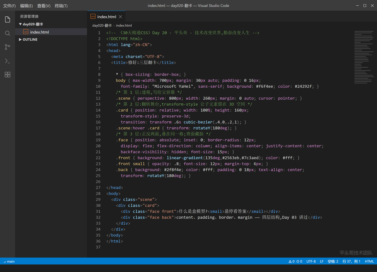
三行关键代码,一行都别漏:
-
父容器
perspective: 800px------ 造出纵深。 -
翻转层
transform-style: preserve-3d------ 让正反两面留在 3D 空间里,不被压平。 -
两面
backface-visibility: hidden------ 转过去的面自动隐形,正面转走、背面转来,永不穿帮。
进阶:backface-visibility 让正反面各归各位
backface-visibility: hidden 的意思:"当我背对观众时,把我藏起来"。
翻卡的完整时间线:0 度时正面朝你、背面背对你(被藏);转到 90 度时两面都侧对观众(卡片视觉上消失一瞬);180 度时背面朝你(现身)、正面背对(被藏)。那一瞬的"消失"不是 bug,是 3D 的物理事实------把过渡时长给足(0.6s+),肉眼只会觉得"翻过去了",不会注意中间那帧。
最容易翻车的地方:翻一半,背面是镜像
Plaintext
<!-- 《30天精通CSS》Day 20 · 平头哥 · 技术改变世界,勤奋改变人生 -->
<!DOCTYPE html>
<html lang="zh-CN">
<head>
  <meta charset="UTF-8">
  <title>变体:漏了 preserve-3d</title>
  <style>
    * { box-sizing: border-box; }
    body { max-width: 700px; margin: 30px auto; padding: 0 16px;
      font-family: "Microsoft YaHei", sans-serif; background: #f6f4ee; color: #24292f; }
    .bar { background: #fff3e0; border: 1px solid #e3e0d8; border-radius: 6px;
      padding: 8px 14px; font-size: 14px; color: #8a3a28; margin-bottom: 24px; }
    .scene { perspective: 800px; width: 260px; margin: 0 auto; }
    .card { position: relative; width: 100%; height: 160px;
      /* 漏了 transform-style: preserve-3d */
      transition: transform .6s; }
    .card:hover { transform: rotateY(180deg); }
    .face { position: absolute; inset: 0; border-radius: 12px;
      display: flex; align-items: center; justify-content: center;
      backface-visibility: hidden; font-size: 15px; }
    .front { background: #2563eb; color: #fff; }
    .back { background: #2f8f4e; color: #fff; transform: rotateY(180deg); }
    .note { font-size: 13px; color: #8a3a28; margin-top: 16px; }
  </style>
</head>
<body>
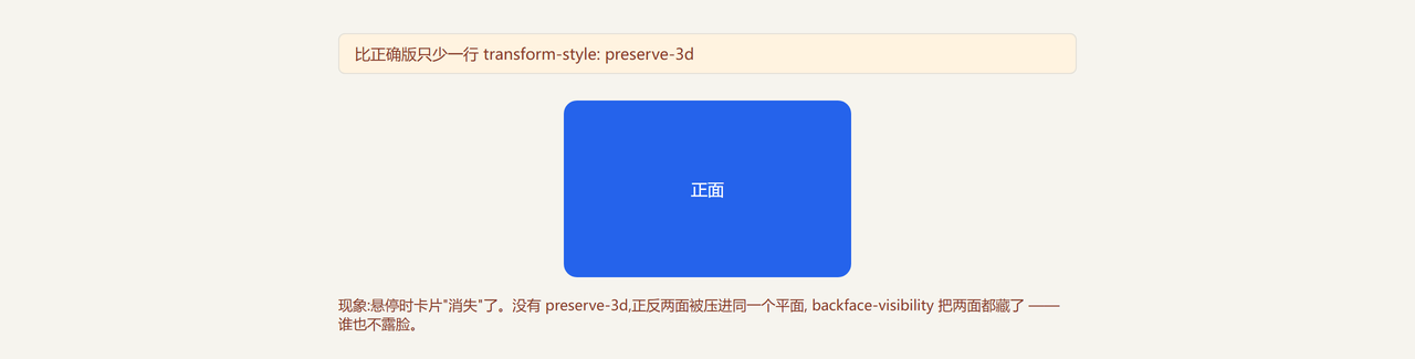
  <div class="bar">比正确版只少一行 transform-style: preserve-3d</div>
  <div class="scene">
    <div class="card">
      <div class="face front">正面</div>
      <div class="face back">背面:看不到我 ------ preserve-3d 漏了,两面被压平在同一层</div>
    </div>
  </div>
  <p class="note">现象:悬停时卡片"消失"了。没有 preserve-3d,正反两面被压进同一个平面,
     backface-visibility 把两面都藏了 ------ 谁也不露脸。</p>
</body>
</html>