以下质朴学习来自鲁智杯以赛促学
Matplotlib可视化库概述
绘画流程
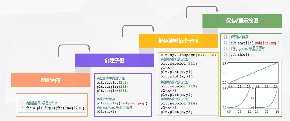
DataFrame.plot()绘图函数,绘制的图形样式默认为折线图
python
# 1.引入matplotlib.pyplot画图
import matplotlib.pyplot as plt
#2.创建画布
plt.figure(figsize=(6,4))
#3.创建子图(如只有一个子图,可省略此步骤)
plt.subplot(1,1,1)
#4.绘制子图
X = ['上衣','裤子','裙子','鞋帽','领带','袜子']
y = [150,200,300,230,100,240]
plt.bar(X,y)
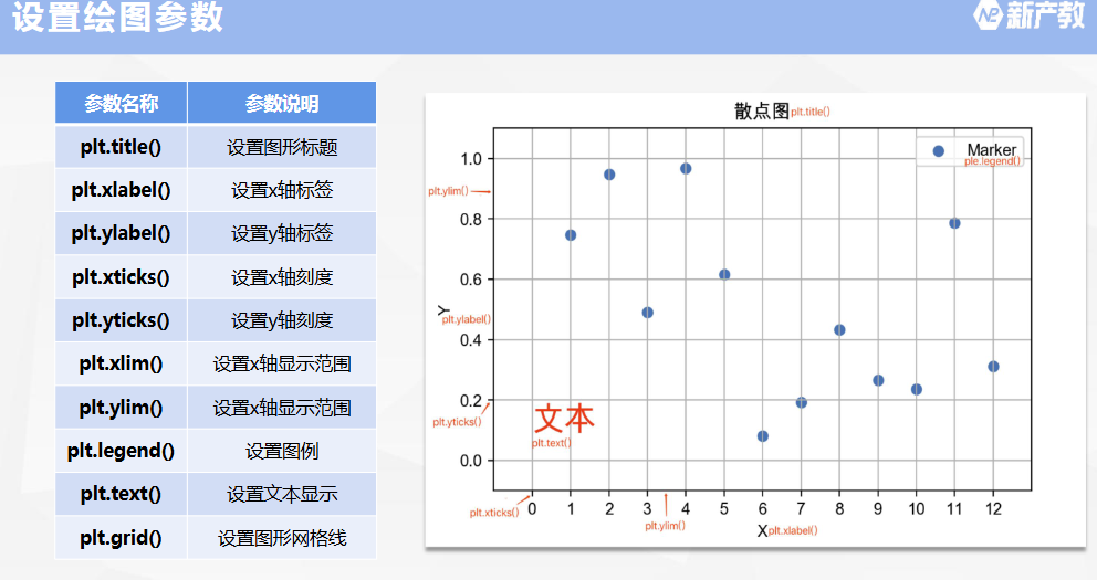
#5.添加子图标题、x,y轴标签
plt.title('各类商品库存柱状图')
plt.xlabel('种类')
plt.ylabel('数量')
#6.保存图片(必须在plt.show()之前)
plt.savefig('库存商品数量柱状图')
#7.显示图片
plt.show()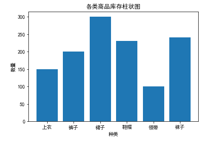
折线图
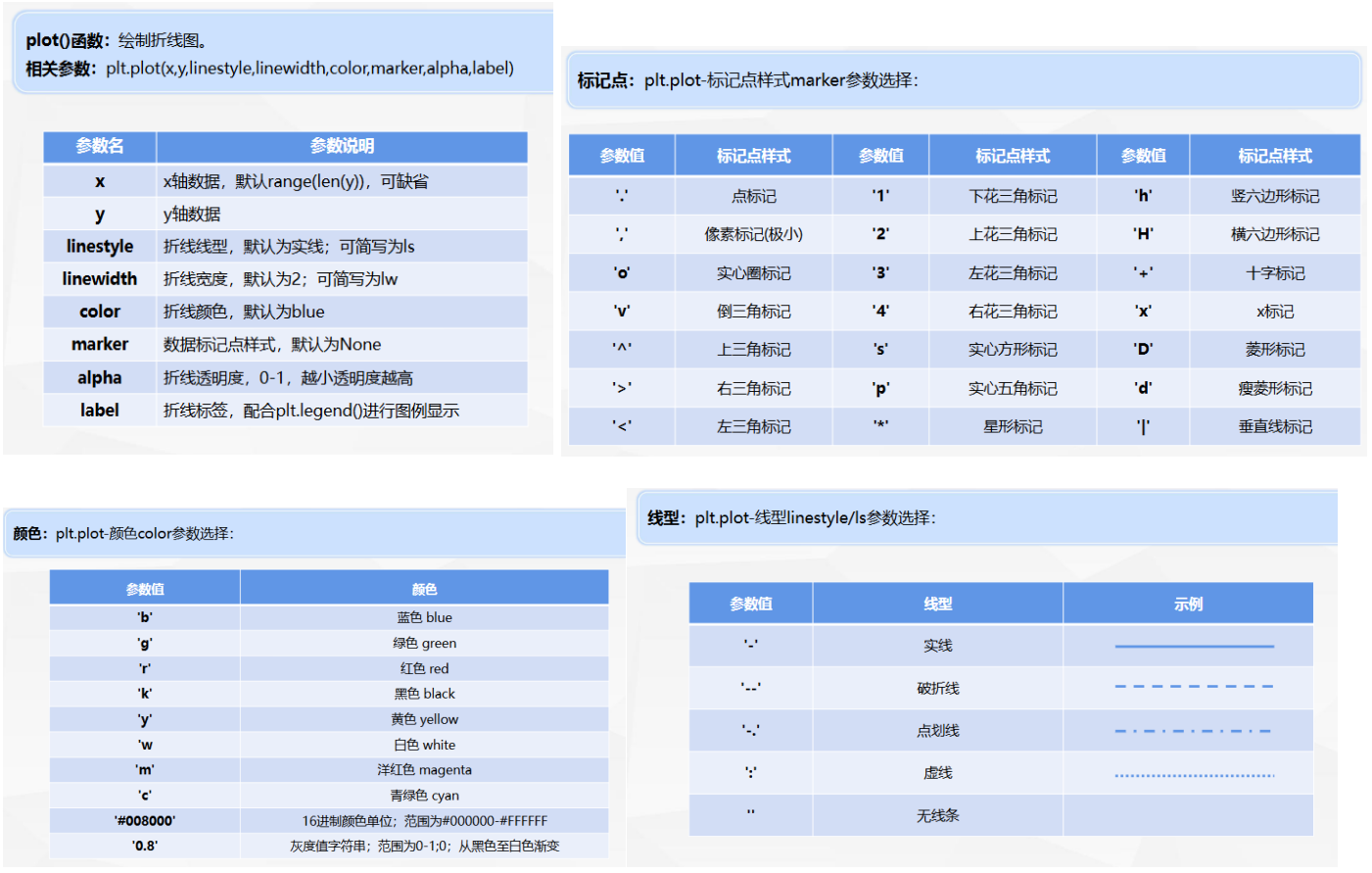
例题:读取"店铺销售数据",计算支付转化率、加入购物车比例、销售额,并绘制折线图。
python
# 读取数据
import pandas as pd
data = pd.read_excel('https://oss.xinchanjiao.com/upload/default/20220804-269363e4-d846-4457-94f7-b34dc3e10b40.xlsx')
# 数据准备
#计算支付转化率
data['支付转化率'] = round(data['支付买家数']/data['访客数'],4)
#计算加入购物车比例
data['加购率'] = round(data['加入购物车件数']/data['访客数'],4)
#计算销售额
data['销售额'] = data['商品价格']*data['销售数量']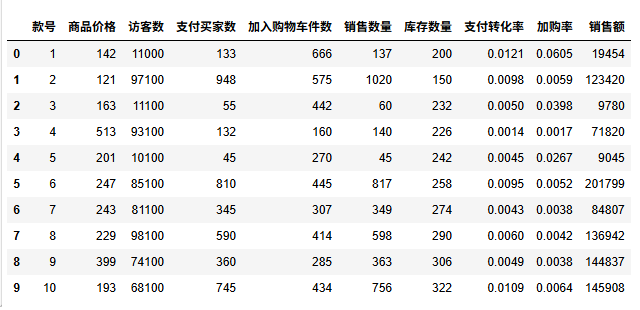
python
# 数据可视化
# 引入matplotlib
from matplotlib import pyplot as plt
plt.rcParams['font.family']='SimHei' # 用黑体显示中文
#创建画布
plt.figure(figsize=(10, 5))
#绘制销售数量折线图
plt.plot(data['款号'], data['支付转化率'], label='支付转化率', marker='o', ls='-.')
plt.plot(data['款号'], data['加购率'], label='加购率', marker='*', ls=':')
#设置图形主题、轴标签等
plt.title('各款号支付转化率&加购率折线图')
plt.xlabel('款号')
plt.ylabel('比率')
plt.xticks(range(1, 11))
#显示图例、图形
plt.legend()
plt.show()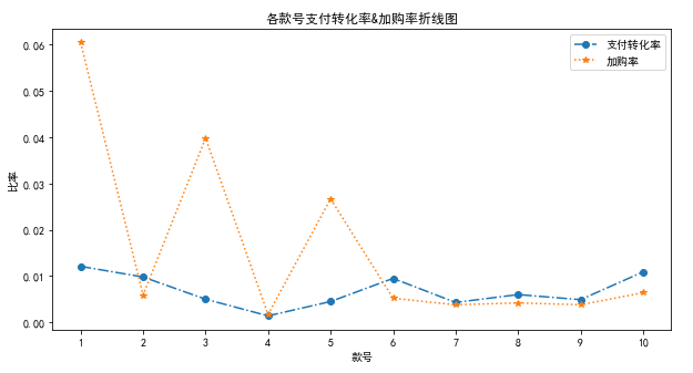
柱状图
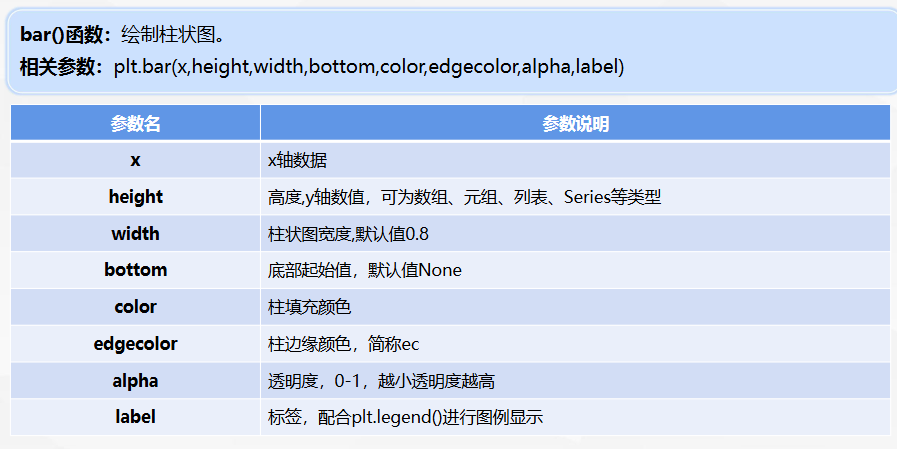
销售数量、库存数量堆叠柱状图
bottom=data['销售数量']
python
# 数据可视化
# 引入matplotlib
from matplotlib import pyplot as plt
plt.rcParams['font.family']='SimHei' # 用黑体显示中文
#创建画布
plt.figure(figsize=(10, 7))
#绘制销售数量折线图
plt.bar(data['款号'], data['销售数量'], label='销售数量')
#在销售数量数据之上画库存量
plt.bar(data['款号'], data['库存数量'], bottom=data['销售数量'],label='库存数量')
#设置图形主题、轴标签等
plt.title('各款号销售数量&库存数量堆叠柱状图')
plt.xlabel('款号')
plt.ylabel('数量')
plt.xticks(range(1, 11))
#显示图例、图形
plt.legend()
plt.show()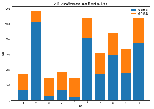
饼状图
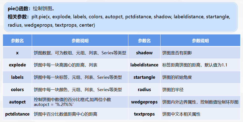
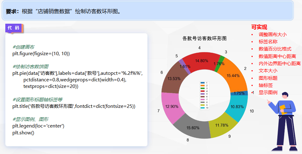
python
# 数据可视化
# 引入matplotlib
from matplotlib import pyplot as plt
plt.rcParams['font.family']='SimHei' # 用黑体显示中文
#创建画布
plt.figure(figsize=(10, 10))
#绘制销售数量折线图
# autopc数值的百分比格式,pctdistance百分比数值距中心的距离,
# wedgeprops=dict(width=1)那就不空心,textprops中文相关属性字号大小等
plt.pie(data['访客数'],labels=data['款号'],autopct='%.2f%%',
        pctdistance=0.8,wedgeprops=dict(width=0.4),
        textprops=dict(size=20))
#设置图形主题、轴标签等
plt.title('各款号访客数环形图',fontdict=dict(fontsize=25))
#显示图例、图形
plt.legend(loc='center')
plt.show()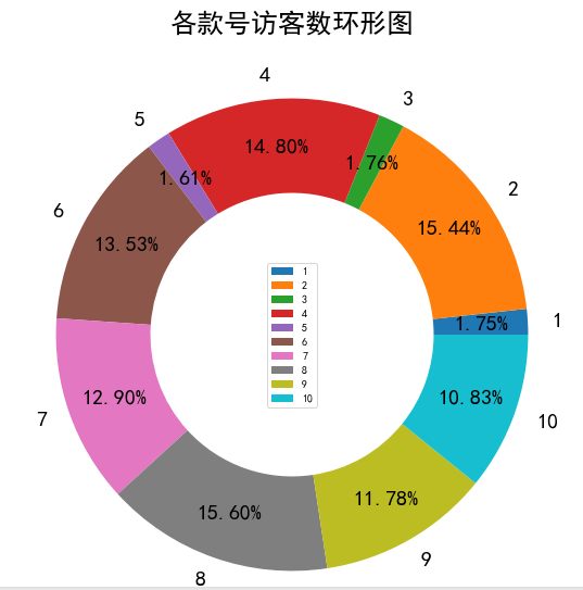
组合图
python
# 数据可视化
# 引入matplotlib
from matplotlib import pyplot as plt
plt.rcParams['font.family']='SimHei' # 用黑体显示中文
# 数据可视化
# 引入matplotlib
from matplotlib import pyplot as plt
plt.rcParams['font.family']='SimHei' # 用黑体显示中文
#创建画布
plt.figure(figsize=(18, 10))

#第一步-绘制221位置上图
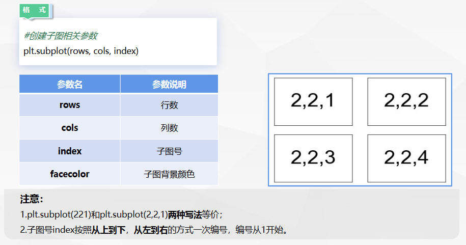
plt.subplot(221)
#绘制销售数量折线图
plt.plot(data['款号'], data['支付转化率'], label='支付转化率', marker='o', ls='-.')
plt.plot(data['款号'], data['加购率'], label='加购率', marker='*', ls=':')
#设置图形主题、轴标签等
plt.title('各款号支付转化率&加购率折线图')
plt.xlabel('款号')
plt.ylabel('比率')
plt.xticks(range(1, 11))
plt.legend()

#第二步-绘制223位置上图
plt.subplot(223)
#绘制销售数量折线图
plt.bar(data['款号'], data['销售数量'], label='销售数量')
#在销售数量数据之上画库存量
plt.bar(data['款号'], data['库存数量'], bottom=data['销售数量'],label='库存数量')
#设置图形主题、轴标签等
plt.title('各款号销售数量&库存数量堆叠柱状图')
plt.xlabel('款号')
plt.ylabel('数量')
plt.xticks(range(1, 11))
plt.legend()

#第三步-绘制122位置上图
plt.subplot(122)
#绘制销售数量折线图
plt.pie(data['访客数'],labels=data['款号'],autopct='%.2f%%',pctdistance=0.8,wedgeprops=dict(width=0.4),
        textprops=dict(size=20))
#设置图形主题、轴标签等
plt.title('各款号访客数环形图')
#显示图例、图形
plt.legend(loc='center')
plt.show()
注意 :这三个图的位置表示分别为 折线:221 柱状:223 饼:122

pandas的plot绘图函数
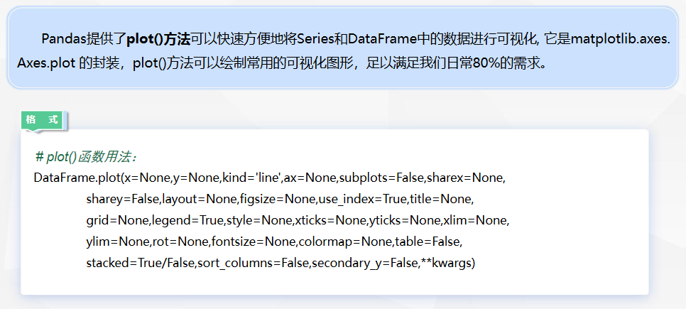
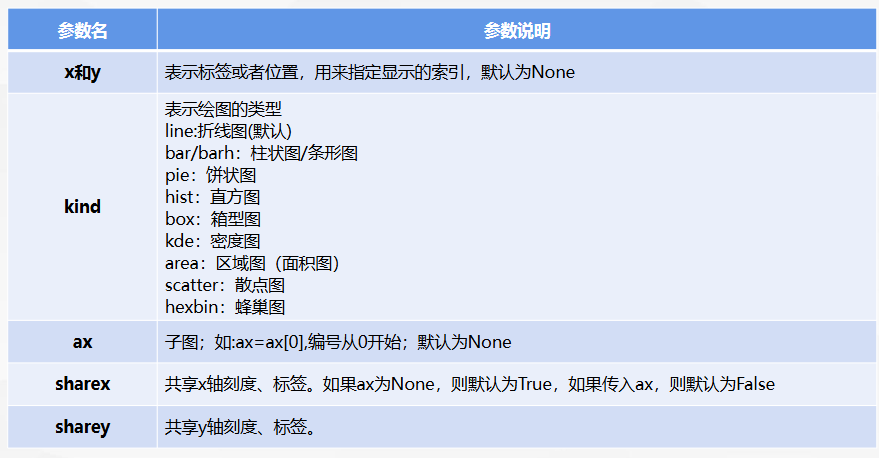
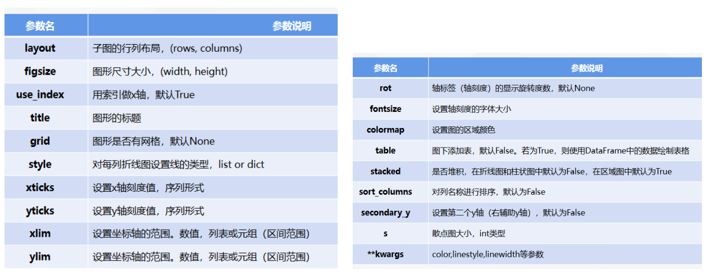
python
#筛选支付转化率、加购率两列直接调用plot()函数绘制图像
data[['支付转化率','加购率']].plot(kind='line',
     title='支付转化率&加购率折线图',
     secondary_y='加购率',figsize=(12,5),grid=True,xticks=range(10))
# kind 绘图类型,secondary_y 第二个y轴,grid是否有网格,xticks 刻x轴度
plt.show()
pyecharts
Echarts是一个由百度开源的数据可视化库,凭借着良好的交互性,精巧的图表设计,得到了众多开发者的认可。而Python是一门富有表达力的语言,很适合用于数据处理。当数据分析遇上数据可视化时,pyecharts 诞生了。
中文使用文档地址:Echarts中文文档
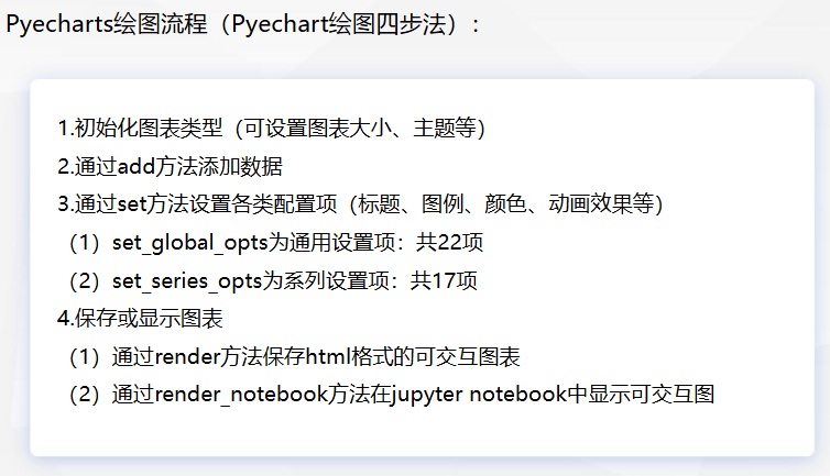
- 用表格数据画图
python
#引入柱状图
from pyecharts.charts import Bar
#初始化柱状图
bar = Bar()
#添加x轴及y轴数据
bar.add_xaxis( ['1月', '2月', '3月', '4月'])
bar.add_yaxis('线上',[13000, 12000, 15000, 14500])
bar.add_yaxis('线下', [8000, 7600, 7500, 8200])
#显示柱状图
bar.render_notebook()- 用列表数据画图
python
# 引入pandas、pyecharts柱状图
import pandas as pd
from pyecharts.charts import Bar
# 读取数据
df=pd.read_excel(r'https://oss.xinchanjiao.com/upload/default
/20230414-88618c3d-90e9-4555-bb8b-786448103b9d.xlsx')
#初始化柱状图
bar = Bar()
#添加x轴及y轴数据
bar.add_xaxis( list(df["月份"]))
bar.add_yaxis('线上',list(df["线上"]))
bar.add_yaxis('线下', list(df["线下"]))
#显示柱状图
bar.render_notebook()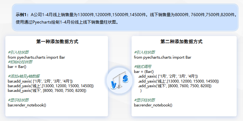
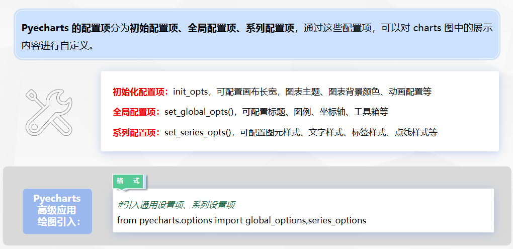
Pyecharts高级
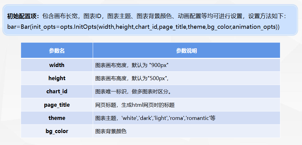
请使用初始化配置项进行调整: 宽度设置为1000px;高度设置为600px;图表ID设置为'线上线下销售额柱状图';网页标题设置为线上线下销售额柱状图.html;背景设置为白色;主题设置为光亮;初始动画的时长为1200ms;初始动画的缓动效果设置为elasticOut
python
#引入柱状图及配置项
from pyecharts import options as opts
from pyecharts.charts import Bar
from pyecharts.options import global_options,series_options
#初始化柱状图
bar = Bar(init_opts=opts.InitOpts(width='1000px',  #宽度设置为1000px
                                  height='600px',  #高度设置为600px
                                  chart_id='线上线下销售额柱状图',  #图表ID图表的唯一标识
                                  page_title='线上线下销售额柱状图.html',  #网页标题
                                   bg_color='white',  #背景设置为白色
                                  theme='light',  #主题设置为光亮,对应柱状颜色也会调整
                                  animation_opts=opts.AnimationOpts(animation_duration=1200,  #初始动画的时长为1200ms,即1.2秒。默认为1000毫秒。
                                                                    animation_easing='elasticOut')))  #初始动画的缓动效果设置为elasticOut,弹性弹出
#添加x轴及y轴数据
bar.add_xaxis( ['1月', '2月', '3月', '4月'])
bar.add_yaxis('线上',[13000, 12000, 15000, 14500])
bar.add_yaxis('线下', [8000, 7600, 7500, 8200])
#显示柱状图
bar.render_notebook()
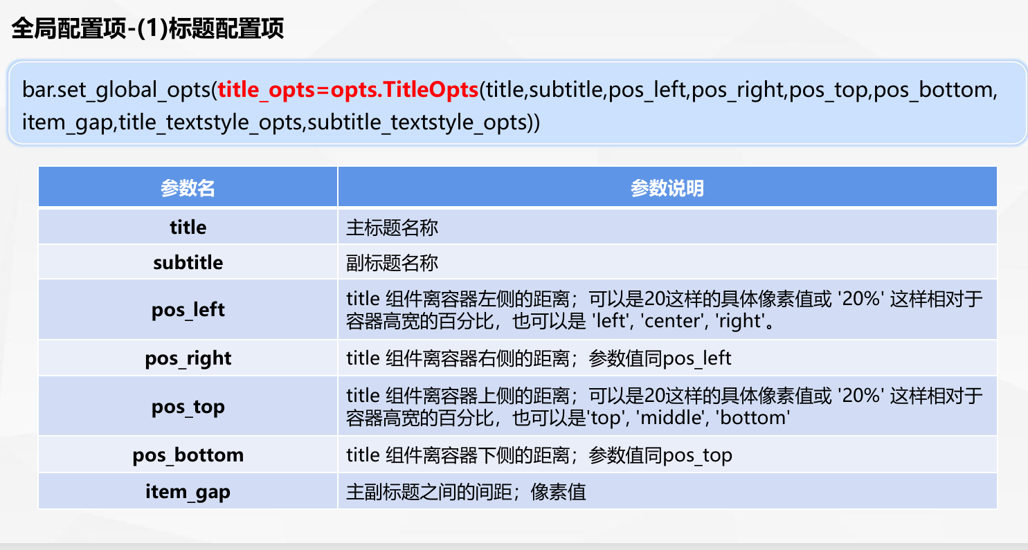
标题配置项
python
#引入柱状图及配置项
from pyecharts import options as opts
from pyecharts.charts import Bar
from pyecharts.options import global_options,series_options
#初始化柱状图
bar = Bar(init_opts=opts.InitOpts(width='1000px',height='600px',theme='light'))   #宽度、高度、主题
#添加x轴及y轴数据
bar.add_xaxis( ['1月', '2月', '3月', '4月'])
bar.add_yaxis('线上',[13000, 12000, 15000, 14500])
bar.add_yaxis('线下', [8000, 7600, 7500, 8200])
#设置全局配置项
bar.set_global_opts(title_opts=opts.TitleOpts(title='主标题名-线上线下销售量柱状图',
                                              subtitle='副标题名-4个月份',
                                              pos_top='top',
                                              item_gap=15))
#显示柱状图
bar.render_notebook()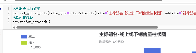
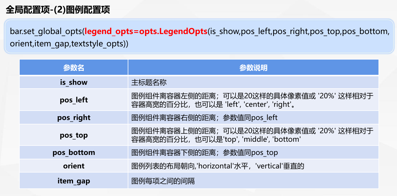
图例配置项
python
#设置全局配置项
bar.set_global_opts(title_opts=opts.TitleOpts(title='主标题名-线上线下销售量柱状图',
                                              pos_left ='center',
                                              item_gap=10),  #标题配置项
                    legend_opts=opts.LegendOpts(pos_top=10,
                                                orient='vertical',
                                                pos_left=60))  #图例配置项
#显示柱状图
bar.render_notebook()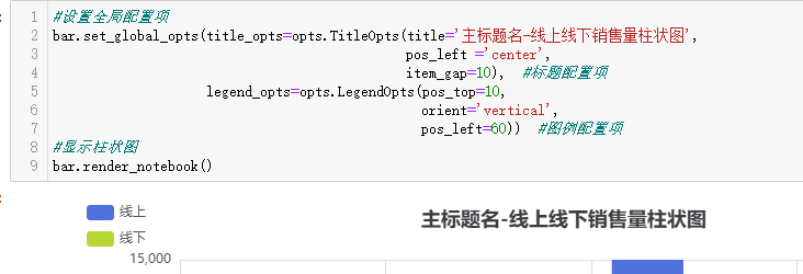
工具箱配置项
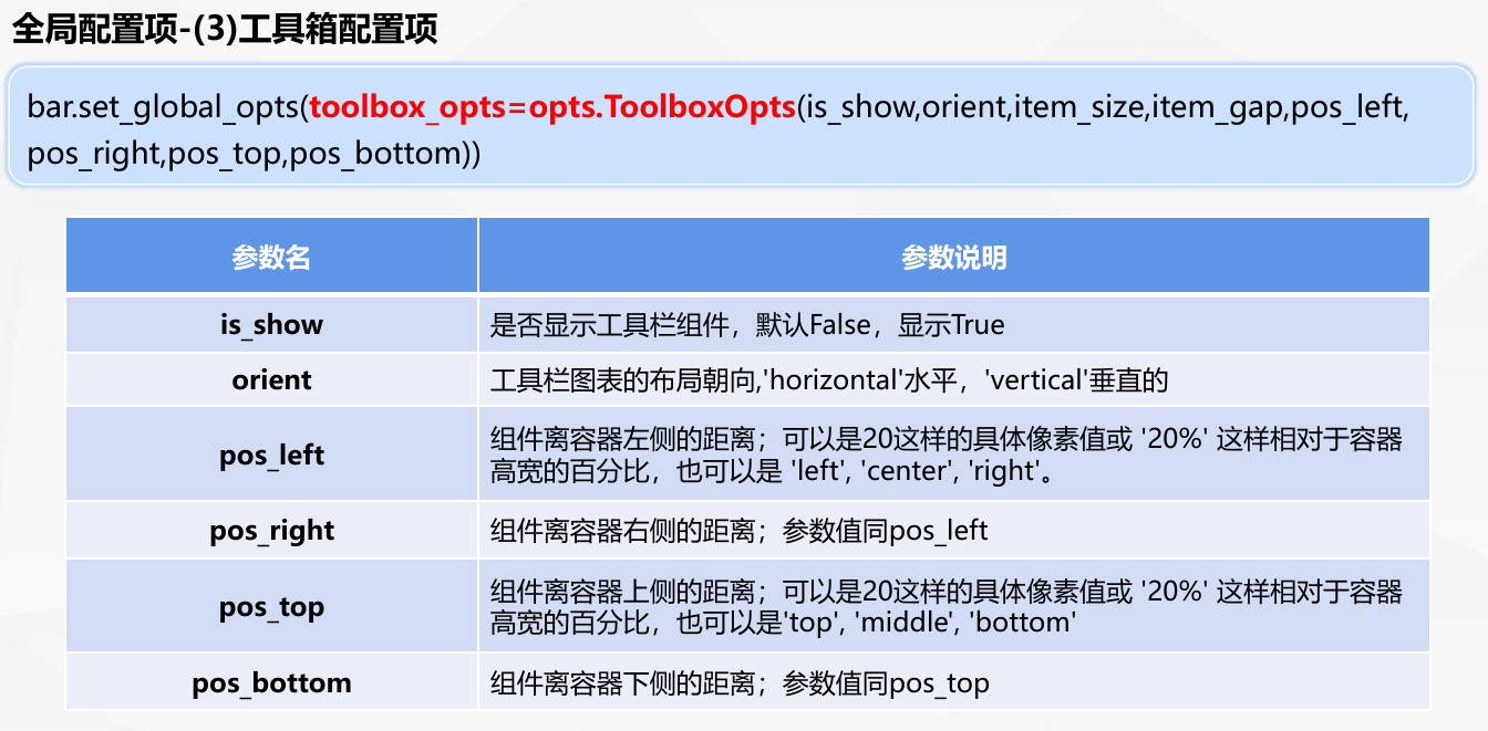
python
#设置全局配置项
bar.set_global_opts(title_opts=opts.TitleOpts(title='主标题名-线上线下销售量柱状图',
                                              pos_left ='center',
                                              item_gap=10),  #标题配置项
                    legend_opts=opts.LegendOpts(pos_top=10,orient='vertical',pos_left=60),   #图例配置项
                    toolbox_opts=opts.ToolboxOpts(is_show=True,pos_left='85%'))   #工具箱配置项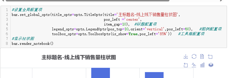
坐标轴配置项
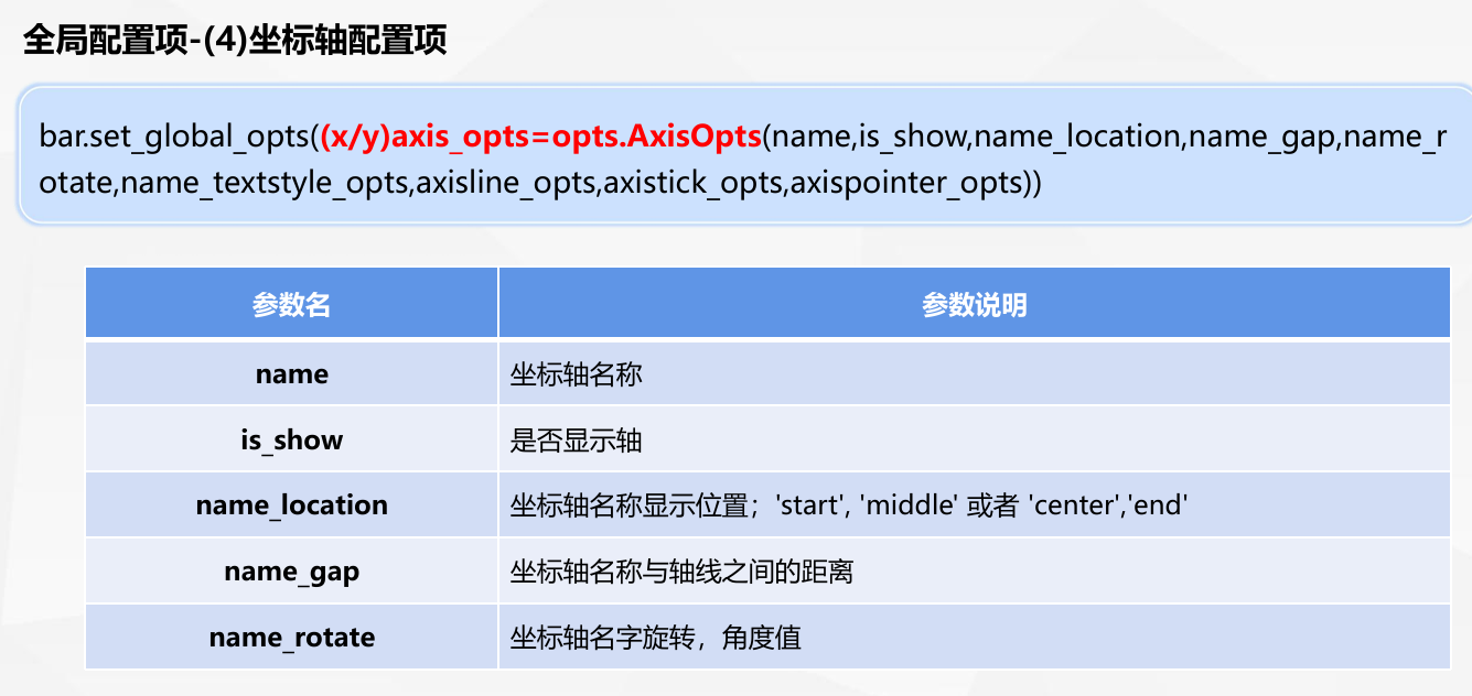
要求
A公司1-4月线上销售量为13000件,12000件,15000件,14500件。线下销售量为8000件, 7600件,7500件,8200件。使用通过Pyecharts绘制1-4月份线上线下销售量柱状图。
请使用全局配置项进行调整:
①标题配置项
主标题名称设置为'主标题名-线上线下销售量柱状图';副标题名称设置为'副标题名-4个月份';title 组件离容器上侧的距离设置为top;主副标题之间的间距设置为15
②图例配置项
图例组件离容器上侧的距离设置为10;图例列表的布局朝向设置为垂直的;图例组件离容器左侧的距离设置为60
③工具箱配置项
是否显示工具栏组件设置为True;组件离容器左侧的距离设置为85%
④坐标轴配置项
X坐标轴名称设置为月份;Y坐标轴名称设置为数量(件)
python
#设置全局配置项
bar.set_global_opts(title_opts=opts.TitleOpts(title='主标题名-线上线下销售量柱状图',pos_left ='center',item_gap=10),  #标题配置项
                    legend_opts=opts.LegendOpts(pos_top=10,orient='vertical',pos_left=120),   #图例配置项
                    toolbox_opts=opts.ToolboxOpts(is_show=True,pos_left='85%'),   #工具箱配置项
                    xaxis_opts=opts.AxisOpts(name='月份'), yaxis_opts=opts.AxisOpts(name='数量(件)'))    #坐标轴配置项
#显示柱状图
bar.render_notebook()
视觉映射配置项
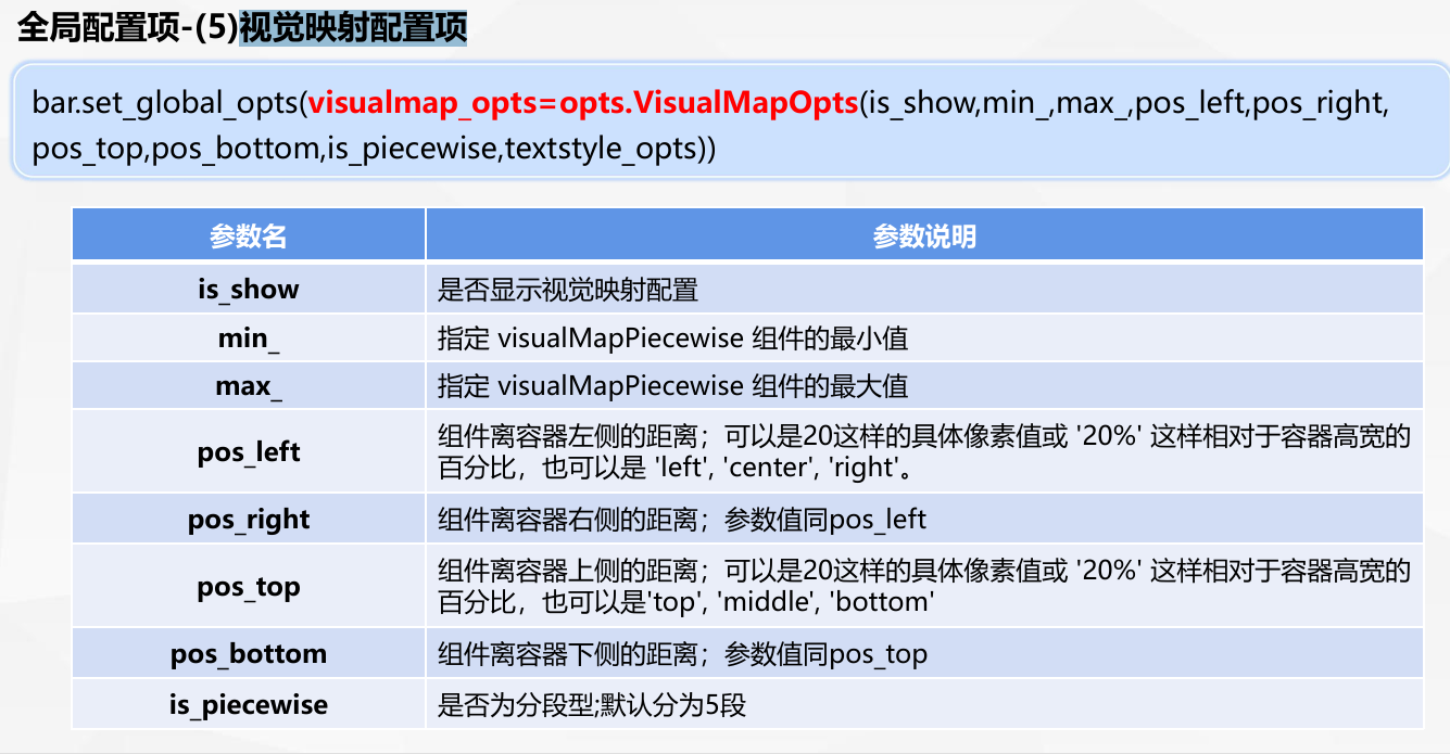
python
#门店数量数据
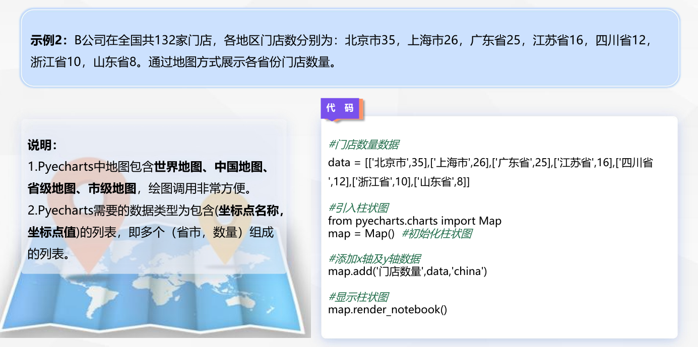
data = [['北京市',35],['上海市',26],['广东省',25],['江苏省',16],['四川省',12],['浙江省',10],['山东省',8]]
#引入柱状图
from pyecharts.charts import Map
#初始化柱状图
map = Map()
#添加x轴及y轴数据
map.add('门店数量',data,'china',is_roam=False)
#设置配置项
map.set_global_opts(title_opts=opts.TitleOpts(title='各省市门店数量分布图',pos_top='top',pos_left='center',item_gap=10),  #标题配置项
                    legend_opts=opts.LegendOpts(pos_top=25,orient='vertical'),    #图例配置项
                    visualmap_opts=opts.VisualMapOpts(is_show=True,min_=0,
                                                      max_=40,is_piecewise=True,
                                                      pos_bottom='15%'))    #视觉映射配置项
#显示柱状图
map.render_notebook()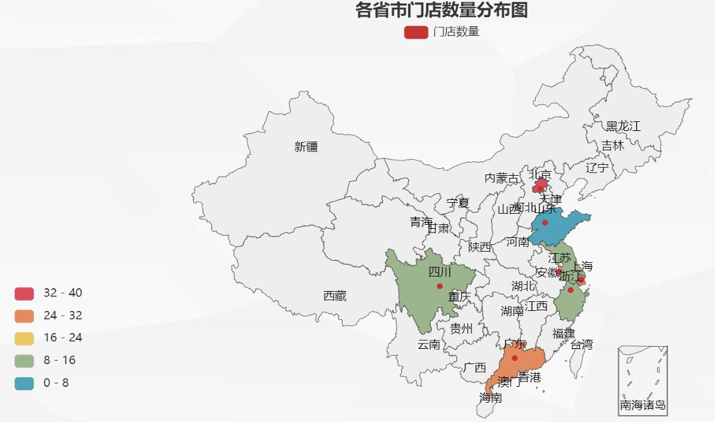
系列配置项
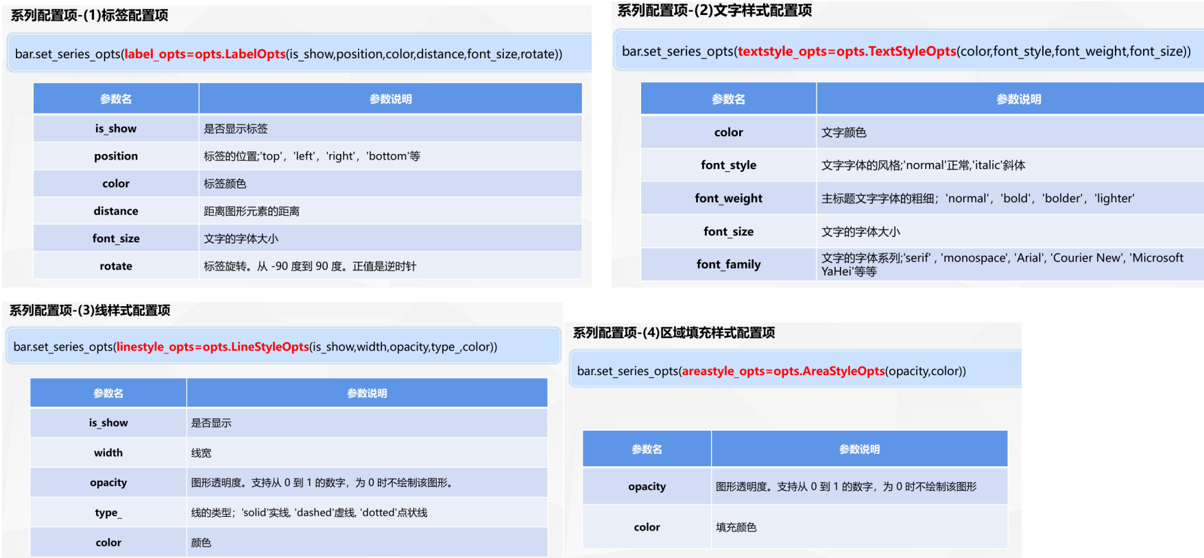
请使用全局配置项和系列配置项进行调整:
线样式设置为True;颜色设置为红色;文字的字体大小设置为10
python
#引入柱状图及配置项
from pyecharts.charts import Bar,Line
from pyecharts.options import global_options,series_options
#初始化柱状图
line = Line(init_opts=opts.InitOpts(width='1000px',height='600px',theme='light'))
#添加x轴及y轴数据
line.add_xaxis(['1月', '2月', '3月', '4月'])
line.add_yaxis('线上', [13000, 12000, 15000, 14500],
               linestyle_opts=opts.LineStyleOpts(width=5,opacity=0.4),
               areastyle_opts=opts.AreaStyleOpts(color='blue',opacity=0.4))
line.add_yaxis('线下销售量', [8000, 7600, 7500, 8200],
               linestyle_opts=opts.LineStyleOpts(width=5,opacity=0.4,type_='dotted'),
               areastyle_opts=opts.AreaStyleOpts(color='green',opacity=0.4))
#设置全局配置项
line.set_global_opts(title_opts=opts.TitleOpts(title='主标题名-线上线下销售量柱状图',
                                               pos_left ='center',item_gap=10),#标题配置项
                    legend_opts=opts.LegendOpts(pos_top=25))  #图例配置项
#系列配置项
line.set_series_opts(label_opts=opts.LabelOpts(is_show=True,color='red',font_size=10))
#显示折线图
line.render_notebook()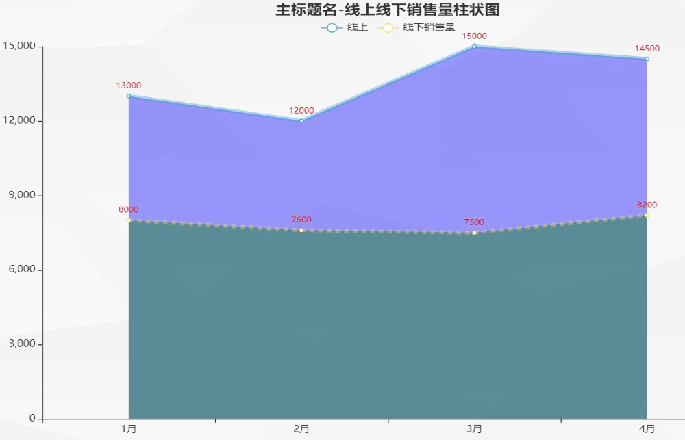
组合图形绘制
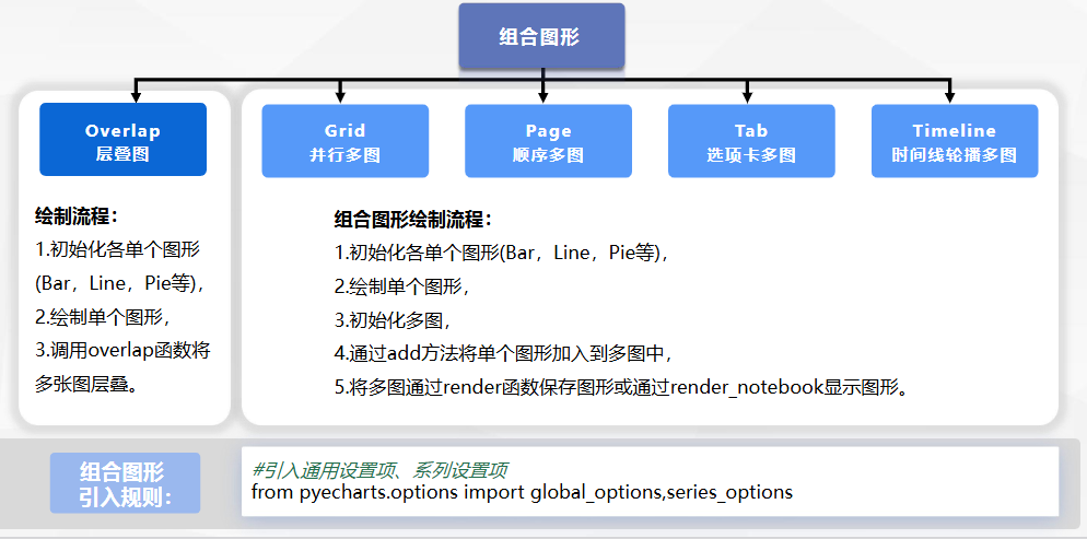
层叠多图
示例数据
1.数据包含店铺10个款号的销售数据。
2.数据包含款号、商品价格、访客数、支付买家数、加入购物车件数、销售数量、商品库存7个字段。
3.通过各类图形进行销售数据的可视化分析。
读取Excel文件门店销售数据.xlsx
python
# 引入pandas
import pandas as pd
# 读取并查看数据:
df = pd.read_excel(r'https://oss.xinchanjiao.com/upload/default/20220804-269363e4-d846-4457-94f7-b34dc3e10b40.xlsx')
#查看数据,显示前十行
df.head(10)
#导入所需库
from pyecharts import options as opts
from pyecharts.charts import Bar, Line
#准备数据
x = df['款号'].tolist()
y1 = df['加入购物车件数'].tolist()
y2 = df['销售数量'].tolist()
y3 = df['访客数'].tolist()
#绘制柱状图
#通过链式调用的方式增加数据和配置项
bar = (
    Bar(init_opts=opts.InitOpts(theme='light'))
    .add_xaxis(x)
    .add_yaxis("加购件数", y1)
    .add_yaxis("销售数量", y2)
    .extend_axis(yaxis=opts.AxisOpts(name='人数',
                axislabel_opts=opts.LabelOpts(interval=5)))#增加第二个y轴
    .set_global_opts(
        title_opts=opts.TitleOpts(title="层叠图-加购件数&销售量&访客数"),
        yaxis_opts=opts.AxisOpts(name='数量'),
        xaxis_opts=opts.AxisOpts(name='款号'))
    .set_series_opts(label_opts=opts.LabelOpts(is_show=False)))
#绘制折线图
line =( Line(init_opts=opts.InitOpts(theme='light'))
       .add_xaxis(x)
       .add_yaxis("访客数", y3,
                  yaxis_index=1,#多轴情况下,索引初始值都为0按顺序排序
                  linestyle_opts=opts.LineStyleOpts(width=5,
                                                    color='red',
                                                    type_='dashed',
                                                    opacity=0.3))
       .set_series_opts(label_opts=opts.LabelOpts(is_show=False)))
#柱状图层叠折线图
bar.overlap(line)
#显示柱状图
bar.render_notebook()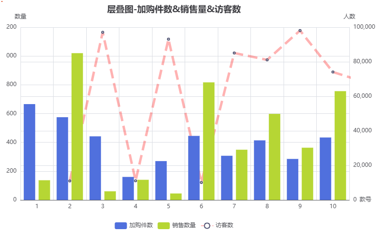
Grid并行多图
绘制各款号加购件数、销售数量柱状图,访客数折线图,使用Grid并行多图纵向显示。
python
#导入所需库
from pyecharts import options as opts
from pyecharts.charts import Bar,Line,Grid  #可一次性导入多个图表
#准备数据
x = df['款号'].tolist()
y1 = df['加入购物车件数'].tolist()
y2 = df['销售数量'].tolist()
y3 = df['访客数'].tolist()
#绘制柱状图
#通过链式调用的方式增加数据和配置项
bar = (Bar()
       .add_xaxis(x)
       .add_yaxis("加购件数", y1)
       .add_yaxis("销售数量", y2)
       .set_global_opts(title_opts=opts.TitleOpts(
                                title="加购件数&销售量柱状图"),
                                yaxis_opts=opts.AxisOpts(name='数量'),
                                xaxis_opts=opts.AxisOpts(name='款号')))
#绘制折线图
line = (Line()
        .add_xaxis(x)
        .add_yaxis("访客数",y3,linestyle_opts=opts.LineStyleOpts(
                                          width=3, color='red', type_='dashed'))
        .set_global_opts(title_opts=opts.TitleOpts(
            title="访客数折线图", pos_top="48%"),
            legend_opts=opts.LegendOpts(pos_top="48%"),
            yaxis_opts=opts.AxisOpts(name='人数'),
            xaxis_opts=opts.AxisOpts(name='款号')))
#创建grid并行多图
grid = Grid()
#将柱状图放在上方
grid.add(bar, grid_opts=opts.GridOpts(pos_bottom="60%"))
#将折线图放在下方
grid.add(line, grid_opts=opts.GridOpts(pos_top="60%"))
#显示图形
grid.render_notebook()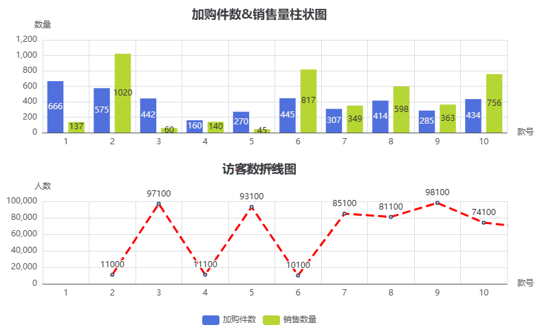
Page顺序多图
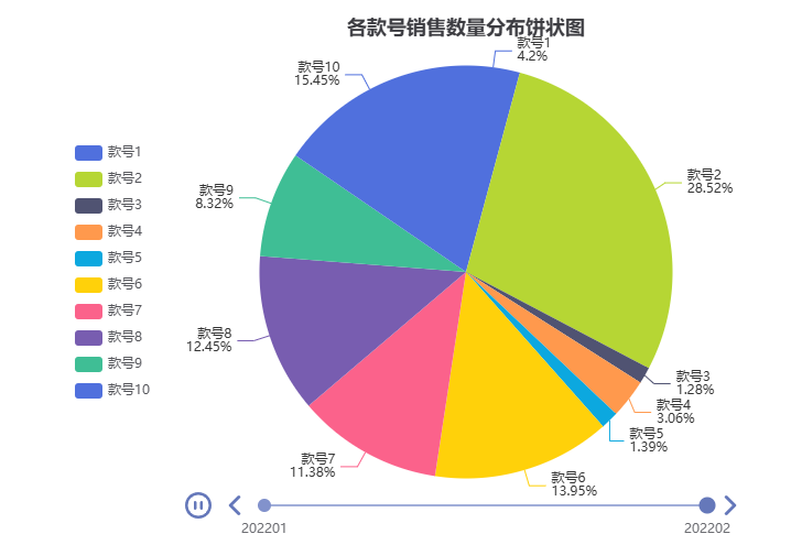
绘制库存数量柱状图及销售数量饼状图后,与任务2中并行多图组成顺序多图。
python
#绘制柱状图
#导入所需库
from pyecharts import options as opts
from pyecharts.charts import Bar
#准备数据
x = df['款号'].tolist()
y1 = df['库存数量'].tolist()
bar1 = (
    Bar(init_opts=opts.InitOpts(theme='roma'))
    .add_xaxis(x)
    .add_yaxis("库存数量", y1)
    .set_global_opts(
        title_opts=opts.TitleOpts(title="库存数量柱状图"),
        yaxis_opts=opts.AxisOpts(name='数量'),
        xaxis_opts=opts.AxisOpts(name='款号')))
bar1.render_notebook()
#绘制销售数量饼状图
#导入所需库
from pyecharts import options as opts
from pyecharts.charts import Pie
#准备数据,将Series转换为pyecharts需要的格式
style = df['款号'].tolist()
sale = df['销售数量'].tolist()
#通过zip函数,将数据转变为Pie图形需要的格式 [(key1, value1), (key2, value2)]
data = [z for z in zip([f'款号{i}'for i in style],sale)]
#绘制各款号销售数量分布饼状图
pie = (Pie().add('',data)
       .set_global_opts(title_opts=opts.TitleOpts(title='各款号销售数量分布饼状图',
                                                  pos_left='center'),
                        legend_opts=opts.LegendOpts(orient='vertical',
                                                    pos_left='10%',
                                                    pos_top='middle'))
       .set_series_opts(label_opts=opts.LabelOpts(formatter='{b}\n{d}%')))
#显示饼状图
pie.render_notebook()
#导入Page顺序多图
from pyecharts.charts import Page
#初始化Page顺序多图,并使用DraggablePageLayout:可拖拽布局方式
page = Page(layout=Page.DraggablePageLayout)
#将库存数量柱状图bar1、销售数量饼状图pie,并行多图grid增加到Page中
page.add(pie,bar1,grid)
#保存Page,命名为门店经营情况.html
page.render("门店经营情况.html")
后续操作
1、在jupyterhub主界面下载已经保存的'门店经营情况.html',根据可视化需求调整各图形的位置(可任意缩放大小),调节好后点击左上角'Save Config'按钮保存'chart_config.json'文件。
2、点击"SaveConfig"后会在此网页上下载一个chart_config.json已经调整好布局的配置文件(确定的各子图位置及大小),将该文件上传至jupyter文件夹后,按以下代码操作:
#生成调整后的html文件
python
Page.save_resize_html('门店经营情况.html', cfg_file='./chart_config.json',
                      dest='门店经营情况-调整布局后.html')
#生成后在jupyterhub主界面可查看'门店经营情况-调整布局后.html'文件。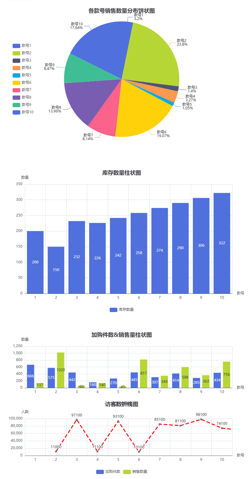
Tab选项卡多图
python
#导入Tab顺序多图
from pyecharts.charts import Tab
#初始化tab选项卡多图
tab = Tab()
#将销售数量饼状图pie增加到Tab中
tab.add(pie,'销售数量饼图')
#将库存数量柱状图bar1增加到Tab中
tab.add(bar1,'库存数量柱状图')
#将并行多图grid增加到Tab中
tab.add(grid,'加购数量销售数量访客数顺序多图')
#显示tab
tab.render_notebook()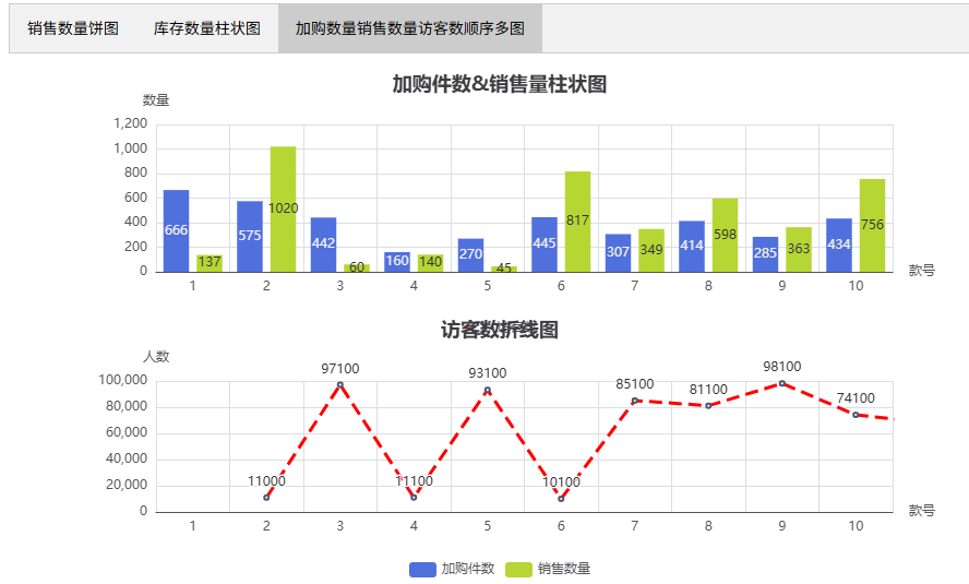
timeline时间线多图
python
#引入pandas库
import pandas as pd
#读取并查看数据
df1 = pd.read_excel(r'https://oss.xinchanjiao.com/upload/default/20220804-269363e4-d846-4457-94f7-b34dc3e10b40.xlsx',sheet_name=1,converters={'款号':str})
df1.head(10)
#导入所需库
from pyecharts import options as opts
from pyecharts.charts import Pie,Timeline
#准备数据,将Series转换为pyecharts需要的格式
style = df['款号'].tolist()
sale_202201 = df1['销售数量_202201'].tolist()
sale_202202 = df1['销售数量_202202'].tolist()
#通过zip函数,将数据转变为Pie图形需要的格式 [(key1, value1)]
data_202201 = [z1 for z1 in zip([f'款号{i}'for i in style],sale_202201)]
data_202202 = [z2 for z2 in zip([f'款号{i}'for i in style],sale_202202)]
#绘制202201各款号销售数量分布饼状图
pie_202201 = (Pie()
       .add('',data_202201)
       .set_global_opts(title_opts=opts.TitleOpts(title='各款号销售数量分布饼状图',pos_left='center'),
                        legend_opts=opts.LegendOpts(orient='vertical',pos_left='10%',pos_top='middle'))
       .set_series_opts(label_opts=opts.LabelOpts(formatter='{b}\n{d}%'))
)
#绘制202202各款号销售数量分布饼状图
pie_202202 = (Pie()
       .add('',data_202202)
       .set_global_opts(title_opts=opts.TitleOpts(title='各款号销售数量分布饼状图',pos_left='center'),
                        legend_opts=opts.LegendOpts(orient='vertical',pos_left='10%',pos_top='middle'))
       .set_series_opts(label_opts=opts.LabelOpts(formatter='{b}\n{d}%'))
)
#初始化Timeline选项卡多图
tl = Timeline()
#将202201各款号销售数量分布饼状图加到Timeline中
tl.add(pie_202201,'202201')
#将202202各款号销售数量分布饼状图加到Timeline中
tl.add(pie_202202,'202202')
#显示Timeline选项卡多图
tl.render_notebook()