动态主从图表是什么图表?
------双图联动的时间序列图表(主图 + 明细图)
- 上方大图 :明细图,显示选中区间的详细数据
- 下方小图 :主图,显示全部数据 ,可拖拽选择区间
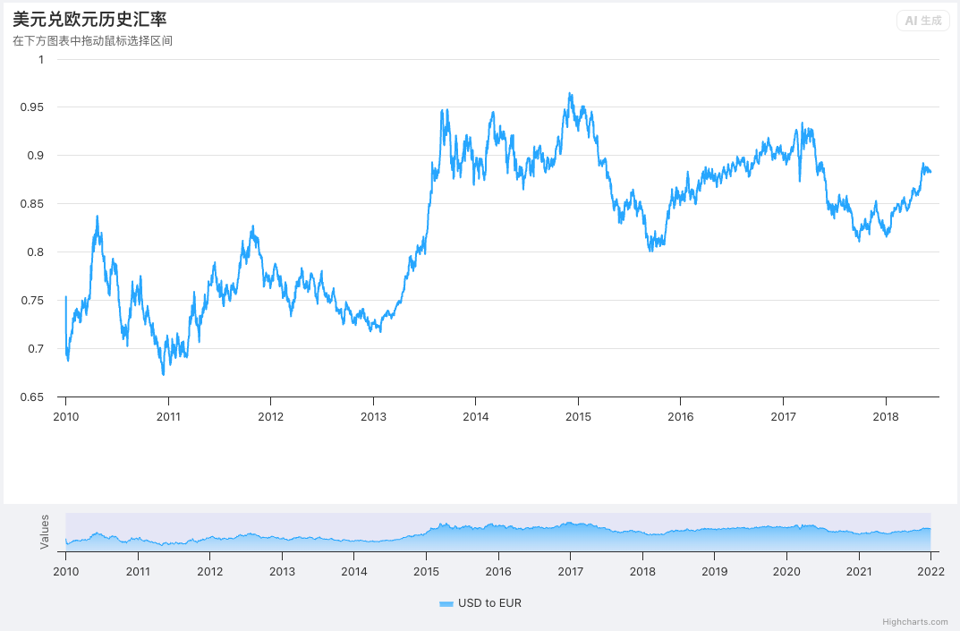
这是 主图 + 明细图联动(拖拽选择区间,上方图表自动放大显示)的经典 Highcharts 案例。
图表显示如何添加第二个图表,以接近Highcharts中的股票导航功能。单击并拖动下方图表以放大上方图表。
HTML全代码:保存为 HTML → 打开就能用
html
<!DOCTYPE html>
<html lang="zh-CN">
<head>
    <meta charset="UTF-8">
    <meta name="viewport" content="width=device-width, initial-scale=1.0">
    <title>美元欧元汇率 - 主图+明细图联动</title>
    <style>
        #container {
            width: 100%;
            height: 700px;
            position: relative;
        }
        #detail-container {
            height: 80%;
        }
        #master-container {
            height: 20%;
            position: absolute;
            bottom: 0;
            left: 0;
            right: 0;
        }
    </style>
    <script src="https://code.highcharts.com/highcharts.js"></script>
</head>
<body>
    <div id="container"></div>

<script>
(async () => {
    // 1. 加载美元兑欧元汇率历史数据
    const data = await fetch(
        'https://www.highcharts.com/samples/data/usdeur.json'
    ).then(response => response.json());

    let detailChart; // 上方明细图表

    // ==============================================
    // 2. 创建【上方明细图表】:显示选中区间的详细曲线
    // ==============================================
    function createDetail(masterChart) {
        const detailData = [];
        const detailStart = data[0][0]; // 数据起始时间

        // 提取主图中需要显示到明细图的数据
        masterChart.series[0].data.forEach(point => {
            if (point.x >= detailStart) {
                detailData.push(point.y);
            }
        });

        // 初始化明细图表
        detailChart = Highcharts.chart('detail-container', {
            chart: {
                marginBottom: 120,
                reflow: false,
                marginLeft: 60,
                marginRight: 20,
                style: { position: 'absolute' }
            },
            credits: { enabled: false }, // 隐藏版权
            title: {
                text: '美元兑欧元历史汇率',
                align: 'left'
            },
            subtitle: {
                text: '在下方图表中拖动鼠标选择区间',
                align: 'left'
            },
            xAxis: { type: 'datetime' }, // 时间轴
            yAxis: {
                title: { text: null },
                maxZoom: 0.1
            },
            // 悬浮提示框
            tooltip: {
                format: '<b>{series.name}</b><br/>{x:%a, %b %e, %Y}:<br/>1 USD = {y:.2f} EUR',
                shared: true
            },
            legend: { enabled: false },
            // 数据点样式
            plotOptions: {
                series: {
                    marker: {
                        enabled: false,
                        states: { hover: { enabled: true, radius: 3 } }
                    }
                }
            },
            // 数据系列
            series: [{
                name: 'USD to EUR',
                pointStart: detailStart,
                pointInterval: 24 * 3600 * 1000, // 一天一个点
                data: detailData
            }],
            exporting: { enabled: false }
        });
    }

    // ==============================================
    // 3. 创建【下方主图表】:可拖拽选择时间区间
    // ==============================================
    function createMaster() {
        const maskFill = 'rgba(0,0,255,0.05)'; // 未选中区域半透明遮罩

        Highcharts.chart('master-container', {
            chart: {
                reflow: false,
                borderWidth: 0,
                backgroundColor: null,
                marginLeft: 60,
                marginRight: 20,
                zooming: { type: 'x' }, // 横向缩放

                // ==============================
                // 核心:拖拽选择区间触发事件
                // ==============================
                selection: function (event) {
                    const min = event.xAxis[0].min;
                    const max = event.xAxis[0].max;
                    const detailData = [];

                    // 提取选中区间内的数据
                    this.series[0].data.forEach(point => {
                        if (point.x > min && point.x < max) {
                            detailData.push([point.x, point.y]);
                        }
                    });

                    // 更新遮罩层(未选中区域变灰)
                    const xAxis = this.xAxis[0];
                    xAxis.removePlotBand('mask-before');
                    xAxis.addPlotBand({
                        id: 'mask-before',
                        from: data[0][0],
                        to: min,
                        color: maskFill
                    });
                    xAxis.removePlotBand('mask-after');
                    xAxis.addPlotBand({
                        id: 'mask-after',
                        from: max,
                        to: data[data.length - 1][0],
                        color: maskFill
                    });

                    // 将选中数据更新到上方明细图
                    detailChart.series[0].setData(detailData);
                    return false;
                }
            },
            title: { text: null },
            xAxis: {
                type: 'datetime',
                maxZoom: 14 * 24 * 3600000, // 最小14天
                plotBands: [{
                    id: 'mask-before',
                    from: data[0][0],
                    to: data[data.length - 1][0],
                    color: maskFill
                }]
            },
            yAxis: {
                gridLineWidth: 0,
                labels: { enabled: false },
                min: 0.6
            },
            plotOptions: {
                series: {
                    fillColor: {
                        linearGradient: [0, 0, 0, 70],
                        stops: [
                            [0, Highcharts.getOptions().colors[0]],
                            [1, 'rgba(255,255,255,0)']
                        ]
                    },
                    lineWidth: 1,
                    marker: { enabled: false },
                    enableMouseTracking: false
                }
            },
            series: [{
                type: 'area',
                name: 'USD to EUR',
                pointInterval: 24 * 3600 * 1000,
                pointStart: data[0][0],
                data: data
            }],
            exporting: { enabled: false }
        }, createDetail); // 创建完成后 → 初始化明细图
    }

    // ==============================================
    // 4. 创建两个图表容器(上方明细 + 下方主图)
    // ==============================================
    const container = document.getElementById('container');
    container.style.position = 'relative';
    container.innerHTML = `
        <div id="detail-container"></div>
        <div id="master-container"></div>
    `;

    // 启动:先创建主图
    createMaster();
})();
</script>
</body>
</html>
核心功能
✅ 你在下方图表拖动鼠标
✅ 上方图表自动放大显示该段数据
✅ 未选中区域自动变灰(遮罩层)
✅ 实时切换、无刷新、流畅交互
这是金融、股票、气象、监控仪表盘最常用的交互模式。
技术亮点
- 异步加载远程 JSON
- 双图表联动通信
- 拖拽选区(selection 事件)
- 动态更新数据
- 遮罩层高亮选中区间
- 时间轴格式化
- 悬浮提示美观
适用场景
- 股票 K 线、走势图
- 汇率、价格监控
- 服务器监控、温度监控
- 任何需要区间放大查看的图表