主轴方向和对齐方式
使用 flex-direction 改变元素排列方式,主轴默认是水平方向,侧轴默认是垂直方向,修改主轴的方向属性 :
- row :行,水平,默认值
- column :列,垂直
- row-reverse :行,从右向左
- column-reverse :列,从下向上
flex-direction: column; 示例:
启用 flex 布局模型,修改主轴方向为 列 ,则侧轴自动转换为横轴

HTML
    <style>
      .icon-xihuan {
        width: 30px;
        height: 30px;
        color: red;
      }
      .box {
        display: flex;
        flex-direction: column;
        width: 100px;
        height: 100px;
        border: 1px solid #000;
      }
    </style>

  <body>
    <div class="box">
      <span class="iconfont icon-xihuan"></span>
      <span>爱心</span>
    </div>
  </body>
先修改主轴为列,再实现盒子水平居中
当 主轴 修改为 列 之后,此时的 侧轴 就变为 横轴 了,要实现 水平居中 ,就要设置侧轴居中对齐 :

HTML
    <style>
      .icon-xihuan {
        width: 30px;
        height: 30px;
        color: red;
      }
      .box {
        display: flex;
        flex-direction: column;
        align-items: center;
        width: 100px;
        height: 100px;
        border: 1px solid #000;
      }
    </style>
先修改主轴为列,再实现盒子垂直居中
当 主轴 修改为 列 之后,要实现 垂直居中 ,就要设置主轴居中对齐,因为此时的 主轴 就是 竖轴 :

HTML
    <style>
      .icon-xihuan {
        width: 30px;
        height: 30px;
        color: red;
      }
      .box {
        display: flex;
        flex-direction: column;
        justify-content: center;
        width: 100px;
        height: 100px;
        border: 1px solid #000;
      }
    </style>
结合以上两个例子,实现居中

HTML
    <style>
      .icon-xihuan {
        width: 30px;
        height: 30px;
        color: red;
      }
      .box {
        display: flex;
        flex-direction: column;
        justify-content: center;
        align-items: center;
        width: 100px;
        height: 100px;
        border: 1px solid #000;
      }
    </style>
弹性盒子换行
默认情况下,多个弹性盒子沿主轴排列,都在同一行显示, 子级尺寸默认弹性伸缩 :

HTML
<style>
.box {
display: flex;
height: 200px;
border: 1px solid #000;
}
.box div{
width: 100px;
height: 100px;
background-color: rgb(189, 189, 247);
}
</style>
<body>
<div class="box">
<div>1</div>
<div>2</div>
<div>3</div>
<div>4</div>
<div>5</div>
<div>6</div>
<div>7</div>
<div>8</div>
</div>
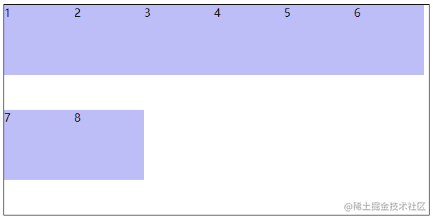
</body>使用 flex-wrap 可以实现弹性盒子 多行 排列效果,弹性盒子换行显示属性:flex-wrap:wrap;,默认不换行 flex-wrap:nowrap

HTML
<style>
.box {
display: flex;
flex-wrap: wrap;
height: 300px;
border: 1px solid #000;
}
.box div{
width: 100px;
height: 100px;
background-color: rgb(189, 189, 247);
}
</style>调整 行对齐 方式用 align-content 属性,其取与 justify-content 基本相同,但没有 space-evenly

HTML
    <style>
      .box {
        display: flex;
        flex-wrap: wrap;
        align-content: space-around;

        height: 300px;
        border: 1px solid #000;
      }
      .box div{
        width: 100px;
        height: 100px;
        background-color: rgb(189, 189, 247);
      }
    </style>