版本:5.9
第一种: 使用 PyQt5 和 Matplotlib 库
安装所需的库:
pip install PyQt5 matplotlib创建和显示图表:
import sys
import numpy as np
import matplotlib.pyplot as plt
from PyQt5.QtWidgets import QApplication, QMainWindow
from matplotlib.backends.backend_qt5agg import FigureCanvasQTAgg as FigureCanvas

class PlotCanvas(FigureCanvas):

    def __init__(self, parent=None):
        fig, self.ax = plt.subplots()
        super(PlotCanvas, self).__init__(fig)
        self.setParent(parent)
        self.plot()

    def plot(self):
        # Example data
        x = np.linspace(0, 10, 1000)
        y = np.sin(x) * 1000

        self.ax.fill_between(x, y, where=(y > 0), interpolate=True, color='red', alpha=0.5)
        self.ax.fill_between(x, y, where=(y <= 0), interpolate=True, color='blue', alpha=0.5)

        self.ax.axhline(0, color='black', linewidth=0.5)
        self.ax.set_xlabel('Time')
        self.ax.set_ylabel('Power (MW)')
        self.ax.set_title('Power Output')

        self.draw()

class MainWindow(QMainWindow):
    def __init__(self):
        super().__init__()
        self.setWindowTitle("Power Output Graph")
        self.setGeometry(100, 100, 800, 600)

        self.canvas = PlotCanvas(self)
        self.setCentralWidget(self.canvas)

app = QApplication(sys.argv)
main = MainWindow()
main.show()
sys.exit(app.exec_())
上面的代码创建了一个包含两个区域(红色和蓝色)的图表,表示功率输出为正值或负值。您可以将 x 和 y 数据替换为您的实际数据,并根据需要调整图表的标签和标题。
请运行此代码来查看生成的图表。这个示例假定您使用的是 Python,并且已安装 PyQt5 和 Matplotlib 库。
第二种:使用 Qt5 和 QCustomPlot 库
确保已经安装QCustomPlot 库,如果你还没有安装,可以从 QCustomPlot 官方网站 下载,并将其包含到你的 Qt 项目中。
自取链接:链接:https://pan.baidu.com/s/1CHe1wN5rhQAPd8bcyvlRfQ?pwd=1024
提取码:1024
以下是完整demo:
main.cpp:
#include <QApplication>
#include <QMainWindow>
#include "qcustomplot.h"

void setupPlot(QCustomPlot *customPlot) {
    // Create data
    QVector<double> x(1001), y(1001); // initialize with entries 0..1000
    for (int i = 0; i < 1001; ++i) {
        x[i] = i / 50.0 - 10; // x goes from -10 to 10
        y[i] = qSin(x[i]) * 1000; // let's plot a sine wave
    }

    // Create graph and assign data to it:
    QCPGraph *graph = customPlot->addGraph();
    graph->setData(x, y);

    // Set axis labels:
    customPlot->xAxis->setLabel("Time");
    customPlot->yAxis->setLabel("Power (MW)");

    // Set axis ranges to show the data:
    customPlot->xAxis->setRange(-10, 10);
    customPlot->yAxis->setRange(-1500, 1500);

    // Set fill color:
    QCPGraph *negativeGraph = customPlot->addGraph();
    negativeGraph->setData(x, y);
    negativeGraph->setPen(Qt::NoPen);
    negativeGraph->setBrush(QBrush(QColor(255, 0, 0, 100))); // Red color for positive values

    QCPGraph *positiveGraph = customPlot->addGraph();
    positiveGraph->setData(x, y);
    positiveGraph->setPen(Qt::NoPen);
    positiveGraph->setBrush(QBrush(QColor(0, 0, 255, 100))); // Blue color for negative values

    for (int i = 0; i < y.size(); ++i) {
        if (y[i] > 0) {
            y[i] = 0;
        }
    }
    negativeGraph->setData(x, y);

    for (int i = 0; i < y.size(); ++i) {
        if (y[i] < 0) {
            y[i] = 0;
        }
    }
    positiveGraph->setData(x, y);

    customPlot->replot();
}

int main(int argc, char *argv[]) {
    QApplication app(argc, argv);
    QMainWindow window;
    QCustomPlot customPlot;

    setupPlot(&customPlot);

    window.setCentralWidget(&customPlot);
    window.resize(800, 600);
    window.show();

    return app.exec();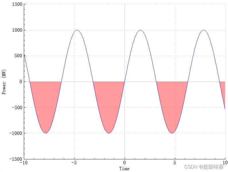
}-
创建一个
qcustomplot.h和qcustomplot.cpp文件,并从 QCustomPlot 官方网站 下载最新版本的 QCustomPlot 代码,然后将其包含在你的项目中。 -
在你的项目文件中(例如
CMakeLists.txt或*.pro文件),确保包含 QCustomPlot 的头文件和源文件。例如,在*.pro文件中添加以下内容:QT += core gui greaterThan(QT_MAJOR_VERSION, 4): QT += widgets TARGET = your_project_name TEMPLATE = app SOURCES += main.cpp \ qcustomplot.cpp HEADERS += qcustomplot.h -
使用 Qt Creator 打开项目并运行它。
-
这样你就可以看到一个类似于你提供的图像的绘图了。这个示例代码生成了一个正弦波并将其分成两个区域(红色和蓝色),分别表示功率输出的正值和负值。
运行截图:
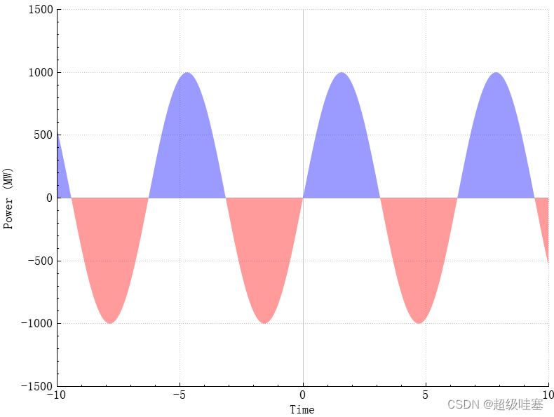
如果想把上下都填充颜色,且上下颜色区分。我们需要分别为正值和负值创建两个图层,并为其填充颜色分别设置为红色和蓝色。还需要确保数据正确的分开填充,以便能显示正确的颜色。
#include <QApplication>
#include <QMainWindow>
#include "qcustomplot.h"

void setupPlot(QCustomPlot *customPlot) {
    // Create data
    QVector<double> x(1001), y(1001), y_positive(1001), y_negative(1001); // initialize with entries 0..1000
    for (int i = 0; i < 1001; ++i) {
        x[i] = i / 50.0 - 10; // x goes from -10 to 10
        y[i] = qSin(x[i]) * 1000; // let's plot a sine wave
        y_positive[i] = (y[i] > 0) ? y[i] : 0; // Only positive values
        y_negative[i] = (y[i] < 0) ? y[i] : 0; // Only negative values
    }

    // Create positive graph and assign data to it:
    QCPGraph *positiveGraph = customPlot->addGraph();
    positiveGraph->setData(x, y_positive);
    positiveGraph->setPen(Qt::NoPen);
    positiveGraph->setBrush(QBrush(QColor(0, 0, 255, 100))); // Blue color for positive values

    // Create negative graph and assign data to it:
    QCPGraph *negativeGraph = customPlot->addGraph();
    negativeGraph->setData(x, y_negative);
    negativeGraph->setPen(Qt::NoPen);
    negativeGraph->setBrush(QBrush(QColor(255, 0, 0, 100))); // Red color for negative values

    // Set axis labels:
    customPlot->xAxis->setLabel("Time");
    customPlot->yAxis->setLabel("Power (MW)");

    // Set axis ranges to show the data:
    customPlot->xAxis->setRange(-10, 10);
    customPlot->yAxis->setRange(-1500, 1500);

    customPlot->replot();
}

int main(int argc, char *argv[]) {
    QApplication app(argc, argv);
    QMainWindow window;
    QCustomPlot customPlot;

    setupPlot(&customPlot);

    window.setCentralWidget(&customPlot);
    window.resize(800, 600);
    window.show();

    return app.exec();
}
分别为正值和负值创建了两个独立的数据集 'y_positive' 和 'y_negative',并将它们添加到两个不同图层中。然后分别设置这些图层的填充颜色。这样既可以保证0轴上方填充为蓝色,下方为红色。
请确保你已经正确地包含了 QCustomPlot 的头文件和源文件,并且在项目文件中添加了对 printsupport 模块的引用:
QT += core gui printsupport

greaterThan(QT_MAJOR_VERSION, 4): QT += widgets

TARGET = chart_test
TEMPLATE = app

SOURCES += main.cpp \
    qcustomplot.cpp

HEADERS += qcustomplot.h
运行效果:
报错解决:qcustomplot.cpp:15260: error: undefined reference to `imp___ZN8QPrinterC1ENS_11PrinterModeE' debug/qcustomplot.o: In function `ZN11QCustomPlot7savePdfERK7QStringiiN3QCP9ExportPenES2_S2': D:\Qt_Projects\My_Demo\build-chart_test-Desktop_Qt_5_15_2_MinGW_32_bit-Debug/../chart_test/qcustomplot.cpp:15260: undefined reference to `_imp___ZN8QPrinterC1ENS_11PrinterModeE'
这个错误通常是由于缺少 Qt 打印模块的链接。为了修复这个问题,需要在项目文件中添加对 Qt 打印支持模块的引用。
QT += printsupport
这个修改确保项目链接了 printsupport 模块,从而解决 QPrinter 的未定义引用问题。