apexcharts数据可视化之极坐标区域图
有完整配套的Python后端代码。
本教程主要会介绍如下图形绘制方式:
- 基础极坐标区域图
- 单色极坐标区域图
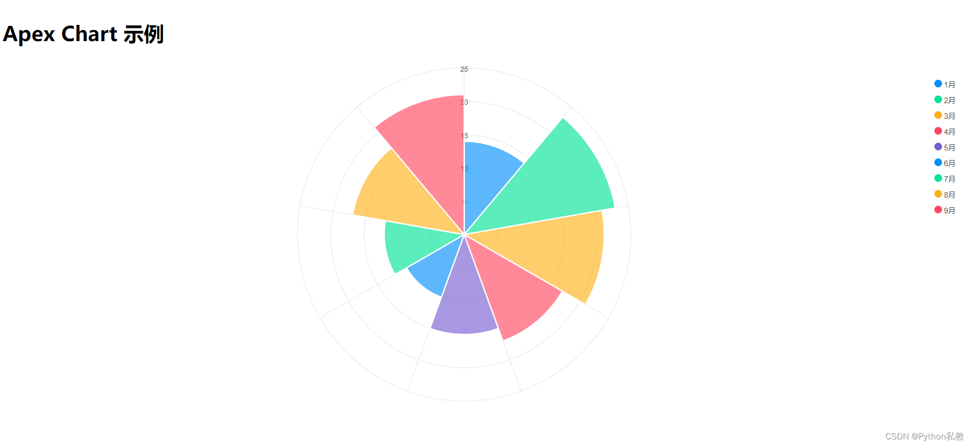
基础极坐标区域图
jsx
import ApexChart from 'react-apexcharts';

export function BasicPolar() {
    // 数据序列
    const series = [14, 23, 21, 17, 15, 10, 12, 17, 21]
    // 图表选项
    const options = {
        chart: {
            type: 'polarArea',
        },
        stroke: {
            colors: ['#fff']
        },
        labels: ["1月", "2月", "3月", "4月", "5月", "6月", "7月", "8月", "9月"],
        fill: {
            opacity: 0.8
        },
        responsive: [{
            breakpoint: 480,
            options: {
                chart: {
                    width: 200
                },
                legend: {
                    position: 'bottom'
                }
            }
        }]
    }
    return (
        <div id="chart">
            <ApexChart options={options} series={series} type="polarArea" height={550}/>
        </div>
    )
}
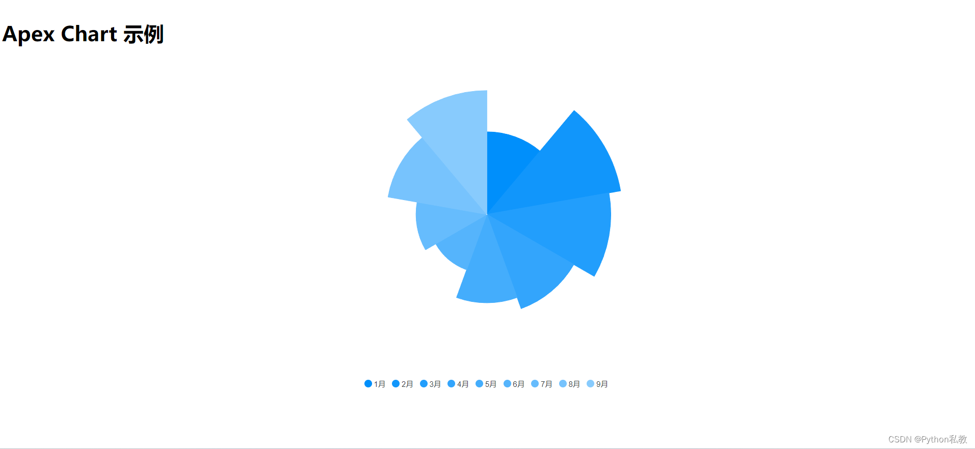
单色极坐标区域图
jsx
import ApexChart from 'react-apexcharts';

export function MonochromePolarArea() {
    // 数据序列
    const series = [14, 23, 21, 17, 15, 10, 12, 17, 21]
    // 图表选项
    const options = {
        chart: {
            type: 'polarArea',
        },
        fill: {
            opacity: 1
        },
        stroke: {
            width: 1,
            colors: undefined
        },
        yaxis: {
            show: false
        },
        legend: {
            position: 'bottom'
        },
        labels: ["1月", "2月", "3月", "4月", "5月", "6月", "7月", "8月", "9月"],
        // 绘制选项
        plotOptions: {
            polarArea: {
                rings: {
                    strokeWidth: 0
                },
                spokes: {
                    strokeWidth: 0
                },
            }
        },
        // 主题
        theme: {
            monochrome: {
                enabled: true,
                shadeTo: 'light',
                shadeIntensity: 0.6
            }
        },
        responsive: [{
            breakpoint: 480,
            options: {
                chart: {
                    width: 200
                },
                legend: {
                    position: 'bottom'
                }
            }
        }]
    }
    return (
        <div id="chart">
            <ApexChart options={options} series={series} type="polarArea" height={550}/>
        </div>
    )
}