文章目录
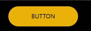
一、动态按钮
<!DOCTYPE html>
<html>
	<head>
		<meta charset="utf-8">
		<title></title>
		<style type="text/css">
			html,
			body {
				background: black;
				height: 100%;
				display: flex;
				align-items: center;
				justify-content: center;
			}

			.circle {
				width: 8px;
				height: 8px;
				border-radius: 50%;
				position: absolute;
				top: 50%;
				left: 50%;
				margin: -4px 0 0 -4px;
				pointer-events: none;
				mix-blend-mode: screen;
				z-index: 10;
				box-shadow: 0px 0px 8px 0px #FDFCA9 inset, 0px 0px 24px 0px #FFEB3B, 0px 0px 8px 0px #FFFFFF42;
			}

			.button-wrapper {
				position: relative;
			}

			.button {
				z-index: 1;
				position: relative;
				text-decoration: none;
				text-align: center;
				appearance: none;
				display: inline-block;
			}

			.button::before {
				content: "";
				box-shadow: 0px 0px 24px 0px #FFEB3B;
				mix-blend-mode: screen;
				transition: opacity 0.3s;

				position: absolute;
				top: 0;
				right: 0;
				left: 0;
				bottom: 0;
				border-radius: 999px;
				opacity: 0;
			}

			.button::after {
				content: "";
				box-shadow: 0px 0px 23px 0px #FDFCA9 inset, 0px 0px 8px 0px #FFFFFF42;
				transition: opacity 0.3s;

				position: absolute;
				top: 0;
				right: 0;
				left: 0;
				bottom: 0;
				border-radius: 999px;
				opacity: 0;
			}

			.button-wrapper:hover {

				.button::before,
				.button::after {
					opacity: 1;
				}

				.dot {
					transform: translate(0, 0) rotate(var(--rotatation));
				}

				.dot::after {
					animation-play-state: running;
				}
			}

			.dot {
				display: block;
				position: absolute;
				transition: transform calc(var(--speed) / 12) ease;
				width: var(--size);
				height: var(--size);
				transform: translate(var(--starting-x), var(--starting-y)) rotate(var(--rotatation));
			}

			.dot::after {
				content: "";
				animation: hoverFirefly var(--speed) infinite, dimFirefly calc(var(--speed) / 2) infinite calc(var(--speed) / 3);
				animation-play-state: paused;
				display: block;
				border-radius: 100%;
				background: yellow;
				width: 100%;
				height: 100%;
				box-shadow: 0px 0px 6px 0px #FFEB3B, 0px 0px 4px 0px #FDFCA9 inset, 0px 0px 2px 1px #FFFFFF42;
			}

			.dot-1 {
				--rotatation: 0deg;
				--speed: 14s;
				--size: 6px;
				--starting-x: 30px;
				--starting-y: 20px;
				top: 2px;
				left: -16px;
				opacity: 0.7;
			}

			.dot-2 {
				--rotatation: 122deg;
				--speed: 16s;
				--size: 3px;
				--starting-x: 40px;
				--starting-y: 10px;
				top: 1px;
				left: 0px;
				opacity: 0.7;
			}

			.dot-3 {
				--rotatation: 39deg;
				--speed: 20s;
				--size: 4px;
				--starting-x: -10px;
				--starting-y: 20px;
				top: -8px;
				right: 14px;
			}

			.dot-4 {
				--rotatation: 220deg;
				--speed: 18s;
				--size: 2px;
				--starting-x: -30px;
				--starting-y: -5px;
				bottom: 4px;
				right: -14px;
				opacity: 0.9;
			}

			.dot-5 {
				--rotatation: 190deg;
				--speed: 22s;
				--size: 5px;
				--starting-x: -40px;
				--starting-y: -20px;
				bottom: -6px;
				right: -3px;
			}

			.dot-6 {
				--rotatation: 20deg;
				--speed: 15s;
				--size: 4px;
				--starting-x: 12px;
				--starting-y: -18px;
				bottom: -12px;
				left: 30px;
				opacity: 0.7;
			}

			.dot-7 {
				--rotatation: 300deg;
				--speed: 19s;
				--size: 3px;
				--starting-x: 6px;
				--starting-y: -20px;
				bottom: -16px;
				left: 44px;
			}

			@keyframes dimFirefly {
				0% {
					opacity: 1;
				}

				25% {
					opacity: 0.4;
				}

				50% {
					opacity: 0.8;
				}

				75% {
					opacity: 0.5;
				}

				100% {
					opacity: 1;
				}
			}

			@keyframes hoverFirefly {
				0% {
					transform: translate(0, 0);
				}

				12% {
					transform: translate(3px, 1px);
				}

				24% {
					transform: translate(-2px, 3px);
				}

				37% {
					transform: translate(2px, -2px);
				}

				55% {
					transform: translate(-1px, 0);
				}

				74% {
					transform: translate(0, 2px);
				}

				88% {
					transform: translate(-3px, -1px);
				}

				100% {
					transform: translate(0, 0);
				}
			}
		</style>
	</head>
	<body>
		<a class="button-wrapper">
			<span class="dot dot-1"></span>
			<span class="dot dot-2"></span>
			<span class="dot dot-3"></span>
			<span class="dot dot-4"></span>
			<span class="dot dot-5"></span>
			<span class="dot dot-6"></span>
			<span class="dot dot-7"></span>
			<span class="button bg-yellow-500 px-16 py-4 rounded-full uppercase">Button<span>
		</a>

		<div id="circle" class="circle bg-yellow-500"></div>
	</body>
	<script type="text/javascript">
		var kinet = new Kinet({
			acceleration: 0.02,
			friction: 0.25,
			names: ["x", "y"],
		});

		var circle = document.getElementById('circle');

		kinet.on('tick', function(instances) {
			circle.style.transform =
				`translate3d(${ (instances.x.current) }px, ${ (instances.y.current) }px, 0) rotateX(${ (instances.x.velocity/2) }deg) rotateY(${ (instances.y.velocity/2) }deg)`;
		});

		document.addEventListener('mousemove', function(event) {
			kinet.animate('x', event.clientX - window.innerWidth / 2);
			kinet.animate('y', event.clientY - window.innerHeight / 2);
		});

		kinet.on('start', function() {
			console.log('start');
		});

		kinet.on('end', function() {
			console.log('end');
		});
	</script>
</html>
二、CSS实例

<!DOCTYPE html>
<html>
	<head>
		<meta charset="utf-8">
		<title></title>
		<style type="text/css">
			.text-effect-wrapper,
			.text {

				&::before,
				&::after {
					content: "";
					position: absolute;
					inset: 0;
					pointer-events: none;
				}
			}

			.text-effect-wrapper {
				--spotlight-color: white;

				overflow: hidden;
				position: relative;

				&::before {
					animation: shimmer 5s infinite linear;
					background:
						radial-gradient(circle, var(--spotlight-color), transparent 25%) 0 0 / 25% 25%,
						radial-gradient(circle, var(--spotlight-color), black 25%) 50% 50% / 12.5% 12.5%;
					inset-block-start: -100%;
					inset-inline-start: -100%;
					mix-blend-mode: color-dodge;
					z-index: 3;
				}

				&::after {
					backdrop-filter: blur(1px) brightness(90%) contrast(150%);
					z-index: 4;
				}
			}

			@keyframes shimmer {
				100% {
					transform: translate3d(50%, 50%, 0);
				}
			}

			.text {
				--background-color: black;
				--text-color: white;

				--color-1: red;
				--color-2: blue;

				color: transparent;
				text-shadow:
					0 0 0.02em var(--background-color),
					0 0 0.02em var(--text-color),
					0 0 0.02em var(--text-color),
					0 0 0.02em var(--text-color);

				&::before {
					backdrop-filter: blur(0.013em) brightness(400%);
					z-index: 1;
				}

				&::after {
					background: linear-gradient(45deg, var(--color-1), var(--color-2));
					mix-blend-mode: multiply;
					z-index: 2;
				}
			}

			body:has(#option-toggle:checked) {
				& .text-effect-wrapper {
					--spotlight-color: orange;

					&::after {
						backdrop-filter: brightness(90%) contrast(150%);
					}
				}

				& .text {
					--angle: 5deg;
					--color-1: hsl(163, 100%, 51%);
					--color-2: hsl(295, 88%, 32%);
					--color-3: hsl(59, 100%, 50%);

					text-shadow:
						0 0 0.03em var(--background-color),
						0 0 0.03em var(--text-color);

					&::before {
						backdrop-filter: brightness(150%) contrast(200%);
					}

					&::after {
						background: linear-gradient(var(--angle), var(--color-1), var(--color-2), var(--color-3));
						mix-blend-mode: color-dodge;
					}
				}
			}


			h1 {
				--font-size: clamp(6.25rem, 3.25rem + 15vw, 13.75rem);

				font: 700 var(--font-size)/1 "Lato", sans-serif;
				text-transform: uppercase;
				text-align: center;
				margin: 0;

				&:empty,
				&:focus {
					border: 2px dotted white;
					min-width: 1ch;
					outline-offset: 5px;
				}
			}

			body {
				background: black;
				display: flex;
				min-height: 100vh;
				justify-content: center;
				align-content: center;
				align-items: center;
			}

			label {
				background-color: hsl(240deg, 20%, 50%);
				border-radius: 5px;
				color: #fff;
				padding: 0.5em 1em;

				position: fixed;
				bottom: 1rem;
				right: 1rem;
				z-index: 1000;

				&:has(:checked) {
					background-color: hsl(350deg, 60%, 50%);
				}
			}

			input {
				position: absolute;
				opacity: 0;
			}
		</style>
	</head>
	<body>
		<div class="text-effect-wrapper">
			<h1 class="text" contenteditable>WanderTp</h1>
		</div>

		<label for="option-toggle">
			<input type="checkbox" id="option-toggle"> Version toggle
		</label>
	</body>
</html>
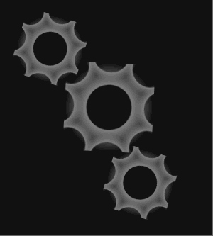
三、滚动的齿轮
<!DOCTYPE html>
<html>
	<head>
		<meta charset="utf-8">
		<title></title>
		<style type="text/css">
			html {
				display: grid;
				place-items: center;
				min-height: 100vh;
				background: #111;
			}

			#machine {
				width: 300px;
				aspect-ratio: 1/1;
				/*   outline: 1px solid black;   */
			}

			.gear {
				width: 100px;
				aspect-ratio: 1/1;
				/*   border-radius: 50%; */
				background:
					radial-gradient(circle at 5% 5%, transparent 20px, gray 21px, transparent 30px),
					radial-gradient(circle at 50% -10px, transparent 20px, gray 21px, transparent 30px),
					radial-gradient(circle at 95% 5%, transparent 20px, gray 21px, transparent 30px),
					radial-gradient(circle at 110px 50%, transparent 20px, gray 21px, transparent 30px),
					radial-gradient(circle at 95% 95%, transparent 20px, gray 21px, transparent 30px),
					radial-gradient(circle at 50% 110px, transparent 20px, gray 21px, transparent 30px),
					radial-gradient(circle at 5% 95%, transparent 20px, gray 21px, transparent 30px),
					radial-gradient(circle at -10px 50%, transparent 20px, gray 21px, transparent 30px),
					radial-gradient(circle at 50% 50%, transparent 25px, gray 26px, transparent 50px);
			}

			.gear:nth-child(1) {
				transform: scale(.75) translate(45%, 45%) rotate(22.5deg);
				animation: roll1 3s linear infinite;
			}

			@keyframes roll1 {
				100% {
					transform: scale(.75) translate(45%, 45%) rotate(-341.5deg);
				}
			}

			.gear:nth-child(2) {
				transform: translateX(100%);
				animation: roll2 3s linear infinite;
			}

			@keyframes roll2 {
				100% {
					transform: translateX(100%) rotate(359deg);
				}
			}

			.gear:nth-child(3) {
				transform: scale(.75) translate(180%, -20%) rotate(22.5deg);
				animation: roll3 3s linear infinite;
			}

			@keyframes roll3 {
				100% {
					transform: scale(.75) translate(180%, -20%) rotate(-341.5deg);
				}
			}
		</style>
	</head>
	<body>
		<div id='machine'>
			<div class='gear'></div>
			<div class='gear'></div>
			<div class='gear'></div>
		</div>
	</body>

</html>