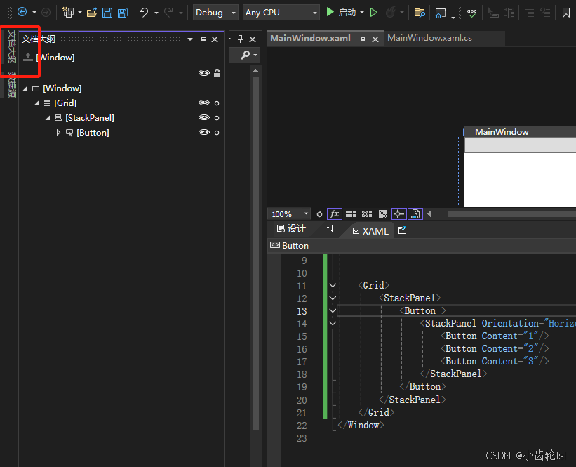
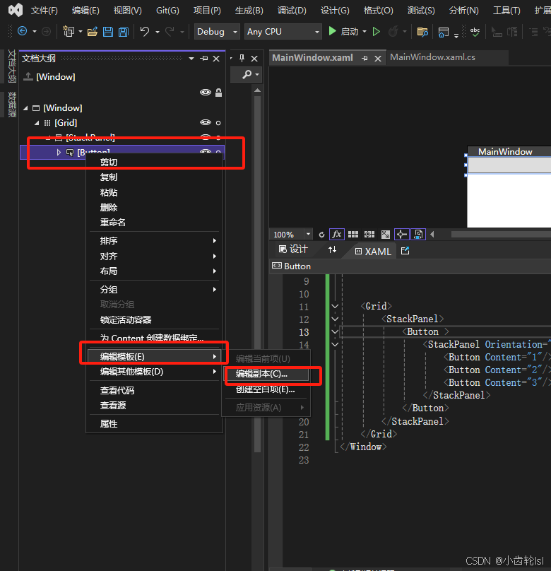
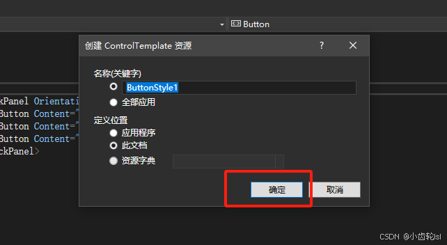
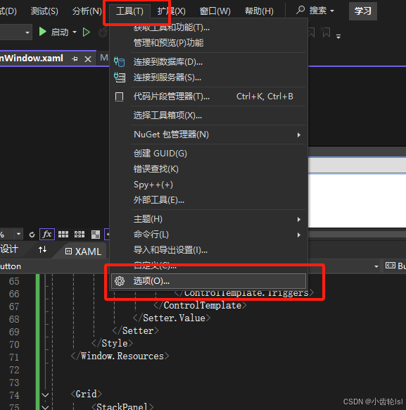
一、操作过程
二、代码
XML
<Window x:Class="学习.MainWindow"
        xmlns="http://schemas.microsoft.com/winfx/2006/xaml/presentation"
        xmlns:x="http://schemas.microsoft.com/winfx/2006/xaml"
        xmlns:d="http://schemas.microsoft.com/expression/blend/2008"
        xmlns:mc="http://schemas.openxmlformats.org/markup-compatibility/2006"
        xmlns:local="clr-namespace:学习"
        mc:Ignorable="d"
        Title="MainWindow" Height="450" Width="800">
    <Window.Resources>
        <Style x:Key="FocusVisual">
            <Setter Property="Control.Template">
                <Setter.Value>
                    <ControlTemplate>
                        <Rectangle Margin="2" StrokeDashArray="1 2" Stroke="{DynamicResource {x:Static SystemColors.ControlTextBrushKey}}" SnapsToDevicePixels="true" StrokeThickness="1"/>
                    </ControlTemplate>
                </Setter.Value>
            </Setter>
        </Style>
        <SolidColorBrush x:Key="Button.Static.Background" Color="#FFDDDDDD"/>
        <SolidColorBrush x:Key="Button.Static.Border" Color="#FF707070"/>
        <SolidColorBrush x:Key="Button.MouseOver.Background" Color="#FFBEE6FD"/>
        <SolidColorBrush x:Key="Button.MouseOver.Border" Color="#FF3C7FB1"/>
        <SolidColorBrush x:Key="Button.Pressed.Background" Color="#FFC4E5F6"/>
        <SolidColorBrush x:Key="Button.Pressed.Border" Color="#FF2C628B"/>
        <SolidColorBrush x:Key="Button.Disabled.Background" Color="#FFF4F4F4"/>
        <SolidColorBrush x:Key="Button.Disabled.Border" Color="#FFADB2B5"/>
        <SolidColorBrush x:Key="Button.Disabled.Foreground" Color="#FF838383"/>
        <Style x:Key="ButtonStyle1" TargetType="{x:Type Button}">
            <Setter Property="FocusVisualStyle" Value="{StaticResource FocusVisual}"/>
            <Setter Property="Background" Value="{StaticResource Button.Static.Background}"/>
            <Setter Property="BorderBrush" Value="{StaticResource Button.Static.Border}"/>
            <Setter Property="Foreground" Value="{DynamicResource {x:Static SystemColors.ControlTextBrushKey}}"/>
            <Setter Property="BorderThickness" Value="1"/>
            <Setter Property="HorizontalContentAlignment" Value="Center"/>
            <Setter Property="VerticalContentAlignment" Value="Center"/>
            <Setter Property="Padding" Value="1"/>
            <Setter Property="Template">
                <Setter.Value>
                    <ControlTemplate TargetType="{x:Type Button}">
                        <Border x:Name="border" Background="{TemplateBinding Background}" BorderBrush="{TemplateBinding BorderBrush}" BorderThickness="{TemplateBinding BorderThickness}" SnapsToDevicePixels="true">
                            <ContentPresenter x:Name="contentPresenter" Focusable="False" HorizontalAlignment="{TemplateBinding HorizontalContentAlignment}" Margin="{TemplateBinding Padding}" RecognizesAccessKey="True" SnapsToDevicePixels="{TemplateBinding SnapsToDevicePixels}" VerticalAlignment="{TemplateBinding VerticalContentAlignment}"/>
                        </Border>
                        <ControlTemplate.Triggers>
                            <Trigger Property="IsDefaulted" Value="true">
                                <Setter Property="BorderBrush" TargetName="border" Value="{DynamicResource {x:Static SystemColors.HighlightBrushKey}}"/>
                            </Trigger>
                            <Trigger Property="IsMouseOver" Value="true">
                                <Setter Property="Background" TargetName="border" Value="{StaticResource Button.MouseOver.Background}"/>
                                <Setter Property="BorderBrush" TargetName="border" Value="{StaticResource Button.MouseOver.Border}"/>
                            </Trigger>
                            <Trigger Property="IsPressed" Value="true">
                                <Setter Property="Background" TargetName="border" Value="{StaticResource Button.Pressed.Background}"/>
                                <Setter Property="BorderBrush" TargetName="border" Value="{StaticResource Button.Pressed.Border}"/>
                            </Trigger>
                            <Trigger Property="IsEnabled" Value="false">
                                <Setter Property="Background" TargetName="border" Value="{StaticResource Button.Disabled.Background}"/>
                                <Setter Property="BorderBrush" TargetName="border" Value="{StaticResource Button.Disabled.Border}"/>
                                <Setter Property="TextElement.Foreground" TargetName="contentPresenter" Value="{StaticResource Button.Disabled.Foreground}"/>
                            </Trigger>
                        </ControlTemplate.Triggers>
                    </ControlTemplate>
                </Setter.Value>
            </Setter>
        </Style>
    </Window.Resources>


    <Grid>
        <StackPanel>
            <Button Style="{DynamicResource ButtonStyle1}" >
                <StackPanel Orientation="Horizontal">
                    <Button Content="1"/>
                    <Button Content="2"/>
                    <Button Content="3"/>
                </StackPanel>
            </Button>
        </StackPanel>
    </Grid>
</Window>
三、代码结果
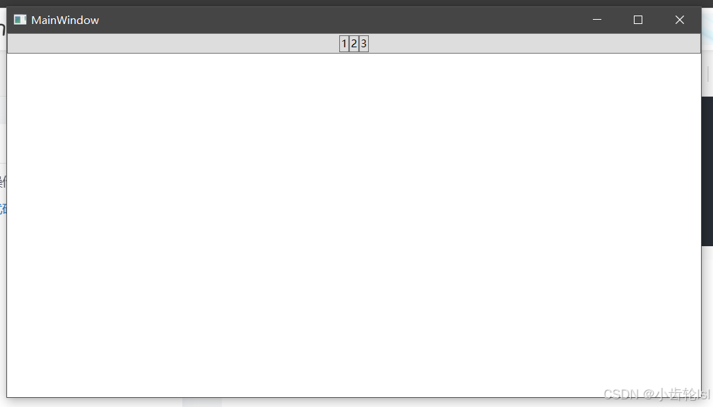
四、总结
通过引用微软库中的Buttton样式代码,可以自定义改变控件的样式,主要是通过改变如下部分。
XML
<ContentPresenter x:Name="contentPresenter"
                  Focusable="False"
                  HorizontalAlignment="{TemplateBinding HorizontalContentAlignment}"
                  Margin="{TemplateBinding Padding}"
                  RecognizesAccessKey="True"
                  SnapsToDevicePixels="{TemplateBinding SnapsToDevicePixels}"
                  VerticalAlignment="{TemplateBinding VerticalContentAlignment}"/>
五、热重载工具
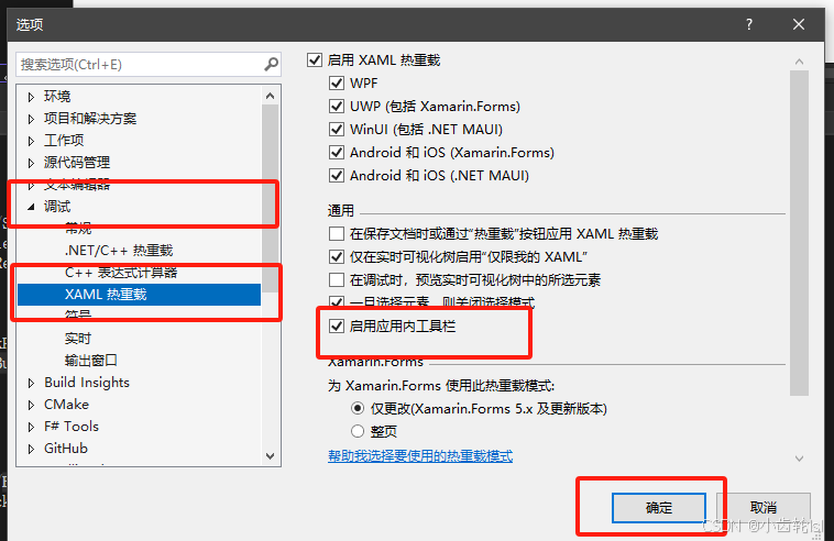
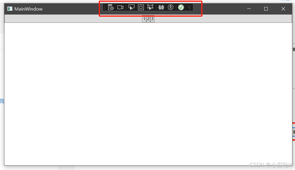
在调试窗口界面上方就可以实现很方便的调试功能。