实现思路
借助echarts.min.js 搭配l-echart进行配置
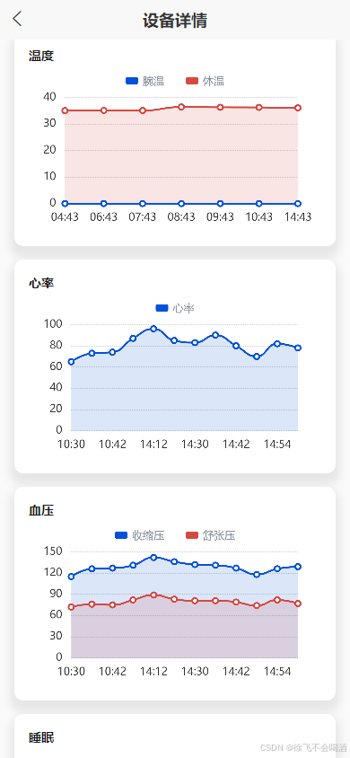
废话不多说上代码后自己百度了解配置项的意思就好
下面代码是折线图的 ,柱状图和它一摸一样,只需要把line换成bar就好
javascript
<template>
  <l-echart ref="chart"></l-echart>
</template>
<script>
import * as echarts from '@/uni_modules/lime-echart/static/echarts.min.js'
export default {
  props: {
		// 以下注释部分是从父组件传递过来的options 这仅仅是一个示例 可以很好的展示ui效果
    options: {
      type: Object,
      default: () => {
        return null
      }
    }
  },
  data() {
    return {
      chart: null
    }
  },
  mounted() {
    this.$nextTick(() => {
      this.initChart()
    })
  },
  watch: {
    options: {
      handler(n) {
        if (n) {
          this.$nextTick(() => {
            this.initChart()
          })
        }
      },
      deep: true
    }
  },
  methods: {
    initChart() {
      const {
        labelX,
        data1,
        data2,
        legends,
        tipLegends,
        legendIcon,
        legendWidth,
        legendColor,
        gridLeft,
        gridRight,
        axisColor,
        splitColor,
        lineColor1,
        lineColor2,
        formatterAfterTextArr
        // labels
      } = this.options

      const series = [
        {
          type: 'line',
          name: (legends && legends[0].name) || tipLegends,
          data: data1,
          symbolSize: 6,
          smooth: true,
          areaStyle: {
            color: 'rgba(' + (lineColor1 || '60, 127, 252') + ', 0.2)'
          },
          lineStyle: {
            color: 'rgba(' + (lineColor1 || '60, 127, 252') + ', 1)'
          },
          itemStyle: {
            color: 'rgba(' + (lineColor1 || '60, 127, 252') + ', 1)'
          }
        }
      ]
      if (data2) {
        series.push({
          type: 'line',
          name: legends && legends[1].name,
          data: data2,
          symbolSize: 6,
          smooth: true,
          areaStyle: {
            color: 'rgba(' + (lineColor2 || '254, 189, 145') + ', 0.2)'
          },
          lineStyle: {
            color: 'rgba(' + (lineColor2 || '254, 189, 145') + ', 1)'
          },
          itemStyle: {
            color: 'rgba(' + (lineColor2 || '254, 189, 145') + ', 1)'
          }
        })
      }
      this.$refs.chart.init(echarts, (chart) => {
        this.chart = chart
        this.chart.setOption({
          animation: false,
          tooltip: {
            trigger: 'axis',
            // 使用mousemove时,左右滑动会导致图表消失
            triggerOn: 'click',
            formatter:
              formatterAfterTextArr && formatterAfterTextArr.length > 0
                ? function (params) {
                    // x轴文字
                    var result = params[0].axisValue + '\n'
                    params.forEach(function (item) {
                      /**
                       * marker:图例样式;
                       * seriesName:series中每一项的name;
                       * value:data数据中value字段
                       * formatterAfterTextArr: value之后需要补充的文字,数组格式
                       * seriesIndex: series数据索引,当有多条series数据时,会自动获取当前选中索引
                       */
                      result += `${item.marker}${item.seriesName}:${item.value}${formatterAfterTextArr[item.seriesIndex]}`
                    })
                    return result
                  }
                : null
          },
          legend: legends && {
						top: '5%', // 控制 板块控制器的位置
						right: 'center',
            data: legends,
            icon: legendIcon || 'roundRect',
            itemWidth: legendWidth || 14,
            itemHeight: 8,
            itemGap: 24, //设置两个legend之间的间距
            textStyle: {
              fontSize: 12,
              color: legendColor || '#69748A',
              padding: [3, 0, 0, 0],
              rich: {}
            }
          },
          grid: {
            left: gridLeft || '5%',
            top: legends ? '20%' : '10%',
            right: gridRight || '8%',
            bottom: '5%',
            containLabel: true
          },
          xAxis: [
            {
              type: 'category',
              boundaryGap: false, // 两端空白
              axisTick: {
                show: false
              },
              axisLine: {
                show: false
              },
              axisLabel: {
                color: axisColor || '#333333',
                fontSize: 12,
								margin: 10
              },
              data: labelX || ['周一', '周二', '周三', '周四', '周五', '周六', '周日'],
            }
          ],
          yAxis: [
            {
              type: 'value',
              minInterval: 1,
              axisTick: {
                show: false
              },
              axisLabel: {
                color: axisColor || '#333333',
                fontSize: 12,
								margin: 10
              },
              axisLine: {
                show: false
              },
              splitLine: {
                lineStyle: {
                  type: 'dashed',
									dashOffset: 20, // 设置虚线的起始偏移量
									gap: 20, // 设置虚线间的距离
                  color: [splitColor || '#ccc']
                },
              },
              splitArea: { show: false }
            }
          ],
          series: series
        })
      })
    }
  }
}
</script>
饼图和柱状图也基本一样 稍微改改就好,很简单。大家可以自己搜索,我这里放的是四个之中相对复杂的,也是摸索了一整子,下面附上效果图,希望能帮到大家。