一、什么是直方图
- 由一批长方形构成,通过长方形的面积或高度来代表对应组在数据中所占的比例。
- 用长方形的面积代表对应组的频数与组距的比时,则称为频率分布直方图;
- 当用长方形的高代表对应组的频数时,则称为频数分布直方图。
- 但严格统计意义上的直方图都是指频率分布直方图 ,而且统计意义上的直方图没有纵向刻度。
二、绘制直方图
三、Python 绘制直方图
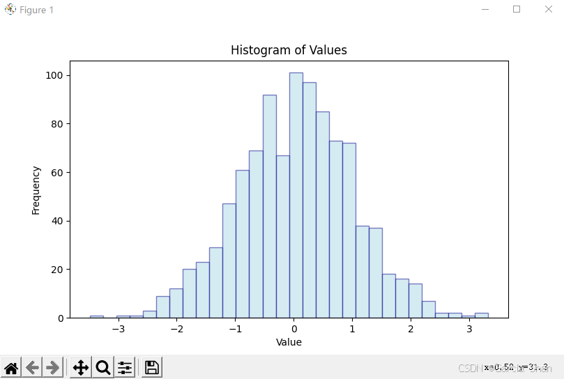
1、使用 pandas 、numpy 和 matplotlib绘制直方图
python
# Using pandas, numpy, matplotlib to draw histograms
import pandas as pd
import numpy as np
import matplotlib.pyplot as plt
import matplotlib

# set the backend of matplotlib to TkAgg
matplotlib.use('TkAgg')

data = pd.DataFrame({
    # Generate 1000 random numbers with a standard normal distribution
    'Values': pd.Series(np.random.randn(1000))
})

# Draw a histogram
data['Values'].plot.hist(bins=30, alpha=0.5, color='lightblue',
                        edgecolor='darkblue')


# set chart title and axis labels
plt.title('Histogram of Values')
plt.xlabel('Value')
plt.ylabel('Frequency')

# display chart
plt.show()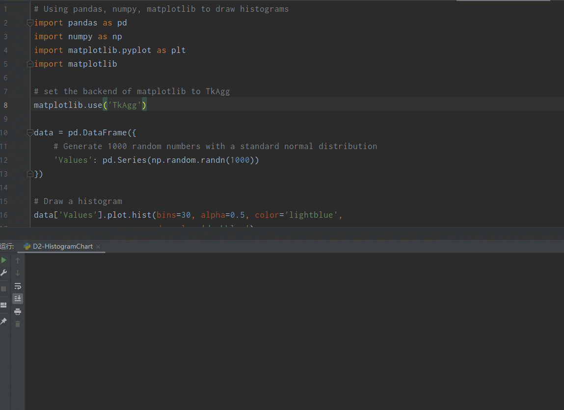
2、使用 pandas 、numpy 和 matplotlib绘制直方图
python
# Using plotly.express to draw histograms
import plotly.express as px
import pandas as pd
import numpy as np
# data = [1, 2, 3, 4, 5, 6, 7, 8, 8, 9, 10, 11, 12, 13, 14, 15, 16, 17]

data = pd.DataFrame({
    'Values': pd.Series(np.random.randn(1000))
})
# Nbins defines the number of boxes in the histogram
fig = px.histogram(data, nbins=80,
                   color_discrete_sequence=['blue'],
                   labels={'Values': 'Value'},
                   title='Histogram of Values',
                   # marginal="box"
                   )

fig.update_traces(
    marker=dict(
        color='lightblue',
        opacity=0.75,
        line=dict(
            color='darkblue',
            width=1
        )
    )
)

# display chart
fig.show()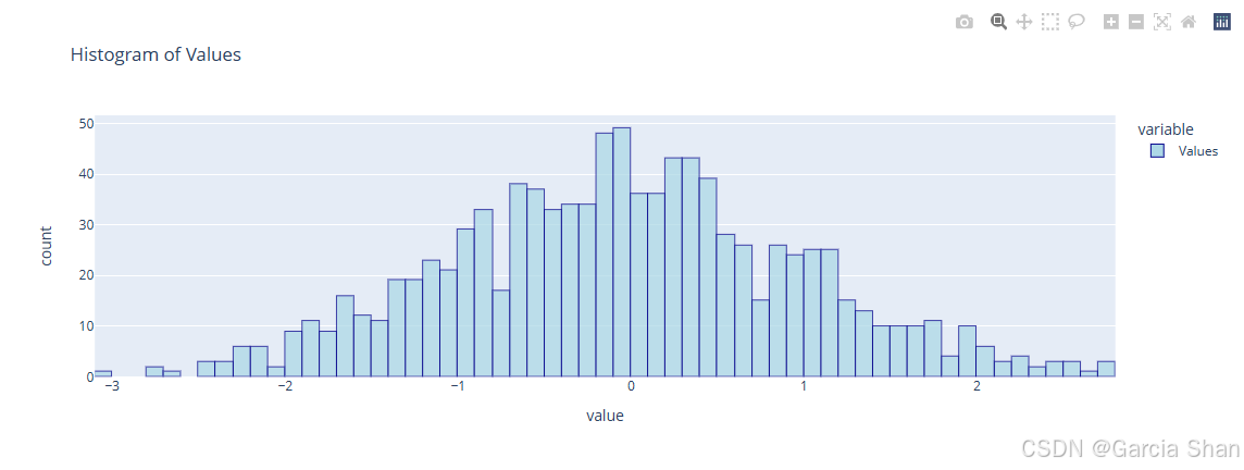
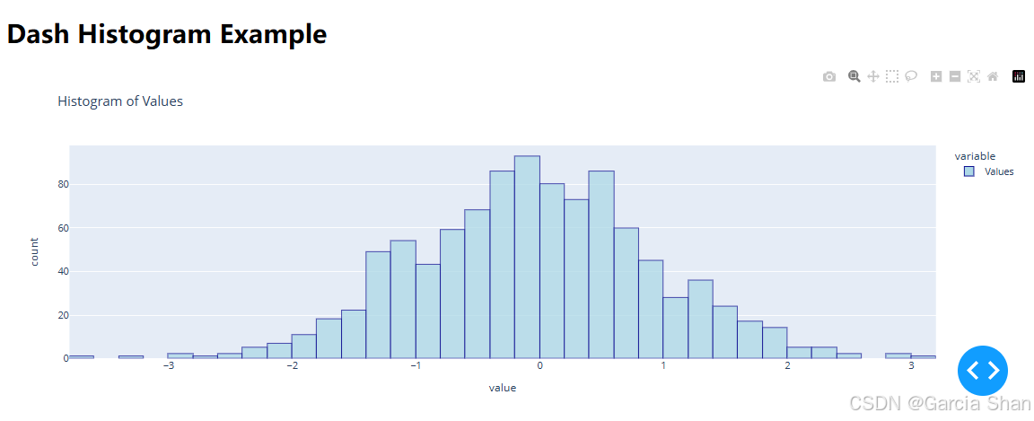
3、使用 pandas 、numpy 、 dash****和 plotly.express绘制直方图
python
# Using dash, plotly.express to draw histogram
import dash
import numpy as np
import pandas as pd
from dash import html, dcc
import plotly.express as px

# create a dash application
app = dash.Dash(__name__)

# create as list
# data = [1, 2, 2, 2, 2, 3, 4, 5, 5, 5, 6, 7, 8, 8, 8, 9, 9, 10, 10, 10, 11, 12, 12, 12, 13, 14, 12, 15, 15, 16, 17, 18, 18, 18, 19, 19, 20, 20, 20]
data = pd.DataFrame({
    'Values': pd.Series(np.random.randn(1000))
})

# use plotly.express to draw histogram
fig = px.histogram(data, nbins=60,
                    color_discrete_sequence=['blue'],
                    labels={'Values': 'Value'},
                    title='Histogram of Values',
                    # marginal="box",
                    )

fig.update_traces(
    marker=dict(
        color='lightblue',
        opacity=0.75,
        line=dict(
            color='darkblue',
            width=1
        )
    )
)

# define application layout
app.layout = html.Div([
    html.H1('Dash Histogram Example'),
    dcc.Graph(figure=fig)
])

# run the application
if __name__ == '__main__':
    app.run_server(debug=True)