一、前言
使用HTML和CSS做一个无脚本的手风琴页面。让知识以自己喜欢的方式进入脑子,适用于很多场景,比如以下:
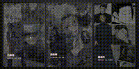
【注:图片源自百度】

二、HTML框架
使用外部样式表,将CSS文件用link标签引入
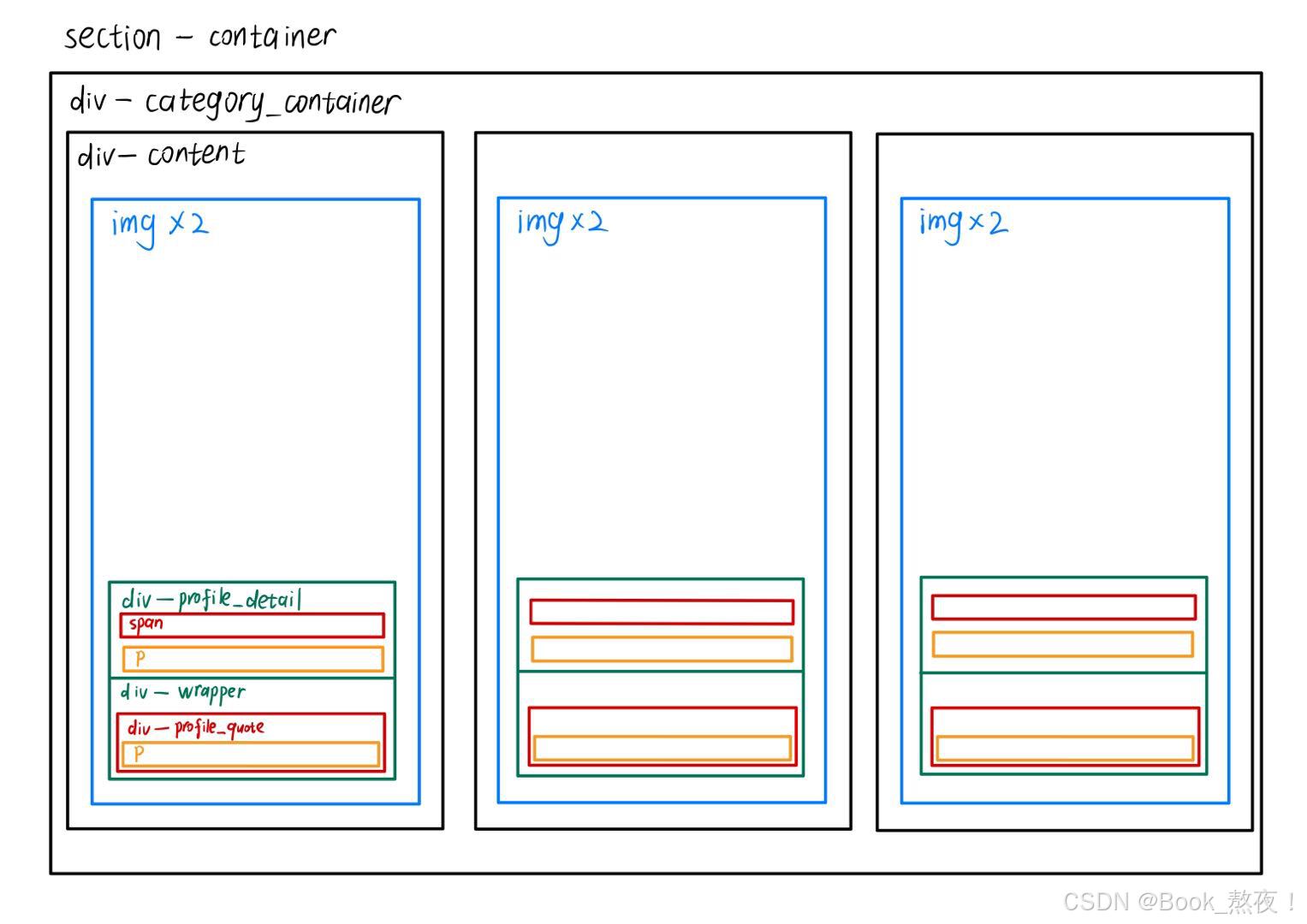
整体框架如下图:
html
<!DOCTYPE html>
<html lang="en">
<head>
<meta charset="UTF-8">
<meta name="viewport" content="width=device-width, initial-scale=1.0">
<title>My_First</title>
<!-- 将css引入 -->
<link rel="stylesheet" href="./style.css">
</head>
<body>
<section class="container">
<div class="category_container">
<div class="content">
<img src="./painter.jpg" alt="painter" class="professio_image">
<img src="./painter2.jpg" alt="painter2" class="profile_image">
<div class="profile_detail">
<span>Painter Qi Yu</span>
<p>"Lemuria's greatest painter"</p>
</div>
<div class="wrapper">
<div class="profile_quote">
<p>"Put the love I feel on paper, trace my bodyguard lady, you are my Muse goddess."</p>
</div>
</div>
</div>
<div class="content">
<img src="./photographer.jpg" alt="photographer" class="professio_image">
<img src="./photographer2.jpg" alt="photographer2" class="profile_image">
<div class="profile_detail">
<span>Photographer Qi Yu</span>
<p>The bodyguard lady's own photographer</p>
</div>
<div class="wrapper">
<div class="profile_quote">
<p>"You promise me: I will never let Qi Yu wait for me again."</p>
</div>
</div>
</div>
<div class="content">
<img src="./sculptor.jpg" alt="sculptor" class="professio_image">
<img src="./scluptor2.jpg" alt="scluptor2" class="profile_image">
<div class="profile_detail">
<span>Sculptor Qi Yu</span>
<p>For you to trace, shine</p>
</div>
<div class="wrapper">
<div class="profile_quote">
<p>"You are the bride of the only sea god in Lemuria, and I will paint your face."</p>
</div>
</div>
</div>
</div>
</section>
</body>
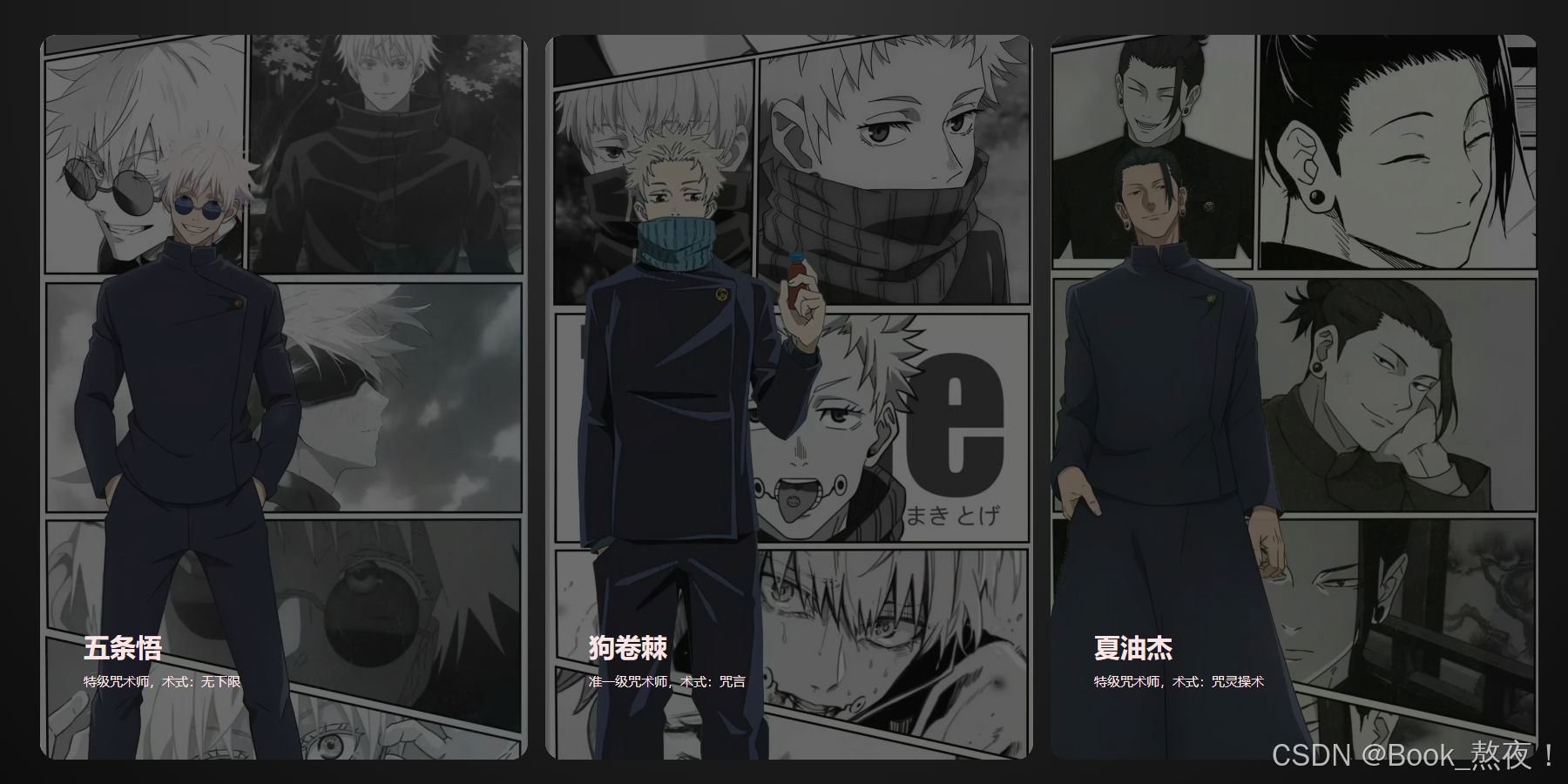
</html>三、CSS装饰
1.全局设置
在谷歌字体库中导入合适的字体
css
@import url("https://fonts.googleapis.com/css2?family=Inter:wght@100..900&display=swap");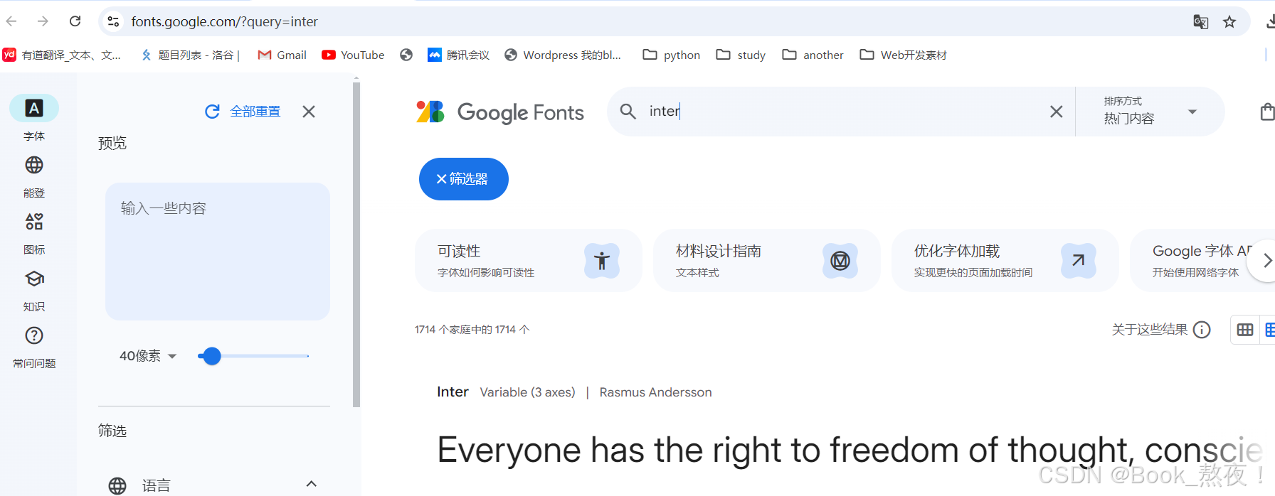
使用通配符选择器,将所有元素的内边距和外边距重置为0;
指定body部分使用导入的Inter字体;
使用CSS变量定义两个颜色变量,浅色和深色
css
/*通配符选择器,查找页面所有标签设置相同样式*/
* {
  padding: 0;
  margin: 0;
  box-sizing: border-box;
}

/*指定body部分使用导入的Inter字体,备用字体sans-serif*/
body {
  font-family: "Inter", sans-serif;
}

/*使用CSS变量定义两个颜色变量,浅色和深色*/
:root {
  --light: #ffe6e6;
  --dark: #0c0c0c;
}

【补充:选择器】
-
标签选择器:使用标签名作为选择器,选中同名标签设置相同的样式
-
类选择器:查找标签,差异化设置标签的显示效果,一个类选择器可以定义多个标签,一个标签允许加多个class属性
-
id选择器:查找标签,差异化设置标签的显示效果,一般与JS配合使用,很少使用CSS样式
-
通配符选择器:查找页面所有标签,设置相同样式,注意不需要调用,浏览器自动查找页面所有标签,设置相同的格式。
使用场景:在制作网页的初期,清楚标签默认样式,便于后续个性化设置。
2.盒子设置
css
/* 定义container类选择器 */
.container {
    /* 一个径向渐变背景*/
  --bg-color: radial-gradient(
  	circle at 50% 0%,
  	rgba(50, 50, 50, 1) 0%,
  	rgba(12, 12, 12, 1) 100%
  );
  /* 限制子元素溢出部分*/
  overflow: clip;
  position: relative;
  /*一个弹性盒子模型布局,子元素会居中对齐*/
  display: flex;
  justify-content: center;
  align-items: center;
  padding: 2rem 5rem;
  width: 100%;
  /* 容器的高度是设备屏幕视口的100%高度*/
  height: 100dvh;
  background-image: var(--bg-color);
}

/*  定义category_container类选择器*/
.category_container {
  --gap: 0.5rem;
  display: flex;
  justify-content: space-between;
  align-items: center;
  flex-wrap: nowrap;
  /*  定义了子元素之间的间距*/
  gap: calc(var(--gap) * 2);
  width: 100%;
  height: 100%;
}

/* 定义content类选择器*/
.content {
  /* 定义初始状态为非活动的变量*/
  --active: 0;
  cursor: pointer;
  overflow: clip;
  position: relative;
  z-index: 10;
  display: flex;
  /*  子元素垂直排列 */
  flex-direction: column;
  justify-content: flex-end;
  gap: 1.5rem;
  padding: 2.5rem;
  /* 宽度为容器的三分之一,设置动画效果,宽度在鼠标悬停时会变化*/
  width: calc((100% / 3) - var(--gap));
  height: 100%;
  border-radius: 1rem;
  transition: width 0.5s ease-in-out;
}

/* 当鼠标悬停在.content元素上,--active变为1,content元素的宽度扩大到容器的70% */
.content:hover {
  --active: 1;
  width: calc(70% - var(--gap));
}

 /* content伪类选择器,用之前定义的深色覆盖整个.content区域,并设置为半透明 */
.content::before {
  content: "";
  position: absolute;
  z-index: -10;
  top: 0;
  left: 0;
  width: 100%;
  height: 100%;
  background-color: var(--dark);
  opacity: 0.6;
}
3.图片设置
css
/* 设置背景图片,覆盖整个容器,图片根据容器尺寸裁剪,居中显示 */
.content img {
  position: absolute;
  z-index: -20;
  top: 0;
  left: 0;
  width: 100%;
  height: 100%;
  -o-object-fit: cover;
     object-fit: cover;
  -o-object-position: center;
     object-position: center;
}

/* profile_image的透明度随着--active状态变化,鼠标悬停时图片逐渐变成透明度为0*/
.content .profile_image {
  opacity: calc(1 - var(--active));
  transition: opacity 0.3s ease-in-out;
}
4.段内设置
css
/* 包含span、p标签,设置个人信息,垂直排列,子元素之间的间距,并有动画效果*/
.profile_detail {
  display: flex;
  flex-direction: column;
  gap: 0.5rem;
  width: 12rem;
  transition: transform 0.5s cubic-bezier(0.23, 0.93, 0.77, 1) 0.01s;
}

.profile_detail span {
  font-size: 1.5rem;
  font-weight: 600;
  color: var(--light);
  text-wrap: nowrap;
}

.profile_detail p {
  font-size: 0.75rem;
  font-weight: 500;
  color: var(--light);
}

/* 个人引用处的文本块,鼠标悬停时会向上移动并显示 */
.profile_quote {
  width: 22rem;
  transform: translate(0, calc((1 - var(--active)) * (100% + 2.5rem)));
}

.profile_quote p {
  font-size: 1.5rem;
  font-weight: 600;
  color: var(--light);
  transform: translate(0, calc((1 - var(--active)) * (100% + 2.5rem)));
  transition: transform 0.5s cubic-bezier(0.23, 0.93, 0.77, 1) 0.1s;
}

/* 通过grid布局,默认grid-template-rows为0,隐藏内容,当鼠标悬停时,展开并显示内容 */
.wrapper {
  display: grid;
  grid-template-rows: 0fr;
  overflow: hidden;
  transition: grid-template-rows 0.5s cubic-bezier(0.23, 0.93, 0.77, 1) 0.01s;
  transition: grid-template-rows 0.5s cubic-bezier(0.23, 0.93, 0.77, 1) 0.01s, -ms-grid-rows 0.5s cubic-bezier(0.23, 0.93, 0.77, 1) 0.01s;
}

.profile_quote {
  min-height: 0;
  transform: translateY(50%);
  opacity: 0;
  transition: opacity 0.8s ease-in-out, transform 0.8s cubic-bezier(0.23, 0.93, 0.77, 1) 0.01s;
}

.content:hover .wrapper {
  grid-template-rows: 1fr;
}

.content:hover .profile_quote {
  transform: none;
  opacity: 1;
}

/* 作为弹窗显示,背景透明,文字颜色为白色,没有边框*/
dialog {
  position: absolute;
  z-index: 1;
  background: none;
  color: white;
  border: 0;
  font-size: 0.8rem;
  padding: 0.5em;
}

dialog a {
  color: whitesmoke;
}
四、最终效果