yfiles-jupyter-graphs 可视化 GraphRAG 结构
前言
前面我们通过 GraphRag 命令生成了知识库文件 parquet,这节我们看一下如何使用 yfiles-jupyter-graphs 添加 parquet 文件的交互式图形可视化以及如何可视化 graphrag 查询的结果。
yfiles-jupyter-graphs 是一个图形可视化扩展,它为结构化节点和关系数据提供交互式的可视化还有自定义节点和边的样式。
一 、加载parquet文件
我们这里生成的 parquet 文件是基于,之前西游记小故事来的,数据集为关于石猴孙悟空的故事。
导入所需要的库:
python
import os
import pandas as pd
import tiktoken
from graphrag.query.context_builder.entity_extraction import EntityVectorStoreKey
from graphrag.query.indexer_adapters import (
    read_indexer_covariates,
    read_indexer_entities,
    read_indexer_relationships,
    read_indexer_reports,
    read_indexer_text_units,
)
from graphrag.query.input.loaders.dfs import (
    store_entity_semantic_embeddings,
)
from graphrag.query.llm.oai.chat_openai import ChatOpenAI
from graphrag.query.llm.oai.embedding import OpenAIEmbedding
from graphrag.query.llm.oai.typing import OpenaiApiType
from graphrag.query.structured_search.local_search.mixed_context import (
    LocalSearchMixedContext,
)
from graphrag.query.structured_search.local_search.search import LocalSearch
from graphrag.vector_stores.lancedb import LanceDBVectorStore
然后我们首先将 parquet 文件的索引输出加载到数据框中,然后将这些数据框转换为与知识模型一致的数据对象集合, 加载文件到dataframes 中:
python
INPUT_DIR = "./inputs/operation"
LANCEDB_URI = f"{INPUT_DIR}/lancedb"
COMMUNITY_REPORT_TABLE = "create_final_community_reports"
ENTITY_TABLE = "create_final_nodes"
ENTITY_EMBEDDING_TABLE = "create_final_entities"
RELATIONSHIP_TABLE = "create_final_relationships"
COVARIATE_TABLE = "create_final_covariates"
TEXT_UNIT_TABLE = "create_final_text_units"
COMMUNITY_LEVEL = 2
读取实体:
python
# read nodes table to get community and degree data
entity_df = pd.read_parquet(f"{INPUT_DIR}/{ENTITY_TABLE}.parquet")
entity_embedding_df = pd.read_parquet(f"{INPUT_DIR}/{ENTITY_EMBEDDING_TABLE}.parquet")
读取关系
python
relationship_df = pd.read_parquet(f"{INPUT_DIR}/{RELATIONSHIP_TABLE}.parquet")
relationships = read_indexer_relationships(relationship_df)
二、使用 yfiles-jupyter-graphs 对整个文件关系进行可视化
安装 yfiles-jupyter-graphs
bash
pip install yfiles_jupyter_graphs --quiet我们通过 parquet 文件使用 yfiles-jupyter-graphs 为知识图谱提供可交互式的可视化页面。
主要是用于将数据转换为 yfiles_jupyter_graphs 库可以使用的格式,并创建一个图形小部件,输入数据的要求是节点的 id 属性和与节点 id 相对应的关系的开始/结束属性。
可以在每个节点/关系字典的属性中添加其他属性:
python
from yfiles_jupyter_graphs import GraphWidget
# 将实体转换为字典
def convert_entities_to_dicts(df):
    nodes_dict = {}
    for _, row in df.iterrows():
        # Create a dictionary for each row and collect unique nodes
        node_id = row["title"]
        if node_id not in nodes_dict:
            nodes_dict[node_id] = {
                "id": node_id,
                "properties": row.to_dict(),
            }
    return list(nodes_dict.values())
# 将关系转换为字典
def convert_relationships_to_dicts(df):
    relationships = []
    for _, row in df.iterrows():
        # Create a dictionary for each row
      row1 = row.astype(str)
      relationships.append({
          "start": row["source"],
          "end": row["target"],
          "properties": row1.to_dict(),
      })
    return relationships

w = GraphWidget()
w.directed = True
w.nodes = convert_entities_to_dicts(entity_df)
w.edges = convert_relationships_to_dicts(relationship_df)
然后我们进行可视化配置,自定义边和样式:
python
# 设置展示标题
w.node_label_mapping = "title"
# 给社区添加颜色
def community_to_color(community):
    """Map a community to a color."""
    colors = [
        "crimson",
        "darkorange",
        "indigo",
        "cornflowerblue",
        "cyan",
        "teal",
        "green",
    ]
    return (
        colors[int(community) % len(colors)] if community is not None else "lightgray"
    )
def edge_to_source_community(edge):
    """Get the community of the source node of an edge."""
    source_node = next(
        (entry for entry in w.nodes if entry["properties"]["title"] == edge["start"]),
        None,
    )
    source_node_community = source_node["properties"]["community"]
    return source_node_community if source_node_community is not None else None


w.node_color_mapping = lambda node: community_to_color(node["properties"]["community"])
w.edge_color_mapping = lambda edge: community_to_color(edge_to_source_community(edge))
w.node_scale_factor_mapping = lambda node: 0.5 + node["properties"]["size"] * 1.5 / 20
w.edge_thickness_factor_mapping = "weight"
自动布局:
python
w.circular_layout()到这里我们就可以展示整个图:
python
from google.colab import output
output.enable_custom_widget_manager()
display(w)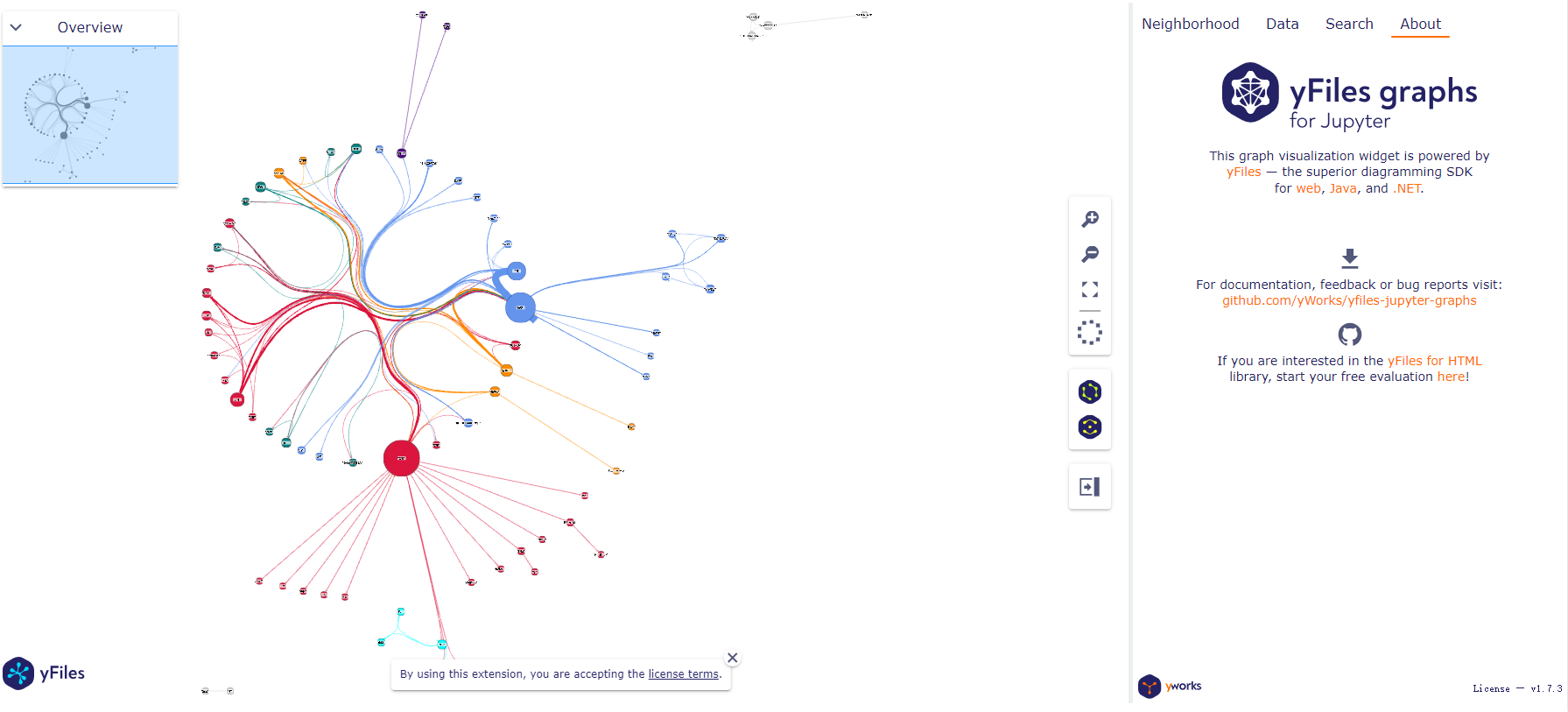
三、对graphrag查询结果以及请求的上下文进行可视化
我们现在用 yfiles-jupyter-graphs 将上下文数据类似地可视化为图形,由 graphrag 查询的结果上下文允许检查请求的上下文图。
这里的代码也就是我们前面提到过得查询过程,由于篇幅过长,想要完整源码可以私信我,也可以查看之前的 graphrag 检索文章看到。
这里我们假设 search_engine 已经配置成功,
开始执行下列检索答案:
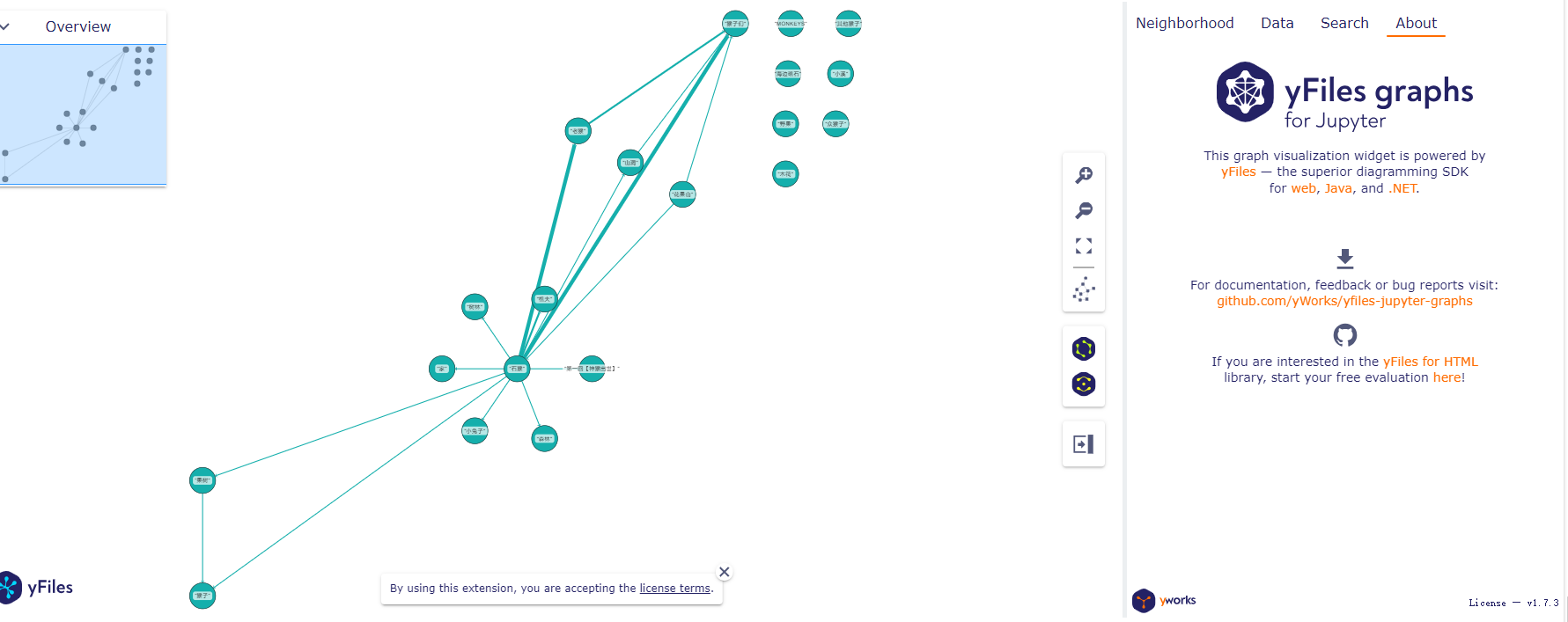
python
result = await search_engine.asearch("给我讲一下关于石猴的故事")
print(result.response)
然后得到下面输出:

开始通过 `yfiles-jupyter-graphs· 绘图和展示图:
python
def show_graph(result):
    from yfiles_jupyter_graphs import GraphWidget
    if (
        "entities" not in result.context_data
        or "relationships" not in result.context_data
    ):
        msg = "The passed results do not contain 'entities' or 'relationships'"
        raise ValueError(msg)
    def convert_entities_to_dicts(df):
        nodes_dict = {}
        for _, row in df.iterrows():
            # Create a dictionary for each row and collect unique nodes
            node_id = row["entity"]
            if node_id not in nodes_dict:
                nodes_dict[node_id] = {
                    "id": node_id,
                    "properties": row.to_dict(),
                }
        return list(nodes_dict.values())

    def convert_relationships_to_dicts(df):
        relationships = []
        for _, row in df.iterrows():
            # Create a dictionary for each row
            relationships.append({
                "start": row["source"],
                "end": row["target"],
                "properties": row.to_dict(),
            })
        return relationships

    w = GraphWidget()
    w.nodes = convert_entities_to_dicts(result.context_data["entities"])
    w.edges = convert_relationships_to_dicts(result.context_data["relationships"])
    w.directed = True
    w.node_label_mapping = "entity"
    w.edge_thickness_factor_mapping = "weight"
    display(w)
show_graph(result)
就可以得到我们的可视化结果了:
四、总结
上面就是我们通过 yfiles-jupyter-graphs 可视化 GraphRAG 的结构和查询结果以及知识图库的全过程,使用这个库我们可以充分认识到GraphRAG 的结构。
它拥有很多优势,比如直观的数据表示,交互性,高度的可定制性,yfiles-jupyter-graphs 基于高性能的 yFiles 图形库,能够处理大型图形结构,这对于可能包含大量节点和边的 GraphRAG 模型来说非常重要。
-- 欢迎点赞、关注、转发、收藏【我码玄黄】,各大平台同名。