在数据中穿梭找寻答案,是我们在探索微生物世界的过程中必不可少的一环。然而,单调的数据分析报告是否让你感觉枯燥乏味?这时候数据可视化的技术可就要来大展神通咯!利用图表和图形唤醒沉睡的数据,科学与艺术的搭配,让数据变得直观明了,令你的研究结果可大放异彩!
多样性分析往往是我们在得到物种丰度表格后做的第一个基础分析,可以探究不同组之间的多样性差异,进一步延伸出更关键的科学问题。一般来说,我们可以将其分为α-多样性分析和β-多样性分析。
α-多样性:通常用来描述单个样本中物种的丰富度和均匀度。可以揭示不同生境或实验处理条件下微生物群落的复杂性和稳定性。常用一些指数去表征,包括Shannon,Simpson以及Chao1等。β-多样性:β-多样性描述的是不同样本间的物种组成差异,反映了生物群落在空间或时间上的变化。可以探究不同环境因素如何影响生物群落结构的变动。β-多样性分析通常包括计算样本间的距离(如Bray-Curtis距离或Jaccard距离),然后使用这些距离矩阵进行排序分析,如主坐标分析(PCoA)或非度量多维尺度(NMDS)。对于alpha多样性一般使用箱线图或者柱状图进行展示,并加上对应的统计检验结果。beta多样性的可视化一般是通过上面讲到的距离算法以及排序后,取结果的1/2轴进行二维散点图进行展示,将不同颜色映射到分组上,一般会加上一些辅助图形以便更好看出规律。
在区分明显的分析结果中,可以使用置信度椭圆或者点连线多边形进行平面绘制。但在区分不明显的分析结果中,一般使用质心-样品点连线的方式,以获得更好的区分度。
代码:
alpha
ggplot()+
geom_boxplot()+
geom_signif()# 加统计检验标注
beta
ggplot()+
geom_point()+
stat_ellipse()+# 加置信度椭圆,level参数指定阈值
geom_segment()+ # 可以绘制质心向样品点连线
geom_encircle() # 绘制外点连线
接下来我们结合一些文献图表案例讲解,如何去展示微生物多样性。
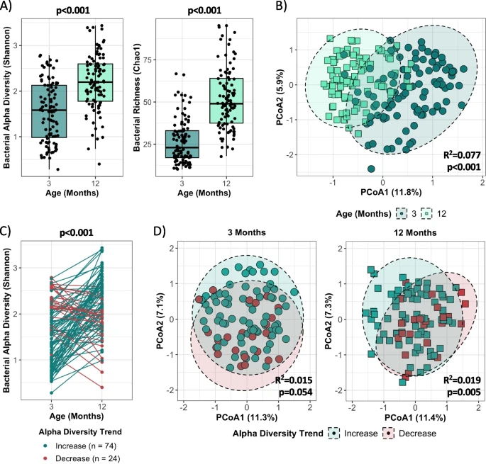
Divergent bacterial alpha diversity maturation patterns are observed in the first year of life. A Bacterial Shannon and Chao1 alpha diversity indices at 3 and 12 months of age, assessed by Mann--Whitney U test (3 months: n = 99, 12 months: n = 99). B Comparison of bacterial beta diversity using the Bray--Curtis dissimilarity index at 3 and 12 months, assessed by PERMANOVA (3 months: n = 99, 12 months: n = 99). Ellipses represent 95% CI. C Changes in bacterial alpha diversity (Shannon index) per individual from 3 to 12 months, assessed by paired t-test (increase: n = 74, decrease: n = 24; see Figure S2A for bacterial richness). D Comparison of bacterial beta diversity using the Bray--Curtis dissimilarity index by alpha diversity trend at 3 and 12 months, assessed by PERMANOVA (increase: n = 74, decrease: n = 24; see Figure S2B for bacterial richness trend). Ellipses represent 95% CI.
上面案例是关于婴儿出生后1年内肠道细菌群落的相关分析,有第3个月取样点和第12个月取样点。图1A使用箱线图展示了α多样性(Shannon指数)和物种丰富度(Chao1指数)从3个月到12个月的显著增加,而图1C是图1A的另一种表现形式,作者使用了对应关系的样本进一步揭示了α多样性的变化趋势。图1B则展示了β多样性的减少(第12个月的95%置信度椭圆小于第3个月的,越集中),说明12个月大的婴儿间微生物组成差异的降低。
在一些分析中,也可以不使用排序,而直接使用距离去表示样品间差异。
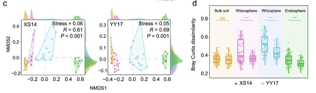
Community dissimilarity in four niches between the low-Cd cultivar XS14 and hybrid cultivar YY17. In panels (a, d), asterisks labeled implies the significant difference (P < 0.05) determined by Student's t tests. 'NS' represents no significant differences.
低镉品种 XS14 和杂交品种 YY17 在块土、根际土、根表面和内生圈四个生态位的细菌群落差异。图c使用Bray-Curtis距离和NMDS排序, XS14和YY17均根据生态位形成不同的簇,在两侧加上密度分布,可以直观看出在NMDS1轴上具有更好的区分。图d则是使用组内样品的Bray-Curtis距离作为Y轴,可以看出与 YY17 相比,XS14 的细菌群落在除了块土之外的生态位中差异相对较高,表明XS14在根相关生态位中拥有更复杂和多功能的微生物群落。
而对于辅助图形的选择一般倾向于使得分组间的规律更明显的类型。
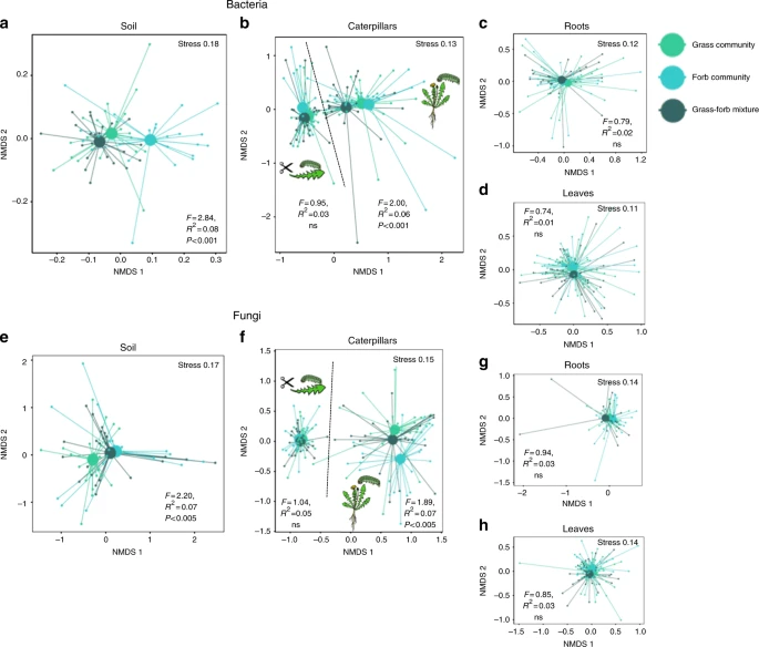
Legacy effects of plant communities on microbiomes. Plant community identity effects on bacterial a--d and fungal (e--h) communities in caterpillars, leaves, roots, and soil. NMDS plots are presented based on Bray--Curtis similarity. The 2D stress value for each panel ranges between 0.11--0.18. Soils originating from grass communities are presented with light green symbols, soils from forb communities with turquoise symbols and soils from mixed grass and forb communities with dark green symbols. In each panel, smaller symbols depict individual samples, centroids are depicted with larger markers. Significance of the plant community treatment effect based on a PERMANOVA is also presented in each panel. a, e represent the composition of microbiomes in soils, b, f microbiomes in caterpillars both on intact plants and on detached leaves. c, g microbiomes in roots and d, h microbiomes in leaves. The effect of plant community growth rate (fast- and slow-growing communities) is shown in Supplementary Fig. 14.
上面案例是关于植食昆虫微生物组的相关研究,基于Bray-Curtis和NMDS分析植物群落对土壤、毛虫肠道、根系、植物叶片细菌群落的影响(图a-d )以及植物群落对土壤、毛虫肠道、根系、植物叶片真菌群落的影响(图e-h)。作者这里使用了质心-样品点连线的辅助线,并放大质心点的大小,会比使用椭圆更直观地展示分组间的规律。
下面我们使用e图的模拟数据进行绘制,看看不同的辅助图形的效果:
代码:
library('vegan')
library('ggplot2')
library('dplyr')
library("ggalt")
NMDS结果可以通过metaMDS函数得到
这里直接读取模拟数据
pic_e_data = read.csv("./pic_e_sactter_data.txt",sep = "\t",header = T)
准备中心点数据
需要先计算质点,为各分组的均值
计算每个分组的质心
centroids <- pic_e_data %>%
group_by(group) %>%
summarise(cent_NMDS1 = mean(NMDS1), cent_NMDS2 = mean(NMDS2))
将质心数据添加到原始数据框中,匹配对应分组
pic_e_data <- pic_e_data %>%
left_join(centroids, by = "group")
head(pic_e_data)
NMDS1 NMDS2 group cent_NMDS1 cent_NMDS2
#1 -1.50 0.1 g1 -0.3735294 -0.09470588
#2 -1.00 0.2 g1 -0.3735294 -0.09470588
绘制一个散点图,按分组group进行着色
p0 <- ggplot(pic_e_data, aes(x = NMDS1, y = NMDS2, color = group)) +
geom_point()+
labs(x = "NMDS1", y = "NMDS2") +
theme_bw() +
theme(panel.grid.major = element_blank(),
panel.grid.minor = element_blank())
添加0.95置信椭圆
p1 = p0 + stat_ellipse(type = "norm", level = 0.95, linetype = "dashed", size = 1)
geom_encircle 外点连线
p2 = p0 + geom_encircle(s_shape=1, expand=0)
质心-样品点连线
p3 = p0 + geom_segment(aes(xend = cent_NMDS1, yend = cent_NMDS2)) +
geom_point(data = centroids, aes(x = cent_NMDS1, y = cent_NMDS2), size = 5) # 加粗显示质心
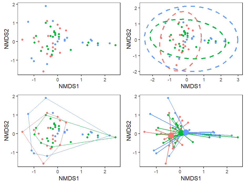
可以看到,对于此数据来说想体现分组间的差异规律,最好是使用质心-样品点连线作为辅助线。
我们的旅程从数字的海洋跃起,现在正停泊在了悦目的视觉码头。通过可视化技术,您的数据不再是晦涩难懂的数字,它们将变成讲述生命故事的图符,每一张图表都展示了自然界的复杂性与和谐。快来做笔记,开始你的可视化之旅吧!
参考文献:
1 Mercer E M, Ramay H R, Moossavi S, et al. Divergent maturational patterns of the infant bacterial and fungal gut microbiome in the first year of life are associated with interkingdom community dynamics and infant nutritionJ. Microbiome, 2024, 12(1): 22.
2 Hannula S E, Zhu F, Heinen R, et al. Foliarfeeding insects acquire microbiomes from the soil rather than the host plantJ. Nature Communications, 2019, 10(1): 1254.
3 Cheng Z, Zheng Q, Shi J, et al. Metagenomic and machine learning-aided identification of biomarkers driving distinctive Cd accumulation features in the rootassociated microbiome of two rice cultivarsJ. ISME Communications, 2023, 3(1): 1-13.