Windows Presentation Foundation(WPF)是微软提供的一个用于构建桌面客户端应用程序的UI框架。其依赖于XAML(Extensible Application Markup Language)进行用户界面设计,提供了一套强大的控件和组件模型。在WPF开发中,自定义模板和触发器是两个非常重要的概念,它们使开发者能够设计出具有良好用户体验的复杂UI组件。
本文将从多个方面深入探讨WPF组件的自定义模板和触发器,结合实例代码进行详细分析。

一、WPF模板概述
WPF中的模板是为控件定义视觉结构的XAML资源。模板可以大幅度改变控件的外观,而不改变其行为。主要有以下几种模板:
- ControlTemplate:用于定义控件的外观。
- DataTemplate:用于定义数据对象的可视化表现。
- ItemsPanelTemplate:用于定义组合控件内部的布局。
1. 控件模板(ControlTemplate)
控件模板是WPF中最基础的模板类型。它明确地将控件的视觉树从控件逻辑中分离开来,使得开发者可以轻松地更换控件的外观。

示例代码
以下是一个简单的Button控件的ControlTemplate示例:
xml
<Window x:Class="WpfApp.MainWindow"
        xmlns="http://schemas.microsoft.com/winfx/2006/xaml/presentation"
        xmlns:x="http://schemas.microsoft.com/winfx/2006/xaml"
        Title="MainWindow" Height="200" Width="300">
    <Window.Resources>
        <ControlTemplate x:Key="CustomButtonTemplate" TargetType="Button">
            <Border Background="LightBlue" BorderBrush="DarkBlue" BorderThickness="2" CornerRadius="5">
                <ContentPresenter HorizontalAlignment="Center" VerticalAlignment="Center"/>
            </Border>
        </ControlTemplate>
    </Window.Resources>

    <Grid>
        <Button Template="{StaticResource CustomButtonTemplate}" Width="100" Height="50" Content="Click Me"/>
    </Grid>
</Window>在这个例子中,我们定义了一个带有蓝色边框和圆角的Button模板。ContentPresenter用于将Button的内容呈现出来。
2. 数据模板(DataTemplate)
数据模板用于定义数据对象在UI中的显示方式。一般用于绑定数据集合的控件,如ListView、ComboBox等。
示例代码
以下是一个经典的DataTemplate使用场景:
xml
<Window x:Class="WpfApp.MainWindow"
        xmlns="http://schemas.microsoft.com/winfx/2006/xaml/presentation"
        xmlns:x="http://schemas.microsoft.com/winfx/2006/xaml"
        Title="MainWindow" Height="200" Width="300">
    <Window.Resources>
        <DataTemplate x:Key="PersonTemplate">
            <StackPanel Orientation="Horizontal">
                <TextBlock Text="{Binding Name}" FontWeight="Bold"/>
                <TextBlock Text="{Binding Age}" Margin="10,0,0,0"/>
            </StackPanel>
        </DataTemplate>
    </Window.Resources>

    <Grid>
        <ListView ItemTemplate="{StaticResource PersonTemplate}">
            <ListView.ItemsSource>
                <x:Array Type="{x:Type local:Person}">
                    <local:Person Name="Alice" Age="30"/>
                    <local:Person Name="Bob" Age="35"/>
                </x:Array>
            </ListView.ItemsSource>
        </ListView>
    </Grid>
</Window>在此例子中,我们定义了一个Person对象的显示模板,使用StackPanel横向排列名字和年龄。
3. 项面板模板(ItemsPanelTemplate)
ItemsPanelTemplate允许开发者自定义用于布局ItemsControl(如ListBox、ComboBox等)中项的面板。
示例代码
xml
<Window x:Class="WpfApp.MainWindow"
        xmlns="http://schemas.microsoft.com/winfx/2006/xaml/presentation"
        xmlns:x="http://schemas.microsoft.com/winfx/2006/xaml"
        Title="MainWindow" Height="200" Width="300">
    <Grid>
        <ListBox>
            <ListBox.ItemsPanel>
                <ItemsPanelTemplate>
                    <WrapPanel/>
                </ItemsPanelTemplate>
            </ListBox.ItemsPanel>
            <ListBoxItem Content="Item 1"/>
            <ListBoxItem Content="Item 2"/>
            <ListBoxItem Content="Item 3"/>
            <ListBoxItem Content="Item 4"/>
        </ListBox>
    </Grid>
</Window>该例中,WrapPanel用于在ListBox中依序排列项,通过ItemsPanelTemplate将默认的StackPanel替换为WrapPanel。
二、WPF触发器
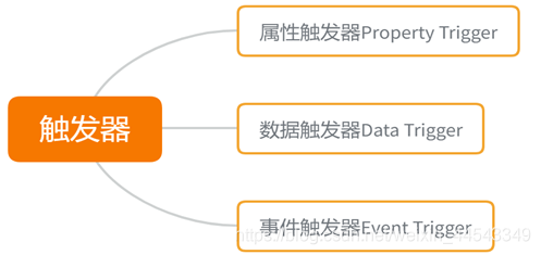
触发器是WPF的另一重要特性,用于在满足特定条件时改变控件的外观或行为。根据目标和用途,WPF中触发器可分为以下几类:
- PropertyTrigger:基于依赖属性的值改变来触发动作。
- DataTrigger:基于绑定数据的值改变来触发动作。
- EventTrigger:基于事件发生来触发动作。
1. 属性触发器(PropertyTrigger)
属性触发器是最基础的触发器,它根据控件属性的状态改变来触发动作。
示例代码
以下示例展示了如何使用PropertyTrigger改变按钮的背景颜色:
xml
<Window x:Class="WpfApp.MainWindow"
        xmlns="http://schemas.microsoft.com/winfx/2006/xaml/presentation"
        xmlns:x="http://schemas.microsoft.com/winfx/2006/xaml"
        Title="MainWindow" Height="200" Width="300">
    <Grid>
        <Button Content="Hover Over Me" Width="150" Height="50">
            <Button.Triggers>
                <EventTrigger RoutedEvent="Button.MouseEnter">
                    <BeginStoryboard>
                        <Storyboard>
                            <ColorAnimation Storyboard.TargetProperty="(Button.Background).(SolidColorBrush.Color)"
                                            To="LightGreen" Duration="0:0:0.5"/>
                        </Storyboard>
                    </BeginStoryboard>
                </EventTrigger>
                <EventTrigger RoutedEvent="Button.MouseLeave">
                    <BeginStoryboard>
                        <Storyboard>
                            <ColorAnimation Storyboard.TargetProperty="(Button.Background).(SolidColorBrush.Color)"
                                            To="LightGray" Duration="0:0:0.5"/>
                        </Storyboard>
                    </BeginStoryboard>
                </EventTrigger>
            </Button.Triggers>
        </Button>
    </Grid>
</Window>
这里我们应用了事件触发器,当鼠标进入按钮区域时,按钮背景色动画地改变为绿色;当鼠标离开时,背景色变回灰色。
2. 数据触发器(DataTrigger)
数据触发器根据数据绑定的值来执行动作,是MVVM机制中相当有用的功能。
示例代码
假设有一个IsActive属性,当其值为True时,我们希望按钮颜色变化:
xml
<Window x:Class="WpfApp.MainWindow"
        xmlns="http://schemas.microsoft.com/winfx/2006/xaml/presentation"
        xmlns:x="http://schemas.microsoft.com/winfx/2006/xaml"
        Title="MainWindow" Height="200" Width="300">
    <Window.Resources>
        <Style x:Key="ActiveButtonStyle" TargetType="Button">
            <Setter Property="Background" Value="LightGray"/>
            <Style.Triggers>
                <DataTrigger Binding="{Binding IsActive}" Value="True">
                    <Setter Property="Background" Value="LightGreen"/>
                </DataTrigger>
            </Style.Triggers>
        </Style>
    </Window.Resources>

    <Grid>
        <Button Content="Active Button" Width="150" Height="50" Style="{StaticResource ActiveButtonStyle}"/>
    </Grid>
</Window>在此示例中,DataTrigger绑定到IsActive属性,当其值为True时,按钮背景变为绿色。
3. 事件触发器(EventTrigger)
事件触发器利用事件来触发动作,通常用于动画效果。
示例代码
以下代码段演示如何在鼠标进入和离开时应用事件触发器:
xml
<Window x:Class="WpfApp.MainWindow"
        xmlns="http://schemas.microsoft.com/winfx/2006/xaml/presentation"
        xmlns:x="http://schemas.microsoft.com/winfx/2006/xaml"
        Title="MainWindow" Height="200" Width="300">
    <Grid>
        <Button Content="Animated Button" Width="150" Height="50">
            <Button.Triggers>
                <EventTrigger RoutedEvent="Button.MouseEnter">
                    <BeginStoryboard>
                        <Storyboard>
                            <DoubleAnimation Storyboard.TargetProperty="Width" To="200" Duration="0:0:0.5"/>
                        </Storyboard>
                    </BeginStoryboard>
                </EventTrigger>
                <EventTrigger RoutedEvent="Button.MouseLeave">
                    <BeginStoryboard>
                        <Storyboard>
                            <DoubleAnimation Storyboard.TargetProperty="Width" To="150" Duration="0:0:0.5"/>
                        </Storyboard>
                    </BeginStoryboard>
                </EventTrigger>
            </Button.Triggers>
        </Button>
    </Grid>
</Window>通过这种方式,我们为Button实现了简单的放大和缩小动画效果,触发器在事件响应中非常强大。
三、模板和触发器的结合运用
模板和触发器的结合使用是WPF开发中提供强大UI定制和响应能力的重要手段。在自定义ControlTemplate中使用Trigger可以创建更灵活和动态的控件行为,尤其是在控件状态改变时能自动响应。

示例:自定义状态按钮
此示例将展示如何结合使用ControlTemplate和触发器,创建一个自定义的状态按钮:
xml
<Window x:Class="WpfApp.MainWindow"
        xmlns="http://schemas.microsoft.com/winfx/2006/xaml/presentation"
        xmlns:x="http://schemas.microsoft.com/winfx/2006/xaml"
        Title="MainWindow" Height="200" Width="300">
    <Window.Resources>
        <ControlTemplate x:Key="StateButtonTemplate" TargetType="Button">
            <Border Name="border" Background="LightGray" BorderBrush="DarkGray" BorderThickness="1" CornerRadius="5">
                <ContentPresenter HorizontalAlignment="Center" VerticalAlignment="Center"/>
            </Border>
            <ControlTemplate.Triggers>
                <Trigger Property="IsMouseOver" Value="True">
                    <Setter TargetName="border" Property="Background" Value="LightBlue"/>
                </Trigger>
                <Trigger Property="IsPressed" Value="True">
                    <Setter TargetName="border" Property="Background" Value="LightCoral"/>
                </Trigger>
            </ControlTemplate.Triggers>
        </ControlTemplate>
    </Window.Resources>

    <Grid>
        <Button Template="{StaticResource StateButtonTemplate}" Width="150" Height="50" Content="State Button"/>
    </Grid>
</Window>在这个例子中,我们定义了一个自定义的按钮模板,并使用触发器在鼠标悬停(IsMouseOver)和按下(IsPressed)情况下改变边框颜色。通过这种方式,控件外观可以智能地响应用户交互。此外,ContentPresenter确保按钮的内容得以呈现。
四、总结
在WPF开发中,模板和触发器的灵活性为控件外观和行为定制提供了广阔空间。本文全面解析了ControlTemplate、DataTemplate、ItemsPanelTemplate在实践中的应用场景,并详细探讨了PropertyTrigger、DataTrigger和EventTrigger等不同类型触发器的使用。结合示例代码,可以让开发者更好地理解如何运用这些功能为应用程序创建引人注目的UI。
定制化是现代应用程序设计的重要元素,充分利用模板和触发器有助于提高应用程序的可维护性和用户体验。在实际开发中,根据项目需求选择合适的模板和触发器,可以创建出更加灵活、高效且富有表现力的用户界面。

python
print("拥抱新技术才是王道!")