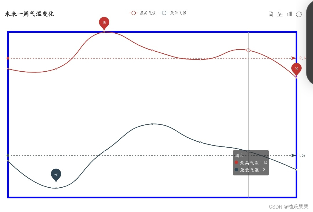
ECharts图例(legend)是用于解释图表中不同系列数据的标识。
图例主要作用是提高图表可读性。比如在折线图展示天气温变化时,通过图例能快速区分各天对应的折线和柱状。
它有多种配置选项。可以设置位置,像放在图表的顶部、底部、左侧或右侧;还能调整样式,包括文字颜色、字体大小等。并且能够实现点击图例来控制对应系列的显示或隐藏,方便用户聚焦部分数据进行分析。
图例:
++代码:++
1.<!DOCTYPE html>
<html lang="en">
<head>
<meta charset="UTF-8">
<script src="js/echarts.js"></script>
<meta http-equiv="X-UA-Compatible" content="IE=edge">
<meta name="viewport" content="width=device-width, initial-scale=1.0">
<title>Document</title>
</head>
<body>
<div id="main" style="width: 900px; height:600px"></div>
<script type="text/javascript">
var myChart= echarts.init(document.getElementById("main"));
var option = {
color:"red","green","blue","yellow","grey","#FA8072",
tooltip:{
trigger:'axis'
},
legend:{
data:'蒸发量','降水量','最低气温','最高气温'
},
toolbox:{
show:true,
feature:{
mark:{show:true},
dataView:{show:true},
magicType:{show:true, type:'line','bar'},
restore:{show:true},
saveAsImage:{show:true}
}
},
xAxis:[
{
type:'category',
position:'bottom',
boundaryGap:true,
show:true,
axisLine:{
linestyle:{
color:'green',
type:'solid',
width:2
}
},
axisTick:{
show:true,
length:10,
linestyle:{
color:'red',
type:'solid',
width:2
}
},
axisLabel:{
show:true,
interval:'auto',
rotate:45,
margin:8,
formatter:'{value}月',
textStyle:{
color:'blue',
fontFamily:'sans-serif',
fontSize:15,
fontstyle:'italic',
fontweight:'bold'
}
},
splitLine:{
show:true,
linestyle:{
color:'#483d8b',
type:'dashed',
width:1
}
},
splitArea:{
show:true,
areaStyle:{
color:'rgba(144,238,144,0.3)','rgba(135,200,250,0.3)'
}
},
data:[
'1','2','3','4','5',
{
value:'6',
textstyle:{
color:'red',
fontSize:30,
fontStyle:'normal',
fontWeight:'bold'
}
},
'7','8','9', '10','11','12'
]
}
],
yAxis:[
{
type:'value',
position:'left',
boundaryGap:0,0.1,
axisLine:{
show:true,
lineStyle:{
color:'red',
type:'dashed',
width:2
}
},
axisTick:{
show:true,
length:10,
linestyle:{
color:'green',
type:'solid',
width:2
}
},
axisLabel:{
show:true,
interval:'auto',
rotate:-45,
margin:18,
formatter:'{value}ml',
textStyle:{
color:'#1e90ff',
fontFamily:'verdana',
fontSize:10,
fontStyle:'normal',
fontweight:'bold'
}
},
splitLine:{
show:true,
linestyle:{
color:'#483d8b',
type:'dotted',
width:2
}
},
splitArea:{
show:true,
areaStyle:{
color:['rgba(205,92,92,0.3)',
'rgba(255,215,0,0.3)']
}
}
},
{
type:'value',
splitNumber:10,
axisLabel:{
formatter:function(value){
return value+'℃'
}
},
splitLine:{
show:false
}
}
],
series:[
{
name:'蒸发量',type:'bar',
data:2.0,4.9,7.0,23.2,25.6,76.7,135.6,162.2,32.6,20.0,6.4,3.3
},
{
name:'降水量',type:'bar',
data:2.6,5.9,9.0,26.4,28.7,70.7,175.6,182.2,48.7,18.8,6.0,2.3
},
{
name:'最低气温',type:'line',
smooth:true,
yAxisIndex:1,
data:2.0,2.2,3.3,4.5,6.3,10.2,20.3,23.4,23.0,16.5,12.0,6.23
},
{
name:'最高气温',type:'line',
smooth:true,
yAxisIndex:1,
data:12.0,12.2,13.3,14.5,16.3,18.2,28.3,33.4,31.0,24.5,18.0,16.2
}
]
};
myChart.setOption(option);
</script>
</body>
</html >
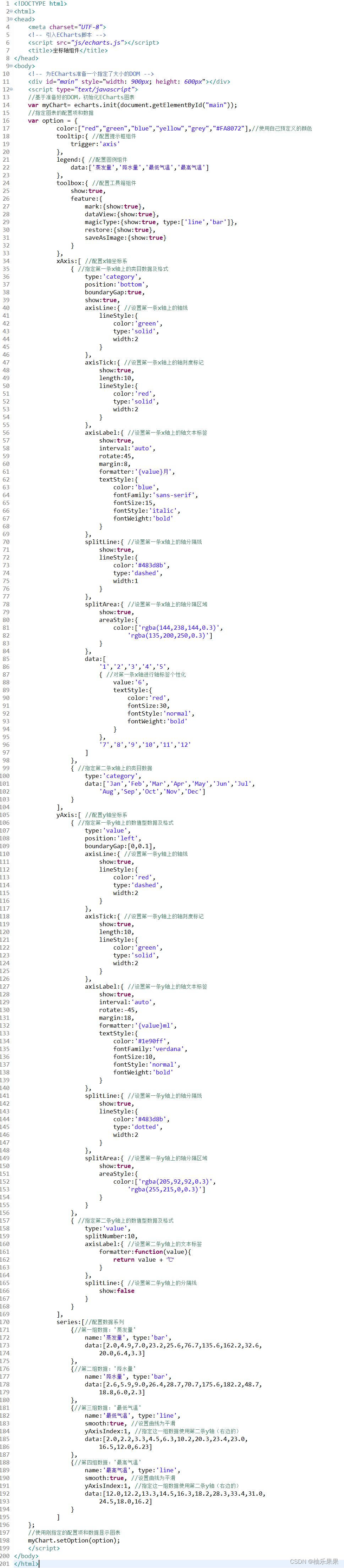
结果:
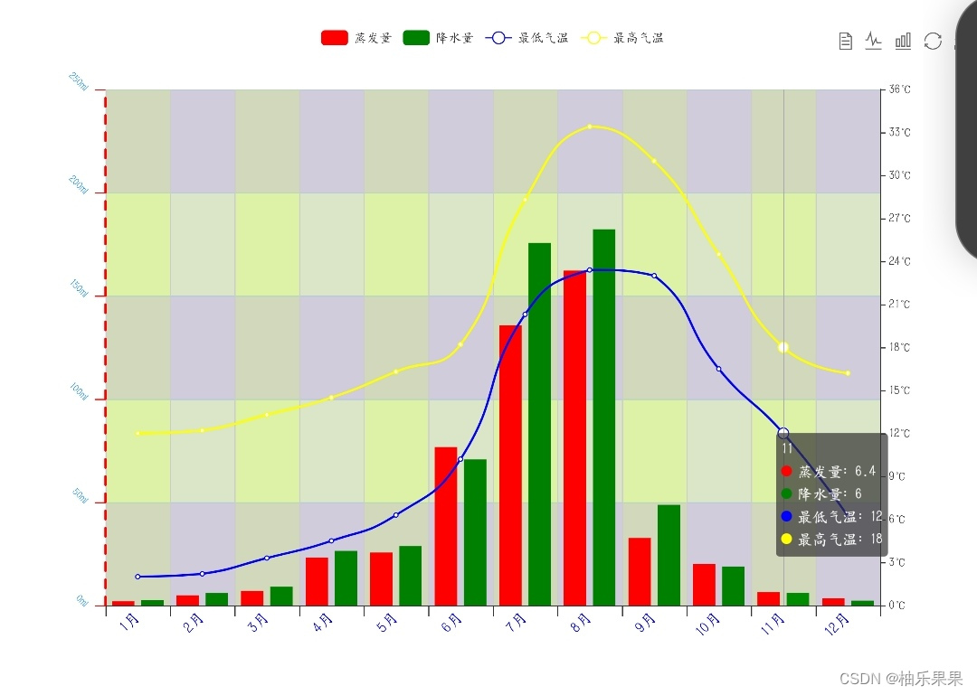
2.<!DOCTYPE html>
<html lang="en">
<head>
<meta charset="UTF-8">
<script src="js/echarts.js"></script>
<meta http-equiv="X-UA-Compatible" content="IE=edge">
<meta name="viewport" content="width=device-width, initial-scale=1.0">
<title>Document</title>
</head>
<body>
<div id="main" style="width: 900px; height:600px"></div>
<script type="text/javascript">
var myChart= echarts.init(document.getElementById("main"));
var option ={
grid:{
show:true,
x:15,y:66,
width:'93%',height:'80%',
x2:100,y2:100,
borderWidth:5,
borderColor:'blue',
bordergroundColor:'#f7f7f7',
},
title:{
text:'未来一周气温变化',
},
tooltip:{
trigger:'axis'
},
legend:{
data:'最高气温','最低气温'
},
toolbox:{
show:true,
feature:{
mark:{show:true},
dataView:{show:true,readOnly:false},
magicType:{show:true,type:'line','bar'},
restore:{show:true},
saveAsImage:{show:true}
}
},
calulable:true,
xAxis:[
{
show:false,
smooth:true,
type:'category',
boundaryGap:false,
data:'周一','周二','周三','周四','周五','周六','周日'
}
],
yAxis:[
{
show:false,
type:'value',
axisLabel:{formatter:'{value} ℃'}
}
],
series:[
{
name:'最高气温',smooth:true,
type:'line',data:11,11,15,13,12,13,10,
markPoint:{
data:[
{type:'max',name:'最大
值'},
{type:'min',name:'最小值'}
]
},
markLine:{
data:[
{type:'average',name:'平均值'}
]
}
},
{
name:'最低气温',smooth:true,
type:'line',data:1,-2,2,5,3,2,0,
markPoint:{
data:[
{name:'周最低',value:-2,xAxis:1,yAxis:-1.5}
]
},
markLine:{
data:[
{type:'average',name:'平均值'}
]
}
}
]
};
myChart.setOption(option);
</script>
</body>
</html>

结果截图: