WPF 有自己的样式设置系统,也自带类似 Winform 的默认样式。默认样式比较一般,我们可以使用下面几种方式自定义好看的 wpf 样式。
1. 本地直接设置
比如更改按钮的背景色和字体颜色,
xml
<Grid>
    <StackPanel Orientation="Horizontal">
        <Button Margin="4" Content="Test" Width="100" Height="40" />
        <Button Margin="4" Content="Test" Width="100" Height="40" Background="DeepPink" Foreground="White" />
    </StackPanel>
</Grid>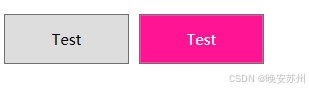
2. 在资源中设置
如下面的样式资源,
xml
<Style x:Key="Base.Style" TargetType="{x:Type Button}">
    <Setter Property="Width" Value="100" />
    <Setter Property="Height" Value="40" />
</Style>

<Style x:Key="Pink.Style" TargetType="{x:Type Button}"
       BasedOn="{StaticResource Base.Style}">
    <Setter Property="Background" Value="DeepPink" />
    <Setter Property="Foreground" Value="White" />
</Style>
可以将它们放在控件的 Resource 属性下,也可以放到资源字典中。
放在控件 Resource 下,
xml
<UserControl x:Class="WpfApp1.Views.StyleView"
             xmlns="http://schemas.microsoft.com/winfx/2006/xaml/presentation"
             xmlns:x="http://schemas.microsoft.com/winfx/2006/xaml"
             xmlns:mc="http://schemas.openxmlformats.org/markup-compatibility/2006"
             xmlns:d="http://schemas.microsoft.com/expression/blend/2008"
             mc:Ignorable="d"
             d:DesignHeight="450" d:DesignWidth="800">
    <UserControl.Resources>
        <Style x:Key="Base.Style" TargetType="{x:Type Button}">
            <Setter Property="Width" Value="100" />
            <Setter Property="Height" Value="40" />
        </Style>

        <Style x:Key="Pink.Style" TargetType="{x:Type Button}"
               BasedOn="{StaticResource Base.Style}">
            <Setter Property="Background" Value="DeepPink" />
            <Setter Property="Foreground" Value="White" />
        </Style>
    </UserControl.Resources>
    <Grid>
        <StackPanel Orientation="Horizontal">
            <Button Margin="4" Content="Test" Style="{StaticResource Base.Style}" />
            <Button Margin="4" Content="Test" Style="{StaticResource Pink.Style}" />
        </StackPanel>
    </Grid>
</UserControl>
放在资源字典,就需要手动引用资源字典(和直接放在控件 Resources 下一样),
xml
<UserControl x:Class="WpfApp1.Views.StyleView"
             xmlns="http://schemas.microsoft.com/winfx/2006/xaml/presentation"
             xmlns:x="http://schemas.microsoft.com/winfx/2006/xaml"
             xmlns:mc="http://schemas.openxmlformats.org/markup-compatibility/2006"
             xmlns:d="http://schemas.microsoft.com/expression/blend/2008"
             mc:Ignorable="d"
             d:DesignHeight="450" d:DesignWidth="800">
    <UserControl.Resources>
        <ResourceDictionary Source="pack://application:,,,/WpfApp1;Component/MyDictionary.xaml" />

    </UserControl.Resources>
    <Grid>
        <StackPanel Orientation="Horizontal">
            <Button Margin="4" Content="Test" Style="{StaticResource Base.Style}" />
            <Button Margin="4" Content="Test" Style="{StaticResource Pink.Style}" />
        </StackPanel>
    </Grid>
</UserControl>
如果引用全局的资源字典,一般都是放到 App.xaml 中,
xml
<Application x:Class="WpfApp1.App"
             xmlns="http://schemas.microsoft.com/winfx/2006/xaml/presentation"
             xmlns:x="http://schemas.microsoft.com/winfx/2006/xaml"
             xmlns:local="clr-namespace:WpfApp1"
             StartupUri="MainWindow.xaml">
    <Application.Resources>
        <ResourceDictionary Source="pack://application:,,,/WpfApp1;Component/MyDictionary.xaml" />

    </Application.Resources>
</Application>
3. 样式优先级
一般样式设置都是有优先级的,比如我在样式资源和本地都设置了按钮背景色,
xml
<Grid>
    <StackPanel Orientation="Horizontal">
        <Button Margin="4" Content="Test" Style="{StaticResource Base.Style}" />
        <Button Margin="4" Content="Test" Style="{StaticResource Pink.Style}" Background="DarkGreen" />
    </StackPanel>
</Grid>
将以本地设置为优先,

参考:
Dependency property value Precedence
优先级总结(从高到低):
-
ControlTemplate trigger
-
locally
-
本地 Style trigger
-
本地Style
-
ControlTemplate
注,如果定义了无 key 的按默认样式,如:
xml
<Style TargetType="Button">
    <Setter Property="Template">
        <Setter.Value>
            <ControlTemplate TargetType="{x:Type Button}">
                <Border x:Name="border">
                    <ContentPresenter x:Name="contentPresenter" />
                </Border>
                <ControlTemplate.Triggers>
                    <Trigger Property="IsMouseOver" Value="true">
                        <Setter TargetName="border" Property="Background" Value="Red" />
                    </Trigger>
                </ControlTemplate.Triggers>
            </ControlTemplate>
        </Setter.Value>
    </Setter>
</Style>
同时又指定了本地样式:
xml
<Button>
    <Button.Style>
        <Style TargetType="Button">
            <Setter Property="Background" Value="Yellow" />
            <Style.Triggers>
                <Trigger Property="IsMouseOver" Value="true">
                    <Setter Property="Background" Value="Green" />
                </Trigger>
            </Style.Triggers>
        </Style>
    </Button.Style>
</Button>
那么鼠标放上去不会显示红色,而是显示系统自带的 #FFBEE6FD

如果把本地 Style 删除,鼠标放上去,就会显示红色。
我的理解是:既然使用了本地 Style, 那么自定义的 Button 样式就不会被应用到这个按钮上,所以只会跟系统自带的 Button 样式作优先级对比。删除本地 Style 则恢复到:自定义样式 和 系统自带的 Button 样式作优先级对比的情况。