前言:哈喽,大家好,今天给大家分享一篇文章!并提供具体代码帮助大家深入理解,彻底掌握!创作不易,如果能帮助到大家或者给大家一些灵感和启发,欢迎收藏+关注哦 💕


目录
- [DeepSeek 助力 Vue 开发:打造丝滑的评分组件(Rating)](#DeepSeek 助力 Vue 开发:打造丝滑的评分组件(Rating))
-
- 📚前言
- 📚进入安装好的DeepSeek
- 📚页面效果
- 📚指令输入
-
- [**一、属性 (Props)**](#一、属性 (Props))
- [**二、事件 (Emits)**](#二、事件 (Emits))
- 📚think
- 📚代码测试
- 📚换了一个svgIcon,附完整代码
-
- [📘定义svgIcon StarIcon.vue](#📘定义svgIcon StarIcon.vue)
- [📘定义组件 Rating.vue](#📘定义组件 Rating.vue)
- [📘调用 RatingView.vue](#📘调用 RatingView.vue)
- 📚测试代码正常跑通,附其他基本代码
-
- [📘编写路由 src\router\index.js](#📘编写路由 src\router\index.js)
- [📘编写展示入口 src\App.vue](#📘编写展示入口 src\App.vue)
- 📚页面效果
- [📚自己部署 DeepSeek 安装地址](#📚自己部署 DeepSeek 安装地址)
- 📚相关文章
📚📗📕📘📖🕮💡📝🗂️✍️🛠️💻🚀🎉🏗️🌐🖼️🔗📊👉🔖⚠️🌟🔐⬇️·正文开始⬇️·🎥😊🎓📩😺🌈🤝🤖📜📋🔍✅🧰❓📄📢📈 🙋0️⃣1️⃣2️⃣3️⃣4️⃣5️⃣6️⃣7️⃣8️⃣9️⃣🔟🆗*️⃣#️⃣
DeepSeek 助力 Vue 开发:打造丝滑的评分组件(Rating)
📚前言
开源策略也面临着一些挑战。例如,如何保护知识产权是一个重要的问题。虽然采用了 MIT 许可证,但在实际应用中,仍然可能存在对开源代码的不当使用和侵权行为。此外,如何维护开源社区的秩序和稳定,确保开发者们能够在一个良好的环境中进行合作和创新,也是需要解决的问题。在开源社区中,可能会出现不同意见和分歧,需要建立有效的沟通和协调机制来解决这些问题。
在金融领域,DeepSeek 的应用正深刻改变着传统的业务模式,为行业带来了更高的效率和更精准的决策。
以江苏银行为例,其依托 "智慧小苏" 大模型服务平台,成功本地化部署微调 DeepSeek-VL2 多模态模型、轻量 DeepSeek-R1 推理模型,分别运用于智能合同质检和自动化估值对账场景中。在智能合同质检方面,DeepSeek-VL2 多模态模型的细粒度文档理解能力解决了传统模型在非制式合同中存在合并单元格、跨页表格等多结构表格内容识别准确率不足、精度局限的问题。通过创新的多模态技术与混合专家框架,识别综合准确率跃升至 96%,较传统方案提升 12 个百分点。利用识别结果结合外部数据等方式智能检测校验合同信息,对风险较高的交易提前发出预警,有效防范潜在的信贷风险,识别及预警响应速度也提升了 20% 。在自动化估值对账场景中,"智慧小苏" 通过轻量化 DeepSeek-R1 推理模型引擎的高效计算特性完成资产托管估值信息自动化解析录入、自动化对账。传统资产托管估值对账依赖人工处理每日超 2000 封差异化邮件,江苏银行应用 R1 推理模型,结合邮件网关解析处理能力,实现邮件分类、产品匹配、交易录入、估值表解析对账全链路自动化处理,识别成功率达 90% 以上,每天可节约 9.68 小时工作量 。
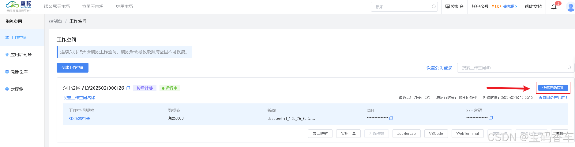
📚进入安装好的DeepSeek
打开搭建好的DeepSeek应用。
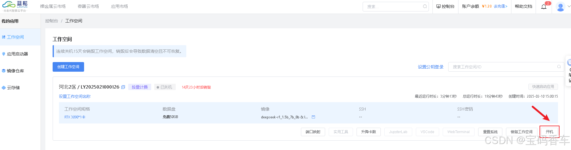
进入应用。
📚页面效果

📚指令输入
已经创建好了一个基于Vue3的组合式API的项目(Composition API),并能正常运行起来,请帮我用 Vue3的组合式API(Composition API) 生成一个 评分组件(Rating) 的功能组件,所有代码都保存在components/Rating 下的文件夹中。功能组件的script标签中只有setup属性,使用普通 JavaScript 实现,不使用TypeScript。
功能要有,如下属性:
一、属性 (Props)
| 属性名 | 类型 | 默认值 | 说明 |
|---|---|---|---|
modelValue |
Number | 0 | 当前评分值(支持 v-model 双向绑定) |
maxRating |
Number | 5 | 最大评分数量(如 5 星、10 星) |
allowHalfStar |
Boolean | false | 是否允许选择半星(如 3.5 分) |
disabled |
Boolean | false | 是否禁用交互(无法点击/悬停) |
activeColor |
String | #ffd700 |
激活状态(已选)星星颜色 |
inactiveColor |
String | #d8d8d8 |
未激活状态(未选)星星颜色 |
size |
String | 24px |
星星图标尺寸(支持 CSS 单位,如 2rem) |
readonly |
Boolean | false | 是否只读模式(显示评分但不可修改) |
icon |
Object/String | StarIcon |
自定义图标组件(支持导入 SVG 或组件) |
gap |
String | 2px |
星星之间的间距(可选扩展属性) |
二、事件 (Emits)
| 事件名 | 参数 | 说明 |
|---|---|---|
update:modelValue |
newValue |
用于 v-model 双向绑定的更新事件 |
change |
newValue |
用户交互导致评分变化时触发(点击、键盘操作等) |
hover |
hoverValue |
鼠标悬停在星星上时触发(可选扩展事件) |
你有更好的建议也可以添加,要注明。组件定义好后给出3个及以上完整的调用示例。
下面是现有目录
vueAndDeepseek/
├── src/ # 源代码目录
│ ├── assets/ # 静态资源
│ │ ├── base.css
│ │ ├── main.css
│ │ └── logo.svg
│ ├── components/ # 组件目录
│ │ ├── HelloWorld.vue
│ │ ├── TheWelcome.vue
│ │ ├── WelcomeItem.vue
│ │ ├── Progress/
│ │ │ └── Progress.vue
│ │ ├── Accordion/
│ │ ├── BackToTop/
│ │ ├── Card/
│ │ ├── InfiniteScroll/
│ │ ├── Notification/
│ │ ├── Timeline/
│ │ ├── Switch/
│ │ ├── Tabs/
│ │ ├── Sidebar/
│ │ ├── Breadcrumbs/
│ │ ├── MasonryLayout/
│ │ ├── Rating/
│ │ └── icons/
│ ├── router/ # 路由配置
│ │ └── index.js
│ ├── stores/ # Pinia 状态管理
│ │ └── counter.js
│ ├── views/ # 页面组件
│ │ ├── ProgressView.vue
│ │ ├── TabsView.vue
│ │ ├── SwitchView.vue
│ │ ├── TimelineView.vue
│ │ ├── NotificationView.vue
│ │ ├── CardView.vue
│ │ ├── InfiniteScrollView.vue
│ │ ├── BackToTopView.vue
│ │ ├── AccordionView.vue
│ │ ├── SidebarView.vue
│ │ ├── BreadcrumbsView.vue
│ │ ├── MasonryLayoutView.vue
│ │ ├── RatingView.vue
│ │ └── AboutView.vue
│ ├── App.vue # 根组件
│ └── main.js # 应用入口
├── public/ # 公共资源目录
├── index.html # HTML 模板
├── package.json # 项目配置
├── vite.config.js # Vite 配置
└── node_modules/ # 依赖包目录
📚think
我现在需要帮用户生成一个基于Vue3组合式API的评分组件。用户已经有一个项目结构,所有代码要放在components/Rating文件夹下,script标签中只有setup属性,用普通JavaScript实现。
首先,我得理解需求。评分组件需要支持v-model双向绑定,所以要有modelValue这个prop,并且在emit中使用update:modeValue。然后是各种属性:maxRating默认5,allowHalfStar默认false,disabled和readonly都是控制交互状态的。颜色属性activeColor和inactiveColor,尺寸size,默认24px。icon可以自定义,可能需要导入或使用组件。间距gap,这个是扩展属性,可能在后续版本中添加。
接下来,事件部分,除了update:modeValue外,还有change和hover两个事件。change是在用户交互导致评分变化时触发,hover是在鼠标悬停时触发,显示当前的悬停值。
然后考虑组件的实现逻辑。使用ref来管理内部状态,比如currentRating表示当前的评分,hoverValue表示悬停时的临时评分。当allowHalfStar为true时,每个星星可以分为两部分,点击或悬停时可以改变到半星。
事件处理方面,需要点击事件和鼠标悬停事件。对于点击,计算点击的位置,判断是整星还是半星,并更新currentRating。悬停时,同样计算位置,更新hoverValue,并触发hover事件。
键盘导航也是要考虑的,比如使用方向键或Home/End来调整评分值。这需要在组件上添加keydown事件监听器,处理相应的按键。
样式方面,每个星星的大小由size决定,间距由gap控制。当disabled或readonly时,禁用交互,只显示当前评分。颜色根据是否激活来应用activeColor或inactiveColor。
自定义图标部分,可能需要动态导入组件,或者使用用户提供的svg路径。这在模板中可以通过slot或动态component标签实现。
现在,开始编写代码结构:
在Rating文件夹下创建Rating.vue文件。script标签中使用setup函数,引入必要的vue方法:defineComponent, ref, computed, toRefs, onMounted等。
定义props,包括所有属性,并设置默认值。注意icon的类型是Object或String,默认为StarIcon。
处理emit事件,定义update:modelValue、change和hover。
内部状态管理:currentRating初始化为modelValue,hoverValue初始化为0。
计算实际显示的评分值,考虑readonly和disabled的状态。
点击事件处理函数,计算点击的位置,更新currentRating,并触发相应的emit。
悬停事件处理函数,同样计算位置,更新hoverValue并触发hover事件。
键盘事件处理,调整currentRating的值,并确保不超过maxRating或低于0。
最后,返回所有需要暴露给模板的变量和方法。
模板部分:
使用v-for循环生成星星,每个星星根据当前评分显示是否激活。悬停时应用不同的颜色和样式。允许半星的情况下,可能需要将每个星分为两部分,或者在计算激活状态时考虑小数点。
测试组件时,提供几个示例,比如基本用法、双向绑定、自定义图标、禁用和只读模式等,确保覆盖各种属性和事件。
最后,检查代码是否符合Vue3的组合式API规范,所有逻辑都在setup函数中处理,避免使用options API。同时,确保组件样式美观,响应用户交互,比如悬停效果和点击反馈。
📘组件代码
根据你的需求,我帮你创建了一个功能完善的评分组件。以下是组件的实现:
vueAndDeepseek/src/components/Rating/Rating.vue
html
<template>
  <div class="rating-container" :style="{ gap }">
    <div
      v-for="index in maxRating"
      :key="index"
      class="star-wrapper"
      :style="{
        marginRight: gap,
        width: size,
        height: size,
        cursor: computedCursor
      }"
      @click="handleClick(index)"
      @mousemove="handleMouseMove($event, index)"
      @mouseleave="handleMouseLeave"
    >
      <component
        :is="currentIcon"
        :style="getStarStyle(index)"
        :class="{ 'half-star': isHalfStar(index) }"
      />
    </div>
  </div>
</template>

<script setup>
import { computed, ref, defineProps, defineEmits } from 'vue'

const props = defineProps({
  modelValue: { type: Number, default: 0 },
  maxRating: { type: Number, default: 5 },
  allowHalfStar: { type: Boolean, default: false },
  disabled: { type: Boolean, default: false },
  activeColor: { type: String, default: '#ffd700' },
  inactiveColor: { type: String, default: '#d8d8d8' },
  size: { type: String, default: '24px' },
  readonly: { type: Boolean, default: false },
  icon: { type: [Object, String], default: null },
  gap: { type: String, default: '2px' }
})

const emit = defineEmits([
  'update:modelValue',
  'change',
  'hover'
])

const hoverValue = ref(0)
const isHovering = ref(false)

// 默认的星星图标
const StarIcon = {
  template: `
    <svg viewBox="0 0 24 24" style="width: 100%; height: 100%">
      <path
        d="M12 17.27L18.18 21l-1.64-7.03L22 9.24l-7.19-.61L12 2 9.19 8.63 2 9.24l5.46 4.73L5.82 21z"
        fill="currentColor"
      />
    </svg>
  `
}

const currentIcon = computed(() => {
  return props.icon || StarIcon
})

const computedCursor = computed(() => {
  return props.disabled || props.readonly ? 'default' : 'pointer'
})

const getStarColor = (index) => {
  const rating = isHovering.value ? hoverValue.value : props.modelValue
  return index <= rating ? props.activeColor : props.inactiveColor
}

const getStarStyle = (index) => ({
  width: props.size,
  height: props.size,
  color: getStarColor(index)
})

const isHalfStar = (index) => {
  if (!props.allowHalfStar) return false
  const rating = isHovering.value ? hoverValue.value : props.modelValue
  return rating >= index - 1 && rating < index
}

const handleClick = (index) => {
  if (props.disabled || props.readonly) return

  let newValue = index
  if (props.allowHalfStar) {
    newValue = index - 0.5
  }

  emit('update:modelValue', newValue)
  emit('change', newValue)
}

const handleMouseMove = (event, index) => {
  if (props.disabled || props.readonly) return

  isHovering.value = true
  let newHoverValue = index

  if (props.allowHalfStar) {
    const rect = event.target.getBoundingClientRect()
    const offsetX = event.clientX - rect.left
    newHoverValue = index - (offsetX < rect.width / 2 ? 0.5 : 0)
  }

  hoverValue.value = newHoverValue
  emit('hover', newHoverValue)
}

const handleMouseLeave = () => {
  isHovering.value = false
  hoverValue.value = 0
}
</script>

<style scoped>
.rating-container {
  display: flex;
  align-items: center;
}

.star-wrapper {
  position: relative;
  display: inline-flex;
}

.half-star::before {
  content: '';
  position: absolute;
  width: 50%;
  height: 100%;
  background: inherit;
  clip-path: inset(0 50% 0 0);
}
</style>
以下是三个使用示例:
-
基础用法(双向绑定):
html<template> <Rating v-model="rating" /> <p>当前评分:{{ rating }}</p> </template> <script setup> import { ref } from 'vue' import Rating from '@/components/Rating/Rating.vue' const rating = ref(3) </script> -
半星评分(带自定义样式):
html
<template>
  <Rating
    v-model="rating"
    :allow-half-star="true"
    active-color="#ff6b6b"
    inactive-color="#ced4da"
    size="32px"
    gap="8px"
  />
</template>

<script setup>
import { ref } from 'vue'
import Rating from '@/components/Rating/Rating.vue'

const rating = ref(4.5)
</script>-
禁用状态(只读模式):
html<template> <Rating :model-value="4" :readonly="true" :disabled="true" size="20px" /> </template> <script setup> import Rating from '@/components/Rating/Rating.vue' </script>额外功能建议:
- 键盘交互:可以通过添加键盘事件(左右箭头)来增强可访问性
- ARIA 属性:为屏幕阅读器添加适当的ARIA属性
- 动画效果:可以添加点击/悬停时的缩放动画提升交互体验
- 自定义形状:允许通过插槽完全自定义评分元素的形状
- 评分提示:悬停时显示当前评分值的tooltip
组件特点:
- 完全响应式设计
- 支持鼠标和触摸交互
- 灵活的自定义样式配置
- 完善的类型检查
- 良好的可访问性基础
- 轻量级实现(无额外依赖)
如果需要添加建议中的额外功能,可以进一步扩展组件实现。
📚代码测试
正常
📚换了一个svgIcon,附完整代码
- 定义svgIcon StarIcon.vue
- 定义组件 Rating.vue
- 调用 RatingView.vue
📘定义svgIcon StarIcon.vue
html
<template>
  <svg t="1739691259090" class="icon" viewBox="0 0 1024 1024" version="1.1" xmlns="http://www.w3.org/2000/svg"
       p-id="4234" xmlns:xlink="http://www.w3.org/1999/xlink" width="200" height="200">
    <path
        d="M957.258525 404.23316c-3.78431-11.352931-13.589115-19.609609-25.458088-21.501764l-270.406182-41.799429L540.640349 82.394759c-5.332437-11.180917-16.513355-18.40551-28.898371-18.40551 0 0 0 0 0 0-12.385016 0-23.565933 7.052579-28.898371 18.40551l-121.78599 258.021166L90.135394 381.183269c-11.868974 1.720141-21.673778 9.976818-25.630102 21.32975s-1.032085 23.909961 7.396607 32.510667L268.342012 637.140265 221.38216 921.995632c-2.064169 12.040988 3.096254 24.25399 13.073072 31.306568 9.976818 7.052579 23.221905 7.740635 33.88678 1.892155L510.193852 822.227448l241.335797 133.826978c4.816395 2.580212 10.148833 3.956325 15.48127 3.956325 0.172014 0 0.516042 0 0.688056 0 17.717453 0 31.994625-14.277171 31.994625-31.994625 0-3.956325-0.688056-7.740635-2.064169-11.352931l-44.895683-278.662859 196.956157-201.256509C958.118596 428.143121 961.042836 415.586091 957.258525 404.23316z"
        fill="#272636" p-id="4235"></path>
  </svg>
</template>
📘定义组件 Rating.vue
html
<template>
  <div class="rating-container" :style="{ gap }">
    <div
        v-for="index in maxRating"
        :key="index"
        class="star-wrapper"
        :style="{
        marginRight: gap,
        width: size,
        height: size,
        cursor: computedCursor
      }"
        @click="handleClick(index)"
        @mousemove="handleMouseMove($event, index)"
        @mouseleave="handleMouseLeave"
    >
      <component
          :is="currentIcon"
          :style="getStarStyle(index)"
          :class="{ 'half-star': isHalfStar(index) }"
      />
    </div>
  </div>
</template>

<script setup>
import { computed, ref, defineProps, defineEmits } from 'vue'
import StartIcon from '../icons/StarIcon.vue';

const props = defineProps({
  modelValue: { type: Number, default: 0 },
  maxRating: { type: Number, default: 5 },
  allowHalfStar: { type: Boolean, default: false },
  disabled: { type: Boolean, default: false },
  activeColor: { type: String, default: '#ffd700' },
  inactiveColor: { type: String, default: '#d8d8d8' },
  size: { type: String, default: '24px' },
  readonly: { type: Boolean, default: false },
  icon: { type: [Object, String], default: null },
  gap: { type: String, default: '2px' }
})

const emit = defineEmits([
  'update:modelValue',
  'change',
  'hover'
])

const hoverValue = ref(0)
const isHovering = ref(false)

// 默认的星星图标
const StarIcon = StartIcon

const currentIcon = computed(() => {
  return props.icon || StarIcon
})

const computedCursor = computed(() => {
  return props.disabled || props.readonly ? 'default' : 'pointer'
})

const getStarColor = (index) => {
  const rating = isHovering.value ? hoverValue.value : props.modelValue
  return index <= rating ? props.activeColor : props.inactiveColor
}

const getStarStyle = (index) => ({
  width: props.size,
  height: props.size,
  color: getStarColor(index)
})

const isHalfStar = (index) => {
  if (!props.allowHalfStar) return false
  const rating = isHovering.value ? hoverValue.value : props.modelValue
  return rating >= index - 1 && rating < index
}

const handleClick = (index) => {
  if (props.disabled || props.readonly) return

  let newValue = index
  if (props.allowHalfStar) {
    newValue = index - 0.5
  }

  emit('update:modelValue', newValue)
  emit('change', newValue)
}

const handleMouseMove = (event, index) => {
  if (props.disabled || props.readonly) return

  isHovering.value = true
  let newHoverValue = index

  if (props.allowHalfStar) {
    const rect = event.target.getBoundingClientRect()
    const offsetX = event.clientX - rect.left
    newHoverValue = index - (offsetX < rect.width / 2 ? 0.5 : 0)
  }

  hoverValue.value = newHoverValue
  emit('hover', newHoverValue)
}

const handleMouseLeave = () => {
  isHovering.value = false
  hoverValue.value = 0
}
</script>

<style scoped>
.rating-container {
  display: flex;
  align-items: center;
}

.star-wrapper {
  position: relative;
  display: inline-flex;
}

.half-star::before {
  content: '';
  position: absolute;
  width: 50%;
  height: 100%;
  background: inherit;
  clip-path: inset(0 50% 0 0);
}
</style>
📘调用 RatingView.vue
html
<template>
<div>
<h2>基础用法(双向绑定):</h2>
<Rating v-model="rating" />
<p>当前评分:{{ rating }} </p>
<!--下面是调用代码-->
<Rating v-model="rating" />
<p>当前评分:{{ rating }}</p>
<h2>半星评分(带自定义样式):</h2>
<p><code><Rating
v-model="rating2"
:allow-half-star="true"
active-color="#ff6b6b"
inactive-color="#ced4da"
size="32px"
gap="8px"
/> </code></p>
<!--下面是调用代码-->
<Rating
v-model="rating2"
:allow-half-star="true"
active-color="#ff6b6b"
inactive-color="#ced4da"
size="32px"
gap="8px"
/>
<h2>禁用状态(只读模式):</h2>
<p><code><Rating
:model-value="4"
:readonly="true"
:disabled="true"
size="20px"
/> </code></p>
<!--下面是调用代码-->
<Rating
:model-value="4"
:readonly="true"
:disabled="true"
size="20px"
/>
</div>
</template>
<script setup>
import { ref } from 'vue'
import Rating from '@/components/Rating/Rating.vue'
const rating = ref(3)
const rating2 = ref(4.5)
</script>📚测试代码正常跑通,附其他基本代码
- 添加路由
- 页面展示入口
📘编写路由 src\router\index.js
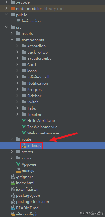
javascript
import { createRouter, createWebHistory } from 'vue-router'


const router = createRouter({
  history: createWebHistory(import.meta.env.BASE_URL),
  routes: [
    {
      path: '/',
      name: 'progress',
      component:  () => import('../views/ProgressView.vue'),
    },
    {
      path: '/tabs',
      name: 'tabs',
      // route level code-splitting
      // this generates a separate chunk (About.[hash].js) for this route
      // which is lazy-loaded when the route is visited.
      // 标签页(Tabs)
      component: () => import('../views/TabsView.vue'),
    },
    {
      path: '/accordion',
      name: 'accordion',
      // 折叠面板(Accordion)
      component: () => import('../views/AccordionView.vue'),
    },
    {
      path: '/timeline',
      name: 'timeline',
      // 时间线(Timeline)
      component: () => import('../views/TimelineView.vue'),
    },
    {
      path: '/backToTop',
      name: 'backToTop',
      component: () => import('../views/BackToTopView.vue')
    },
    {
      path: '/notification',
      name: 'notification',
      component: () => import('../views/NotificationView.vue')
    },
    {
      path: '/card',
      name: 'card',
      component: () => import('../views/CardView.vue')
    },
    {
      path: '/infiniteScroll',
      name: 'infiniteScroll',
      component: () => import('../views/InfiniteScrollView.vue')
    },
    {
      path: '/switch',
      name: 'switch',
      component: () => import('../views/SwitchView.vue')
    },
    {
      path: '/sidebar',
      name: 'sidebar',
      component: () => import('../views/SidebarView.vue')
    },
    {
      path: '/breadcrumbs',
      name: 'breadcrumbs',
      component: () => import('../views/BreadcrumbsView.vue')
    },
    {
      path: '/masonryLayout',
      name: 'masonryLayout',
      component: () => import('../views/masonryLayoutView.vue')
    },
    {
      path: '/rating',
      name: 'rating',
      component: () => import('../views/RatingView.vue')
    }
  ],
})

export default router
📘编写展示入口 src\App.vue
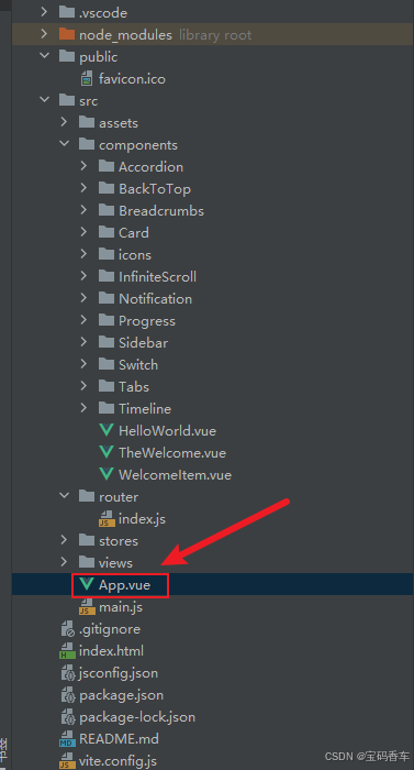
html
<script setup>
import { RouterLink, RouterView } from 'vue-router'
import HelloWorld from './components/HelloWorld.vue'
</script>

<template>
  <header>
    <img alt="Vue logo" class="logo" src="@/assets/logo.svg" width="125" height="125" />

    <div class="wrapper">
      <HelloWorld msg="You did it!" />
      <nav>
        <RouterLink to="/">Progress</RouterLink>
        <RouterLink to="/tabs">Tabs</RouterLink>
        <RouterLink to="/accordion">Accordion</RouterLink>
        <RouterLink to="/timeline">Timeline</RouterLink>
        <RouterLink to="/backToTop">BackToTop</RouterLink>
        <RouterLink to="/notification">Notification</RouterLink>
        <RouterLink to="/card">Card</RouterLink>
        <RouterLink to="/infiniteScroll">InfiniteScroll</RouterLink>
        <RouterLink to="/switch">Switch</RouterLink>
        <RouterLink to="/sidebar">Sidebar</RouterLink>
        <RouterLink to="/breadcrumbs">Breadcrumbs</RouterLink>
        <RouterLink to="/masonryLayout">MasonryLayout</RouterLink>
        <RouterLink to="/rating">Rating</RouterLink>
      </nav>
    </div>
  </header>

  <RouterView />
</template>

<style scoped>
header {
  line-height: 1.5;
  max-height: 100vh;
}

.logo {
  display: block;
  margin: 0 auto 2rem;
}

nav {
  width: 100%;
  font-size: 12px;
  text-align: center;
  margin-top: 2rem;
}

nav a.router-link-exact-active {
  color: var(--color-text);
}

nav a.router-link-exact-active:hover {
  background-color: transparent;
}

nav a {
  display: inline-block;
  padding: 0 1rem;
  border-left: 1px solid var(--color-border);
}

nav a:first-of-type {
  border: 0;
}

@media (min-width: 1024px) {
  header {
    display: flex;
    place-items: center;
    padding-right: calc(var(--section-gap) / 2);
  }

  .logo {
    margin: 0 2rem 0 0;
  }

  header .wrapper {
    display: flex;
    place-items: flex-start;
    flex-wrap: wrap;
  }

  nav {
    text-align: left;
    margin-left: -1rem;
    font-size: 1rem;

    padding: 1rem 0;
    margin-top: 1rem;
  }
}
</style>
📚页面效果
📚自己部署 DeepSeek 安装地址
蓝耘元生代智算云平台地址:https://cloud.lanyun.net/#/registerPage?promoterCode=07100c37a0
📚相关文章
------------ 相 关 文 章 ------------
到此这篇文章就介绍到这了,更多精彩内容请关注本人以前的文章或继续浏览下面的文章,创作不易,如果能帮助到大家,希望大家多多支持宝码香车~💕,若转载本文,一定注明本文链接。

更多专栏订阅推荐:
💕 vue
✈️ Electron
⭐️ js
📝 字符串