目录
引言
QML的Loader组件提供了一种强大的机制,使开发者能够动态加载和卸载QML组件,这对于优化内存使用和提升应用性能至关重要。本文将通过两个实用示例:延迟加载和组件切换,深入探讨Loader组件的应用场景和技术细节。
相关阅读
工程结构
Main.qml LoaderDelay.qml LoaderSwitch.qml component/HeavyComponent.qml 内置Component1 内置Component2
LoaderDelay.qml - 延迟加载实现
在某些场景下,我们需要加载资源密集型组件,但又不希望在应用启动时立即加载,以避免启动延迟。通过Loader结合Timer,可以实现按需延迟加载。
完整代码
qml
import QtQuick
import QtQuick.Controls

Rectangle {
    color: "lightgray"

    Column {
        anchors.centerIn: parent
        spacing: 10

        Button {
            text: "延迟加载"
            onClicked: {
                busyIndicator.running = true
                delayTimer.start()
            }
            anchors.horizontalCenter: parent.horizontalCenter
        }

        BusyIndicator {
            id: busyIndicator
            running: false
            anchors.horizontalCenter: parent.horizontalCenter
        }

        Loader {
            id: loader
            width: 200
            height: 200
            anchors.horizontalCenter: parent.horizontalCenter
        }
    }

    Timer {
        id: delayTimer
        interval: 2000  // 延迟2秒加载
        onTriggered: {
            loader.source = "component/HeavyComponent.qml"
            busyIndicator.running = false
        }
    }
}
HeavyComponent.qml
qml
import QtQuick
import QtQuick.Controls

Rectangle {
    width: 200
    height: 200
    color: "#666"

    Column {
        anchors.centerIn: parent
        spacing: 15

        Text {
            text: "耗时组件已加载完成"
            font.pixelSize: 16
            color: "#333"
            anchors.horizontalCenter: parent.horizontalCenter
        }

        Text {
            text: "加载用时:2秒"
            font.pixelSize: 14
            color: "#333"
            anchors.horizontalCenter: parent.horizontalCenter
        }

        // 旋转的方块
        Rectangle {
            width: 50
            height: 50
            color: "white"
            anchors.horizontalCenter: parent.horizontalCenter

            RotationAnimation on rotation {
                from: 0
                to: 360
                duration: 3000
                loops: Animation.Infinite
            }
        }
    }
}
代码解析
延迟加载机制:
- LoaderDelay.qml中包含一个空的Loader组件,初始状态下不加载任何内容
- 点击"延迟加载"按钮后,显示BusyIndicator并启动Timer
- Timer触发后(2秒延迟),Loader加载HeavyComponent.qml并隐藏BusyIndicator
用户交互流程:
- 用户点击按钮 → 显示加载指示器 → 延迟2秒 → 加载重型组件 → 隐藏加载指示器
HeavyComponent组件:
- 模拟一个资源密集型组件,包含文本和动画效果
- 在实际应用中,这可能是包含复杂图形、大量数据处理或网络请求的组件
运行效果

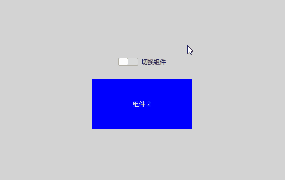
LoaderSwitch.qml - 动态切换组件
使用Loader动态切换不同组件是一种常见需求,特别是在需要根据用户操作或系统状态切换界面时。
完整代码
qml
import QtQuick
import QtQuick.Controls

Rectangle {
    color: "lightgray"

    Column {
        anchors.centerIn: parent
        spacing: 20

        Switch {
            id: controlSwitch
            text: "切换组件"
            anchors.horizontalCenter: parent.horizontalCenter
        }

        Loader {
            width: 200
            height: 100
            anchors.horizontalCenter: parent.horizontalCenter
            sourceComponent: controlSwitch.checked ? component1 : component2
        }
    }

    Component {
        id: component1
        Rectangle {
            width: 200
            height: 100
            color: "red"
            Text {
                anchors.centerIn: parent
                text: "组件 1"
                color: "white"
            }
        }
    }

    Component {
        id: component2
        Rectangle {
            width: 200
            height: 100
            color: "blue"
            Text {
                anchors.centerIn: parent
                text: "组件 2"
                color: "white"
            }
        }
    }
}
代码解析
组件切换机制:
- 通过Switch控件控制Loader加载的组件
- 使用三元操作符(?:)根据Switch状态动态切换sourceComponent属性
- 当Switch被选中时加载component1(红色矩形),未选中时加载component2(蓝色矩形)
内联Component定义:
- 两个组件直接在文件中定义,而非外部文件
- 这种方式适合简单组件,减少了文件数量,提高了代码可读性
绑定与自动更新:
- sourceComponent属性与Switch状态的绑定确保UI自动更新
- 无需额外编写信号处理代码
运行效果
Main.qml - 主界面实现
为了将所有示例串联起来,我们使用了Main.qml作为主界面,它采用左侧列表 + 右侧内容区的布局方式。
完整代码
qml
import QtQuick
import QtQuick.Controls
import QtQuick.Layouts

ApplicationWindow {
    visible: true
    width: 800
    height: 600
    title: "QML Loader 示例"

    RowLayout {
        anchors.fill: parent
        spacing: 10

        // 左侧选择栏
        ListView {
            Layout.preferredWidth: 200
            Layout.fillHeight: true
            model: [
                "文件加载",
                "组件加载",
                "加载状态",
                "动态标签",
                "创建控件",
                "延迟加载",
                "切换组件"
            ]
            delegate: ItemDelegate {
                width: parent.width
                text: modelData
                highlighted: ListView.isCurrentItem
                onClicked: {
                    listView.currentIndex = index
                    switch(index) {
                        case 0: mainLoader.source = "LoaderFile.qml"; break
                        case 1: mainLoader.source = "LoaderComponent.qml"; break
                        case 2: mainLoader.source = "LoaderStatus.qml"; break
                        case 3: mainLoader.source = "LoaderDynamicTab.qml"; break
                        case 4: mainLoader.source = "LoaderCreateControls.qml"; break
                        case 5: mainLoader.source = "LoaderDelay.qml"; break
                        case 6: mainLoader.source = "LoaderSwitch.qml"; break
                    }
                }
            }
            id: listView
        }

        // 右侧内容区
        Loader {
            id: mainLoader
            Layout.fillWidth: true
            Layout.fillHeight: true
            source: "LoaderFile.qml"
        }
    }
}
主界面结构
Main.qml 选择示例 加载 右侧Loader 左侧列表 各示例QML文件 LoaderFile.qml LoaderComponent.qml LoaderStatus.qml LoaderDynamicTab.qml LoaderCreateControls.qml LoaderDelay.qml LoaderSwitch.qml
代码解析
布局设计:
- 使用RowLayout实现左右分栏布局
- 左侧列表固定宽度,右侧内容区自适应填充
导航机制:
- ListView结合ItemDelegate实现导航列表
- 点击列表项更新currentIndex并切换mainLoader的source
动态加载:
- 主界面本身使用Loader加载各个示例组件
- 实现了示例之间的无缝切换,避免所有组件同时加载消耗资源
总结
通过本文的两个示例,我们展示了QML Loader组件在不同场景下的应用:
延迟加载(LoaderDelay.qml):
- 按需加载复杂组件,提升应用启动性能
- 配合BusyIndicator提供良好的用户体验
- 使用Timer实现延迟加载机制
动态切换(LoaderSwitch.qml):
- 基于用户输入实时切换UI组件
- 使用内联Component定义简化代码结构
- 通过绑定实现自动UI更新
Loader组件是QML中的性能优化利器,它能够:
- 减少初始加载时间和内存占用
- 实现UI组件的动态切换和按需加载
- 根据用户操作或应用状态灵活管理界面
下载链接
完整代码可在以下地址获取:GitCode - QML Loader示例