鸿蒙开发入门到进阶:从布局基础到组件实战
@TOC
单位
前言
在布局中,经常会采用px来作为布局的一个尺寸参考单位,这个单位在浏览器页面已经是布局的标准,在鸿蒙开发中,提出了一些新的单位用于布局。
- 物理像素:一般用
px来表示。- 逻辑像素:在布局的时候底层针对物理像素和屏幕的尺寸关系进行了转化的中间层。
- 分辨率:代表屏幕上面到底布局了多少像素点(发光点)。
css
div{
	width:500px;
	height:50px;
}上面样式的500px实际上参考3560px像素为布局,但是最终渲染出来结果转化为了1680px支持的比例,鸿蒙开发中,要进行布局,需要采用官方提供的单位来实现。
| 名称 | 描述 |
|---|---|
px |
屏幕物理像素单位。预览器默认1080px,如果你的盒子100px,默认参考1080px来布局 |
vp |
屏幕密度相关像素,根据屏幕像素密度转换为屏幕物理像素,当数值不带单位时,默认单位,vp。说明:vp与px的比例与屏幕像素密度有关。 以屏幕实际大小为参考布局 |
fp |
字体像素,与vp类似适用屏幕密度变化,随系统字体大小设置变化。 |
lpx |
视窗逻辑像素单位,lpx单位为实际屏幕宽度与逻辑宽度(通过designWidth配置)的比值,designWidth默认值为720。当designWidth为720时,在实际宽度为1440物理像素的屏幕上,1lpx为2px大小。 |
代码为:
typescript
@Entry
@Component
struct Page02_TaskList{
  build() {
    Column(){
      Text("文本")
        .fontSize(30)
      Row()
        .width("100vp")
        .height("100vp")
        .backgroundColor("red")
      Row()
        .width("100lpx")
        .height("100lpx")
        .backgroundColor("black")
    }
    .width("100%")
    .height("100%")
  }
}
总结:
总结:
- 如果采用
px作为单位,在鸿蒙中参考的物理像素作为布局参考尺寸。物理像素值可能是动态变化,放在不同手机上面,物理像素可能会变。 vp作为鸿蒙开发中我们推荐的单位,采用当前手机的屏幕宽度来作为我们布局的参考,不管物理像素到底是多少,可以减少屏幕之间布局的差异,默认不写单位vp。fp一般用于设置字体大小,默认可以采用vp作为字体大小,fp最大的特点随着系统字体大小变化而变化。lpx这个单位要进行换算。如果设计稿为720px,像素单位为1440px,他们之间换算单位为1lpx为2px大小。
Column和Row布局
前言
Column默认垂直方向为主轴,水平方向为侧轴。Row默认水平方向为主轴,垂直方向为侧轴。
元素放在这两个容器中,子元素默认会在侧轴方向上面水平居中
typescript
@Entry
@Component
struct Page02_TaskList{
  build() {
    Column(){
      Column(){
        Text("你好,小王")
          .fontSize(30)
          .fontWeight(FontWeight.Bold)
          .fontColor("#12175E")
        Text("测试代码")
      }
      .width("100%")
      .height("50%")
      .backgroundColor(Color.Gray)
      // .alignItems(HorizontalAlign.Start)  // 侧轴方向
      Row(){
        Text("Row")
      }
      .width("100%")
      .height("50%")
      .backgroundColor(Color.Pink)
    }
  }
}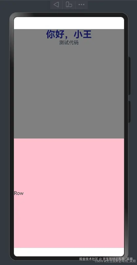
在布局过程中,这两个组件都可以用alignItems和justifyContent来调整子元素的布局方案。
typescript
@Entry
@Component
struct Page02_TaskList{
  build() {
    Column(){
      Column(){
        Text("你好,小王")
          .fontSize(30)
          .fontWeight(FontWeight.Bold)
          .fontColor("#12175E")
        Text("测试代码")
      }
      .width("100%")
      .height("50%")
      .backgroundColor(Color.Gray)
      .alignItems(HorizontalAlign.Start)  // 侧轴方向
      .justifyContent((FlexAlign.SpaceBetween))
      Row(){
        Text("Row")
      }
      .width("100%")
      .height("50%")
      .backgroundColor(Color.Pink)
      .alignItems(VerticalAlign.Top)
      .justifyContent(FlexAlign.SpaceBetween)
    }
  }
}
布局案例效果及代码
typescript
import { TaskStatisties } from "../view/TaskStatisties"
import { TaskItem } from "../view/TaskItem"
@Entry
@Component
struct Page02_TaskList{
  build() {
    Column(){
      Text("你好,小王")
        .fontSize(30)
        .fontWeight(FontWeight.Bold)
        .fontColor($r("app.color.text_color"))
      Text("让每天的工作效率提高")
        .fontSize(14)
        .fontColor(Color.Gray)
        .margin({top:14})
      Text("我的计划")
        .fontSize(26)
        .fontWeight(FontWeight.Bold)
        .fontColor($r("app.color.text_color"))
        .margin({top:30})
     /*
      * 我的计划列表
      * */
      TaskStatisties()
    /*
     * 今天任务
     * */
      Column({space:10}){
        // 标题板块
        Row(){
          Text("今日任务")
            .fontSize(26)
            .fontWeight(FontWeight.Bold)
            .fontColor($r("app.color.text_color"))
          Text("查看更多")
            .fontSize(14)
            .fontColor($r("app.color.text_color"))
        }
        .width("100%")
        .justifyContent(FlexAlign.SpaceBetween)
        .alignItems(VerticalAlign.Bottom)
        .margin({top:20})
        .width("100%")
        //  任务列表渲染
        TaskItem()
      }

    }
    .width("100%")
    .height("100%")
    .backgroundColor("#f1f3f5")
    .alignItems(HorizontalAlign.Start)
    .padding({left:10,top:10,right:10,bottom:10})

  }
}其中TaskStatisties组件代码
typescript
@Component
export struct TaskStatisties{
  build() {
    // 我的计划
    Row(){
      // 我的计划左侧
      Column({space:10}){
        // 存放已完成的任务
        Column(){
          Image($r("app.media.startIcon"))
            .width(70)
            .margin({top:10,left:10,bottom:10})
          Text("已完成")
            .fontWeight(FontWeight.Bold)
            .fontSize(18)
            .fontColor($r("app.color.text_color"))
            .margin({left:15})
          Text("0任务")
            .fontWeight(FontWeight.Bold)
            .fontSize(18)
            .fontColor($r("app.color.text_color"))
            .margin({left:15,top:5})
        }
        .height(164)
        .width(168)
        .backgroundColor("#83C7E3")
        .borderRadius(15)
        .alignItems(HorizontalAlign.Start)
        // 等待中任务
        Column({space:5}){
          Image($r("app.media.startIcon"))
            .width(34)
            .margin({top:5,bottom:10})
          Text("等待中")
            .fontWeight(FontWeight.Bold)
            .fontSize(18)
            .fontColor($r("app.color.text_color"))
          Text("0任务")
            .fontWeight(FontWeight.Bold)
            .fontSize(18)
            .fontColor($r("app.color.text_color"))
        }
        .height(128)
        .width(168)
        .backgroundColor("#DE817E")
        .borderRadius(15)
        .alignItems(HorizontalAlign.Start)
        .padding({left:20,top:20})
      }
      .width("50%")
      .height("100%")
      // 我的计划右侧
      Column({space:10}){
        // 未完成
        Column({space:5}){
          Image($r("app.media.startIcon"))
            .width(34)
            .margin({top:5,bottom:10})
          Text("未完成")
            .fontWeight(FontWeight.Bold)
            .fontSize(18)
            .fontColor($r("app.color.text_color"))
          Text("0任务")
            .fontWeight(FontWeight.Bold)
            .fontSize(18)
            .fontColor($r("app.color.text_color"))
        }
        .height(128)
        .width(168)
        .backgroundColor("#717CE7")
        .borderRadius(15)
        .alignItems(HorizontalAlign.Start)
        .padding({left:20,top:20})
        // 未来任务
        Column(){
          Image($r("app.media.startIcon"))
            .width(70)
            .margin({top:10,left:10,bottom:10})
          Text("未来任务")
            .fontWeight(FontWeight.Bold)
            .fontSize(18)
            .fontColor($r("app.color.text_color"))
            .margin({left:15})
          Text("0任务")
            .fontWeight(FontWeight.Bold)
            .fontSize(18)
            .fontColor($r("app.color.text_color"))
            .margin({left:15,top:5})
        }
        .height(164)
        .width(168)
        .backgroundColor("#A4E8B9")
        .borderRadius(15)
        .alignItems(HorizontalAlign.Start)
      }
      .width("50%")
      .height("100%")
    }
    .height(300)
    .width("100%")
  }
}其中TaskItem组件代码
typescript
@Component
export struct TaskItem{
  build() {
    Column({space:10}){
      Column({space:10}){
        // 存放图片和文字
        Row({space:20}){
          Image($r("app.media.startIcon"))
            .width(30)
            .height(30)
          Text("完成HarmonyOs第一阶段项目")
            .fontColor($r("app.color.text_color"))
            .fontWeight(FontWeight.Bold)
            .fontSize(18)
        }
        .width("100%")
        Text(`9:00-12:00`)
          .fontWeight(FontWeight.Bold)
          .fontColor(Color.Gray)
        Row(){
          Text("生活")
            .fontColor(Color.White)
        }.width(80)
        .height(30)
        .backgroundColor(Color.Brown)
        .borderRadius("50%")
        .justifyContent(FlexAlign.Center)
      }
      .width("100%")
      .height(120)
      .backgroundColor(Color.White)
      .borderRadius(10)
      .alignItems(HorizontalAlign.Start)
      .padding({left:15,top:10})
    }
  }
}
Scroll滚动组件
前言
在移动端开发中,都会遇到水平方向或者垂直方向内容超过过后,默认无法查看的问题,这个需要借助官方提供的Scroll组件来实现页面滚动,支持水平方向,也可以支持垂直方向。
常用属性
typescript
.scrollable(ScrollDirection.Vertical) // 滚动方向纵向
.scrollBar(BarState.On) // 滚动条常驻显示
.scrollBarColor(Color.Gray) // 滚动条颜色
.scrollBarWidth(10) // 滚动条宽度
.scrollSnap()  //设置Scroll组件的限位滚动模式。
.friction(0.6) // 用于设置摩擦系数,穿戴设备和其他设备不一样
.edgeEffect(EdgeEffect.None)  // 滚动到边缘的效果
.enableScrollInteraction(true) // 设置是否支持滚动手势,当设置为false时,无法通过手指或者鼠标滚动,但不影响控制器的滚动接口。
.initialOffset({xOffset:20}) // 设置初始滚动偏移量只在首次布局时生效,后续动态修改该属性值不生效。
常用方法回调
typescript
// 即将滚动的时候,触发事件
.onWillScroll((xOffset: number, yOffset: number, scrollState: ScrollState) => {
    console.info(xOffset + ' ' + yOffset)
  })
  // 滚动到边缘事件回调。
  .onScrollEdge((side: Edge) => {})
  // 滚动开始触发
  .onScrollStart(() => {})
  // 滚动停止触发
  .onScrollStop(() => {})
  // 滚动事件回调,Scroll滚动时触发。
.onDidScroll(()=>{})滚动容器组件的控制器Scroller
可滚动容器组件的控制器,可以将此组件绑定至容器组件,然后通过它控制容器组件的滚动,同一个控制器不可以控制多个容器组件,目前支持绑定到List,Scroll,ScrollBar,Grid,WaterFlow上。
- Scroller控制与滚动容器组件的绑定发生在组件创建阶段。
- Scroller控制器与滚动容器组件绑定后才可以正常调用Scroller方法,否则根据调用接口不同会不生效又或者抛异常。
导入对象:scroller: Scroller = new Scroller()
Scroller常用API
-
滑动到指定位置
scrollTo(value: { xOffset: number | string, yOffset: number | string, animation?: ScrollAnimationOptions | boolean }) -
滚动到容器边缘,不区分滚动轴方向,Edge.Top和Edge.Start表现相同,Edge.Bottom和Edge.End表现相同。
scrollEdge(value: Edge, options?: ScrollEdgeOptions) -
滚动类组件开启按传入的初始速度进行惯性滚动。
fling(velocity: number): void -
滚动到下一页或者上一页。
scrollPage(value: ScrollPageOptions) -
获取当前的滚动偏移量。
currentOffset(): OffsetResult -
滑动到指定Index,支持设置滑动额外偏移量。
scrollToIndex(value: number, smooth?: boolean, align?: ScrollAlign, options?: ScrollToIndexOptions) -
滑动指定距离。
scrollBy(dx: Length, dy: Length) -
查询组件是否滚动到底部。
isAtEnd(): boolean -
获取子组件的大小及相对容器组件的位置。
getItemRect(index: number): RectResult -
通过坐标获取子组件的索引。
getItemIndex(x: number, y: number): number
使用示例:
typescript
  scroller: Scroller = new Scroller()
  Button('scroll 150')
       .height('5%')
       .onClick(() => { // 点击后下滑指定距离150.0vp
         this.scroller.scrollBy(0, 150)
       })
       .margin({ top: 10, left: 20 })
     Button('scroll 100')
       .height('5%')
       .onClick(() => { // 点击后滑动到指定位置,即下滑100.0vp的距离
         const yOffset: number = this.scroller.currentOffset().yOffset;
         this.scroller.scrollTo({ xOffset: 0, yOffset: yOffset + 100 })
       })
       .margin({ top: 60, left: 20 })
     Button('scroll 100')
       .height('5%')
       .onClick(() => { // 点击后滑动到指定位置,即下滑100.0vp的距离,滑动过程配置有动画
         let curve = curves.interpolatingSpring(10, 1, 228, 30) //创建一个阶梯曲线
         const yOffset: number = this.scroller.currentOffset().yOffset;
         this.scroller.scrollTo({ xOffset: 0, yOffset: yOffset + 100, animation: { duration: 1000, curve: curve } })
       })
       .margin({ top: 110, left: 20 })
滚动案例效果及代码
案例: 
this的指向问题
前言
面向对象开发的时候,会出现this使用,在进行事件绑定的时候,也会设计this调用指向,在箭头函数中我们也会用到this,准备判断他的指向
场景一:在普通函数中使用this
javascript
function show(){
	// this这个关键字,只是一个占位符
	console.log(this)
}
window.show()  // 打印window对象
场景二、面向对象中
javascript
/*
* Stu只是类模板,真正的对象new出来
*/
class Student{
	constructor(id,name){
		this.id = id
		this.name = name
		this.message()
	}
	message(){}
	play(){
		this.message()
	}
}

const stu = new Student()
console.log(stu.id)
const stu2 = new Student()
总结
- 类模板中
this默认占位符,如果你没有通过类new一个对象,实际上类中的this没意义。- 当你执行
new操作符的时候,通过类模板创建出一个对象,类中this代表new出来的对象。- 类中的函数和属性要相互调用,都必须通过
this来进行调用。
场景三:事件函数的绑定
javascript
<button id="btn"> 点击</button>
const obtn = document.getElemengById("btn")
obtn.onClick = function(){
	console.log(this)  // 输出button节点
}
事件函数中绑定了普通函数过后,内部的this默认指向事件源对象。
场景四:箭头函数中的this
作用域:全局作用域,局部作用域(函数作用域),eval作用域(忽略),块级作用域(不参与)
javascript
const user = {
	id:1,
	name:"wuyong"
	play:()=>{
		console.log(this)  // 指向user
	}
}
user.play()改变this指向
call:call可以传递多个参数,第一个当前this环境,第二个往后参数。call(this,1,2,3) apply:可以传递多个参数,第一个当前this环境,第二个参数是数组。apply(this,[1,2,3]) bind:参数跟call一样,传递多个,但是返回一个函数,const fun = bind(this,1,2,3) fun
结论:
this永远指向一个对象,不管在哪种场景下面。- 普通函数中
this,谁调用这个函数,默认this就是指向谁。- 建通函数默认没有
this的指向,如果箭头函数中有this出现,一定指向父级作用域。
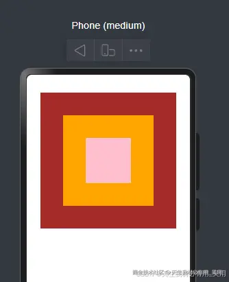
Stack布局模式
层叠布局(StackLayout)用于在屏幕上预留一块区域显示组件中的元素,提供元素可以重叠的布局,层叠布局通过Stack容器组件实现位置的固定定位与层叠, 容器中的子元素依次入栈,最后一个子元素覆盖前一个子元素,子元素可以叠加,也可以设置位置。 类似于前端布局的绝对定位,默认情况所有元素都叠在一起渲染。
基础效果
基础效果代码
javascript
@Entry
@Component
struct Page04_Stack{
  build() {
    Column(){
      Stack(){
        Column(){}
        .width(300)
        .height(300)
        .backgroundColor(Color.Brown)
        Column(){}
        .width(200)
        .height(200)
        .backgroundColor(Color.Orange)
        Column(){}
        .width(100)
        .height(100)
        .backgroundColor(Color.Pink)
      }
    }.width("100%")
    .height("100%")
  }
}
总结:
- 放在Stack容器里面的元素,默认会产生重叠。
- 所有子元素在重叠时候,默认居中排列。
对齐方式
Stack(value?: { alignContent?: Alignment }) alignContent属性:就是代表默认的子元素排列位置。 Alignment :官方提供位置枚举数据,左上角,右上角,上,下,左,右,左下角,右下角,居中。
javascript
Stack({alignContent:Alignment.TopStart}){} 分别对应下图
  代码:
代码:
Z序控制
Stack容器中兄弟组件显示层级关系可以通过z序控制的zindex属性改变,zindex值越大,显示层级越高,即zindex值大的组件会覆盖在zindex值小的组件上方。类似于前端开发中的z-index层级控制。 注意:zIndex是一个属性,用在子元素身上。
javascript
Column(){}
  .width(100)
   .height(100)
   .backgroundColor(Color.Pink)
   .zIndex(999)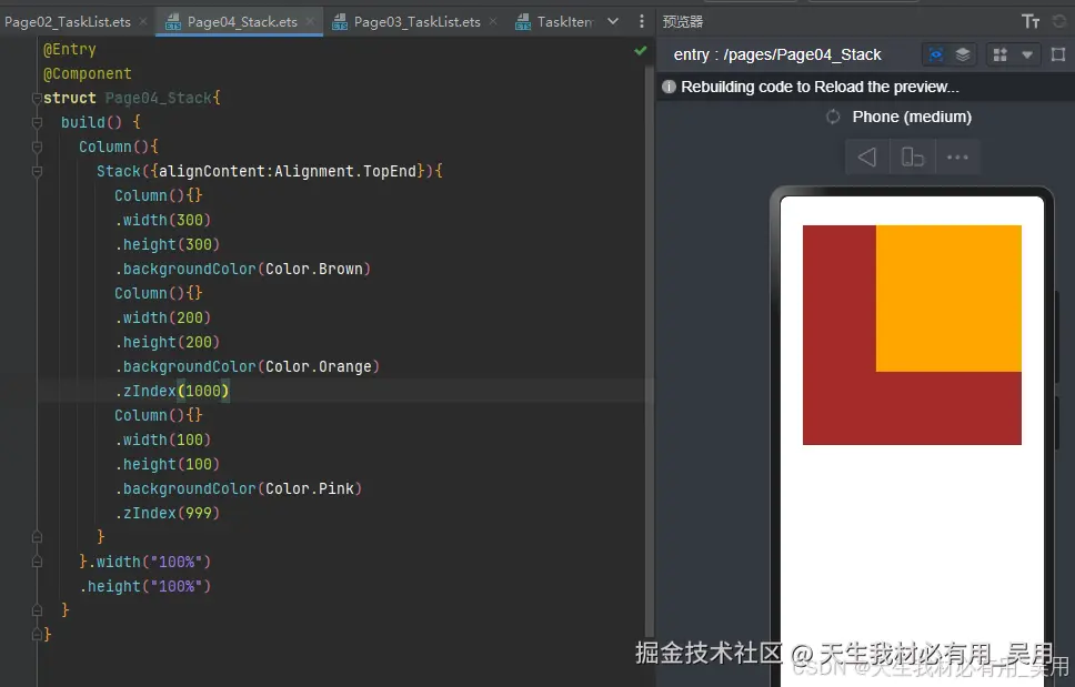
Stack案例效果及代码
效果:  案例代码:
案例代码:
javascript
import { TaskStatisties } from "../view/TaskStatisties"
import { TaskItem } from "../view/TaskItem"
@Entry
@Component
struct Page02_TaskList{
  build() {
    Stack({alignContent:Alignment.BottomEnd}){
      Column(){
        Text("你好,小王")
          .fontSize(30)
          .fontWeight(FontWeight.Bold)
          .fontColor($r("app.color.text_color"))
        Text("让每天的工作效率提高")
          .fontSize(14)
          .fontColor(Color.Gray)
          .margin({top:14})
        /*
         * 我的计划列表
         * */
        Scroll(){
          Column(){
            Text("我的计划")
              .fontSize(26)
              .fontWeight(FontWeight.Bold)
              .fontColor($r("app.color.text_color"))
              .margin({top:30})
            TaskStatisties()
            /*
             * 今天任务
             * */
            Column({space:10}){
              // 标题板块
              Row(){
                Text("今日任务")
                  .fontSize(26)
                  .fontWeight(FontWeight.Bold)
                  .fontColor($r("app.color.text_color"))
                Text("查看更多")
                  .fontSize(14)
                  .fontColor($r("app.color.text_color"))
              }
              .width("100%")
              .justifyContent(FlexAlign.SpaceBetween)
              .alignItems(VerticalAlign.Bottom)
              .margin({top:20})
              .width("100%")
              //  任务列表渲染
              TaskItem()
            }
          }
          .alignItems(HorizontalAlign.Start)
        }
        .scrollable(ScrollDirection.Vertical)
        .scrollBar(BarState.Off)
      }
      .width("100%")
      .height("100%")
      .backgroundColor("#f1f3f5")
      .alignItems(HorizontalAlign.Start)
      .padding({left:10,top:10,right:10,bottom:80})
      Stack(){
        Image($r("app.media.ellipse"))
          .width(40)
          .height(40)
        Image($r("app.media.jiahao"))
          .width(30)
          .height(30)
      }.margin({
        bottom:50,
        right:30
      })
    }
  }
}
RelativeContainer布局
前言
在应用的开发过程中,经常设计复杂界面,这个就涉及到多个相同或不同组件之间的嵌套,如果布局组件嵌套深度过深,或者嵌套组件书过多,会带来额外的开销,如果在布局的方式上进行优化,就可以有效的提升性能,减少事件开销。使容器布局多样化。
 在鸿蒙中RelativeContainer容器包含了相对定位和绝对定位概念,控制页面中某一个区域,以及这个区域内部的元素排列规则,指定一个容器作为RelativeContainer,里面的元素在排列过程中,参考以下的布局规范。
布局规范
设置当前组建的哪个边界对齐到锚点,容器内子组件的参考边界区分水平方向和垂直方向。
-
水平方向上,可以按照起始
(left),居中(middle),尾端(right)的组件边界与锚点对齐。当设置三个边界时,仅起始(left)和居中(middle)的边界设置生效。
-
在垂直方向上,可以设置组件边界与锚点对齐,具体包括顶部
(top)、居中(center)和底部(bottom)。当设置三个边界时,仅顶部(top)和居中(center)生效。
相对定位特性一
在RelativeContainer容器中设置子元素,默认情况没有设置子元素的相对偏移,默认所有元素层叠在一起,对齐容器的左上角。 示例代码:
javascript
@Entry
@Component
struct Page05_RelativeContainer {
  build() {
    RelativeContainer() {
      Column() {
        Text("box1")
      }
      .width(300)
      .height(300)
      .backgroundColor(Color.Brown)
      Column() {
        Text("box2")
      }
      .width(200)
      .height(200)
      .backgroundColor(Color.Orange)
      Column() {
        Text("box3")
      }
      .width(100)
      .height(100)
      .backgroundColor(Color.Pink)
    }.width("100%")
    .height("50%")
    .border({ width: 1, color: Color.Red })
  }
}
效果: 
相对定位特性二
在RelativeContainer中,子元素可以设置偏移的位置。 难点:是子元素可以以在RelativeContainer作为偏移参考,也可以以其他子元素做为偏移参考。 所有子元素以RelativeContainer作为定位参考,效果代码如下: 
javascript
@Entry
@Component
struct Page05_RelativeContainer {
  build() {
    Column() {
      RelativeContainer() {
        Column() {
          Text("box1")
        }
        .width(100)
        .height(100)
        .backgroundColor(Color.Brown)
        Column() {
          Text("box2")
        }
        .width(100)
        .height(100)
        .backgroundColor(Color.Orange)
        .alignRules({
          // box2容器垂直方向对齐大容器的顶部
          top: { anchor: "__container__", align: VerticalAlign.Top },
          // box2容器水平方向对齐大容器的右边
          right: { anchor: "__container__", align: HorizontalAlign.End }
        })
        Column() {
          Text("box3")
        }
        .width(100)
        .height(100)
        .backgroundColor(Color.Pink)
        .alignRules({
          // box3容器左边水平对齐大容器的右边
          left:{anchor:"__container__",align:HorizontalAlign.Start},
          // box3容器底部垂直对齐大容器的底部
          bottom:{anchor:"__container__", align:VerticalAlign.Bottom }
        })

        Column() {
          Text("box4")
        }
        .width(100)
        .height(100)
        .backgroundColor(Color.Red)
        .alignRules({
          // box4容器的中间水平对齐大容器的中间
          middle:{anchor:"__container__",align:HorizontalAlign.Center},
          // box4容器的中间垂直对齐大容器的中间
          center:{anchor:"__container__",align:VerticalAlign.Center}
        })

        Column() {
          Text("box5")
        }
        .width(100)
        .height(100)
        .backgroundColor(Color.Blue)
        .alignRules({
          // box5容器的右边对水平对齐大容器的右边
          right:{anchor:"__container__",align:HorizontalAlign.End},
          // box5容器的底部垂直对齐大容器的底部
          bottom:{anchor:"__container__",align:VerticalAlign.Bottom}
        })
      }.width(300)
      .height(300)
      .border({ width: 1, color: Color.Red })
    }
    .width("100%")
    .height("100%")
    .justifyContent(FlexAlign.Center)
    .alignItems(HorizontalAlign.Center)
  }
}
总结:
alignRules存放在子元素身上,代表子元素设置相对位置,需要提供参考元素,子元素指定水平方向哪一个参考线,以及对其元素的参考线。- 水平方向的参考线有三个,垂直方向的参考线也有三个。
- 参考元素默认
__container__代表腹肌容器。
设置偏移: 可以使用margin或者offset来设置子元素的定位后的偏移量。
offset参数:x:正数代表水平右移y:正数往下移动
下面示例分别使用了margin和offset来设置偏移量  上效果代码如下
typescript
Column() {
    Text("box5")
   }
   .width(100)
   .height(100)
   .backgroundColor(Color.Blue)
   .margin({bottom:50,right:30})
   .alignRules({
     // box5容器的右边对水平对齐大容器的右边
     right:{anchor:"__container__",align:HorizontalAlign.End},
     // box5容器的底部垂直对齐大容器的底部
     bottom:{anchor:"__container__",align:VerticalAlign.Bottom},
     bias: { vertical: 2 }
   })
或者
typescript
Column() {
   Text("box5")
 }
 .width(100)
 .height(100)
 .backgroundColor(Color.Blue)
 .alignRules({
   // box5容器的右边对水平对齐大容器的右边
   right:{anchor:"__container__",align:HorizontalAlign.End},
   // box5容器的底部垂直对齐大容器的底部
   bottom:{anchor:"__container__",align:VerticalAlign.Bottom},
   bias: { vertical: 2 }
 })
 .offset({x:-50,y:-30})
相对定位特性三
子元素可以相当于子元素进行位置控制。上面两个特性都是相对于父元素进行位置控制,其实可以以子元素作为参考来进行位置设置。 示例:使用相对于子元素,实现中间盒子居中
typescript
.alignRules({
          left:{anchor:"row1",align:HorizontalAlign.End},
          top:{anchor:"row1",align:VerticalAlign.Bottom}
        })
效果:  全部代码:
全部代码:
typescript
@Entry
@Component
struct Page05_RelativeContainer {
  build() {
    Column() {
      RelativeContainer() {
        Column() {
          Text("row1")
        }
        .id("row1")
        .width(100)
        .height(100)
        .backgroundColor(Color.Brown)
        Column() {
          Text("row2")
        }
        .id("row2")
        .width(100)
        .height(100)
        .backgroundColor(Color.Orange)
        .alignRules({
          // box2容器垂直方向对齐大容器的顶部
          top: { anchor: "__container__", align: VerticalAlign.Top },
          // box2容器水平方向对齐大容器的右边
          right: { anchor: "__container__", align: HorizontalAlign.End }
        })
        Column() {
          Text("row3")
        }
        .id("row3")
        .width(100)
        .height(100)
        .backgroundColor(Color.Pink)
        .alignRules({
          // box3容器左边水平对齐大容器的右边
          left:{anchor:"__container__",align:HorizontalAlign.Start},
          // box3容器底部垂直对齐大容器的底部
          bottom:{anchor:"__container__", align:VerticalAlign.Bottom }
        })

        Column() {
          Text("row4")
        }
        .id("row4")
        .width(100)
        .height(100)
        .backgroundColor(Color.Red)
        .alignRules({
          left:{anchor:"row1",align:HorizontalAlign.End},
          top:{anchor:"row1",align:VerticalAlign.Bottom}
        })

        Column() {
          Text("row5")
        }
        .id("row5")
        .width(100)
        .height(100)
        .backgroundColor(Color.Blue)
        .alignRules({
          // box5容器的右边对水平对齐大容器的右边
          right:{anchor:"__container__",align:HorizontalAlign.End},
          // box5容器的底部垂直对齐大容器的底部
          bottom:{anchor:"__container__",align:VerticalAlign.Bottom},
          bias: { vertical: 2 }
        })
      }.width(300)
      .height(300)
      .border({ width: 1, color: Color.Red })
    }
    .width("100%")
    .height("100%")
    .justifyContent(FlexAlign.Center)
    .alignItems(HorizontalAlign.Center)
  }
}
注意:因为设置了边框,导致效果有些许偏移,去除边框即可。  总结:
总结:
- 子元素之间可以相互作为移动位置的参考,
anchor设置为对应子元素id编号。 - 每次移动一个子元素,参考的哪个子元素要固定下来,参考子元素位置发生变化,其他子元素也会受到影响。
相对定位特性四
设置一个元素在父容器中水平垂直居中显示。 第一种方式、  代码如下:
代码如下:
typescript
@Entry
@Component
struct Page05_RelativeContainer {
  build() {
    Column() {
      RelativeContainer() {
        Column() {
          Text("row1")
        }
        .id("row1")
        .width(100)
        .height(100)
        .backgroundColor(Color.Brown)
        .alignRules({
          middle:{anchor:"__container__",align:HorizontalAlign.Center},
          center:{anchor:"__container__",align:VerticalAlign.Center}
        })
      }.width(300)
      .height(300)
      .border({ width: 1, color: Color.Red })
    }
    .width("100%")
    .height("100%")
    .justifyContent(FlexAlign.Center)
    .alignItems(HorizontalAlign.Center)
  }
}
总结:
- 这个特性采用了子元素的水平方向中心线和大容器布局位置重叠,水平方向居中。
- 重叠方向的中心线和大盒子垂直方向的居中位置重叠,垂直方向也居中了。
第二种方式、
typescript
 .alignRules({
          top:{anchor:"__container__",align:VerticalAlign.Top},
          bottom:{anchor:"__container__",align:VerticalAlign.Bottom},
          left:{anchor:"__container__",align:HorizontalAlign.Start},
          right:{anchor:"__container__",align:HorizontalAlign.End}
        })
效果: 
全部代码:
typescript
@Entry
@Component
struct Page05_RelativeContainer {
  build() {
    Column() {
      RelativeContainer() {
        Column() {
          Text("row1")
        }
        .id("row1")
        .width(100)
        .height(100)
        .backgroundColor(Color.Brown)
        .alignRules({
          top:{anchor:"__container__",align:VerticalAlign.Top},
          bottom:{anchor:"__container__",align:VerticalAlign.Bottom},
          left:{anchor:"__container__",align:HorizontalAlign.Start},
          right:{anchor:"__container__",align:HorizontalAlign.End}
        })
      }.width(300)
      .height(300)
      .border({ width: 1, color: Color.Red })
    }
    .width("100%")
    .height("100%")
    .justifyContent(FlexAlign.Center)
    .alignItems(HorizontalAlign.Center)
  }
}
总结:
- 设置垂直方向居中显示,单独设置top和bottom,让容器自己去移动元素在垂直方向移动居中。
- 设置水平方向居中显示,单独设置left和right,让容器自己去移动元素在水平方向移动居中。
阶段完结~