React Native 入门 jsx 基础语法
JSX 介绍
JSX (JavaScript XML) 是一种 JavaScript 的语法扩展,允许你在 JavaScript 文件中编写类似 HTML 的代码。它是 React 和 React Native 应用程序中用来描述 UI 的主要方式。
JSX 的特点
- JSX 看起来像 HTML,但实际上是 JavaScript 的语法糖
- JSX 让你可以在 JavaScript 代码中直接编写标签结构
- JSX 通过转译器(如 Babel)被转换为纯 JavaScript 函数调用
- JSX 使组件的结构和行为可以写在一起,提高代码的可读性和维护性
TSX 与 JSX 的区别
TSX 是 TypeScript 与 JSX 的结合:
- TSX = TypeScript + JSX
- 在
.tsx文件中,你可以使用 JSX 语法,同时享受 TypeScript 的类型检查 - TypeScript 为 JSX 元素和组件提供了类型安全,帮助开发者在编译时发现潜在问题
- TSX 文件中可以定义接口、类型和类型注解,增强代码的可维护性和可靠性
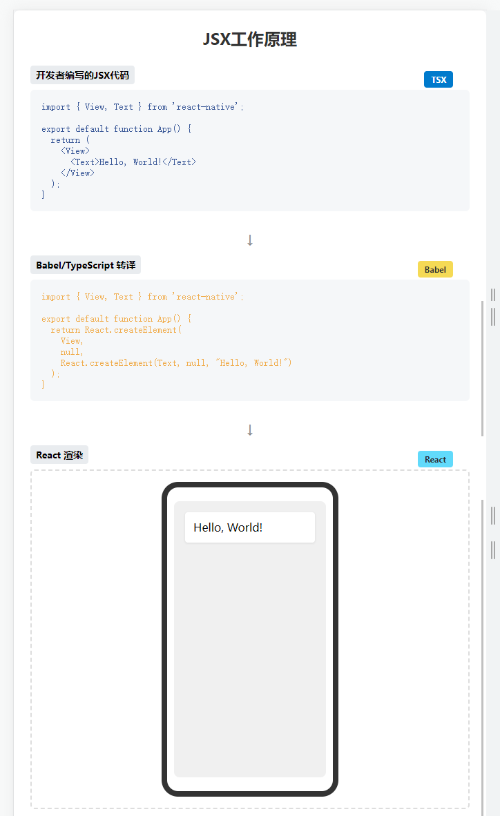
JSX 和 TSX 的工作原理
当你写下:
jsx
<View>
  <Text>Hello, World!</Text>
</View>
它会被转译为:
javascript
React.createElement(
  View,
  null,
  React.createElement(Text, null, "Hello, World!")
);
TypeScript 会在这个过程中进行类型检查,确保你使用的组件和属性都符合预期的类型定义。
目录结构
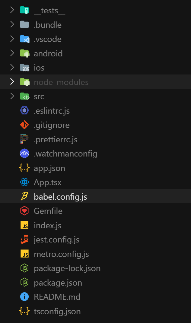
plain
├── android/                  # Android平台相关文件
│   ├── app/                  # Android应用特定配置
│   ├── build.gradle          # Android项目构建配置
│   ├── settings.gradle       # Android项目设置
│   ├── gradle.properties     # Gradle属性配置
│   ├── gradlew               # Gradle包装器脚本(Unix)
│   └── gradlew.bat           # Gradle包装器脚本(Windows)
│
├── ios/                      # iOS平台相关文件
│   ├── AwesomeProject1/      # iOS应用特定文件
│   ├── Podfile               # iOS依赖管理配置
│   └── AwesomeProject1.xcodeproj/ # Xcode项目文件
│
│
├── __tests__/                # 测试文件目录
│   └── App.test.tsx          # App组件的测试文件
│
├── node_modules/             # npm依赖包安装目录
│
├── App.tsx                   # 应用主要组件,定义UI和逻辑
├── index.js                  # 应用入口文件,注册应用组件
│
├── package.json              # 项目信息和npm依赖配置
├── package-lock.json         # npm依赖版本锁定文件
├── app.json                  # React Native应用配置
│
├── babel.config.js           # Babel转译器配置
├── metro.config.js           # Metro打包器配置
├── .eslintrc.js              # ESLint代码检查配置
├── .prettierrc.js            # Prettier代码格式化配置
├── .watchmanconfig           # Watchman文件监控配置
├── jest.config.js            # Jest测试框架配置
├── tsconfig.json             # TypeScript配置
│
├── Gemfile                   # Ruby gems依赖配置(iOS构建相关)
├── .bundle/                  # Ruby bundle安装目录
│
└── README.md                 # 项目说明文档
JSX 介绍
JSX and React 是相互独立的 东西。但它们经常一起使用,但你 可以 单独使用它们中的任意一个,JSX 是一种语法扩展,而 React 则是一个 JavaScript 的库。
JSX 是 JavaScript 语法扩展,可以让你在 JavaScript 文件中书写类似 H 标签。
javascript xml 在书写 js 的时候,直接写标签 把标签也看成 js 中的一种 类型
tsx typescript +xml
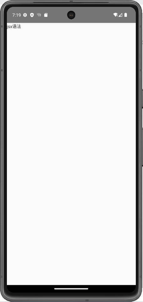
最简结构
tsx
import { Text, View } from "react-native";

export default function App() {
  return (
    <View>
      <Text>jsx语法</Text>
    </View>
  );
}
JSX 规则
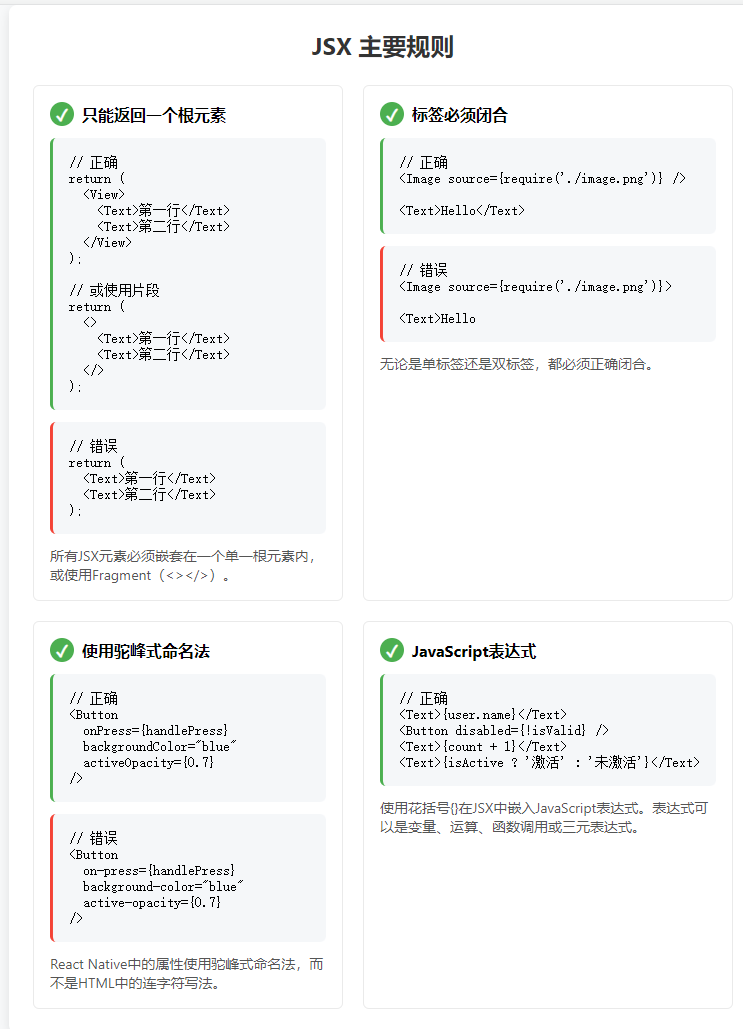
只能返回一个根元素
tsx
import { Text, View } from "react-native";

export default function App() {
  return (
    <View>
      <Text>jsx语法</Text>
    </View>
  );
}
如果你想要同时返回多个结构,可以使用 <></>语法把他们包裹起来
tsx
import React from "react";
import { Text } from "react-native";

export default function App() {
  return (
    <>
      <Text>jsx语法1</Text>
      <Text>jsx语法2</Text>
    </>
  );
}
标签必须闭合
不管单标签还是双标签都必须闭合
tsx
import { Button } from "react-native";

export default function App() {
  return <Button title="点我" />;
}
使用驼峰式命名法给 大部分属性命名!
tsx
import { Alert, Button } from "react-native";

export default function App() {
  return (
    <Button
      title="点我"
      onPress={() => {
        Alert.alert("被征用");
      }}
    />
  );
}
JSX 注释
tsx
{
  // 这里是单行注释
}
{
  /*
      这里是多行注释
      这里是多行注释
      这里是多行注释
      这里是多行注释
      */
}
JSX 表达式
jsx 表达式可以让我在标签中嵌入表达式
tsx
import { Text, View } from "react-native";

export default function App() {
  const msg = "我们的rn";
  const getNum = () => 100;
  return (
    <View>
      {/* 普通标签 */}
      <Text>普通标签</Text>
      {/* 数学运算 */}
      <Text>{1 + 1}</Text>
      {/* 字符串 */}
      <Text>{"a" + "b"}</Text>
      {/* 变量 */}
      <Text>{msg}</Text>
      {/* 三元表达式 */}
      <Text>{1 + 1 === 2 ? "对了" : "错误"}</Text>
      {/* 函数调用 */}
      <Text>{getNum()}</Text>
    </View>
  );
}
属性上使用表达式
tsx
import { Button } from "react-native";

export default function App() {
  const title = "登录";
  const showMsg = () => {};
  return <Button onPress={showMsg} title={title} />;
}
JSX 嵌套 JSX
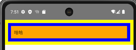
可以把标签也看成是一种特殊的变量来理解以下代码
tsx
import { Text, View } from "react-native";

export default function App() {
  return (
    <View style={{ padding: 10, backgroundColor: "yellow" }}>
      {
        <View style={{ padding: 10, backgroundColor: "blue" }}>
          {<Text style={{ padding: 10, backgroundColor: "orange" }}>哈哈</Text>}
        </View>
      }
    </View>
  );
}
JSX 条件渲染
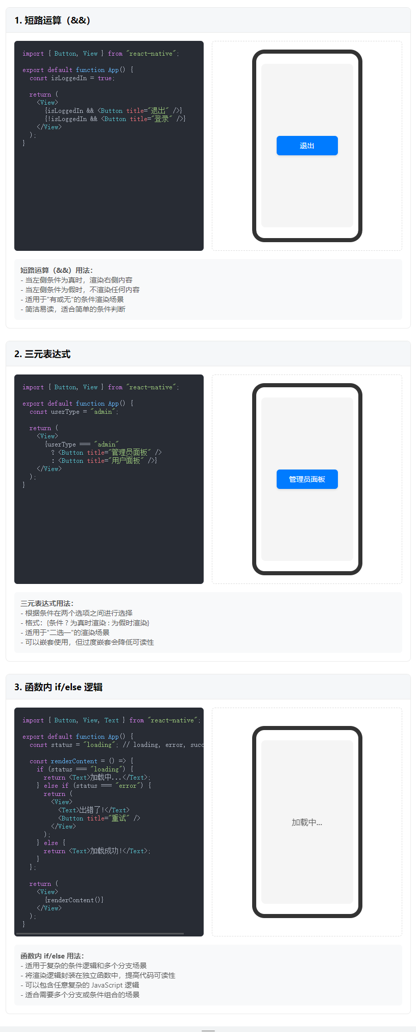
JSX 中实现条件渲染,可以三种方式
- 短路运算
- 三元表达式
- 如果是更加复杂的结构,函数中结合 if/else 来实现
短路运算
tsx
import { Button, View } from "react-native";

export default function App() {
  return (
    <View>
      <View>{true && <Button title="男" />}</View>;
      <View>{false && <Button title="女" />}</View>;
    </View>
  );
}
三元表达式
tsx
import { Button, View } from "react-native";

export default function App() {
  return (
    <View>
      <View>{true ? <Button title="男" /> : <Button title="女" />}</View>;
    </View>
  );
}
函数内 if/else
tsx
import { Button, View } from "react-native";

export default function App() {
  const showBtn = () => {
    if (1 === 1) {
      return <Button title="111" />;
    } else {
      return <Button title="222" />;
    }
  };
  return (
    <View>
      <View>{showBtn()}</View>;
    </View>
  );
}
jSX 列表渲染
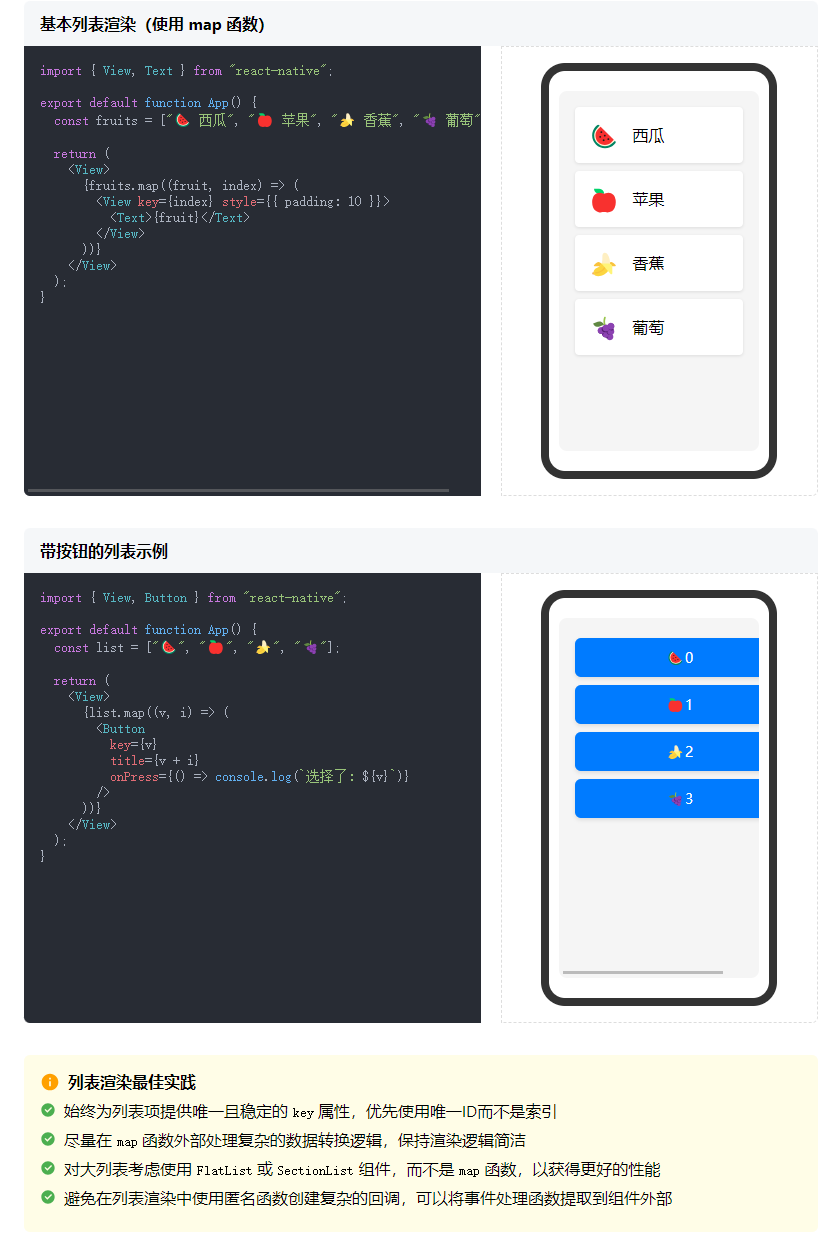
主要通过数组的 map 函数来实现
tsx
import { Button, View } from "react-native";

export default function App() {
  const list = ["🍉", "🍎", "🍌", "🍇"];
  return (
    <View>
      {list.map((v, i) => (
        <Button title={v + i} key={v} />
      ))}
    </View>
  );
}
样式
React Native 中,推荐组件和组件样式分离的写法 StyleSheet.create
tsx
import { Text, View, StyleSheet } from "react-native";

export default function App() {
  return (
    <View style={styles.container}>
      <Text>样式</Text>
    </View>
  );
}

const styles = StyleSheet.create({
  container: {
    backgroundColor: "blue",
    padding: 10,
  },
});
自定义组件 基本使用
后期可以根据需求,对组件进行导入、导出使用
tsx
import { Text, View } from "react-native";

export default function App() {
  return (
    <View>
      <Text>父组件</Text>
      <Child />
    </View>
  );
}

function Child() {
  return <Text>子组件</Text>;
}
useState
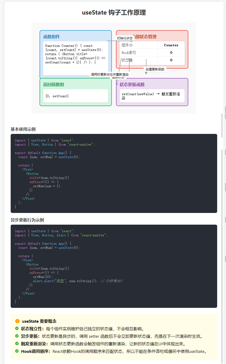
useState 是 React 中用于更新状态的技术
useState 是一个函数,传入要设置的状态的初始值,返回一个数组,第一个元素是数据本身,第二个元素是修改元素的函数。
tsx
import { useState } from "react";
import { View, Button } from "react-native";

export default function App() {
  const [num, setNum] = useState(0);
  return (
    <View>
      <Button
        title={num.toString()}
        onPress={() => {
          setNum(num + 1);
        }}
      />
    </View>
  );
}需要注意的是,出于性能考虑,修改状态是异步的
tsx
import { useState } from "react";
import { View, Button, Alert } from "react-native";

export default function App() {
  const [num, setNum] = useState(0);
  return (
    <View>
      <Button
        title={num.toString()}
        onPress={() => {
          setNum(10);
          Alert.alert("点击", num.toString()); // 输出0
        }}
      />
    </View>
  );
}
自定义组件 父子传参
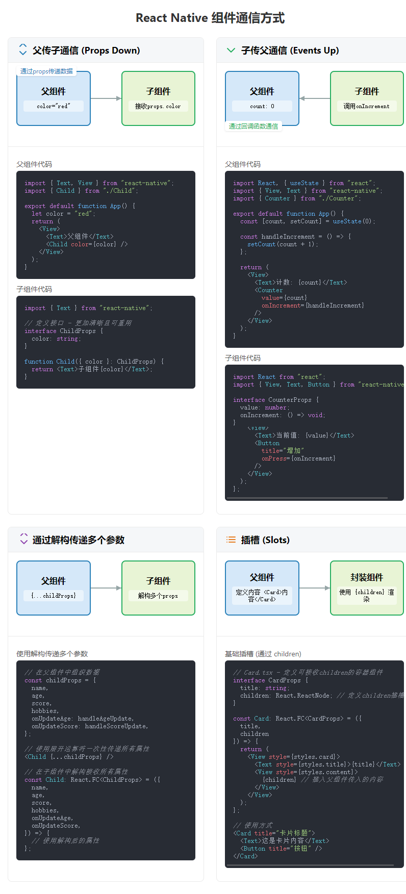
通过普通接口指定参数类型
tsx
import { Text, View } from "react-native";

// 定义接口 - 更加清晰且可重用
interface ChildProps {
  color: string;
}

export default function App() {
  let color = "red";
  return (
    <View>
      <Text>父组件</Text>
      <Child color={color} />
    </View>
  );
}

function Child({ color }: ChildProps) {
  return <Text>子组件{color}</Text>;
}
通过 React.FC 指定参数类型
tsx
import React from "react";
import { Text, View } from "react-native";

// 定义接口 - 更加清晰且可重用
interface ChildProps {
  color: string;
}

export default function App() {
  let color = "red";
  return (
    <View>
      <Text>父组件</Text>
      <Child color={color} />
    </View>
  );
}

// 使用React.FC<Props>类型,可以更明确地表明这是一个函数组件
const Child: React.FC<ChildProps> = ({ color }) => {
  return <Text>子组件{color}</Text>;
};
自定义组件 子父传参
tsx
import React, { useState } from "react";
import { View, Text, Button } from "react-native";

// 定义子组件接收的props类型
interface CounterProps {
  value: number;
  onIncrement: () => void;
}

// 父组件
export default function App() {
  // 在父组件中维护状态
  const [count, setCount] = useState(0);

  // 定义一个传递给子组件的函数
  const handleIncrement = () => {
    setCount(count + 1);
  };

  return (
    <View>
      <Text>父组件</Text>
      <Text>父组件中的计数: {count}</Text>

      {/* 向子组件传递属性和方法 */}
      <Counter value={count} onIncrement={handleIncrement} />
    </View>
  );
}
// 子组件
const Counter: React.FC<CounterProps> = ({ value, onIncrement }) => {
  return (
    <View>
      <Text>子组件计数器: {value}</Text>
      <Button
        title="增加计数"
        onPress={() => {
          // 调用父组件传递的函数
          onIncrement();
        }}
      />
    </View>
  );
};
通过解构传递多个参数
tsx
import React, { useState } from "react";
import { View, Text, Button } from "react-native";

// 定义子组件接收的props类型
interface ChildProps {
  name: string;
  age: number;
  score: number;
  hobbies: string[];
  onUpdateAge: () => void;
  onUpdateScore: (newScore: number) => void;
}

// 父组件
export default function App() {
  // 在父组件中维护多个状态
  const [name] = useState("张三");
  const [age, setAge] = useState(25);
  const [score, setScore] = useState(85);
  const [hobbies] = useState(["阅读", "游泳", "编程"]);

  // 处理年龄更新
  const handleAgeUpdate = () => {
    setAge(age + 1);
  };

  // 处理分数更新
  const handleScoreUpdate = (newScore: number) => {
    setScore(newScore);
  };

  // 解构传递多个属性和方法
  const childProps = {
    name,
    age,
    score,
    hobbies,
    onUpdateAge: handleAgeUpdate,
    onUpdateScore: handleScoreUpdate,
  };

  return (
    <View>
      <Text>父组件</Text>
      <Text>
        姓名: {name}, 年龄: {age}, 分数: {score}
      </Text>

      {/* 方式1: 逐个传递属性 */}
      <Child
        name={name}
        age={age}
        score={score}
        hobbies={hobbies}
        onUpdateAge={handleAgeUpdate}
        onUpdateScore={handleScoreUpdate}
      />

      {/* 方式2: 使用展开运算符传递所有属性 */}
      <Child {...childProps} />
    </View>
  );
}

// 子组件 - 通过解构直接获取所需的属性
const Child: React.FC<ChildProps> = ({
  name,
  age,
  score,
  hobbies,
  onUpdateAge,
  onUpdateScore,
}) => {
  return (
    <View>
      <Text>子组件</Text>
      <Text>姓名: {name}</Text>
      <Text>年龄: {age}</Text>
      <Text>分数: {score}</Text>
      <Text>爱好: {hobbies.join(", ")}</Text>

      <Button title="增加年龄" onPress={onUpdateAge} />

      <Button title="提高分数" onPress={() => onUpdateScore(score + 5)} />
    </View>
  );
};
基础插槽
往自定义组件中插入我们想要的结构。它有以下常见的使用场景
- 卡片(Card)组件:包装内容并提供一致的外观
- 模态框(Modal):包装弹窗内容,但允许自定义内容
- 面板(Panel):带标题和可折叠功能的内容容器
tsx
import React from "react";
import { View, Text, Button } from "react-native";

// 基础插槽:使用children
interface CardProps {
  title: string;
  children: React.ReactNode; // 定义children插槽
}

// 基础插槽组件
const Card: React.FC<CardProps> = ({ title, children }) => {
  return (
    <View>
      <Text>{title}</Text>
      <View>{children}</View>
    </View>
  );
};

// 父组件
export default function App() {
  return (
    <View>
      <Text>基础插槽示例</Text>

      {/* 基础插槽用法 */}
      <Card title="卡片标题">
        <Text>这是卡片内容</Text>
        <Button title="卡片按钮" onPress={() => console.log("按钮点击")} />
      </Card>
    </View>
  );
}
具名插槽
tsx
import React from "react";
import { View, Text, Button, StyleSheet } from "react-native";

// 具名插槽:使用特定属性定义多个插槽
interface PanelProps {
  title: string;
  header?: React.ReactNode; // 可选的头部插槽
  content: React.ReactNode; // 主内容插槽
  footer?: React.ReactNode; // 可选的底部插槽
}

// 具名插槽组件
const Panel: React.FC<PanelProps> = ({ title, header, content, footer }) => {
  return (
    <View style={styles.panel}>
      <Text style={styles.panelTitle}>{title}</Text>

      {/* 头部插槽 */}
      {header && <View style={styles.panelHeader}>{header}</View>}

      {/* 内容插槽 */}
      <View style={styles.panelContent}>{content}</View>

      {/* 底部插槽 */}
      {footer && <View style={styles.panelFooter}>{footer}</View>}
    </View>
  );
};

// 父组件
export default function App() {
  return (
    <View style={styles.container}>
      <Text style={styles.header}>具名插槽示例</Text>

      {/* 具名插槽用法 */}
      <Panel
        title="具名插槽"
        header={<Text style={styles.headerText}>这是自定义头部区域</Text>}
        content={
          <View>
            <Text>这是主要内容区域</Text>
            <Button
              title="内容区按钮"
              onPress={() => console.log("内容区按钮点击")}
            />
          </View>
        }
        footer={
          <View style={styles.footerButtons}>
            <Button title="取消" onPress={() => console.log("取消")} />
            <Button title="确定" onPress={() => console.log("确定")} />
          </View>
        }
      />
    </View>
  );
}

// 样式
const styles = StyleSheet.create({
  container: {
    padding: 16,
    gap: 16,
  },
  header: {
    fontSize: 20,
    fontWeight: "bold",
    marginBottom: 16,
  },
  panel: {
    backgroundColor: "#f9f9f9",
    borderRadius: 8,
    borderWidth: 1,
    borderColor: "#ddd",
    marginBottom: 16,
    overflow: "hidden",
  },
  panelTitle: {
    fontSize: 18,
    fontWeight: "bold",
    backgroundColor: "#eee",
    padding: 12,
  },
  panelHeader: {
    padding: 12,
    backgroundColor: "#f5f5f5",
    borderBottomWidth: 1,
    borderBottomColor: "#ddd",
  },
  headerText: {
    fontWeight: "600",
  },
  panelContent: {
    padding: 16,
  },
  panelFooter: {
    padding: 12,
    backgroundColor: "#f5f5f5",
    borderTopWidth: 1,
    borderTopColor: "#ddd",
  },
  footerButtons: {
    flexDirection: "row",
    justifyContent: "flex-end",
    gap: 8,
  },
});