目录
[3.1 TabBar](#3.1 TabBar)
[3.2 TabBarView](#3.2 TabBarView)
[4.1 视觉样式深度定制](#4.1 视觉样式深度定制)
[4.2 自定义指示器与标签](#4.2 自定义指示器与标签)
[4.3 动态标签管理](#4.3 动态标签管理)
[5.1 性能优化方案](#5.1 性能优化方案)
[5.2 复杂手势处理](#5.2 复杂手势处理)
[5.3 响应式布局适配](#5.3 响应式布局适配)
[6.1 页面滑动卡顿](#6.1 页面滑动卡顿)
[6.2 动态标签内容不同步](#6.2 动态标签内容不同步)
[6.3 指示器位置异常](#6.3 指示器位置异常)
[7.1 架构设计原则](#7.1 架构设计原则)
[7.2 交互优化方案](#7.2 交互优化方案)
[7.3 跨平台适配策略](#7.3 跨平台适配策略)
一、引言
在 Flutter 中,TabBar 和 TabBarView 组件用于实现多个页面的标签导航,类似于 Android 的 ViewPager + TabLayout。TabBar 用于显示标签页,TabBarView 用于切换不同的页面内容。它们通常与 DefaultTabController 结合使用,实现流畅的页面切换效果。
二、基本用法
Dart
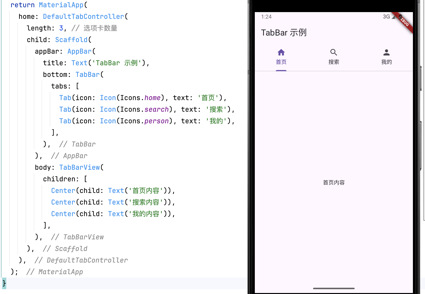
return MaterialApp(
      home: DefaultTabController(
        length: 3, // 选项卡数量
        child: Scaffold(
          appBar: AppBar(
            title: Text('TabBar 示例'),
            bottom: TabBar(
              tabs: [
                Tab(icon: Icon(Icons.home), text: '首页'),
                Tab(icon: Icon(Icons.search), text: '搜索'),
                Tab(icon: Icon(Icons.person), text: '我的'),
              ],
            ),
          ),
          body: TabBarView(
            children: [
              Center(child: Text('首页内容')),
              Center(child: Text('搜索内容')),
              Center(child: Text('我的内容')),
            ],
          ),
        ),
      ),
    );
代码解析
DefaultTabController(length: 3, child: ...):定义标签页的数量。TabBar:定义标签,支持文本和图标。TabBarView:对应的内容页,顺序与TabBar一致。Scaffold.appBar:包含TabBar,用于展示选项卡。
三、主要属性
3.1 TabBar
| 属性 | 说明 |
|---|---|
tabs |
选项卡列表,支持 Tab() 组件 |
isScrollable |
是否允许滑动 |
indicatorColor |
选中指示器颜色 |
indicatorSize |
选中指示器的大小(tab / label) |
labelColor |
选中项文字颜色 |
unselectedLabelColor |
未选中项文字颜色 |
示例:
Dart
TabBar(
  isScrollable: true,
  indicatorColor: Colors.red,
  labelColor: Colors.blue,
  unselectedLabelColor: Colors.grey,
  tabs: [...],
)
3.2 TabBarView
| 属性 | 说明 |
|---|---|
children |
选项卡对应的页面内容 |
physics |
允许或禁止滑动 (NeverScrollableScrollPhysics() 可禁用) |
示例(禁止滑动):
Dart
TabBarView(
  physics: NeverScrollableScrollPhysics(),
  children: [...],
)
四、进阶定制:突破默认样式
4.1 视觉样式深度定制
通过参数全面修改 TabBar 外观:
Dart
TabBar(
  indicator: BoxDecoration(
    borderRadius: BorderRadius.circular(8),
    color: Colors.deepPurple.withOpacity(0.2),
  ),
  indicatorSize: TabBarIndicatorSize.label,
  indicatorPadding: EdgeInsets.symmetric(vertical: 6),
  labelColor: Colors.deepPurple,
  unselectedLabelColor: Colors.grey,
  labelStyle: TextStyle(
    fontWeight: FontWeight.bold,
    fontSize: 16,
    shadows: [Shadow(color: Colors.black38, offset: Offset(1,1))]
  ),
  tabs: [...],
);
4.2 自定义指示器与标签
完全自定义指示器组件:
Dart
TabBar(
  indicator: _CustomIndicator(),
  tabs: [
    Tab(child: _CustomTabItem('动态', Icons.update)),
    Tab(child: _CustomTabItem('消息', Icons.forum)),
  ],
);

class _CustomIndicator extends Decoration {
  @override
  BoxPainter createBoxPainter([VoidCallback? onChanged]) {
    return _IndicatorPainter();
  }
}

class _IndicatorPainter extends BoxPainter {
  @override
  void paint(Canvas canvas, Offset offset, ImageConfiguration cfg) {
    final paint = Paint()
      ..color = Colors.amber
      ..style = PaintingStyle.fill;
    canvas.drawRRect(
      RRect.fromRectAndRadius(
        Rect.fromCenter(
          center: offset + Offset(cfg.size!.width/2, cfg.size!.height - 6),
          width: 28,
          height: 4,
        ),
        Radius.circular(2),
      ),
      paint
    );
  }
}
4.3 动态标签管理
实现动态增删标签功能:
Dart
List<String> categories = ['推荐', '本地', '体育'];

void _addTab() {
  setState(() {
    categories.add('新增 ${categories.length}');
  });
}

TabBar(
  isScrollable: true,
  tabs: categories.map((text) => Tab(text: text)).toList(),
),

TabBarView(
  children: categories.map((_) => NewsFeed()).toList(),
)
五、工程实践关键技巧
5.1 性能优化方案
解决页面状态保持问题:
Dart
TabBarView(
  children: [
    KeepAliveWrapper(child: Page1()), // 自定义保持状态组件
    AutomaticKeepAliveClientMixin(
      wantKeepAlive: true,
      child: Page2(),
    ),
  ],
)

// KeepAliveWrapper 实现
class KeepAliveWrapper extends StatefulWidget {
  final Widget child;

  const KeepAliveWrapper({Key? key, required this.child}) : super(key: key);

  @override
  _KeepAliveWrapperState createState() => _KeepAliveWrapperState();
}

class _KeepAliveWrapperState extends State<KeepAliveWrapper>
    with AutomaticKeepAliveClientMixin {
  @override
  bool get wantKeepAlive => true;

  @override
  Widget build(BuildContext context) {
    super.build(context);
    return widget.child;
  }
}
5.2 复杂手势处理
与 PageView 嵌套时的滑动冲突解决方案:
Dart
PageView(
  physics: ClampingScrollPhysics(), // 禁用页面滑动
  controller: _pageController,
  children: [
    TabBarViewWrapper( // 自定义嵌套容器
      tabController: _tabController,
      child: TabBarView(...),
    ),
  ],
)

class TabBarViewWrapper extends StatelessWidget {
  final TabController tabController;
  final Widget child;

  const TabBarViewWrapper({required this.tabController, required this.child});

  @override
  Widget build(BuildContext context) {
    return NotificationListener<ScrollNotification>(
      onNotification: (notification) {
        if (notification is ScrollUpdateNotification) {
          // 处理横向滑动逻辑
          tabController.animateTo(tabController.offset -
              notification.scrollDelta! / context.size!.width);
        }
        return true;
      },
      child: child,
    );
  }
}
5.3 响应式布局适配
多设备尺寸下的显示优化:
Dart
LayoutBuilder(
  builder: (context, constraints) {
    if (constraints.maxWidth > 600) {
      // 平板端横向布局
      return Row(
        children: [
          SizedBox(
            width: 200,
            child: TabBar(
              isScrollable: true,
              labelColor: Colors.blue,
              unselectedLabelColor: Colors.grey,
              tabs: categories.map((text) => Tab(text: text)).toList(),
              controller: _tabController,
              orientation: VerticalTabOrientation(),
            ),
          ),
          Expanded(
            child: TabBarView(
              controller: _tabController,
              children: [...],
            ),
          ),
        ],
      );
    } else {
      // 手机端标准布局
      return DefaultTabController(...);
    }
  },
)
六、常见问题排查指南
6.1 页面滑动卡顿
解决方案:
-
对复杂子页面使用
RepaintBoundary和Opacity进行渲染优化 -
避免在
build方法中执行耗时操作 -
使用
PageView替代TabBarView实现懒加载
6.2 动态标签内容不同步
解决方案:
-
使用
GlobalKey刷新特定页面 -
结合
StreamBuilder实现数据驱动更新 -
通过
IndexedStack保持页面状态
6.3 指示器位置异常
解决方案:
-
检查
TabBar的indicatorSize设置 -
确认父容器的布局约束
-
使用
PreferredSizeWidget包装自定义组件
七、最佳实践建议
7.1 架构设计原则
-
采用 BLoC 或 Provider 进行状态管理
-
将 Tab 配置数据与业务逻辑分离
-
对复杂页面实现按需加载(Lazy Loading)
7.2 交互优化方案
-
添加滑动过渡动画(使用
AnimatedSwitcher) -
实现标签拖拽排序功能
-
支持标签页的快捷操作菜单
7.3 跨平台适配策略
-
iOS 风格适配:使用
CupertinoSlidingSegmentedControl -
Web 端优化:支持鼠标悬停效果
-
桌面端增强:添加键盘导航支持
八、总结
Flutter 的 TabBar 体系为开发者提供了从简单到复杂场景的完整解决方案。通过深度定制化能力与灵活的控制器机制,开发者可以打造出既符合 Material Design 规范又能满足个性需求的分页导航系统。在实际项目中,应重点关注性能优化与状态管理,结合响应式设计原则,确保在不同平台和设备上都能提供流畅的用户体验。
相关推荐
Flutter AppBar 详解-CSDN博客文章浏览阅读906次,点赞34次,收藏36次。AppBar 是 Flutter 提供的顶栏组件,通常用于应用的导航栏,包含标题、返回按钮、菜单等功能。AppBar 结合 Scaffold 使用,能够增强用户体验,提供一致的导航交互。本文将介绍 AppBar 的基本用法、主要属性及自定义方式。https://shuaici.blog.csdn.net/article/details/146070214Flutter BottomNavigationBar 详解-CSDN博客文章浏览阅读1.3k次,点赞39次,收藏49次。BottomNavigationBar 是用于实现底部导航栏的组件,适用于具有多个页面或功能的应用,例如社交媒体、购物应用等。用户可以通过底部导航快速切换不同的页面或视图。本文将介绍 BottomNavigationBar 的基本用法、主要属性以及自定义样式。
https://shuaici.blog.csdn.net/article/details/146070241