1、组合图、数据透视表
(1)数据预处理
知识点
- 日期函数 year() month()
- 数据透视表操作
- 同比计算公式
- 环比计算公式


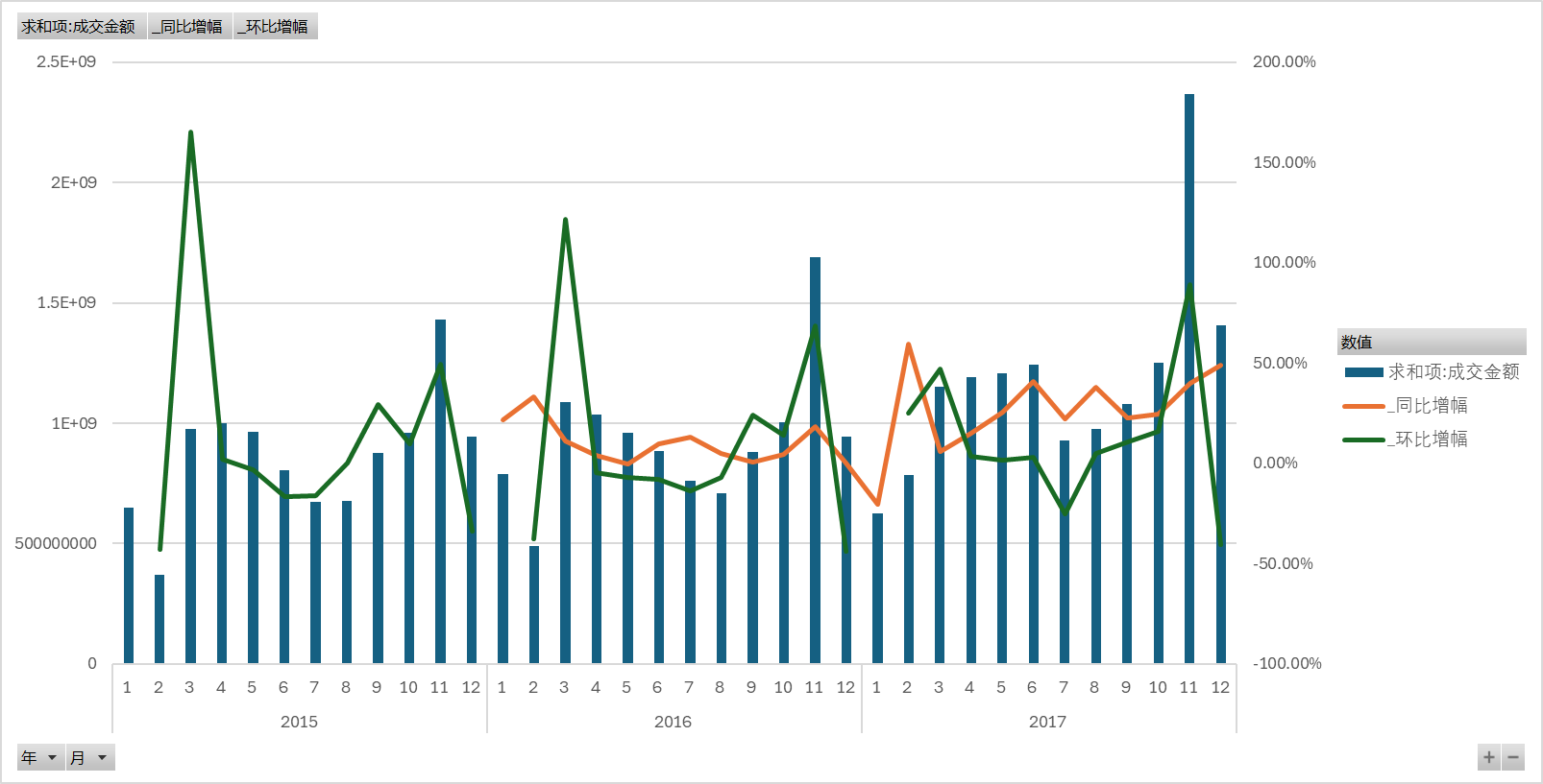
(2)excel 数据透视表+插入组合图
a.2015~2017数据集处理方式:
- 操作:
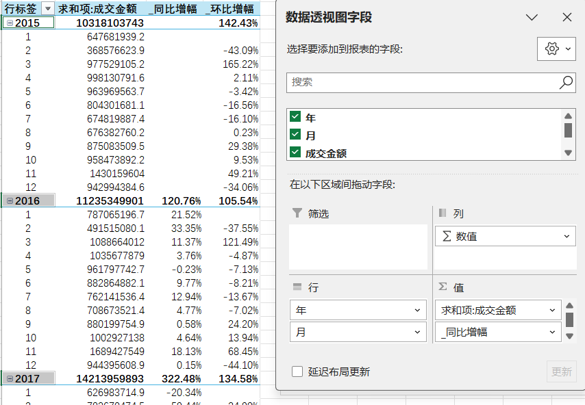
- 结果
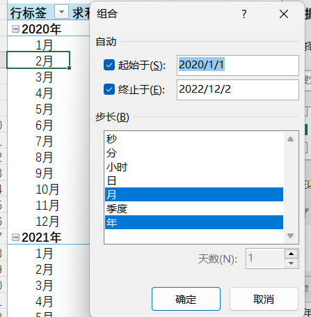
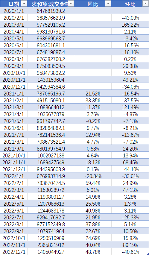
b.2020~2022数据集处理方式
一次数据透视结果:
- 操作
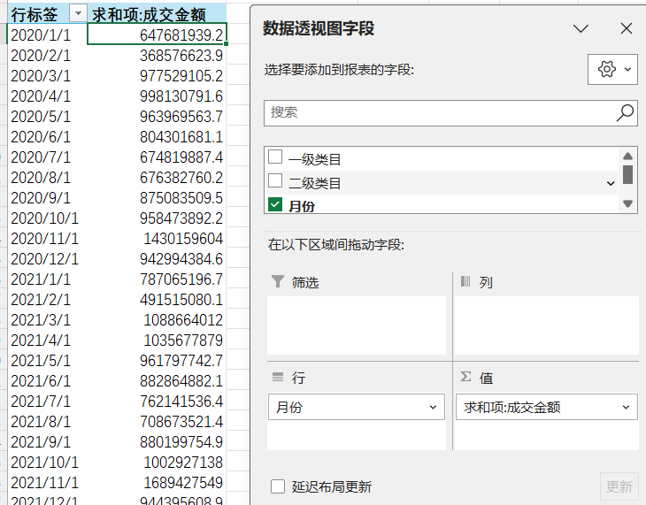
- 结果
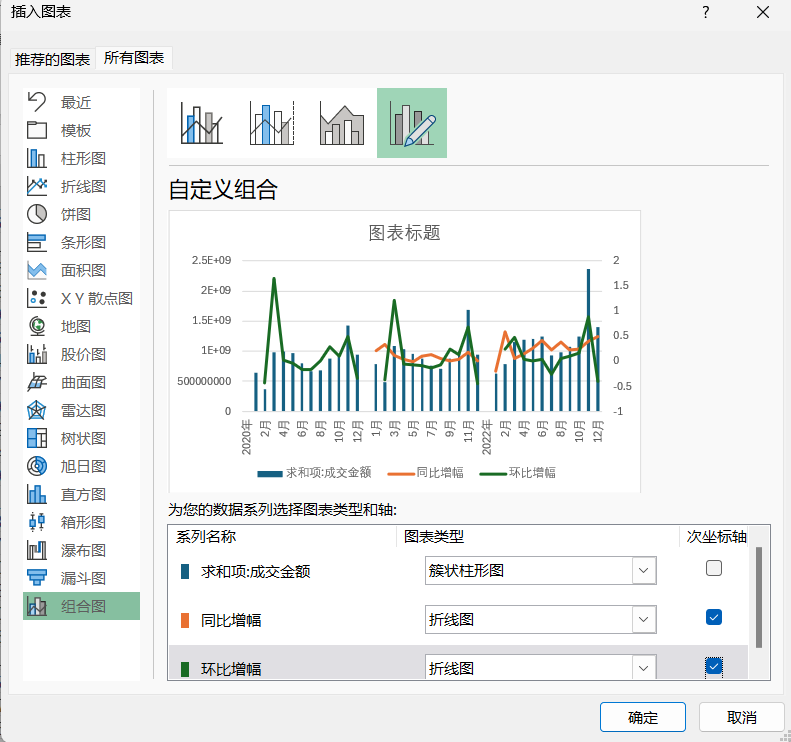
两次数据透视结果
- 操作:
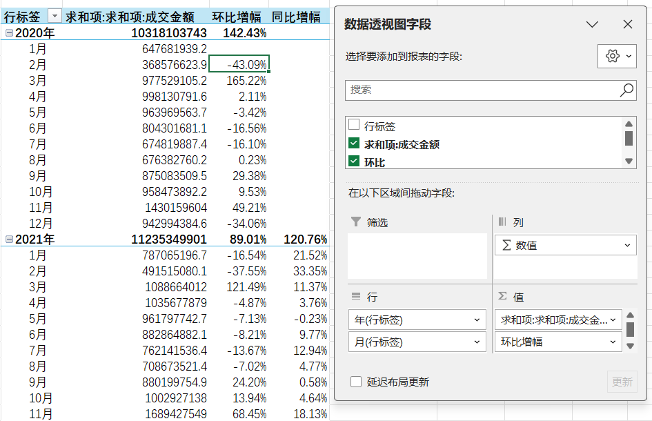
- 结果:
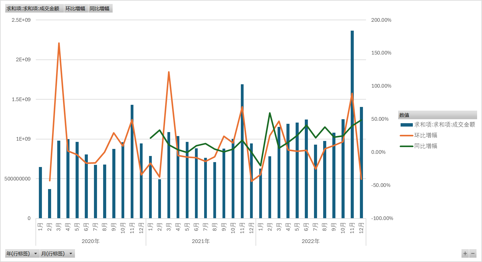
(3)python绘制组合图
a.数据预处理结果
b.代码
知识点:
使用 make_subplots 创建子图,设置 secondary_y=True 启用双 Y 轴
交互模式:hovermode='x unified' 使鼠标悬停时同时显示所有系列在同一日期的数据,便于对比。
python
import pandas as pd
import plotly.graph_objects as go
from plotly.subplots import make_subplots

# 读取数据
data = pd.read_excel('组合图数据.xlsx',engine='openpyxl')

# 将日期列转换为datetime类型
data['日期'] = pd.to_datetime(data['日期'])

# 创建组合图
fig = make_subplots(specs=[[{"secondary_y": True}]])

# 添加成交金额柱状图
fig.add_trace(
    go.Bar(
        x=data['日期'],
        y=data['求和项:成交金额'],
        name='求和项:成交金额',
        marker_color='#1f77b4'
    ),
    secondary_y=False
)

# 添加同比增幅折线图
fig.add_trace(
    go.Line(
        x=data['日期'],
        y=data['同比'],
        name='同比增幅',
        line=dict(color='#d62728', width=2, dash='dash')
    ),
    secondary_y=True
)

# 添加环比增幅折线图
fig.add_trace(
    go.Line(
        x=data['日期'],
        y=data['环比'],
        name='环比增幅',
        line=dict(color='#2ca02c', width=2, dash='dash')
    ),
    secondary_y=True
)

# 设置图表布局
fig.update_layout(
    title='2020年1月1日-2022年12月1日的成交金额、环比增幅、同比增幅的组合图',
    xaxis_title='日期',
    yaxis_title='成交金额',
    yaxis2=dict(
        title='增幅 (%)',
        overlaying='y',
        side='right'
    ),
    hovermode='x unified'
)

# 显示图表
fig.show()
c.结果
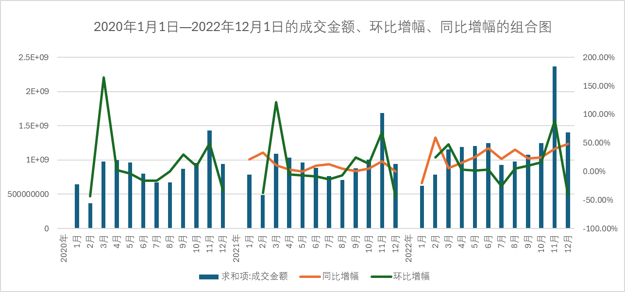
组合图
优化:销售数据仪表盘:
a.代码
知识点
- dash 构建交互界面,dash_bootstrap_components 提供美观的 UI 组件。
- dbc.Container:Bootstrap 的响应式容器,fluid=True表示宽度 100%
- dbc.Row, dbc.Col:Bootstrap 的网格系统,一行一列。
- html.H1:HTML 标题标签,className添加样式(居中、上下边距)。
- dcc.Dropdown:下拉菜单组件:
id:组件唯一标识,用于回调。
options:选项列表,格式为{label:显示文本, value:实际值}。
value:默认选中的值。
multi=True:允许多选。- dbc.Button:Bootstrap 按钮:
n_clicks:记录点击次数,触发回调。
color="primary":蓝色主按钮。- dbc.Spinner:加载动画,在数据处理时显示。
- dcc.Graph:Plotly 图表组件,id='sales-graph'用于显示组合图。
- @app.callback:装饰器,定义回调函数。
- Output:回调输出,更新sales-graph组件的figure属性。
- Input:触发回调的输入,这里是按钮的n_clicks。
- State:获取下拉菜单当前值(不触发回调)。
- hovertemplate:鼠标悬停时显示的信息:
%{x|%Y年%m月}:格式化日期(如 2023 年 01 月)。
%{text}:显示text中的金额。
< extra></ extra>:隐藏右侧默认信息。- overlaying='y':与左侧 Y 轴共享 X 轴。
- hovermode='x unified':鼠标悬停时,所有数据在同一 X 轴对齐显示。
- tickformat='% Y 年 % m 月':X 轴日期格式化为2023年01月。
tickformat=',':Y 轴数字添加千位分隔符(如1,000,000)。- 流式布局(fluid layout)fluid=True 响应式布局适配不同屏幕。
python
import pandas as pd
import plotly.graph_objects as go
from plotly.subplots import make_subplots
import dash
from dash import dcc, html, Input, Output, State
import dash_bootstrap_components as dbc

# 读取数据
data = pd.read_excel('组合图数据.xlsx',engine='openpyxl')

# 确保日期列是正确的格式
data['日期'] = pd.to_datetime(data['日期'])
data['年份'] = data['日期'].dt.year
data['月份'] = data['日期'].dt.month

# 创建应用
app = dash.Dash(__name__, external_stylesheets=[dbc.themes.BOOTSTRAP])
server = app.server  # 用于生产部署

# 获取年份和月份的唯一值
years = sorted(data['年份'].unique())
months = list(range(1, 13))
month_names = ['一月', '二月', '三月', '四月', '五月', '六月',
               '七月', '八月', '九月', '十月', '十一月', '十二月']

# 应用布局
app.layout = dbc.Container([
    dbc.Row([
        dbc.Col(html.H1("销售数据分析仪表盘", className="text-center mt-4 mb-4"), width=12)
    ]),

    dbc.Row([
        dbc.Col([
            html.Label("选择年份:", className="mr-2"),
            dcc.Dropdown(
                id='year-dropdown',
                options=[{'label': str(year), 'value': year} for year in years],
                value=years,  # 默认选择所有年份
                multi=True,
                className="w-100"
            )
        ], width=3),

        dbc.Col([
            html.Label("选择月份:", className="mr-2"),
            dcc.Dropdown(
                id='month-dropdown',
                options=[{'label': month_names[i - 1], 'value': i} for i in months],
                value=months,  # 默认选择所有月份
                multi=True,
                className="w-100"
            )
        ], width=3),

        dbc.Col([
            dbc.Button(
                "应用筛选",
                id='apply-filter',
                n_clicks=0,
                className="mt-3",
                color="primary"
            )
        ], width=2)
    ], className="mb-4"),

    dbc.Row([
        dbc.Col([
            dbc.Spinner(
                id="loading-spinner",
                children=[dcc.Graph(id='sales-graph')],
                color="primary",
                type="grow"
            )
        ], width=12)
    ])

], fluid=True)


# 回调函数
@app.callback(
    Output('sales-graph', 'figure'),
    [Input('apply-filter', 'n_clicks')],
    [State('year-dropdown', 'value'),
     State('month-dropdown', 'value')]
)
def update_graph(n_clicks, selected_years, selected_months):
    # 确保参数有效
    if not selected_years:
        selected_years = years
    if not selected_months:
        selected_months = months

    # 筛选数据
    filtered_data = data[
        data['年份'].isin(selected_years) &
        data['月份'].isin(selected_months)
        ]

    # 如果没有数据,返回空图表
    if filtered_data.empty:
        fig = go.Figure()
        fig.update_layout(
            title="没有匹配的数据",
            xaxis_title="日期",
            yaxis_title="成交金额"
        )
        return fig

    # 创建组合图
    fig = make_subplots(specs=[[{"secondary_y": True}]])

    # 添加成交金额柱状图
    fig.add_trace(
        go.Bar(
            x=filtered_data['日期'],
            y=filtered_data['求和项:成交金额'],
            name='成交金额',
            text=[f"{x:,.0f}" for x in filtered_data['求和项:成交金额']],
            hovertemplate='日期: %{x|%Y年%m月}<br>成交金额: %{text}<extra></extra>',
            marker_color='#1f77b4'
        ),
        secondary_y=False
    )

    # 添加同比增幅折线图
    fig.add_trace(
        go.Scatter(
            x=filtered_data['日期'],
            y=filtered_data['同比'],
            name='同比增幅',
            text=[f"{x:.1f}%" for x in filtered_data['同比']],
            hovertemplate='日期: %{x|%Y年%m月}<br>同比增幅: %{text}<extra></extra>',
            line=dict(color='#d62728', width=2, dash='dash'),
            marker=dict(size=8)
        ),
        secondary_y=True
    )

    # 添加环比增幅折线图
    fig.add_trace(
        go.Scatter(
            x=filtered_data['日期'],
            y=filtered_data['环比'],
            name='环比增幅',
            text=[f"{x:.1f}%" for x in filtered_data['环比']],
            hovertemplate='日期: %{x|%Y年%m月}<br>环比增幅: %{text}<extra></extra>',
            line=dict(color='#2ca02c', width=2, dash='dash'),
            marker=dict(size=8)
        ),
        secondary_y=True
    )

    # 设置图表布局
    fig.update_layout(
        title=f"成交金额与增幅分析 ({', '.join(map(str, selected_years))}年)",
        title_font=dict(size=20),
        xaxis_title="日期",
        yaxis_title="成交金额",
        yaxis2=dict(
            title="增幅 (%)",
            overlaying='y',
            side='right'
        ),
        legend=dict(
            x=0, y=1.05,
            orientation='h',
            bgcolor='rgba(255, 255, 255, 0.8)',
            bordercolor='rgba(0, 0, 0, 0.1)',
            borderwidth=1,
            font=dict(size=14)
        ),
        hovermode='x unified',
        plot_bgcolor='rgba(240, 240, 240, 0.5)',
        margin=dict(l=60, r=60, t=60, b=60),
        font=dict(family="SimHei, WenQuanYi Micro Hei, Heiti TC", size=14)
    )

    # 设置X轴格式
    fig.update_xaxes(
        tickformat='%Y年%m月',
        tickfont=dict(size=14)
    )

    # 设置Y轴格式
    fig.update_yaxes(
        tickformat=',',
        title_font=dict(size=16)
    )

    return fig


if __name__ == '__main__':
    app.run_server(debug=True)
b.结果
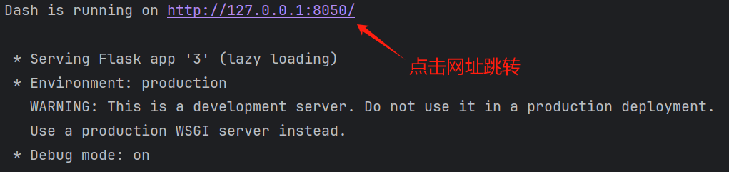
销售数据仪表盘
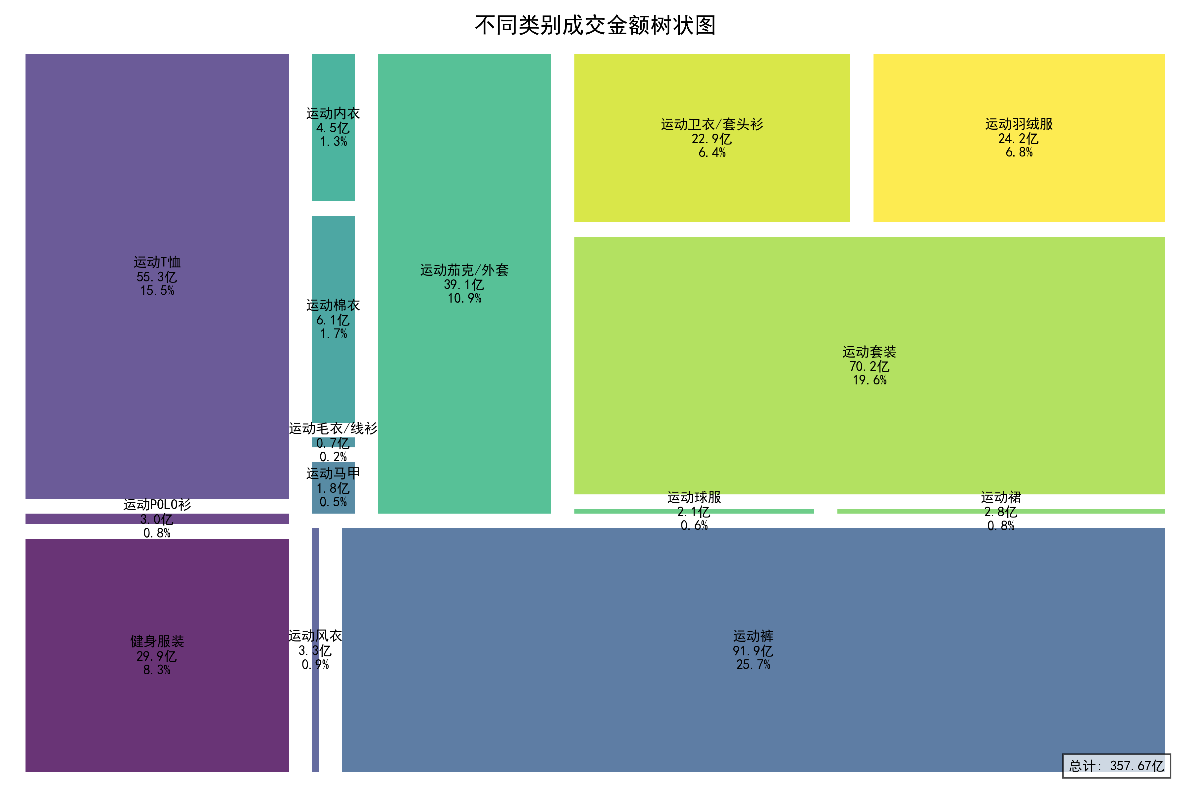
2、树状图可视化
(1)数据预处理,数据透视表实现求和
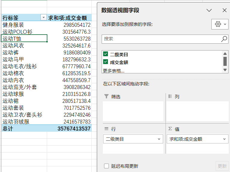
(2)EXCEL 插入树状图
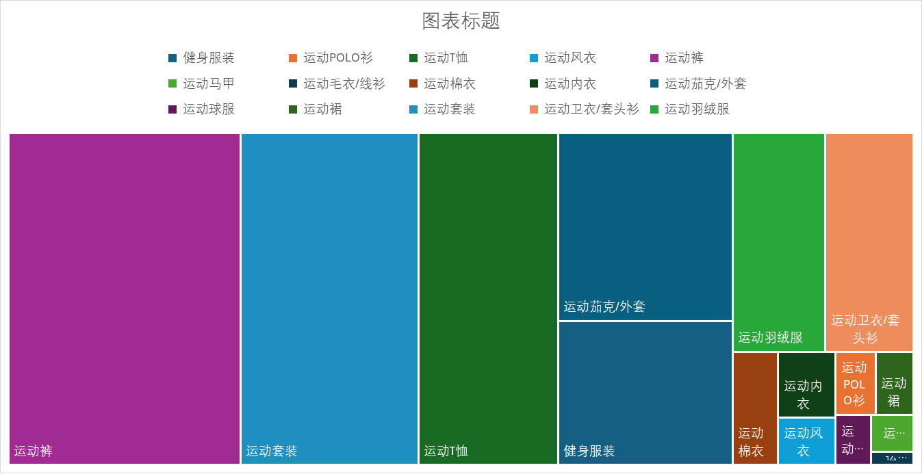
(3)python matplotlib库中的squarify.plot()函数绘制树状图
python
import pandas as pd
import matplotlib.pyplot as plt
import squarify
import numpy as np

# 读取数据
df = pd.read_excel('树状图.xlsx', engine='openpyxl')

# 设置图片清晰度
plt.rcParams['figure.dpi'] = 300
# 设置中文字体
plt.rcParams['font.sans-serif'] = ['SimHei', 'WenQuanYi Micro Hei', 'Heiti TC']

# 数据预处理:计算占比,用于标签显示
total = df['求和项:成交金额'].sum()
df['占比'] = df['求和项:成交金额'].apply(lambda x: f"{x/total*100:.1f}%")

# 创建自定义颜色映射
cmap = plt.cm.get_cmap('viridis', len(df))
colors = [cmap(i) for i in range(len(df))]

# 绘制树状图
plt.figure(figsize=(12, 8))  # 设置图形大小

squarify.plot(
    sizes=df['求和项:成交金额'],
    label=[f"{name}\n{amount/1e8:.1f}亿\n{percent}"
           for name, amount, percent in zip(df['类别'], df['求和项:成交金额'], df['占比'])],
    color=colors,
    alpha=0.8,
    pad=True  # 添加间隔,使图形更清晰
)

# 设置标题和样式
plt.title('不同类别成交金额树状图', fontsize=16, pad=10)
plt.axis('off')  # 隐藏坐标轴

# 添加图例说明
plt.text(
    0.99, 0.01,
    f"总计: {total/1e8:.2f}亿",
    ha='right',
    va='bottom',
    transform=plt.gca().transAxes,
    fontsize=10,
    bbox=dict(facecolor='white', alpha=0.7)
)

# 调整布局
plt.tight_layout()

# 显示图形
plt.show()