安装与加载GGPLOT2库
确保已安装ggplot2库,若未安装可通过以下命令安装:
r
install.packages("ggplot2")加载库:
r
library(ggplot2)准备数据
假设有一个包含时间序列数据的数据框df,包含两列:date(日期)和value(数值)。示例数据生成:
r
df <- data.frame(
  date = seq(as.Date("2023-01-01"), as.Date("2023-12-31"), by = "month"),
  value = c(15, 18, 22, 25, 30, 28, 26, 24, 20, 18, 16, 14)
)
基础折线图绘制
使用geom_line()绘制折线图:
r
ggplot(df, aes(x = date, y = value)) +
  geom_line()
自定义折线图样式
调整线条颜色、粗细和添加点标记:
r
ggplot(df, aes(x = date, y = value)) +
  geom_line(color = "blue", linewidth = 1) +
  geom_point(color = "red", size = 3)
添加标题与坐标轴标签
通过labs()函数设置标题和标签:
r
ggplot(df, aes(x = date, y = value)) +
  geom_line(color = "blue") +
  labs(title = "Monthly Value Trends (2023)",
       x = "Date",
       y = "Value")
调整坐标轴格式
例如将日期格式化为月份缩写:
r
ggplot(df, aes(x = date, y = value)) +
  geom_line(color = "blue") +
  scale_x_date(date_labels = "%b") +
  labs(title = "Monthly Trends", x = "Month", y = "Value")
多系列折线图
若数据包含分组(如category列),可通过aes(color)区分不同系列:
r
df_multi <- data.frame(
  date = rep(seq(as.Date("2023-01-01"), as.Date("2023-06-01"), by = "month"), 2),
  value = c(15, 18, 22, 25, 30, 28, 10, 12, 15, 18, 20, 22),
  category = rep(c("A", "B"), each = 6)
)

ggplot(df_multi, aes(x = date, y = value, color = category)) +
  geom_line() +
labs(title = "Multi-Series Line Chart")# 加载必要的库
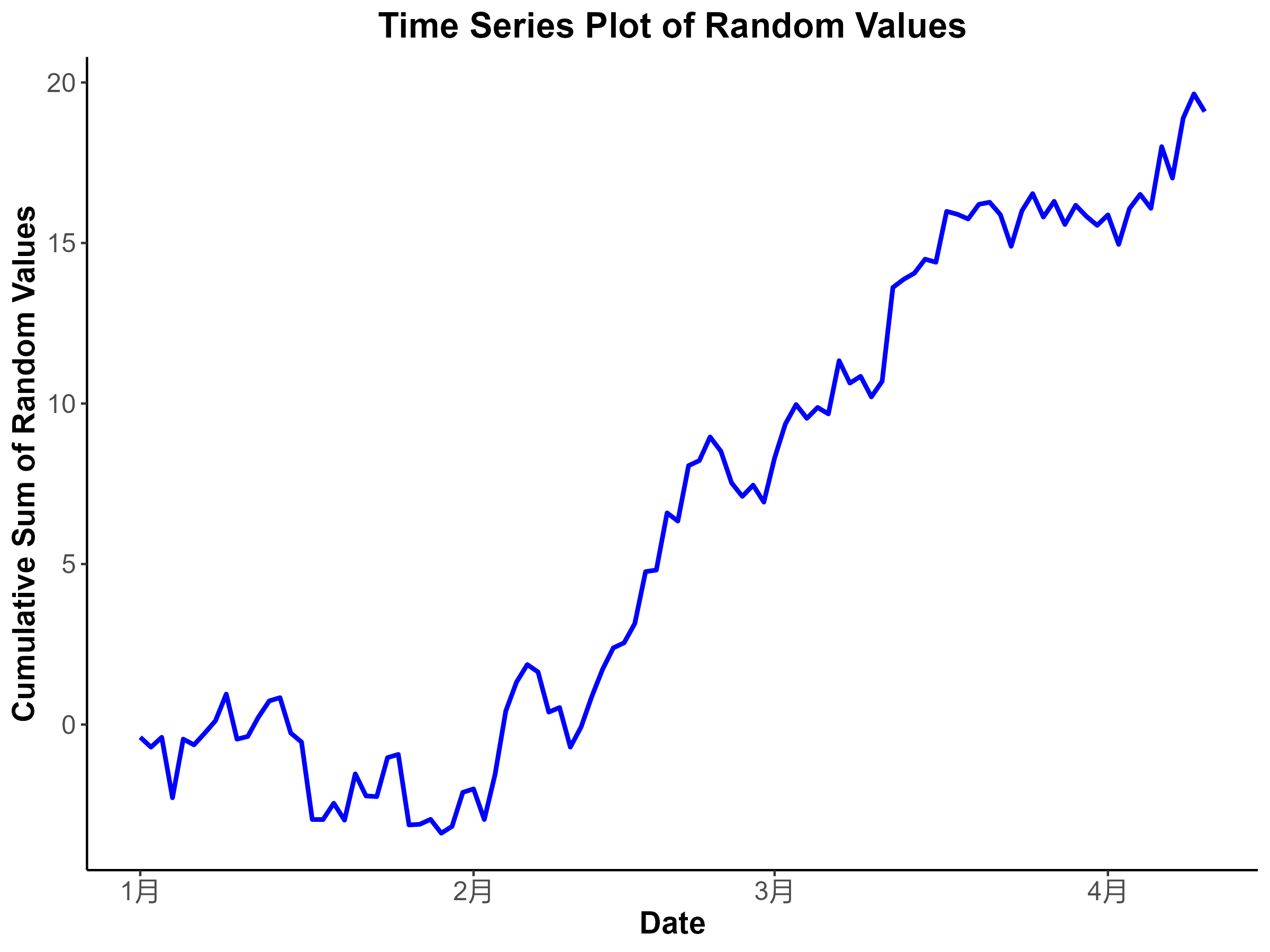
library(ggplot2)
# 生成数据
df <- data.frame(
date = seq(as.Date("2023-01-01"), by = "day", length.out = 100),
value = cumsum(rnorm(100))
)
# 绘制折线图
p <- ggplot(df, aes(x = date, y = value)) +
geom_line(color = "blue", size = 1) + # 使用蓝色线条,适当调整线条粗细
labs(title = "Time Series Plot of Random Values", # 标题
x = "Date", # X轴标签
y = "Cumulative Sum of Random Values") + # Y轴标签
theme_classic() + # 使用经典主题
theme(plot.title = element_text(size = 16, face = "bold", hjust = 0.5), # 标题样式
axis.title = element_text(size = 14, face = "bold"), # 轴标题样式
axis.text = element_text(size = 12), # 轴刻度标签样式
legend.position = "none") # 移除图例(如果不需要)
# 保存为高分辨率图像
ggsave("time_series_plot.png", plot = p, width = 8, height = 6, dpi = 300)
# 显示图像
print(p)