文章目录
图片例子
生成图片并储存,设置中文字体支持
python
from matplotlib import pyplot as plt
import random
import os

# 设置中文字体支持
plt.rcParams["font.family"] = ["Microsoft YaHei"]
plt.rcParams['axes.unicode_minus'] = False

# 生成数据
x = list(range(0, 120))
y = [random.randint(20, 35) for _ in range(120)]

# x轴标签
_xtick_labels = [f"10点{i}分" for i in range(60)] + [f"11点{i}分" for i in range(60)]

# 创建图形
plt.figure(figsize=(20, 8), dpi=80)
plt.plot(x, y, color='blue', linestyle='-', marker='o', markersize=4)
plt.xticks(x[::3], _xtick_labels[::3], rotation=45, ha='right', fontsize=10)

# 标题和标签
plt.title("Random Values Over Time (10:00-11:59)", fontsize=14)
plt.xlabel("Time", fontsize=12)
plt.ylabel("Value", fontsize=12)
plt.grid(True, linestyle='--', alpha=0.7)
plt.tight_layout()

# ✅ 正确保存路径:桌面
save_path = r"C:\Users\35986\Desktop\time_series_plot.png"
plt.savefig(save_path)

print("图片成功保存到桌面!路径为:", save_path)
plt.show()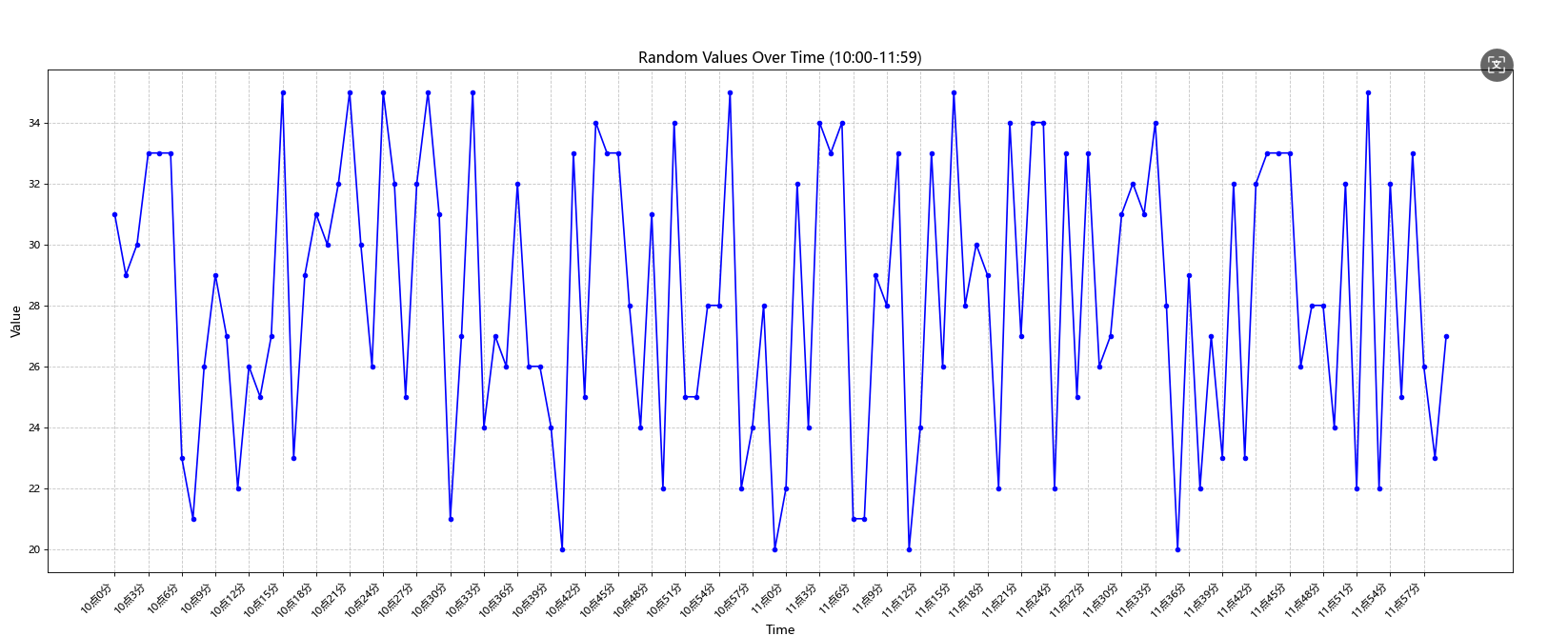
两条线
python
from matplotlib import pyplot as plt

# Data
a = [1, 0, 1, 1, 2, 4, 3, 2, 3, 4, 4, 5, 6, 5, 4, 3, 3, 1, 1, 1]  # You
b = [1, 0, 3, 1, 2, 2, 3, 3, 2, 1, 2, 1, 1, 1, 1, 1, 1, 1, 1, 11]  # Desk Mate
ages = list(range(11, 31))  # Ages 11 to 30

# Create the plot
plt.figure(figsize=(10, 6), dpi=100)
plt.plot(ages, a, color='blue', linestyle='-', marker='o', markersize=5, label='You')
plt.plot(ages, b, color='orange', linestyle='-', marker='s', markersize=5, label='Desk Mate')

# Customize the plot
plt.title('Number of Partners by Age (11-30)', fontsize=14)
plt.xlabel('Age', fontsize=12)
plt.ylabel('Number of Partners', fontsize=12)
plt.xticks(ages)  # Show every age on x-axis
plt.grid(True, linestyle='--', alpha=0.7)
plt.legend()

# Adjust layout to prevent label cutoff
plt.tight_layout()

# Save the plot to the desktop (adjust the path for your system)
save_path = r"D:\my_app\python\python  project\figure\time_series_plot.png"
plt.savefig(save_path)
print(f"Plot saved to: {save_path}")

# Display the plot


plt.show()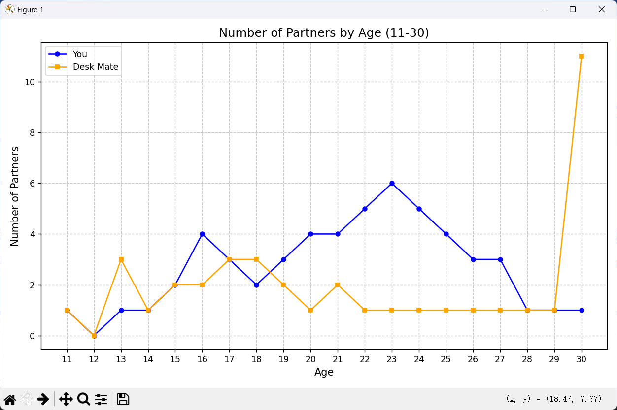
绘制散点图和直方图
python
import matplotlib.pyplot as plt
import numpy as np

# Data
a = [11, 17, 16, 11, 12, 11, 12, 6, 6, 7, 8, 9, 12, 15, 14, 17, 18, 21, 16, 17, 20, 14, 15, 15, 15, 19, 21, 22, 22, 22, 23]  # March
b = [26, 26, 28, 19, 21, 17, 16, 19, 18, 20, 20, 19, 22, 23, 17, 20, 21, 20, 22, 15, 11, 15, 5, 13, 17, 10, 11, 13, 12, 13, 6]  # October
days = list(range(1, 32))  # Days 1 to 31

# Create figure with two subplots
plt.figure(figsize=(12, 8))

# Subplot 1: Scatter plot
plt.subplot(2, 1, 1)
plt.scatter(days, a, color='b', marker='o', s=50, label='March 2016')
plt.scatter(days, b, color='r', marker='s', s=50, label='October 2016')
plt.title('Daily High Temperatures in Beijing (March vs. October 2016)', fontsize=14)
plt.xlabel('Day of Month', fontsize=12)
plt.ylabel('Temperature (°C)', fontsize=12)
plt.xticks(days[::2])  # Show every other day for clarity
plt.grid(True, linestyle='--', alpha=0.7)
plt.legend()

# Subplot 2: Histogram of temperature frequencies
plt.subplot(2, 1, 2)
plt.hist(a, bins=range(min(a + b), max(a + b) + 2), alpha=0.5, color='b', label='March 2016')
plt.hist(b, bins=range(min(a + b), max(a + b) + 2), alpha=0.5, color='r', label='October 2016')
plt.title('Temperature Distribution (March vs. October 2016)', fontsize=14)
plt.xlabel('Temperature (°C)', fontsize=12)
plt.ylabel('Count', fontsize=12)
plt.grid(True, linestyle='--', alpha=0.7)
plt.legend()

# Adjust layout and display
plt.tight_layout()
plt.show()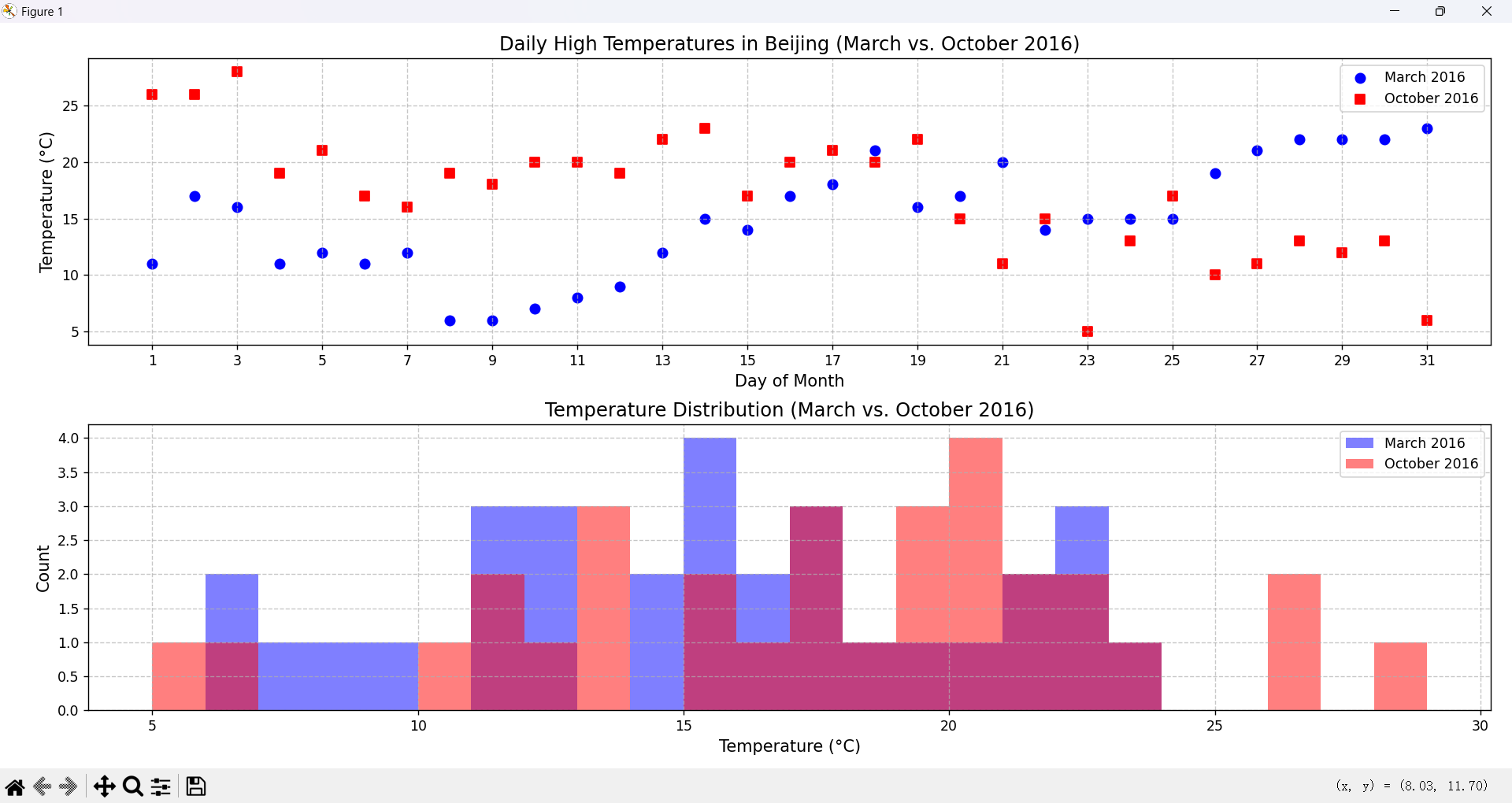
绘制条形图(bar)
python
import matplotlib.pyplot as plt
import numpy as np

# 设置中文字体支持
plt.rcParams["font.family"] = ["Microsoft YaHei"]
plt.rcParams['axes.unicode_minus'] = False

# Data
a = ["战狼2", "速度与激情8", "功夫瑜伽", "西游伏妖篇", "变形金刚5:最后的骑士",
     "摔跤吧!爸爸", "加勒比海盗5:死无对证", "金刚:骷髅岛", "极限特工:终极回归",
     "生化危机6:终章", "乘风破浪", "神偷奶爸3", "智取威虎山", "大闹天竺",
     "金刚狼3:殊死一战", "蜘蛛侠:英雄归来", "悟空传", "银河护卫队2", "情圣", "新木乃伊"]
b = [56.01, 26.94, 17.53, 16.49, 15.45, 12.96, 11.8, 11.61, 11.28, 11.12,
     10.49, 10.3, 8.75, 7.55, 7.32, 6.99, 6.88, 6.86, 6.58, 6.23]  # Unit: 亿元

# Create figure
plt.figure(figsize=(12, 6))

# Plot bar chart
bars = plt.bar(a, b, color='skyblue', edgecolor='black')

# Add data labels on top of each bar
for bar in bars:
    yval = bar.get_height()
    plt.text(bar.get_x() + bar.get_width()/2, yval + 0.5, f'{yval}',
             ha='center', va='bottom', fontsize=8)

# Customize the plot
plt.title('Top 20 Movies by Box Office in Mainland China (2017)', fontsize=14)
plt.xlabel('Movie Title', fontsize=12)
plt.ylabel('Box Office (Billions of CNY)', fontsize=12)
plt.xticks(rotation=45, ha='right', fontsize=10)  # Rotate x-axis labels for readability
plt.grid(True, axis='y', linestyle='--', alpha=0.7)  # Grid on y-axis
plt.tight_layout()

# Save the plot
plt.savefig('box_office_bar_chart.png')

# Display the plot
plt.show()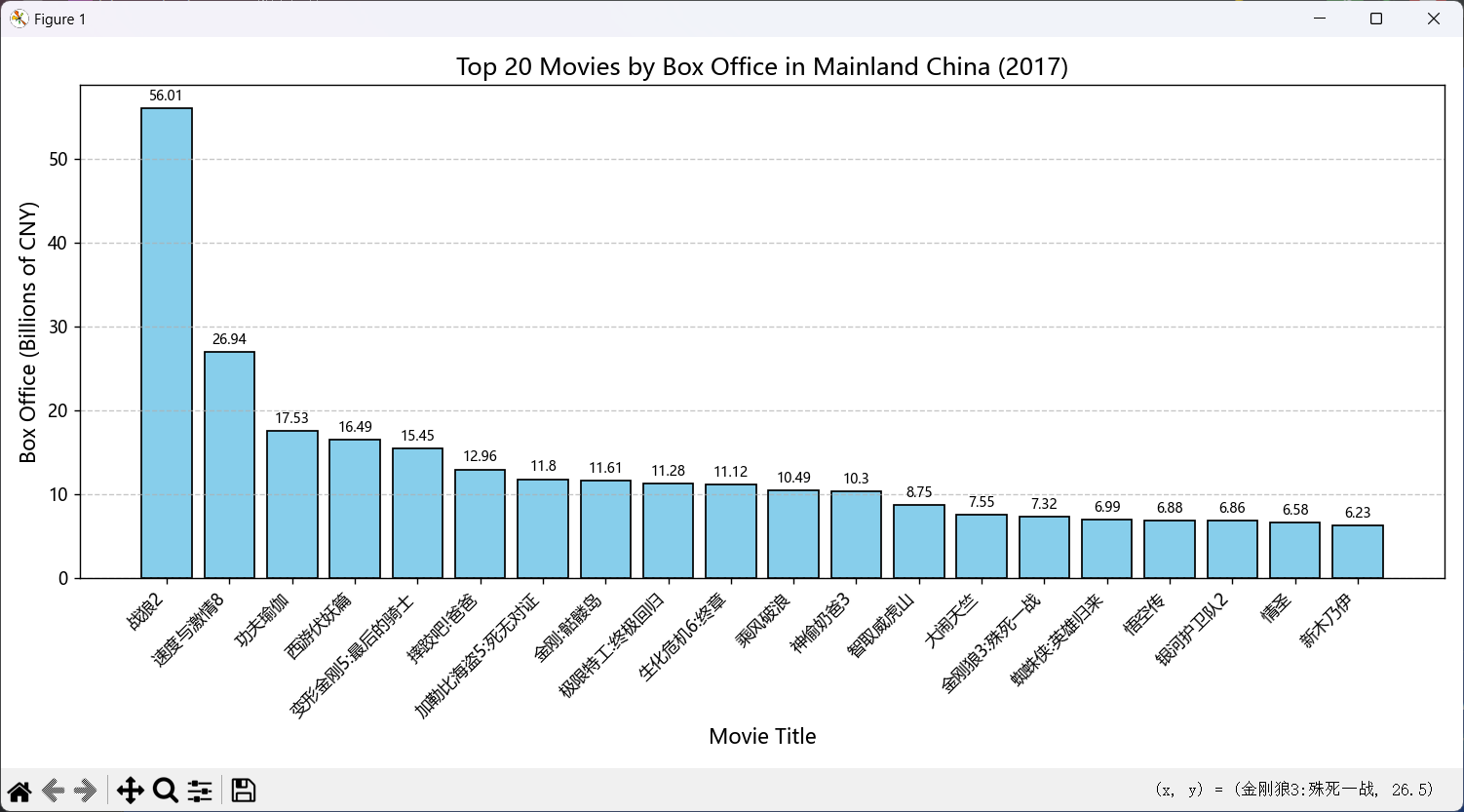
绘制条形图(横着的)(plt.barh)
python
import matplotlib.pyplot as plt
import numpy as np
# 设置中文字体支持
plt.rcParams["font.family"] = ["Microsoft YaHei"]
plt.rcParams['axes.unicode_minus'] = False

# Data
a = ["战狼2", "速度与激情8", "功夫瑜伽", "西游伏妖篇", "变形金刚5:最后的骑士",
     "摔跤吧!爸爸", "加勒比海盗5:死无对证", "金刚:骷髅岛", "极限特工:终极回归",
     "生化危机6:终章", "乘风破浪", "神偷奶爸3", "智取威虎山", "大闹天竺",
     "金刚狼3:殊死一战", "蜘蛛侠:英雄归来", "悟空传", "银河护卫队2", "情圣", "新木乃伊"]
b = [56.01, 26.94, 17.53, 16.49, 15.45, 12.96, 11.8, 11.61, 11.28, 11.12,
     10.49, 10.3, 8.75, 7.55, 7.32, 6.99, 6.88, 6.86, 6.58, 6.23]  # Unit: 亿元

# Sort data by box office earnings (descending)
sorted_data = sorted(zip(b, a), reverse=True)
b_sorted, a_sorted = zip(*sorted_data)

# Create figure
plt.figure(figsize=(10, 8))

# Plot horizontal bar chart
plt.barh(a_sorted, b_sorted, color='#1f77b4', edgecolor='none')  # Match the blue color from the image

# Customize the plot
plt.title('2017年内地电影票房前20', fontsize=14)  # Title: "Top 20 Movies by Box Office in Mainland China 2017"
plt.xlabel('票房(亿元)', fontsize=12)  # X-axis: "Box Office (Billions of CNY)"
plt.ylabel('电影名', fontsize=12)  # Y-axis: "Movie Title"
plt.tight_layout()

# Save the plot
plt.savefig('horizontal_box_office_bar_chart_matching_image.png')

# Display the plot
plt.show()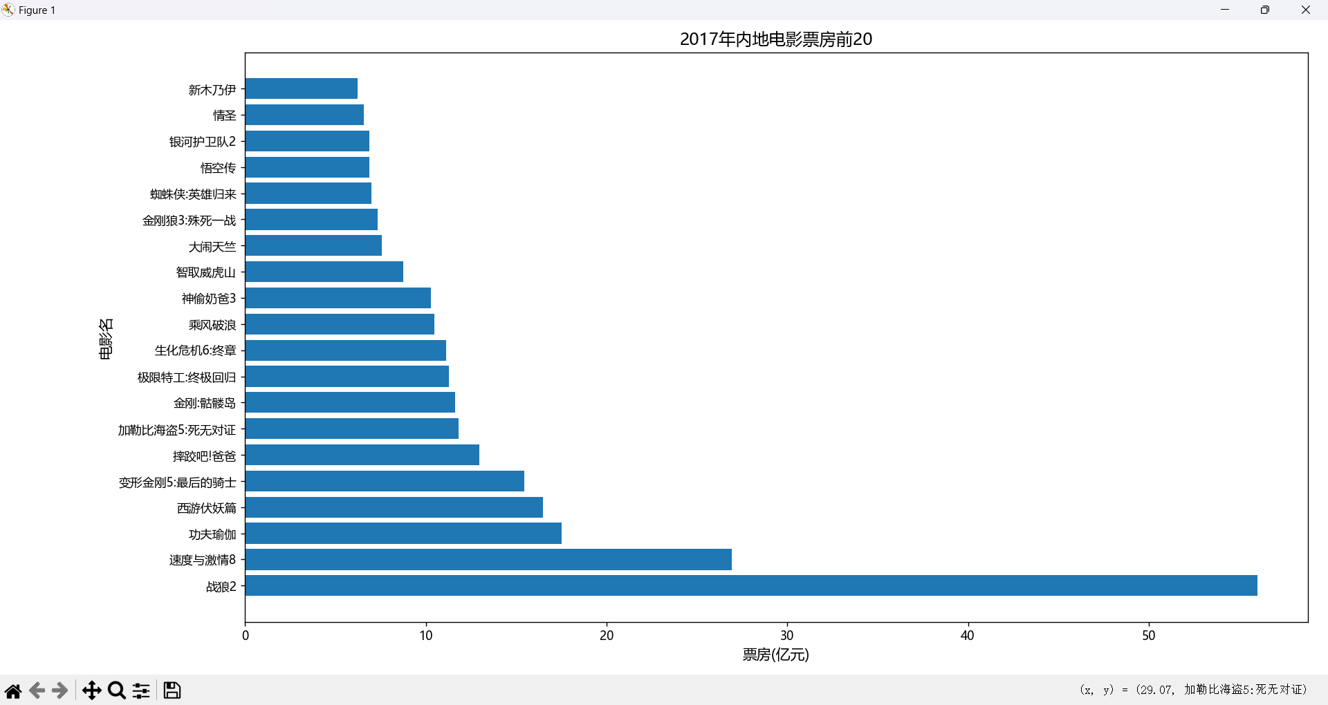
分组的条形图
先给每天分组,再用for循环画图。
python
import matplotlib.pyplot as plt
import numpy as np

# 设置中文字体支持
plt.rcParams["font.family"] = ["Microsoft YaHei"]
plt.rcParams['axes.unicode_minus'] = False

# Data
a = ["猩球崛起3:终极之战", "敦刻尔克", "蜘蛛侠:英雄归来", "战狼2"]
b_14 = [2358, 399, 2358, 362]  # 2017-09-14
b_15 = [12357, 156, 2045, 168]  # 2017-09-15
b_16 = [15746, 312, 4497, 319]  # 2017-09-16

# Prepare data for grouped bar chart
days = ['2017-09-14', '2017-09-15', '2017-09-16']
data = np.array([b_14, b_15, b_16]).T  # Transpose to group by movie

# Set bar width and positions
bar_width = 0.2
x = np.arange(len(days))

# Create figure
plt.figure(figsize=(8, 6))

# Plot bars for each movie
for i in range(len(a)):
    plt.bar(x + i * bar_width, data[i], bar_width, label=a[i], edgecolor='black')

# Add data labels
for i in range(len(a)):
    for j in range(len(days)):
        plt.text(x[j] + i * bar_width, data[i][j] + 200, f'{data[i][j]}',
                 ha='center', va='bottom', fontsize=8)

# Customize the plot
plt.title('2017年9月14-16日电影票房对比', fontsize=14)  # Title: "Box Office Comparison for Sep 14-16, 2017"
plt.xlabel('日期', fontsize=12)  # X-axis: "Date"
plt.ylabel('票房 (单位未知)', fontsize=12)  # Y-axis: "Box Office (Unit Unknown)"
plt.xticks(x + bar_width * (len(a) - 1) / 2, days, fontsize=10)
plt.legend(fontsize=10)
plt.grid(True, axis='y', linestyle='--', alpha=0.7)
plt.tight_layout()

# Save the plot
plt.savefig('grouped_bar_chart_movie_box_office.png')

# Display the plot
plt.show()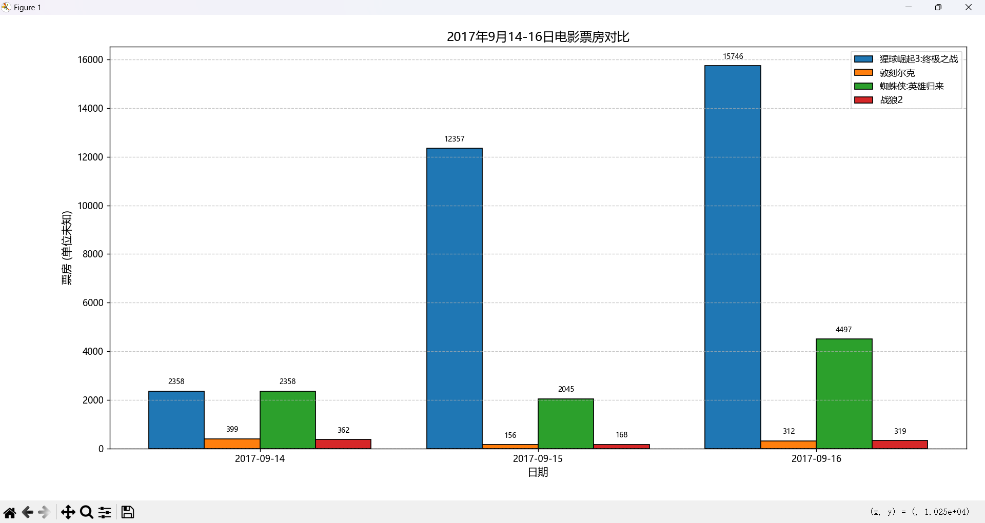
颜色和线条风格
在 Python 的 Matplotlib 库中,绘图时可以通过 color 参数指定颜色,通过 linestyle 参数指定线条风格,通过 marker 参数指定数据点标记样式。以下是常用的颜色字符、线条风格字符和标记样式的详细说明:
1. 颜色字符 (color)
Matplotlib 支持多种方式指定颜色,包括单字符缩写、完整颜色名称、十六进制代码、RGB/RGBA 元组等。常用的单字符颜色缩写如下:
| 字符 | 颜色 |
|---|---|
'b' |
蓝色 (Blue) |
'g' |
绿色 (Green) |
'r' |
红色 (Red) |
'c' |
青色 (Cyan) |
'm' |
洋红 (Magenta) |
'y' |
黄色 (Yellow) |
'k' |
黑色 (Black) |
'w' |
白色 (White) |
其他颜色指定方式:
- 完整颜色名称 :如
'blue','green','red'等。 - 十六进制代码 :如
'#FF0000'(红色)。 - RGB 元组 :如
(1, 0, 0)(红色,值范围 0-1)。 - RGBA 元组 :如
(1, 0, 0, 0.5)(半透明红色)。 - 灰度值 :如
'0.5'(中灰色,值范围 0-1)。
示例:
python
plt.plot(x, y, color='r')  # 红色
plt.plot(x, y, color='blue')  # 完整名称
plt.plot(x, y, color='#00FF00')  # 绿色(十六进制)
plt.plot(x, y, color=(0, 0, 1))  # 蓝色(RGB)
2. 线条风格字符 (linestyle)
Matplotlib 支持多种线条风格,通过 linestyle 或简写 ls 参数指定。常用的线条风格字符如下:
| 字符 | 风格 |
|---|---|
'-' 或 'solid' |
实线 |
'--' 或 'dashed' |
虚线 |
'-.' 或 'dashdot' |
点划线 |
':' 或 'dotted' |
点线 |
'None' 或 '' |
无线条 |
示例:
python
plt.plot(x, y, linestyle='--')  # 虚线
plt.plot(x, y, ls='-')  # 实线
plt.plot(x, y, ls=':')  # 点线
3. 标记样式字符 (marker)
标记用于在数据点上绘制特定符号,通过 marker 参数指定。常用的标记样式字符如下:
| 字符 | 标记样式 |
|---|---|
'o' |
圆圈 |
's' |
正方形 |
'p' |
五边形 |
'^' |
上三角形 |
'v' |
下三角形 |
'<' |
左三角形 |
'>' |
右三角形 |
'*' |
星号 |
'D' |
钻石形 |
'+' |
加号 |
'x' |
叉号 |
'.' |
点 |
',' |
像素点 |
标记相关参数:
markersize或ms:设置标记大小,如markersize=5。markerfacecolor或mfc:设置标记填充颜色。markeredgecolor或mec:设置标记边框颜色。
示例:
python
plt.plot(x, y, marker='o', markersize=5, markerfacecolor='red')  # 红色填充圆圈
plt.plot(x, y, marker='s', ms=6)  # 正方形标记
plt.plot(x, y, marker='^')  # 上三角形标记
4. 组合使用
在 plt.plot() 中,可以通过一个格式字符串快速指定颜色、线条风格和标记样式,格式为 [color][marker][linestyle]。例如:
python
plt.plot(x, y, 'ro-')  # 红色圆圈实线
plt.plot(x, y, 'bs--')  # 蓝色正方形虚线
plt.plot(x, y, 'g^:')  # 绿色三角形点线
5. 其他注意事项
- 颜色列表 :Matplotlib 还支持更广泛的颜色表(如 Tableau 颜色、CSS 颜色),可通过
plt.colormaps()查看。 - 线条宽度 :通过
linewidth或lw参数设置线条粗细,如linewidth=2。 - 透明度 :通过
alpha参数设置透明度(0 到 1),如alpha=0.5。 - 更多标记样式:Matplotlib 支持超过 20 种标记样式,完整列表可参考 Matplotlib 文档。
示例代码
以下是一个综合示例,展示不同颜色、线条风格和标记样式:
python
import matplotlib.pyplot as plt
import numpy as np

x = np.linspace(0, 10, 10)
y1 = np.sin(x)
y2 = np.cos(x)

plt.figure(figsize=(8, 5))
plt.plot(x, y1, 'ro-', linewidth=2, markersize=8, label='Sin')  # 红色圆圈实线
plt.plot(x, y2, 'bs--', linewidth=1.5, markersize=6, label='Cos')  # 蓝色正方形虚线
plt.title('Example Plot', fontsize=14)
plt.xlabel('X', fontsize=12)
plt.ylabel('Y', fontsize=12)
plt.grid(True)
plt.legend()
plt.tight_layout()
plt.show()