Matplotlib
折线图
python
import numpy as np
import matplotlib.pyplot as plt
import matplotlib
# 配置中文格式------保证图中出现中文的时候不会乱码
matplotlib.rcParams['font.sans-serif']=['SimHei']
matplotlib.rcParams['axes.unicode_minus']=False
# 绘图
x = np.linspace(0,2*np.pi,40)
y = np.sin(x)
plt.figure(figsize=(4,3))
plt.plot(x,y,
         label='y=sin(x)哈哈',
         marker="D",
         markersize=6,
         markerfacecolor='g',
         # linestyle='-.',
         # linewidth=5,
         alpha=0.5)
plt.xlabel("x")
plt.ylabel("sin(x)")
plt.legend()
plt.text(0,0,"这是起点")
plt.grid(True)   # 网格加持
plt.show()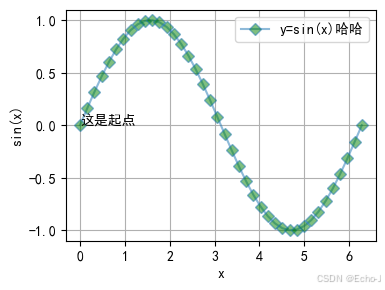
散点图
python
import matplotlib.pyplot as plt
import numpy as np
# 配置中文格式------保证图中出现中文的时候不会乱码
matplotlib.rcParams['font.sans-serif']=['SimHei']
matplotlib.rcParams['axes.unicode_minus']=False
# 绘图
N = 10
x = np.random.rand(N)
y = np.random.rand(N)
# 每个点随机大小
plt.figure(figsize=(4,3))
plt.scatter(x, y,
            s=(10*np.random.rand(N))**2,
            c = np.random.rand(N),
            marker='^',
            alpha=0.5,
            label='三角形')
plt.legend()
plt.show()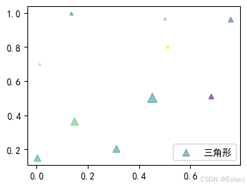
饼图
python
import matplotlib.pyplot as plt
import matplotlib
import numpy as np
# 配置中文格式------保证图中出现中文的时候不会乱码
plt.rcParams['font.sans-serif'] = ['SimHei']
matplotlib.rcParams['axes.unicode_minus'] = False
# 绘图
labels = ['娱乐', '育儿', '饮食', '房贷', '交通', '其它']
sizes = [2, 5, 12, 70, 2, 9]
# 自定义颜色列表
colors = ['#ff9999', '#66b3ff', '#99ff99', '#ffcc99', '#c2c2f0', '#ffb3e6']
plt.figure(figsize=(4, 3))
plt.pie(sizes, labels=labels, autopct='%1.1f%%', colors=colors)
plt.title("------------家庭支出---------")
plt.show()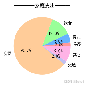
柱状图
python
import matplotlib.pyplot as plt
import numpy as np
import matplotlib
# 配置中文格式------保证图中出现中文的时候不会乱码
plt.rcParams['font.sans-serif'] = ['SimHei']
matplotlib.rcParams['axes.unicode_minus'] = False
# 绘图
size = 10
y1 = [6, 5, 8, 5, 6, 6, 8, 9, 8, 10]
y2 = [5, 3, 6, 4, 3, 4, 7, 4, 4, 6]
y3 = [4, 1, 2, 1, 2, 1, 6, 2, 3, 2]
x = np.arange(size)
total_width = 0.8
width = total_width / 3
x = x - (total_width - width) / 2
plt.figure(figsize=(4,3))
plt.bar(x, y1, width=width, label='111',color='red')
plt.bar(x + width, y2, width=width, label='222',color='blue')
plt.bar(x + 2 * width, y3, width=width, label='333', color='green')
plt.xticks(x + width, ['a','b','c','d','e','f','g','h','i','j'])
plt.legend(loc="upper left") # 防止label和图像重合显示不出来
plt.ylabel('y')
plt.xlabel('x')
plt.title("------柱状图------")
plt.show()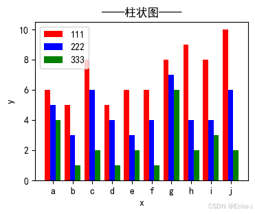
直方图
使用hist绘制
python
import numpy as np
import matplotlib.pyplot as plt
import matplotlib
matplotlib.rcParams['font.sans-serif'] = ['SimHei']
matplotlib.rcParams['axes.unicode_minus'] = False
data = np.random.normal(0, 1, 1000)
data_max = data.max()
data_min = data.min()
a = np.linspace(data_min, data_max, 11)
count = np.zeros(shape=(10,), dtype=np.int32)
for i in range(10):
    count[i] = ((data >= a[i]) & (data < a[i + 1])).sum()
x = [(a[i] + a[i + 1]) / 2 for i in range(10)]
plt.figure(figsize=(4, 3))
# plt.bar(x, count, width=x[1] - x[0], color=['r', 'y'], label="(0,1)正态分布")
plt.hist(data, bins=10, facecolor="blue", edgecolor="black", label="(0,1)正态分布")
plt.legend()
plt.show()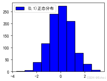
使用bar绘制
python
plt.bar(x, count, width=x[1] - x[0], color=['r', 'y'], label="(0,1)正态分布")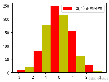
使用hist绘制直方图比使用bar绘制直方图更加简单
子图
python
import numpy as np
import matplotlib.pyplot as plt
# 画第1个图:折线图
x=np.arange(1,100)
plt.figure(figsize=(4,3))
plt.subplot(221)    # 2行 2列 序号为1
plt.plot(x,np.sin(x))
# 画第2个图:散点图
plt.subplot(222)
plt.scatter(np.arange(0,10), np.random.rand(10), c="red")
# 画第3个图:饼图
plt.subplot(223)
plt.pie(x=[15,30,45,10],labels=list('ABCD'),autopct='%.0f',explode=[0,0.05,0,
0])
# 画第4个图:条形图
plt.subplot(224)
plt.bar([20,10,30,25,15],[25,15,35,30,20],color='g')
plt.show()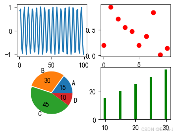
DataFrame绘图基础
此时想要绘制什么图形就改变kind属性值就可以。
line:折线图
pie:饼图
bar:柱状图 绘制多个柱状图的时候直接为属性y赋值列表
scatter:散点图
x轴默认使用index
python
import numpy as np
import pandas as pd
x=np.linspace(-np.pi,np.pi,100)
d=pd.DataFrame({"sin(x)":np.sin(x),"cos(x)":np.cos(x)},index=x)
d.plot(y=["sin(x)","cos(x)"],kind="line",color=["r","b"])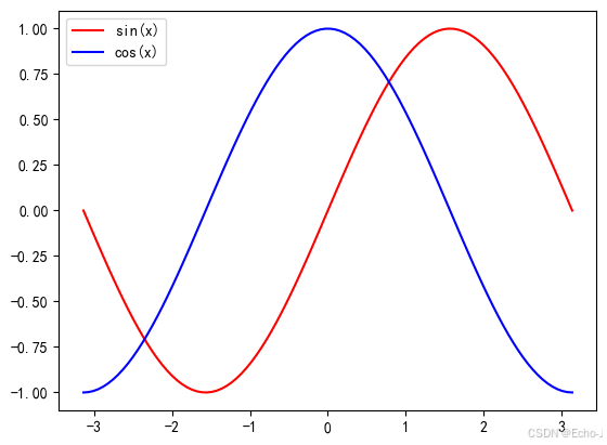
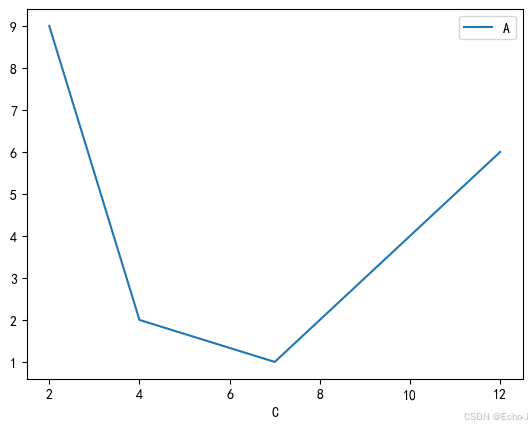
使用某一列数据进行绘制折线图
python
import pandas as pd
d=pd.DataFrame({"A":[9,2,1,6],"B":['ax','bx','cx','dx'],"C":[2,4,7,12
]},index=['a','b','c','d'])
d.plot(x="C",y="A",kind="line")