安装与加载
在R中使用plotly库前需要安装并加载。安装可以通过CRAN进行,使用install.packages()函数。加载库使用library()函数。
r
install.packages("plotly")
library(plotly)
测试库文件安装情况
# 安装并加载必要的包
if (!requireNamespace("plotly", quietly = TRUE)) {
  install.packages("plotly")
}
library(plotly)
基本绘图语法
plotly的基本语法围绕plot_ly()函数展开。数据通过参数传递,图形类型由add_trace()或直接指定图形类型(如type = "scatter")决定。
r
# 使用plot_ly创建散点图
plot_ly(data = iris, x = ~Sepal.Length, y = ~Petal.Length, type = "scatter", mode = "markers")
图形类型与参数
plotly支持多种图形类型,包括散点图、线图、柱状图等。通过调整type和mode参数可以定义图形样式。
r
# 线图示例
plot_ly(data = iris, x = ~Sepal.Length, y = ~Petal.Length, type = "scatter", mode = "lines")

# 柱状图示例
plot_ly(data = iris, x = ~Species, y = ~Sepal.Length, type = "bar")
自定义布局
使用layout()函数可以自定义图形的标题、轴标签、图例等属性。
r
plot_ly(data = iris, x = ~Sepal.Length, y = ~Petal.Length, type = "scatter", mode = "markers") %>%
  layout(
    title = "Iris Dataset Scatter Plot",
    xaxis = list(title = "Sepal Length"),
    yaxis = list(title = "Petal Length")
  )
添加多个图形层
通过add_trace()函数可以在同一图形上叠加多个图形层。
r
plot_ly(data = iris, x = ~Sepal.Length, y = ~Petal.Length, type = "scatter", mode = "markers") %>%
  add_trace(y = ~Petal.Width, mode = "lines")
交互功能
plotly图形默认支持交互功能,如缩放、平移、悬停显示数据等。可以通过layout()中的hovermode等参数调整交互行为。
r
plot_ly(data = iris, x = ~Sepal.Length, y = ~Petal.Length, type = "scatter", mode = "markers") %>%
  layout(hovermode = "closest")
导出图形
plotly图形可以导出为HTML文件或静态图片,使用htmlwidgets::saveWidget()或plotly::export()函数。
r
p <- plot_ly(data = iris, x = ~Sepal.Length, y = ~Petal.Length, type = "scatter", mode = "markers")
htmlwidgets::saveWidget(p, "plot.html")
以上内容涵盖了plotly库的基本语法规则和常见操作,适用于快速上手和进阶使用。通过组合不同的函数和参数,可以创建丰富多样的交互式图形。
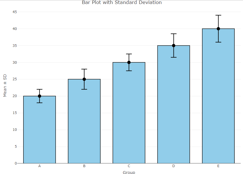
# 安装并加载必要的包
if (!requireNamespace("plotly", quietly = TRUE)) {
  install.packages("plotly")
}
library(plotly)

# 示例数据
data <- data.frame(
  Group = c("A", "B", "C", "D", "E"),
  Mean = c(20, 25, 30, 35, 40),
  SD = c(2, 3, 2.5, 3.5, 4)
)

# 创建柱状图
fig <- plot_ly(data, x = ~Group, y = ~Mean, type = 'bar', name = 'Mean',
               marker = list(color = 'skyblue', line = list(color = 'black', width = 1.5)))

# 添加误差线
fig <- fig %>% add_trace(
  x = ~Group, y = ~Mean, error_y = list(
    type = 'data', array = ~SD, visible = TRUE,
    color = 'black', thickness = 2, width = 10
  ),
  type = 'scatter', mode = 'markers', name = 'Error Bars',
  marker = list(size = 10, color = 'black')
)

# 设置布局
fig <- fig %>% layout(
  title = 'Bar Plot with Standard Deviation',
  xaxis = list(title = 'Group'),
  yaxis = list(title = 'Mean ± SD'),
  barmode = 'overlay',
  bargap = 0.2,
  bargroupgap = 0.1,
  showlegend = FALSE
)

# 显示图形
fig