自定义弹窗
自定义弹窗是界面开发中最为常用的一种弹窗写法。在自定义弹窗中, 布局样式完全由您决定,非常灵活。通常会被封装成工具类,以使得APP中所有弹窗具备相同的设计风格。
自定义弹窗具备的能力有
- 打开弹窗
- 自定义布局,以及自定义传参数(通常只要能传参,您就几乎对其界面有绝对的掌控了)
- 更新弹窗内容
- 关闭弹窗
- 释放布局资源
以下能力均可在API图中展现。如果图看明白,基本能掌握比看官方文档还要全面的点。
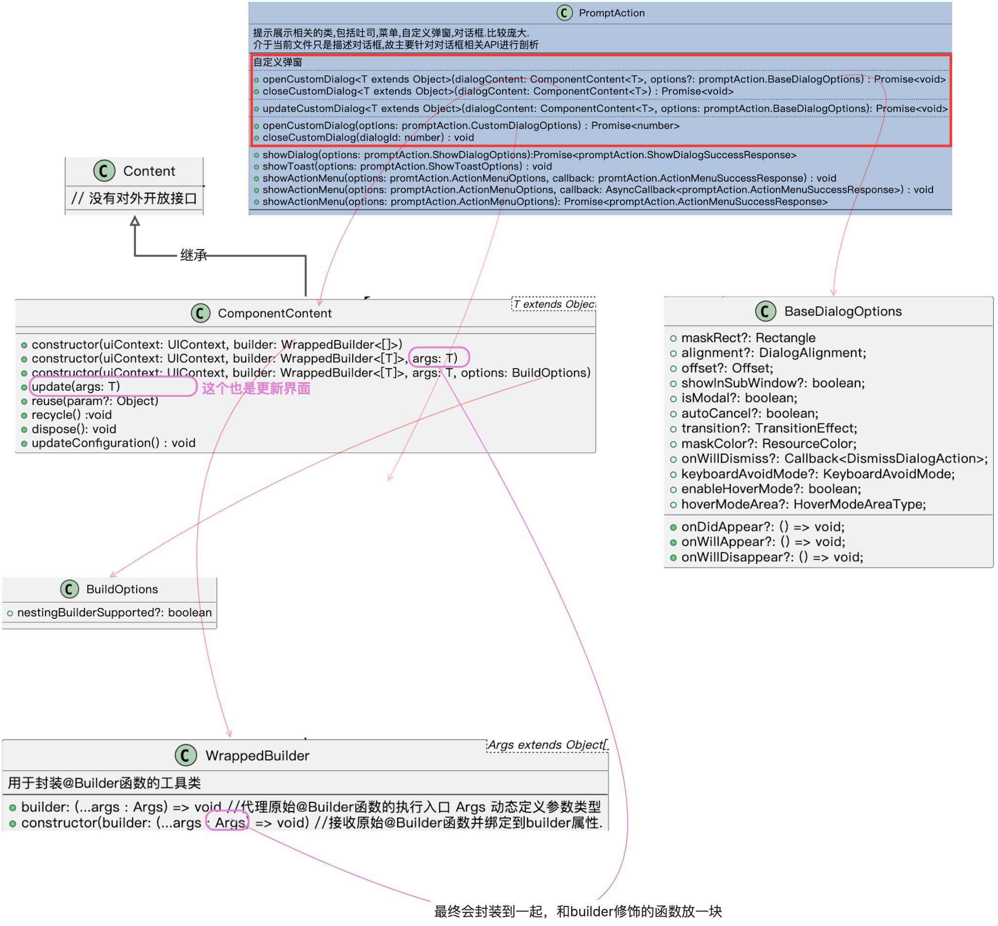
API
想要让一个自定义弹窗展示,我们首先要获取一个名为 PromptAction类的实例。这个实例由:
getUIContext().getPromptAction()来获取。我们拿到实例之后,就可以看到他里面有比较全面的, 老版本的和新版本的自定义弹窗接口。
下图直接以PromptAction类为切入点。关联所有自定义弹窗需要的API。
代码案例
代码
//用到的自定义数据
interface DialogUIParam {
titleText: string
button1Text ?: string
button2Text ?: string
button1Color ?: Color | Resource | string
button2Color ?: Color | Resource | string
}
interface MyCustomDialogParam {
uiParam: DialogUIParam
onButton1Click: () => void
onButton2Click: () => void
}
// 变量
myCustomDialogContent: ComponentContent<Object> | null = null
// 调用入口
Text('自定义弹窗')
.id('customDialog')
.fontSize($r('app.float.page_text_font_size'))
.fontWeight(FontWeight.Bold)
.alignRules({
top: { anchor: 'TextPickerDialog', align: VerticalAlign.Bottom },
start: { anchor: '__container__', align: HorizontalAlign.Start }
})
.onClick(() => {
this.openCustomDialog()
})
//打开弹窗
openCustomDialog() {
// 首先得到promptAction对象
let promptAction: PromptAction = this.getUIContext().getPromptAction()
if (this.myCustomDialogContent == null) {
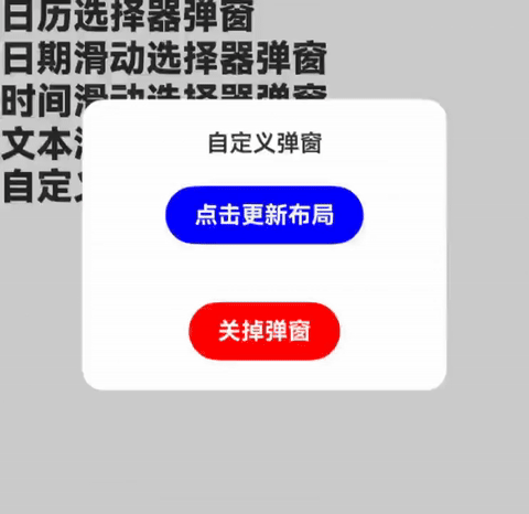
let uiParam: DialogUIParam = {
titleText: '自定义弹窗',
button1Text: '点击更新布局',
button2Text: '关掉弹窗',
button1Color: Color.Blue,
button2Color: Color.Red
}
let param: MyCustomDialogParam = {
uiParam: uiParam,
onButton1Click: () => {
// 更新弹窗的布局
param.uiParam.button1Color = Color.Red
this.myCustomDialogContent?.update(param)
},
onButton2Click: () => {
this.closeCustomDialog()
}
}
this.myCustomDialogContent = new ComponentContent(
this.getUIContext(),
new WrappedBuilder(this.myCustomDialog), param)
}
let baseDialogOptions: promptAction.BaseDialogOptions = {
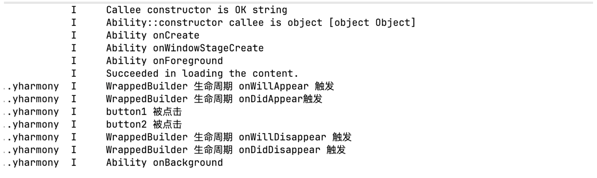
onDidAppear: () => {
console.log("WrappedBuilder 生命周期 onDidAppear触发")
},
onWillAppear: () => {
console.log("WrappedBuilder 生命周期 onWillAppear 触发")
},
onWillDisappear: () => {
console.log("WrappedBuilder 生命周期 onWillDisappear 触发")
},
onDidDisappear: () => {
console.log("WrappedBuilder 生命周期 onDidDisappear 触发")
this.myCustomDialogContent?.dispose()
this.myCustomDialogContent = null
}
}
promptAction.openCustomDialog(this.myCustomDialogContent, baseDialogOptions)
}
// 关闭弹窗
closeCustomDialog() {
if (this.myCustomDialogContent != null) {
this.getUIContext().getPromptAction().closeCustomDialog(this.myCustomDialogContent)
}
}
// builer修饰的组件
@Builder
myCustomDialog(param: MyCustomDialogParam) {
Stack() {
Column() {
Text(param.uiParam.titleText)
.id('title')
if (param.uiParam.button1Text) { //条件渲染
Button(param.uiParam.button1Text)
.id('button1')
.margin(20)
.padding({
top: 10,
bottom: 10,
left: 20,
right: 20
})
.onClick(() => {
console.log("button1 被点击")
param.onButton1Click()
})
.backgroundColor(param.uiParam.button1Color ? param.uiParam.button1Color : Color.Blue)
}
if (param.uiParam.button2Text) {
Button(param.uiParam.button2Text)
.id('button2')
.padding({
top: 10,
bottom: 10,
left: 20,
right: 20
})
.margin({ top: 20 })
.onClick(() => {
console.log("button2 被点击")
// // 让弹窗消失
param.onButton2Click()
})
.backgroundColor(param.uiParam.button2Color ? param.uiParam.button2Color : Color.Blue)
}
}.alignSelf(ItemAlign.Center)
}
.height(200)
.width(250)
.backgroundColor(Color.White)
.borderRadius(15)
}日志