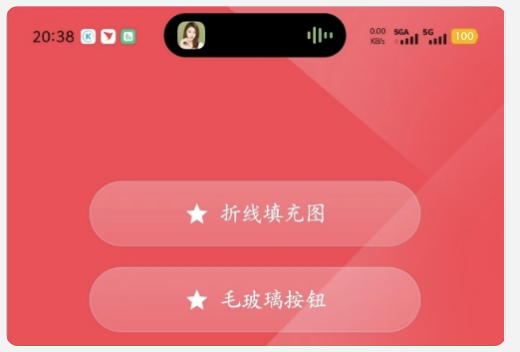
直接上图看效果
直接上compose代码
kotlin
/**
* 自定义毛玻璃效果按钮 - 背景模糊,文字清晰
*/
@Composable
fun GlassButton(
onClick: () -> Unit,
text: String,
backgroundColor: Color = Color.White,
txetColor: Color = Color.White,
modifier: Modifier = Modifier
) {
val isHigherAndroidVersion = android.os.Build.VERSION.SDK_INT >= android.os.Build.VERSION_CODES.S
Box(modifier = modifier) {
// 毛玻璃背景层
Card(
modifier = Modifier.fillMaxSize(),
shape = RoundedCornerShape(25.dp),
// 半透明背景
colors = CardDefaults.cardColors(
containerColor = backgroundColor.copy(alpha = 0.12f)
),
// 增加细微白色边框增强玻璃感
border = BorderStroke(0.5.dp, backgroundColor.copy(alpha = 0.3f))
) {
Box(
modifier = Modifier
.fillMaxSize()
.background(
brush = Brush.verticalGradient(
colors = listOf(
backgroundColor.copy(alpha = 0.2f),
backgroundColor.copy(alpha = 0.1f)
)
)
)
.then(
// 只对背景应用模糊效果
if (isHigherAndroidVersion) {
Modifier.blur(radius = 20.dp)
} else {
Modifier
}
)
)
}
// 前景内容层 - 不应用模糊效果
Box(
modifier = Modifier
.clip(RoundedCornerShape(25.dp))
.fillMaxSize()
.clickable(onClick = onClick),
contentAlignment = Alignment.Center
) {
Row(
verticalAlignment = Alignment.CenterVertically,
horizontalArrangement = Arrangement.Center
) {
// 星星图标
Icon(
imageVector = Icons.Filled.Star,
contentDescription = null,
tint = Color.White,
modifier = Modifier.size(20.dp)
)
Spacer(modifier = Modifier.width(8.dp))
// 文字内容 - 保持清晰
Text(
text = text,
fontSize = 16.sp,
color = txetColor,
fontWeight = androidx.compose.ui.text.font.FontWeight.Medium
)
}
}
}
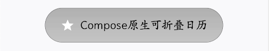
}根据需求改代码,比如改成下面这样的
代码贴上了,具体根据需求改。
博主幸劳,转载记得标注原出处链接,支持原创。